Empirical Motivations
We now turn to consider various empirical arguments why poverty measurement should be multidimensional. Nolan and Whelan (2011), observing the rise of multidimensional approaches in Europe, identify three reasons that non-monetary as well as monetary indicators have come to be used: meaning, identification, and multidimensionality.
The first notes that non-monetary deprivations ‘play a central role in capturing and conveying5 See Fleurbaey (2006a) and Robeyns and van der Veen (2007). the realities of the experience of poverty, bringing out concretely and graphically what it means to be poor' (2011: 16). Non-monetary indicators may also improve identification in two ways. They may help ‘in arriving at [and justifying] the most appropriate income threshold’. Also, empirical studies motivated a critique that low income, surprisingly, ‘fails in practice to identify those unable to participate in their societies due to lack of resources’ (2011: 16), and that non-monetary deprivation indicators were more reliable tools for identification. This may be due to differences in people’s abilities to convert income into resource-based outcomes, or due to challenges such as equivalence scales. The third reason poverty is measured directly using multiple indicators is that poverty itself is defined as being intrinsically multidimensional.
Nolan and Whelan very helpfully observe that in all three of these situations, and particularly the last, ‘The need for a multidimensional measurement approach in identifying the poor/excluded is an empirical matter, rather than something one can simply read off from the multidimensional nature of the concepts themselves’. If, for example, poverty were defined as multidimensional but any single indicator, including household income, were sufficient to identify the poor and measure the level and trends of poverty in a society (including ‘those other dimensions of deprivation and exclusion’, p.
19), a multidimensional methodology would not be required for poverty measurement.We explore whether various unidimensional measures accurately reflect the level and trend of multidimensional poverty and related questions. We first probe whether monetary poverty measures can be assumed to be a sufficient proxy to identify who is poor and monitor the level and trends of other dimensions of poverty. As evidence indicates this is not the case, we then ask whether some non-monetary indicator can play that role but again find large mismatches. So we enquire whether a single policy lever, such as GDP growth, has been shown to be sufficient to reduce poverty in its many dimensions, and again find a negative answer. Finally, we observe that a dashboard of single indicators overlooks clustered disadvantages, and that monetary measures do not necessarily identify the same group of people as poor in comparison with multidimensional measures. These reasons thus also point out the need for multidimensional poverty measures that reflect the joint distribution of disadvantages.
1.2.1 Monetaryvsnon-Monetaryhousehold deprivations
The prominent focus on income poverty reduction is built on the implicit assumption that monetary poverty measures adequately identify who is poor. Yet an increasing empirical literature documents a mismatch between monetary and non-monetary deprivations. This leads to analysts to ask, ‘What is the relationship between deprivation indicators and household income, how is that to be interpreted, and what conclusions can be drawn?’ (Nolan and Whelan 2011: 31).
As we survey extensively in Chapter 4, in both Europe and developing countries, studies since the early 1980s have repeatedly documented the fact that income or consumption poverty measures identify different people as poor than other deprivation indicators.[13] Kaztman (1989) found that 13% of households in Montevideo, Uruguay, were income poor but did not experience unsatisfied basic needs, whereas 7.5% were in the opposite case.
Ruggeri Laderchi (1997) concluded on the basis of Chilean data that ‘income in itself is not... conveying all of the information of interest if the aim is to provide a comprehensive picture of poverty. Stewart, Saith, and Harriss-White (2007) found that 53% of malnourished Indian children in that study did not live in income-poor households and 53% of the children living in income-poor households were not malnourished. Bradshaw and Finch (2003) find that while 17-20% of people are income poor, and subjective poor, and materially deprived, only 5.7% of the population experience all three dimensions, leading them to conclude that ‘it is not safe to rely on one measure of poverty—the results obtained are just not reliable enough. Across nine European countries, Whelan, Layte, and Maitre (2004) used panel data to compare the persistently income poor and the persistently materially deprived, and found that roughly 20% of people were persistently poor by each measure but only 9.7% were poor according to both measures. These and many other empirical studies show that in many cases there are large mismatches between income poverty and deprivations in other indicators: income does not accurately proxy non-monetary deprivations in identifying the poor.1.2.2 TRENDS IN MONETARY POVERTY VS TRENDS IN
NON-MONETARY DEPRIVATIONS
But it may be that while the details differ, a decrease in income poverty heralds a decrease in other indicators also—that the trends will be similar. Yet using all presently available data across developing countries, there does not appear to be a high association across levels of progress shown in different indicators.
Motivated by Bourguignon et al. (2010), we performed a very similar exercise using national aggregate data from 1990-2012.[14] Figure 1.1 depicts the association between the change in $1.25/day income poverty and the change in some non-income Millennium Development Goal (MDG) indicators, namely, the prevalence of underweight children, primary school completion rate, the ratio of female to male primary school enrolment, and under-5 mortality during this period.
The size of the bubble represents the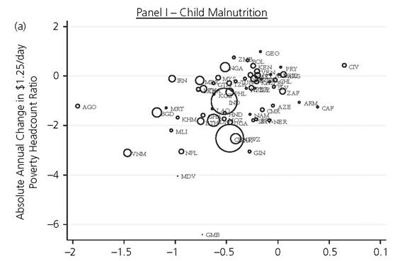
Absolute Annual Change in % Children with Low Weight for Age
Figure 1.1. Scatter plots comparing cross-country reductions in income poverty to progress in other Millennium Development Goal
Source: Authors' elaboration using World Development Indicators (World Bank) 1990-2012
population size in the year 2000 (UNDESA 2013).[15] Progress in these four indicators is not strongly associated with progress in $1.25/day income poverty reduction.[16]
To cross-check this finding, we investigate a raft of recent studies considering country trajectories in meeting the MDGs.[17] Figure 1.2 presents the share of countries that have met different MDG targets at the national level, where it is evident that although a number of countries have met the goal of extreme poverty reduction in terms of $1.25/day, these countries have largely failed to meet the goals in many non-income indicators.
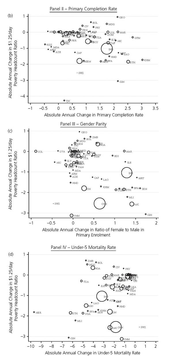
Figure 1.1. (cont.)
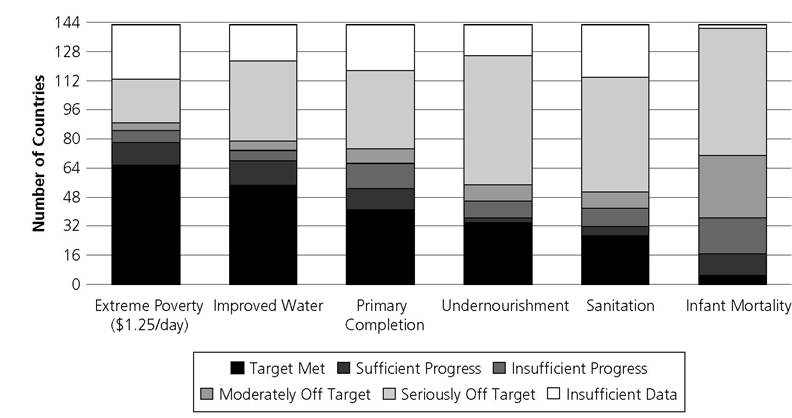
Figure 1.2. Progress in different MDGs across countries
Source: Global Monitoring Report 2013 (World Bank 2013). The data were downloaded from http:// data.worldbank.org/mdgs/progress-status-across-groups-number-of-countriesaccessed on April 1, 2014.
The emerging conclusion is that meeting the goal of income poverty reduction does not ensure reducing deprivations in non-income indicators.[21]
These two examples clearly suggest, as Bourguignon et al. (2010) concluded, that income poverty trends do not proxy trends in the reduction of non-income deprivations. The evidence and literature reviewed in this and the previous section suggest that whether information on multidimensional poverty levels or trends is required, or policy impacts on poverty are to be measured, income poverty measures must be complemented by measures reflecting other dimensions of poverty.
1.2.3 ASSOCIATIONS ACROSS NON-MONETARY DEPRIVATIONS
If consumption and income do not map multidimensional poverty, perhaps another indicator could be identified that was highly associated in level and trend with deprivations in other non-monetary dimensions. Such a headline indicator could summarize progress in non-income spheres. Indicators like girls' education or malnutrition are often heralded as general-purpose measures. Yet to date, systematic cross-tabulations of deprivations or assessments of redundancy, which will be introduced in section 7.3, have not identified a bellwether indicator.
Table 1.1 Cross-tabulation of deprivations in two indicators

To give one example of one variable pair for one country, data from the National Family Health Survey 2005-6 of India shows that around 21% of the population live in a household in which no member has completed five years of schooling and, in 18% of the population, a child is not attending school up to the age at which he or she would complete class 10. With these two educational indicators, one might expect a high association, as educated families should send their children to school. But only 7.4% of households experience both deprivations whereas 13.6% and 10.6% are deprived in one indicator but not in the other. This situation can be summarized by a simple cross-tabulation presented in Table 1.1 (section2.2.3 discusses such tables containing the joint distribution of deprivations).
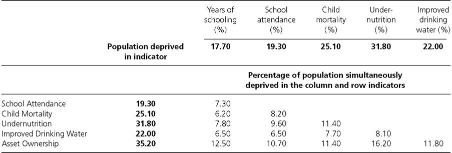
This type of mismatch is repeated throughout many countries. In fact, we did a simple exercise using a sample of seventy-five developing countries and using the six of the ten indicators that form the Global Multidimensional Poverty Index (MPI).[22] We computed the proportion of people in these seventy-five countries who are deprived in each of the six indicators and report these in the second column and the second row of Table 1.2.
The remaining entries show the proportion of the population who are simultaneously deprived in each pair of these indicators.[23] For example, 17.7% of the population live in households deprived in years of schooling and 19.3% of the population live in households where at least one school-aged child does not attend school. However, only 7.3% of the population live in households that are deprived in both indicators. This information thus summarizes the cross-tabulation between these two indicators as in Table 1.1 (but now using the population of all seventy-five countries).Overall, we find that the proportion of people in households with deprivation in these six indicators ranges from 17.7% to 35.2%, and deprivations in both indicators in each pair ranges from 6% to 16.2%. The size of the mismatch (i.e. the proportion of people in households with one deprivation but not the other) can be large. The highest match in this pair is between asset ownership and undernutrition - which match in just over half of the people; otherwise the matches are lower. Thus it is clearly not possible to
Table 1.2 Average deprivation in pairwise indicators across seventy-five developing countries
infer deprivation in one indicator by observing deprivation in another.[24] If, as it seems, no single non-income deprivation reflects all others, multidimensional measures and analyses are required to make visible the highly differentiated profiles of interconnected deprivations that poor people experience.
1.2.3 ECONOMIC GROWTH AND SOCIAL INDICATORS
Perhaps then we should move back from single indicators of human lives to more general-purpose indicators like economic growth, and ask whether growth in Gross National Income catalyzes reductions in various deprivations. This question coheres with a sentiment that growth clearly matters greatly—but growth of what?[25] Is it growth of average income or growth of incomes of the bottom 40%—or is it inclusive growth that reduces non-income dimensions? Despite differing ideological perspectives on this question, the question of how growth is associated with trends in non-income deprivations is fundamentally an empirical question, and one on which more data are available now than previously.
Dreze and Sen's Uncertain Glory (2013) provides a meticulous yet rousing documentation of the empirical disjunction between growth and progress in social indicators in India. After noting the environmental damage that accompanied India's growth, Dreze and Sen argue that ‘the achievement of high growth—even high levels of sustainable growth—must ultimately be judged in terms of the impact of that economic growth on the lives and freedoms of the people' (2013: vii). And it is no mystery that this impact depends on public action: ‘It is not only that the new income generated by economic growth has been very unequally shared, but also that the resources newly created have not been utilized adequately to relieve the gigantic deprivations of the underdogs of society' (p. 9).
As a concrete example, they compare India's advances in growth and social indicators 1990-2011 with those of Bangladesh and find that India's per capita GDP growth was much larger than that of Bangladesh between 1990 and 2011, and by 2011 its per capita GDP was about double that of Bangladesh. Yet Bangladesh, during the same period, has overtaken India in terms of a wide range of basic social indicators. In Table 1.3, we present India's performance, as well Bangladesh's and Nepal's, in GDP and certain non-income indicators. It is clear that India's GDP per capita was already much higher in 1990 and, because of a much higher growth rate, India became richer. However, India's improvements in some of the crucial selected non-income indicators have been much slower for the same period than both Bangladesh and Nepal.[26]
Looking internationally, other studies also did not find a strong association between economic growth and progress in non-income social indicators. For example, analysing
Table 1.3 Comparison of India's performance with Bangladesh and Nepal
| Year | India | Bangladesh | Nepal | |
| GDP per capita (PPP, constant | 1990 | 1,193 | 741 | 716 |
| 2005 international $) | 2011 | bgcolor=white>3,2031,569 | 1,106 | |
| Growth (p.a.) | 4.8% | 3.6% | 2.1% | |
| Under-5 Mortality Rate | 1990 | 114 | 139 | 135 |
| (per 1,000) | 2011 | 61 | 46 | 48 |
| Change | -53 | -93 | -87 | |
| Maternal Mortality Ratio | 1990 | 600 | 800 | 770 |
| (per 100,000) | 2010 | 200 | 240 | 170 |
| Change | -400 | -560 | -600 | |
| Infant Immunization | 1990 | 59 | 64 | 44 |
| (DPT) (%) | 2011 | 72 | 96 | 92 |
| Change | 13% | 32% | 48% | |
| Female Literacy Rate, | 1990 | 49 | 38 | 33 |
| Age 15-24 Years (%) | 2010 | 74 | 78 | 78 |
| Change | 25% | 40% | 45% |
Source: Dreze and Sen (2013) and World Bank Data Online accessed at
the cross-country data from 1990-2008, Bourguignon et al. (2008, 2010) found a strong relation between economic growth and income poverty reduction. They found, however, ‘little or no correlation' between growth and the non-income MDGs:
The correlation between growth in GDP per capita and improvements in non-income MDGs is practically zero... [thereby confirming] the lack of a relationship between those indicators and poverty reduction. This interesting finding suggests that economic growth is not sufficient per se to generate progress in non-income MDGs. Sectoral policies and other factors or circumstances presumably matter as much as growth (2010: 28).
1.2.4 THE VALUE-ADDED OF THE JOINT DISTRIBUTION OF
DEPRIVATIONS: CLUSTERING AND IDENTIFICATION
If income poverty measures, and indeed any single non-income indicator, fail to predict the levels and trends of other deprivations, wouldn't a dashboard of indicators be sufficient? We address this question precisely in section 3.1 and observe that while dashboards will always be used, they fall short in key ways. Leaving aside other disadvantages, the fundamental reason is that they ignore what we call the ‘joint distribution of deprivations', namely, that there are people who experience simultaneous deprivations.
To clarify the point, consider the case of Brazil between 1995 and 2006 (Figure 1.3). The left panel presents the percentage of the population deprived in six indicators in 1995 and 2006. The indicators were typically considered in the unsatisfied basic needs approach in Latin America. Note that all deprivation rates decreased over this period. For example, the percentage of the population living in households with incomes less than $2/day was reduced from 29% in 1995 to 13% in 2006. The right panel presents
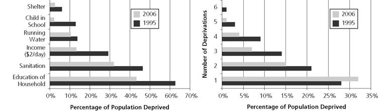
Figure 1.3. The importance of understanding joint distribution of deprivations in Brazil Source: Battiston et al. (2013)
distinctive and important information that is not possible to infer from the left panel. Specifically, we see that in 1995, 28% of the population lived in households with just one deprivation, 21% in households with two deprivations, and so on. In 2006, the joint distribution of deprivations had improved. In fact, joint deprivations in two or more indicators went down, and the proportion of the population in households with just one deprivation increased to 32%. Tellingly, if we were only to make a conclusion based on a dashboard of indicators, we would have missed this information on the multiplicity of deprivations experienced. Thus, the consideration of joint distribution is crucial. But should it affect the identification of who is poor also?
We have already discussed evidence that income poverty is not necessarily associated with deprivations in other dimensions. Does this disjunction vanish when income or consumption poverty is compared to multidimensional poverty measures accounting for simultaneous deprivations? Or do both identify the same people as poor? Surprisingly, mismatches remain high. Klasen (2000: table 10) found large mismatches between income and multiple deprivations in South Africa. For example, when 20.3% of the population (7.7 million people) were identified as severely income poor, and 20.3% identified (7.7 million) as severely multiply deprived, only 2.9% of the population—1.1 million people—were both severely income poor and severely deprived. Moving to Bhutan, its official MPI and income poverty measure are both drawn from the same 2012 Bhutan Living Standards Survey dataset. About 12% of the population were income poor, and 12.7% of people were multidimensionally poor. Yet merely 3.2% of Bhutanese experienced both income and multidimensional poverty (National Statistics Bureau, Royal Government of Bhutan 2014; see also chapter 5).[27] Similarly high mismatches were found in studies using thirteen databases in eleven countries (Alkire and Klasen 2013).
And likewise in Europe—Nolan and Whelan list twenty-six European countries, and in none of them were more than half of the income-poor or materially deprived populations poor by both indicators, and in twelve countries less than one-third of the income poor also experienced multiple material deprivations (2011: table 6.2). Hence monetary measures do not necessarily identify the same group of people to be poor as multidimensional measures do.
1.2.5 DATA AND COMPUTATIONAL TECHNOLOGIES
The measurement of multidimensional poverty reflecting the joint distribution of deprivations requires data to be available for the same unit of analysis in all dimensions. However, data on poverty are severely limited in coverage and frequency. While stock market data are available hourly, labour force surveys may be quarterly, and GNI data are annual; poverty data are often only available every three to ten years. The High-Level Panel (2013) rightly demanded a ‘data revolution’. Given a data deluge in many domains, the lack of up-to-date information on—and across—key dimensions of poverty like health, nutrition, work, wealth, and skills (as well as violence, decent work, and empowerment) has been rightly recognized as a travesty.[28] Such data is needed to design high-impact interventions and evaluate policy success.
What is less recognized is that data on multidimensional poverty are already on the upswing (Alkire 2014). Much of the increase is occurring in national surveys; Alkire (2014) also summarizes increases in poverty-related internationally comparable survey data availability. For example, non-income MDG indicators are often drawn from four international household surveys: the Demographic and Health Survey (DHS), the Multiple Indicator Cluster Survey (MICS), the Living Standard Measurement Survey (LSMS), and the Core Welfare Indicators Questionnaire (CWIQ). Figure 1.4 shows that the number of countries which have fielded at least one of these surveys increased from five in 1985—the first year in which any was fielded—to 127 countries in 2010. By 2011, around ninety countries had completed at least three surveys. In Europe, a similar increase in household and registry data, and in harmonized data, has occurred. For example, the EU-SILC survey, which began in the mid-2000s, now releases data annually across over thirty countries.
While the quality, periodicity, and range of data have increased dramatically there is still no one survey that collects all key dimensions of poverty in an internationally harmonized way and with sufficient frequency and quality (Alkire and Samman 2014). Nor indeed is there agreement on key poverty dimensions and periodicity. Despite these shortcomings, the quality, frequency, and range of data and of data sources have increased. Further increases in data availability, accompanied by powerful technologies of data processing and visualization, permit computations and analyses of multidimensional poverty measures that were not possible even twenty years ago. Box 7.1 discusses
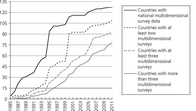
Figure 1.4. Availability of developing country surveys: DHS, MICS, LSMS, and CWIQ
in more detail the different fronts on which data collection can be improved in the near future.
1.3