Cross-Country Income Differences
There are very large differences in income per capita and output per worker across countries today. Countries at the top of the world income distribution are more than thirty times as rich as those at the bottom.
For example, in 2000, GDP (or income) per capita in the United States was over $34000. In contrast, income per capita is much lower in many other countries: about $8000 in Mexico, about $4000 in China, just over $2500 in India, only about $1000 in Nigeria, and much much lower in some other sub-Saharan African countries such as Chad, Ethiopia, and Mali. These numbers are all in 2000 US dollars and are adjusted for purchasing power party (PPP) to allow for differences in relative prices of different goods across countries (all data from the Penn World tables compiled by Summers and Heston). The cross-country income gap is considerably larger when there is no PPP-adjustment. For example, without the PPP adjustment, GDP per capita in India and China in 2000 would be lower by a factor of four or so.Figure 1.1 provides a first look at these differences. It plots estimates of the distribution of PPP-adjusted GDP per capita across the available set of countries in 1960, 1980 and 2000. A number of features are worth noting. First, the 1960 density shows that 15 years after the end of World War II, most countries had income per capita less than $1500 (in 2000 US dollars); the mode of the distribution is around $1250. The rightwards shift of the distributions for 1980 and for 2000 shows the growth of average income per capita for the next 40 years. In 2000, the mode is still slightly above $3000, but now there is another concentration of countries between $20,000 and $30,000. The density estimate for the year 2000 shows the considerable inequality in income per capita today.
Part of the spreading out of the distribution in Figure 1.1 is because of the increase in average incomes.
It may therefore be more informative to look at the logarithm (log) of income per capita. It is more natural to look at the log of variables, such as income per capita, that grow over time, especially when growth is approximately proportional as suggested by see Figure 1.8) (this is because when x (t) grows at a proportional rate, log x (t) grows linearly, and more importantly, if xι (t) and x2 (t) both grow by 10% over a certain period of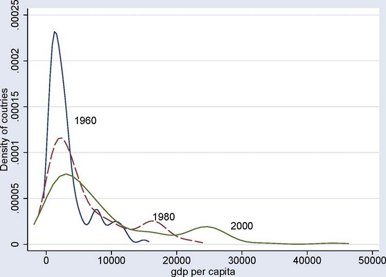
Figure 1.1. Estimates of the distribution of countries according to PPP- adjusted GDP per capita in 1960, 1980 and 2000.
time, xι (t) — X2 (t) will also grow, while logxι (t) — logx% (t) will remain constant). Figure 1.2 shows a similar pattern, but now the spreading-out is more limited. This reflects the fact that while the absolute gap between rich and poor countries has increased considerably between 1960 and 2000, the proportional gap has increased much less. Nevertheless, it can be seen that the 2000 density for log GDP per capita is still more spread out than the 1960 density. In particular, both figures show that there has been a considerable increase in the density of relatively rich countries, while many countries still remain quite poor. This last pattern is sometimes referred to as the “stratification phenomenon”, corresponding to the fact that some of the middle-income countries of the 1960s have joined the ranks of relatively high-income countries, while others have maintained their middle-income status or even experienced relative impoverishment.
Figures 1.1 and 1.2 demonstrate that there is somewhat greater inequality among nations. An equally relevant concept might be inequality among individuals in the world economy. Figures 1.1 and 1.2 are not directly informative on this, since they treat each country identically regardless of the size of its population. The alternative is presented in Figure 1.3, which shows the population-weighted distribution.
In this case, countries such as China, India, the 4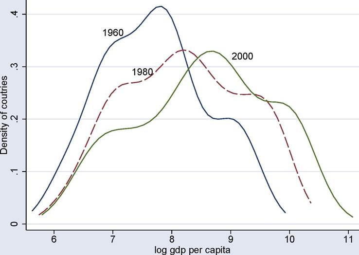
Figure 1.2. Estimates of the distribution of countries according to log GDP per capita (PPP-adjusted) in 1960, 1980 and 2000.
United States, and Russia receive greater weight because they have larger populations. The picture that emerges in this case is quite different. In fact, the 2000 distribution looks less spread out, with thinner left tail than the 1960 distribution. This reflects the fact that in 1960 China and India were among the poorest nations, whereas their relatively rapid growth in the 1990s puts them into the middle-poor category by 2000. Chinese and Indian growth has therefore created a powerful force towards relative equalization of income per capita among the inhabitants of the globe.
Figures 1.1, 1.2 and 1.3 look at the distribution of GDP per capita. While this measure is relevant for the welfare of the population, much of growth theory focuses on the productive capacity of countries. Theory is therefore easier to map to data when we look at output (GDP) per worker. Moreover, key sources of difference in economic performance across countries are national policies and institutions. So for the purpose of understanding the sources of differences in income and growth across countries (as opposed to assessing welfare questions), the unweighted distribution is more relevant than the population-weighted distribution. Consequently, Figure 1.4 looks at the unweighted distribution of countries according to (PPP-adjusted) GDP per worker. Since internationally comparable data on employment 5
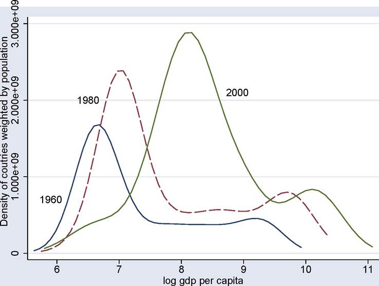
Figure 1.3. Estimates of the population-weighted distribution of countries according to log GDP per capita (PPP-adjusted) in 1960, 1980 and 2000.
are not available for a large number of countries, “workers” here refer to the total economically active population (according to the definition of the International Labour Organization). Figure 1.4 is very similar to Figure 1.2, and if anything, shows a greater concentration of countries in the relatively rich tail by 2000, with the poor tail remaining more or less the same as in Figure 1.2.
Overall, Figures 1.1-1.4 document two important facts: first, there is a large amount of inequality in income per capita and income per worker across countries as shown by the highly dispersed distributions. Second, there is a slight but noticeable increase in inequality across nations (though not necessarily across individuals in the world economy).
1.2.