A look at the facts
Before modeling the economic forces that connect changes in technology to labor market outcomes, it is useful to begin by summarizing how labor market inequalities and the aggregate technological environment evolved over the past three decades.
2.1. Labor market inequalities
In the late 1980s and early 1990s, an extensive body of empirical work has started to systematically document the changes in the U.S. wage structure over the past three decades. Levy and Murnane (1992) give the first overview of an already developed empirical literature. To date, Katz and Autor (1999) and, more recently, Eckstein and Nagypal (2004), offer the most exhaustive description of the facts. In between, numerous other papers have contributed significantly to our understanding of the data on wage inequality.[165]
The typical data source used in the empirical work on the subject is the sequence of yearly cross-sections in the March Current Population Survey (CPS). The other important data source is the longitudinal Panel Study of Income Dynamics (PSID). In this section, we limit ourselves to stating the main facts and briefly commenting on them, omitting the details on the data sets, the sample selection, and the calculations that can be found in the original references. Unless otherwise stated, the data refer to a sample of male workers with strong attachment to the labor force, i.e., full-time, full-year workers.[166]
Observation 1. Wage inequality in the United States is today at its historical peak over the post-World War II period. However, early in the century it was even larger. The returns to college and high school fell precipitously in the first half of the century and then rose again until now [Goldin and Katz (1999)].
In other words, the time series for inequality over the past 100 years is “U-shaped”. Although the bulk of this chapter is devoted to interpreting the dynamics of the wage structure over the past three decades, it is useful to put the evidence in a historical perspective to appreciate that the high current level of inequality is not a unique episode in U.S.
history. The rest of the facts characterize the evolution of inequality since the mid-1960s.[167]Observation 2. Wage inequality increased steadily in the United States starting from the early 1970s. The 90-10 weekly wage ratio rose by 35 percent for both males and females in the period 1965-1995: from 1.20 to 1.55 formales, and from 1.05 to 1.40 for females. The increase in inequality took place everywhere in the wage distribution: both the 90-50 differential and the 50-10 differential rose by comparable amounts [Katz and Autor (1999)].
Qualitatively, the rise in inequality is present independently of the measure of dispersion and of the definition of labor income. For example, the standard deviation of log wages for males rose from 0.47 in 1965 to 0.62 in 1995, the Gini coefficient jumped from 0.25 to 0.34 [Katz and Autor (1999)], and the mean-median ratio rose from 1.00 to 1.18 over the same period [Eckstein and Nagypal (2004)]. Inequality of annual earnings increased even more.[168]
Observation 3. The average and median wage have remained constant in real terms since the mid-1970s. Real wages in the bottom of the wage distribution have fallen substantially. For example, the 10th wage percentile for males declined by 30 percent in real terms from 1970 to 1990 [Acemoglu (2002a)].6 On the contrary, salaries in the very top of the wage distribution have grown rapidly. In 1970, the workers in the top 1 percent of the wage distribution held 5 percent of the U.S. wage bill, whereas in 1998 they received over 10 percent [Piketty and Saez (2003)].
A large part of the absolute increase of top range salaries is associated with the surge in CEO compensation. Piketty and Saez (2003) document that in 1970 the pay of the top 100 CEOs in the United States was about 40 times higher than the average salary. By 2000 those CEOs earned almost 1,000 times the average salary.
We now list a set of facts on the evolution of between-group inequality, i.e.
inequality between groups of workers classified by observable characteristics (e.g., gender, race, education, experience, occupation). For this purpose, it is useful to write wages wit using the Mincerian representation
where Xit is a vector measuring the set of observable features of individual i at time t, pt can be interpreted as a vector of prices for each characteristic in X, and ωit is the residual unobserved component.
Observation 4. The returns to education increased slightly from 1950 to 1970, fell in the 1970s, increased sharply in the 1980s, and continued to increase, although at a slower pace, in the 1990s. For example, the college wage premium - defined as the ratio between the average weekly wage of college graduates (at least 16 years of schooling) and that of workers with at most a high school diploma (at most 12 years of schooling) - was 1.45 in 1965, 1.35 in 1975, 1.50 in 1985, and 1.70 in 1995 [EcksteinandNagypal (2004)]. If one estimates the coefficient on educational dummies in a standard Mincerian wage regression like (1), the finding is similar: the annual return to a college degree (relative to a high-school degree) was 33 percent in the 1980s and over 50 percent in the 1990s [Eckstein and Nagypal (2004)].
We plot the college wage premium over the period 1963-2002 in Figure 1 (top panel).[169] [170] Interestingly, if one slices up the college-educated group more finely into workers with post-college degrees and workers with college degree only, the rise in the skill premium is still very apparent. The return to post-college education relative to college education doubled from 1970 to 1990 [Eckstein and Nagypal (2004)].
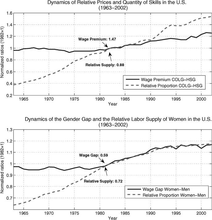
Figure 1. The top panel depicts the evolution of the skill premium (average wage of college graduates relative to the wage of high-school graduates) and of the relative quantity of skilled workers, from 1963-2002.
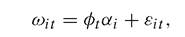
The bottom panel depicts the evolution of the gender gap (average wage of female workers relative to the wage of male workers) and of the relative quantity of female workers, over the same period of time.Observation 5. The returns to professional and white-collar occupations relative to blue-collar occupations display dynamics and magnitudes similar to the data stratified by education. For example, the professional-blue collar premium rose by 20 percent from 1970 to 1995 [Eckstein and Nagypal (2004)].
Occupation is an interesting dimension of the wage structure that, until recently, received very little attention. For example, the “returns to occupation” appear large and significant, over and beyond returns to education. We discuss the theories of wage inequality that stress the changes in occupational structure in Section 7.
Observation 6. The returns to experience increased in the 1970s and the 1980s and leveled off in the 1990s. For example, the ratio of weekly wages between workers with 25 years of experience and workers with 5 years of experience rose from 1.3 in 1970 to 1.5 in 1995 [Katz and Autor (1999)]. An analysis by education group shows that the experience premium rose sharply for high-school graduates but remained roughly constant for college graduates [Weinberg (2003b)].
It is worth emphasizing, that although entry of the baby-boomers into the labor market in the early 1970s had a significant impact on the experience premium, the dynamics described above are robust to this and other demographic effects. See, for example, Juhn, Murphy and Pierce (1993).[171]
Observation 7. Inequality across race and gender declined since 1970. The blackwhite race differential, for workers of comparable experience, fell from 35 percent in 1965 to 20 percent in 1990 [Murphy and Welch (1992)]. The female-male wage gap fell from 45 percent in 1970 to 30 percent in 1995 [Katz and Autor (1999)].
We plot of the gender wage gap over the period 1963-2002 in Figure 1 (bottom panel).
A unifying theory of the changes in the wage structure based on technological change should have something to say about gender as well as race. Admittedly, these two dimensions of inequality have been largely neglected by the literature. We return briefly to the gender gap in Section 4.Observation 8. The composition of the working population changed dramatically over the past 40 years: in the period 1970-2000, women’s labor force participation rate rose from 49 percent to 73 percent; college graduates rose from 15 to 30 percent of the male labor force and from 11 to 30 percent of the female labor force; professionals soared from 24 to 33 percent of the male labor force and from 8 to 28 percent of the female labor force [Eckstein and Nagypal (2004)].
We plot the relative supply of skilled workers and female workers over the time period 1963-2002 in Figure 1 (top and bottom panel, respectively).[172]
in terms of Equation (1), one can define the between-group component of wage inequality as the cross-sectional variance of X'itpt, and the within-group component as the variance of the residual ωit. The fraction accounted for by observable characteristics, in turn, can be decomposed into what is caused by a change in the dispersion in the quantities of observable characteristics (Xit), for given vector of prices, and what is due to a change in the prices associated to each observable characteristic (pt), for a given distribution of quantities.
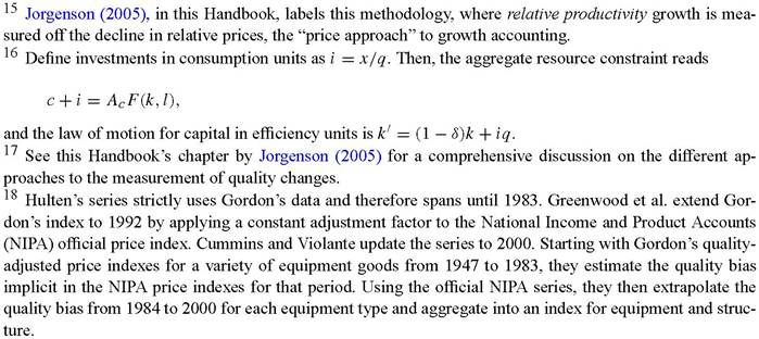
Observation 9. Overall, changes in quantities and prices of observable characteristics (gender, race, education, experience) explain about 40 percent of the increase in the variance of log wages from 1963 to 1995. The price component is by far larger than the quantity component. Increasing within-group inequality, i.e., wage dispersion within cells of “observationally equivalent” workers accounts for the residual 60 percent of the total increase. With respect to the timing, the rise in within-group inequality seems to anticipate that of the college premium by roughly a decade [Juhn, Murphy and Pierce (1993)].[173] [174] One can specify further the structure of the residual ωit of Equation (1), for example as where αi is the permanent part of unobservable skills (e.g., “innate ability”), φt is its time-varying price, and εit is the stochastic component due to earnings shocks whose variance is also allowed to change over time. Observation 10. Around one-half of the rise in residual earnings inequality is explained by the permanent components (e.g., a higher return to ability), with the rest accounted for by transitory earnings shocks [Gottschalk and Moffitt (1994)].11 interestingly, the rise in the transitory component is not due to higher job instability or labor mobility [Neumark (2000)], but rather to more volatile wage dynamics, in particular faster wage growth on the job and more severe wage losses upon displacement [violante (2002)]. in Table 1 we report some key numbers on unemployment, wage inequality, and labor income shares for several OECD countries at five-year intervals from 1965 to 1995. We are particularly interested in the comparison between the United States and continental Table 1 Data on the evolution of the labor share, the unemployment rate, and wage inequality across OECD countries from 1965-1995. Cross-country labor market data (1965-1995) Inequality Inequality Inequality Table 1 (Continued) Note. Data on unemployment rates are from Blanchard and Wolfers (2000). Data on labor shares are from Blanchard and Wolfers (2000) except the 1995 entry for Austria, Denmark, Ireland and Portugal which was computed directly from OECD data. Inequality is measured as the 90-10 log-wage differential for male workers. The data are taken from the OECD Employment Outlook (1996, Table 3.1). Austria: the measure is the 80-10 differential and data in the 1985 column are for 1987. Belgium: the measure is the 80-10 differential and data in the 1995 column are for 1993. Denmark: 1985 and 1990 columns are for 1983 and 1991 respectively. Finland: data in the 1985 column are for 1986. Germany: data in the 1985 and 1995 columns are for 1983 and 1993 respectively. Italy: data in the 1985, 1990 and 1995 columns are for 1984, 1991 and 1993 respectively. Netherlands: the measure of inequality is for males and females. Norway: data in the 1985 and 1990 columns are for 1983 and 1991 respectively. Moreover, the measure of inequality is for males and females. Portugal: data in the 1990 and 1995 columns are for 1989 and 1993 respectively. Canada: data in the 1980 and 1985 columns are for 1981 and 1986 respectively. For all countries, except USA and U.K., data in the 1995 column are for 1994. Europe average: unweighted mean of European countries, except U.K. European countries (averaged in the row labeled Europe (average)). For completeness, we include data for the United Kingdom and Canada, whose behavior falls somewhere between that of the United States and continental Europe. Observation 11. The time pattern of wage inequality over the past 30 years differs substantially across countries. The U.K. economy had a rise in wage inequality similar to that in the U.S. economy, except for the fact that the average real wage in the United Kingdom has kept growing [Machin (1996)]. Continental European countries had virtually no change in wage inequality, whereas over the same period they had large increases in their unemployment rates (roughly, all due to longer unemployment durations) and a sharp fall in the labor income share in GDP. On the contrary, in the United States both the unemployment rate and the labor share have remained relatively constant [Blanchard and Wolfers (2000)]. In 1965 the unemployment rate in virtually every European country was lower than in the United States. Thirty years later, the opposite was true: the U.S. unemployment rate rose only by 1.7 percent from 1965 to 1995, whereas the average unemployment rate increase of European countries was 8.4 percent.[175] The labor income share has declined only marginally in the United States - by 1.5 percentage points from 1965 to 1995 - while on average it fell by almost 6 points in Europe. Wage inequality, measured by the percentage differential between the ninth and the first earnings deciles for male workers, rose only slightly in Europe by 4 percent in the period from 1980 to 1995, and it even declined in some countries (Belgium, Germany and Norway). Recall that, over the same period, earnings inequality surged in the United States: the OECD data show a rise of almost 30 percent, close to the numbers we reported earlier in this section. Interestingly, the European averages hide much less cross-country variation than one would expect, given the raw nature of the comparison. For example, in 11 out of the 14 continental European countries, the increase in the unemployment rate has been larger than 6 percentage points, and in 9 countries the decline in the labor share has been greater than 5 percentage points. Recently, Rogerson (2004) has argued that if one focuses on employment rate differences between the United States and Europe rather than on unemployment rate differences, a new set of insights emerges from the data. Employment rates in the United States start to increase relative to European employment rates twenty years before the divergence in unemployment rates. Moreover, the increase in European unemployment rates is correlated with the decline of European manufacturing employment. 2.2. Technological change The standard measure of aggregate technological change, total factor productivity (TFP), does not distinguish between the different ways in which technology grows. First, technology growth may differ across final-output sectors and second, it may have different effects on the productivity of different input factors. The recent experience of developed countries, however, seems to suggest that in the past 30 years technological change has originated in particular sectors of the economy and has favored particular inputs of production. Arguably, the advent of microelectronics (i.e., microchips and semiconductors) induced a sequence of innovations in information and communication technologies with two features. First, sector-specific productivity (SSP) growth substantially increased the productivity of the sector that produces new capital equipment, making the use of capital in production relatively less expensive. Second, factor-specific productivity (FSP) growth favored skilled and educated labor disproportionately. In other words, the recent technological revolution has affected the production structure in a rather asymmetric way. Our assessment of the importance of SSP and FSP changes relies heavily on observed movements in relative prices. For SSP change, we rely on the substantial decline of the price of equipment capital relative to the price of consumption goods, a process that does not show any sign of slowing down. On the contrary, it shows an acceleration in recent years. For FSP change, we rely on the substantial increase in the wage of highly educated workers relative to less educated workers, the skill premium. We first review the Solow growth accounting methodology for TFP within the context of the one-sector neoclassical growth model and then introduce SSP accounting and how it applies to the idea of capital-embodied technical change.[176] [177] Next, we discuss how an acceleration of capital-embodied technical change might relate to the much- discussed TFP growth slowdown in the 1970s and 1980s; here, we discuss the possible relevance of the concept of General Purpose Technologies (GPTs). Finally, we explain the mapping between relative wages and FSP changes. 2.2.1. Total factor productivity accounting Standard economic theory views production as a transformation of a collection of inputs into outputs. We are interested in how this production structure is changing over time. At an aggregate National Income and Product Accounts (NIPA) level we deal with some measure of aggregate output, y, and two measures of aggregate inputs: capital k and labor l. The production structure is represented by the production function F, y = F(k,l,t). Since the production structure may change, the production function is indexed by time t. Aggregate total factor productivity changes when the production function shifts over time, i.e., when there is a change in output which we cannot attribute to changes in inputs. More formally, the marginal change in output is the sum of the marginal changes in inputs, weighted by their marginal contributions to output (marginal products), and the shift of the production function, y = Fkk + Fll + Ft.14 This is usually expressed in terms of growth rates as where hats denote percentage growth rates, and the weight on an input growth rate is the elasticity of output with respect to the input: ηk = Fkk∕F and ηl = Fll∕F. Alternatively, if we know the elasticities, we can derive productivity growth as output growth minus a weighted sum of input growth rates. Solow’s (1957) important insight was that, under two assumptions, we can replace an input’s output elasticity - which we do not observe - with the input’s share in total revenue, for which we have observations. First, we assume that production is constant returns to scale, i.e., that if we are to double all inputs, then output will double, implying that the output elasticities sum to one: ηk + ηn = 1. Second, we assume that producers act competitively in their output and input markets, i.e., that they take the prices of their products and inputs as given. Profit maximization then implies that inputs are employed until the marginal revenue product of an input is equalized with the price of that input. In turn, this means that the output elasticity of an input is equal to the input’s revenue share. For example, for the employment of labor, profit maximization implies that py Ft = pl, which can be rewritten as ηl = Fll∕F = pll∕pyy = αl (pi stands for the price of good i). With these two assumptions, we can calculate aggregate productivity growth, also known as total factor productivity (TFP) growth, as The Solow growth accounting procedure has the advantage that its implementation does not require very stringent assumptions with respect to the production structure, except constant returns to scale, and it does not require any information beyond measures of aggregate output and input quantities and the real wage. This relatively low information requirement comes at a cost: this aggregate TFP measure does not provide any information on the specific sources or nature of technological change. Given available data on quantities and prices for industry outputs and inputs, it is straightforward to apply the Solow growth accounting procedure and obtain measures of sector-specific technical change [see, for example, Jorgenson, Gollop and Fraumeni (1987)]. Recently Jorgenson and Stiroh (2000) have documented the substantial differences in output and TFP growth rates across U.S. industries over the period 1958-1996. In particular, they point out that TFP growth rates in high-tech industries producing equipment investment are about three to four times as high as a measure of aggregate TFP growth. Also based on industry data, Oliner and Sichel (2000) and Jorgenson (2001) attribute a substantial part of the increase of aggregate TFP growth over the second half of the 1990s to one industry: semiconductors. 2.2.2. Sector-specific productivity accounting The convincing evidence for persistent differences of SSP growth raises the potential of serious aggregation problems for the analysis of aggregate outcomes. We now discuss SSP accounting in a simple two-sector growth model that focuses on the distinction between investment and consumption goods. This approach provides a straightforward measure of SSP growth, and it keeps the aggregation problems manageable. Based on this approach, we present evidence of substantial increases of the relative productivity in the equipment-investment goods producing industries and stagnant productivity in the consumption goods industries since the mid-1970s. Greenwood, Hercowitz and Krusell (1997) use a two-sector model of the economy - where one sector produces consumption goods and the other new capital - to measure the relative importance of total-factor productivity changes in each of these sectors. Goods - consumption c and new capital x - are produced using capital and labor as inputs to constant-returns-to-scale technologies, and total factor inputs can be freely allocated across sectors, Note that we have assumed that factor substitution properties are the same in the two sectors; that is, the functions relating inputs to outputs are the same. One can show that with identical factor substitution properties, the two-sector economy is equivalent to a one-sector economy with exogenous changes in the relative price of investment goods, 1/q, The relative productivity of the investment goods sector is also called “capital- embodied” technical change, because q can be interpreted as the productivity level (quality) embodied in new vintages of capital.16 Accounting for quality improvements in new products is a basic problem of growth accounting.17 This is especially true for our framework since we measure investment in terms of constant-quality capital goods. In a monumental study, Gordon (1990) constructed quality-adjusted price indexes for different types of producers’ durable equipment. Building on Gordon’s work, Hulten (1992), Greenwood, Hercowitz and Krusell (1997) and Cummins and Violante (2002) have derived aggregate time series for capital- embodied technical change in the U.S. economy.18 They use the property just described: that the constant-quality price of investment relative to consumption (precisely, nondurable consumption and services) reveals the extent of productivity improvements. Their main finding is that: Observation 12. Productivity growth in the sector producing equipment investment has accelerated relative to the rest of the economy since the early to mid-1970s. The solid line in Figure 2 shows the relative productivity of the equipment investment goods sector, q, for the period 1947-2000, normalized to 1 in the first year. This index grows at an annual rate of about 1.6 percent until 1975 and at an annual rate of 3.6 percent thereafter. In the 1990s, productivity growth embodied in capital has been spectacularly high, reaching an average annual rate just below 5 percent. The measurement of SSP growth through changes in relative prices requires that the price measures used are appropriately adjusted for quality improvements, presenting a problem for the time period studied since, arguably, the IT revolution has caused large improvements in the quality of durable goods and has led to the introduction of a vast range of new items. Therefore, alternative ways of measuring capital-embodied productivity advancements have been proposed. Hobjin (2000) calculates the rate of embodied technical change by calibrating a vintage capital model. His findings are very similar to the price-based approach, both in terms of the average growth rate, and in terms of Figure 2. The dynamics of three sources of productivity growth in the postwar U.S. economy: disembodied, capital-embodied, and labor-embodied. Source: Cummins and Violante (2002). the timing of the technological acceleration. Bahk and Gort (1993) and Sakellaris and Wilson (2004) use plant-level data to estimate production functions and assess the productivity effects of new investments. They estimate the growth rate of capital-embodied technical change to be between 12 and 18 percent per year, much higher than the rest of the literature. We calculate the rate of SSP change in the consumption goods sector based on the standard Solow approach. It is well known that the U.S. labor income share in GDP has been remarkably stable for the time period considered. We therefore choose a Cobb- Douglas parametric representation of the production function, Observation 13. Productivity in the sector producing consumption goods (precisely, non-durable and services) shows essentially no growth over the two decades 1975-1995. The approach of Greenwood, Hercowitz and Krusell (1997) defines aggregate output in terms of consumption goods. This is rather non-standard. The usual approach, especially as applied to the study of SSP, defines aggregate output growth as a revenue- weighted sum of sectoral output growth rates: a Divisia index [see, e.g., Jorgenson (2001) or Oliner and Sichel (2000)]. For this more standard approach, one can write aggregate TFP growth as the revenue-weighted sum of sectoral TFP growth. While the Divisia-aggregator approach is a definition with some desirable properties, the Greenwood, Hercowitz and Krusell (1997) approach is based on a particular theory and requires certain identifying restrictions concerning the production structure. Hall (1973) shows that in multi-sector models a unique output aggregator, that is, a function that relates some measure of aggregate output to some measure of aggregate input, exists if certain separability conditions for the aggregate production possibility frontier are satisfied. The conditions for such an output aggregator to exist are, essentially, the ones imposed by Greenwood, Hercowitz and Krusell (1997).[179] Given the definition of aggregate output in Equation (6), SSP for consumption, or Ac, is then sometimes interpreted as neutral, or disembodied, aggregate technological change. 2.2.2. Reconciling the acceleration in investment-specific productivity growth with the slowdown in TFP: general purpose technology and learning The stagnation of aggregate TFP since the mid-1970s - evident from Figure 2 - accounts for the phenomenon often referred to as a “productivity slowdown” in the growth accounting literature.[180] How can we reconcile the acceleration of investment SSP with a slowdown of consumption SSP? One interpretation builds on learning-by-doing (LBD). New investment goods do not attain their full potential as soon as they are introduced but, rather, their productivity can stay temporarily below the productivity of older capital that was introduced same time ago. This feature is attributed to learning effects.[181] These learning effects can be extremely important when the technological change is “drastic”. Recent discussions suggest that the advent of microelectronics led to a radical shift in the technological paradigm, i.e., to a new “general purpose technology” (GPT). Bresnahan and Trajtenberg (1995) coined this term to describe certain major innovations that have the potential for pervasive use and application in a wide range of sectors of the economy. David (1990) and Lipsey, Bekar and Carlaw (1998) cite the microchip as the last example of such innovations that included, in ancient times, writing and printing and, in more recent times, the steam-engine and the electric dynamo.[182] Although it is hard to define the concept satisfactorily, given available data, we list as a “fact” the dominant view, which maintains that: Observation 14. Technological change in the past 30 years displays a “general purpose” nature. Though most of the evidence supporting this statement is anecdotal, there are some bits of hard evidence. Hornstein and Krusell (1996) document that the decline in TFP occurred roughly simultaneously across many developed countries. More recently, Cummins and violante (2002) construct measures of productivity improvements for 26 different types of equipment goods. Using the sectoral input-output tables, they aggregate these indexes into 62 industry-level measures of equipment-embodied technical change, and document that their growth rate has accelerated by a similar amount in virtually every industry in the 1990s. Jovanovic and Rousseau (2005) draw an articulated parallel between the diffusion of electricity in the early 20th century and the diffusion of information technologies (IT) eighty years later based on a variety of data. Their evidence supports the view that both episodes marked a drastic discontinuity in the historical process of technological change. Taken together, all these observations suggest that, similar to other past GPTs, IT has affected productivity in a general way over the past three decades. There are two versions of the argument that IT are responsible for the observed productivity slowdown. According to one, the slowdown is real: when learning-by-doing is important in improving the efficiency of a production technique, abandoning the older, but extensively used technology to embrace a new method of production involves a “step in the dark” that can lead to a temporary slowdown in labor productivity [Hornstein and Krusell (1996), Greenwood and Yorukoglu (1997) and Aghion and Howitt (1998, chapter 8)]. An alternative, complementary version maintains that the slowdown is a statistical artifact due to mismeasurement: if the phase of IT adoption coincides with associated investments in organizational or intangible capital, as our Section 5 will suggest, then insofar as these investments are not included in the official statistics, measured TFP growth will first underestimate and then overestimate “true” TFP growth [Hall (2001) and Basu et al. (2003)]. The reason is that initially, when large investments in organizational capital are made, the “output side” of the mismeasurement is severe. Later, when the economy has built a significant stock of organizational capital, the “input side” of mismeasurement becomes dominant. This explanation of the TFP slowdown is appealing, but extremely difficult to evaluate quantitatively because of the lack of direct evidence on how organizations learn. Using some theory, Hornstein (1999) argues that one key parameter is the fraction of knowledge that firms can transfer from the old to the new technology but also shows that the model’s predictions vary significantly across plausible parameterizations. Atkeson and Kehoe (2002) build an equilibrium model to measure the dynamics of organizational capital during the “electrification of America”. They criticize the Bahk and Gort (1993) view that organizational learning is reflected into an increase in the productivity of labor at the plant level: in an equilibrium model where labor is mobile, productivity is equalized across plants. Instead, they argue that when organizations learn they expand in size. Thus, cross-sectional microdata on the size distribution of plants allows to identify the structural parameters of the stochastic process behind organizational learning. Finally, Manuelli (2000) argues that, even in absence of learning effects, the anticipation of a future technological shock embodied in capital can result in a transitional phase of slowdown of economic activity. In the period between the announcement and the actual availability of the new technology, the existing firms prefer exercising the option of waiting to invest and the new firms prefer delay entering. Consequently, output falls temporarily until the arrival of the new technology.[183] 2.2.4. Factor-specific productivity accounting In order to talk about changes in FSP, one possibility is to generalize the production function in Equation (8) by disaggregating the contributions to production of the two labor inputs - skilled (e.g., more educated) and unskilled (e.g., less educated) labor. Suppose the aggregate labor input, l, is a CES function of skilled and unskilled labor, ls and lu, with FSPs As and Au, Relative wage data can then be employed to understand the nature and evolution of FSP in the economy. With competitive input markets, the relative wages are a function of the relative FSP and the relative labor supply The elasticity of substitution between skilled and unskilled labor here is 1 /(1 — σ). Katz and Murphy (1992) run a simple regression of relative wages on relative input quantities and a time trend to capture growth in the ratio As∕Au. They measure skilled labor input as total hours supplied to the market by workers with at least a college degree. Their estimate of the substitution elasticity - around 1.4 (or σ = 0.29) - indicates that a ten- percent increase in the relative supply of skilled labor implies a seven percent decline of the skill premium.[184] The estimated elasticity of substitution between factors, together with the growing skill premium, imply an increase in the relative FSP of skilled labor in excess of 11 percent per year. We conclude that the typical result of similar exercises on U.S. data is that: Observation 15. Recent technological advancements have been favorable to the most skilled workers in the population. In other words, technical change has been skill- biased. The “acceleration” in the rate of capital-embodied technical change, the “general purpose” nature of the new wave of technologies, and the “skill-biased” attribute of the recent productivity advancements are the three chief features of the new technological environment that seems to have emerged since the early to mid-1970s. The various economic theories that we are about to review in the rest of this chapter are built on various combinations of these features. 3.
Country 1965 1970 1975 1980 1985 1990 1995 Change Austria Unemp. rate 0.018 0.011 0.017 0.029 0.045 0.054 0.061 0.043 Labor share 0.698 0.679 0.717 0.694 0.665 0.646 0.645 -0.053 Inequality 0.820 0.790 0.870 0.880 0.060 Belgium Unemp. rate 0.023 0.022 0.064 0.114 0.111 0.110 0.142 0.120 Labor share 0.667 0.729 0.730 0.682 0.685 0.676 0.009 Inequality 0.660 0.650 0.640 -0.020 Denmark Unemp. rate 0.014 0.016 0.061 0.093 0.085 0.112 0.103 0.089 Labor share 0.736 0.723 0.732 0.706 0.677 0.635 0.605 -0.131 Inequality 0.760 0.770 0.770 0.010 Finland Unemp. rate 0.025 0.021 0.050 0.051 0.047 0.121 0.167 0.142 Labor share 0.738 0.711 0.762 0.730 0.723 0.733 0.680 -0.058 Inequality 0.890 0.920 0.940 0.930 0.040 France Unemp. rate 0.020 0.027 bgcolor=white>0.049 0.079 0.101 0.105 0.115 0.095 Labor share 0.688 0.674 0.707 0.710 0.645 0.618 0.603 -0.085 Inequality 1.210 1.210 1.240 1.230 0.020 Germany Unemp. rate 0.010 0.011 0.037 0.060 0.075 0.078 0.099 0.089 Labor share 0.685 0.703 0.703 0.704 0.667 0.658 0.637 -0.048 Inequality 0.870 0.830 0.830 0.810 -0.060 Ireland Unemp. rate 0.047 0.055 0.078 0.112 0.164 0.146 0.120 0.073 Labor share 0.828 0.842 0.835 0.833 0.763 0.715 0.645 -0.183 Italy Unemp. rate 0.041 0.043 0.051 0.070 0.099 0.096 0.120 0.079 Labor share 0.669 0.687 0.711 0.690 0.656 0.653 0.606 -0.063 Inequality 0.850 0.830 0.770 0.970 0.120 Netherlands Unemp. rate 0.010 0.018 0.038 0.080 0.081 0.062 0.071 0.061 Labor share 0.656 0.687 0.705 0.661 0.623 0.619 0.624 -0.032 Inequality 0.920 0.960 0.950 0.030 Norway Unemp. rate 0.016 0.015 0.018 0.026 0.030 0.056 0.049 0.034 Labor share 0.750 0.771 0.782 0.757 0.739 0.713 -0.037 Inequality 0.720 0.720 0.680 -0.040 Portugal Unemp. rate 0.040 0.024 0.065 0.079 0.070 0.051 0.073 0.033 Labor share 0.562 0.615 0.873 0.751 0.673 0.679 0.680 0.118 Spain Unemp. rate 0.028 0.030 0.059 0.161 0.200 0.196 0.230 0.202 Labor share 0.763 0.780 0.788 0.756 0.679 0.669 0.616 -0.147 Sweden Unemp. rate 0.018 0.022 0.019 0.028 0.021 0.052 0.079 0.061 Labor share 0.724 0.716 0.745 0.711 0.691 0.693 0.630 -0.095 Inequality 0.750 0.760 0.730 0.790 0.040 U.K. Unemp. rate 0.019 0.025 0.044 0.089 0.091 0.086 0.079 0.060 Labor share 0.693 0.699 0.698 0.694 0.690 0.712 0.692 -0.002 Inequality 0.920 1.050 1.150 1.200 0.280 Canada Unemp. rate 0.040 0.058 bgcolor=white>0.076 0.099 0.089 0.103 0.096 0.056 Labor share 0.716 0.660 0.652 0.634 0.630 0.666 0.659 -0.057 Inequality 1.240 1.390 1.380 1.330 0.090
Country 1965 1970 1975 1980 1985 1990 1995 Change USA Unemp. rate 0.038 0.054 0.070 0.083 0.062 0.066 0.055 0.017 Labor share 0.685 0.695 0.675 0.678 0.665 0.666 0.670 -0.015 Inequality 1.180 1.350 1.380 1.470 0.290 Europe Unemp. rate 0.024 0.024 0.047 0.076 0.087 0.095 0.110 0.086 (average) Labor share 0.708 0.712 0.753 0.726 0.683 0.670 0.637 -0.062 Inequality 0.859 0.841 0.844 0.900 0.040 


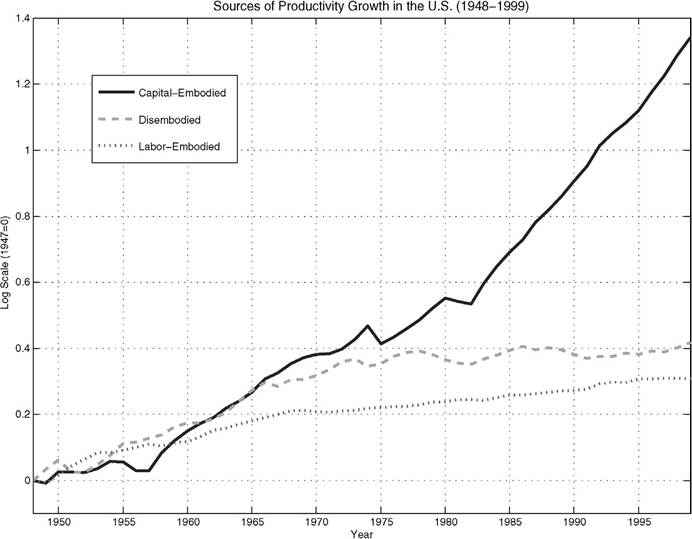
 ) with labor income share, 1 - α = 0.64 [Cooley and Prescott (1995)]. Conditional on observations for real GDP (in terms of consumption goods), the real capital stock, and employment, we can use this expression to solve for the SSP of the consumption sector Ac.[178] The common finding from this computation, as evident from the dashed line in Figure 2, is the following observation.
