Stylized facts
In this section we describe some of the major features of cross-country growth data. Our goal is to identify some of the salient cross-section and intertemporal patterns that have motivated the development of growth econometrics.
Section 2.1 makes some general observations on growth in the very long-run. Section 2.2 discusses the main data set used to study growth since 1960. Section 2.3 describes general facts about differences in output per worker across countries. Section 2.4 extends this discussion by focusing on growth miracles and disasters. Basic facts concerning convergence are reported in Section 2.5. In Section 2.6 we describe the general slowdown in growth over the last two decades. Section 2.7 extends this discussion by considering the question of predictability of growth rates over time. Section 2.8 identifies growth differences across levels of development and across geographic regions. In Section 2.9, we characterize some aspects of stagnation and volatility. Section 2.10 draws some general conclusions about the basic growth facts.2.1. A long-run view
Taking a long view of economic history, a central fact concerning aggregate economic activity across countries is the massive divergence in living standards that has occurred over the last several centuries. A snapshot of the world in 1700 would show all countries to be poor, if their living standards were assessed in today’s terms. Over the course of the 18th and 19th centuries, growth rates increased slightly in the UK and other countries in Western Europe. Annual growth rates appear to have remained low, by modern standards, even in the midst of the Industrial Revolution; but because this growth was sustained over time, GDP per capita steadily rose. The outcome was that the UK, some other countries in Western Europe, and then the USA gradually advanced further ahead of the rest of the world.
What was happening elsewhere? As Pritchett (1997) argues, even in the absence of national accounts data, we can be almost certain that rapid productivity growth was never sustained in the poorer regions of the world. The argument proceeds by extrapolating backwards from their current levels of GDP per capita, using a fast growth rate. This quickly implies earlier levels of income that would be too low to support human life.
2.2. Data after 1960
Today’s overall inequality across countries is partly the legacy of rapid growth in a small group of Western economies, and its absence elsewhere. But there have been important deviations from this general pattern. Since the 1960s, some developing countries have grown at rates that are unprecedented, at least based on the experiences of the advanced economies of Europe and North America. The tiger economies of East Asia have seen GDP per worker grow at around 5% a year, or even faster, for the best part of forty years. A country that grows at such rates over forty years will see GDP per worker rise more than sevenfold, as in the case of Hong Kong, Singapore, South Korea and Taiwan.
In the rest of this section, we describe these patterns in more detail. As with most of the empirical growth literature, we will focus on the period after 1960, the point at which national accounts data start to become available for a larger group of coun- tries.[315] Our calculations use version 6.1 of the Penn World Table (PWT) due to Heston, Summers and Aten (2002). They have constructed measures of real GDP that adjust for international differences in price levels, and are therefore more comparable across space than measures based on market exchange rates.[316]
For the purposes of our analysis, the “world” will consist of 102 countries, those with data available in PWT 6.1 and with populations of at least 350,000 in the year 1960. These 102 countries account for a large share of the world's population. The most important missing countries are economies in Eastern Europe that were centrally planned for much of the period.
Because of its enormous population, collectivist China is included in the sample, but is a country for which output measurement is especially difficult. In a small number of cases, data for GDP per worker for 2000 are extrapolated from preceding years using growth rates for the early and mid-1990s. Appendix A gives more details of the sample, and the extrapolation procedure.Throughout, we use data on GDP per worker. Most formal growth models are based on production functions, and their implications relate more closely to GDP per worker than GDP per capita. Jones (1997) provides another justification for this choice. When there is an unmeasured non-market sector, such as subsistence agriculture, GDP per worker could be a more accurate index of average productivity than GDP per capita.
The paths of GDP per worker and GDP per capita will diverge when there are changes in the ratio of workers to population, which is one form of participation rate. There has been an upwards trend in these participation rates where such rates were originally low, while at the upper end of the distribution participation has been stable.[317] For a sample of 90 countries with available data, the median participation rate rose from 41% to 45% between 1960 and 2000. There was a sharp increase at the 25th percentile (from 33% to 40%) but very little change at the 75th percentile. This pattern suggests that growth in GDP per capita has usually been close to growth in GDP per worker, except for the countries that started with low participation rates.
There is an important point to bear in mind, when interpreting our later tables and graphs, and those found elsewhere in the literature. Our unit of observation is the country. In one sense this is clearly an arbitrary way to divide the world’s population, but one that can have systematic effects on perceptions of stylized facts. We can illustrate this with a specific example. Sub-Saharan Africa has many countries that have small populations, while India and China combined account for about 40% of the world’s population.
In a decade where India and China did relatively well, such as the 1990s, a country-based analysis will understate the overall improvement in living standards. In contrast, in a decade where Africa did relatively well, such as the 1960s, the overall growth record would appear less strong if assessed on a population-weighted basis. The point that countries differ greatly in terms of population size is important when interpreting tables, graphs and regressions that use the country as the unit of observation.2.3. Differences in levels of GDP per worker
Initially, we document the international disparities in GDP per worker. We first look at data for countries with large populations. Table 1 lists a set of countries that together account for 4.3 billion people. Of the countries with large populations, the main omissions are Germany, because of the difficulty posed by reunification, and economies that were centrally planned, including Russia.
Table 1
International disparities in GDP per worker
| Country | Population (m, 2000) | R1960 | R2000 |
| USA | 275 | 1 | 1 |
| United Kingdom | 60 | 0.69 | bgcolor=white>0.69|
| Argentina | 37 | 0.62 | 0.40 |
| France | 60 | 0.60 | 0.76 |
| Italy | 58 | 0.55 | 0.84 |
| South Africa | 43 | 0.47 | 0.34 |
| Mexico | 97 | 0.44 | 0.38 |
| Spain | 40 | 0.40 | 0.68 |
| Iran | 64 | 0.30 | 0.30 |
| Colombia | 42 | 0.27 | 0.18 |
| Japan | 127 | 0.25 | 0.60 |
| Brazil | 170 | 0.24 | 0.30 |
| Turkey | 67 | 0.17 | 0.24 |
| Philippines | 76 | 0.17 | 0.13 |
| Egypt | 64 | 0.17 | 0.21 |
| Korea, Republic of | 47 | 0.15 | 0.57 |
| Bangladesh | 131 | 0.10 | 0.10 |
| Nigeria | 127 | 0.08 | 0.02 |
| Indonesia | 210 | 0.08 | 0.14 |
| Thailand | 61 | 0.07 | 0.20 |
| Pakistan | 138 | 0.07 | 0.11 |
| India | 1016 | 0.06 | 0.10 |
| China | 1259 | 0.04 | 0.10 |
| Ethiopia | 64 | 0.04 | 0.02 |
| Mean | 0.29 | 0.35 | |
| Median | 0.21 | 0.27 |
Note: R is GDP per worker as a fraction of that in the USA.
The table shows GDP per worker, relative to the USA, for 1960 and 2000. The countries are ranked in descending order in terms of their 1960 position. Some clear patterns emerge: the major economies of Western Europe have maintained their position relative to the USA (as in the case of the UK) or substantially improved it (France, Italy, Spain). Among the poorer nations, there are some countries that have improved their relative position dramatically (Japan, Republic of Korea, Thailand) and others that have performed badly (Argentina, Nigeria). If we look at the mean and median of relative GDP per worker, there has been a moderate increase, suggesting a slight tendency for reduced dispersion. But these statistics disguise a wide variety of experience, and we will discuss the issue of convergence in more detail below.
We now consider the shape of the international distribution of GDP per worker, using the USA’s 1960 value as the benchmark. Figure 1 shows a kernel density plot of the distribution of GDP per worker in 1960 and 2000, relative to the benchmark. The right-
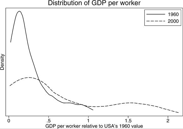
Figure 1. Cross-country density of output per worker.
wards movement reflects the growth that took place over this period. Also noticeable is a thinning in the middle of the distribution, the “Twin Peaks” phenomenon identified in a series of papers by Quah (1993a, 1993b, 1996a, 1996b, 1996c, 1997).
Is the position in the league table of GDP per worker in 1960 a good predictor of that in 2000? The answer is a qualified yes: the Spearman rank correlation is 0.84. This pattern is shown in more detail in Figure 2, which plots the log of GDP per worker relative to the USA in 2000, against that in 1960. In this and later figures, one or two outlying observations are omitted to facilitate graphing.
The high rank correlation is not a new phenomenon. Easterly et al. (1993) report that, for 28 countries for which Maddison (1989) has data, the rank correlation of GDP per capita in 1988 with that in 1870 is 0.82.
2.4. Growth miracles and disasters
Despite some stability in relative positions, it is easy to pick out countries that have done exceptionally well and others that have done badly. There is an enormous range in observed growth rates, to an extent that has not previously been observed in world history. To show this, we rank the countries by their annual growth rate between 1960 and 2000, and present a list of the fifteen best performers (Table 2) and the fifteen worst (Table 3). To show the dramatic effects of sustaining a high growth rate over forty years, we also show the ratio of GDP per worker in 2000 to that in 1960.
These tables of growth miracles and disasters show a regional pattern that is familiar to anyone who has studied recent economic growth. The best performing countries are
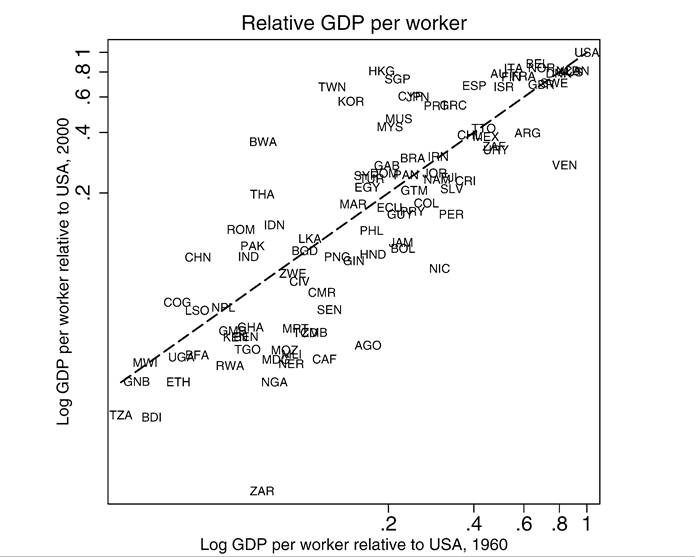
Figure 2. Output per worker: 1960 versus 2000.
Table 2
Fifteen growth miracles, 1960-2000
| Country | Growth 1960-2000 | Factor increase |
| Taiwan | 6.25 | 11.3 |
| Botswana | 6.07 | 10.6 |
| Hong Kong | 5.67 | 9.09 |
| Korea, Republic of | 5.41 | 8.24 |
| Singapore | 5.09 | 7.29 |
| Thailand | 4.50 | 5.83 |
| Cyprus | 4.30 | 5.39 |
| Japan | 4.13 | 5.04 |
| Ireland | 4.10 | 5.00 |
| China | 3.99 | 4.77 |
| Romania | 3.91 | 4.63 |
| Mauritius | 3.88 | 4.58 |
| Malaysia | 3.82 | 4.48 |
| Portugal | 3.48 | 3.93 |
| Indonesia | 3.34 | 3.72 |
Table 3
Fifteen growth disasters, 1960-2000
| Country | Growth 1960-2000 | Ratio |
| Peru | 0.00 | 1.00 |
| Mauritania | -0.11 | 0.96 |
| Senegal | -0.26 | 0.90 |
| Chad | -0.43 | 0.84 |
| Mozambique | -0.50 | 0.82 |
| Madagascar | -0.60 | 0.79 |
| Zambia | -0.61 | 0.78 |
| Mali | -0.77 | bgcolor=white>0.74|
| Venezuela | -0.88 | 0.70 |
| Niger | -1.03 | 0.66 |
| Nigeria | -1.21 | 0.62 |
| Nicaragua | -1.30 | 0.59 |
| Central African Republic | -1.56 | 0.53 |
| Angola | -2.04 | 0.44 |
| Congo, Democratic Rep. | -4.00 | 0.20 |
mainly located in East Asia and Southeast Asia. These countries have sustained exceptionally high growth rates; for example, GDP per worker has grown by a factor of 11 in the case of Taiwan. If we now turn to the growth disasters, we can see many instances of “negative growth”, and these are predominantly countries in sub-Saharan Africa. Later in this section, we will compare Africa’s performance with that of other regions in more detail.[318]
2.5. Convergence?
An alternative way of showing the diversity of experience is to plot the growth rate over 1960-2000 against the 1960 level of real GDP per worker, relative to the USA. This is shown in Figure 3. The most obvious lesson to be drawn from this figure is the diversity of growth rates, especially at low levels of development. The figure does not provide much support for the idea that countries are converging to a common level of income, since that would require evidence of a downward sloping relationship between growth and initial income. Neither does it support the widespread idea that poorer countries have always grown slowly.
2.6. The growth slowdown
Next, we present similar figures fortwo sub-periods, 1960-1980 and 1980-2000. These plots, shown as Figures 4 and 5, reveal another important pattern. For many developing
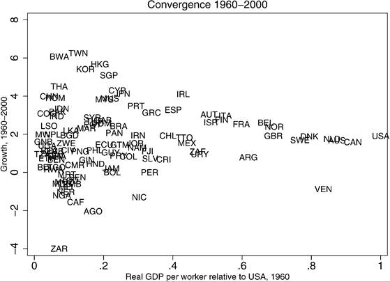
Figure 3. Growthversusinitialincome: 1960-2000.
countries, growth was significantly lower in the second period, with many countries seeing a decline in real GDP per worker after 1980. We can see this more clearly by looking at the international distribution of growth rates for the two sub-periods. Figure 6 shows kernel density estimates, and reveals a clear pattern: the mass of the distribution has shifted leftwards (slower growth) while at the same time the variance has increased (greater dispersion in growth rates).
A different way to highlight the growth slowdown is to plot the growth rate in 19802000 against that in 1960-1980 as is done in Figure 7, which also includes a 45 degree line. Countries above the line have seen growth increase, whereas countries below have seen growth decline. There are clearly more countries in which growth has declined over time, with the crucial exceptions of China and India, which have seen a dramatic improvement. To reveal the same pattern, Table 4 lists the countries in various categories, classified by growth rates in 1960-80 and in 1980-2000.
2.7. Does past growth predict future growth?
Another lesson to be drawn from Figure 7 and Table 4 is that relative performance has been unstable. The correlation between growth in 1960-1980 and that in 1980-2000 is just 0.40, so past growth is not a particularly useful predictor of fιιture growth.[319] For
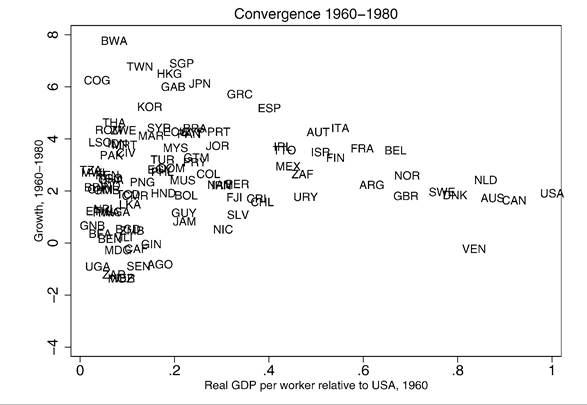
Figure 4. Growthversus initial income 1960-1980.
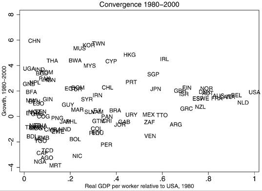
Figure 5. Growth versus initial income: 1980-2000.
the whole sample, the correlations across decades are also weak (Table 5). It is less well known that the cross-decade correlation has tended to increase over time, as is clear from Table 5's below diagonal elements for the whole sample. This is tentative evidence that
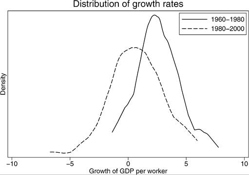
Figure 6. Density of growth rates across countries.
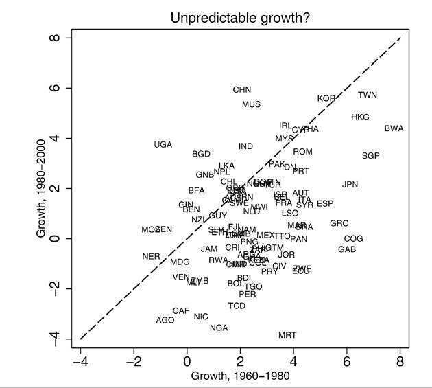
Figure 7. Growth rates in 1960-1980 versus 1980-2000.
Table 4
Growth in 1960-1980 and 1980-2000
| G2 ≤ 0 | 0 < G2 ≤ 1.5 | 1.5 < G2 ≤ 3 | G2 > 3 | |
| G1 ≤ 0 | Angola, | Guinea, | Uganda | |
| Central African | Mozambique, | |||
| Republic, DR Congo, Madagascar, Niger, Venezuela | Senegal | |||
| 0 < G1 ≤ 1.5 | Jamaica, Mali, | Benin, | Burkina Faso, | Bangladesh |
| Nicaragua, | El Salvador, | Guinea-Bissau, | ||
| Nigeria, Rwanda, | Ethiopia, | Nepal, Sri Lanka | ||
| Zambia | Guyana, New Zealand | |||
| 1.5 < G1 ≤ 3 | Argentina, | Fiji, Gambia, | Australia, | China, India, |
| Bolivia, Burundi, | Malawi, Mexico, | Canada, | Mauritius | |
| Cameroon, Chad, | Namibia, | Denmark, Chile, | ||
| Colombia, | Netherlands, | Dominican Rep., | ||
| Costa Rica, | Sweden, | Egypt, Iran, | ||
| Ghana, | Switzerland, | Norway, UK, | ||
| Honduras, Kenya, Papua New Guinea, Peru, Philippines, South Africa, Tanzania, Togo | Uruguay | USA | ||
| G1 > 3 | Ecuador, Gabon, | Brazil, | Austria, | Botswana, |
| Guatemala, | Rep. Congo, | Belgium, | Cyprus, Hong | |
| Ivory Coast, | France, Greece, | Finland, | Kong, Ireland, | |
| Jordan, | Lesotho, | Indonesia, Israel, | Korea, Malaysia, | |
| Mauritania, | bgcolor=white>Morocco, Spain,Italy, Japan, | Romania, | ||
| Panama, | Syria, Trinidad | Pakistan, | Singapore, | |
| Paraguay, Zimbabwe | and Tobago | Portugal, Turkey | Taiwan, Thailand |
Note: The above table classifies countries according to their annual growth rates over 1960-80 (G1) and over 1980-2000 (G2).
national economies are gradually sorting themselves into a pattern of distinct winners and losers.
2.8. Growth differences by development level and geographic region
Can we say anything more about the characteristics of the winners and losers? First, we investigate the relationship between growth and initial development levels in more
Table 5
Growth rate correlations across decades
| 1960-1970 | 1970-1980 | 1980-1990 | 1990-2000 | |
| Whole sample | ||||
| Growth 1960-1970 | 1.00 | |||
| Growth 1970-1980 | 0.16 | 1.00 | ||
| Growth 1980-1990 | 0.28 | 0.31 | 1.00 | |
| Growth 1990-2000 | 0.11 | 0.33 | 0.44 | 1.00 |
| Rich country group | ||||
| Growth 1960-1970 | 1.00 | |||
| Growth 1970-1980 | 0.73 | 1.00 | ||
| Growth 1980-1990 | 0.06 | 0.40 | 1.00 | |
| Growth 1990-2000 | -0.07 | 0.37 | 0.61 | 1.00 |
Note: Whole sample is 102 countries. Rich country group is 19 countries.
Table 6
Growth, 1960-2000, by initial relative income
| Percentile | N | 25th | Median | 75th | |
| All | 102 | 0.7 | 1.6 | 2.7 | |
| Relative income: | |||||
| R ≤ 0.05 | 10 | 1.0 | 1.5 | 2.4 | |
| R > 0.05 & R | ≤ 0.10 | 22 | -0.5 | 0.9 | 2.9 |
| R > 0.10 & R | ≤ 0.25 | 33 | 0.4 | 1.9 | 2.7 |
| R > 0.25 & R | ≤ 0.50 | 19 | 0.8 | 1.5 | 3.1 |
| R > 0.50 | 18 | 1.6 | 1.9 | 2.6 |
Notes: This table shows the 25th, 50th and 75 th percentiles of the distribution of growth rates for countries at various levels of development in 1960.
R is GDP per worker in 1960 relative to the US level.
detail. We rank the sample of 102 countries by initial income in 1960, and then look at the distribution of growth rates for subgroups. In Table 6, for various ranges of initial income relative to the USA, we show the growth rate at the 25th percentile, the median, and the 75 th percentile. If we take the 22 countries which began somewhere between 5% and 10% of GDP per worker in the USA, the annual growth rate at the 25th percentile is negative, but is 2.9% at the 75th percentile. This diversity of experience extends throughout the distribution of relative incomes, but is less pronounced for the richest group.
Table 7
Growth, 1960-2000, by country groups
| Group | N | 25th | Median | 75th |
| Sub-Saharan Africa | 36 | -0.5 | 0.7 | 1.3 |
| South and Central America | 21 | 0.4 | 0.9 | 1.5 |
| East and Southeast Asia | 10 | 3.8 | 4.3 | 5.4 |
| South Asia | 7 | 1.9 | 2.2 | 2.9 |
| Industrialized countries | 19 | 1.7 | 2.4 | 3.0 |
Note: This table shows the 25th, 50th and 75th percentiles of the distribution of growth rates for various groups of countries.
Table 7 shows the quartiles of growth rates for countries in different regions.[320] Once again, sub-Saharan Africa is revealed as a weak performer. Within sub-Saharan Africa, even the country at the 75th percentile shows growth of just 1.3%. Performance is slightly better for South and Central America, but still not strong. Against this background, the record of East and Southeast Asia looks all the more remarkable.
In further work (not shown) we have constructed versions of Tables 6 and 7 for 1960-1980 and 1980-2000. These reinforce the patterns already discussed: dispersion of growth rates at all levels of development, major differences across regional groups, and a collapse in growth rates after 1980. Even for the developed countries, growth rates were noticeably lower after 1980 than before, reflecting the well-known productivity slowdown and the reduced potential for catch-up by previously fast-growing countries, such as France, Italy and Japan.
2.9. Stagnation and output volatility
Some countries did not record fast growth even in the boom of the 1960s. Some have simply stagnated or declined, never sustaining a high or even moderate growth rate for the length of time needed to raise output appreciably. In our sample, there are nine countries that have never exceeded their 1960 level of GDP per worker by more than 30%. Even more striking, a quarter of the countries (26 of 102) never exceeded their 1960 level by more than 60%. To put this in context, a country that grew at an average rate of 2% a year over a forty-year period would see GDP per worker rise by around 120%. Easterly (1994) drew attention to the international prevalence of stagnation, and the failure of some poorer countries to break out of low levels of development.
There are other ways in which the behavior of the poorer countries looks very different to that of rich countries. As emphasized by Pritchett (2000a), it is not uncommon
Table 8
Output collapses
| Country | Largest 3-year drop | Dates |
| Chad | 50% | 1980-83 |
| Rwanda | 47% | 1991-94 |
| Angola | 46% | 1973-76 |
| Romania | 37% | 1977-80 |
| Dem. Rep. Congo | 36% | 1992-95 |
| Mauritania | 34% | 1985-88 |
| Tanzania | 34% | 1987-90 |
| Mali | 34% | 1985-88 |
| Cameroon | 33% | 1987-90 |
| Nigeria | 32% | 1997-00 |
Note: This table shows the ten countries with the largest output collapses over a three-year period, using data on GDP per workerbetween 1960 and the latest available year.
for output to undergo a major collapse in less developed countries (LDCs). To show this, we calculate the largest percentage drop in output over three years recorded for each country, using data from 1960 to the latest available year. The precise statistic we calculate is:
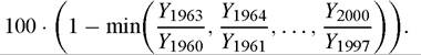
The largest ten output falls are shown in Table 8, which shows how dramatic an output collapse can be. Several of these output collapses are associated with periods of intense civil war, as in the cases of Rwanda, Angola and the Democratic Republic of the Congo. But the phenomenon of output collapse is a great deal more widespread than may be explained by events of this type. Of the 102 countries in our sample, 50 showed at least one three-year output collapse of 15% or more. 65 countries experienced a three- year output collapse of 10% or more. In contrast, between 1960 and 2000, the largest three-year output collapse in the USA was 5.4%, and in the UK 3.6%, both recorded in 1979-82. A corollary of these patterns is that time series modeling of LDC output, whether on a country-by-country basis or using panel data, has to be approached with care. It is not clear that the dynamics of output in the wake of a major collapse would look anything like the dynamics at other times.
We conclude our consideration of stylized facts by briefly reporting some evidence on long-run output volatility. Table 9 reports figures on the standard deviation of annual growth rates between 1960 and 2000. Industrialized countries are relatively stable, while sub-Saharan Africa is by far the most volatile region, followed by South and Central America. Volatility is not uniformly higher in developing countries, however: using the standard deviation of annual growth rates, South Africa is less volatile than the USA, Sri Lanka less volatile than Canada, and Pakistan less volatile than Switzerland.
Table 9
Volatility, 1960-2000, by regions
| Group | N | 25th | Median | 75th |
| Sub-Saharan Africa | 36 | 5.5 | 7.4 | 9.3 |
| South and Central America | 21 | 3.9 | 4.8 | 5.4 |
| East and Southeast Asia | 10 | 3.8 | 4.1 | 4.7 |
| South Asia | 7 | 3.0 | 3.3 | 5.2 |
| Industrialized countries | 19 | 2.3 | 2.9 | 3.5 |
Note: This table shows the 25th, 50th and 75th percentiles of the distribution of the standard deviation of annual growth rates, using data from the earliest available year until the latest available, between 1960 and 2000.
2.10. Asummaryofthestylizedfacts
The stylized facts we consider can be summarized as follows:
1. Over the forty-year period as a whole, most countries have grown richer, but vast income disparities remain. For all but the richest group, growth rates have differed to an unprecedented extent, regardless of the initial level of development.
2. Although past growth is a surprisingly weak predictor of future growth, it is slowly becoming more accurate over time, and so distinct winners and losers are beginning to emerge. The strongest performers are located in East and Southeast Asia, which have sustained growth rates at unprecedented levels. The weakest performers are predominantly located in sub-Saharan Africa, where some countries have barely grown at all, or even become poorer. The record in South and Central America is also distinctly mixed. In these regions, output volatility is high, and dramatic output collapses are not uncommon.
3. For many countries, growth rates were lower in 1980-2000 than in 1960-1980, and this growth slowdown is observed throughout most of the income distribution. Moreover, the dispersion of growth rates has increased. A more optimistic reading would also emphasize the growth take-off that has taken place in China and India, home to two-fifths of the world’s population and a greater proportion of the world’s poor.
Even this brief overview of the stylized facts reveals that there is much of interest to be investigated and understood. The field of growth econometrics has emerged through efforts to interpret and understand these facts in terms of simple statistical models, and in the light of predictions made by particular theoretical structures. In either case, the complexity of the growth process and the paucity of the available data combine to suggest that scientific standards of proof are unattainable. Perhaps the best this literature can hope for is to constrain what can legitimately be claimed.
Researchers such as Levine and Renelt (1991) and Wacziarg (2002) have argued that, seen in this more modest light, growth econometrics can provide a signpost to interesting patterns and partial correlations, and even rule out some versions of the world that might otherwise seem plausible. Seen in terms of establishing stylized facts, empirical studies help to broaden the demands made of future theories, and can act as a discipline on quantitative investigations using calibrated models. In the remainder of this chapter, we will discuss in more detail the uses and limits of statistical evidence. We first examine how empirical growth studies are related to theoretical models, and then return in more depth to the study of convergence.