INEQUALITY IN INCOME
8.4.1 Measures of Inequality from the Overall Distribution
8.4.1.1 Introduction
This section focuses on measures of the overall distribution of income in high-income and some middle-income and developing countries.
In contrast with the next section, which focuses narrowly on the top of the pretax income distribution, this section considers a variety of statistics that either explicitly exclude the very top (and bottom) of the distribution or that use the full distribution but are calculated with data that are not necessarily representative of incomes at the very top. Most of this section describes trends since 1970, but some attention is also paid to data series that are available over shorter periods and to a single-year analysis of the most current available income data, which allow us to discuss a broader range of inequality metrics and a greater number of countries.Overall conclusions about the broad distribution of household income include:
* The countries with the least unequal distributions are the Nordic (Sweden, Norway, Denmark, and Finland) and “Benelux” (Belgium, Netherlands, and Luxembourg) countries as well as Austria and some eastern European nations.
* Across MICs and high-income countries there is a wide range in levels of inequality. By most measures the income distribution in the United States is among the most unequal, and when compared with the narrower set of the richest nations, the distribution in the United States is the most unequal. A number of MICs and developing nations, including Brazil, China, Turkey, and South Africa, though, have income distributions that are more unequal than in the United States.
* Taxes and transfers reduce the degree of inequality in every country, but there is dramatic variation in the extent of redistribution. The impact of taxes and transfers is very small in some highly unequal countries (Russia) and some less unequal ones (South Korea).
In some countries, taxes and transfers have a dramatic impact on the distribution of income; Finland has among the most unequal distributions of market income but one of the most equal distributions of DHI because of the extensive distribution in its welfare state. The United States combines relatively high levels of inequality in market income with very low levels of tax and transfer redistribution to achieve the highest level of DHI inequality among rich nations.* The distribution of income has become more unequal in most countries since the 1970s. The only rich country to buck the long-term trends toward greater inequality is France. Even France, though, has experienced increases in inequality since the early 2000s.
* The income distribution in a number of countries has followed a U-shaped pattern (Sweden, Finland, and Canada), falling in the 1970s or the 1980s before rising in the 1990s.
* Two of the most unequal of the rich nations—the United States and the United Kingdom—experienced large increases in inequality in the late 1970s and 1980s and modest increases in the second half of the 1990s, but in both countries the level of inequality in 2010 was not very different from levels experienced in the early 1990s.
* The distribution of market income in Germany, Italy, Japan, and some of the Nordic countries grew steadily more unequal between the mid-1980s and the mid-2000s, and the distribution of pretax/transfer income in those countries is now almost as unequal as in the United States, Israel, or the United Kingdom.
* In almost all countries the long-term trends in inequality are more pronounced among the working-age population.
8.4.1.2 Distributional Statistics
A variety of statistics have been developed for the analysis of the distribution of income. The most commonly used statistic is the Gini coefficient, but a number of other measures have been applied to a wide range of countries using data covering the most recent decades. The statistics discussed below include Lorenz curves, the Gini coefficient, Atkinson Index (ATK), percentile ratios (P90/P50 and P90/P10), quintile shares (S80/S20), and the Palma Index.
(See Allison, 1978; Atkinson, 1970; Cowell, 2000; Heshmati, 2004; among others, for overviews of the various summary statistics to describe distributional inequality.)Not a statistic perse, the Lorenz curve is a graphical representation of the cumulative distribution of income. The Lorenz curve uses ordered income data and shows the cumulative share of income held at each point in the distribution of households.
To reduce the information contained in the Lorenz curve to a single number, a variety of summary statistics have been proposed. One that has a direct link to the Lorenz curve is the Gini coefficient. The Gini coefficient can be calculated in a number of ways and visually can be represented as a ratio of the area between the Lorenz curve and the perfect equality line divided by the total area below the perfect equality line. In ordered data for household share of total income, the 45-degree line represents perfect equality; each household has the same income and each point in the distribution of total households matches the same point in the distribution of total household income (e.g., the bottom 45% of households receive 45% of total income). The Gini coefficient ranges from 0 (perfect equality) to 1 (the most extreme inequality) if all income is held by a single household.
Using unordered data, the Gini coefficient for household income can be calculated as the relative mean difference, or the average absolute difference between incomes for all pairs of households divided by twice the mean income (Allison, 1978):
where N represents the total number of households, i and j index each household in all possible pairings of household, x is household income, and x is mean income over the sample.
The Gini coefficient is one of many statistics representing the entire distribution. Other commonly used measures of inequality focus on specific points or regions of the distribution.
Below we discuss inequality measures from the most recently available data using the P90/P10 and P90/P50 interdecile ratios, which represent “high” income levels (from the 90th percentile of the distribution in this case) as some multiple of “low” income (the 10th percentile of the distribution) or “middle” income (the median). Asimilarmeasure, the S80/S20, represents a ratio of the shares of total household income received by those in the top quintile of the distribution and those in the bottom quintile. The Palma Index, popularized by Palma (2011), is a slight modification of the more common S80/S20 and divides the share of income held by the highest 10% of the distribution by the share of income received by the lowest-income 40% of the distribution.The final measure discussed in this section is the ATK.20 Similar to the Gini coefficient, the ATK summarizes the entire distribution. Unlike the Gini, though, the ATK can be decomposed to identify different groups or income sources making different contributions to inequality. The ATK differs from the previous measures by explicitly incorporating a weighting variable that can be selected to place more weight on incomes at the top or the bottom of the distribution
[1] The mean log deviation (MLD) is another statistic that uses the entire distribution but tends to produce results very similar to the Gini coefficient. MLD statistics are not included here because of limited space, but they have been calculated by the OECD in the past, including in Divided We Stand (2011). Also, the squared coefficient of variation (SCV) has been used in some analyses of income distribution, including OECD (2011), but rankings developed using this measure are very sensitive. Deding and Dall Schmidt (2002) showed that, compared to the Gini coefficient, the SCV produces substantially larger year-to-year shifts in inequality and is particularly sensitive to tax and transfer payments at the upper tail of the distribution.
For these reasons we do not include SCV measures in this review.aversion, reflect greater sensitivity to incomes at the lower end of the distribution. The ATK falls between 0 and 1, equaling 0 under perfect equality and with higher values when dispersion is greater.
8.4.1.3 Levels of Inequality in High- and Middle-Income Countries in the Late 2000s With expanded interest in the distribution of income, there are more data available from recent years to compare incomes across countries than at any point in history. This section reviews evidence from a broad array of rich countries and MICs using all of the distribution statistics described above. The following section focuses on a narrower set of countries and examines trends in the distribution of income using a more limited set of statistics. All of the analyses in these sections rely heavily on the data produced and made available by LIS, Eurostat, the OECD, and the national statistical agencies of a handful of rich countries.
8.4.1.3.1 LorenzCurves
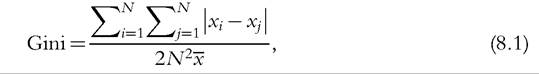
Unlike most summary statistics used in the analysis of inequality, Lorenz curves visually represent the entire distribution. Analyzing these plotted cumulative distribution functions allows us to see whether pairs of countries can be ranked by standard dominance criteria.[378] Figure 8.8 includes a series of Lorenz curves for different geographically or institutionally coherent clusters of countries. Each graph also includes the Lorenz curve for the United States to aid in comparability across the different graphs. The figure uses data from the most recent LIS wave for each country (identified in the individual graphs) and represents equivalized DHI.[379]
The distribution of income in the continental European countries (including Austria, Belgium, France, Germany, Luxembourg, and Switzerland), as well as Japan (shown in Figure 8.8a), and the Nordic countries (Denmark, Finland, Norway, and Sweden, shown in Figure 8.8b) is much less unequal than in the United States.
Because the Lorenz curves do not cross at any point, we can say that each of these countries has a “superior” Lorenz curve to the United States. Any differences between these countries—which are slightly more evident among the Nordic counties—are small compared with their differences with the United States.The U.S. distribution is more unequal than most of the rest of the European countries, but not to such a great extent. In the case of the Anglo-Saxon countries (Figure 8.8c), Australia, Canada, and Ireland have Lorenz curves that are superior to that of the United States, but the Lorenz curves for the United States and the
Figure 8.8 Lorenz curves Ofequivalized DHI (LIS) in the mid- and late 2000s: (a) continental European countries (and Japan), (b) Nordic countries, (c) Anglo-Saxon countries, (d) Southern European countries, (e) Eastern European countries, and (f) other countries. Data are based on the authors'analysis of LIS data.
United Kingdom are virtually indistinguishable, although they do not cross. The United States also has an inferior Lorenz curve relative to the countries in Southern Europe (Spain, Italy, and Greece, shown in Figure 8.8d), but the gaps are less dramatic than for the Nordic or continental European countries. None of the southern European countries has a distribution that is superior to the others, as the Lorenz curves cross at the top and the bottom of the distributions.
Even in Eastern Europe (Figure 8.8e), each country has a Lorenz curve superior to that of the United States. In the case of Estonia (2004) and the Russian Federation, the distribution is very similar, especially in the upper third, but at no point do the Lorenz curves cross. In the Slovak Republic, Slovenia, and the Czech Republic (2004) the distributions look more similar to those of continental European countries than those of their Eastern European neighbors.
Only when we expand the set of countries beyond Europe and include MICs and developing counties do we find distributions of income that are more unequal than that of the United States (“Other Countries” include South Korea, India, China, Brazil, and Israel, shown in Figure 8.8f). The most recent LIS data for Brazil, India, China, and South Africa show that the Lorenz curves for those countries are inferior to that of the United States. Among those four nations, South Africa stands out with the most unequal distribution. Israel and the United States have virtually indistinguishable Lorenz curves, both of which are inferior to the Lorenz curves for South Korea and Taiwan.
8.4.1.3.2 EU and OECD Country Summary Statistics and Rankings
In recent years the EU and the OECD have calculated timely summary distributional statistics for their member countries. These figures are based on DHI data from 2010 to 2011 for the EU and “around 2010” for the non-EU OECD countries.[380] Statistics from both entities are adjusted for household size using slightly different equivalence scales.
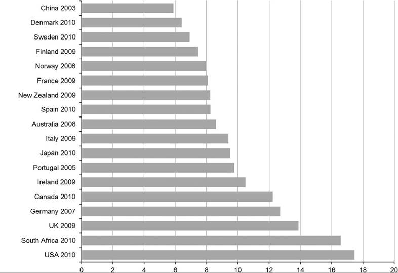
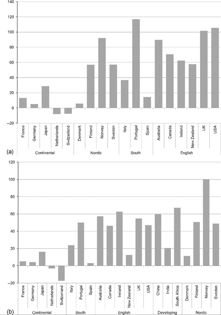
Figure 8.9 includes three different summary statistics for the 23 richest nations that are EU or OECD members and is sorted based on rankings for the Gini coefficient (shown in Figure 8.9a).[381] With a Gini coefficient of 0.38, the United States has the highest level of inequality among the rich nations. At the other extreme, with Gini coefficients between 0.23 and 0.28, the Nordic and Benelux (Belgium, Netherlands, and Luxembourg) countries and Austria had the most equal distribution of income, led by Norway. The large continental economies and the Anglo-Saxon countries fall in the middle, with Gini coefficients ranging from 0.28 and 0.31 in Germany and France, respectively, to between 0.32 and 0.33 in Australia, Canada, and the United Kingdom.
While they are based on smaller ranges of the distribution, the S80/S20 interquartile share ratio (Figure 8.9b) and the P90/P10 interdecile ratio (Figure 8.9c) each produce rankings similar to that of the Gini coefficient. In the rich nations with the highest
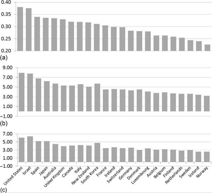
Figure 8.9 Summary distribution statistics for equivalized DHI for the richest EU and OECD nations for 2010-2011: (a) Gini coefficient, (b) interquartile share ratio (S80/S20), and (c) interdecile ratio (P90/P120). EU member country data are mainly from 2011 or 2010;non-EU OECD member country data are primarily from 2010. Gini coefficient, S80/S20 ratio, and P90/P10 ratio figures for EU member countries are based on Eurostat data and are mostly from 2010. A number of EU countries have data from 2011, including Denmark, Finland, France, Germany, Iceland, Luxembourg, the Netherlands, and Norway. Non-EU OECD member county figures for Gini, S80/S20, and P90/P10 are mainly from 2010, with some exceptions: South Korea, 2011; Japan, New Zealand, and Switzerland, 2009. Sources: Eurostat and OECD.
S80/S20 ratios, the United States and Israel, the average income among the highest- income fifth of households is 7.8 times the average income in the bottom fifth. In the less unequal Nordic and Benelux nations, the ratio ranged from 3.2 to 3.9. The P90/P10 ratio was 6.4 in Israel, followed closely by the United States at 6.1. Most of the ranking using the P90/P10 is similar to the S80/S20 ranking and, in turn, the Gini coefficient ranking, but the rich Asian nations stand out somewhat. In the Gini coefficient rankings, Japan and South Korea were similar to, and somewhat less unequal than,
Table 8.2 Summary distributional statistics for equivalized disposable household income—EU and OECD measures for 2010-2011 and the late 2000s
| Australia | Gini 0.334 | Interquintiie share ratio (S80/S20) 5.7 | Interdeciie ratio (P90/P10) 4.5 |
| Austria | 0.263 | 3.8 | 3.1 |
| Belgium | 0.263 | 3.9 | 3.2 |
| Bulgaria | 0.336 | 6.1 | 4.9 |
| Canada | 0.320 | 5.3 | 4.1 |
| Croatia | 0.31 | 5.4 | 4.5 |
| Cyprus | 0.31 | 4.7 | 3.7 |
| Czech Republic | 0.249 | 3.5 | 2.9 |
| Denmark | bgcolor=white>0.2814.5 | 3.0 | |
| Estonia | 0.325 | 5.4 | 4.4 |
| Finland | 0.259 | 3.7 | 3.1 |
| France | 0.305 | 4.5 | 3.5 |
| Germany | 0.283 | 4.3 | 3.6 |
| Greece | 0.343 | 6.6 | 4.9 |
| Hungary | 0.269 | 4.0 | 3.3 |
| Iceland | 0.240 | 3.4 | 2.6 |
| Ireland | 0.298 | 4.6 | 3.7 |
| Israel | 0.376 | 7.8 | 6.4 |
| Italy | 0.319 | 5.6 | 4.2 |
| Japan | 0.336 | 6.2 | 5.2 |
| Latvia | 0.359 | 6.5 | 5.1 |
| Lithuania | 0.32 | 5.3 | 4.4 |
| Luxembourg | 0.280 | 4.1 | 3.4 |
| Malta | 0.272 | 3.9 | 3.3 |
| Netherlands | 0.254 | 3.6 | 2.9 |
| New Zealand | 0.317 | 5.1 | 4.1 |
| Norway | 0.226 | 3.2 | 2.6 |
| Poland | 0.309 | 4.9 | 4.0 |
| Portugal | 0.345 | 5.8 | 4.6 |
| Romania | 0.332 | 6.2 | 5.2 |
| Russian Federation | 0.428 | 9 | 6.9 |
| Slovak Republic | 0.257 | 3.8 | 3.1 |
| Slovenia | 0.237 | 3.4 | 3.0 |
| South Korea | 0.311 | 5.7 | 4.8 |
| Spain | 0.340 | 6.8 | 5.2 |
| Sweden | 0.244 | 3.6 | 3.0 |
| Switzerland | 0.297 | 4.5 | 3.5 |
| Turkey | 0.448 | 11.3 | 8.5 |
| United Kingdom | 0.330 | 5.3 | 4.0 |
| United States | 0.380 | 7.9 | 6.1 |
Sources: Eurostat and OECD.
Note: Eurostat data are used forEU countries that are also OECD members. EU member country data mainly from 2011 or 2010; non-EU OECD member country data are primarily from 2010. Gini Coefficient, S80/S20 ratios, and P90/P10 ratio figures for EU member countries are based on Eurostat data and are mostly from 2010. A number of EU countries have data from 2011, including Bulgaria, Cyprus, Czech Republic, Denmark, Estonia, Finland, France, Germany, Greece, Hungary, Iceland, Luxembourg, the Netherlands, Norway, Poland, Portugal, and Slovenia. Non-EU OECD member country figures for Gini, S80/S20 ratios, and P90/P10 ratios are mainly for 2010, with some exceptions: South Korea figures are from 2011; Japan, New Zealand, and Switzerland are from 2009; and Russian Federation are from 2008.
SCV for all countries is from the OECD's “DividedWe Stand” and are primarily for 2008, except for Hungary and Turkey (2007) and Japan (2006). These statistics are no longer collected by the OECD.
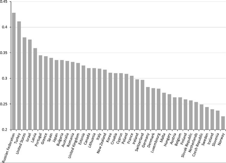
Figure 8.10 Gini coefficients for equivalized DHI for 2010-2011, including middle-income and developing EU and OECD nations. Source: EU-SILC, Eurostat data (figures for 2010/2011 for EU member countries). OECD data are mainly from 2010; exceptions include South Korea (2011) and New Zealand and Turkey (2009).
many of the Anglo-Saxon and southern European nations. Using the P90/P10, Japan and Korea appear more unequal and rank third and sixth, at 5.2 and 4.8, respectively. Among the less unequal Nordic and Benelux countries, the P90/P10 lies between 2.6 and 3.2.
The list of countries regarded as the “most unequal” or “least unequal” is, of course, somewhat dependent on the set of countries included. Figure 8.10 represents the ordered Gini coefficients for a set of countries that includes the 23 rich nations already shown in Figure 8.9 with 17 additional high-income countries, with gross domestic product per capita above $12,500 (International Monetary Fund (IMF), 2013), that are also part of EU or the OECD. In Figure 8.10, the United States is supplanted by the Russian Federation and Turkey as having the most unequal distributions using the Gini coefficient. The list of countries with less unequal distributions is similarly bolstered as the Nordic and Benelux countries are joined by several central European nations, including Slovenia and the Czech Republic. All of the summary statistics from Figures 8.9 and 8.10 are in included in Table 8.2.
8.4.1.3.3 LIS Country Summary Statistics and Rankings
As seen in the Lorenz curves above, the LIS project includes data from a number of countries that are not part of the EU or the OECD. LIS also regularly calculates several distribution statistics not typically reported by the OECD or the EU. Figure 8.11 includes two different ATK measures (ε = 0.5, 1), the P90/P50 interdecile ratio and the Palma Index (Figure 8.11d), for 34 countries with values reported in any of the three most recent LIS waves (covering the decade of the 2000s). The data used in these figures also are included in Table 8.3.
The alternative summary statistics in Figure 8.11 maintain the same basic rank ordering among the rich countries shown in Figure 8.9, with the least unequal distributions found in the Benelux and Nordic countries and the most unequal found in the United States, Israel, and the United Kingdom. Including the MICs and developing countries that are part of the LIS project, though, alters the ranking considerably. South Africa stands out as the most unequal country by far among the 34, with an ATK of 0.29, 38% higher than second-ranked China. Using a somewhat larger inequality aversion parameter (ε = 1) results in higher measured ATK numbers but by and large preserves the rank ordering across nations (Figure 8.11a). With greater sensitivity to incomes at the bottom of the distribution, the Czech Republic’s rank (from most unequal to least unequal) falls three spots, and Switzerland’s rises five spots, but overall our understanding of which countries have more- or less-equal distributions of income is essentially unchanged by modest changes in the inequality aversion parameter.
Analysis of the P90/P50 interdecile ratio (Figure 8.11c) demonstrates the dramatic differences in the distributions of the rich EU and OECD countries from those of the MICs and developing countries in the LIS project. Israel is the rich nation with the highest P90/P50, with an equivalized DHI at the 90th percentile 2.3 times that at the median. Four LIS lower-income countries (Brazil, China, India, and South Africa) have P90/P50 ratios at least 40% higher than Israel.
Proponents of adopting the Palma Index have argued that it isolates the portions of the income distribution that are most volatile over time and across countries (Cobham and Sumner, 2013). Compared to the Gini Index (and the ATK) the Palma Index is also transparent as to which portions of the distribution are determining the measure of inequality. This feature is shared by the P90/P10, P90/P50, and S80/S20 measures. Country rankings based on the Palma Index, calculated using LIS data, are very similar to those obtained using more common measures. The Nordic countries have the least unequal distributions, with values ranging from 0.98 (Norway) to 0.82 (Denmark), whereas South Africa has the most unequal, with a Palma Index of 7.8. The United States has the highest Palma Index (1.75) among rich nations.
Figure 8.11 indicates that the country rankings are similar across all four inequality measures. South Africa is the most unequal among the 34 nations in the LIS data using all of the measures, whereas Denmark is the least unequal. The United States ranks fifth most unequal using three of the measures and seventh most unequal using the other (P90/P50).
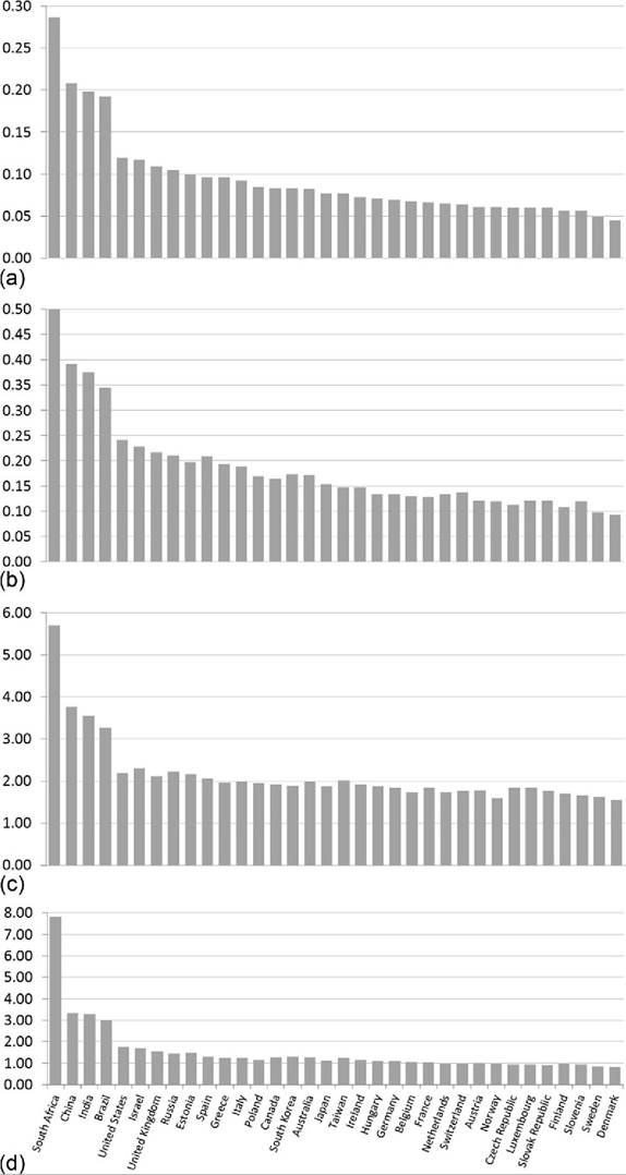
Figure 8.11 Distributional summary statistics from LIS countries using equivalized household income in the 2000s (LIS waves VI, VII, and VIII): (a) Atkinson coefficient (e=0.5), (b) Atkinson coefficient (e = 1), (c) P90/P50 ratio, and (d) Palma Index (S10/S40 ratio). The sample years range from 2002 to 2010. Data are from the authors' analysis of LIS data. (a)-(c) are from LIS published “key figures.” (d) is based on the authors' analysis of LIS data.
Table 8.3 Summary distribution statistics from LIS using equivalized disposable household income
| Australia, 2003 | Atkinson coefficient (« ¼ 0.5) 0.082 | Atkinson coefficient (« ¼ 1) 0.172 | Percentile ratio (90/50) 1.98 | Palma Index (S90/S40) 1.28 |
| Austria, 2004 | 0.061 | 0.120 | 1.79 | 1.00 |
| Belgium, 2000 | 0.068 | 0.129 | 1.74 | 1.08 |
| Brazil, 2006 | 0.192 | 0.345 | 3.27 | 3.00 |
| Canada, 2007 | 0.083 | 0.164 | 1.93 | 1.28 |
| China, 2002 | 0.208 | 0.392 | 3.77 | 3.33 |
| Czech Republic, 2004 | 0.060 | 0.113 | 1.85 | 0.96 |
| Denmark, 2004 | 0.045 | 0.092 | 1.56 | 0.82 |
| Estonia, 2004 | 0.100 | 0.197 | 2.17 | 1.49 |
| Finland, 2004 | 0.056 | 0.108 | 1.71 | 0.98 |
| France, 2005 | 0.066 | 0.128 | 1.84 | 1.04 |
| Germany, 2010 | 0.069 | 0.133 | 1.85 | 1.10 |
| Greece, 2010 | 0.096 | 0.194 | 1.97 | 1.26 |
| Hungary, 2005 | 0.071 | 0.134 | 1.87 | 1.10 |
| India, 2004 | 0.198 | 0.375 | 3.56 | 3.29 |
| Ireland, 2010 | 0.072 | 0.147 | 1.92 | 1.14 |
| Israel, 2010 | 0.117 | 0.228 | 2.30 | 1.69 |
| Italy, 2010 | 0.092 | 0.189 | 1.99 | 1.26 |
| Japan, 2008 | 0.077 | 0.154 | 1.88 | 1.13 |
| Luxembourg, 2010 | 0.060 | 0.120 | 1.85 | 0.96 |
| Netherlands, 2004 | 0.065 | 0.133 | 1.74 | 0.98 |
| Norway, 2004 | 0.061 | 0.119 | 1.60 | 0.98 |
| Poland, 2004 | 0.085 | 0.169 | 1.96 | 1.17 |
| Russia, 2010 | 0.105 | 0.210 | 2.24 | 1.45 |
| Slovak Republic, 2010 | 0.060 | 0.120 | 1.77 | 0.93 |
| Slovenia, 2010 | 0.056 | 0.119 | 1.66 | 0.95 |
| South Africa, 2010 | 0.287 | 0.505 | 5.70 | 7.81 |
| South Korea | 0.083 | 0.173 | 1.895 | 1.31 |
| Spain, 2010 | 0.096 | 0.209 | 2.06 | 1.32 |
| Sweden, 2005 | 0.049 | 0.097 | 1.63 | 0.85 |
| Switzerland, 2004 | 0.064 | 0.137 | 1.76 | 0.97 |
| Taiwan, 2005 | 0.077 | 0.147 | 2.02 | 1.26 |
| United Kingdom, 2010 | 0.109 | 0.216 | 2.13 | 1.56 |
| United States, 2010 | 0.119 | 0.241 | 2.19 | 1.75 |
Data are based on the authors' analysis of LIS project data. The Palma Indexwas Calculatedby the authors using LIS project data, the Atkinson coefficient, and P90/P50 from LIS published “key figures.”
8.4.1.3.4 Comparing Current Distributions of Pretax and Transfer Income and DHI
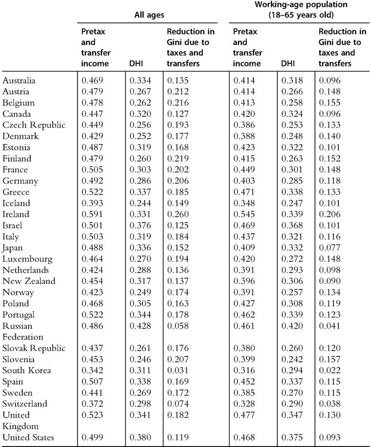
In almost every nation, and particularly among rich nations, the tax and transfer systems reduce the disparity of income. Whether taxes are paid at higher rates among upperincome households, benefits and transfer payments are directed disproportionately toward lower-income households, or both, measures of inequality are lower for DHI than for market income. The extent to which the tax and transfer systems reduce measured inequality varies substantially across countries. The distributions of DHI and pretax and transfer income, and the extent to which taxes and transfers reduce inequality, are shown in Figure 8.12 for a set of31 OECD countries. The figure shows Gini coefficients for DHI and pretax and transfer income (sorted on the latter) for all age levels (panel a) and for working-age (18-65 years old) individuals (panel b).
The rank ordering of countries based on inequality of pretax and transfer income for all ages (Figure 8.12a) is very different from the previously described rankings based on DHI. The United States does not have the most unequal distribution of pretax and transfer income, even among rich countries—it is ninth behind Ireland, Israel, the United Kingdom, and the southern European countries. The pretax and transfer income Gini for Italy is 0.50, 47% greater than South Korea, which has the lowest Gini among this set of countries. Also, instead of being clustered at the bottom, the Benelux countries are spread across the rankings based on the Gini coefficient for pretax and transfer income, and at least one Nordic country—Finland—rises to the middle.
Another important feature highlighted in Figure 8.12 is the substantial cross-national variation in the extent to which the tax and transfer systems reduce inequality. In several countries—notably the Russian Federation and South Korea—the tax and transfer systems have little impact on the distribution of income, and the Gini coefficient for DHI is only slightly smaller than the Gini for pretax and transfer income. In the case of Russia, low levels of redistribution leave the country with very high levels of inequality in DHI compared with other countries. In South Korea there is relatively little redistribution, but pretax and transfer income is distributed more evenly than in most countries, leaving a Gini for DHI that falls in the middle of the rankings.
In other countries, the tax and transfer system has a considerably larger impact on the distribution of income. In 11 countries the Gini coefficient is at least 40% lower for DHI than it is for market income. This is true for several of the Nordic and Benelux countries, as well as Ireland, Germany, and a number of eastern European countries. Substantial tax and transfer redistribution in these countries leaves them with the most equal distributions of DHI. In the case of the United States and Israel, above-average inequality in the distribution of market income combined with below-average levels of tax and transfer redistribution leave them with the highest Gini coefficients for DHI among the rich nations.
In this section we describe the difference between the Gini coefficients for pretax and transfer income and DHI as a measure of the extent of redistribution in a country. This measure of redistribution, however, has important limitations and warrants some caveats. One such caveat is that the gap between these two Gini coefficients is a distorted measure of “redistribution” because the tax and transfer policies carrying out said redistribution can be expected to cause some changes in household and firm economic behavior that
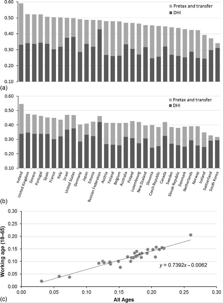
Figure 8.12 Gini coefficients around 2010 for pretax and transfer income and DHI for all ages (a), working age (18-65 years old) (b), and correlation between “redistribution” (pretax and transfer income Gini less DHI Gini) for all ages and the working-age populations (c). OECD member country data are primarily from 2010 with some exceptions: South Korea data are from 2011; Japan, New Zealand, and Switzerland data are from 2009;and the Russian Federation data are from 2008.
will be reflected in pretax and transfer income. Another limitation of this measure of redistribution is that similar types of income are classified as transfers in some countries but not in others, according to different institutional arrangements and policy choices. Retirement income systems are particularly relevant here. Countries with greater reliance on pensions provided directly by the public sector will seem to have greater redistribution than countries that finance retirement schemes through employers and private accounts (supported by tax incentives and potentially regulations).[382] A corollary is that countries with older populations (and otherwise equivalent pension systems) will seem to have greater redistribution by this measure.
We can compare the extent of redistribution across countries in a way that avoids some of these classification issues, at least in part, by using incomes from the working-age population (Figure 8.12b). Excluding retirees, who overwhelmingly rely on pension income, does not dramatically alter the rank ordering of countries based on the Gini coefficient for pretax and transfer income or the extent of redistribution observed across countries. The United States and the Anglo-Saxon and southern European countries remain the most unequal, whereas the Nordic and Benelux countries remain the least unequal. In a few countries, however, the cross-national ranking for inequality of pretax and transfer income jumps when elderly individuals are excluded; countries with notable increases include the United States, Canada, Israel, and the Russian Federation.
This extent of redistribution is greater among the total population than it is for the working-age population in every country. In the typical country the measure of redistribution for the working age is almost three quarters as large as it is for the total population (Figure 8.12c). The correlation between redistribution for all ages and for the working-age population is quite high. The simple correlation coefficient between the measures of redistribution for these two different age groups is 0.95. Countries that engage in relatively high levels of redistribution among the total population (including the elderly) also tend to engage in relatively high levels of redistribution among the working-age population. Table 8.4 contains all of the figures used in Figure 8.12.
8.4.1.4 Trends in the Distribution of Income Since 1970
Because income distribution data and statistics for some countries are only available for recent years, we are able to analyze trends in the distribution of income since the 1970s for a more limited set of countries than was discussed in the previous section. Here we first describe trends in the Gini coefficient for equivalized DHI since the mid-1970s for 10 rich nations. Then we turn to trends in the S80/S20 and P90/P10 measures, which are available for a somewhat larger number of OECD countries starting mostly in the
25
Table 8.4 Comparison of household market income and disposable household income: Gini coefficients for OECD countries around 2010
Source: OECD Inequality Database, accessed October 23, 2013. Data for most OECD countries are for 2010; exceptions include South Korea (from 2011); Ireland, Japan, New Zealand, and Switzerland (from 2009); and the Russian Federation (from 2008).
mid-1980s, but with data going back to the 1970s for a few.[383] Then we discuss trends in the Gini coefficient for pretax and transfer income and the extent to which taxes and transfers lower the Gini coefficient in a broader range of OECD countries. Finally, we compare trends in inequality since the mid-1980s using all three distributional statistics for working-age population and for all ages.
8.4.1.4.1 Trends in Equivalized DHI Gini Coefficients for 10 Rich Nations
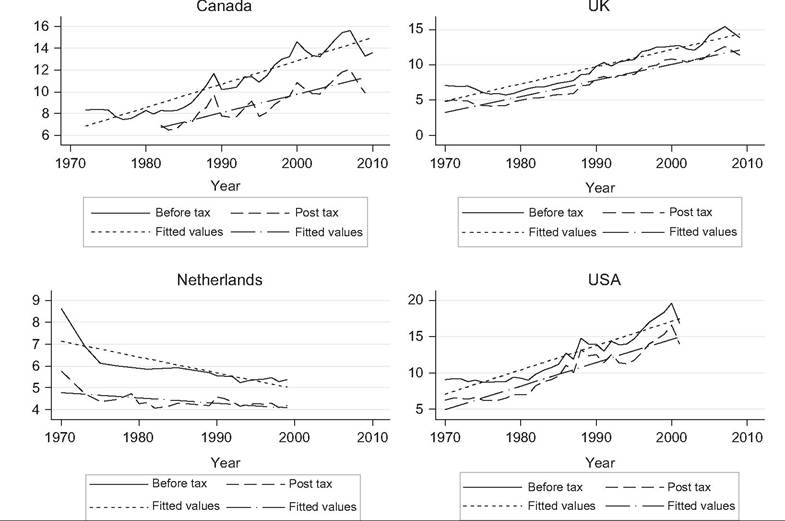
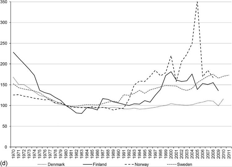
Most of the rich nations that have collected comparable, mostly annual, data since the early 1970s have experienced sizeable increases in the Gini coefficient[384] (Figure 8.13). For some countries those increases came in the 1980s (United States, United Kingdom, and the Netherlands), whereas for others they came in the 1990s and early 2000s (Canada, the Nordic countries, and Germany). Inequality trends in these countries can be thought of as following a J or U shape to varying degrees (see Gottschalk and Smeeding, 2000, for further discussion).
In Italy and France, inequality decreased in the 1980s, and since the mid-1990s the Gini coefficient has changed little in either country. Italy’s early 1980s declines were, however, offset by increases in the early 1990s (Brandolini and Vecchi, 2011). Most of the rich nations included in Figure 8.6 have experienced relatively small changes in their DHI inequality over the last 10 or 20 years, but many have witnessed marked cyclical fluctuations, particularly the United States, the United Kingdom, and the Nordic countries.
In most cases the rank ordering of countries remains unchanged after nearly 40 years of mostly rising inequality. The most dramatic shifts were undertaken by France, which had the most unequal distribution (among these rich nations) in the mid-1970s and now has a Gini coefficient only modestly higher than that of the Nordic countries. Also, the United Kingdom had among the least unequal distributions in the mid-1970s and has been among the most unequal since the early 1990s. The United States has had the most unequal distribution of income among rich nations since the early 1980s.
Rising inequality in the Nordic countries has produced relative but notable shifts as well. Through the early 1990s, the distribution of income in the Nordic countries was substantially less unequal than it was in other countries; since that time rising inequality in the Nordic countries and stable (France and the Netherlands) or modestly rising
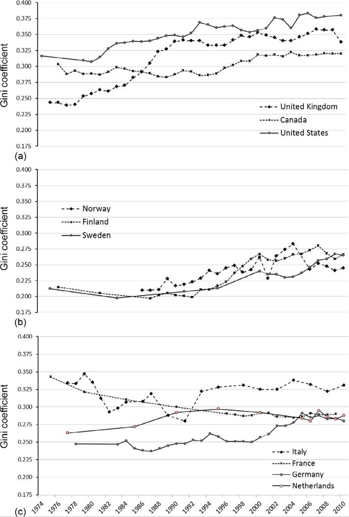
Figure 8.13 Trends in equivalized DHI Gini coefficient in rich countries by country group, OECD, and statistical agency data: Anglo-Saxon countries and the United States (a), Nordic countries (b), and Continental and Southern Europe (c). Source: OECD income distribution data for Canada, Sweden, and United States. Inequality Chartbook (Atkinson and Morelli, 2012, 2014) based on figures published by statistical agencies for remaining countries and updated by authors. Data for Italy from Smeeding and Brandolini (2009), updated by Brandolini.
inequality (Germany) in other countries has produced some convergence in the inequality levels in continental Europe and the Nordic countries. In Germany, the Gini of DHI rose 14% (from 0.25 to 0.28) over the period.[385] Although the distribution of income was less unequal in the Lander of the former East Germany (EDHI Gini of 0.20 in East Germany and 0.25 in West Germany in 1991), reunification had little impact on the inequality trends for Germany (Fuchs-Schiindeln and Schiindeln, 2009; Grabka and Kuhn, 2012).
Compared with the early 1980s, the range of inequality measures of these 10 rich countries has become somewhat more compressed. The two nations that previously had the most equal distributions—Sweden and Finland—experienced some of the largest increases in inequality. Around 1980, this set of 10 rich countries had a mean DHI Gini of 0.265 with a variance of 0.0022; around 2010 the mean had increased to 0.30, while the variance had decreased to 0.0017.
8.4.1.4.2 Trends in the S80/S20 and P90/P10 Measures for Equivalized DHI for 14 OECD Countries
A somewhat larger group of countries has been collecting comparable income data at least since the early 1980s (with Denmark, Israel, Japan, Luxembourg, and New Zealand augmenting the 10 rich nations discussed in the previous section).[386] The OECD has analyzed the income surveys from those countries and calculated S80/S20 and P90/P10 ratios. Both of these alternative measures yield largely similar trends in income inequality to what we saw for the Gini coefficient in Figure 8.13.
The share of income received by the top quintile divided by the share of income received by the bottom quintile (S80/S20) has increased in each of these countries since the early 1980s, but some countries experienced larger increases in inequality, and the rank ordering changed somewhat (Figure 8.14). Israel experienced the largest absolute change over this period, with its S80/S20 rising by 2.5, basically matching the United States for top spot with the top fifth of households receiving 7.8 times as much income as those in the bottom fifth. Israel’s inequality surge occurred in the late 1990s and early 2000s. Sweden experienced the largest relative increase over the same period—its S80/ S20 increased 48%. Canada experienced the smallest increase among these countries: its S80/S20 increased less than 10% higher than its lowest point in the 1980s.
Shifting to an inequality measure that further sharpens the contrast between the top and bottom of income distribution, the P90/P10 interdecile ratio does little to change the trends (Figure 8.15). Similar to the S80/S20 measure, income inequality did increase in each of the countries over this period. For Israel and Japan, the distribution seems to have
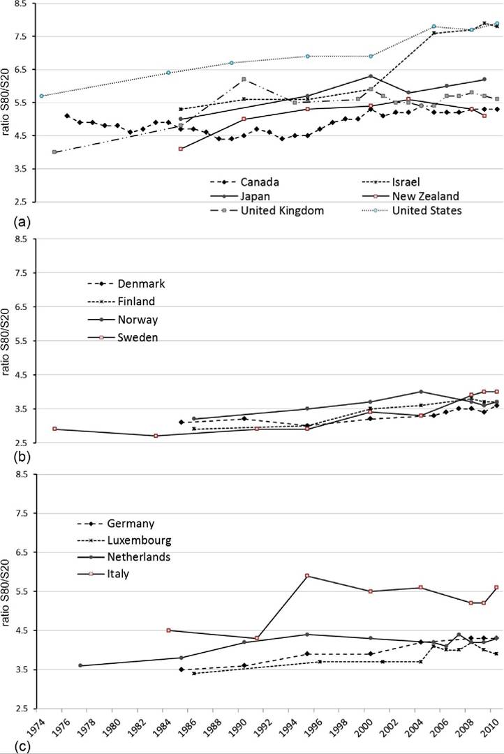
Figure 8.14 Trends in S80/S20 ratio for equivalized DHI by country group based on OECDdata: Anglo- Saxon countries, the United States, and others (a);Nordic countries (b);and Continental and Southern Europe (c). Source: OECD income distribution data.
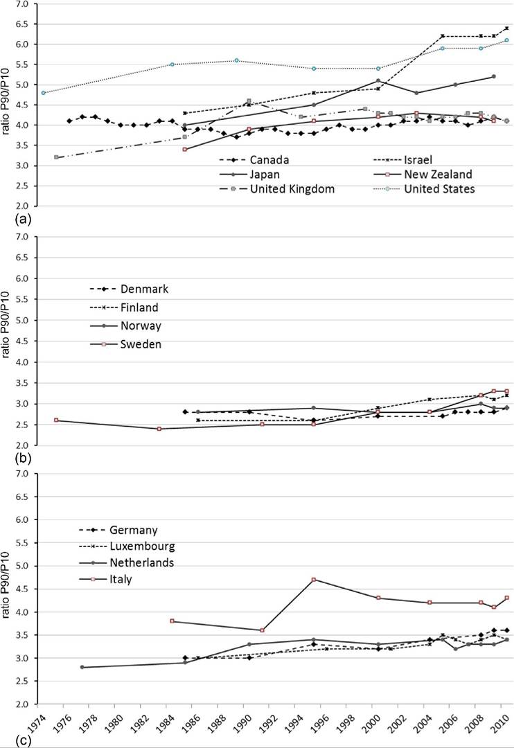
Figure 8.15 Trends in P90/P10 ratios for equivalized DHI by country group based on OECD data: Anglo-Saxon countries, the United States, and others (a);Nordic countries (b);and Continental and Southern Europe (c). Source: OECD income distribution data.
grown even more unequal using the P90/10 ratio. By the mid-2000s Israel had supplanted the United States as the most unequal rich nation, with households at the 90th percentile receiving DHIs 6.4 times greater than those at the 10th percentile. InJapan the P90/P10 ratio rose 30% over these three decades.
In most cases, though, the increase in inequality since the early 1980s is equivalent to or somewhat smaller than what is indicated by trends in the S80/S20. In the case of Canada, the 2010 value for the P90/P10 ratio was equal to its 1983 value but 0.4 above its low point in the 1980s. In all of the Nordic and continental European countries (except the Netherlands), the P90/P10 ratio increased less in percentage terms than the S80/S20 did over the same period.
8.4.1.4.3 Trends in Pretax and Transfer Gini Coefficients and the Extent of Redistribution for OECD Countries
Trends in the distribution of pretax and transfer income (using the Gini coefficient) and the extent of redistribution can be explored using the same data, which are available for an expanded set of OECD countries, though for some only since the mid-1990s.
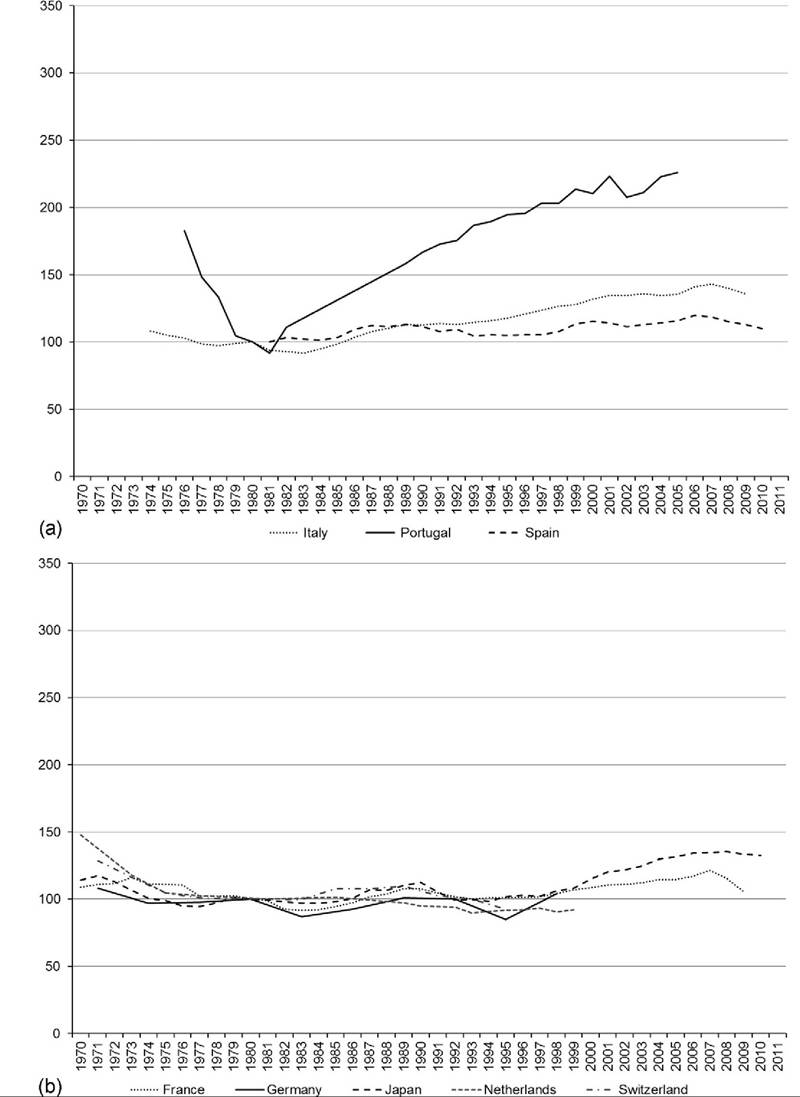
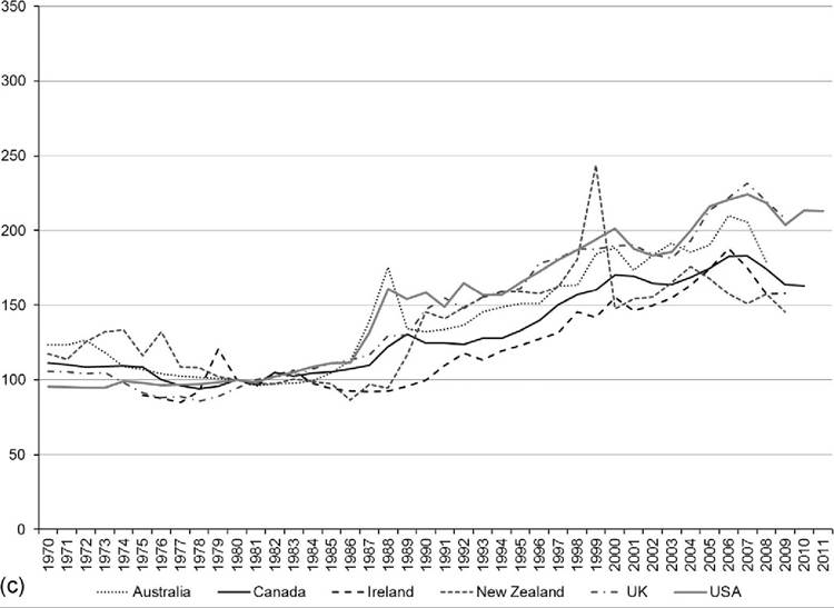
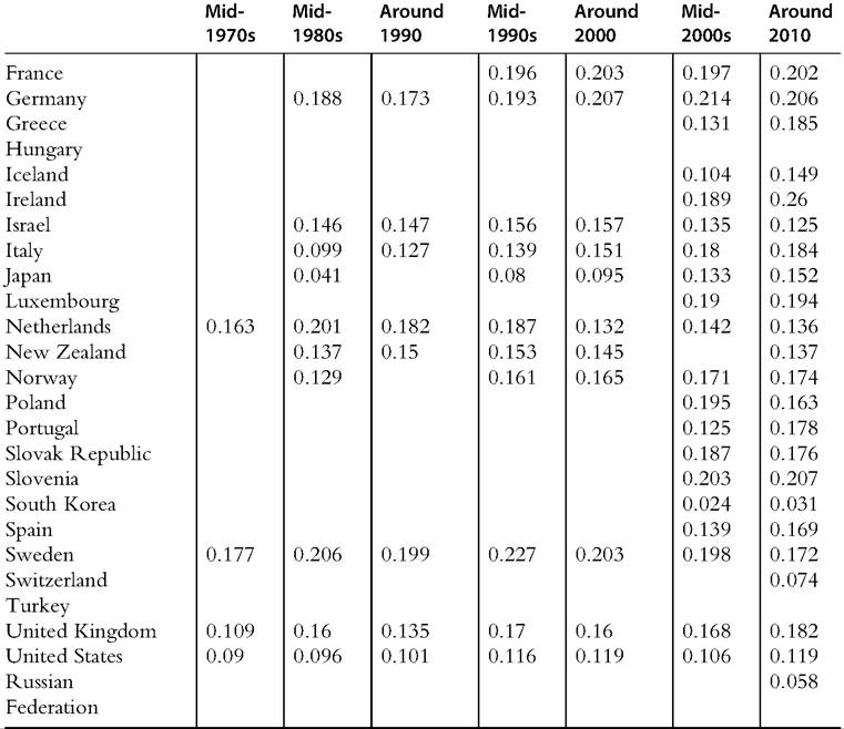
Japan is the country with the largest increase in pretax and transfer inequality among these high-income countries, increasing more than 40% and going from the least unequal distribution in the mid-1980s to one of the most unequal in 2010 (Figure 8.16a). (Figures 8.16 and 8.17 include only countries with data available for the mid-1980s and show the percentage change relative to the mid-1980s base.) Italy also experienced relatively large increases in inequality over this period, with its pretax and transfer Gini increasing 30% (Figure 8.16c). Pretax and transfer inequality increased in most of these countries. In the Anglo-Saxon countries and the United States, the increases were concentrated in the 1980s and early 1990s; in the Nordic and continental European countries Gini coefficients increased most in the early 1990s. The only country that seemed to avoid increased pretax and transfer inequality was the Netherlands. The pretax and transfer Gini actually fell more than 10% in Finland in the late 1990s. For the US, the Netherlands, and Finland, however, data are only available since the mid-1990s. In the Netherlands, increases in the pretax and transfer Gini coefficient in the 1980s were offset by decreases in the late 1990s. New Zealand also experienced declining inequality in the 2000s. A number of countries (including Finland, Israel, and Sweden) have witnessed very little change in pretax inequality over the past 15 years; Gini coefficients have fluctuated only slightly between the mid-1990s and 2010.[387]
Incorporating the influence of taxes and transfers can produce inequality trends that seem quite different, in some cases, than what we see in market or pretax and transfer
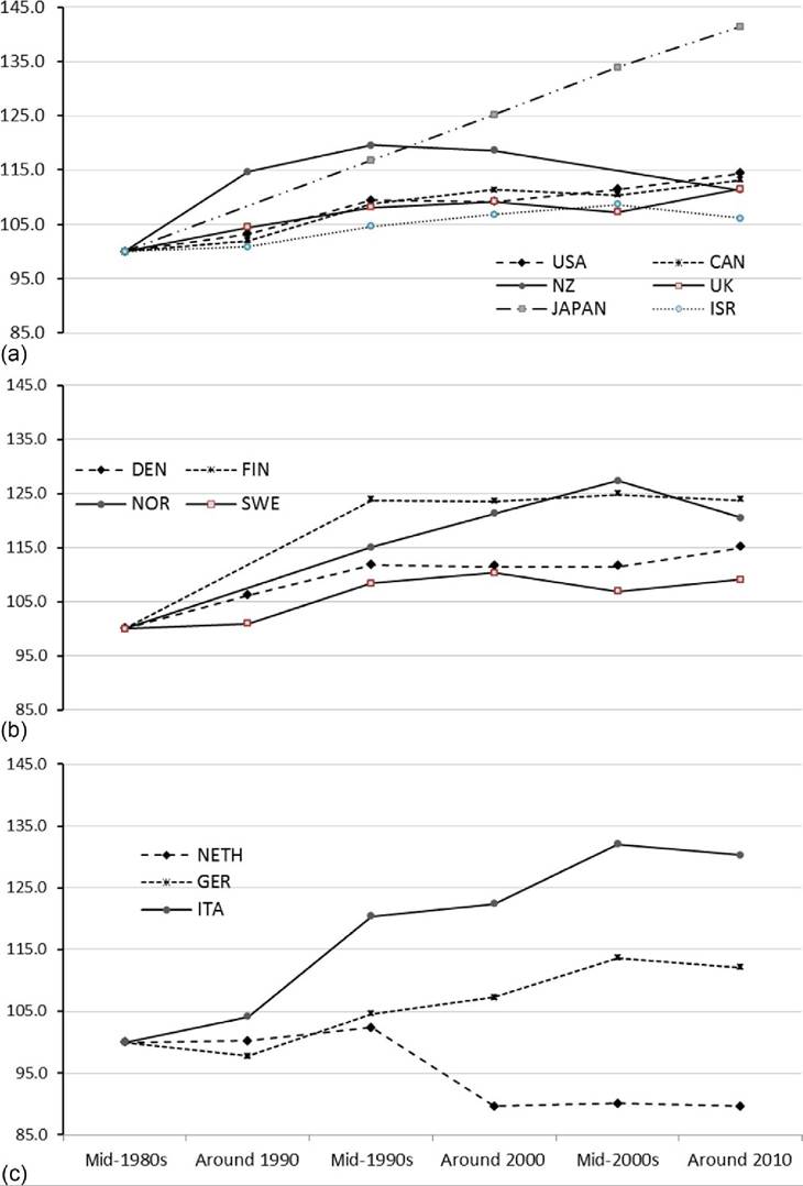
Figure 8.16 Change in pretax and transfer income Gini (mid-1890s = 100) for OECD countries, by country group: Anglo-Saxon countries, the United States, and others (a);Nordic countries (b);and Continental and Southern Europe (c). Source: OECD Inequality Database, accessed October 23, 2013.
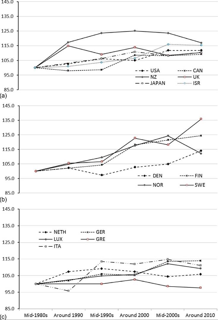
Figure 8.17 Change in disposable household income Gini (mid-1980s = 100) for OECD countries, by country group: Anglo-Saxon countries, the United States, and others (a);Nordic countries (b);and Continental and Southern Europe (c). Source: OECD Inequality Database, accessed October 23, 2013.
income. (See Deding and Dall Schmidt, 2002 for an earlier analysis of this issue during the 1990s.) Trends in the Gini coefficients using equalized DHI for the same countries over the same period are shown in Figure 8.17. For some countries trends for the DHI and pretax and transfer Gini coefficients are very similar. The United States, for example, saw the pretax and transfer Gini coefficient increase 14% between the mid-1980s and 2010, while its DHI Gini coefficient increased 12%. The United States is one of the countries for which excluding trends for the 1970s substantially understates its increase in inequality; between the mid-1970s and 2010 the U.S. pretax and transfer Gini increased 23% and its DHI Gini increased 20%.
Denmark, Finland (Figure 8.17b), and Germany (Figure 8.17c) also saw similar increases in the Gini coefficient before and after the inclusion of taxes and transfers. For a number of countries, though, the inclusion of taxes and transfers produces markedly different trends in inequality. For Canada, Japan, Italy, Norway, and the United Kingdom, rising inequality in the distribution of income is blunted once taxes and transfers are included. Japan and Italy, the countries with the largest increases in pretax and transfer inequality in Figure 8.16, experienced increases in their DHI inequality only one-quarter and one-third as large, respectively. The opposite is the case for Sweden, the Netherlands, Israel, and New Zealand, which experienced larger increases in inequality after including taxes and transfers. In the case of Sweden, the Gini for pretax and transfer income increased 9% (from 0.40 to 0.44) between the mid-1980s and 2010, while the Gini for DHI increased 36% (from 0.19 to 0.27).
The differences in the trends illustrated in Figures 8.16 and 8.17 are partly a result of the evolution of the tax and transfer systems in these countries. (As mentioned previously, changes in the age of the population and other demographic and policy factors can influence these trends as well.) Figure 8.18 shows how the extent to which tax and transfers reduce the Gini coefficients for pretax and transfer incomes has changed over this period. The most striking pattern in Figure 8.18 is the dramatic and sustained increase in tax and transfer “redistribution” in most rich nations from the mid-1970s through the mid- 1990s, which was followed by steady declines in the decade and a half since. The Anglo-Saxon (Figure 8.18a) and Nordic countries (Figure 8.18b) in particular followed an inverse U-shaped pattern, with redistributive efforts increasing between the mid- 1970s and mid-1990s but declining after that point. Since around 2000, taxes and transfers also have played a smaller role in reducing market income inequality in Israel.
In some countries the redistributive impact did not subside in the 1990s. Japan (Figure 8.18a) and Italy (Figure 8.18c) both experienced steady increases in redistribution from the 1990s through the late 2000s. The impact of redistribution has fluctuated less in the United States than in most other high-income countries. Increased redistribution in Canada and Japan, though, has shifted the United States from having one of the lowest levels of redistribution to having the lowest among rich nations. (See Caminada et al., 2012; Immervoll and Richardson, 2011; Wang and Caminada, 2011, for more detailed
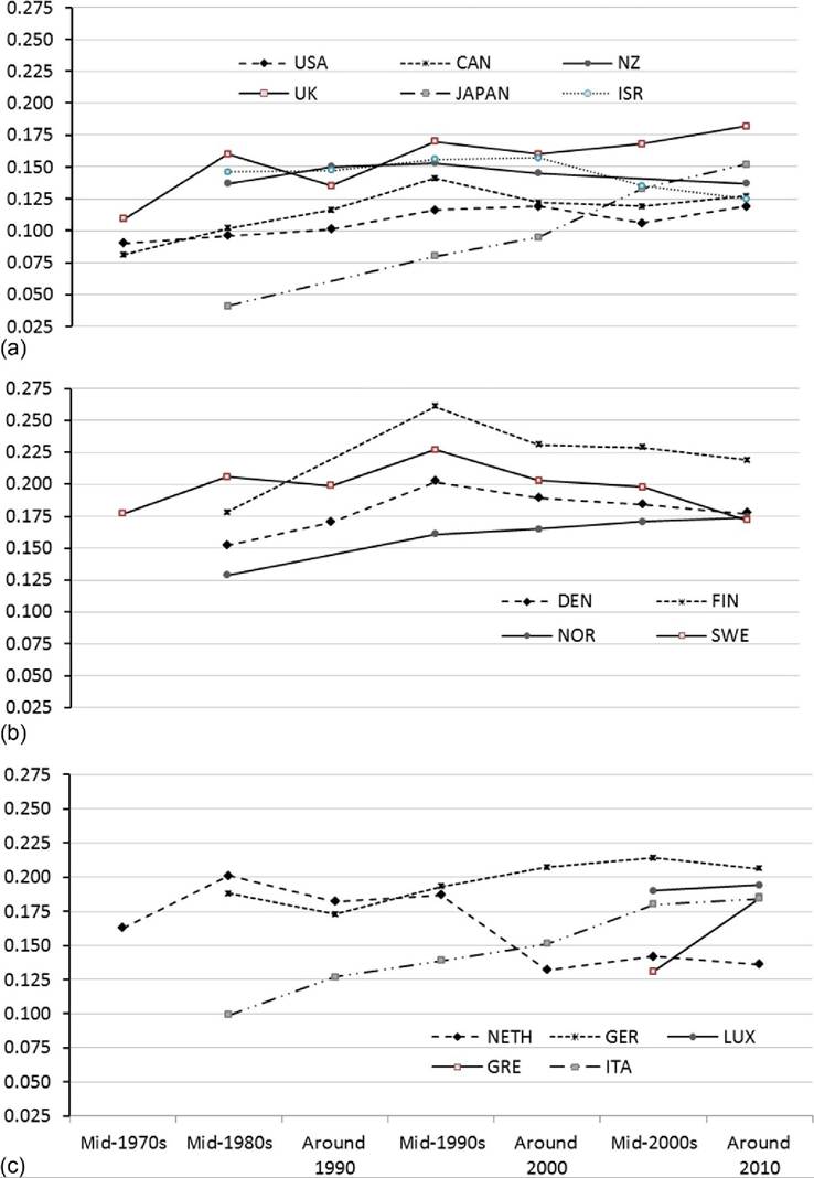
Figure 8.18 Reduction in Gini coefficient due to taxes and transfers trends for OECD countries, by country group: Anglo-Saxon countries, the United States, and others (a);Nordic countries (b);and Continental, Southern, and Eastern Europe (c). Source: OECD Inequality Database, accessed October 23, 2013.
discussion of the specific policies and their contribution to reducing market inequality in OECD and LIS countries.) Gini coefficients for pretax and transfer income, DHI, and the difference between the two for the OECD countries are shown in Table 8.5.
8.4.1.4.4 Comparing Trends in DHI Inequality for All Ages and the Working-Age Population We previously described how age composition is important in understanding how taxes and transfers affect cross-national rankings of income inequality. We can use the same OECD data to evaluate trends in income distribution statistics for the working-age population and contrast them with trends for the overall population. Table 8.6 includes S80/S20 and P90/P10 ratios, as well as Gini coefficients using equivalized DHI for a selection of years between the mid-1980s and 2010 for high-income OECD countries.
Over the entire 25-year period, the distribution of income grew even more unequal among the working-age population in almost every country. The largest differences can be seen among the Nordic countries. In Norway and Sweden, the P90/P10 ratio increased 20% and 15% more among the working-age than for the overall population, respectively, between the mid-1980s and 2010 (panel A). Smaller differences can be seen for the United States, United Kingdom, and Canada, which saw inequality increase between 4% and 8% more among the working-age than among all ages combined. Israel is the only country to see larger increases among the overall population than the workingage, although New Zealand also saw larger increases among the overall population after the mid-1990s. For some of the countries, though, there is no notable difference in the inequality trends between the working-age and the overall population at any point, or at least in more recent years.
The S80/S20 ratio measure yields a strikingly similar pattern of results (panel B) as the P90/P10 ratio, but differences in Gini coefficient trends between the age groups (panel C) are more muted. Norway and Denmark saw DHI Gini coefficients increase 10% and 5% more, respectively, among the working-age than the overall population between 1985 and 2010. In most countries, however, trends in the Gini coefficient were only modestly greater among the working-age population. The tails of the distribution have a greater impact on the S80/S20 and P90/P10 measures than they do on the Gini coefficient and seem to be particularly relevant to understanding any differences in inequality trends for different age groups.
8.4.2 Top Incomes
8.4.2.1 Introduction
The first empirical section of this chapter focused on incomes at the bottom of the distribution relative to the poverty line. The previous section discussed trends in the overall distribution ofincome (e.g., Gini coefficients), suggesting that the distribution of income has become more unequal in most countries since the 1970s. This section shifts attention to the top of the distribution. Top incomes deserve a separate discussion because top
Table 8.5 Gini index for market income and post-tax/transfer income and the extent of redistribution
Table 8.5 Gini index for market income and post-tax/transfer income and the extent of redistribution—cont'd
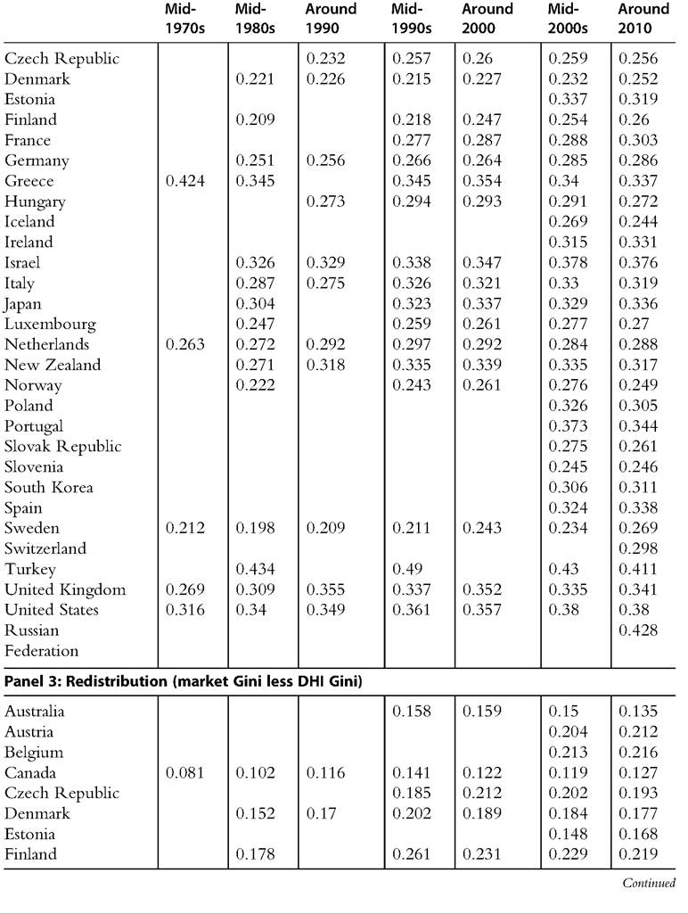
Table 8.5 Gini index for market income and post-tax/transfer income and the extent of redistribution—cont'd
Source: OECD Inequality Database, accessed October 23, 2013.
Note: For most OECD countries, “Around 2010” is for the year 2010, with some exceptions: for South Korea, data are for 2011; for Hungary, Ireland, Japan, New Zealand, Switzerland, and Turkey, data are for 2009; and for the Russian Federation, data are for 2008.
income measures taken from household surveys are typically less accurate because ofboth sampling and nonsampling errors.
The main objective of this section is to discuss the trends of the so-called top income shares as computed from administrative tax statistics. Different from Chapter 7, we focus here on the investigation of the four decades since 1970. Moreover, we mainly describe here the trends in top shares, leaving out a discussion of what may have driven such trends (see Part III of this volume). The methodological issues affecting the comparison of trends over time and across countries also define a substantial part of this section. Indeed, we start
Table 8.6 Comparing trends in equivalized DHI inequality for all ages and for the working-age population, by measure by country
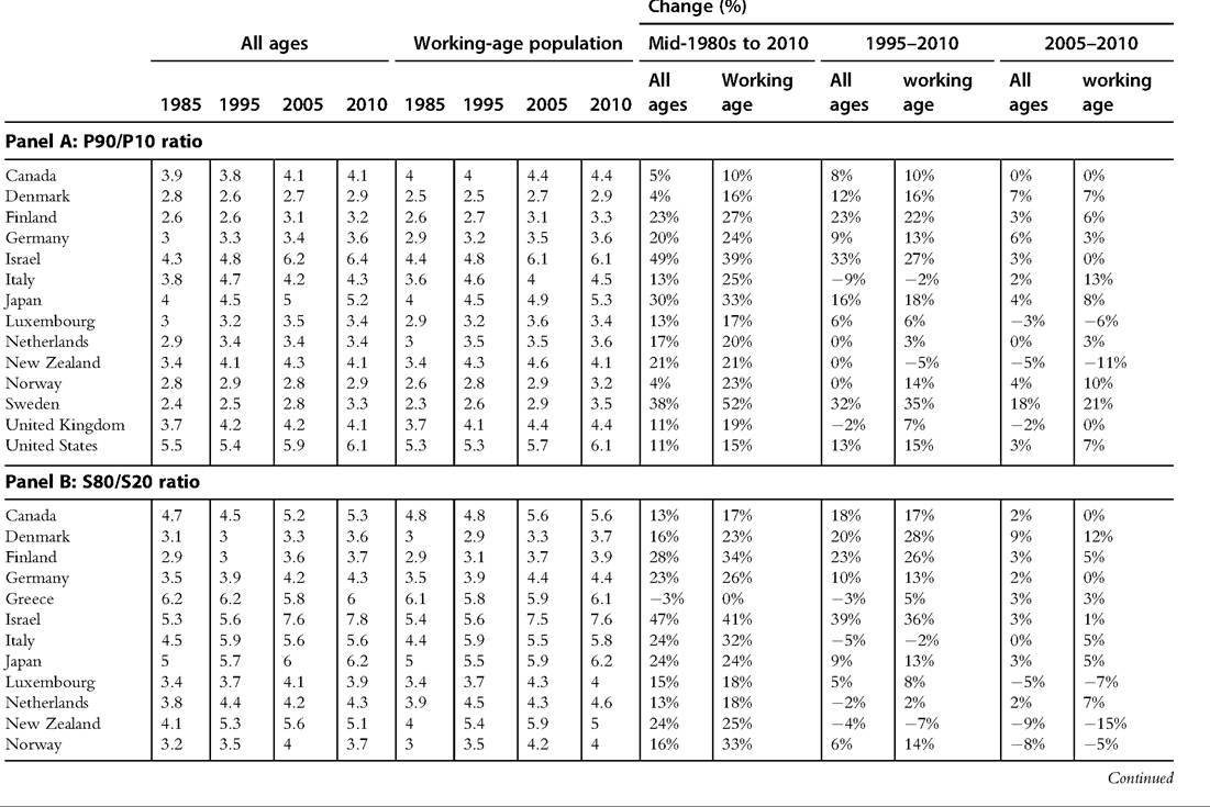
Table 8.6 Comparing trends in equivalized DHI inequality for all ages and for the working-age population, by measure by country—cont'd
Source: OECD Income Distribution Database, accessed November 8, 2013. Some data for some countries are from the following years: Finland, 1986, 2004; Greece, 1986, 1994; Italy, 1984, 2004; Japan, 2006, 2009; Luxembourg, 1986, 1996; New Zealand, 2003, 2009; Norway, 1986, 2004; Sweden, 1983, 2004; United Kingdom, 1994; United States, 1984.
here with an overview of the main features and limitations of the data with the objective of highlighting how the latter can affect the comparability of the top shares over time and across countries. Where possible, we illustrate how income at the top can be decomposed by different sources, highlighting the role of capital and wage incomes. Similarly, we provide a brief description of the impact of fiscal policy on the top income shares after taxes. Differences in tax systems can affect differently the level as well the trend of top shares across countries. Finally, we discuss how we can complement the two sources of information (tax and survey statistics) to improve our understanding of the evolution ofincome inequality.
The analysis in this section uses data on total income of the families, tax units, and individuals above the 99th percentile of the distribution. Therefore, unlike Chapter 7, this chapter does not focus on different income groups within the top decile. The data are collected and assembled from tax statistics, available from the World Top Incomes Database (WTID) by Alvaredo et al. (2012). The database is the result of years of work in a line of research initiated by FrankelandHerzfeld (1943)31 and Kuznets (1953), revived by Piketty (2001), and carried on in subsequent collective works directed by Atkinson and Piketty (2007, 2010), who pulled together a number of contributions from different authors.
Motivations for the surge of interest in incomes at the top of the distribution vary. On one hand, the WTID database constitutes a unique source of information covering most of the twentieth century (and in a few cases the beginning of the twenty-first century as well). As shown in great detail in Chapter 7, this is a crucial advantage for studies of income distribution, which are usually plagued by data limitations.
On the other hand, the analysis of top income shares helps to offer a better understanding of the post-1970 dynamics of income distribution and its determinants. First, the share of total income captured by a tiny minority of the population in many advanced countries has been increasing continuously since the 1980s, and this has fueled concerns about the social inclusiveness of economic growth. IntheUnitedStates, “the top 1 percent captured 58 percent of real economic growth per family” during the 1976—2007 period (Atkinson etal., 2011, p. 8). Findingssuchas theselikely motivated the managing director of the IMF, Christine Lagarde, to refer to inequality and the inclusiveness of growth as one of the three future challenges of the global economy that the IMF aims to address.[388] [389] [390] Second, understanding the dynamics of the share of total income of the upper-income brackets may be crucial to understanding changes in the overall income distribution. This has been shown empirically by Leigh (2007) and Smeeding and Thompson (2011) and discussed more formally by Atkinson (2007) and Alvaredo (2011). As in Chapter 7, we recognize here that the relationship between top shares and other income inequality measures may well be changing over time. In particular, we exploit disaggregated evidence for different decades to show that such a relationship has weakened since the 1990s. This differentiates our conclusions from those of Chapter 7, calling for extra prudence in using top shares as a proxy for the overall income distribution as obtained from household surveys. Furthermore, academic research has shown that the information contained within standard surveys hardly captures incomes above the 99th percentile so that top income shares can be potentially used to adjust available measures of overall inequality such as the Gini coefficient, discussed in the previous section. Third, top income shares have been particularly useful to studies of important issues in public economics, such as the elasticity of reported income to tax changes, the extent of income shifting and tax avoidance, and, more generally, behavioral responses to changes in taxation. Finally, the new empirical evidence on top shares gave the economic profession a new challenge: conventional explanations of rising income inequality since the end of Bretton Woods system, such as the skill-biased technological change and globalization forces, are no longer sufficient to explain the evolution of top income shares across different developed countries. 8.4.2.2 Data and Methodology As mentioned above, our analysis makes use of the WTID for 21 countries since 1970.34 In general, the series are constructed using tax statistics, and they make use of gross types of income (e.g., in the United States, the gross market income is defined before deductions, individual income taxes, payroll taxes, and all kinds of government transfers). Top income shares are mostly calculated from detailed, historically tabulated income tax statistics. Alternatively, tax administration microdata are also increasingly used, especially for the last decades of the twentieth century. Information contained within the tax statistics then is combined with control totals for population and income. Essentially, tax statistics provide the total income and the total number of tax units for given income ranges and allow us to compare these values with the totals in the economy.[391] [392] It is important to note that when using group tabulations data, the precise share of income accruing to a specific percentile within the top decile is obtained through interpolation techniques because the ranges of tax units within tabulations do not necessarily coincide with the percentage of the population for which we would like to assemble data. Interpolation is commonly applied using distributional assumptions about the top tail of income distribution (e.g., Pareto distribution) or, alternatively, by computing lower and upper bounds for every share (e.g., the actual share can be obtained using the mean-split histogram, as used by Atkinson, 2005). Broadly speaking, the choice between these two different interpolation techniques does not affect the substance of the results, and interpolation errors have been generally proven to be negligible. This is particularly true when the information within the grouped tabulations is detailed and of high quality.[393] While choice of interpolation technique does not seem to be crucial, other factors may substantially influence the accuracy of estimates of top income shares and the comparability of levels and trends across countries.[394] 8.4.2.2.1 Caveats and Limitations to the Data Although top shares are calculated with similar methodologies across countries, there are a number of caveats that are important to consider.[395] This section summarizes and extends the discussion of the methodology for the derivation of top shares data found in previous publications. Differences and changes in methodology may (or may not) affect the comparability of data across countries as well as over time, even within individual country-specific series. Understanding the relevance of these issues is the focus of the following subsections. Reliance on tax statistics raises a number of important questions and concerns about the construction of top income shares. First, the income definition is tailored to follow administrative requirements, implying that the definitions of income, income unit, and so on, do not necessarily coincide with the preferred definitions used for research pur- poses.[396] Administrative criteria may also differ across countries or change over time (e.g., changes to tax legislation such as income sources subjected to taxation, tax units), generating comparability issues. Calculating comparable top share series also requires consistency between the numerator (total top income) and the denominator (total income in the economy). However, the control total for income is calculated in different ways across countries and over time, in turn affecting the comparability of data. In addition, economic agents have incentives to change their behavior to minimize their tax liabilities and most probably understate their true income (e.g., tax avoidance, tax evasion, income shifting), and these incentives may vary with income and across tax systems. Finally, the series are largely concerned with gross income before taxes so that the effective change in income inequality after taxes is dependent on changes in the effective tax rate of top income brackets. This has certainly changed dramatically over time and might not have followed a similar pattern in all countries. This is an issue of crucial importance, although it is much less debated because of data limitations. This section addresses these issues separately. Despite these concerns, it is worth noting that the literature on top income shares also has highlighted the potential and the strength of these data, generally concluding that these problems can be attenuated. The country-specific series are usually obtained from the same sources over time, and we can easily identify breaks that may affect the measurement as well as indicate the direction and magnitude of the potential change. In addition, our focus on the post-1970 period allows us to have both better data and better documentation to deal with these issues to a satisfactory level. For an analysis on the very long run (since approximately 1750), we direct the reader to Chapter 7. 8.4.2.2.2 Definition of the Control Total for Income Every top share is a fraction between the incomes accruing to a specific top income group with respect to the total income in the economy. The two definitions of income have to be consistent, and there are different ways to come up with an estimate of the total pretax income in the economy. As detailed by Atkinson et al. (2011), and illustrated within the previous chapter as well, one possible approach is to subtract specific categories of income from the total personal income within the national accounts. This is done to come as close as possible to the income definition reported in the tax statistics (occasionally proportionally adjusted). This is the original approach pioneered by Frankel and Herzfeld (1943), then by Kuznets in 1953, and later adopted by Piketty in 2001 and used by most of the countries in the WTID.[397] The alternative approach is to inflate the total income that is reported in the tax statistics to correct the missing income of individuals who do not file a tax return (as done for the series for the United Kingdom, Finland, the Netherlands, Sweden after 1942, Switzerland after 1971, and the United States after 1944). Whereas the first approach makes use of external control of income from national accounts sources, the second approach deals with sources of income that are mainly internal to the tax statistics.[398] In a few cases where national accounts are not available (this is especially true for earlier years), total income is estimated from the full population households survey (this was done for China) or as a share of gross domestic product (this is the case for initial observations of Spanish and Portuguese top incomes). As should be expected, these methodological differences may affect the level of the series as well as the trend. In particular, the comparison of cross-country trends can be affected when different methodologies are systematically applied by different countries. For the case of the United Kingdom, Atkinson (2007) documents how the ratio between total income based on tax statistics and total income from national accounts[399] has declined over time, falling from 0.9 at the beginning of the century to 0.85 in the last years of the century. Assuming that the ratio decreased at a constant rate, we could obtain a rough estimate of the dynamics of the top income shares based on the control totals using national accounts. Despite the documented minor change, the impact on the trend of top shares can be seen over time. The gap between the top shares reported in the WTID (using control total estimated from the tax statistics) and the ones we estimate based on a different control total rises from 1 percentage point in 1970 to 2 percentage points in 2000. In the case of the United Kingdom, the two different approaches yield very similar trends over time, but the magnitude of the increase—whether the top 1% share rose 5 or 6 percentage points—is sensitive to the definition of control total. The differences could potentially influence comparisons of top income shares within and across countries at a point in time as well over time.[400] 8.4.2.2.3 Definition of Top Income As discussed above, the income definition follows the administrative requirements for tax statistics, which vary over time and across countries. In particular, the income definition used within the WTID attempts to be as close as possible to the definition of gross total market income (net of government transfers, taxes, and deductions). Changes in tax legislation may allow the inclusion or the exclusion of particular income sources within the reported income (e.g., capital gains, dividends, income deductions). In other words, these changes may bring about an expansion or a reduction of the tax base. We discuss below three specific types of changes and structural breaks in taxation regimes that can create severe problems for the consistency of top shares estimates over time. Nonetheless, we also point out that these changes do not always result in actual breaks (in levels or trends) for the top income shares series. The first type of change in taxation discussed here deals with the treatment of deductions within the tax statistics. Starting from 1976, the income of the U.K. series, for instance, is grossed to include deductions that were previously subtracted from income[401]: “(i) allowable interest payments such as those for house purchase, (ii) alimony and maintenance payments, (iii) retirement annuity premiums, and (iv) other allowable annual payments” (Atkinson and Salverda, 2005). Such a change did not, however, cause a substantial change in the top income share: “the share of the top 1% was shown as rising from 5.6 to 5.7%, and that of the top 10% from 25.8% to 26.2%” (Atkinson and Salverda, 2005). The second relevant type of taxation change concerns the treatment of capital income within the tax base. This problem is listed by Atkinson et al. (2011) as probably the “main shortcoming” of the WTID data, undermining the comparability of the top income series. Indeed, the estimation of top income shares is based on the observation of reported income for taxation purposes, and the restriction or the expansion of the tax base may be misleading representation of the real changes of total income held by top income groups. On one hand, many sources of income from capital (interest income, returns on pension funds, imputed rents, etc.) have disappeared from the income tax base over time because they have been either fully exempted from taxation or are taxed separately. As reported by Iwamoto et al. (1995) and Moriguchi and Saez (2008), a substantial share of capital income, for example, was missing from the Japanese self-assessed income tax starting from 1947 “because almost all interest income has been either tax exempted or taxed separately and withheld at source... and so was a large part of dividends since 1965.” However, as suggested by Moriguchi and Saez (2008), interests and dividends constitute only approximately 3% of total personal income in Japan, and even assuming that top groups absorb the whole income from these sources, the top 1% would still be far below the pre-1945 levels and below top 1% share in the United States. Similarly, the French tax base shrank with the exclusion of imputed rents of homeowners, as documented by Piketty (2001, 2003), who also provides some conservative estimates showing that the reduction of French top income shares was robust to the full imputation of tax- exempted capital income to reported income at the top. On the other hand, the tax base may be expanding, generating a problem similar to, but the reverse of, the one discussed above. This is, for instance, described by Burkhauser et al. (2013) for the case of Australia, where the tax reform proposed in 1985 (and formally approved by 1987) aimed at broadening the tax base “in order to improve equity and efficiency.” Most important, the tax reform included realized capital gains within the personal income tax base because “prior to 1985, Australia had no general tax on capital gains” and reduced substantially the marginal tax rates on dividends by introducing the so-called full-imputation system, which no longer allowed dividends to be subjected to both corporate and income taxation.[402] More specifically, both tax interventions (approved in 1987 and 1986, respectively), on the one hand, allowed the inclusion within the income tax base “most realized capital gains regardless of how long the asset was held. But to soften its effect, the reform applied only to assets purchased after September 19, 1985. Certain types of assets continued to be exempt, most importantly owner-occupied housing” (p. 8). On the other hand, the switch to a full-imputation system increases enormously, although artificially, the reported dividends income.[403] [404] However, Burkhauser et al. (2013) further note that whereas the change in the tax law on dividends may have had an impact on the level of the share, the change in capital gains taxation had instead an impact that “grows over time with the stock of assets purchased after September 19,1985 and the share of realized capital gains that enter the tax base” (p. 9). As reported by Burkhauser et al. (2013), these issues were not directly addressed by Atkinson and Leigh (2007) and led them to overstate the real increasing trend of Australian top shares.4 Finally, the third type of taxation change relates to the treatment of capital gains within the income definition. This can be more problematic because this source of income is particularly important for the very top income brackets—and is increasingly so because capital gains have been receiving advantageous tax treatment with respect to dividend-type income in most advanced countries. As distributed, corporate profits became less advantageous (dividends often are taxed at the income tax rate and subject to double taxation at the corporate level and individual level). Thus, including capital gains becomes fundamental “to assess the impact of retained profits of corporations on top individual incomes” (Atkinson etal., 2011). Moreover, because of favorable taxation, investors may be more willing to hold stocks with an underlying low payout ratio to cash in capital gains rather than dividends (e.g., the clientele effect). These considerations suggest that excluding capital gains can leave out a considerable (and increasing) amount of the income of richer tax units, making static and temporal comparison of effective top income shares across countries more problematic, assuming that the extent of the relevance of capital gains and their dynamics differ among countries. Figure 8.19 Top 1% share trends in the United States and Sweden, including capital gains (CGs). The graph shows that, despite the inclusion of CGs, the levels of the shares are substantially different across the two countries, whereas the trend over time becomes similar. Source: World Top Income Database, accessed August 2013. To illustrate the validity of the argument above, we describe below how the top income share changes once capital gains are taken into account. However, this exercise can be done only for six countries, namely Canada, Japan, Germany, Spain, Sweden, and the United States.[405] The role of capital gains for top income shares has been discussed by Roine and Waldenstromm (2012) for the case of Sweden, where, they argue, excluding capital gains “severely underestimates the actual increase in inequality and, in particular, top income shares during recent decades.” Indeed, Figure 8.19 shows that after including capital gains, the top income share in Sweden has a similar trend to the top 1% in the United States. Yet the difference in level remains substantial. Figure 8.20 depicts the dynamics of top 1% income shares including and excluding capital gains for those countries for which data exist, suggesting that the importance of capital gains may also vary a great deal across Figure 8.20 Cross-country variation in the impact of including capital gains income for top 1% share trends. The series of top 1% share excluding capital income are set equal to 100 in 1980. The series of top 1% shares including capital gains are calculated as follows: top1cg = 100*top1cg/ top1. Source: World Top Income Database, accessed September 2013. countries. In the case of Germany, including capital gains income has essentially no impact on the top 1% share of income. Capital gains seem to affect the cyclicality of top shares in Japan, creating spikes but not persistent changes in level or trend. In Sweden, Canada, and Spain, the inclusion of capital gains income did not have a marked impact on the top 1% share before 1980 or 1990, but the influence of capital gains has become increasingly large since the 1980s, influencing the perceived trend of the increase in top shares. For the United States, the inclusion of capital gains income has resulted in systematically higher top shares over the entire period. It is crucial to note that the relevant concept of capital gains discussed here is that concerning its “realized” component for tax purposes. Indeed, realized capital gains refers to the wedge between the selling and purchasing prices of the asset. Furthermore, realized losses are subtracted from realized gains to obtain the measure of net realized capital gains valid for taxation purposes. This is a concept very different from accrued capital gains, which simply reflects the current differential between the “market price” and the purchase price. Indeed, individuals may realize capital losses for taxation purposes so that a series including capital gains is not necessarily more valid, informative, or complete than a series excluding capital gains. Changes in tax systems can also affect the unit of reference (e.g., change in tax units); the extent of tax evasion and avoidance, including the phenomena of income shifting (e.g., substitute wages with tax-exempted noncash compensation); and anticipation or postponement of income returns. These issues are of crucial importance and are discussed later in separate sections. 8.4.2.2.4 Changes in Tax Avoidance and Tax Evasion This section discusses the roles of (unlawful) tax evasion, (lawful) tax avoidance, and other behavioral responses to changes in taxation. The use of tax data to estimate top income shares poses potentially serious problems resulting from underreporting, retiming of income reporting, and income shifting (depending on fiscal convenience). We discuss these important issues here to understand how they may affect the comparability of top shares series over time and across countries.[406] Work by Piketty et al. (2012) showed that most of the countries under investigation experienced a reduction in the top marginal tax rate, which was highly correlated with the surge in top income shares we observed in the three decades following the end of the BrettonWoodssystem (see Figure 8.21). The reduction in the top marginal tax rate could indeed reduce the propensity to evade and avoid taxation, increasing tax collection and Figure 8.21 Top marginal tax rates across countries, 1970-2010: southern and continental European countries (and Japan) (a) and English-speaking and Nordic European countries (b). The figure depicts the top income tax rates (including both central and local government individual income taxes) over the period from 1970 to 2010. Source: Piketty et al. (2012). therefore income reported at the top. Hence, the increase in inequality may be due to a reduction in tax avoidance because of lower tax rates for richer groups.[407] Indeed, Figure 8.21 shows how the top marginal tax rates changed over time for the sample of countries under investigation, highlighting a clear overall reduction in tax progressivity over time. However, several researchers have devoted substantial attention to this aspect and pointed out that differences in levels across countries and the upward trend in income inequality observed in many countries are substantially robust, real phenomena rather than spurious results merely driven by tax avoidance and tax evasion (Alvaredo, 2010; Alvaredo and Saez, 2009; Banerjee and Piketty, 2005; Leigh, 2009; Leigh and van der Eng, 2009; Moriguchi and Saez, 2008; Roine and Waldenstrom, 2008). First, as reported by Leigh (2009), the evidence suggests that income underreporting (the size of the tax gap) does not substantially vary across countries, whereas tax regimes vary dramatically. In addition, the extent of tax avoidance (and the scope for evasion) at the very top of the income distribution may not necessarily be higher than that for the rest of the distribution given the public visibility of their sources of income and the efficient enforcement efforts of tax authorities (Alvaredo, 2010; Alvaredo and Saez, 2009; Leigh and van der Eng, 2009). Second, despite the reduction in tax progressivity, one can argue that there is little evidence to suggest that the extent of tax avoidance among the richest households has changed substantially over time, at least for countries with relatively high tax compli- ance[408] (see Internal Revenue Service, 1996, 2006 for evidence on the United States; Roine and Waldenstrom, 2008[409] for Sweden). In addition, even if this was not the case, the extent of avoidance (and evasion) at the top should have decreased much more than that of the rest of the population to exert an overall positive influence on the top shares.[410] Third, the country-specific top wage shares often closely follow the evolution of the overall top income shares. These results are inconsistent with the assumption that the evolution of inequality is entirely captured by the time-varying tax avoidance and evasion. Indeed, the tax on wages and salaries—compared with farm income or business income—is usually withheld at the source so that it is almost impossible to escape the tax authorities’ purview (Alvaredo, 2010; Banerjee and Piketty, 2005; Moriguchi and Saez, 2008). Finally, Piketty et al. (2012) developed and tested a model linking the increase in top income shares to reduced tax progressivity, mainly through three motivations: increase in hours of work supplied (e.g., supply-side theory), increased rent-seeking activity (e.g., a top executive has control of salaries has more incentive to influence remuneration and seize a greater share of the firm profits), and decreased tax avoidance. However, the elasticity of reported income to change in tax rates due to tax avoidance is considered the least important factor. Indeed, Piketty et al. also point out that there are countries (such as Italy, Japan, Sweden, and the Netherlands) that experienced only modest increases in top shares despite significant top rate tax cuts of similar magnitude to those implemented in Norway, Finland, and all advanced English-speaking countries. In sum, there is little evidence to suggest that tax avoidance in relation to decreases in top marginal tax rates is a particularly relevant explanatory factor of the long-run surge in top income shares. Nonetheless, other types of changes in taxation regulations may well have a substantial impact on top shares. Below, we differentiate between those changes bringing about permanent shifts in income or temporary behavioral responses. Both theory and empirical evidence highlight how tax avoidance (especially income shifting over time or across the tax base) can be of great relevance for short-term changes in reported income to exploit tax opportunities (Saez et al., 2012 provide a comprehensive survey of this literature as well as interesting empirical findings). The classic example discussed within the top incomes literature is the Tax Reform Act (TRA) of 1986, which, among other things, dramatically decreased the top marginal tax rate on personal income, increased the capital gains tax rate, and, while lowering it, set the corporate income tax rate at a level higher than the top personal income tax rate. These policy changes provided strong incentive for agents to realize capital gains in the short term and to shift income from corporate to personal income (Gordon and Slemrod, 2000; Slemrod, 1996). It is worth noting that the shifting of business income from the corporate tax base to the individual tax base has brought about a permanent level shift for the top income shares in the United States (if excluding capital gains). Following these legal changes, the highest fractile share in total U.S. income (top 0.01%) increased by 30% from 1986 to 1987 (a year of a stock market crash) and by 53% from 1987 to 1988 (when a systemic banking crisis hit). However, as argued by Atkinson et al. (2011), the taxation policy change did not affect the series including capital gains[411] because “before TRA 1986, small corporations retained earnings and profits accrued to shareholders as capital gains eventually realized and reported on individual tax returns. Therefore, income including capital gains does not display a discontinuity around TRA 1986” (note to Figure 8.5). Similarly, the changes in taxation do not seem to have influenced the long-run trend of the shares. 54 There are also other less-discussed examples that may illustrate the full range of changes (and their complexity) in tax statistics and that we ought to take into account. For example, a substantial reduction of marginal tax rates on dividends was obtained in Australia in 1987 through the introduction of the full-imputation system (before the income from dividends was subjected to both corporate and income taxation).[412] Atkinson and Leigh (2007) note that “the effect of the introduction of imputation in Australia in 1987 is evident in the statistics.” Indeed, the taxation regime change was announced in 1985 and had a short-term impact on dividend distribution once the law was passed in 1987, consistent with optimal retiming of income reporting. Moreover, it is also possible that the substantial reduction of the marginal tax rate on dividends may have induced more firms to distribute a greater share of their profits (changing the level of the shares).[413] A switch to a full-imputation system in 1993 had a long-lasting impact on the composition of top income shares in Finland (as documented by Jantti et al., 2010).[414] A similar change was documented for New Zealand in 1989. However, in the same year, a tax cut to take place in 1990 was announced (the top individual rate would have been reduced to the company tax rate), causing companies to postpone their payment to top executives. Moreover, “similar anticipation of tax changes is likely to have caused the sharp spike in top income shares is observed in 1998-99, and may have caused the 2000 figure to be depressed,” as discussed by Atkinson and Leigh (20 05).[415] Similarly, in 2005 Norway announced a permanent increase in dividend tax (to be increased in 2006); this marked a notable peak in top income shares as individuals and corporations shifted income over time to avoid the impending rate increase (Aaberge and Atkinson, 2008).[416] 8.4.2.2.5 Definition of Tax Units Different country-specific series are based on different definitions of tax units. In some countries the unit of reference is the family (e.g., typically spouses with dependents or singles with no dependents). This is the case for the United States and most continental European countries. Other countries define their tax units based on individuals. This is the case, for example, for Australia, Canada, New Zealand, Japan, India, Italy, and Spain.[417] Most important, some countries have experienced a change in the tax base as the taxation system moved from a family to an individual base. Fortunately, however, only the United Kingdom experienced such a shift within the period under analysis (the shift occurred in 1990).[418] Such a change in tax units can create comparison problems for at least two reasons.[419] First, the level of top shares is affected and the direction and magnitude of such a change depends respectively on the joint distribution of income within families populating the top income brackets and on the actual proportional difference between the number of individuals and the number of tax units as well as on the specific assumption about the Pareto coefficient.[420] As discussed by Atkinson et al. (2011), if the income for the richest families is unequally distributed (e.g., the head of the family concentrates most of the family income), we expect, under specific assumptions, the shift from family to individual unit to have a positive impact on the measured top income share series. The impact on the shares becomes negative if income is equally distributed within the top tax units. In the United Kingdom, for instance, the tax units increased from 33,000 to 46,000 in 1990 because of the change from family units to individual units, and the top 1% series experienced an approximate positive jump of 1 percentage point as a result. Second, and most important, a change in the composition of tax units may also affect the trend of the series, not just its level. Indeed, this happens if the factors influencing the level of the shares discussed above also vary over time. This is not implausible; for example, income may have become more evenly distributed within the richest families and the growth rate of tax units could have well exceeded population growth over the past decades. Also, the change in the distribution of income at the top over time (formalized as the change of the Pareto coefficient) has been thoroughly documented and discussed by Atkinson et al. (2011). Nonetheless, the available country-specific evidence (for Canada) shows that the use of different unit bases may affect only the level of shares (see Saez and Veall, 2005). 8.4.2.2.6 Gross and Disposable Top Income Shares Gross income data can be complemented by information on government transfers and taxation to obtain measures of disparity in disposable incomes or spendable income, ultimately a preferable income definition for individuals. Indeed, the pretax top share can show a different picture than the post-tax share, depending on the degree of progressivity of the tax system and the extent of redistribution. As discussed earlier, tax systems in most of the countries discussed here have changed a great deal over time and have reduced their progressivity. These tax policy changes can influence both the perception of economic inequality and comparisons of inequality over time and across countries. Indeed, the incidence of taxation on net top income shares may vary across countries, affecting the extent of comparability of top shares trends across countries. Data on disposable top income share are available only for a handful of countries. In this section we describe the evidence for the Netherlands and the United Kingdom (Atkinson and Salverda, 2005), Canada (Veall, 2012), the United States, and France (Piketty and Saez, 2006). Although one should bear in mind that methodologies adopted by these authors are not homogenous and income definitions are not directly comparable, it is interesting to obtain a measure of the direct impact of taxation on top shares. Following the work by Atkinson and Salverda (2005), we divide the pretax income shares by the after-tax shares to measure the so-called relative implicit tax rate. We define the latter as the “arithmetic impact of taxation” on top shares, calculated as 1 — (pretax share)/(post-tax share), which in turn is equal to 1 — (1 — average tax rate at the top)/ (1 — average tax rate for the overall population). Figure 8.22 depicts the “implicit tax rate” for Canada, the Netherlands, the United States, and the United Kingdom,[421] Figure 8.22 Implicit tax rates for a selected group of countries. The graph shows the dynamics of the “relative implicit tax rate” from 1970 for the United States, United Kingdom, Canada, and New Zealand. The implicit tax rate represents the “arithmetic impact of taxation” on top shares, and it is calculated as [1 — (pretax share)/(post-tax share)], which in turn is equal to [1 — (1 — average tax rate at the top)/(1 — average tax rate for the overall population)]. Sources: Calculation of the authors based on data from country-specific literature for the United Kingdom and New Zealand (Atkinson and Salverda, 2005), Canada (Veall, 2012), and the United States and France (Piketty and Saez, 2006). showing that, with the exception of Canada, the tax system reduced its progressivity in these countries. For the United Kingdom, United States, and the Netherlands, the inversed implicit tax rate for the top 1% went from around 35% in 1970 to around 20% in 2000. However, the implicit tax rate in United States decreased more during the 1980s, reaching the value of 10% in 1990 before rebounding to around 20%. In Canada the pattern was nearly reversed. The Canadian implicit tax rate was, on average, lower than 20% during the 1980s; it then increased by 10 percentage points during the 1990s and finally declined gradually to a value of around 25%. This is why net top income share would show an attenuated increase in inequality in Canada, as shown in Figure 8.23. In the United States and the United Kingdom, however, pre- and posttax trends in the top 1% share are essentially indistinguishable. Figure 8.23 Pre- and post-tax top 1% shares for selected countries. The graphs show both the top 1% based on gross income (net of taxes and of transfers) as well as on net income. Sources: Elaboration of the authors based on data from country-specific literature for the United Kingdom and New Zealand (Atkinson and Salverda, 2005), Canada (Veall, 2012), and the United States and France (Piketty and Saez, 2006). 8.4.2.3Top Shares in the Late 2000s The WTID contains information for top income shares in 25 countries. In addition to all of the caveats described above, making comparisons across countries is limited to the years of data that are available. Nineteen of those countries, though, do have data during the “late 2000s” (2009, 2010, or 2011), and several more have at least some data for the period of the “mid-2000s” (2003-2008). Such data for the top 1% shares in the mid- 2000s andlate 2000s are represented in Figure 8.24. Comparisons of the level ofinequal- ity using these top share figures across countries may be problematic for all of the reasons discussed above. Differences in definitions of income and income reporting units, as well as tax treatment of different types of income and potential differences in tax reporting, avoidance, and evasion, can all influence differences in the levels of top income shares over time. These caveats notwithstanding, it is interesting to notice that the ranking of countries based on top income shares remains similar to what was observed using the inequality Figure 8.24 Top 1% shares in the late 2000s. Source: Data from the World Top Income Database (accessed September 2013). measures across in the entire distribution (based on data comparable across countries) in Section 8.4.1. Among rich countries, the English-speaking countries have higher measured inequality than the Nordic counties. In 2010 the top 1% share was nearly 18% in the United States and less than 7% in Sweden and Denmark. Among the MICs and developing countries under investigation within the chapter and for which we have data, South Africa has the highest levels of inequality. 8.4.2.4 Comparison of Trends Across Country Groups The primary goal of this section is to explore commonalities and differences in data trends across countries from 1970 to 2010. Previous sections emphasized how different sources, methods, and definitions of income tax may affect the estimated top shares across countries. However, we have showed that not all changes in methodology or breaks in data series create comparability problems. As noted by Gottschalk and Smeeding (2000), the time-varying and time-invariant factors specific to the shares need to be the same across countries to have meaningful cross-country comparisons. To ease the exploration of differences in trends, we ignore factors that are country-specific and time invariant, namely the differences in levels. More precisely, we standardize the values of the shares to be equal to 100 in 1980. Because of data availability, the standardization to 100 is done for the year 1990 for emerging countries. This takes care of measurement errors and heterogeneity of methodology of calculation of top shares across countries that are constant over time. We group the countries in our data set into the following clusters: Nordic European (Denmark, Finland, Norway, and Sweden); southern European (Italy, Portugal, and Spain); western English-speaking (Australia, Canada, Ireland, New Zealand, the United Kingdom, and the United States); and continental European countries (France, Germany, the Netherlands, and Switzerland) together with Japan. The remaining countries—China, India, and South Africa—are labeled as emerging or MICs. These clusters differ somewhat from the previous section discussing inequality across the entire distribution but are consistent with the groupings used by Atkinson et al. (2011). According to Atkinson et al. (2011), these groupings are “made not only on cultural or geographical proximity but also on proximity of the historical evolution of top income shares” (p. 40). The various panels in Figure 8.25 show that top income shares are growing in many countries; increasing inequality is not limited to a small number of countries or any obvious subset of countries. Indeed, a common pattern observed across most of the countries in the WTID shows declining top shares for one or two decades since 1970, followed by steadily rising top shares through 2010. The precise timing and extent of the “U turn” in top shares varies across countries, and we provide below a description of the main features of the dynamics of top shares over time across different country groups. All of the southern European countries have seen an increasing top 1% share since 1980, but the increase has been much sharper in Portugal, where the top share more than doubled between 1980 and 2010 compared with an increase of “only” 40% in Italy and approximately 15% in Spain (Figure 8.25a). Trends in the top shares of Continental European countries (Figure 8.25b) fluctuate more with business cycle patterns than the southern European countries. Nonetheless, the pattern of top shares series remains broadly consistent with a mild U shape; the top 1% share fell between 1970 and the early 1980s and remained more or less stable until the mid-1990s, when it mildly rebounded until the onset of the 2007—2008 financial crisis. In fact, most of the Continental European countries lack top share data over the past decade, making a complete analysis of this period impossible at present. France and Japan are the two countries in this group with data over the full period, and they both follow this pattern closely. Between the mid-1990s and mid-2000s, the top share increased approximately 30% in Japan and 15% in France. Between 2007 and 2010 top shares held steady in Japan but declined sharply in France. Top shares in the English-speaking countries also fluctuated with the business cycles but exhibit a clearer upward trend since the early or mid-1980s than the Continental European countries (Figure 8.25c). Moreover, with the exception of New Zealand, Figure 8.25 Top 1% share trends between 1970 and 2011 by country group: Southern Europe (1980 = 100) (a). Continental Europe and Japan (1980 = 100) (b), English-speaking countries (1980 = 100) Continued Figure 8.25, cont'd (c), Nordic countries (1980 = 100) (d), and developing countries (1990 = 100) Continued Figure 8.25, cont'd (e). In (a)-(d), 1980 was calculated as 100. In (e), 1990 was calculated as 100. Source: World Top Income Database, accessed September 2013. Elaboration by the authors. all English-speaking countries[422] experienced a similar trend since the end of the 1980s.[423] Between 1990 and the onset of the 2007 financial crisis, the top 1% share increased between 60% and 70% (in Australia, Canada, the United Kingdom, and the United States) and around 90% (in Ireland). Trends in the English-speaking countries show some evidence of the impact of the economic crisis, with top shares decreasing between 2007 and 2010-2011. In the Nordic countries, top shares were mostly flat during the 1980s and did not start increasing until 1990 or later (Figure 8.25d). This is particularly clear in the case of Norway, where the top 1% share was unchanged between 1980 and 1990 but doubled between 1990 and 2000. Increases after 1990 were smaller in the other Nordic countries, especially Denmark, where the top income share only rose 15% between the late 1980s and the late 1990s before sliding back down in the late 1990s and early 2000s. The post-1990 trend in rising top shares appears to have been halted or reversed by 2000 in Finland and by the mid-2000s in Norway, although in Sweden the increase in top shares continued. As discussed earlier, the unusually large spike Norway’s top 1% share in 2005 is attributable to dividends paid out in anticipation of tax policy changes in 2006. In developing countries in the WTID, the trends in top shares seem to resemble most closely those in the English-speaking countries. Top shares started increasing in the early 1980s in India and in the late 1980s in China and South Africa (Figure 8.25e). After the 1990s, these three developing countries appear to experience a long-term increasing trend in the top 1% share of income. Between 1980 and 2009-2011, top shares more than doubled in the United States and the United Kingdom and were on track to double in Australia and Ireland before falling sharply in the global economic downturn that hit most developed countries beginning in 2007/2008. The English-speaking countries stand out as experiencing the largest increases in top shares over the entire post-1980 period, and they account for three of the top five countries with the largest cumulative changes in top 1% share between 1980 and the average after 2000 (Figure 8.26a). However, much of the run-up in top shares in English-speaking countries occurred in the 1980s. Focusing on changes in top shares since 1990, a different set of countries stands out as having large increases. The four countries with the largest cumulative changes in the top 1% share since 1990 include two Nordic countries (Finland and Norway) and two developing countries (China and South Africa) (Figure 8.26b). After 1990, cumulative increases in top shares were roughly equal between English-speaking and developing countries. It is important to note that the results are invariant to the exclusion of the abnormal spike in the top income share that occurred in Norway largely as a result of the anticipated change in taxes on dividends.[424] The various graphs in Figure 8.25 track the decrease in top income shares in the decade or two after 1970, depending on the country, followed by increasing top shares starting around 1980 or 1990, again depending on the country. Whether these long-term Figure 8.26 Cumulative changes in top income shares by country and country group. (a) Average cumulated change from 1980 to after 2000. (b) Average cumulated change from 1990 to after 2000. Data are sorted by the average cumulative change in top 1% by country groups. In the case of Germany, we draw information from the top share including capital gains. The cumulated change is computed since 1990 for the developing countries. Because of a lack of information the period after 2000 is equivalent to 1995 for Switzerland and to 1999 for India and the Netherlands. Results obtained exclude Norway's top 1% peak in 2004 and 2005. Source: World Top Income Database, accessed September 2013. Elaboration by the authors. trends will persist into the future is an open question. Most of the countries in the WTID did witness decreasing top shares between 2007 and 2010, but many of the countries lack data during these years. Have long-term trends toward rising inequality been reversed by this period of financial turmoil and recession? Or, can they be expected to revert to their pre-2007 trends? Morelli (2014) uses the US top income shares data to answer this question by estimating impulse response functions of top shares to the occurrence of banking shocks. The main findings of this paper suggest that the short-term impact of systemic banking crises on the upper-income brackets of the income distribution is negative at the very top of the income distribution (e.g., above the 99th percentile) and positive at the bottom of the top decile (e.g., between the 90th and 99th percentiles). In other words, the relative response to systemic banking shocks differs across top income groups given their heterogeneous nature. However, and most importantly, systemic banking crises do not seem to substantially affect top income shares; their estimated dynamic responses are found to be relatively small in magnitude.[425] Moreover, the findings of the paper are also suggesting that the impact of crises may also be temporary in nature since top income shares may quickly return to their predicted path in the absence of a crisis. Consistent with what was informally documented and suggested by Atkinson et al. (2011), Saez (2013), and Piketty and Saez (2012), these results suggest that even major disruptive crises such as the financial turmoil in 2007/2008 do not represent a structural break for top shares series, and we should not expect a reversal of the increasing trend in income concentration unless some strong change in the political and institutional framework is expected (e.g., a change in taxation regime, remuneration practices, regulation policies). 8.4.2.5 Income Decomposition In the sections above we described the increasing trends of top income shares for most of the countries. What is driving these trends? To better understand the mechanisms that led to an increase in inequality in most of the countries under investigation, we can use composition data from income tax statistics. However, income decomposition by sources is available for only a few countries. Ideally, we would like to understand how both marginal distributions of each source of income as well as their joint distribution affect the dynamics of the right tail of the income distribution. This is discussed by Atkinson et al. (2011) and subsequently by Alvaredo et al. (2013) in the case of the United States for two sources of income, namely wage and capital. Their results suggest an increasing association between the two sources of income for individuals within top brackets. However, understanding this important issue (which requires the availability of microdata for every country and year) goes well beyond the scope of this chapter. A less rigorous approach is to simply decompose the top income into, say, two main sources (wage and capital income) to understand their incidence in total income accruing to the top. 68 Below we depict the share of capital income (including rental income from buildings, interest income, and dividends but excluding realized capital gains where possible) and employment income (wages, salaries, bonuses, allowances, and pensions) for those eight countries where these calculations are possible (Australia, Canada, France, Japan, Italy, the Netherlands, Spain, and the United States). On balance, wage income weighs substantially more within the total top income above the 99th percentile (top 1%). This holds true with the exception of Italy and Australia, where wage income has a relatively lower incidence on the total (Figure 8.26).[426] The picture is reversed if we look at richer top income brackets above the 99.99th percentile (top 0.01%). Here, the incidence of capital income is generally higher than earned income (the only exceptions are Canada and the United States).[427] Results are shown in Figure 8.27. The relative shares of different sources of income accruing to the top also have changed over time, and the experience has been heterogeneous across countries. In the case of top 1% shares, on balance, there is evidence ofa slight increase over time in the labor-type income share for the countries for which income composition data are available (Figure 8.27a). The main exceptions are Spain and Australia, which exhibited decreasing wage shares from the late 1990s until the mid-2000s.[428] InJapan and the United States, wage shares increased slightly before 1990, but they have remained roughly constant since. In other countries, including France and Italy, there is little evidence of any trend Figure 8.27 Laborand capital compositions of top incomes. (a) Income composition of the top 1% group. (b) Income composition of top 0.01% group. The graphs depict the incidence of different sources on total income accruing to the top 1%. In particular, the graphs show the share of capital income (including rental income, interest income, and dividends but excluding realized capital gains, where possible) and employment income (wages, salaries, bonuses, allowances, and pensions) for the eight countries where these calculations are possible (Australia, Canada, France, Japan, Italy, Netherlands, Spain, and the United States). Note that Australian and Spanish data include realized capital gains to the extent they are taxable. Moreover, Australian data can only be decomposed in wage and nonwage income (“capital” income includes realized capital gains as well as business income, self-employed income, profits from unincorporated businesses, and farm income). Source: World Top Income Database, accessed September 2013. Elaboration by the authors. in wage shares. The clearest cases with increasing wage shares are the Netherlands after 1990 and Canada after 1980. The evidence of an increase in top wages income is less clear cut for the top 0.01% shares (Figure 8.27b). Wage income visibly increased over time for Italy, Canada, and the United States (until around 2000, after which there was a marked reversal). The wage income share was relatively stable in Australia and France. It is nonetheless important to bear in mind that definitions of income sources are not necessarily comparable across countries and that different tax systems within different countries may incentivize the reporting of a specific income source with greater fiscal convenience (see section 8.4.2.2.4 concerned with fiscal avoidance). It is therefore not always clear how one should interpret the documented percentage incidence of wage and capital incomes within top brackets. The results discussed within this section do not take these important issues into account. 8.4.2.6 Bridging the Gap Between Tax Statistics and Survey Data: Gini Versus Top Share In the second section of this chapter we explored the dynamics of overall income inequality using a variety of summary statistics, including Gini coefficients, decile ratios, and others. These variables are usually constructed from household surveys. Some countries are, however, increasingly resorting to register data (such as the Scandinavian countries) or to a combination of both survey and register data (such as the United Kingdom and France since 2008) in an attempt to overcome standard household survey limitations. Indeed, household surveys are not typically stratified by income, and, in part, as a result suffer limitations that are particularly pernicious for top income groups (measurement errors, nonresponse, or incomplete response); these surveys often adopt a topcoding methodology that by construction limits the information on the right tail of the income distribution.[429] [430] These limitations frequently make it impossible to get robust quantitative evidence about the incomes of individuals at the very top of the distribution.73 On the other hand, top income shares are constructed from tax administrative microdata or grouped tabulations and are particularly suitable to estimate the right tail of the income distribution. Nonetheless, they provide less compelling information about the bottom of the distribution. Do these two different sources provide substitutable or complementary information? In other words, are top income shares to be combined with survey data to have a more complete picture of economic inequality within a country? Or, do top shares embed sufficient information to proxy the distribution of income as a whole? In what follows we discuss these important questions individually. 8.4.2.7 Are Top Income Shares Complementary to Household Survey Data? Work by Burkhauser et al. (2012a) compared the evolution of the top income shares in the United States calculated in survey data (Current Population Survey (CPS) data from internal sources) with that provided by Piketty and Saez (2006) using administrative tax data (from the Internal Revenue Service).[431] Burkhauser et al. (2012a) suggest that CPS-based top shares track closely with the tax-based top shares up to the 99th percentile. Importantly, the comparison takes into account the same unit of reference (tax units) and a definition of income similar to that adopted in Piketty and Saez (2006). However, the U.S. top 1%, as estimated by Burkhauser et al. (2012a), does not track the top 1% obtained by Piketty and Saez (2006) with the same precision. This is even more evident once capital gains are included within the income definition,[432] as noted by Atkinson et al. (2011). Indeed, as shown before, capital gains are an important component of income at the top and could influence substantially both the level and the trend of income inequality. In addition, including capital gains arguably provides a more economically meaningful measure of income dispersion.[433] Atkinson et al. (2011) also provide a tentative adjustment of official CPS Gini coefficients, taking into consideration the differentials in top 1% shares between survey-based and tax-based estimates (including capital gains). The result suggests that the official CPS data on Gini (household equalized gross income) fail to capture about half of the increase in overall inequality in the United States as measured by the adjusted Gini index. These findings seem to indicate that taxation data are able to capture additional information that is not recorded within statistical surveys. Yet it is also important to stress here that the extent to which estimates based on survey data can be adjusted using tax statistics is not yet fully understood or investigated. Moreover, the required “adjustments” may well be different across countries. Such adjustments are increasingly implemented within the literature. Atkinson (2007) provides the intuitive formal approximate relationship between the top share and the Gini coefficient, G = (1 — S)G* + S, where G represents the overall Gini coefficient, S is the top share, and G* is the Gini coefficient for the rest of the population excluding the top individuals. However, the above-mentioned derivation requires the assumption that the top income group refers to an infinitesimal share of the population (say top 1%, top 0.1%, or top 0.01%). Alvaredo (2011) subsequently obtains the more general derivation valid for noninfinitesimal top groups as well: G = (1 — S)(1 — P)G* + S — P + G**PS, where P is the population share of the top group under investigation and G** is the Gini relative to the distribution of income within the top group (G** can be further simplified to 1/(2 — α), assuming that the right tail is Pareto distributed with coefficient α). Under the presumption that the observed Gini coefficient (obtained from standard survey data) is a better representation of inequality within the bottom group (G*), we can use the above results to obtain estimates of the adjusted Gini for the whole population (G). This could be considered to be the first approximate attempt to correct the overall measure of inequality using the available additional information about the top income share (for instance, this was illustrated for the case of Argentina by Alvaredo, 2011). From the discussion above one can already expect the actual value of the adjusted measure of Gini to depend on the choice of top shares to be used. Assuming that the top percentile is excluded from the national household survey, we can illustrate the adjustment of the official Gini coefficient of gross equalized household income (including cash transfers) from the CPS data in the case of the United States. Using Atkinson’s (2007) original formula illustrated above and the top 1% share from the WTID, including capital gains, the adjustment is worth 5 percentage points in 1970 and more than 10 percentage points in 2006 (Figure 8.28). The adjustment is approximately 1 percentage point lower if we use the top 1% excluding capital gains. Furthermore, using Alvaredo’s (2011) more general formula, the adjustment is further reduced by one additional percentage point. Such adjustments, however, depend on the strong assumption (not necessarily true) about the exact share of national income thought to be excluded from the household survey statistics. Such an assumption has to be carefully assessed before carrying out any corrections to the shares. Indeed, one could obtain adjusted Gini measures in a slightly more sophisticated way by estimating the top shares using both the survey and the Figure 8.28 Adjusting the U.S. Gini coefficient using the top income shares. The baseline Gini coefficient represents the headline series of the U.S. Current Population Survey (CPS) based on household equivalized gross income. Top income shares estimated by Piketty and Saez (2003), Saez (2013), and Burkhauser et al. (2009) then are used to calculate adjusted measures of Gini coefficient. We carried out four different adjustments. Adjustment 1 assumes that the top 1% (including capital gains) is not captured at all within the household survey statistics, and we use the formula described by Atkinson (2007) to derive the “true” Gini coefficient: G = (1 — S)G*+S, where G represents the overall Gini coefficient, and S is the top share, and G* is the Gini coefficient for the rest of the population excluding the top individuals. Adjustment 2a uses the same formula above but the top 1% excluding capital gains. Adjustment 2b makes use of the more general specification highlighted by Alvaredo (2011): G=(1 — S)(1 — P)G*+S — P + G**PS, where P is the population share of the top group under investigation and G** is the Gini relative to the distribution of income within the top group (G** can be further simplified to 1/(2 — a), assuming that the right tail is Pareto distributed with coefficient a). Finally, adjustment 3 assumes that the top 1% share is partially captured within the national survey. The difference D represents the estimates of top shares using taxation statistics (and including capital gains) from those using survey data;the following correction is then used to apply the following adjustment: G = (1 — D)G* +D. Sources: Burkhauser et al. (2012), Atkinson et al. (2011), and calculations of the authors. taxation administrative data, adopting a homogeneous methodology (e.g., unit of analysis, income definition, control totals). The formulas mentioned above will then serve to adjust the available Gini from the survey data using the difference D of the estimates of top shares using different sources: G = (1 — D)G* + D. A similar adjustment was carried out in the case of the United States (discussed above) and illustrated by Atkinson et al. (2011).[434] [435] This adjustment, using top income shares including capital gains, is represented in Figure 8.28 and represents a substantially smaller adjustment to the Gini coefficient than the ones discussed above (an approximate change of 1.5 percentage points in 1970 and 5 points in 2006 with respect to the actual baseline Gini coefficient based on gross income). This suggests that more than half of the increase in inequality from 1970 to 2006 is not captured by the inequality measure (based on household surveys), which excludes a sizeable part of the top 1% share of national income, as estimated with taxation data.7 Finally, one could go beyond the first approximation adjustments we discussed above by matching the individual information within surveys using administrative data with full coverage of the population. Not much research has been carried out yet at this stage, and this remains an important open issue that will attract the attention of economists and statisticians in the coming years. To conclude, top income shares tend to be underestimated within household surveys (especially above the 99th percentile), and we have shown that taxation data can, in some cases, provide additional and complementary information that could not be otherwise recorded. Given the relentless increase in top income shares in many advanced and developing countries, it is possible that the official indicators of income inequality might substantially and increasingly underestimate the extent of the change in the actual dispersion of income distribution. However, data on reported income for taxation purposes are not without caveats, as we extensively discussed in this chapter, and caution is prudent when applying any kind of approximate correction to a Gini coefficient that is heavily dependent on arbitrary choices. 8.4.2.8 Changes in Top Income Shares as Proxies for the Overall Income Distribution We discussed above how top income shares, as measured using tax statistics, may not be fully represented within household survey data. However, changes in top shares may still be informative about the dynamics of the income distribution as a whole, especially if much of the action is at the top, as suggested by the burgeoning literature on top incomes. The analysis of data in this chapter highlighted how different measures of inequality generally result in similar impressions of how inequality has changed and which countries have the most unequal distributions of income, whether based on the entire distribution or only on top-income households. For instance, it is true that countries with larger top 1% shares also tend to have higher Gini coefficients, S80/S20 ratios, and P90/P10 ratios, although the correlation coefficient is substantially less than 1. The top 1% share (using pretax income of tax units) and the Gini coefficient (using DHI) have a correlation coefficient of 0.65; using the S80/S20 ratio the correlation is also 0.65, and using the P90/P10 ratio, it is 0.72.[436] Consistent with this evidence, an important study by Leigh (2007) found that the correlation between top shares and Gini coefficients[437] is not only strong in the cross section but also after controlling for country fixed effects and common time effects. This suggests that within-country changes of top income shares and Gini coefficients also are strongly correlated. Given the importance of the work by Leigh (2007), and similar to what was done in Chapter 7, we extend here his analysis by making use of updated data on both top income shares and Gini coefficients made available since Leigh has published his work.[438] However, we further extend the work in several respects. First, we used two additional series of Gini coefficients. Specifically, we use the Gini series (related to equivalized DHI) assembled by Atkinson and Morelli (2012, 2014) within the Chartbook of Economic Inequality,[439] and we make use of series of Gini coefficients of gross/market income,[440] which is more directly comparable with the series of top income shares. Although Leigh’s analysis stretches back to the early years of twentieth century, we focus here on the post- 1970 period only. Second, and most important, we acknowledge here that Leigh’s (2007) original specification treats top income shares as the dependent variable. To the extent that we need to analyze the informative content of top shares for the overall income distribution measures, this is not necessarily the preferred approach.[441] Thus we reverse the order of the regression variables by regressing the log of Gini on the log of top shares to obtain more direct information about the elasticity of the Gini coefficient as it relates to changes in top share. This is shown in Table 8.7, where the elasticity of Gini to changes in top Table 8.7 Assessing the elasticity of Gini coefficients to changes in top 1% shares Note: A significance level of 1% is indicated by *. shares is estimated to be in the range of 10—40%, with strong statistical significance if we consider the whole post-1970 period. As a third step, we also estimate the elasticity of Gini coefficients to changes in the top 1% across three different subperiods: 1970-1985, 1986-2000, and 2001-2012. This allows us to study the evolution of the elasticity of the Gini to change in the top 1% over time.8 The findings show that the relationship between changes in top shares and changes in the Gini coefficient tends to disappear during the latest period (Table 8.8). This seems consistent with the facts observed within previous sections, where top shares show no sign of having “peaked,” whereas Gini coefficients have increased at a slower pace in many countries since the 1980s or the 1990s. One reason, as discussed before, may be that household income surveys poorly measure the top share.85 86 [442] [443] [444] Table 8.8 Assessing the elasticity of Gini coefficients to changes in top 1% shares over time Note: A significance level of 1% is indicated by *. Regressing Iog(Gini) on log(top1) using fixed effects regression with robust SEs. Finally, we also replicate[445] here the original specification (regressing log of top shares on the log of Gini) by Leigh (2007). Results are represented in Table 8.9, where the original results by Leigh (panel A) are compared with those making use of more up-to-date data (panel B) as well as with the results based on two different series of Gini coefficients (panel C). It is worth noting that the use of up-to-date and adjusted inequality series, together with the restriction to the post-1970 period, does not seem to affect the validity of Leigh’s (2007) findings (panel B). Similarly, the use of the two additional series of Gini coefficients (panel C) substantially confirms the Leigh’s findings.[446] The latter result is relevant because Gini coefficients based on pretax and pretransfer income are more appropriate data series to compare with top income shares (based on gross income).[447] To summarize, the relationship between changes in the top shares and Gini coefficients documented by Leigh (2007) remains strong and robust to the controls for updated information, restricted period sample, and different Gini indicators, including that based on pretax and pretransfer income. Hence, changes in top income shares remain, on average, a good proxy for overall income distribution despite the misrepresentation of top income brackets within the statistical survey data documented above. However, there is evidence suggesting that the relationship between Gini and top shares became weaker during the first decade of the twenty-first century, suggesting that household surveys may not entirely capture the dynamics of income at the top. This suggests that greater Table 8.9 Assessing the association between the top 1% and Gini coefficients, replicating the findings by Leigh (2007) Note: A significance level of 1% is indicated by *. aAll observations available from 1886 to 2004—regressing log (top 1%) on log (Gini). bData from 1970 to 2011—regressing log (top 1%) on log (Gini). prudence is called for when extrapolating the validity of any results based on the analysis of top income shares directly to the overall income distribution.9 8.5.