LONG-RUN TRENDS IN INCOME INEQUALITY
In his 1953 book Shares of Upper Income Groups in Income and Savings, Simon Kuznets produced the first comparable long-run income distribution series.[226] His main innovation consisted in using U.S.
income tax statistics over the period 1913-1948 and relating the incomes of those who paid taxes (the high-income earners) to an estimate of all personal income.[227] In his words:The basic procedure is to compare the number and income of persons represented on federal income tax returns with the total population and its income receipts.[...] Since, except for a few recent years, tax returns cover only a small fraction of the total population—the fraction at the highest income levels—our estimates of income shares are only for a small upper sector. From the same source we can, with certain limitations, carry through the comparison for various types of income.
Kuznets (1953, p. xxix)
The series for the United States, together with observations from England and Germany,[228] showing a secular decline of top income shares at least since the 1920s, formed the empirical basis of the famous “Kuznets curve” theory.[229]
Kuznets' series were not systematically updated, even if tax data and aggregate income sources of course continued to be available and developed.[230] In recent years, however, there has been what one may call a rediscovery of Kuznets' methodology and with it a significant increase in our knowledge about long-run changes in the distribution of income. Beginning with the influential work on long-run inequality in France by Thomas Piketty (Piketty, 2001a, 2001b, 2003) a number of researchers have created income inequality series using the same methodology for many countries (to date 26), and work is ongoing in many more.[231] For most countries the data spans the full length of the twentieth century, sometimes even longer.
As Thomas Piketty phrases it in the introduction to the first of two volumes (Atkinson and Piketty, 2007, 2010) that collectsmuch of this work: “In a sense, all what we are doing in this project is to extend and generalize what Kuznets did in the early 1950s—except that we now have 50 more years of data and over 20 countries instead of one.”
This—the long time span covered—is the most obvious advantage of the new data coming out of this project. For most countries the series start in the early 1900s and in some cases even further back. But there are other important aspects as well. First, data are typically high frequency (yearly), which has proven to be important for the interpretation of some historical developments, in particular the dramatic short-run shocks to top incomes in connection to the World Wars and the Great Depression. Second, the data offer a great deal of cross-country comparability as they are based on the same type of primary source across countries, income tax statistics, and there is typically no top coding of these data. Third, and perhaps most important, the data allow for a decomposition according to the source of income (i.e., earnings, capital income), which has proven to be of crucial importance for understanding long-run developments of inequality and, in particular, the interplay between income and wealth.
Naturally, there are important limitations with using these data as well. First of all, data are limited to the development of top income shares and do not reflect what happens in the rest of the distribution. (However, as we shall see in Section 7.2.3, it turns out that top income shares are highly correlated with more general distribution measures such as the Gini coefficient). Second, focus lies on pretax and transfer income. Third, the unit of analysis, as well as the income concept, is determined by the tax code, which differs both across countries and in some cases also over time within individual countries and means that we cannot make any adjustments for household size.
It should be noted, however, that considerable effort has gone into adjusting for these changes to make country series at least consistent across time (but leaving some of the cross-country comparability problems unaddressed). Fourth, given the concerns in most countries with tax avoidance and tax evasion, tax statistics are potentially problematic as a source of information on incomes.7.2.1 Methods and Data in the Top Income Literature
To answer the basic question, “What share of total income is received by some fraction of the population?” one needs to specify three things. First, we need to know what total income is, how it is defined, and how large it is. Second, we need to decide what population we are talking about (all individuals, all adults, all households, etc.). Third, we need information about the incomes of the subset of the population whose income share we want to relate to the total. The innovation of Kuznets (1953)—which was developed in Piketty (2001a) and has been the methodology used in the top-income literature—was to relate the assessed incomes of the taxpaying population to all household sector incomes. Because historically only those with the highest incomes were taxed and thus obliged to hand in personal tax returns, their incomes must be related to reference totals not only for everyone in the taxed population but also for the population as a whole. In other words, the reference total population and income need to also include individuals who did not file a tax return as well as their incomes. To construct these we must use aggregate sources such as population statistics (which is ample), census data (which do exist), and national accounts (which are scarce for historical eras). Top income shares can then be computed by dividing the number of tax units in the top, and their incomes, with the reference tax population and reference total income. Assuming that top incomes are approximately Pareto distributed, standard inter- and extrapolation techniques can be used to calculate the income shares for various top fractiles, such as the top 10% (P90-100) or the top 0.01% (P99.99-100).
In the following section, we will briefly outline the main issues associated with going from basic data to calculating homogenous income shares. This includes thinking about the nature of tax data and the typical adjustments made, the construction of a population total, the construction of an income total, the interpolation techniques used and the relation to shares-within-shares estimates, and finally some other issues such as part-year incomes. For a more detailed discussion on the methodology, see Atkinson (2007).
7.2.1.1 Tax Statistics and the Definition of Income
With the introduction of progressive income tax systems in many countries during the late nineteenth and early twentieth centuries came tabulations published by tax authorities over all income tax returns. These tabulations, often published annually, typically group incomes in different income brackets and, for each bracket, report the number of individuals (or, more generally, tax units) and the total income assessed. Table 7.1 exemplifies the type of information that is typically available in these tables with the case of Sweden in 1951.
As with most other income data sources, the tabulated income statistics does not correspond to any theoretically comprehensive definition of income but a definition determined by tax legislation.[232] And even more important, what is included in this tax income concept has often changed over time, and it varies across countries. To make estimates as comparable as possible, which has been a primary objective in each country study in the top income literature, one therefore needs to fix a definition for the income concept and then make adjustments to the tax data. The concept of income that has been used in almost all country studies of top incomes is some version of total gross income, defined as the sum of income from all sources, before taxes and transfers, but net of allowable deductions (mainly interest payments). Total gross income thus consists of factor income (labor earnings and capital income) plus occupational pensions, which equals market income, and in addition taxable transfer income (public pensions and some social
Table 7.1 Example of grouped income data from tax statistics: Sweden, 1951
| Income class (tSEK) | Tax units | Income (tSEK) | Average income (tSEK) | Cumulative tax units | Cumulative tax units (%) | Cumulative income (tSEK) | Cumulative income (%) |
| 0-0.6 | 154,414 | 43,002 | 0.3 | 3,969,635 | 100.00 | 23,274,169 | 100.00 |
| 0.6-1.0 | 222,940 | 111,491 | 0.5 | 3,815,221 | 96.11 | 23,231,167 | 99.82 |
| 1.0-1.5 | 235,230 | 261,731 | 1.1 | 3,592,281 | 90.49 | 23,119,676 | 99.34 |
| 1.5-2.0 | 239,850 | 392,751 | 1.6 | 3,357,051 | 84.57 | 22,857,945 | 98.21 |
| 2.0-2.5 | 225,110 | 503,851 | 2.2 | 3,117,201 | 78.53 | 22,465,194 | 96.52 |
| 2.5-3.0 | 193,550 | 552,984 | 2.9 | 2,892,091 | 72.86 | 21,961,343 | 94.36 |
| 3.0-3.5 | 189,590 | 591,231 | 3.1 | 2,698,541 | 67.98 | 21,408,359 | 91.98 |
| 3.5-4.0 | 177,800 | 682,637 | 3.8 | 2,508,951 | 63.20 | 20,817,128 | 89.44 |
| 4.0-4.5 | 180,030 | 761,374 | 4.2 | 2,331,151 | 58.72 | 20,134,491 | 86.51 |
| 4.5-5.0 | 182,160 | 917,150 | 5.0 | 2,151,121 | 54.19 | 19,373,117 | 83.24 |
| 5-6 | 373,140 | 2,144,387 | 5.7 | 1,968,961 | 49.60 | 18,455,967 | 79.30 |
| 6-7 | 385,710 | 2,633,731 | 6.8 | 1,595,821 | 40.20 | 16,311,580 | 70.08 |
| 7-8 | 345,720 | 2,753,591 | 8.0 | 1,210,111 | 30.48 | 13,677,849 | 58.77 |
| 8-10 | 437,440 | 4,096,471 | 9.4 | 864,391 | 21.78 | 10,924,258 | 46.94 |
| 10-12 | 177,860 | 1,927,328 | 10.8 | 426,951 | 10.76 | 6,827,787 | 29.34 |
| 12-15 | 112,370 | 1,507,572 | 13.4 | 249,091 | 6.27 | 4,900,459 | 21.06 |
| 15-20 | 72,140 | 1,216,108 | 16.9 | 136,721 | 3.44 | 3,392,887 | 14.58 |
| 43,010 | 1,005,136 | 23.4 | 64,581 | 1.63 | 2,176,779 | 9.35 | |
| 30-50 | 14,958 | 621,526 | 41.6 | 21,571 | 0.54 | 1,171,643 | 5.03 |
| 50-100 | 5319 | 341,690 | 64.2 | 6613 | 0.17 | 550,117 | 2.36 |
| 100 Sum | 1294 3,969,365 | 208,427 23,274,169 | 161.1 5.9 | 1294 | 0.03 | 208,427 | 0.90 |
“tSEK” denotes thousand Swedish kronors, current prices.
Source: Statistics Sweden (1956, table 7).benefits). Social Security contributions paid by employers and employees are generally excluded, as they are not part of the tax base.[233]
Even if the total gross income concept may seem like a clear enough definition, there are several broad categories of income that may cause problems of comparability both over time and across countries. One example is the tax treatment of transfers (often work-related such as sickness pay, unemployment insurance, and pensions) that are sometimes included in the tax base, for example, in the Nordic countries in recent decades. The reason to include them is that they are not viewed as “pure” transfers but rather part of a collective insurance scheme where you need to work in the first place to get the transfer.[234] Taxable transfers have typically become more important over time but are also very different in size across countries. Roine and Waldenstrom (2008) calculated top shares both including and excluding such transfers for Sweden. Their conclusion is that for most of the twentieth century the difference is small, but in recent years the increase in top income shares is notably larger for market income than for total income (including taxable transfers). In the year when the effect is the largest, the difference is almost 1 percentage point (about 15% of the income share), but it does not change the main trends though (and considering the importance of these systems in the Swedish context, this is likely to be an upper bound of the effect).
Another area is the inclusion (or exclusion) of capital income and, in particular, realized capital gains. Many countries have moved in the direction of excluding parts of capital income in their tax bases, and to the extent that such incomes accrue to top income groups, this would mean that top shares are underestimated over time. Although the income from interest-bearing bank deposits and corporate dividends are easily observed and included in most countries’ taxable income concept, other capital incomes, such as the imputed rent of homeownership and realized capital gains, are more difficult to observe.
Imputing income from owner-occupied housing requires information about housing stocks at the household level and has not been generally available over time. However, had it been possible to estimate homeownership rents, we believe that would have reinforced the equalization we observe over the twentieth century, possibly with a more ambiguous effect in the earlier period.[235] As for the impact of capital gains on long- run trends, this issue is discussed further in Section 7.2.2.3.In many countries the historical income tax statistics also include information about the different sources of income, such as wage earnings, capital income, and business income, across the income distribution. In these tables, income earners are typically ranked according to total gross income, and then the amount of income from each source is listed within each gross income class. Table 7.2 displays an example of this kind of evidence for Sweden in 1951. Note that as in the case of total gross income, the reported incomes by source may not necessarily follow the theoretically most appropriate concepts but instead reflect definitions in the tax code. This is fairly clear in the Swedish 1951 example. The table consists of three, and perhaps even four, income sources reflecting capital income: interests and dividends (which are called “income from capital” in the tax data), (imputed) property income, realized capital gains, and the part of farm income adhering to imputed income from agricultural property. Also, what we would theoretically think of as labor income is not only contained in what is called “labor income” but also in business (or entrepreneurial) income as well as the part of farm income reflecting labor.
7.2.1.2 Reference Total for the Population
As tax statistics are based on the “tax unit” concept, the natural reference population is the total tax unit population of the country, had everyone filed a tax return. In countries like Australia, Canada, Italy, and Spain, taxes are filed individually, and the natural reference group is then the adult population defined as all residents above some age cutoff. In countries like France, Germany, and the United States, taxes are instead filed per family, which is typically defined as a married couple or a single adult (or an adult child living at home but with own income). In these cases the reference population becomes something like the adult population minus all married women (who file jointly with their husbands), with “adult” again defined as individuals above a certain age. In some countries, such as Finland, Sweden, and the United Kingdom, the definition of the tax unit has changed over time. In the Finnish case, for example, the family was the tax unit before 1935 when separate taxation of married couples was introduced. This was changed back again 1943, and the family was the tax unit again until the reintroduction of individual taxation in 1976. In Sweden the family was the tax unit before 1967 when a choice of filing individually was introduced. This was then the rule until individual taxation finally became compulsory in 1971. In the United Kingdom the family was the tax unit before 1991 when the system switched to being individual.[236] In all these cases the population total has to change accordingly. Sometimes there are overlapping periods or legislation that allows family or individual taxation. In these cases judgment has to be used to choose
Table 7.2 Example of income by source: Sweden, 1951
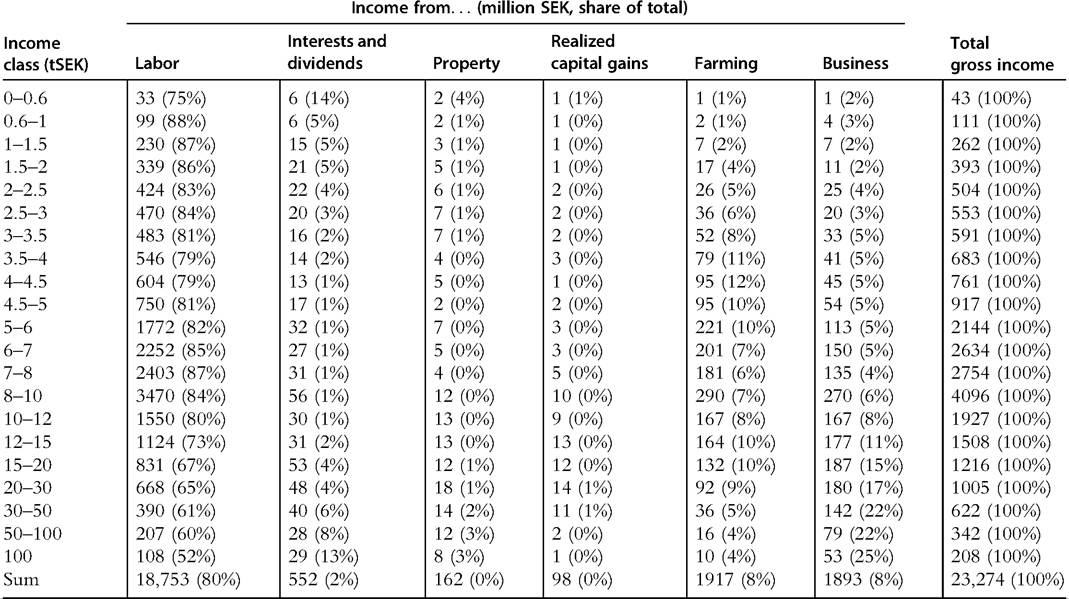
“tSEK” denotes thousand Swedish kronors, current prices. Source: Statistics Sweden (1956, table 7).
the appropriate reference total. Table 7.3 gives an overview of the key features of the top income data used in all the 26 countries covered in our analysis, including the definition of tax units.
The main question based on these differences in tax unit concepts is, of course: “How important is this administrative setup and variation over time and across countries for the analysis of long run inequality trends?” Does it, for example, matter if we consider the population above 15 as adults or if we set the threshold to 20? Atkinson (2007) answered these questions under reasonable assumptions. The maximum difference between using an age cutoff at 15 instead of 20 (typically the alternative spans are smaller) results in a 6% (not percentage point) difference. If the top 1 percentile share were 10% with an age cutoff at 20, it would thus be 10.6% with a cutoff at 15. With respect to the effect of the tax unit being the individual or the family (or household), the maximum bounds are a little wider. Contrasting the extreme cases where top couples consist of individuals where either both earn the same, or one spouse has zero income, a top 1% share of 10% can be reduced to 8.3%, or increased to 11.8% when moving from joint to individual taxation. In cases where it has been possible to calculate top shares for individuals and couples, the difference is typically smaller. In general, Leigh (2005) showed that unless husbands and wives have equal income, individual-based data tend to (but must not) give rise to a more unequal income distribution than does the household-based data. Overall, the impact of changing tax units and age cutoffs are not likely to be important for the long-run trends we discuss below.
7.2.1.3 Reference Total for Income
When calculating the reference totals for income, there are basically two ways in which to proceed. Either one can start from the sum of all incomes reported on personal tax returns and then add items that are not included in the legal tax base as well as estimated incomes of individuals not filing taxes (not including children). Or one may start from the National Accounts item “Total Personal Sector Income” and from this broad concept deduct (estimates of) all items not included in the preferred definition of income. To the extent that data allow it, a calculation from both directions is of course desirable, as that would give an indication of the size of the potential difference between the respective procedures. In practice, these calculations may be difficult due to lack of data especially concerning early periods. In such cases the reference income total has typically been set to a share of GDP based on calibrations in periods when data are available (see Table 7.3 for an overview).
The following relation between the different parts (taken from Atkinson, 2007; Atkinson et al., 2011) is a useful illustration of the two procedures (starting either from the top and deducting items or from the bottom adding items),
Table 7.3 Key features in top income data
| Main source | Coverage | Tax unit, age cutoff | Income concept | Reference income basis | Capital gains included? | |||||||
| Australia | Atkinson and Leigh (2007a) | 1921-2002 (82y) | Ind. 15 + | GI | Nat. Acc. | Yes, where taxable | ||||||
| Argentina | Alvaredo (2010) | 1932-1973 (39y) | Ind. 20 + | GI | Nat. Acc. | No | ||||||
| Canada | Saez and Veall (2005) | 1920-2000 (81y) | Ind. 20 + | GI | Nat. Acc. | No (but reported after 1971) | ||||||
| China | Piketty and Qian (2009) | 1986-2003 (18y) | Ind./Fam. | GI (incl. transfers) | Survey | No | ||||||
| Colombia | Alvaredo and Velez (2013) | 1993-2010 (18y) | Ind. 20 + | GI | Tax stat. | Yes | ||||||
| Denmark | Atkinson and S0gaard (2013) | 1870-2010 (97y) | Fam. 18+-1969; Ind. 15+ 1970- | GI, AI. | Tax stat. | Yes | ||||||
| Finland | Jantti et al. (2010) | 1920-2004 (85y) | Ind. 16 + | Gross/AI. | Tax stat. | No | ||||||
| France | Piketty (2001a, 2003) | 1900-2006 (92y) | Fam. | GI | Nat. Acc. | No | ||||||
| Germany | Dell (2007, 2008) | 1891-1918 (57y) | Fam. 21 + | GI | Nat. Acc. | Yes, where taxable | ||||||
| India | Banerjee and Piketty (2009) | 1922-1988 (71y) | Ind. | GI | Nat. Acc. | No | ||||||
| Indonesia | Leigh and van der Eng (2009) | 1920-1939, 1982-2004 (34y) | Households | NI (excl. farm inc.) | Nat. Acc.-1939; Survey 1982- | No | ||||||
| Ireland | Nolan (2007) | 1922-2000 (68y) | Fam. 18 + | NI | Nat. Acc. | No | ||||||
| Italy | Alvaredo and Pisano (2010) | 1974-2004 (29y) | Ind. 20 + | GI excl. interest inc. | Nat. Acc. | No (but reported after 1981) | ||||||
| JaPan | Moriguchi and Saez (2008) | 1886-2005 (119y) | Ind. 20 + | GI | Nat. Acc. | No | ||||||
| Mauritius | Atkinson (2011) | 1933-2008 (74y) | Fam. 15 + | GI (with adjustments) | Nat. Acc. | No | ||||||
| Netherlands | Salverda and Atkinson (2007), Atkinson and Salverda (2005) | 1914-1999 (55y) | Fam. 15 + | GI | Survey | No | ||||||
| New Zealand | Atkinson and Leigh (2007b) | 1921-2002 (79y) | Fam. -1952; Ind. 1953-; 15 + | AI. -1940; GI 1945- | Nat. Acc. | Yes, where taxable | ||||||
| Norway | Aaberge and Atkinson (2010) | 1875-2006 (67y) | Ind. 16 + | GI | Nat. Acc. | Yes | ||||||
| Portugal | Alvaredo (2010) | 1936-2005 (64y) | Fam. 20 + | GI | Nat. Acc. | No | ||||||
| Singapore | Atkinson (2010) | 1947-2005 (57y) | Ind. 15 + | GI | Nat. Acc. | No | ||||||
| Spain | Alvaredo and Saez (2009) | 1933-2005 (49y) | Ind. 20 + | GI | Nat. Acc. | No (but reported after 1981) | ||||||
| South Africa | Alvaredo and Atkinson (2011) | 1913-2007 (71y) | Fam. 15 + -1989; Ind. 15+ 1990- | GI | Nat. Acc. | No (until 2002) | ||||||
| Sweden | Roine and Waldenstrom (2008) | 1903-2006 (75y) | Fam. -1950; Ind. 1951-; 16 + | GI | Nat. Acc.-1950; Tax stat. 1951- | Series with and without | ||||||
| Switzerland | Dell et al. (2007) | 1933-1995/96 (31y) | Fam. 20 + | GI | Nat. Acc. | No | ||||||
| United Kingdom | Atkinson (2005, 2007a) | 1908-2005 (95y) | Fam. -1989; Ind. 1990-; aged 15 + | GI | Nat. Acc.-1943; Tax stat. 1944- | Yes, where taxable | ||||||
| United States | Piketty and Saez (2003) | 1913-2007 (96y) | Fam. 20 + | GI | Nat. Acc.-1943; Tax stat. 1944- | No | ||||||
Notes: See also Atkinson and Piketty (2007, 2010), Leigh (2009), Atkinson et al. (2011), and the World Top Income Database for information about the country statistics. Specifically, for several countries there are other studies that have contributedto the series. In column “Coverage,” “y” denotes number ofyear observations. Tax units “Ind.” and “Fam.” stand for individual and family, respectively. “GI” denotes total income from all sources (labor, capital, business) gross of all deductions, whereas “NI” denotes income net ofdeductions. All incomes are before taxes and (most) transfers. “Nat.Acc.” denotes that the reference income total is based on NationalAccounts data, typically some share of GDP or the sum of different aggregate income components, whereas “Tax stat.” denotes that the reference total is derived from the sum of tax-assessed incomes plus some additional items (e.g., nonassessed income, imputed income from home ownership).
Total “Personal sector total income”
— Nonhousehold income (nonprofit institutions such as charities)
= Household sector total income
— Items not included in the tax base (such as employers’ Social Security contributions, and nontaxable transfer payments)
= Household gross income reported to tax authorities
— Taxable income not declared by filers
— Taxable income of those who do not file tax returns
= Declared taxable income of filers
Using different reference totals can potentially have an important impact on the income shares. In their analysis of a number of alternatives for computing reference totals, some based on different National Accounts aggregates, some being fixed shares of GDP, and others departing from tax assessments adding estimated incomes of nonfilers, Roine and Waldenstrom (2010, Appendix C) show that there are indeed single years or episodes when differences are notable. Overall, however, the main trends in the results are robust to which alternative is chosen.
7.2.1.4 Interpolation Techniques and the Interpretation of the Pareto Coefficient The historical income tax statistics typically come in the form of grouped observations, where income earners in different income brackets are separated by even income thresholds (see Table 7.2). The estimated top income shares, by contrast, present the share of total income earned by specific top fractions in the income distribution, such as the top 10,5,1, and 0.1 percentiles. These even fractions do almost never correspond to the even income thresholds observed in tax data. To get these top shares we therefore need to use interpolation and in some cases even extrapolation when shares of the highest top groups are estimated within the highest, open-ended income interval (see Table 7.2).
The most common interpolation procedure in the top income literature has been to assume that incomes in the top are Pareto distributed. This goes back to Pareto (1897), who was the first to make systematic observations of the size distribution of income. Given the nature of data, his observations were confined to the upper tail, and even though he initially thought that the Pareto function was a correct description of the whole distribution (with a bound at a “physiological minimum” > 0), he eventually recognized that the distribution function over the whole population was probably humpshaped and not Pareto distributed.[237]
The Pareto law says that incomes within the top of the distribution can be characterized by a power function of the form

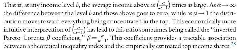
where y denotes income and k and α are constants. The parameter α in (7.1) is called “Pareto’s alpha” or the “Pareto-Lorentz coefficient,” and it reflects the degree of inequality, or the steepness of the income distribution; the higher α the lower the inequality. To see this, we can express the average income yamong people earning above a certain “base” income b as a function of the α as
The assumption of a Pareto distributed upper income tail has been confirmed by several studies using individual microdata for years when such data are available.[238] [239] But again, the results coming out of the top income literature do not hinge on this assumption. Several studies of top income shares have instead of Pareto interpolation estimated top shares using slightly different techniques, primarily mean-split histograms (see table 4 in Atkinson et al., 2011, for details).
7.2.1.5 Tax Avoidance and Tax Evasion
Problems with tax avoidance and evasion are present in all studies of income inequality based on data from personal tax returns.[240] Importantly, though, overall underreporting does not necessarily change income shares. If incomes are missing in equal proportion across the distribution and are also missing from the reference total, the shares are unaffected. If, however, income is missing in equal proportions in tax statistics but not from the reference total (as could be the case if we combine tax statistics and National Accounts statistics) then we will underestimate top shares (and overestimate the share of the rest of the population) because we simply allocate the income not observed for the top earners as
being received by the rest of the population. If avoidance is more important in the top, then we will of course also underestimate their share, whereas the impact of underreporting being more prevalent in the rest of the population typically creates a bias in the opposite direction, but it also depends on the construction of the reference total.
The main potential problem for assessing the trends, however, is the extent to which avoidance and evasion is very different across countries or changes in a systematic way over time. It could, for example, be argued that the increased tax rates seen over the twentieth century have given taxpayers increased incentives to avoid taxation. But this would be ignoring that the same increase in tax rates have given tax authorities increased incentives to collect taxes. Broadly speaking, high tax countries are also better at enforce- ment.31 In the recent top income literature virtually all studies include sections on the issue of tax avoidance and evasion. Unsurprisingly, these all point to avoidance and evasion in various forms being present in all countries but the overall picture that emerges is that it is very unlikely that this would have a significant impact on the overall trend (see Atkinson et al., 2011, for details). To illustrate, Italystands out as a country where evasion is much larger than other OECD countries but Alvaredo and Pisano (2010) still concluded that this does not change the main development of inequality. Dell et al. (2007) looked at the impact of assuming that all foreign income in Switzerland goes to French taxpayers and concluded that this would have a marginal effect on French top income shares. Similarly, Roine and Waldenstrom (2008) estimated the impact of capital flight from Sweden and concluded that even if the absolute numbers are sizable, and the impact on top income shares is nontrivial, the effect does not alter the general conclusions. Under the extreme assumption of attributing all unexplained residual capital flows out of Sweden since the 1980s to the top 1% income group, this increases their share by about 25%. This is significant, but it barely changes Sweden’s rank or trajectory in relation to other countries.
The areas where avoidance and evasion responses are most likely to have a significant impact are on short-run fluctuations and when it comes to distinguishing the source of income. When ranking the importance of different behavioral responses to taxation Slemrod (1992,1996) placed timing of economic transactions at the top as most responsive to tax incentives. Examples of this are clearly visible in the form of spikes in certain years, in particular when including realized capital gains (e.g., in connection to the tax reform act in the United States in 1986, in connection to changes in capital gains taxes in Sweden in 1991 and 1994, the year before the increased tax on dividends in Norway in 2006). As the second most important response to taxation Slemrod identified financial and accounting responses. This could take the form of income shifting between being corporate or personal, but also shifting the reported source of income. There are, for example, clear incentives for individuals to shift earnings to take the form of capital income in dual tax systems
31
Overall, there is evidence that taxation is a key component of administrative capacity of government (Besley and Persson, 2009, 2013). See also Friedman et al. (2000).
where capital taxes are lower than wage taxes. Such income shifting does not lead to aggregate effects but may be of importance when interpreting shifts across income sources.
The issue of avoidance and evasion is clearly potentially important and should not be dismissed. Still, it is striking that not even in evaluating cases that we have reason to believe are among the more extreme do we see effects that dramatically change the overall trends. Also, as noted by Atkinson et al. (2011), the fact that some incomes (typically from capital) are tax exempt probably has a more important impact on inequality than underreporting.
7.2.1.5 OtherIssues
In addition to the preceding, there are many other details in the historical income distribution data that call for attention and possibly correction. For example, in any given year individuals move into and out of the relevant tax unit population, some become “adults” due to age reasons, some die, some move into the country, others move out, some get married, others divorce. This mobility affects the relevant population, and it also creates “partyear incomes” that show up as low incomes in the data. Another potential difficulty is that tax years may not correspond to calendar years. Beside the problem of how to label observations, this may create problems if reference data are collected for calendar years (as is often the case). Fortunately these problems turn out not to be very large in quantitative terms.[241]
7.2.1.6 So Can We Trust the Top Income Data?
How should one deal with the challenges mentioned earlier that are associated with using historical income tax statistics? In past research scholars have suggested different approaches, including calculating theoretical bounds of the size of potential errors and employment of alternative sources that offer external checks of the order of magnitude by which an estimate could be wrong. In the end, however, one must make a number of judgment calls to select a final preferred series, and such calls can of course always be questioned. Having said that, considerable effort has gone into the construction of the series for each individual country with the explicit aim to make the series as homogenous as possible. We actually think that a hallmark of this research has been to take data quality issues very seriously and wherever possible produce estimates under different assumptions to be transparent about the effects of each individual choice made. In most cases where there are alternative ways to proceed, all alternatives have been explored and to the extent that this affects the results this is reported. The end result, we believe, is a data set with robust conclusions about the development of top income shares over time.
7.2.2 The Evidence and What We Learn
We identify three main themes in the empirical results. These themes form the basis for the three subsections that follow. The first addresses the overall evolution of income inequality as reflected in top income shares of the 26 countries covered here. The second theme is about the results showing a considerable heterogeneity among groups within the income top, especially differences in the top percentile and those in the lower part of the top decile. The third theme considers the role of decomposing total incomes by source, that is, assessing whether the recorded trends are, for example, driven by changes in the earnings distribution or whether they are based on shifts in the returns to personal wealth.
7.2.2.1 Common Trends or Separate Experiences?
Figure 7.1 illustrates the top 1% income share over the period 1870—2010 for all observations we have to date. Clearly this kind of illustration is not meant to be readable in the sense that the development of individual countries is discernible; rather it illustrates the extent to which there are truly common trends globally.[242]
The overall picture that emerges is one where the top 1% income share hovers around a relatively high level up until the First World War (in the few countries for which data exist), and then declines steadily over the twentieth century up until around 1980. After 1980 there seems to be a more scattered pattern. In some countries, in particular the United States and the United Kingdom, and in Anglo-Saxon countries more generally, top shares have increased significantly, whereas developments in other places, in particular in some Continental European countries, are close to flat after 1980.
In the literature on top income shares, much emphasis has been put on the diverging pattern between Anglo-Saxon countries and continental Europe.[243] As a result of the recent additions of new evidence from other countries, however, it is motivated to go beyond this dichotomy and incorporate the experiences of countries in other parts of the world.[244] We extend the division and examine inequality trends across six different country groups:
• Anglo-Saxon countries (Australia, Canada, Ireland, New Zealand, United Kingdom, and the United States)
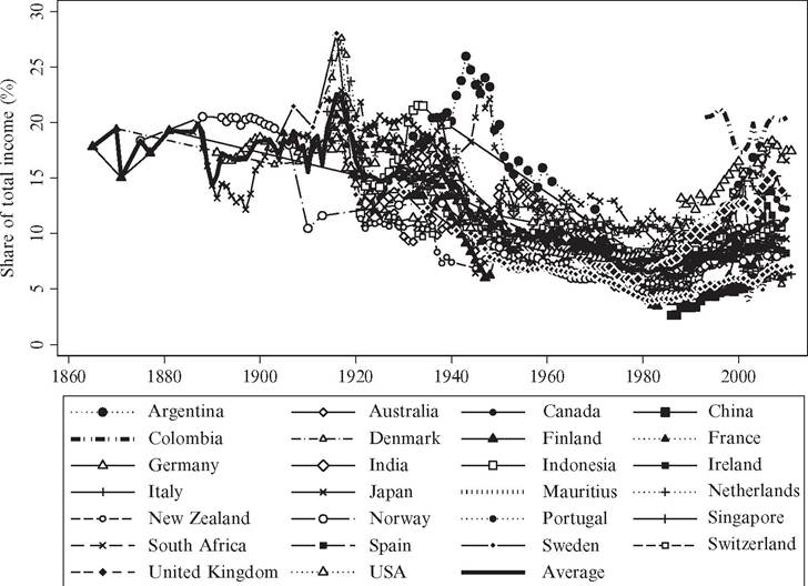
Figure 7.1 Top 1% income share in 26 countries, 1870-2010. Source: See main text for description of the series and the World Top Income Database for sources.
• Continental European countries (France, Germany, Italy, the Netherlands, Portugal, Spain, and Switzerland)
• Nordic countries (Denmark, Finland, Norway, and Sweden)
• Asian countries (China, India, Indonesia, Japan, and Singapore)
• African countries (Mauritius and South Africa)
• Latin American countries (Argentina and Colombia)
Figure 7.2 presents the long-run evolution of top income percentile shares in these six country groups.[245] Looking at the overall long-run development, there are clear similarities across the groups. They all exhibit a sharp decline in the top shares over the twentieth century, beginning around the time of the First World War and further reinforced by dramatic drops around the Second World War. Wartime shocks thus appear to have
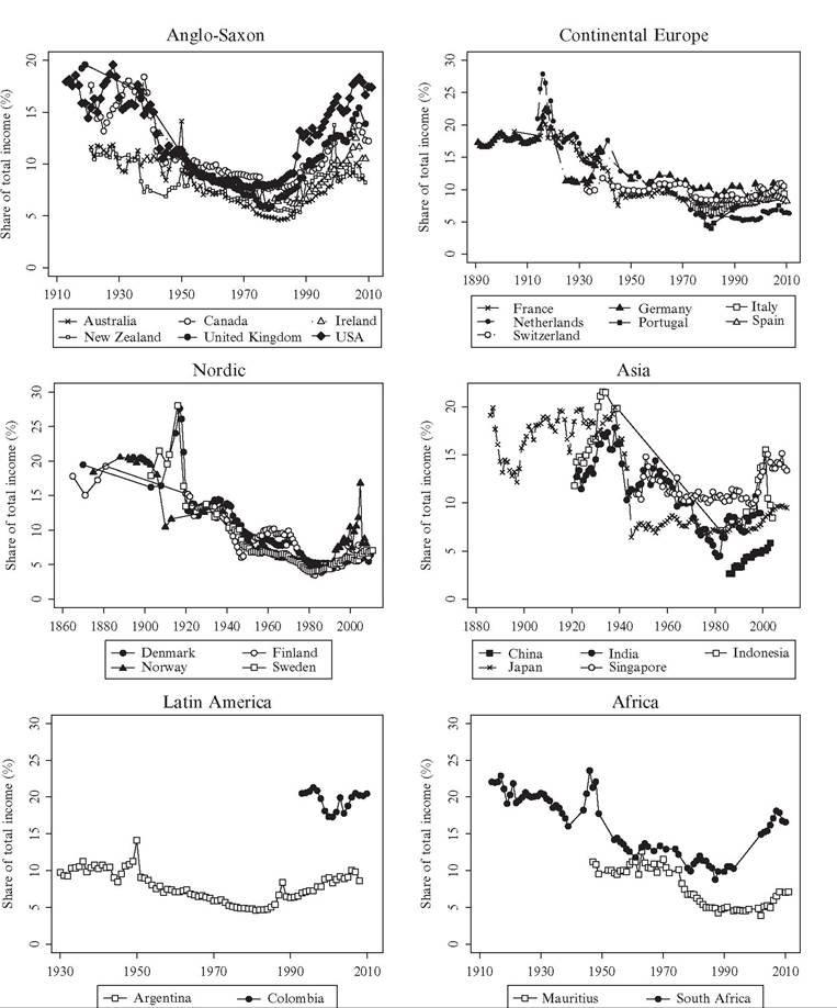
Figure 7.2 Top 1% across country groups. Source: See Figure 7.1.
had a large impact on top income shares. Everyone was probably affected by the wartime trade disruptions and new regulations of most goods and labor markets, but when it comes to specific surtaxes on wealth and high incomes or even the bombings of factories and similar capital destroying events, these were probably more important for the incomes of the rich. Havingsaidthis, the period 1914—1945 was also associated with periodic booms and asset price bubbles set off by a combination of highly expansionary fiscal policies and the economies being relatively closed. In both Denmark and Sweden, top income shares actually spiked in the midst of the First World War, and this is generally regarded as a consequence of the boom and asset price bubbles (Atkinson and S0gaard, 2013; Roine and Waldenstrom, 2008).
The twentieth century equalization trend in the top income shares continued up until the 1980s when it either flattened out in some countries or was reversed into increasing top income shares. That these common trends over the past century are in fact statistically significantly joint across countries has been shown recently by Roine and Waldenstrom (2011) in an analysis of common and country-specific trends and structural breaks in top income shares.
Notwithstanding the similarities, the evidence also indicates variation across countries within the geographical groupings reported earlier. For example, the upward trend in top income shares began in the late 1970s in the United States, Canada, and the United Kingdom, but started about 5-10 years later in Australia, New Zealand, and Ireland (though Ireland had a short-term peak around 1980). Within Continental Europe, most countries have not experienced stark increases in the top percentile share except for Portugal where it more than doubled between 1980 and 2000. The Asian data are not sufficiently complete to allow for conclusions about country differences: Japan and India appear to follow roughly similar patterns over time, with stable inequality levels before and after the dramatic shift in the 1940s when not only war but also profound institutional change hit these two countries. Since 1980 all the five Asian countries have exhibited an increasing top share. In Latin America and Africa, variation is small but so is the sample, and we cannot draw any conclusions from these results until we increase the number of observations.
Altogether, this analysis shows that with respect to the development of inequality, almost all countries display a secular decline in top income shares over the twentieth century up until around 1980. This decline is substantial: top percentile shares drop from around 20% of total personal income at the beginning of the 1900s to between 5% and 10% around 1980. In many countries much of this decline is concentrated around the World Wars and the Great Depression. Around 1980 the decline in top shares stopped, and in most countries they started to increase. This increase is substantial in Western English-speaking countries (Australia, Canada, New Zealand, the United Kingdom, and the United States) as well as in China and India. It is more modest but still clear in both some Nordic countries (Sweden, Finland, and Norway, but less clear in Denmark) and some Southern European countries (Italy and Portugal, but less clear in Spain), whereas finally, the development in some Continental European countries (France, Germany, the Netherlands, and Switzerland) and in Japan is close to flat.
7.2.2.2 The Importance of Developments Within the Top Decile
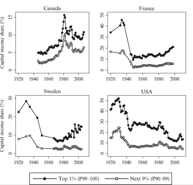
In income inequality research, top income earners are often defined as everyone in the top decile (P90—100) of the income distribution. However, recent studies following Piketty (2001a) have shown that the top decile is very heterogeneous.[246] For example, the income share of the bottom nine percentiles of the top decile (P90-99) has been remarkably stable over the past century in contrast to the share of the top percentile (P99—100), which fluctuated considerably. Moreover, although relatively high wage earners dominate in the lower group of the top decile, capital incomes are relatively more important to the top percentile. Figure 7.3 shows the development of the P90—99 income share over the period 1870—2010. Whereas the top percent income share fell by roughly a factor between 2 and 4 in the period until 1980 and has thereafter increased by a factor 2 in some countries, the long-run share of the P90—99 group has on average been relatively stable around 20-25% over the whole period.
An alternative way of studying income concentration is to express it in terms of the income share of certain top groups within the income share of another, larger, top group.
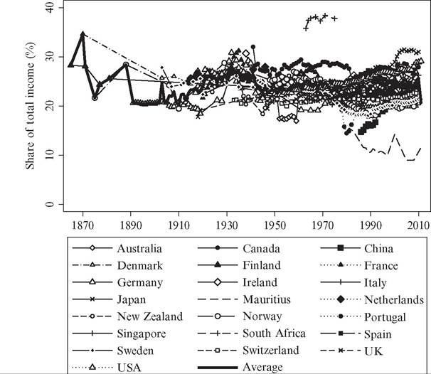
Figure 7.3 Trends in “next 9” percentiles in the top decile (P90-99), 26 countries. Source: See Figure 7.1.
37
There are at least two merits with this approach. First, it measures the inequality within the top of the distribution, which is different from inequality overall especially when considering theories that predict a widening gap among the rich. Second, the top income shares may contain measurement error through the estimated reference total income held by the full population. By dividing the top income percentile by the top income decile (i.e., P99—100/P90—100), we get a “shares-within-shares” ratio that eliminates the reference total.[247]
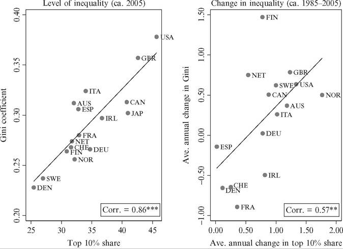
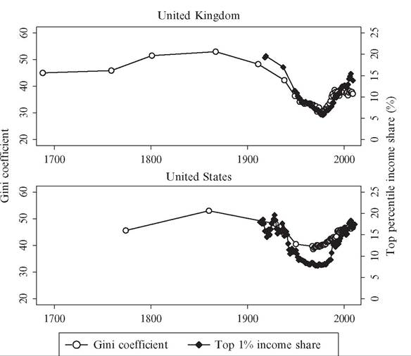
Figure 7.4 shows the trend in the shares-within-shares ratio where we divide the top income percentile by the top income decile. It largely resembles the evolution seen in Figure 7.1, with a stable and relatively high level up to the 1910s and then a declining trend up until about 1980, after which an increase can be observed in some countries. This indicates both a degree of robustness of the overall trends in top income shares shown earlier and that concentration within the top has also changed over time.
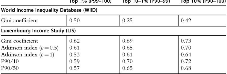
Taken together, the evidence suggests that there are substantial differences in the long-run development between different groups in the top income decile. In fact, most
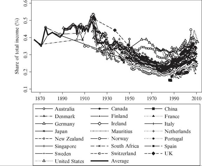
Figure 7.4 Shares-within-shares in top incomes (P99-100/P90-100). Source: See Figure 7.1.
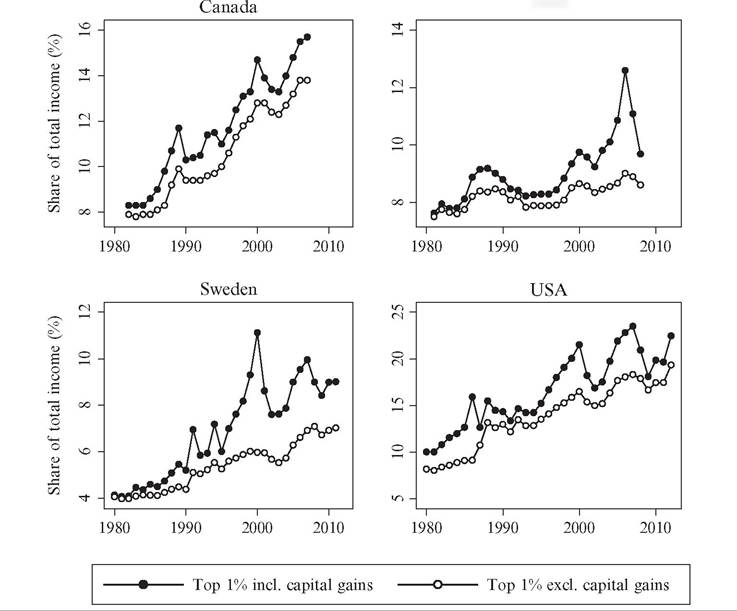
of the observed overall changes in inequality are driven by decreasing or increasing shares of income earned by the top percentile group (P99—100), whereas the income share of the rest of the top decile in most countries is remarkably constant over the whole of the twentieth century.[248] [249] 7.2.2.2 The Importance of Capital Incomes and Capital Gains A major finding of the recent top income literature is that capital incomes are crucial for the development of income inequality over the long run (Atkinson and Piketty, 2007, 2010; Atkinson et al., 2011). Although wage earnings have always comprised the bulk of incomes among the masses, in the top of the distribution incomes have come from both labor and capital. As a consequence, the variation in top income shares can be expected to largely reflect changes in capital income flows. Some of these capital incomes are returns to corporate ownership, some are coupon yields on fixed-interest securities, whereas others come in the form of rental payments from tenants, interest earnings on bank deposit accounts, or as capital gains on financial or nonfinancial assets owned or sold. Our understanding of inequality trends over the long run requires that we closely examine the nature of these capital incomes and, in particular, the association between the distributions of income and personal wealth. Unfortunately, few countries offer long-run distributional evidence by income source. Figure 7.5 shows the share of capital income (excluding capital gains) in total income since 1920 for the top percentile (P99-100) and the next nine percentiles in the top decile (P90-99) in four countries: Canada, France, Sweden, and the United States. Some notable results stand out. First, the importance of capital income clearly increases in the income level; in all cases capital is a more important source of income for the P99-100 than for the P90-99 group. Second, there was a sharp drop in the share of capital income around the Second World War, with the capital income share dropping by roughly half. This result clearly matches well with the findings of a similar drop in wealth concentration around the time of the war (see the following section for further information), whether due to wartime destruction or increased taxation and regulatory pressures. 0 Third, there is no clear uniform trend in recent decades; in the United States the importance of capital income seems to decrease, in France and Sweden the opposite appears true, while in Canada no clear trend is discernible. For some countries, such as Sweden, the historical income tax statistics offer a possibility to cross-tabulate taxable wealth and income across both wealth and income distributions for most of the twentieth century (see Roine and Waldenstrom, 2008, 2009). Figure 7.5 Capital income share in total gross income, 1920-2010 (%). Source: Saez and Veall (2005), Veall (2010) for Canada, Piketty (2001b) for France, Roine and Waldenstrom (2008,2010) for Sweden, and Piketty and Saez (2003, and updates) for the united States. Although not a complete data source, this allows us to get more insights into the interrelationship between income and wealth and how this matters for the long-run evolution of income inequality. The Swedish evidence indicates that the total wealth share held by people in the top income percentile decreased before 1950, in particular in the interwar period. By contrast, the “high-wage” income earners in the P90—95 income fractile increased their wealth share substantially over the same period, mainly in the 1910s and 1930s. The natural interpretation of these changes is that wealth as a source ofincome for the very rich declined in this period while, at the same time, moderately rich groups with high incomes accumulated new wealth. However, the drastic drops in Swedish capital income shares between 1930 and 1950 in the entire top decile seen in Figure 7.5 is not mirrored in their relative wealth share. Possibly this could be due to some wealth not being fully covered in taxable wealth because of definitions of the tax code or tax avoidance. Capital gains turn out to be an additional important and interesting question. Theoretically capital gains, realized and unrealized, are undoubtedly a source of income in the classic Haig-Simons definition.[250] But in practice, capital gains represent a highly complicated income component to include in an individual’s income. First, to the extent that they are observable at all, capital gains only appear on tax returns at the point of realization, making it difficult to properly allocate them in time. In many countries’ tax codes (e.g., Spain and Sweden up until 1991) parts of the realized capital gains are tax exempt depending on the length of the holding period of the respective assets.[251] Also, if data are grouped in income brackets it is not possible to allocate the capital gains to the right individuals and in the worst case, large one-time realizations may elevate individuals with much lower incomes into a one-time high-income position distorting the true underlying distribution. Finally, the economic interpretation of the capital gain depends on what type of asset transaction it emanates from. For example, if it relates to a house sale, the sale of a closely held firm, or the execution of a work-related options program, the interpretation in terms of labor or capital income differs. Tax data typically lump together all capital gains, but in an effort to disentangle them according to the income characteristics of those realizing capital gains, Roine and Waldenstrom (2012) divided the top percentile incomes into work-related (earned by “working rich”) and capital-related (earned by “rentiers”). They found that the “working rich” are the largest group both in terms of incomes and numbers but that its share has declined since 1980. This, however, does still not answer if realized capital gains stem from work-related activities or if high- income earners also realize capital gains in addition to their incomes. Problems with observing and accurately dating capital gains have led many inequality researchers to exclude the realized capital gains altogether from inequality data.[252] However, in the top income literature the approach to capital gains has been pragmatic in the sense that, whenever possible, top income shares have been presented both including and excluding realized capital gains (of course making the corresponding adjustments to the reference totals). This has been possible in Canada, Finland, Spain, Sweden, and the United States. In some countries such as Australia, New Zealand, and Norway capital gains are included in the tax base but not reported separately, whereas in other countries (e.g., the United Kingdom, the Netherlands, Switzerland, and Japan), realized capital gains are not taxed under the income tax (with some variation over time) and therefore not included in the reported gross income concept. The impact on top income shares from adding taxable realized capital gains is shown in Figure 7.6. The figure first illustrates the problem often raised with respect to including Spain Figure 7.6 Capital gains in top income percentile, four countries. Note: Income earners are ranked separately according to each income concept. realized capital gains, namely, that there are clear visible spikes in years when realizations are attractive for tax reasons. The clearest example of this is the well-known 1986 Tax Reform Act in the United States when the top percentile share was almost twice as high when realized capital gains were included, but the spikes in 1991 and 1994 in the case of Sweden are also driven by similar tax incentives.[253] But, second, even if one disregards these peak years, there seems to be a trendwise increase in the importance of realized capital gains as a source ofincome in the countries. Roine and Waldenstrom (2012) study to what extent this, in the case of Sweden, is an artifact of increasing turnover and a reflection of different individuals making occasional appearances in the top group. Using micropanel data they can compute average incomes, excluding and including capital gains, ofindividuals over longer time periods. Their main finding is that it is not mainly different individuals who take turns in appearing in the top group; rather it is mainly top income individuals that earn substantial amounts of capital gains in addition to their other incomes. Armour et al. (2013) and Burkhauser et al. (2013) used survey evidence from household panels in the United States and Australia, respectively, to compute both realized and unrealized capital gains and study their impact on measured income inequality. Comparing their results with those found in the top income literature for these two countries, the authors concluded that capital gains are indeed important drivers of inequality but that only using taxable realized capital gains may confuse the timing of inequality changes and also tend to overstate increases in top income shares. Taken together, decomposing income inequality trends with respect to income source turns out to be very important for understanding the developments. Whereas earnings have always comprised the bulk of incomes of most individuals, top incomes come from both labor and capital, and variation in top income shares can largely be driven by changes in capital income flows. In the beginning of the twentieth century the highest incomes were dominated by capital income, and most of the decline is caused by decreasing capital incomes, partly due to shocks to wealth holdings during the World Wars and the Great Depression. This clearly explains some of the differences within the top that we observe in the first half of the century. In contrast, the recent upturn in top income shares is mainly due to increasing top wages and salaries, especially in the United States and the United Kingdom, but capital is also making a return in some countries. 7.2.3 The Relation Between Top Income Data and Other Measures of Inequality As we pointed out in the introduction, the primary motivation for the top income project was a dissatisfaction with inequality data sets in general. It was a lack of comparable, annual time series of inequality over the long run that was the main problem, more than a lack of data on details within the top. As shown earlier, detailed information within the top turns out to be important in its own right and is in fact in many respects crucial for understanding the overall development. But what about the relation between top shares and other measures of inequality that cover the entire population, such as the Gini coefficient? And what about the relationship between top income shares based on tax data and similar top shares based on household surveys? This section seeks to answer these questions. 7.2.3.1 Comparing Tax-Based and Survey-Based Estimates of Top Income Shares Household surveys are a common source for income inequality analysis. Unlike most tax data, surveys allow for household adjustments and, at times, more comprehensive income concepts. Some recent studies recalculate the U.S. top income shares of Piketty and Saez (2003) using some of the largest U.S. household surveys: the Current Population Survey (CPS) (Burkhauser et al., 2012) and the Survey of Consumer Finances (SCF; Kennickell, 2009; Wolffand Zacharias, 2009). These studies are only able to compute estimates since the 1970s. Nonetheless, they offer valuable points of comparison for the tax-based top income share series, in particular given the potential problems with tax avoidance and other concerns related with the tax data. The CPS-based analysis produces lower inequality levels overall and also present a lower trend increase in top shares since the 1970s. Atkinson et al. (2011), however, point out that much of this difference stems from the fact that the CPS data are top-coded, which means that the highest incomes are incompletely observed, which may underestimate the top shares. Similarly, the CPS has a lower coverage of capital gains, and given their importance in the top (as argued earlier in this chapter), this omission may account for a fair share of the difference. The survey evidence based on the SCF suffers less from top-coding and, accordingly, are more in line with the tax-based series of Piketty and Saez. In a similar comparative exercise for Australia, Burkhauser et al. (2013) contrasts the tax-based evidence with top shares calculated from the Household, Income and Labour Dynamics in Australia Survey. The authors find that top income shares are somewhat lower when using a more theoretically appropriate income concept based on the survey evidence. Regarding the overall patterns in terms of time trends and income composition, however, there is a high degree of agreement between the two sets of series. In other words, household surveys in Australia, the United States, or the United Kingdom do not seem to offer a fundamentally divergent picture from the basic evidence of the top income literature. 7.2.3.2 Theoretical and Empirical Relationship Between Top Shares and Overall Inequality Measures To what extent can top income shares be thought of as a measure of overall income inequality? To answer this question one can refer to desirable properties of inequality measures (see, e.g., Cowell, 2011), the theoretical relationship between top shares and other inequality measures, or to the observed statistical associations between different inequality measures when based on actual observations. As discussed by Leigh (2007), top income shares meet four basic properties that any measure of inequality should satisfy: they are not affected by any other characteristics of the population than income (anonymity), they remain the same when all incomes are multiplied by the same number (scale independence), top shares remain unchanged if the population is replicated identically (population principle). When it comes to the transfer principle, this is only satisfied in its weak form because a transfer from a high- income individual to a low income never increases the measure, but it may remain unchanged. A transfer from the top group to the rest of the population lowers the top income group share, but transfers within the respective groups leave the measure unchanged. A direct consequence is, of course, that top income shares cannot capture changes that happen within the lower part of the distribution. What is the quantitative impact of a top income share change on the Gini coefficient? Atkinson (2007) suggests a useful approximation. Ifwe assume that the top share is negligible in size but has an income share S, the total Gini coefficient (G) can be approximated as G = S +(1 — S) G0, where G0 is the Gini coefficient for the population excluding the top group. To use the example given by Atkinson (2007), if the Gini in the rest of the population remains at 0.4 but the top percentile group experiences a 14 percentage point increase in their share (as in the United States between 1976 and 2006) this leads to an 8.4 percentage point increase in the overall Gini. What about the correlation between top income shares and Gini coefficients in data? Figure 7.7 illustrates the overall, average relationship the 2 for 16 developed countries. The left panel illustrates a positive and high correlation, 0.86, between the levels of inequality. The right panel shows that the correlation between average annual inequality changes during the period 1985-2005 is lower but still positive and high, 0.57. Looking at the relationship more systematically, Table 7.4 gives a correlation matrix for the relation between top income shares and broader measures of income inequality. Using data from the LIS, the WIID, and the WTID over the past 30 years, the table shows Pearson correlations between three top income shares (the top percentile, the top decile, Figure 7.7 Top income decile and the Gini coefficient. Source: Gini coefficient for disposable incomes of equivalized households are retrieved from the Luxembourg Income Study Datacenter (www.lisdatacenter. org) and top decile gross income shares from the World Top Incomes Database. Pearson correlations are statistically significant at the 1% (***) and 5% levels (**), respectively. Table 7.4 Correlations between top income shares and other inequality measures Notes: The correlations are all statistically significant at the 1% level. The number of observations for the WIID variables is 300 for Top 1% and 263 for the Top 10—1% and Top 10%, and 63 for all LIS variables. and the lower nine percentiles in the top decile) and the Gini coefficient, the Atkinson index using two inequality aversion parameters, and the income ratios between the 90th percentile and 10th percentile (P90/P10) and the median (P90/P50). The correlations are the lowest for the WIID Gini coefficients, 0.25 and 0.42 for two of the top share measures. When using the LIS data, correlations are markedly higher, between 0.53 and 0.57 for the top percentile and between 0.64 and 0.74 for the two other income shares. Finally, we also examine what the relationship between top income shares and the Gini coefficient looks like over the very long run. We do this by plotting series for two countries, the United Kingdom and the United States, where the Gini coefficient spans the entire period since the beginning of industrialization until present day, whereas the top income percentile only covers the last century. Figure 7.8 shows the results from this exercise. The evidence suggests that the twentieth-century experiences are quite similar across the two indices of inequality. In both countries the documented equalization appears in both measures with only minor deviations in the magnitudes. These observations thus indicate that had we accessed top income data for the eighteenth and nineteenth centuries they may have generated similar long-run trends since the 1700s as those portrayed in Figure 7.8, but of course we cannot make any certain statements without hard evidence.45 [254] [255] Altogether, this section shows that top income shares are related to well-known measures of overall income inequality such as the Gini coefficient, the Atkinson index or Figure 7.8 Long-run inequality trends using Gini and top income percentile share. Sources: Gini coefficients for the United Kingdom from Lindert (2000, table 1), Milanovic (2013, table 1), and Office for National Statistics (2011, table 5), and for the United States from the same Lindert and Milanovic sources and U.S. Census Bureau (2011, table A-3). Top income shares from World Top Income Database. income ratios, both theoretically and empirically. Top income shares Iulfillproperties for being sensible inequality measures and quantitatively changes in top shares have a nontrivial impact on the Gini coefficient. They are also significantly correlated with overall measures of inequality although they (by definition) do not capture variation within the lower part of the income distribution. Does this imply that we can uncritically assume that top income shares can serve as a proxy for, say, the Gini coefficient? No, of course it does not. The correlations we present rely on evidence from time periods when we observe both top shares and enough data to calculate the other inequality measures. In practice, this means relying on data starting in the 1970s. In the few cases when we have data for longer periods these confirm the close relationship when going back in time. However, as shown by Smeeding et al. (2014) in Chapter 8 of this Handbook, the relationship is weaker in recent decades as household surveys do not fully capture the developments in the very top of the distribution. In the end, how to use top shares (or any other summary statistic) when aiming to capture overall income inequality, is a question of judgment. Our view is that, based on the evidence we have, and, in particular, given the restrictions in terms of available alternatives, top shares should not be dismissed as being “only about the top” but are also useful as a general measure of inequality in over time. 7.2.3.3 Other Series over Long-Run Inequality: Wages, Factor Prices, and Life Prospects Much of what we write in this chapter is based on the assertion that the long-run evolution of income inequality is meaningfully reflected in the evolution of top income shares, that is, the shares of income accruing to top fractiles in repeated annual crosssectional income distributions. Notwithstanding our conclusions in the previous section, there are some important limitations to the top income data, and it is therefore useful to complement these series with alternative measures. One is the poor coverage of period before 1900; top income data only exist in a handful of countries, none earlier than the 1860s and in most cases only in the form of a few scattered year observations. Furthermore, top income data are not ideal to study the dynamics between inequality and economic development in relation to industrialization as characterized by some theories such as the Kuznets hypothesis. Last, the use of repeated annual income distributions prevents conclusions about trends in the distribution of lifetime incomes, that is, whether differences in the quality and length of people’s life span has changed in such way that the overall inequality trends are either mitigated or boosted depending whether it is the lives of the poor that has improved the most or the least. In this section, we present some additional evidence on long-run inequality that have bearing on these issues. We do this by studying trends in some other measures that are popular in the past literature: wage dispersion across occupations (and regions), factor price differentials, and differences in life prospects. The first measure, wage dispersion, is most often constructed as the wage ratio of rural to urban workers or of professionals (skilled) to blue-collar (unskilled) workers. Besides being available over very long time periods, often well before industrialization, these measures also offer a closer association with the original Kuznets conjecture, which was about changes in wage inequality precisely between urban and rural workers within countries over the path of industrialization. A large number of studies have scrutinized this conjecture using different types of wage ratios, and they offer somewhat contradictory evidence (also see Section 7.4.1). In his review of this extensive literature, Lindert (2000) asserts that, at least concerning the United Kingdom and the United States, historical series are still too incomplete to allow for any firm conclusions. However, at least they do not establish any clear support for strong increasing trends in sectoral or occupational wage differentials as Kuznets’ assertion would stipulate.[256] In a study of the evolution of skill premia across occupations during the premodern era up until the early twentieth century in the entire Western world, van Zanden (2009, ch. 5) also failed to find any evidence of increased wage dispersion during industrialization. Looking instead at the twentieth century, wage ratios decline almost unanimously in Western countries. Not only does this development fit the acclaimed downturn of the Kuznets curve but it also correlates positively with the inequality trends suggested by the declining top income shares. As Lindert (2000) emphasized, however, the twentieth-century drop in pay differentials does not seem to be driven by the forces suggested by Kuznets. Instead the factors compressing wage ratios were rather aligned to institutional developments such as labor market regulations and the expansion of trade unions and to the extension of educational attainment for large masses in the population (Goldin and Katz, 2008). Sweden has in the past literature been referred to as a “clear example of the Kuznets curve” (Morrison, 2000, p. 227), an assertion based largely on Soderberg’s (1991) investigation of sectoral wage dispersion. Swedish wage differentials across skilled and unskilled workers seem to have risen between 1870 and 1930, with exception for a sharp drop during the First World War, and then turned downward until 1950. As Sweden’s industrialization can be said to have begun around 1870 and peaked around the turn of the century, the skill differential in wage indeed matches the Kuznets pattern. However, more recent research using new evidence on wage differentials between rural and urban workers (Bohlin et al., 2011) and across occupations (Ljungberg, 2006) cannot replicate these results. They find either no trend at all or even a negative trend beginning already in the nineteenth century, casting doubts about the existence of even a Swedish Kuznets 48 curve. Relative factor prices, typically expressed as the ratio of land rents to real wages, represent another outcome that bears information about inequality trends, even if it is primarily motivated by trade theory. One basis, the inequality interpretation, is offered by Lindert (1986, 2000), who argued that land ownership during the nineteenth century was highly concentrated and changes in its return relative to real wages can reflect changes in the overall income inequality. According to several studies (Clark, 2008, p. 274; Lindert, 2000; O’Rourke and Williamson, 1999; van Zanden, 2009), the wage-land rental ratio did not decrease (i.e., inequality did not increase) at all during the nineteenth century in the industrializing world. If anything, the wage-rental ratio went up in the decades before the First World War, but whether that reflected a true equalization 48 Specifically, Bohlin et al. (2011) compared the wage gap between agricultural (rural) workers and engineering (urban) workers between 1860 and 1945, controlling for differences in nonwage reimbursement and costs of living. They find no secular trend in the wage gap before 1950 but a considerable short-term responsiveness to shocks, for example, to local living costs. Ljungberg (2006) compared wages of male manufacturing workers with wages of graduate engineers, college engineers, and secondary school teachers between 1870 and 2000, finding that unadjusted wage gaps trended downward but that the pre-First World War trend largely disappeared when controlling for the growth of human capital in the labor force at large. in the midst of the second industrial revolution or merely the demise of the rural land owners remains an open question.[257] Finally, although the dispersion of incomes earned during a single year is often a relevant time frame of analysis, there are dimensions of personal welfare when outcomes over longer time spans are of primary concern. If, for example, industrialization allowed the broad masses to live better, eat healthier, and work safer, and thereby live longer, without affecting the lives of the rich at all, this would result in an equalization of lifetime incomes even if distribution of annual incomes did not change at all. The literature on differential mortality trends over the long run and their implications for lifetime income inequality trends is quite small. In his review article, Lindert (2000) referred to studies of the United Kingdom that seem to reach conflicting conclusions, some finding that the biggest gains in life expectancy materialized among the already rich, whereas others found the opposite. Clark (2008) looked at the differences in life prospects between “rich” and “poor” before and after industrialization, broadly put. He found that the rich-poor difference in terms of male stature decreased from 3% to 1%, in life expectancy from 18% to 9%, in number of surviving children from 99% to —19%, and in literacy from 183% to 14%.[258] However, the most recent research on socioeconomic inequalities in death over the long run presents a more sceptical view of the role of industrialization. Using historical longitudinal microdata from several countries aiming at uncovering the causal impact of industrialization on social mortality differences, scholars have not found any clear trend break along with the industrialization and, in general, no clear impact of income on mortality at all.[259] Altogether, the evidence put forward in this subsection has broadened the focus on long-term trends to also include other measures of inequality such as occupational wage ratios, factor price differentials, and lifetime-amended income inequality. These other distributional sources offer insights into pre-1900 inequality trends, the economic dynamics more closely related to the Kuznets conjecture, and into the development of the inequality of lifelong well-being, all of which are unsatisfactorily addressed by the top income data (and not addressed at all by other pre-1900 income inequality data sources). The main message from these studies is that there are few indications of an increase in inequality during the nineteenth century, that is, the era when most Western countries experienced their definitive industrial takeoffs. There is hence little empirical support for the first part of the Kuznets inverse-U curve. We would still hesitate to extrapolate our top income shares backward into the nineteenth century based on the evidence from pay ratios. In terms of lifetime income inequality movements, there is again no clear trend that deviates notably from the one offered by the top income shares. If anything, the twentieth-century equalization may be even stronger if would adjust for changes in longevity differences across the distribution, but this conclusion rests on still quite tentative evidence. 7.2.4 Income Inequality over the Long Run—Taking Stock of What We Know Combining all the preceding information, it seems that there are three possible permutations of broad overall trends since the beginning ofWestern industrialization. To continue the letter-analogue to describe shapes, the question is if we (with a bit of imagination) see an N, a U, or an L. The N-shape corresponds to an increase in inequality over industrialization followed by a decrease over the twentieth century and again an increase since around 1980. The U-shape would be a situation where inequality is high before and during the period of industrialization, then declines over the twentieth century, and increases again after around 1980. Finally the L-shape corresponds to the U-shape but without the upturn around 1980. The question marks, thus, revolve around to what extent there was an increase or not during industrialization and to what extent there has been an increase in recent decades. The answer to the first question is difficult due to lack of clear evidence. There are some signs of increased inequality during industrialization but many studies also point toward high and relatively stable levels before the decrease in the twentieth century. When it comes to the second question about the increase since around 1980, the evidence is much more solid and clearly indicates that the answer depends on the country in question.[260] In some countries, especially the United States and the United Kingdom, inequality has risen sharply. This increase has taken place from a level that was already high in relation to others before it started. In countries like Sweden and Finland, increases have also been substantial but here from internationally low levels to levels that are much higher, but remain among the lowest. In other words, the increase in percentage terms has been almost as large in Sweden and Finland as in the United States and United Kingdom but the level difference is very significant. In some other countries, for example France, Germany, and Japan, there is no clear upward trend but in absolute terms inequality remains higher than in the Nordic countries. To what extent is this picture any different than the one we had before the top income literature and other findings that emerged in the past decade? In terms of the broad overall developments, it may actually not be so different. There are some more studies suggesting that the increase in inequality during industrialization is not so clear 52 and the recent upward trend in inequality has been made even clearer. Of course we have a lot more data on inequality over the long run in the form of top income shares. But overall there is nothing dramatically new in terms of the secular trends over the long run. What is new, however, is the change in our understanding of these trends as a result of a number of features in the top income data. First, the detailed analysis of changes within the top of the distribution has shown just how much of the development is driven by the top 1% group of the distribution and, conversely, how surprisingly stable the income share of the lower half of the top decile has been over the long run. Second, the decomposition of income according to source has increased our understanding of the importance of accounting for all sources and how the same broad trend could be driven by entirely different mechanisms depending of the development of capital and wages, respectively. This applies both to the aggregate economy and to different groups across the income distribution. Third, the often yearly observations have shown the importance of sufficiently high frequency data. In particular, this aspect of the new series has been an important part of the focus on the role of shocks and war especially in the first half of the twentieth century, thus creating an at least partly new interpretation of the decline in inequality in the first half of the twentieth century. Finally, the relationship between top incomes and other measures of inequality illustrate how this literature has contributed both to our understanding of the importance of developments within the top, and the possibilities to use these measures as proxies for overall inequality. 7.3.