LONG-RUN TRENDS IN WEALTH INEQUALITY
It is fair to say that the majority of research on economic inequality has focused on incomes. Much less attention has been given to the role of wealth, which is unfortunate for a number of reasons.
As a determinant of people’s consumption possibilities, personal wealth is of first-order relevance. The classical Haig-Simons definition of income states that income is what we can consume while keeping our real wealth intact. Wealth can also determine which opportunities individuals have to make investments and pursue different occupations, especially in the presence of credit constraints. The interplay between the distribution of wealth and development is also central to many theories attempting to explain the cross-country differences in long term development.This section presents and discusses the existing research on the long-run evolution of wealth inequality. The ambition is to harmonize the outline with the previous section on the long-run trends in income inequality. We begin by presenting the core methods and data issues concerning how to measure wealth, wealth inequality, and how to tackle the specific challenges associated with studying historical trends. Thereafter we present ten country case studies for which we have sufficiently good data on wealth concentration for at least a century and in some cases from the beginning of each country’s industrialization.
Finally, we bring together the pieces of evidence into cross-country mappings of the trends, searching for common patterns that may help us address the overall questions about the relationship between economic development and inequality.
7.3.1 Data and Measurement
Despite the arguments for studying wealth and its distribution, the empirical literature on wealth inequality is still limited, particularly when it comes to the long-run perspective. Naturally, there are many reasons for this past neglect, but the problem of agreeing on a manageable definition of wealth and then the practical problems associated with measuring it empirically are most likely important.
Sources for studying wealth over time are of different sorts. In their investigation of the analysis of wealth distribution, Davies and Shorrocks (2000) pointed at the five most common sources of wealth data: wealth tax returns, estate tax returns (or probate records), investment income method (using capital income and some assumed or observed net rate of return), household surveys, and journalistic rich list. With respect to investigations of long-run patterns, perhaps the most consistent of these sources is estate records. They have existed for centuries with largely the same basic structure of assets and debts of the deceased individuals. Unfortunately, there are few compilations of estate records in most countries over time, which is why we still lack data on wealth distribution from this source. A few countries have presented tabulated sizes of estate records in relation to estate tax compilations. Wealth tax statistics is another common source, available in a fairly homogenous way in several countries over long periods of time. Here, however, the problems of what components are included in the tax base or how large share of the population that is covered in the statistics are more pressing problems. Surveys, finally, comprise a more recent source for wealth distribution evidence.
Historical evidence on wealth distribution data is primarily based on wealth and estate taxation statistics. These fiscal instruments have been used for centuries and offer consistent source materials. Authorities have often also been interested not only in collecting the revenues but also in calculating the size of each tax base as well as their respective size distribution. Of the historical evidence presented later, series from France, the United Kingdom, and, in part, the United States, all emanate from the estate tax and, specifically, samples of individual estate tax returns. U.S. wealth distribution data from the latter part of the twentieth century and the beginning of the twenty-first century are also available in household surveys.
Wealth distribution data from Denmark, the Netherlands, Norway, and Switzerland are all based on wealth tax statistics, in most cases as tabulated distributions published by each country’s tax authorities. For Finland and Sweden the bulk of the data come from both wealth tax statistics but there are some complementary observations from estate tax returns. For Australia, finally, observations come from estate tax data, wealth surveys, and even journalistic rich lists.7.3.1.1 The Wealth Holding Unit
The concept of wealth owner varies across the empirical studies covered in this chapter depending on the nature of the data source used. When wealth tax-based data are used (as in the Netherlands, Switzerland, and the Nordic countries), the most common unit of observation is households. For the most part, this means tax households where married couples (and their under-aged children) count as one, as do children 18 years or older living at home. Many of the survey-based wealth records from recent decades, however, define households as cost-based households, the major difference being that adult children living at home are now included in the parents’ household. When studying very long time spans, households sometimes also included servants, parents or grandparents, slaves, or unregistered immigrants. Shammas (1993) shows that the U.S. historical wealth concentration is sensitive for the treatment of these different subgroups into the reference tax population.[261] Estate tax data and probate inventories (used in France, the United Kingdom, and the United States) are instead based on (deceased) individuals.[262] [263] Most studies focus on adult individuals, thereby imposing a lower age cutoff normally between 15 and 25 years of age.5
To define wealth holding units consistently matters for the distributional estimates. As was pointed out earlier in the discussion of the distribution of incomes, individual-based data tend to (but must not) give rise to a more unequal wealth distribution than does the household-based data (Atkinson, 2007).
Roine and Waldenstrom (2009) compared shifts in Swedish top wealth shares using household and individual distributions finding no important differences, and Kopczuk and Saez (2004) reached the same conclusions in their analysis of U.S. wealth distribution trends.7.3.1.2 The Concept of Wealth
The definition of personal wealth that is most commonly used in studies of wealth distribution is net wealth, also called net worth or net marketable wealth. Net wealth consists of the sum of all nonhuman real and financial assets less debt. Real (or nonfinancial) assets primarily consist of housing and land, but they may also include durable consumption goods (see further the discussion later), for example, cars, boats, furniture, and also valuables such as antiquities, jewelry, and art. In the distant past, even items such as clothing and other semidurable consumption goods were often inherited (especially among the less wealthy) and may also be covered among the nonfinancial assets. Financial assets are cash, bank deposits, corporate stocks, bonds and other claims, and insurance savings, which today also include some parts of funded pension assets. Debts, finally, are the sum of housing mortgages and loans for consumption, investment, or education.
As already stated, our definition of wealth does not include peoples’ inherent or acquired skills, or human capital. This is a natural implication of the wealth definition set out at the beginning, which focuses on assets that are marketable and thus possible to sell or purchase at a market place.[264] Historically, such market for human wealth has existed, namely in association with slavery. In terms of aggregate wealth the total value of “slave assets” was somewhere between 15% and 30% of total national wealth (Piketty and Zucman, 2014, figure 11; Soltow, 1989, p. 180). According to Soltow (1989, p. 267), slaves were disproportionately held by the wealthy, and the inequality in slave ownership was almost three times as large as the inequality in land and dwellings.
Measuring net wealth is sensitive to the valuation of assets. Ideally assets should be valued at current market prices, net of taxes and transaction costs, the theoretical reason being the possibility to convert wealth to consumption. However, most estimates of historical inequality use data where assets are reported in tax-assessed values rather than in market values. Tax laws are typically designed to strike a balance between the revenue needs of government and tax collectability of tax authorities, and the rules regarding asset coverage or valuation criteria may thus not be aligned with what researchers would ideally like to have. But if the discrepancy across tax and market values is similar across the distribution—and historically we think that this was arguably often the case—the biasing effect of valuation on relative wealth shares should be small. Only a few studies have delved into these questions. Examples are the analyses of inequality trends in the United StateswhereWilliamsonandLindert (1980a,b) and WolffandMarley (1989) investigated whether tax-driven avoidance distorts the use of tax data for distributional analysis (and they generally found that it does not). Atkinson and Harrison (1978) examined how the valuation of taxed assets may influence inequality, for example, looking at life policies (table 4.6) and offshore assets (pp. 161f).[265] Roine and Waldenstrom (2009) studied the effect of valuation by using several alternative estimates of aggregate wealth (based on either tax or market values as well as including items that have not been taxable) and also different assumptions about the distribution of the difference between these alternative reference totals and the baseline specification. They found that there are some differences in the levels of wealth shares over the period, but that the trends in wealth concentration remain unchanged. Altogether, we believe that the comparability of the estimated shares presented in this chapter is good over time.
Some components are especially difficult in the analysis of personal wealth. Although some of them appear in the wealth data in several countries and time periods, their presence is associated with uncertainty concerning both valuation and conceptual adequacy. In the following we discuss three of the most important “problematic assets” and how they are typically treated in the historical sources. In the end, they do not, however, affect the main conclusions about the long-run inequality trends reported later.
(i) Pension and Social Security wealth is a composite term for the net present value of individuals’ entitlements to future private and public payments for pensions and other social outlays. These assets are for the most part not included in the historical inequality estimates. Conceptually, scholars have shown that expectations about future public pensions reduce the incentive to accumulate private wealth (see, e.g., Berg, 1983; Feldstein, 1976; Gale, 1998), and thus a comparison of private wealth across systems with differing public pension coverage may be misleading unless retirement wealth is accounted for. Researchers therefore sometimes add Social Security wealth to the net marketable wealth of households, yielding a concept often called augmented wealth. Studies of the concentration of augmented wealth typically find that it is substantially lower than the concentration of marketable wealth. For example, Wolff (2007) found that the Gini coefficient for the United States in 2001 dropped by a fifth when going from net worth to augmented wealth, and Frick and Grabka (2013) found a similar drop for Germany in 2007. The Inland Revenue in the United Kingdom presented for many years series of the distribution of marketable wealth (Series C) as well as wealth including public and private pension entitlements (Series E), exhibiting Gini coefficients that were about a third lower when including pensions.[266]
However, there are numerous problems associated with defining pension assets, or other “drawing rights” on the Social Security system, as private property, and until questions like those are fully settled we will not see a comprehensive treatment of pension and Social Security wealth alongside net marketable real and financial assets. The main issue is how to judge the fact that, on the one hand, not having the public system would have required an individual to save privately, thus decreasing consumption possibilities, but on the other hand, the “drawing rights” are not marketable wealth and cannot be converted freely into other consumption by the individual.[267]
(ii) Consumer durables are not always included in the wealth data, and when they are their valuation is difficult. First of all, this asset class is typically completely absent from wealth tax returns or administrative tax registers, primarily for evasion reasons. It is thus not part of the bulk of the distributional estimates examined in this chapter. However, insofar as data are based on probates or estate tax returns or household surveys, durables are more likely to be included because of smaller possibilities (and smaller incentives) to evade.[268] Atkinson and Harrison (1978, p. 43) noted that the valuation of consumer goods is difficult, and they often take too low values in estate data. In general, it is actually an open question whether consumer durables should at all be included in the household balance sheet. According to the System of National Account they should not because all consumed goods are assumed to depreciate within 1 year and therefore cannot contribute to any fixed asset formation.[269] However, many durables (e.g., cars, boats, and some electronic equipment) arguably last more than 1 year, and for this reason some countries (such as the United States) do include durable consumer goods in household balance sheets. Historically, consumption goods like china, furniture, and even clothing were important parts of household inventories and were inherited along with other assets. Waldenstrom (2014) estimated the household balance sheet of Swedish households since 1810, finding that durables represented between 10% and 20% of nonfinancial assets throughout the period up until today. Interestingly, durables grew more important in the middle of the twentieth century, which is related to the growth in earnings potential of increasingly educated middle-class households (Roine and Waldenstroom, 2009).
(iii) Foreign wealth holdings have historically been sizeable in many countries, especially colonial powers such as France and the United Kingdom. In a recent investigation, Piketty and Zucman (2014, table A27) found that net foreign wealth represented between a 10th and a quarter of total national wealth in these two countries from the middle of the nineteenth century up to World War I. At the individual level, information about foreign assets such as foreign government stock and bonds and other real estate is most likely completely absent from domestic wealth tax returns, but should in principle be more visible in estate data. As noted by Atkinson and Harrison (1978, p. 161), however, overseas real estate was not taxable before 1962 and therefore not included in wealth inequality estimations before this year. In an attempt to gauge the importance of the acclaimed tax-driven capital flight from Sweden during the period from the 1970s to the 2000s, Roine and Waldenstroom (2009) used residual flows in the Balance of
Payments and Financial Accounts to estimate the aggregate offshore wealth held by residents. Assuming that this wealth was primarily held by the richest residents, the authors found that the top percentile wealth share rose from about 20% in the 2000s to over 30%, depending on assumptions about interest rates on foreign capital and whether to include the closely held corporations of superrich Swedes.[270] Also, without explicit reference to distributional aspects, Lane and Milesi-Feretti (2001, 2007) constructed estimates of the external wealth of nations since 1970. However, going further back we know very little about the role of offshore wealth in historical eras and can therefore not offer a consistent interpretation of their role for long-run inequality trends.
7.3.1.3 Measuring Historical Wealth Inequality
When we estimate the concentration of wealth, we use a similar methodology as when calculating top income shares. That is, we estimate the wealth share held by Variousfractions of the population by dividing the observed top wealth holdings for specific groups (fractiles) in the top by a reference total for all personal wealth in the economy. Just as in the case of historical income distribution data, the historical wealth distribution data often come in the form of tabulated distributions of grouped data. This means that we observe wealth holders and their net wealth divided into different wealth size classes. To get the exact wealth share accruing to certain fractiles in the top, such as the top percentile or the top decile, we use the Pareto interpolation technique described previously.
Using top wealth shares as measure of inequality has several advantages for our purposes.[271] Most historical sources of wealth data come from wealth and estate tax returns, and the group most consistently represented in these tax listings throughout history is the rich (i.e., where the wealth was), which makes them the most homogenously observed group over time. Moreover, wealth distributions are heavily skewed—much more so than income distributions—and top wealth holders have often held the vast majority of all personal wealth; between 70% and 90% before the Second World War and between 50% and 70% thereafter. Studying the top and its wealth therefore means that almost all personal wealth is being studied. Finally, most of the historical wealth inequality estimates constructed by past researchers come in the form of top wealth shares, especially as top wealth percentiles, and this measure is therefore the most appropriate to use for our purposes.
A specific challenge associated with estimating top wealth shares is the measuring of the reference total of net wealth ofthe whole population. Wealth tax data typically only cover the top households that have paid wealth tax, and researchers must therefore limit their observations to years when attempts to measure the corresponding total for the whole population have been made, for example, in censuses or special public investigations. In the case of Sweden, for example, there are years for which tabulated top wealth data exists, but there is no reliable information about the reference total wealth to be found. Estate data also have problems with constructing population measures but they are of a slightly different kind. Researchers here typically try to collect a sample of estates that is representative for the whole population, which thereby enables them to compute the relevant inequality measures using only the sample at hand. However, most of the time the estate data sources are themselves not fully representative for the population, mostly lacking information about people with low levels of personal wealth.[272]
The different wealth data sources also display the wealth distribution for different entities. Whereas wealth tax data and surveys reflect the distribution of the living population, estate tax data and probate inventories reflect the distribution of the deceased. Because those people who die during a year are not a representative sample of the living population (e.g., because the old are heavily overrepresented), these two distributions are not immediately comparable. The usual procedure used by researchers to make them comparable is by applying so-called mortality multipliers, which are inverse mortality rates for different age, sex, or social status groups.[273] In this way, the distribution of estates can be transformed so as to reflect the wealth distribution among the living population.
7.3.1.4 TaxAvoidanceandEvasion
As already noted, using data from administrative tax-based statistics to compute measures of wealth distribution gives rise to some problems relating to tax evasion and avoidance. But, as in the case of the income distribution, the extent to which such activities lead to errors in estimated wealth shares is, however, not clear. If noncompliance and tax planning is equally prevalent in all parts of the distribution—it may, of course, take very different forms—this affects the reported wealth levels but not the shares. The same goes for comparisons over time and across countries (see Section 7.2.1.5 for more on this). Unfortunately there is little systematic evidence on this. There are overviews, mainly concerned with personal income taxes, suggesting that, although avoidance and evasion activities are important in size, there are no clear results on the incidence of overall opportunities or on these activities becoming more or less important over time.[274]
Moreover, it is not clear whether to expect more or less avoidance and evasion in countries with higher tax rates. As the incentives to engage in avoidance and evasion become higher when taxes increase, so do the incentives for tax authorities to improve their control.[275] Regarding wealth and estate taxes it may seem plausible to think that estate tax data are more reliable because it is typically in the interest of the heirs to formally establish correct valuations of the estate.[276] At the same time tax planning aimed at avoiding the estate tax is an important industry in the United States and elsewhere. This may affect the reliability of the data. For wealth, tax data problems of underreporting are likely to be similar to those for income data, with items that are double reported being well captured, whereas other items are more difficult.
Finally, the use of tax havens may be a problem, and as we discussed earlier there are indications that substantial amounts have been hidden over the past decades (see for example, Johannessen and Zucman, 2014, and references therein). Given the large fixed costs related to advanced tax planning, it is likely that such activities are limited to the very top of the distribution. If this has become more important over the past decades— something that seems likely—then estimates of wealth concentration for recent periods may understate wealth holdings in the very top and not be directly comparable with estimates produced for earlier years in this century, in particular top wealth shares may be underestimated for recent decades.
7.3.2 Evidence on Long-Run Trends in Wealth Inequality
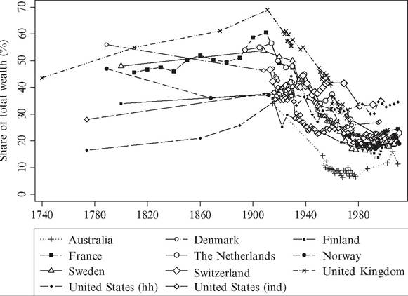
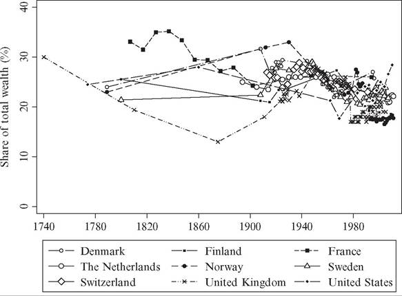
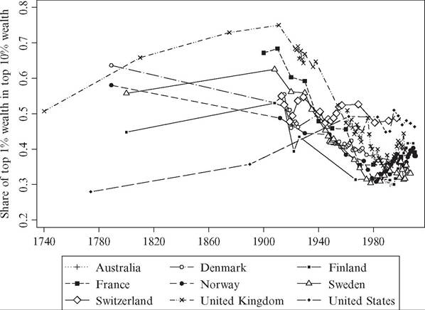
In this section we present evidence on the evolution of wealth inequality in 10 Western countries. The length and detail of the series vary but in most cases the first observations are from around 1800 and with relatively frequent observations throughout the whole of the twentieth century. The relatively small number of countries for which we have data allows us to delve a little deeper into each country case, examining the specificities associated with national histories as well as the structure of historical wealth distribution evidence. After going through the country cases, we compile the series and study to what extent there are common patterns over time. Note that we focus on the twentieth and twenty-first centuries in the country-specific figures in order to ease inspection of the trends in this era, whereas in the figures compiling several countries (Figures 7.19—7.21) we show the full set of observations stretching back to the nineteenth and eighteenth centuries.[277]
7.3.2.1 Country-Specific Evidence
7.3.2.1.1 Australia
A recent investigation of Australian wealth concentration since the beginning of the twentieth century is the one by Katic and Leigh (2013). The authors estimate top wealth shares using three different sources: estate tax returns, household surveys, and journalistic rich lists. The main emphasis is put on the first two, but the very recent trends can also be studied by putting the rich lists into context.
The earliest observation comes from a war wealth survey conducted in 1915 by the Commonwealth Bureau of Census and Statistics. From the 1950s up until the 1970s, tabulated estate tax returns were collected and adjusted by using inverse mortality multipliers adjusted for age, sex, and social status. From the 1980s onward, the authors again used wealth surveys, conducted by different entities, but complemented them by annual observations of wealth share of the superrich Australians published in the Australian magazine Business Review Weekly.
A common theme in all these sources is that they are not extensive in terms of coverage of wealth holders. With a few exceptions, only the very richest citizens are covered, and for this reason the only long-run time series coming out of the historical evidence are the wealth share of the top 1 and top 0.5 percentiles.
Figure 7.9 shows the trend in the Australian top wealth percentile share between 1915 and 2008. The share falls from almost 35% of total wealth during the First World War down to less than 15% in the early 1950s. Due to the lack of observations in between these dates, we cannot tell whether the fall came as a consequence of the immediate post-WWI turmoil, the crisis impact during the GreatDepression of the 1930s, or the dramatic events during the Second World War and its aftermath. From the 1950s onward, the top percentile share has hovered at around a level of 10-15% of total wealth. Internationally, this is a very low wealth share, actually the lowest of all countries covered in this chapter. At this point, the reasons for the low Australian share have not been studied in detail.
7.3.2.1.2 Denmark
For Denmark, historical wealth concentration data exists from as early as 1789 and then more frequently during the twentieth century. The earliest observation comes from a comprehensive national wealth tax assessment in 1789, from which Soltow (1981a-c) collected a large individual sample of the gross wealth of households.[278] The next observation, however, comes over a century later at the time of the introduction of the modern
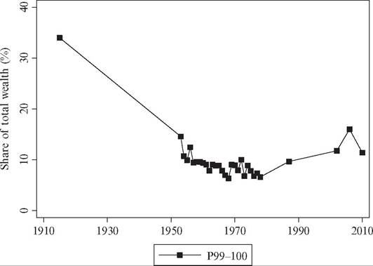
Figure 7.9 Wealth concentration in Australia, 1915-2010. Source: See the Appendix for details about sources and data.
wealth tax. For 1908-1925, Zeuthen (1928) lists tabulated wealth distributions (number of households and their wealth sums in different wealth size classes) for Danish households, adjusted to include those households with no taxable wealth. Similar tabulated wealth tax-based data are published in Bjerke (1956) for 1939, 1944, and 1949 and in various official statistical publications of Statistics Denmark for a few years thereafter until the wealth tax was abolished in 1997.[279]
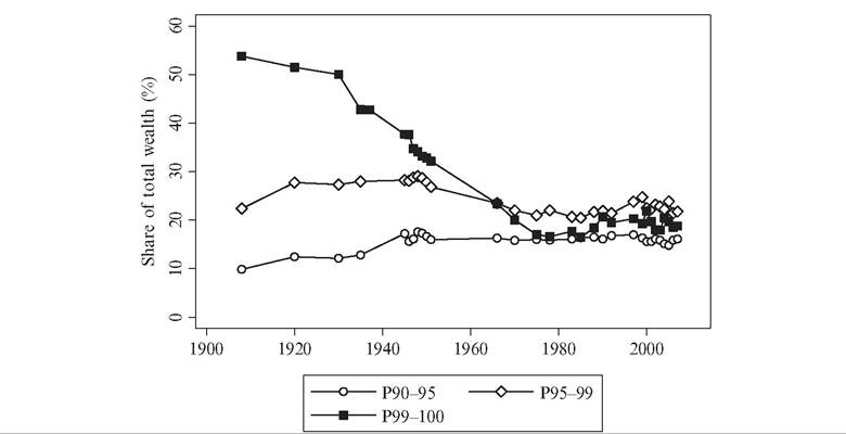
Figure 7.10 shows the wealth shares of groups within the top decile between 1908 and 1996, while Figures 7.19 and 7.20 show the trends back to 1789. The lowest four percentiles (P90-95) exhibit a flat trend up to 1908 and thereafter double their share from 10% to 20% over the twentieth century. The next four percentiles (P95-99) lie constant between 25% and 30% of total wealth over the entire period, whereas the top percentile (P99-100) decreases significantly over the entire period, with particularly marked decreases after the two world wars. When looking at the very top of the distribution, the top 0.1 percentile (P99.9-100), there is no decrease at all up to 1915, but instead there is a dramatic drop by almost two-thirds of the wealth share between 1915 and 1925. Overall, the Danish wealth concentration decreased over the course of industrialization, and this continued throughout the twentieth century, although the development was not uniform at all times and across all groups.
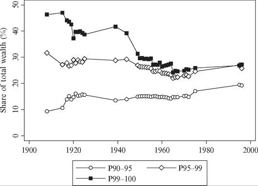
Figure 7.10 Wealth concentration in Denmark, 1908-1996. Source: See the Appendix for details about sources and data.
One way to understand the wealth compression of the Danish industrialization is to compare the identities of the Danish top wealth holders before and after the late nineteenth century. The dominant groups in the top of the wealth distribution in 1789 were owners oflarge agricultural estates. Soltow (1981a-c, p. 126) cited a historical source saying that “some 300 Danish landlords owned about 90 percent of the Danish soil.” By contrast, in 1925, the group with the largest private fortunes was the brokers (Veksellerere) although landlords (Godsejere, Proprietarerog Storforpagterere) were still wealthy, both groups having more than 50 times larger average wealth than the country average.[280]
The drops in top wealth shares after the two world wars were partly associated with the sharply progressive wartime wealth taxes.[281] According to Bjerke (1956, p. 140), however, the fall after the Second World War was also largely due to new routines in the collection and valuation of wealth information of the tax authorities, which in particular made middleclass wealth more visible. Toward the end of the century, the wealth concentration continued declining up to the 1980s, largely due to increased share of the relatively equally distributed house-ownership in the total portfolio (Lavindkomstkommissionen, 1979, Chapter 5), but thereafter started to increase up to the mid-1990s.
7.3.2.1.3 Finland
Finland is another Nordic country for which wealth distribution data exist since the agrarian era and during most of the twentieth century. The country’s industrialization came relatively late, in the interwar period, and even around the Second World War Finland was a predominantly agrarian economy focusing on forest industry and smallscale agriculture. Politically Finland was part of Sweden up until 1809, after which it came under Russian rule until 1917 when Finland ultimately gained independence (Eloranta et al., 2006).
Our estimates of the Finnish historical wealth distribution are essentially based on wealth tax statistics.[282] The earliest known observation of wealth distribution in Finland is 1800, coming from a wealth tax assessment levied in Sweden and Finland. Jutikkala (1953) and Soltow (1980) examined this assessment collecting a representative sample of the gross wealth of almost 2000 male household heads. The taxed households represented about one-third of the population, whereas the other two-thirds were exempt because they lacked a sufficient amount of personal taxable wealth. The next set of estimates comes from estate data in 1907-1909, 1914, and 1915 compiled and published by Statistics Finland.[283] We compute top wealth shares of the deceased but adjust these with respect to the likely difference between top wealth shares of the deceased and living populations using observed differentials in Sweden around the same time. [284] For the early twentieth century, we use Soltow’s (1980) estimates from wealth tax assessments in 1922, 1926, and 1967. All these samples include adjustments for the share of the population without wealth on which no wealth tax was levied. Finally, we have wealth tax tabulations for the period 1987-2005 using net marketable wealth data retrieved directly from Statistics Finland.[285]
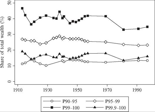
Figure 7.11 presents the evolution of wealth concentration in Finland from 1908 up to 2005, and Figures 7.19 and 7.20 show the trends back to 1800. The top decile held 46% of domestic net wealth in 1800, and its share peaked at 70% in 1909. Over the period the Finnish top percentile share exhibits an inverse-U shape, setting out at a relatively low share in 1800, which was doubled a century later in the years preceding the First World
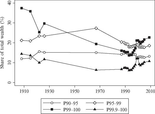
Figure 7.11 Wealth concentration in Finland, 1908-2009. Source: See the Appendix for details about sources and data.
War. The 1920s saw a strong reduction in the top percentile share, possibly due to the civil war taking place at this time. Later on during the twentieth century, the top percentile’s share decreased further, reaching a global low in around 1990 when its share was less than 14% of total personal wealth. However, after this Finland experienced the IT-boom, led by the immense success of mobile phone producer Nokia, and the top percentile share increased swiftly during the 1990s and 2000s, reaching a level of 22% in 2005 (Eloranta et al., 2006). As for the rest of the top decile, the Finnish pattern is similar to that of most other countries studied here. The next four percentiles (P95-99) also experienced an inverse-U pattern, but peaked later, in the 1960s, after which its share started to decrease. The bottom half of the top decile hovered around 10-15% of total wealth.
Overall, the historical wealth concentration in Finland follows a pattern that looks very much like an inverse-U. The share of total wealth held by the rich (in the top percentile) increased during the nineteenth century and decreased during the twentieth century. The upper middle class (the rest of the top decile), however, did not change their relative position much during the two centuries covered. Also notable is the relatively low level of wealth concentration in Finland, especially in the year 1800 but also during the twentieth century.
7.3.2.1.4 France
The long-run evolution of French wealth inequality is particularly interesting to study given France’s important role for Europe’s economic and political development. Piketty et al. (2006), and later adjusted by Piketty (2014), presented new data on wealth concentration for Paris and France over almost 200 years from the Napoleonic era up to today. No previous study on any country has produced such long homogenous time series, offering complete coverage of wealth inequality overindustrialization. The French wealth data comes from estate sizes collected in relation to an estate tax established in 1791 and maintained for more than two centuries. For every 10th year during 1807-1902, the authors manually collected all estate tax returns recorded in the city of Paris—Paris was chosen both for practical reasons but also because it hosted a dispro- portionally large share of the wealthy in France. Using summary statistics on the national level for the estate tax returns, the top Paris wealth shares were “extrapolated” to the national level. For the post-1902 period, tabulated estate size distributions published by French tax authorities were used.
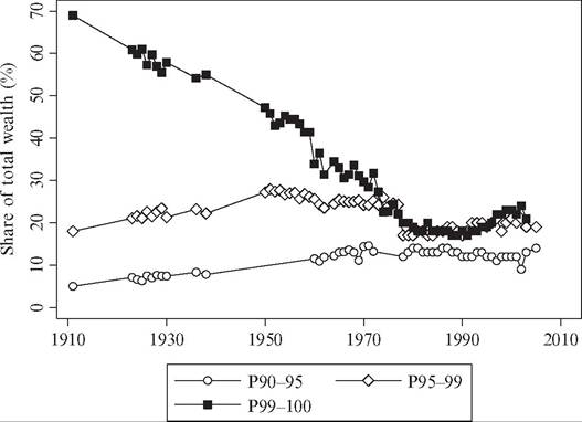
Figure 7.12 shows the evolution of the wealth shares for some fractiles within the top wealth decile in France since 1900, while Figures 7.19 and 7.20 show the trends beginning in the early nineteenth century. The estimates are from the population of deceased, that is, directly from the estate tax returns, but comparisons with the equivalent wealth shares for the distribution of the living population (computed using estate multipliers) reveal practically identical trends and levels.[286] The figures show that wealth
Figure 7.12 Wealth concentration in France, 1900-2010. Source: See the Appendix for details about sources and data.
concentration increased significantly for the top 1 and 0.1 percentiles over the nineteenth century, first slowly up to the 1870s then more quickly until its peak at the eve of the First World War. By contrast, the two lower groups in the top decile are much less volatile during the period. The bottom half (P90-95) held about 9% of total wealth until the First World War when its share started to increase slowly until it had doubled by the 1980s. The next 4% (P95-99) stayed put on a level around 27% of total wealth throughout the period. These patterns suggest that the French industrialization, which took off around midcentury, greatly affected personal wealth. It did so already after a couple of decades, but only in the absolute top. This conclusion is further supported by two other observations. First, the composition of top wealth went from being dominated by real estate assets (mainly land and palaces) in the first half of the century to being dominated by financial assets (cash, stocks, and bonds), which were supposedly held by successful industrialists and their financiers. Second, over the same period the share of aristocrats among top wealth holders decreased from about 40% to about 10%.[287] [288] From the First World War to the end of the Second World War, top wealth shares declined sharply, which according to Piketty (2003) is directly linked to the shocks to top capital holdings that inflation, bankruptcies, and destructions meant. The postwar era was quieter with regard to changes in the wealth concentration, although its decline continued most likely in relation to the increase of progressive taxation (Piketty et al., 2006).
7.3.2.1.4 TheNetherlands
The Netherlands represents and interesting point of reference to the analysis of long-run trends in wealth inequality among Western economies. Although the Netherlands did not industrialize in the traditional sense until the middle of the nineteenth century, its economy was already developed due to its role in the expansion of global trade that started already in the sixteenth century. According to van Zanden (1998b), this may explain the apparent lack of increase in inequality following the Industrial Revolution. Although inequality grew during the preindustrial era due to high growth rates but stagnant real incomes, industrialization did not only boost fortunes of the wealthy but there was also an increased demand for all kinds of labor, skilled as well as unskilled.
The previous literature on historical wealth inequality in the Netherlands is relatively rich. Soltow (1998) and Vermaas et al. (1998) present a series of estimates of inherited wealth and housing inequality in different Dutch regions from the beginning of the nineteenth century. Unfortunately, defining a trend over the nineteenth century appears to be difficult. The only comparable information between 1808, 1880, and 1908 comes from inheritance tax records that cover inheritances to distant heirs, that is, not spouses and children. The data indicates a slight increase in inequality.
The most comprehensive longitudinal data are offered by the wealth tax statistics, which allow for an estimation of top wealth shares since 1894. The primary source of these observations is Wilterdink (1984), which presented a detailed account of the top vintile and groups within it for selected years between 1894 and 1974. The estimates stem from wealth tax records, showing the distribution among wealth tax units (mainly individuals), whereas the recent wealth survey data show the distribution among households. For the most recent years, Statistics Netherlands has compiled wealth-tax based distributions for the periods 1993-2000 and 2006-2011.[289]
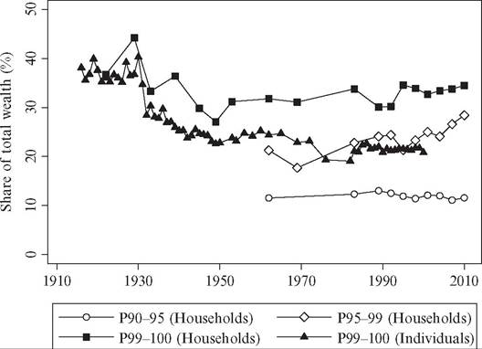
Figure 7.13 shows the top wealth shares of the Netherlands from this year up to 2011. Wealth concentration was a high and stable around the turn of the century 1900. Thereafter the top percentile wealth share started decreasing. Both Wilterdink (1984) and van Zanden (1998a) highlighted the role of the geopolitical events, and these are clearly seen in the falls in top percentile shares during the two world wars and the depression of the 1930s. However, the researchers also emphasized the role of governmental redistribution, in particular the imposition of heavy wealth taxes after 1946 to finance the reconstruction after the war.
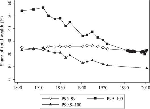
Figure 7.13 Wealth concentration in the Netherlands, 1894-2011. Sources: See the Appendix for details about sources and data.
7.3.2.1.5 Norway
Data on Norwegian wealth concentration come mostly from various kinds of wealth taxation. Overall, these data are perhaps the most uncertain presented in the entire chapter, and the estimates of top wealth shares presented in this chapter must therefore be interpreted cautiously. The first observation is from 1789, when the wealth tax assessment that also was launched in Denmark came into place (the two countries were in a political union at this time). As in Denmark, both real and financial assets were subject to taxation, including land, houses or farms, factories, livestock, mills, shop inventories, and financial instruments. Debts were not deducted, and hence the wealth concept is gross wealth.[290] Our second observation is from 1868, when the Norwegian government launched a national wealth tax assessment. Mohn (1873) presents totals for wealth and households and a tabulation of the wealth held by the top 0.27% (P99.73-100) of all households, including a detailed listing of the 15 overall largest fortunes.[291] For 1912, we use wealth tax returns from the taxation of 1913-1914 (exempting financial wealth) which are presented in tabulated form in Statistics Norway (1915b).[292] Similarly, for 1930 we use tabulated wealth distributions (number of wealth holders in wealth classes along with totals for wealth and tax units) presented in Statistics Norway (1934).
From 1948 onward, we use the tabulation of wealth holders and wealth sums in classes of net wealth published annually in the Statistical Yearbook of Statistics Norway. In the early 1980s the wealth statistics started being reporting for individual taxpayers instead of, as before, for households. To keep our series as consistent as possible, we attempted to convert the post-1982 observations from reflecting the individual distribution to reflect the household distribution using a listing of both types by Statistics Norway for the year of 1979.[293]
For the period since 1993, we use tabulated wealth distributions published on the Statistics Norway’s Web site.[294] Somewhat ironically, the uncertainty about these data is perhaps largest because both asset coverage and valuations are highly problematic. For example, tax-assessed values of housing are heavily discounted and represent on average no more than a fifth of their true market value, with the discount being larger for more expensive dwellings (Epland and Kirkeberg, 2012). For this reason, household net tax- assessed wealth is negative for practically every Norwegian household. Furthermore, it is not obvious that the distributional trends in tax-assessed net assets are the same as those in market-valued assets if there are also trends in market-to-tax values of dwellings.
To shed some additional light on these matters, we refer to what we see as the most reliable estimate of the Norwegian net wealth distribution presented by Epland and Kirkeberg (2012). This investigation brings together a rich microdata material for 2009, carefully estimates market-valued assets and liabilities, and computes wealth inequality estimates. The study finds that the top wealth decile held about 53% and the top percentile about 21% of all net wealth (Epland and Kirkeberg, 2012, table 8). Interestingly, although the aforementioned tax-based tabulations of net wealth made no sense, the distribution of gross wealth seems less off the chart, producing for 2009 top shares of 54% for the top decile and 26% for the top percentile. For this reason, we use the time series pattern offered by the tabulated gross wealth of Statistics Norway and scale down the wealth shares to match the Epland-Kirkeberg reference level of2009.
Altogether, the Norwegian long-run wealth concentration estimates are thus highly problematic in several respects. Looking at the overall trend in wealth concentration, however, it appears to be relatively robust to variations in some of our assumptions, and it does not deviate much from the long-run inequality trends observed in other countries.
Figure 7.14 presents the trends in Norwegian wealth concentration between 1912 and 2002, while the trends back to 1789 are shown in Figures 7.19 and 7.20. The top wealth decile is broken up into the bottom 5% (P90-95) of wealth holders, the next 4% (P95-99), the top percentile, as well as the top 0.1 percentile. Norway’s top wealth holders experienced quite different trends in their relative positions over the period. As for the bottom 5% of the top decile, its share decreases between 1789 and 1912 and then jumps up sharply between 1912 and 1930 to land on a fairly stable (though slowly declining) level thereafter. The wealth share of the next 4% exhibits an inverse-U shaped pattern, increasing sometime in the nineteenth century (we do not know exactly when due
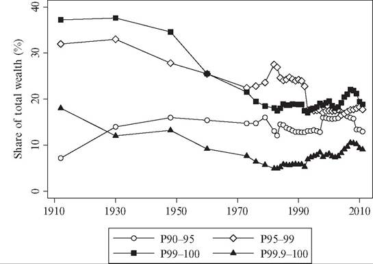
Figure 7.14 Wealth concentration in Norway, 1912-2011. Sources: See the Appendix for details about sources and data.
to a lack of data), peaking in 1930 and then declining almost monotonically over the rest of the twentieth century. Finally, the share of the top wealth percentile decreases significantly between 1789 and 1868, both years predating Norway’s industrialization period. The share then goes up to slightly in 1912 only to start decreasing again. The most dramatic falls occur in the postwar period, with the top percentile dropping from 34.6% to 17.5% during 1948—1983 and the top 0.1 percentile going from 13.2% to 5.7% over the same period. In the 1990s, there is a rapid recovery, which may be related to the oil fortunes being built up in recent times and to the rise in world stock markets prices that also produced a rise in the top income shares over this period (Aaberge and Atkinson, 2010). The sizeable increase between 1997 and 1998 can also be explained by a change in the Norwegian tax laws specifying an increase in the assessed values of corporate stock on personal tax returns.[295]
Despite the somewhat disparate trends among Norway’s top wealth holders and underlying problems with the Norwegian wealth tax-based data series, the evidence presented in Figures 7.14, 7.19, and 7.20 nonetheless corresponds relatively well with what one could expect given the economic and political history of Norway over this period. The Norwegian economy was badly hit by the economic crisis after the Napoleonic wars, and there was a shift in the political power from the great landlords and landed nobility to a class of civil servants.[296] When merchant shipping expanded in the world after 1850, Norwegian shipowners and manufacturers experienced a tremendous economic boost. When looking at the average wealth of various occupations in 1868 listed in Mohn (1873: 24), the four richest groups were manufacturers (having 160 times the country average household wealth), merchants (124 times), shipowners (96 times), and civil servants (87 times). Half a century later, in 1930, a similar comparison between the wealth of top occupations groups and the country average was made (Statistics Norway, 1934, p. 6), and only shipowners had kept the distance to the rest of the population (having 119 times the country average wealth), whereas merchants (22 times) and manufacturers (19 times) had lost wealth relative to the average.
87
7.3.2.1.6 Sweden
In a recent study, Roine and Waldenstrom (2009) compiled available evidence ofhistor- ical wealth distribution data for Sweden to construct a homogenous series of top wealth shares from the time of the industrial takeoff in the late nineteenth century up to the early 2000s.[297] The primary basis for these series was wealth tax statistics published in various sources, including censuses and special public investigations by tax authorities or the Ministry of Finance. The concept of wealth in these sources is typically net wealth in tax-assessed values. However, these data were complemented by estate tax material originally presented by Ohlsson et al. (2008) for a few points in time: 1873-1877,1906-1908, 1954/55, 1967, and 2002-2003. A striking resemblance between wealth tax and estate tax data emerges regarding the patterns over the twentieth century. In addition to these sources, there is also an early observation of Swedish gross wealth inequality in 1800 using evidence collected by Soltow (1985) from a national tax assessment.[298] [299] This observation comes from a wealth census that was carried out in 1800 and describes the gross wealth distribution for the population of males aged 20 and older.9 Figure 7.15 shows the evolution of top wealth shares since 1908 while Figures 7.19 and 7.20 depict the trends over the past two centuries. Looking first at the pattern over the nineteenth century, our observations indicate a relatively stable wealth distribution, which by today’s standards was very unequal. As there are no observations between 1800 and 1873 (or actually 1908), there is little that can be said about the nineteenth-century Figure 7.15 Wealth concentration in Sweden, 1908-2007. Sources: See the Appendix for details about sources and data. development. However, Soltow (1989a) made attempt to do so using public reports about the amount of citizens in four specified social classes (“destitute,” “poor,” “moderately rich,” and “rich”) between 1805 and 1855 and some other sources ofprop- erty distribution. His main conclusion regarding the wealth inequality trend is that overall inequality seems to have decreased over this period and all the way up to the twentieth century.[300] Soltow admits, however, that his calculations do not exclude the possibility that the top 1 or 2 wealth percentiles may have actually increased their share of total private wealth. Over the twentieth century the picture is much clearer. We are able to use multiple sources that overlap in time, and even though there is still uncertainty about the levels over time, the trends seem relatively certain. The long-run trend in wealth concentration in Sweden over the twentieth century is that the top decile has seen its wealth share drop substantially, from around 90% in the early decades of the century, to around 53% around 1980, and then recovering slightly to a level around 60% in recent years. In the bottom half of the Swedish wealth distribution there is a considerable share of households holding negative net wealth, a fact that appears to be partly due to widespread state loans for college studies but partly also because several important assets, for example, condominiums and private and public pension savings, are not fully covered in the official wealth statistics. 92 Lookingjust at this general trend is, however, incomplete if one is to really comprehend the evolution of wealth concentration. Decomposing the top decile as shown in Figure 7.15, we see that the majority of the top decile actually experiences substantial gains in wealth shares over the first half of the century. The overall drop in the top decile share is explained by such dramatic decreases in the top percentile share that this outweighs the increase for the lower groups in the top decile. In the period 1950—1980 the entire top 5 percentile experiences declines in wealth shares, but the decrease is larger for the top percentile, and after 1980 the trend is again the same for both groups but now the gains in wealth shares are somewhat larger for the top percentile. How can we account for these developments? Focusing first on the decreases in the very top of the distribution over the first half of the century we note that most of the decrease takes place between 1930 and 1950, with the sharpest falls in the early 1930s—a time of financial turbulence and in particular the collapse of the Kreuger company empire—and just after the Second World War.[301] The period after 1945 was a time when many of the reforms discussed in the 1930s, but put on hold by the war, were expected to happen, and politically the Communist Party gained ground forcing the Social Democratic Party to move to the left.[302] In particular, the progressive taxes that had been pushed up during the war remained high and also affected wealth holdings as Sweden had a joint income and wealth tax until 1948. The main reason for the decreasing share in the very top is, however, likely to be the increasing share for the lower part of the top decile, and this, in turn, is likely to be increased wealth accumulation among relatively well-paid individuals. After 1945 the trend of increased accumulation of wealth continues down the distribution. Over the next 30 years the most important change is the increased share of owner-occupied housing in total wealth, which increases from being 17% of all wealth to 45% in 1975 and remains around that in 1997 when adding owner-occupied apartments and houses and vacations homes (Roine and Waldenstrom, 2009). Even if this type of wealth was far from evenly accumulated across the distribution, it accrued to relatively large groups in the distribution causing wealth concentration to keep falling. Today about half of all households in Sweden own their homes.[303] Over the past decades fluctuations in wealth shares depend largely on movements in real estate prices and share prices. Increases in the former have a tendency to push up the share of the upper half of the distribution at the expense of the very top causing inequality to go down, whereas increases in share prices make the very top share larger due to share ownership still being very concentrated causing inequality to increase.[304] In the year 1997 the top percentile in the wealth distribution owns 62% of all privately held shares, and the top 5% holds 90%.[305] 7.3.2.1.7 Switzerland Data on the Swiss wealth concentration are based on wealth tax returns compiled by tax authorities for disparate years between 1913 and 1997 and analyzed by Dell et al. (2007). The Swiss wealth tax was levied on a highly irregular basis, and the authors have therefore spliced several different point estimates from local as well as federal estimates to get a roughly continuous series for the whole country. Figure 7.16 depicts top wealth shares within the Swiss top wealth decile over the twentieth century. In stark contrast to the other countries surveyed in this study, wealth concentration in Switzerland appears to have been basically constant throughout the period. The wealth shares at the top of the distribution have decreased, but the movements are small compared to all other countries studied.[306] This does not only refer to the Figure 7.16 Wealth concentration in Switzerland, 1913-1996. Sources: See the Appendix for details about sources and data. top decile vis-a-vis the rest of the population, but perhaps most strikingly also to the concentration of wealth within the top. The highest percentile and the top 0.1 percentile have not gained or lost considerably compared the bottom 9% of the top decile, except for some short-run fluctuations. Accounting for this long-term stability of Swiss wealth inequality is not easy. One possibility is the country’s relatively low level of wealth taxation, which suggests a low rate of redistribution and small effects on the incentives to accumulate new wealth. The twentieth-century experience with high taxes on wealth and inheritance appears to have contributed to the low top income and wealth shares in a number of countries, as we discuss elsewhere in this chapter. However, the fact that Switzerland stayed out of both world wars cannot alone account for the stable wealth distribution; Sweden also escaped both world wars does not share the Swiss pattern. In any case, the Swiss top wealth share series seriously questions the hypothesis that significant economic development always lead to a lower level of wealth inequality over time for reasons of either redistribution or simply relatively quicker accumulation of household wealth among the middle class. 7.3.2.1.8 United Kingdom There are a number of estimates of the wealth concentration in the United Kingdom dating back to the country’s industrialization in the middle of the eighteenth century. Prior to 1900, data on wealth distribution are less homogenous and emanate from scattered samples of probate records and occasional tax assessments (see Lindert, 1986, 2000; Soltow, 1981a-c). It was not until the Inland Revenue Statistics started publishing compilations of estate tax returns after the First World War that the series are fully reliable (see Atkinson and Harrison, 1978; Atkinson et al., 1989).[307] [308] Still there are some notable breaks in the series. For example, the geographical unit of analysis changes over time, with preSecond World War numbers almost always being England and Wales, whereas the postwar ones reflect all of the United Kingdom. Data in Atkinson et al. (1989, table 1) show, however, that the differences between these entities are fairly small. More important, the tax authority changed some of its methods to compute top wealth shares leading to large breaks in the time series around the Second World War, in 1960, and around 1980. Among the important changes were lowered age cutoffs, different treatment of life insurance policies and valuation of consumer durables, and also more careful collection routines of the tax authorities.1 Figure 7.17 Wealth concentration in the United Kingdom, 1911-2005. Notes and sources: England and Wales up to 1960, Great Britain thereafter. See the Appendix for details about sources and data. When England industrialized in the second half of the eighteenth century, the buildup of personal wealth also changed. Looking at the overall wealth concentration since 1911 in Figure 7.17 and Figures 7.19 and 7.20 for the period back to 1740 it is evident that there is great heterogeneity within the top 5 percentiles of the distribution.[309] Apparently, wealth concentration at the very top increased, while, by contrast, the wealth share of the next four percentiles saw its wealth share decline during the same period. Using supplementary evidence on personal wealth, Lindert (1986, 2000) shows that wealth gaps were indeed increasing in the absolute top during the nineteenth century, with large landlords and merchants on the winning side. At the same time, Lindert points out that the middle-class (in this case those between the 60th and 95th wealth percentiles) were also building up a stock of personal wealth, and this is probably what is causing the drop in the share of the next 4% in Figure 7.17. After the First World War, the pattern was the reversed. While the top percentile wealth share dropped dramatically from almost 70% of total wealth in 1913 to less than 20% in 1980, the share of the next four percentiles remained stable and even gained relative to the rest of the population. Atkinson et al. (1989a,b) argued that this development was driven by several factors, but that the evolution of share prices, the ratio of consumer durables, and owner-occupied housing (so-called popular wealth) to the value of other wealth were the most important ones. According to the most recent statistics from the Inland Revenue, the top percentile’s share increased by about one-third between 1990 and 2003, but this increase has not yet been explained by researchers. 101 Possibly, it reflects the surge in share prices following the financial market deregulation of the 1980s as the financial wealth are most concentrated to the absolute top of the wealth distribution.1 7.3.2.1.9 UnitedStates The historical development of wealth concentration in the United States has been extensively studied by economists and historians, and estimates are available back to the time of the American Revolution. In this study, we combine different pieces of evidence to create a long and relatively homogenous series of wealth inequality. As acknowledged by previous scholars, there are several problems concerning consistency over time, which has spurred some controversy over both definitions of data and conclusions drawn. For these reasons, we compare some of the complementary series using different sources and wealth definitions to get an idea of how large these problems may be. Our focus is the evolution of U.S. top wealth shares from colonial times to the present day. The main series refer to the distribution of net wealth among households, and for these we show wealth shares of fractiles within the entire top decile. Still the figure also presents the top percentile shares in the adult distribution for which there are rich, annual data available over especially the twentieth century. The top wealth shares for the household distribution prior to 1900 are few but important as they determine our notion of the link between industrialization and inequality in the United States. There has been some disagreement over the pre-1900 inequality trends, with some scholars arguing that preindustrial U.S. inequality was high and that inequality was basically stable during the nineteenth century (e.g., Soltow, 1971,1989), whereas others have argued that U.S. wealth inequality increased markedly between the Revolution and the latter half of the nineteenth century (e.g., Lindert, 2000; Williamson and Lindert, 1980a,b). In this chapter, we use the observations reported by Lindert (2000). These are essentially the estimates from the seminal contributions of Alice HansonJones (see, e.g., Jones, 1970, 1972, 1980), which included adjustments to add unfree men and women to the reference total population. The available evidence for the twentieth century is more unified, with long-run series being based on a combination of estate tax returns and survey data (see, e.g., Lampman, 1962; Smith, 1984; WolffandMarley, 1989). We use the compilation of those sources by Wolff (1996) for the period up to 1958, and for the period thereafter we use the survey data from the SCF and its forerunners presented by Kennickell (2009, 2011).[310] [311] For the adult population, our preferred estimate for 1774 is from Lindert (2000).[312] For the nineteenth century, there are unfortunately only gross wealth estimates for the adult population (see Lindert, 2000), and therefore the next evidence is for the years 1916—2000 provided by Kopczuk and Saez (2004) using mortality multiplier-adjusted federal estate tax returns. Figure 7.18 shows the results for the period since 1916 and Figures 7.19 and 7.20 for the period back to 1774. Beginning with the two top percentile series, they appear to be inversely U-shaped over the period, with wealth shares increasing slowly between the late eighteenth and the mid-nineteenth centuries but then much faster between 1860 and 1929, when they more than doubled. The long-run pattern of the lower 9% of the top wealth decile, however, exhibits stable or even decreasing shares of total wealth (although based on rather few observations). This inequality increase in the absolute top coincides with the industrialization era in the United States around the mid-nineteenth century. Although the few pre-First World War estimates are uncertain, their basic message is supported by researchers using other sources. For example, Rosenbloom and Stutes (2008) also found in their cross-sectional individual analysis of the 1870 census that regions with a relatively high share of its workforce in manufacturing had relatively more unequal wealth distributions (see also Moehling and Steckel, 2001). Another anecdotal piece of evidence in support for a linkage between industrialization and increased Figure 7.18 Wealth concentration in the United States, 1916-2010. Sources: “Households” and “Individuals” refer to different wealth holder populations. See the Appendix for details about sources and data. Figure 7.19 Wealth concentration in 10 countries, 1740-2011. Sources: Graph shows top percentile (P99-100) wealth shares for all countries. See the Appendix for details about sources and data. Figure 7.20 Wealth share of the “next four percentiles” (P95-99) in nine countries. Sources: See the Appendix for details about sources and data. inequality is that the 15 richest Americans in 1915 were industrialists from the oil, steel, and railroad industries and their financiers from the financial sector.[313] [314] The twentieth-century development in Figure 7.18 suggests that wealth concentration peaked just before the Great Depression when the financial holdings of the rich were highly valued on the markets. In the depression years, however, top wealth shares plummeted as stocks lost almost two-thirds of their real values. Kopczuk and Saez (2004) showed that corporate equity represented more than half of the net wealth of the top 0.1 percentile wealth holders in 1929. Another contributing factor to wealth compression was surely the redistributive policies in the New Deal. After the Second World War, the top percentile wealth shares remained low until the 1980s, when the top household percentile’s share increased significantly, peaking around mid-late 1990s and then to decline somewhat in 2001. By contrast, the top adult percentile wealth share from the estate series in Kopczuk and Saez (2004) exhibits no such increase, which is surprising given that this period also saw a well-documented surge in U.S. top incomes (Piketty and Saez, 2003). Whether the difference in trends between the household and adult distributions reflects inconsistencies in the data or some deeper dissimilarity in the relation between income and wealth accumulation remains to be examined by future research. 7.3.2.2 Cross-Country Trends in Long-Run Wealth Concentration Earlier we presented a compilation of recent as well as some new evidence on the long- run evolution of wealth inequality in 10 Western countries: Australia, Denmark, Finland, France, the Netherlands, Norway, Sweden, Switzerland, the United Kingdom, and the United States. As we have already pointed out, the quality of these data differs substantially across countries and in some cases even within single countries over time. Like many previous researchers, we have attempted to adjust the series to make them consistent and comparable over time, but naturally some problems remain. Still, we have tried to classify the series (countries) into different quality levels to run the analysis on more homogenous subsets, and those exercises do not produce any notably different conclusions with respect to the long-run trends in wealth concentration.1 Figure 7.19 shows the top wealth percentile in each of these countries for various periods during 1740-2011. Furthermore, Figure 7.20 contrasts the trends in the top percentile against those in the next Iburpercentiles (P95-99). Even though great caution should be taken when comparing these series, we still believe that some conclusions can be drawn about the developments of wealth inequality in these countries over the past 200 years. Twobroadconclusions can be drawn from the series as summarized in Table 7.5. First, the evidence does not unambiguously support the idea that wealth inequality increases in the early stages of industrialization. Looking at the development of the wealth share of the top percentile among the countries analyzed here, the Nordic observations indicate fairly stable inequality levels over the initial stages of industrialization (i.e., in the late nineteenth century). The U.K. series (England and Wales) exhibits clearly increasing wealth shares for the top percentile in the period of the two industrial revolutions (1740-1911), as do the U.S. and French series over the nineteenth century. For the Netherlands, the evidence is less certain, indicating either a flat or a slightly increasing nineteenth-century trend (van Zanden, 1998b; Vermaas et al., 1998). Overall this suggests that going from a rural to an industrial society, with entirely new stocks and types of wealth being created, may, but does not necessarily, give rise to a large increase in wealth concentration. It also suggests that—-just as in the case with income inequality series—carefully studying smaller fractiles of the distribution is necessary to get a more complete picture of the development. Second, although the series do not suggest a clear common pattern over the nineteenth century when industrialization took place (first in the United Kingdom, later in the United States, France, and the Netherlands and toward the end of the century in the Nordic countries), the development over the twentieth century seems more uniform. Top wealth shares have decreased sharply in just about all countries studied in this Table 7.5 Wealth inequality trends across eras, 10 Western countries Notes: The nineteenth century inequality trends forthe Netherlands are not observed directly, but various sources indicate that there was little increase in inequality during the Dutch industrialization since the middle of the century (see Section 7.3.2.1.5 on Netherlands). chapter with the exception of Switzerland and possibly also the United States, where the fall has been small, but where the level also was not as high historically as in most European countries. The magnitude of the decrease seems to be that the top percentile lost its share of total wealth by about a factor of 2 on average (from around 40-50% in the beginning of the century to around 20-25% today). It also seems that the lowest point in most countries was around 1980 and that the top percentile wealth share has increased in most countries after that. Interestingly, the wealth share of the next 4 percentiles (P95-99) does not display any strong indications of a decreasing trend. Indeed, there are periods of notable equalization also affecting this wealth fractile, but over the course of the entire century Table 7.5 clearly highlights that this moderately rich group sustained its share of total wealth. This said, there were likely replacements between economic groups and types of actors over time (as also suggested by the country case studies earlier), indicating that the cross-sectional evidence also needs to be complemented by evidence about mobility within the distribution.[315] Similar to the analysis of long-run top income shares, we can make a closer examination of the evolution of wealth concentration expressed in terms of wealth shares of the very top groups within the larger top group. This approach results in a slightly different measure of inequality as it looks at the inequality within the top of the wealth distribution and not overall inequality. As some theories are especially concerned with widening gap among the rich, investigating inequality among the wealthy can make sense.[316] [317] Furthermore, estimating the reference total wealth held by the full population is associated with potential error. Applying the shares-within-shares measure by dividing the top wealth percentile by the top wealth decile, P99-100/P90-100, we land at a ratio that effectively eliminates the reference total.1 Figure 7.21 depicts the evolution of wealth concentration using the shares-within- shares estimate. Two countries drop of out the picture (Australia and the Netherlands) due to a lack of long-run data on the top wealth decile, and there are also fewer observations for the countries still in the comparison. Still the patterns confirm our previous findings. The equalization of the twentieth century is clearly observed except for in the Swiss (and possibly the United States) cases. As for the nineteenth-century development, the picture gets a bit blurry, largely due to a lack of data. The Nordic countries exhibit similar inequality trends as given earlier: rising in Finland and Sweden but falling in Denmark and Figure 7.21 Shares-within-shares (P99-100/P90-100), nine countries, 1740-2011. Notes and sources: The shares-within-shares measure is computed by dividing the top wealth percentile (P99-100) by the top wealth decile (P90-100). The resulting measure eliminates the (often separately constructed) reference wealth total from the equation and thereby offers a robustness check of the overall trends. However, the measure also provides a metric of the wealth inequality within the top. See the Appendix for details about sources and data. Norway. France also looks quite similar as when the actual top shares are examined. Overall this implies that, notwithstanding the variations, most of the long-run wealth inequality trends are driven not by the changes of the very top in relation to those just below, but by the change of the entire wealth top in relation to the rest of the population. 7.3.3 The Composition of Wealth Up until this point, the analysis has dealt primarily with the distribution of total net wealth. However, the composition of wealth across asset types (and debts) also matters to wealth inequality trends just as the composition of labor and capital incomes was shown in the previous sections to matter for the trends in income inequality. Unfortunately, when it comes to the historical evidence about wealth composition across the wealth distribution, we know almost nothing. As for the aggregate composition of private wealth, we know more thanks to both old and more recent evidence.[318] These data show that agricultural assets practically vanished over the course of the two past centuries. Private housing, by contrast, increased its share of total national wealth from one-fifth in the nineteenth and early twentieth centuries to three-fifths today, largely corroborating the previously documented postwar rise in “popular wealth,” dwellings, and consumer goods, among the broad layers of the population.[319] 110 Among the few studies that contain evidence on the wealth composition across different groups of wealth holders, less than a handful offer some kind of historical evidence. One stylized fact that seems to hold regardless of time period, however, is that financial assets in general, and corporate securities in particular, are consistently more important in the portfolios of the rich than of the rest of the population. For example, Kennickell (2009) and Cowell (2013) showed that the share of basically financial assets in the top wealth decile was higher than for the population as a whole (except for savings, which are more important for middle-class households between the median and the 90th wealth percentile). Kopczuk and Saez (2004) showed that the share of corporate stock in the portfolios of top 0.5 percentile U.S. wealth holders (using estate tax data) was between 40% and 60% during 1916—2000 and that this was strictly higher than for the whole population (using national wealth estimates).[320] In their study of trends in French wealth concentration, Piketty et al. (2006) documented similar patterns for France over the nineteenth century. Specifically, they looked at the share of personal estate, which includes all nonreal assets, in total assets and found that its share was higher among the richest in the top 0.1 percentile than among the intermediately rich in the rest of the top wealth decile. It was, however, also very high among the broad layers population (the bottom nine wealth deciles). The authors explained this U-shaped pattern by the fact “that real estate is a middle class asset: the poor are too poor to own land or buildings; what little they have is in furniture, cash, or other moveables. In contrast, the rich hold most of their wealth in stocks and bonds” (p. 244). Altogether, the historical evidence on the composition of wealth across the distribution suggests that housing wealth is more important in the portfolios of the broader population, whereas financial assets dominate the portfolios of the rich. Furthermore, the new long-run evidence on aggregate wealth of the private sector shows that housing wealth became more important in total national wealth after the Second World War, and this fact probably explains a large part of the documented wealth compression witnessed in many Western economies during this period. 7.3.4 Concluding Discussion: What Do the Long-Run Wealth Inequality Trends Tell Us? What then can we say about the relationship between wealth concentration and economic development based on the data reported in this chapter? Can one talk about common patterns across countries over the development path or are there mainly a set of disparate country-specific histories? Have initial wealth inequalities been amplified or reduced? Taking stock of the series shown here suggests that industrialization was not unambiguously accompanied by increasing wealth inequality. Although inequality did indeed increase in the United Kingdom, the United States, and France, it probably did not change much in the Netherlands, Finland, Norway, and Sweden and even decreased a little in Denmark. Noting that the countries in the first group all were large, central economies that were early to industrialize, whereas the Netherlands and the Nordic countries were smaller economies that industrialized later, may hold clues to the different experiences but it does not change the fact that industrialization did not increase wealth concentration everywhere. The experience over the twentieth century appears to be much more homogenous. As the countries continued to develop, top wealth concentration also dropped substantially. Looking at the details of the pattern by which different fractiles gain wealth shares indicates that this drop was due to a gradual process of wealth spreading in the population—confirming the role of increasing “popular wealth” identified in, for example, Atkinson and Harrison (1978). In a sense this pattern is consistent with a Kuznets- type process in which inequality eventually decreases as the whole economy becomes developed. However, this development was probably not driven by the kind of process suggested by Kuznets, but mainly by other factors such as political interventions and exogenous shocks. Piketty et al. (2006) argued that it primarily was adverse shocks to top wealth during the period 1914-1945 related with wartime shocks that decreased French wealth inequality and that the subsequent introduction of redistributive policies that prevented them from recovering. Piketty (2011) and Piketty and Zucman (2014) emphasized that the wartime shocks to capital were only to a limited extent the consequence of outright destructions of factories, constructions, or infrastructure, instead pointing at the importance of capital taxation and regulation. A similar explanation is given by Kopczuk and Saez (2004) for the United States.[321] This reasoning has been supported by the fact that Switzerland, which did not take part in either of the wars, exhibits rather stable top wealth shares. Our data on Sweden, which also did not participate in any of the world wars, shows an example of equalization taking place without decreases in top wealth shares driven by exogenous shocks. Even though events such as the Kreuger Crash in 1932 hit top wealth holders in Sweden as well, this does not explain the entire drop. Policy may, at least in Sweden, have played a more active role in equalizing wealth than merely holding back the creation of new fortunes after the Second World War. Suggesting that rising taxation and increased redistribution have been important for the decline of wealth inequality is also consistent with the largest drops taking place in the Scandinavian countries as well as with the smaller decline in Switzerland, with its smaller government. 113 Altogether the data presented here suggest that (a) there was a mixed impact of industrialization and (b) in later stages, after countries became industrial, significant wealth holding spread to wider groups, bringing wealth inequality down. In terms of the often discussed inverse U-shape over the path of development, the first upward part does not seem to be present everywhere, whereas the later stage decrease in inequality does fit all countries we have studied. An important addition to this characterization is that this analogy misses an important point that is present in the series. Whereas the inverse U-shape suggests that the distribution of wealth starts at some level in a nonindustrialized society, then rises, and later returns to the same level of inequality, all our series indicate that development has unambiguously lowered wealth concentration. The proper characterization of wealth inequality over the path of development hence seems to be that, so far, it follows an inverse J-shape with wealth being more equally distributed today than before industrialization started. The direction of future inequality remains to be seen. 7.4.