Venn Diagrams
Venn diagrams are a diagrammatic representation that shows all possible logical relations between a finite collection of sets. The name of Venn diagrams refers to John Venn who formally introduced the tool (Venn 1880), although the tool pre-dates this and was known—as Venn himself mentions—as Eulerian circles (in fact, although Euler used them, there were uses of similar representations even before Euler).[82] Venn diagrams consist of a collection of closed figures, such as circles and ellipses, that include, exclude, or intersect one another such that each compartment is associated with a class.[83]
3.2.1 THE METHODOLOGY AND APPLICATIONS
Applied to the analysis of multidimensional poverty measurement, the interior of each closed figure in a Venn diagram can be used with a set of indicators and associated deprivation cutoffs to represent the number of people who are deprived in a certain dimension.
Naturally, the exterior of each closed figure can be used to represent the number of people who are non-deprived in the same dimension. Note that these two groups—deprived and non-deprived—within each dimension are mutually exclusive and collectively exhaustive with respect to the considered population. The intersections between the closed figures show the extent to which deprivations in different dimensions overlap, that is, the number of people who are jointly deprived in certain dimensions in a particular society.Table 3.1 Joint distribution of deprivations in two dimensions
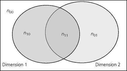
Figure 3.1. Venn diagram of joint distribution of deprivations in two dimensions
When there are only two dimensions, a Venn diagram provides a diagrammatic representation of a 2 ? 2 contingency table, introduced in section 2.2.3.
Here we reproduce Table 2.1 as Table 3.1 in order to visually link it to Figure 3.1 below. Figure 3.1 contains the same pattern of joint distribution as Table 3.1, but in a Venn diagram. The circle with a darker shade to the left denotes the number of people who are deprived in Dimension 1, whereas the circle with a lighter shade denotes those who are deprived in Dimension 2. In this example, without a loss of generality, we assume that more people are deprived in Dimension 2 than in Dimension 1; hence, the circle corresponding to Dimension 2 is larger than that of Dimension 1. The intersection of the two circles represents the number of people who experience deprivations in both dimensions, n11, and is larger or smaller according to the extent of overlap. The diagram also represents the number of people deprived in the first but not in the second dimension, n10, and those deprived in the second but not the first dimension, n01. If some people are deprived in each dimension but no one is jointly deprived, the two circles do not intersect.The Venn diagram is particularly useful when two to four dimensions are involved, because the visual representation is easy to interpret. A three-dimension Venn diagram is shown in Figure 3.2. The diagram depicts the frequencies for all the possible combinations of deprivations using the notation nj∙1 j∙2j∙3, such that jι = 1 signals deprivation in dimension jι and jι = 0 signals non-deprivation in dimension jι for all ι = 1,2,3. Thus, for example, n111 in the intersection of the three circles denotes the number of people who are deprived in all three dimensions, n010 denotes the number of people who are deprived in the second dimension only, and so on for other combinations.
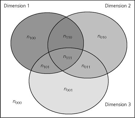
Figure 3.2.
Venn diagram of joint distribution of deprivations in three dimensionsIn empirical work, the Venn diagram has been used as an exploratory tool to understand the overlapping deprivations in various dimensions and to draw attention to mismatches between them (Ferreira and Lugo 2013). For example, Atkinson et al. (2010) use a three-dimension Venn diagram to depict joint deprivations in income poverty, severe material deprivation, and joblessness. Naga and Bolzani (2006) employ a three-dimension Venn diagram to show how there are disagreements on which households are identified as poor when three different definitions based on income, consumption, and predicted permanent income are used. Venn diagrams have also been selected to capture how different poverty measures or multidimensional targeting instruments agree with each other. For example, Roelen, Gassman, and de Neubourg (2009) created a two-dimension Venn diagram to present the mismatch between the monetary poor and the multidimensionally poor; Alkire and Seth (2013a) used Venn diagrams to portray the mismatches and overlaps between multidimensional poverty targeting instruments; and Decancq, Fleurbaey, and Maniquet (2014) evaluated the degree of overlap between measures of poverty based on expenditures, counting, and preference sensitivity.[84]
3.2.2 Acriticalevaluation
Venn diagrams are simple and intuitive, yet powerful and information-rich visual graphics. They depict the level of deprivation by dimension (the relative size of the circles) as well as the matches and mismatches across deprivations. By presenting the
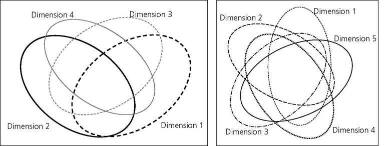
Figure 3.3. Venn diagrams of deprivations for four and five dimensions
joint distribution, Venn diagrams provide more information than dashboard measures or composite indices. Additionally, although Venn diagrams do not identify who is poor, they organize the information on the joint distribution in such a way that one could graphically outline an equally weighted identification function of the poor.
In terms of limitations, Venn diagrams are intuitively interpretable when there are up to four dimensions. As can be seen from Figure 3.3, the rudimentary diagrammatic interpretation becomes highly complicated when there are five or more dimensions involved, a weakness Venn (1880) highlighted: ‘it must be admitted that such a diagram is not quite so simple to draw as one might wish it to be' (p. 7) and ‘beyond five terms it hardly seems as if diagrams offered much substantial help' (p. 8). Furthermore, this tool does not generate a summary measure, so it is not necessarily possible to conclude if one society has higher/lower poverty than another society, unless, in addition, an identification criterion of the poor has been implemented with the diagram. Finally, the tool does not reflect (when an indicator has a cardinal scale) the depth of deprivation in each dimension. Regardless of the scale, every dimension is converted into the binary states of deprived and non-deprived.3.3