Economic Growth and Income Differences
How could one country be more than thirty times richer than another? The answer lies in differences in growth rates. Take two countries, A and B, with the same initial level of income at some date.
Imagine that country A has 0% growth per capita, so its income per capita remains constant, while country B grows at 2% per capita. In 200 years’ time country B will be more than 52 times richer than country A. Therefore, the United States is considerably 10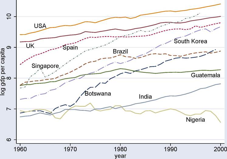
Figure 1.8. The evolution of income per capita in the United States, United Kingdom, Spain, Singapore, Brazil, Guatemala, South Korea, Botswana, Nigeria and India, 1960-2000.
richer than Nigeria because it has grown steadily over an extended period of time, while Nigeria has not (and we will see that there is a lot of truth to this simple calculation; see Figures 1.8, 1.10 and 1.12).
In fact, even in the historically-brief postwar era, we see tremendous differences in growth rates across countries. This is shown in Figure 1.7 for the postwar era, which plots the density of growth rates across countries in 1960, 1980 and 2000. The growth rate in 1960 refers to the (geometric) average of the growth rate between 1950 and 1969, the growth rate in 1980 refers to the average growth rate between 1970 and 1989 and 2000 refers to the average between 1990 and 2000 (in all cases subject to data availability; all data from Penn World tables). Figure 1.7 shows that in each time interval, there is considerable variability in growth rates; the cross-country distribution stretches from negative growth rates to average growth rates as high as 10% a year.
Figure 1.8 provides another look at these patterns by plotting log GDP per capita for a number of countries between 1960 and 2000 (in this case, we look at GDP per capita instead of GDP per worker both for data coverage and also to make the figures more comparable to the historical figures below).
At the top of the figure, we see US and UK GDP per capitaincreasing at a steady pace, with a slightly faster growth in the United States, so that the log (“proportional”) gap between the two countries is larger in 2000 than it is in 1960. Spain starts much poorer than the United States and the UK in 1960 but grows very rapidly between 1960 and the mid-1970s, thus closing the gap between itself and the United States and the UK. The three countries that show very rapid growth in this figure are Singapore, South Korea and Botswana. Singapore starts much poorer than the UK and Spain in 1960, but grows very rapidly and by the mid-1990s it has become richer than both. South Korea has a similar trajectory, though it starts out poorer than Singapore and grows slightly less rapidly, so that by the end of the sample it is still a little poorer than Spain. The other country that has grown very rapidly is the “African success story” Botswana, which was extremely poor at the beginning of the sample. Its rapid growth, especially after 1970, has taken Botswana to the ranks of the middle-income countries by 2000.
The two Latin American countries in this picture, Brazil and Guatemala, illustrate the often-discussed Latin American economic malaise of the postwar era. Brazil starts out richer than Singapore, South Korea and Botswana and has a relatively rapid growth rate between 1960 and 1980. But it experiences stagnation from 1980 onwards, so that by the end of the sample Singapore, South Korea and Botswana have become richer than Brazil. Guatemala’s experience is similar but even more bleak. Contrary to Brazil, there is little growth in Guatemala between 1960 and 1980 and no growth between 1980 and 2000.
Finally, Nigeria and India start out at similar levels of income per capita as Botswana but experience little growth until the 1980s. Starting in 1980, the Indian economy experiences relatively rapid growth, though this has not been sufficient for its income per capita to catch up with the other nations in the figure. Finally, Nigeria, in a pattern that is unfortunately all-too-familiar in sub-Saharan Africa, experiences a contraction of its GDP per capita, so that in 2000 it is in fact poorer than it was in 1960.
The patterns shown in Figure 1.8 are what we would like to understand and explain. Why is the United States richer in 1960 than other nations and able to grow at a steady pace thereafter? How did Singapore, South Korea and Botswana manage to grow at a relatively rapid pace for 40 years? Why did Spain grow relatively rapidly for about 20 years, but then slow down? Why did Brazil and Guatemala stagnate during the 1980s? What is responsible for the disastrous growth performance of Nigeria?
1.4.