Species richness increases with area and decreases with distance
In 1859, H. C. Watson plotted the first curve showing a quantitative species-area relationship—in this case, for plants within Great Britain (FIGURE 18.18) (Williams 1943). The curve starts with a small “bit” of the county of Surrey and expands to ever-increasing areas that eventually encompass all of Surrey, southern England, and finally Great Britain.
With each increase in area, species richness increases until it reaches a maximum number bounded by the largest area considered. (ECOLOGICAL TOOLKIT 18.1 and ANALYZING DATA18.1 provide further insight on how species-area curves are plotted and interpreted.)
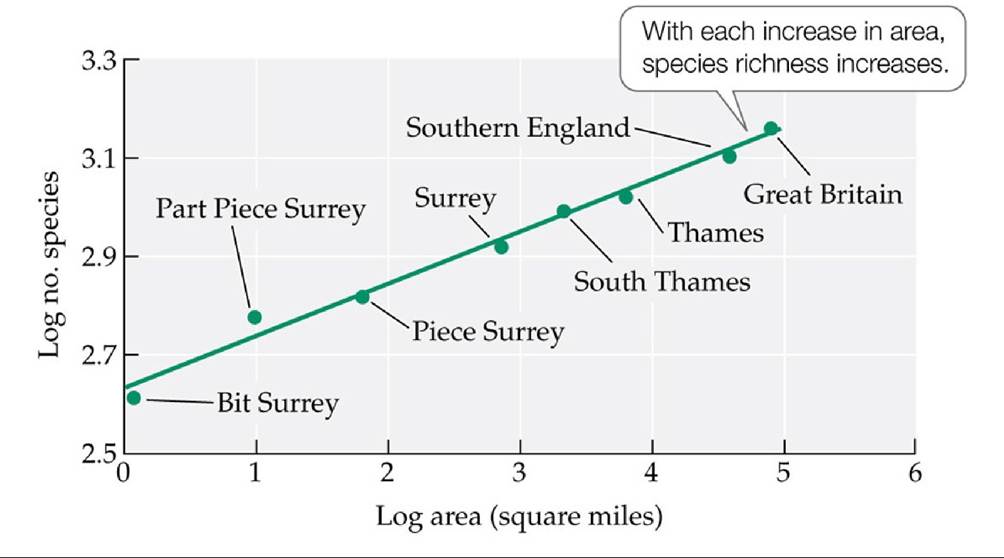
FIGURE 18.18 Thespecies-AreaRelationship The first species-area curve, for British plants, was constructed by H. C. Watson in 1859. (After M. Rosenzweig. 1995. SpeciesDiversity in Space and Time. Cambridge University Press: Cambridge; based on data in C. B. Williams. 1964. Patterns in the Balance of Nature. Academic Press: London; H. C. Watson. 1859. Cybele Britannica: or British Plants and Their Geographical Relations 4: 379. Longman and Company: United Kingdom.) View larger image
ECOLOGICAL TOOLKIT 18.1
Species-Area Curves
Species-area curves are the result of plotting the species richness (S) of a particular sample against the area (A) of that sample. A linear regression equation estimates the relationship between S and A in the following manner: 
where z is the slope of the line and c is the y intercept of the line.
Because species-area data are typically nonlinear, ecologists transform S and A into logarithmic values so that the data fall along a straight line and conform to a linear regression model.
The figure shows species-area curves for plants on the Channel Islands (off the coast of France) and on the French mainland (Williams 1964).
Log transformations were conducted on both the island and mainland data, the two data sets were plotted separately, and a linear model was used to estimate the best-fit curve for each of the data sets.An important characteristic of species-area curves is evident in this figure: the steeper the slope of the line (i.e., the greater the z value), the greater the difference in species richness among the sampling areas. The Channel Islands have a much steeper slope than the French mainland areas, for the reasons outlined at the end of Concept 18.3.
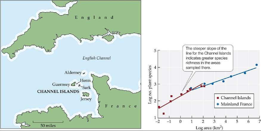
Species-Area Relationships of Island versus Mainland Areas Species-area curves for plant species on the Channel Islands and in mainland France show that the slope of a
linear regression equation (z) is greater for the islands than for the mainland areas. (After M. Rosenzweig. 1995. Species Diversity in Space and Time. Cambridge University Press: Cambridge; based on data in C. B. Williams. 1964. Patterns in the Balance of Nature. Academic Press: London.) View larger image
ANALYZING DATA 18.1
Do Species Invasions Influence Species-Area Curves?
As we learned in Analyzing Data 16.1, the invasion of non-native species has been implicated in both increases and decreases of species diversity within communities. In the study we considered in that exercise, the majority of the non-native species had negative effects on species diversity at relatively small scales (16 m2). Does this pattern hold as we increase the spatial scale over which we sample species diversity?
Kristin Powell and colleagues (2013)* considered this question by comparing the effect of native and non-native plants on forest communities at different spatial scales. They used species-area curves to plot the number of plant species versus the area sampled for three separate tree communities across the United States: tropical forests in Hawaii being invaded by the fire tree (Morella faya), oak-hickory forests in Missouri being invaded by Amur honeysuckle (Lonicera maackii), and hardwood hammock forests in Florida being invaded by the cerulean flax lily (Dianella ensifolia). In each of the forests, they identified multiple pairs of sites on opposite sides of an invasion front that had been ongoing for at least 30 years.
At invaded sites, more than 90% of the plant cover was invaders, while the second site remained uninvaded. Powell et al.'sresults for the Florida forest community are shown in the figure.
1. How do the slope (z) and y intercept (c) of the curve differ for invaded and uninvaded sites? What does this difference tell us about the effect of invaders on species richness at small versus large spatial scales?
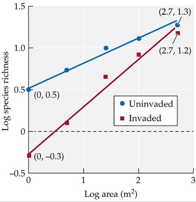
3. Provide a hypothesis that could explain the difference between the species-area curves for invaded versus uninvaded areas.
*Powell, K. I., J. M. Chase, and T. M. Knight. 2013. Invasive plants have scale-dependent effects on diversity by altering species-area relationships. Science 339: 316-318.
Most species-area relationships have been documented for islands (FIGURE 18.19). Islands, in this case, include all kinds of isolated areas surrounded by a “sea” of dissimilar habitat (referred to as matrix habitat). So “islands” can include real islands surrounded by ocean, lake “islands” surrounded by land, or mountain “islands” surrounded by valleys. They can also include habitat fragments, like those produced by the deforestation of the Amazon (see Figure 18.2). Nonetheless, all of these islands and island-like habitats display the same basic pattern: large islands have more species than small islands.
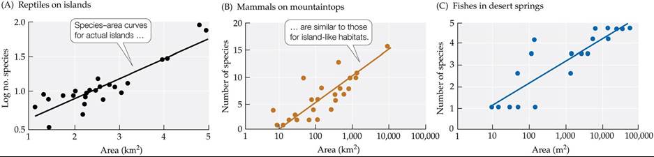
FIGURE 18.19 Species-Area Curves for Islands and Island-Like Habitats Species-area curves plotted for (A) reptiles on Caribbean islands, (B) mammals on mountaintops in the American Southwest, and (C) fishes living in desert springs in Australia all show a positive relationship between area and species richness. (A after S. J. Wright. 1981. Am Nat 118: 726-748; B after M. V. Lomolino et al. 1989. Ecology 70: 180-194; C after A. Kodric-Brown and J. H. Brown. 1993. Ecology 74: 1847-1855.) View larger image
In addition, because of the isolated nature of islands, species diversity on islands shows a strong negative relationship to distance from the main source of species.
For example, Lomolino et al. (1989) found that mammal species richness on mountaintops in the American Southwest decreases as a function of the distance from the main source of species—in this case, two large mountain ranges in the region. This and other examples generally show that islands more distant from source populations, such as those in mainland areas or unfragmented habitats, have fewer species than islands of roughly the same size closer to source populations.
Almost always, however, island isolation and size are confounded. Robert MacArthur and Edward O. Wilson (1963) illustrated this problem by plotting the relationship between bird species richness and island area for a group of islands in the Pacific Ocean off New Guinea (FIGURE 18.20). Here, the islands varied in both size and degree of isolation from the mainland, but some patterns were evident. For example, if we compare islands of equivalent size, the island farthest from source populations (on New Guinea) has fewer bird species than the island closest to source populations.
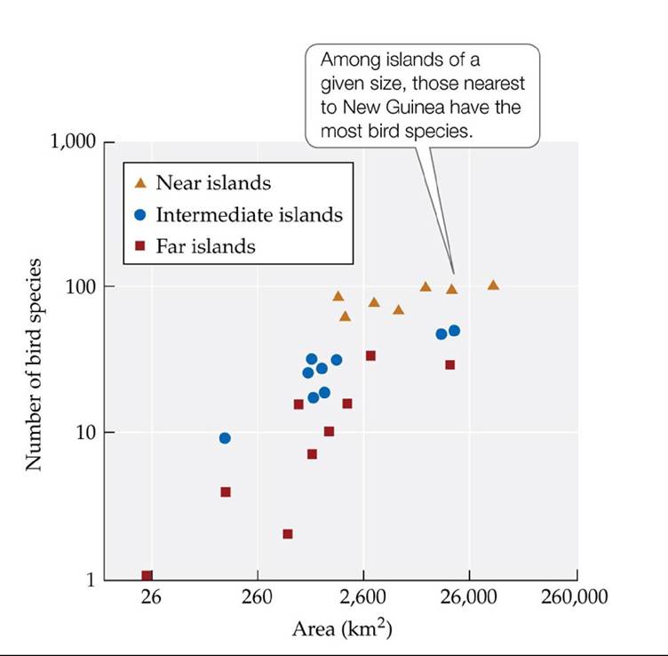
FIGURE 18.20 Area and Isolation Influence Species Richness on Islands MacArthur and Wilson plotted species-area relationships for birds on islands of different sizes and at different distances from source populations (on New Guinea). (After R. H. MacArthur and E. O. Wilson. 1963. Evolution 17: 373-387.) View larger image
Let's turn now to the question of how island area and isolation could together act to produce these commonly observed species diversity patterns.