POVERTY: LEVELS
The vast literature on poverty measurement suggests that there are neither normative nor objective arguments to set an unambiguous threshold below which everybody is poor and above which everyone is nonpoor (Deaton, 1997).
Despite this central conceptual ambiguity, reducing poverty is a deliberate policy objective for governments around the world. The international community has embraced this goal as reflected in the first Millennium Development Goal of halving poverty by 2015. In this section we focus on measures of poverty in the income/consumption space using international poverty lines in terms of U.S. dollars adjusted for purchasing power parity (PPP). This choice implies taking a one-dimensional, monetary, static, absolute view of poverty, that certainly has many limitations and drawbacks, but it is still the best available paradigm to summarize deprivations in the world.The $1-a-day per person at PPP is a poverty standard meant to define an international norm to gauge the inability to pay for food needs. The $1 line, proposed in Ravallion et al. (1991) and used in World Bank (1990), was chosen as being representative of the national poverty lines found among low-income countries. The line was recalculated in 1993 PPP terms at $1.0763 a day (Chen and Ravallion, 2001), and more recently in 2005 PPP at $1.25 a day (Ravallion et al., 2009).
To make international comparisons of economic aggregates researchers have long favored the use of PPP conversion rates, instead of market exchange rates, with the aim of ensuring parity in terms of purchasing power over both internationally traded and nontraded goods. The simplicity of the PPP adjustment, however, entails several potential drawbacks for the international comparison of poverty measures, that have been extensively discussed in the literature.[539] For instance, a concern is that the weights attached to different commodities in the conventional PPP rate may not be appropriate for the poor.[540] The main data sources for estimating PPPs are the price surveys carried out within countries for the International Comparison Program (ICP) (World Bank, 2008).
Although the estimation of PPP conversion rates has substantially improved in the last decades, it still has many limitations, including high variability; the switch from 1993 to 2005 PPP figures led to significant changes in absolute poverty measures in some countries.[541]The $1.25 line is usually deemed too low for middle-income countries; for that reason it is typical to compute poverty with the $2-a-day standard, which is close to the median of the official poverty lines chosen by developing countries. Although these international lines have been criticized, their simplicity and the lack of reasonable and easy-to-implement alternatives have made them the standard for international poverty comparisons.[542] Although the measurement of poverty with national lines takes into consideration that societies differ in the criteria used to identify the poor, the international lines are unavoidable instruments to compare absolute poverty levels and trends across countries and provide regional and world poverty counts.
The World Bank is the main institution that regularly produces information on poverty measurement in the developing world drawn from original microdata from household surveys.[543] In 2013, the World Bank released an update of the developing world’s poverty estimates for 1981—2010. The new poverty estimates combine the PPP exchange rates for household consumption from the 2005 International Comparison Program with data from more than 850 household surveys across 127 developing countries. In this section we rely heavily on that data set (PovcalNet).
The problem of the choice of the welfare variable discussed for inequality in Section 9.3 applies to the measurement of poverty, as well. Although poverty estimates in PovcalNet refer to consumption deprivation, in most countries in Latin America and a few others in the rest of the world, they are constructed from income data. After computing consumption and income poverty in 22 household surveys of 7 Latin American countries using the $2 standard, we find that on average the ratio of consumption/ income poverty is 0.97 with only small differences across countries.
Given this piece of evidence we decided not to perform an adjustment for income poverty figures in the analysis that follows.9.5.1 Income Poverty in the Developing World
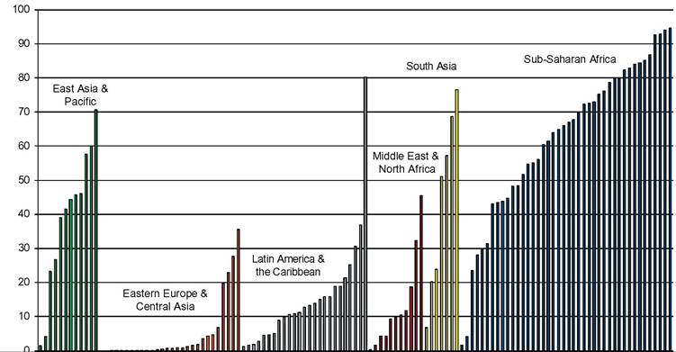
Although poverty is a ubiquitous characteristic of the developing economies, its severity widely varies across countries. Figure 9.15 shows the poverty headcount ratio in most of the developing countries in the world, using the $2-a-day poverty line. The figure reveals the enormous differences among developing nations in terms of monetary deprivation. Although there are economies where the proportion of the population living with less than $2 a day is below 2%, in several countries that proportion exceeds 80%. The problem of absolute income poverty has a radically different scale in some countries compared to others, even within the developing world.
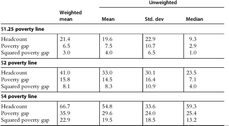
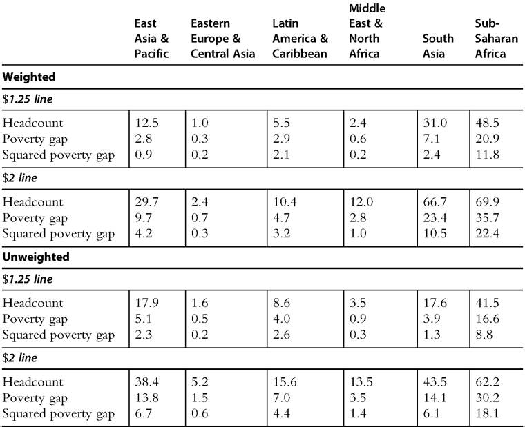
In 2010, 41% of the population in the developing world lived with less than $2 a day. The unweighted mean headcount ratio was significantly lower: In a typical developing country 33% of the population was poor according to that criterion. The difference between the weighted and unweighted mean is not determined by China, as the incidence of poverty in that country is similar to the developing world mean, but by India (and to a lesser extent Indonesia and Pakistan), where the deprivation measures are substantially higher. In fact, when ignoring India both the weighted and unweighted headcount ratios become very close (33.3 and 32.7). The median poverty rate is also lower than the mean (23.5 for the $2 line). Table 9.10 reports these results for other indices and poverty lines. Interestingly, when using the $1.25 line the weighted mean is
96
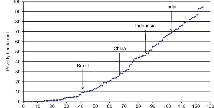
Figure 9.15 Poverty headcount ratio. Developing countries, 2010. Note: Poverty computed over the distribution of consumption/income per capita with the PPP-adjusted $2-a-day line. Source: Own calculations based on PovcalNet (2013).
Table 9.10 Poverty measures
Developing countries, 2010
Note: Poverty computed over the distribution of consumption/income per capita. Source: Own calculations based on PovcalNet (2013).
lower than the unweighted mean for the poverty gap and the squared poverty gap, a result driven by the relatively low value of these indicators in China and Indonesia.
The picture of poverty in the developing world is not significantly affected by changing the poverty indicator or the poverty line. The correlations across countries when using alternatively the headcount (H), the poverty gap (PG) and the squared poverty gap (SPG) with a given poverty line are all higher than 0.9.9 For a fixed indicator the correlations are higher than 0.95 when changing the poverty line. The correlations are only slightly lower when changing both the indicator and the line (e.g., 0.85 for SPG with the $1.25 line and H with the $2 line).
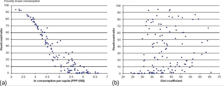
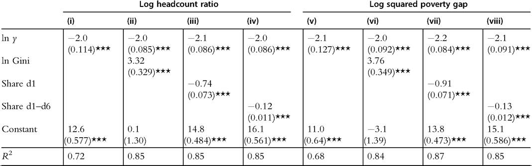
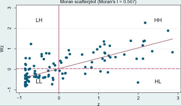
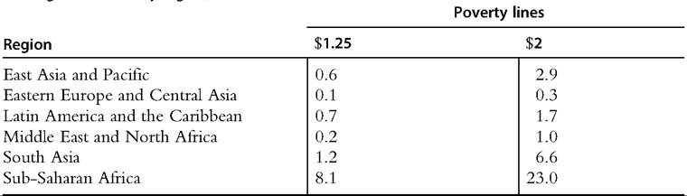
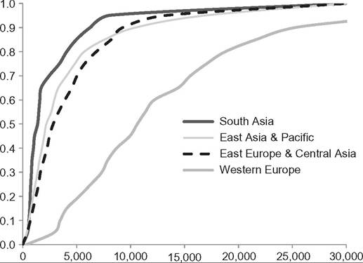
The top 10 steps in the poverty ladder, using the headcount ratio with the $2 line, are all occupied by sub-Saharan African countries.[544] [545] The following 10 features also eight SSA economies, in addition to a Caribbean country (Haiti) and a South Asian nation (Bangladesh). However, given its size, India is the country with the largest number of poor people. Although around 840 million people in that country live with less than $2 a day, the number in the second nation in that ranking, China, is less than a half (359). Both countries are home of 52% of the poor in the world, whereas the following four countries—Nigeria, Bangladesh, Indonesia, and Pakistan—represent 19%. Of course, these exact figures are valid only for a specific definition of income poverty, but the main results are robust to changes in indices and poverty lines.[546] As expected, the relationship between mean consumption and poverty is very tight (Figure 9.16, panel a). A simple model of the headcount ratio ($2 line) on log mean consumption per capita estimated in a cross section of developing countries for 2010 accounts for more than 70% of the variation in the data. Table 9.11 shows some simple regressions aimed at characterizing the relationship between poverty, mean income, and inequality in a cross section of developing countries. The results of course do not have any causal implication, and they are not helpful to orient policy, but nonetheless are illustrative of the empirical relationship among these three variables. An increase (cross-country) of 1% in mean consumption is associated to a fall Poverty-inequality Figure 9.16 Poverty, mean consumption, and inequality. Developing countries, 2010. Note: Poverty computed over the distribution of consumption/income per capita with the PPP-adjusted 2$-a-day line. Source: Own calculations based on PovcalNet (2013). of around 2% in the headcount ratio, whereas a drop of 1% in the Gini coefficient is associated to a reduction of around 3.3% in poverty measured by the headcount. The results are similar when measuring deprivation with the squared poverty gap. 9.5.2 Poverty by Region Poverty has a clear regional component: Table 9.12 reveals that Eastern Europe and Central Asia is always the region with the lowest income poverty, followed by Middle East and North Africa and Latin America and the Caribbean. Poverty in South Asia is substantially larger than in Eastern Asia when weighting by population, but roughly similar when ignoring weights. All income poverty measures are substantially higher in subSaharan Africa than in the rest of the developing world. Figure 9.17 unveils the considerable heterogeneity within each geographic region. When using the $2 line, the poverty headcount ratio ranges in EAP from 1.4 (Malaysia) to 70.6 (Timor-Leste), in ECA from 0.1 (Slovenia) to 35.6 (Georgia), in LAC from 1.2 (Uruguay) to 80.1 (Haiti), in MENA from 1.6 (Jordan) to 45.6 (Yemen), in SA from 6.8 (Maldives) to 76.5 (Bangladesh), and in SSA from 1.5 (Seychelles) to 94.5 (Liberia). Figure A.1 in the appendix displays a map of the poverty levels in the world that illustrates the regional differences, as well as the within-region heterogeneities. There is a considerable degree of spatial correlation of poverty measures across countries. The Moran scatterplot is a way to illustrate that spatial correlation (Figure 9.18). The horizontal axis shows the normalized headcount ratio of a country ($2 line), whereas the vertical axis depicts a weighted average of its neighbors' normalized poverty rates, where neighborhood is defined in terms of geographical proximity. The graph suggests a strong positive correlation between a country poverty incidence rate and that of its neighbors (the Moran correlation coefficient is 0.507, significant at 1%). Almost 80% Table 9.11 Regressions of poverty measures Developing countries, 2010 Note: Poverty Computedoverthe distribution ofconsumption/income per capitawith the PPP-adjusted $2-a-day line. ln y ¼ log mean household consumption/income per capita; share d1 ¼ share ofdecile 1 in the household consumption/income per capita distribution; share d1-d6 ¼ cumulative share ofdeciles 1—6. Robust standard deviations are shown under the coefficients. ***¼significant at 1%. Source: Own calculations based on PovcalNet (2013). Table 9.12 Poverty indicators by region Develooino countries, 2010 Note: Poverty computed over the distribution of consumption/income per capita. Source: Own calculations based on PovcalNet (2013). of the countries are either in the HH cells (high poverty for the country and its neighbors) or in the LL cells. The poverty gap indicator has an intuitive-appealing interpretation: when normalized by the poverty line and the total population of a country, it gives the total cost needed to end poverty, in the particular case in which cash transfers could be perfectly targeted to poor people in the amount just needed to reach the poverty line, and no changes in behavior take place. Table 9.13 shows the unweighted mean across countries of the cost of eliminating poverty as percentage of GDP under this scenario in each region. Although the context is clearly unrealistic, the figures give a rough idea of the magnitude of the task of fighting poverty in each region of the developing world in relation to the available economic resources. Although eliminating poverty with the $2 line in this scenario would require on average less than 1 GDP point in the economies of ECA and Figure 9.17 Poverty headcount ratio. Developing countries, 2010. Note: Poverty computed over the distribution of consumption/income per capita with the PPP-adjusted $2-a-day line. Source: Own calculations based on PovcalNet (2013). Figure 9.18 Spatial correlation of poverty rates. Moran's scatterplot. Developing countries, 2010. Note: Poverty computed over the distribution ofconsumption/income per capita with the PPP-adjusted $2-a-day line. z is the normalized poverty headcount ratio (the value minus the mean, divided by the standard deviation), Wz is the weighted average of the normalized poverty headcount ratios of a country's neighbors, where the weights W are defined in terms of contiguity. Source: Own calculations based on PovcalNet (2013). Table 9.13 The cost of eliminating poverty Total poverty gap as percentage of GDP Unweighted means by region, 2010 Note: Poverty computed over the distribution of consumption/income per capita. Source: Own calculations based on PovcalNet (2013). Figure 9.19 Distribution functions. Note: Cumulative distribution functions of per capita household income. Source: Own estimates based on microdata from Gallup World Poll, 2006. between 1 and 2 points in MENA and LAC, the size of the effort is larger in Asia and orders of magnitude greater in sub-Saharan Africa. International surveys, such as the Gallup Poll, provide an opportunity to alleviate some of the typical comparability problems of household surveys because survey design and questionnaires are identical across countries. However, as discussed earlier, these surveys have still small samples, and measurement errors are presumably large, given that only one income question is included. The correlation between headcount ratios computed with the Gallup Poll and PovcalNet is 0.32, significant at 2%, whereas the rank Spearman correlation is 0.61, significant at 1%. Figure 9.19 shows the cumulative density function in some regions of the world, based on Gallup data. There is first-order stochastic dominance of the Western Europe distribution over the rest, whereas the South Asian distribution is dominated by the rest.1 The curves of ECA and EAP cross each other, although they do so at high- income levels. 9.6.
More on the topic POVERTY: LEVELS:
- Foreword: Frances Moore Lappe
- Youth in Sri Lanka
- A Plurality of Ways to Specify the Capability Framework
- CONCLUSION
- CHARACTERISTICS OF ETHNO-RELIGIOUS CONFLICTS
- Oetzel John, Ting-Toomey Stella. The SAGE Handbook of Conflict Communication: Integrating Theory, Research and Practice. SAGE Publications,2013. — 912 p., 2013
- Diagnosis of Bovine Tuberculosis in Zambia
- References
- THE THEORY AND PRACTICE OF EMPIRE-BUILDING
- The Yogi's Way of War