Monitoring Quality
Selecting Quality Indicators for Your Services
There are several ways one may choose to select indicators (also referred to as measures or metrics). The best approach would be adopting a list of industry standard quality metrics for neonatal and pediatric transport.
Unfortunately, such a list has yet to be established. A practical approach is asking similar transport programs to share the quality indicators they regularly track. Another useful approach is having team members brainstorm measures they believe would represent whether or not they are succeeding in the various missions, roles, and responsibilities assigned to the transport service. As a starting point, one may choose to begin with quality indicators representing each of the IOM's 6 dimensions of quality. Regardless of which measures are chosen, they should be objective, measurable criteria meaningful to a program's operations.The utility of selecting quality indicators similar to other transport programs is the added opportunity to benchmark an organization’s performance. Benchmarking is the process of comparing one’s performance with others’ and begins with standardized, comparative measurements and then examines performance differences between similar processes. Benchmarking identifies top performers and their best practices. Sharing data among organizations helps us learn from variation in practice and is critical to fostering collaborative large-scale quality improvement efforts. Table 8.1 lists examples of targeted areas for QI planning applicable to the transport setting. Although the list is not all-inclusive, the categories of education, safety, communications, and overall aspects of transport operations represent the typical areas that should be considered when developing a QI program.
Tracking Quality Indicators
One of the most helpful ways of tracking quality indicators is using a graph of performance over time.
Identifying trends and interpreting large amounts of data is much easier when presented in a graph form rather than in tables filled with numbers. In fact, several graphs on a single page displaying performance on key quality indicators may easily convey a tremendous amount of information to its audience, whereas the same data in lengthy tables would take much more time and effort to interpret. This is the basisTable 8.1: Sample Categories for Process Improvement Opportunities in Transport
| Education and training |
| Hiring process: clinical performance, experience Orientation Ongoing continuing education Skills competency training and procedural evaluation Certifications: NRP, PALS, ACLS, ATLS or trauma equivalent Annual performance appraisal |
| Safety |
| Personnel: annual physical and testing (eg, PPD) Institutional and program mandatory yearly review • Environmental safety: fire, electrical, hazardous materials • Patient safety: infection control, sedation, pain management • Transport safety: helipad/helicopter, ambulance, fixed-wing aircraft, survival training |
| Administration |
| Budget: resource allocation and expenditures Compliance with regulatory agencies Health Insurance Portability and Accountability Act (HIPAA) compliance Marketing and public relations |
| Communications |
| Internal: dispatch, triaging, meetings, logs, memos, committee minutes External: referral institutions, vendors, patient follow-up |
| Equipment standards |
| Reliability Maintenance Alarm parameters Safety features Meets technological standards of the transport environment |
| Vehicles (ambulance, helicopter, fixed-wing aircraft) |
| Design Configuration Maintenance Federal and state specifications and regulations CAMTS standards Evaluation of enhanced safety features currently available for implementation (TAWS, NVG, GPS) |
| Patient care guidelines, protocols, procedures, policies, and documentation |
| Reviewed and updated regularly Chart review Documentation: meeting critical elements Morbidity and mortality |
Table 8.1: Sample Categories for Process Improvement Opportunities in Transport, continued
Sample transport review triggers
Sentinel, serious, adverse, and near-miss events
Death during transport
Death within 24 h of admission
Cardiopulmonary resuscitation
Intubation or extubation
Transported without vascular access
Deviation from protocols
Use of vasopressors
Discharged patients directly from emergency department or within 24 h
Time at the referring institution exceeded acceptable limits
Change from floor to ICU within specified number of hours
Technical interventions completed (eg, CT, central catheters, needle thoracotomy)
Mode of transport decisions questionable for particular patient or specific mode
Operational data (including quantity indicators)
Number of completed transports
Number of transports canceled because of weather
Number of transports canceled because of maintenance
Number of canceled or aborted transports
Response time
Team composition
NRP indicates Neonatal Resuscitation Program; PALS, Pediatric Advanced Life Support; ACLS, Advanced Cardiac Life Support; ATLS, Advanced Trauma Life Support; PPD, purified protein derivative (tuberculin); CAMTS, Commission on Accreditation of Medical Transport Systems; ICU, intensive care unit; CT, computed tomography; TAWS, Terrain Awareness Warning System; NVG, night vision goggles; GPS, global positioning system.
of dashboard development. Dashboards are common in the business realm and have recently begun to be used in health care. Named for its conceptual similarities to those found in vehicles, a dashboard is a powerful medium of communication—a “single-screen display of the most important information people need to do a job, presented in a way that allows them to monitor what's going on in an instant.”2
Two of the more common charts used to track data for quality improvement are the run chart and the control chart. Both display measurements on the y-axis over time on the x-axis. Run charts and control charts are depicted and discussed in the following sections.
Understanding Variation
Identifying important trends in your tracked data requires a basic understanding of the concept of variation. Although we often report measurements over time as averages (means or medians), in terms of reporting quality improvement data, how much the data varies from the average is equally important as is the average number itself. Variation itself can be measured; standard deviation is a commonly used measure of variation. An example demonstrating variation’s importance follows: over a 1-month period, 2 emergency departments were able to administer antibiotics to their patients in an average of 2 hours after physicians ordered them. In 1 emergency department, each patient’s antibiotics were administered at the goal of 2 hours. In the other emergency department, half of the patients received their antibiotics in 1 hour, which is excellent. The other half received their antibiotics in 3 hours, which is less acceptable. Both emergency departments’ averages are 2 hours, but there is clearly more to the story. If only averages were reported, important information differentiating the 2 emergency departments would never be recognized, and the successful processes that allow antibiotics to be administered sometimes within 1 hour may never be adequately realized.
There are 2 types of variation: intended and unintended. Intended variation can be good—when active improvements result in positive change. When there are negative or positive changes in a quality indicator over time without any interventions, that variation is unintended. Both negative and positive changes deserve investigation. Negative changes are often attributable to inefficiencies, waste, or errors. Positive changes may reveal new ways to improve the outcome measure.
Variation comes from 2 different sources, described as “common cause” variation and “special cause” variation by Dr. W. Edwards Deming, one of the grandfathers of modern quality improvement methodology. Common causes are those that are inherent in a system over time, reflected in the often clinically unimportant and seemingly random small ups and downs in data. This variation is often out of one’s direct control: slight variations in weather and normal wear and tear on equipment, for example. Special causes, on the other hand, are those that are not part of the system but arise because of specific circumstances. They are represented by drastic ups or downs in data. These specific circumstances may be, but are now always, anticipated; a non-sterile batch of catheters may result in a drastic rise in infection, for example, or a new electronic charting system may drastically prolong transport team scene time. Special cause variation does not have to be bad. A flurry of positive customer service evaluations clustering around days a particular transport squad is working is an example of positive special cause variation. Universally, however, good or bad, special cause variations should be reviewed. These are opportunities from which to learn and make process improvements. In contrast, the insignificant common cause variation is rarely worth the resources trying to change. Understanding the differences between common cause and special cause variation is critical to developing effective strategies for improvement.
Identifying Important Trends
Again, identifying important trends in one's data is best done graphing the data over time on what is referred to as a run chart. Fig 8.1 gives an example of a run chart. The horizontal scale is time or sequence, and the vertical scale is the measurement of interest. Trends up or down are more accurately determined after a baseline has been established. Although the number of
Figure 8.1: Run Chart
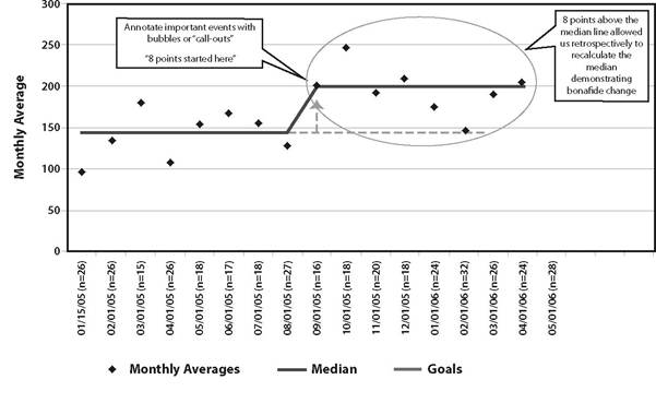
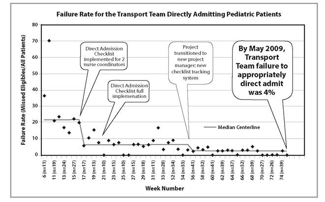
data points needed to establish a baseline varies somewhat in the literature, most sources suggest that 16 to 24 points of baseline data is required to feel confident that the median or mean line is truly that.3 Calculate the mean or median for the baseline data and draw that line on the run chart. Although using the mean or the median is acceptable, we recommend using the median, which will protect your average from being “thrown off” by a single extremely high or low measurement. Important interventions, milestones, and process changes should also be noted on the run chart with arrows indicating when they occurred (Fig 8.2 and 8.3).
How often should you measure your quality indicator: daily, weekly, or even monthly? Much of this will depend on the type of quality indicator, how often events tend to occur, and often enough that you can catch important trends early.
Differentiating the small ups and downs of common cause variation from the statistically significant special cause variation indicating real quality improvement or worsening requires referencing run chart rules for special causes. There are many criteria with which to evaluate run charts for evidence of true quality improvement or worsening, but 3 popular ones identify special cause when any of the following are true: (1) there is a “shift”
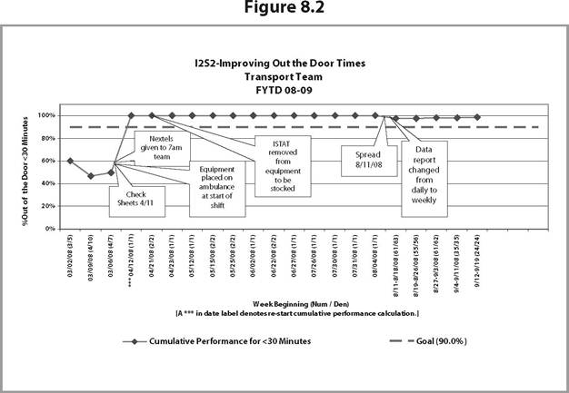
Figure 8.3
(ie, 8 consecutive points are either above or below the mean/median centerline); (2) there is a “trend” (ie, 6 consecutively increasing or decreasing data points); or (3) there are “alternating points” (ie, at least 14 consecutive points alternating above and below the mean/median centerline).
Points on the line do not make or break a run. Changes following these rules may be positive—from a successful quality improvement project you have implemented or negative—from an unanticipated new problem in the process. Once a rule is met and change is “official,” a new mean/median line is drawn on the basis of those data points. The new mean/median line is now used to evaluate subsequent changes using the rules, and so on.Control charts have similar rules for special causes. They also have additional lines representing thresholds (upper and lower control limits), which, when crossed by points on the graph, demonstrate special cause, good or bad, depending on the data. Control charts are important in helping to distinguish common cause from special cause variation. A process is considered stable if the distribution of data points falls within the control limits (common cause variation). If the distribution of data points falls within and outside of the control limits, the process has special cause variation and is considered unstable. Learning from special cause variation should be the first step toward improving an unstable system. There are readily available computer programs capable of generating run charts and control charts from your data and able to assist you with analyzing them. These are easily found searching on the Internet.
More on the topic Monitoring Quality:
- What are Quality and Quality Improvement?
- Quality Control
- Quality of Bedding
- Quality of Care Issues at the Sending Facility
- Developing a QI Program
- Accreditation is a voluntary process that provides a means to demonstrate a level of quality.
- Quality of Life
- MONITORING OF CRITICALLY SICK CHILD
- List of Abbreviations
- AAP. Guidelines for Air and Ground Transport of Neonatal and Pediatric Patients. 4th edition. — American Academy of Pediatrics,2015. — 488 p., 2015