Measuring the three characteristics of a GPT
As suggested in Figure 1, we shall choose Electricity and IT as our candidate GPTs, and the measures that we construct will pertain mostly to these two technologies. In passing, we shall also touch upon steam and internal combustion.
The three subsections below report, in turn, various measures of each characteristic - pervasiveness, improvement, and innovation - for the two GPTs at hand.2.1. Pervasiveness of the GPT
The first characteristic is the technology’s pervasiveness. We begin by looking at aggregates and proceed to consider individual industrial sectors in more detail.
2.1.1. Pervasiveness in the aggregate
Ideally we would like to track the evolution of various candidate GPTs using continuous time series from about 1850 to the present, but we do not have data that consistently cover this entire stretch of time, and thus will need to work with two overlapping segments: 1869-1954 and 1947-2003.
Figure 2 shows the shares of total horsepower in manufacturing by power source from 1869 to 1954.[122] The period covers the decline in usage of water wheels and turbines, the rise and fall of steam engines and turbines, the rise and gradual flattening out of the internal combustion engine’s use in industrial applications, and the sharp rise in the use of primary and secondary electric motors. The symmetry of the plot is striking in that, with the exception of internal combustion, power-generating technologies seem to have led for the most part sequential existences. The relative brevity of the entire steam cycle, which rises and falls within a period of 50-60 years, suggests that the technology
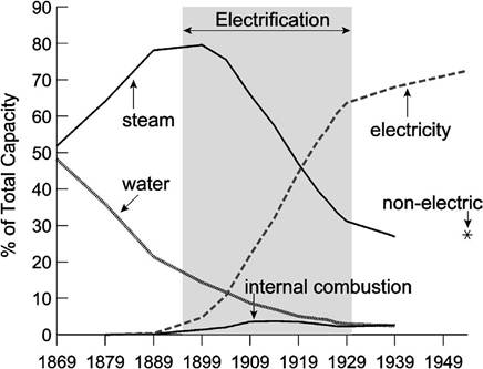
Figure 2. Shares of total horsepower generated by the main sources in U.S. manufacturing, 1869-1954.
which replaced it, Electricity, was important enough to force a rapid transition among manufacturers.
In contrast, the decline of water power was more gradual.If we could continue Figure 2 to the present, Electricity would surely still command a very high share of manufacturing power as the next new source (e.g., solar power?) has not yet emerged to replace it. The persistence of Electricity as the primary power source, even though its diffusion throughout the manufacturing sector was complete decades ago, helps to identify it as one of the breakthrough technologies of the modern era.
Figure 3 shows the diffusion of computers in the U.S. industrial sector as measured by the share of IT equipment and software in the aggregate capital stock.[123] Computer and software purchases appear to have reached the first inflection point in their “S-curve” more slowly than Electrification in the early years of its adoption, but it is striking how much faster the IT share has risen over the past few years. Moreover, while the diffusion of Electricity had slowed down by 1930, the year which we mark as the end of the Electrification era, computer and software sales continue their rapid rise to this day.
The vertical axes in Figures 2 and 3 are scaled differently. In Figure 2 the vertical axis measures the share of total horsepower in manufacturing, whereas in Figure 3 it is the share of IT equipment and software in the aggregate capital stock. But scaling aside, a comparison of the shape of the diffusions in the two figures suggests that the
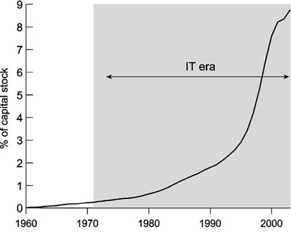
Figure 3. Shares of computer equipment and software in the aggregate capital stock, 1960-2003.
IT-adoption era will last longer than the 35 years of Electrification. Indeed, the acceleration in adoption, which was over by about 1905 for Electrification, did not end until about 1997 for IT. It also appears that IT forms a smaller part of the physical capital stock than did electric-powered machinery at the corresponding stages.
Why did Electricity spread faster than IT seems to be doing? Both technologies are subject to a network externality; Electricity because the connecting of cables and wires to a neighborhood was more profitable when the number of users was larger, and IT especially so after the Internet was invented. Perhaps electrical technologies were more profitable, or perhaps the rapid price decline of computers and peripherals makes it optimal to wait and adopt later as Jovanovic and Rousseau (2002a) emphasize.
2.1.2. Pervasiveness among sectors
Cummins and Violante (2002, p. 245) classify a technology as a GPT when the share of new capital associated with it reaches a critical level, and if adoption is widespread across industries. Electrification seems to fit this description. Figure 4 shows the shares of total horsepower electrified in manufacturing sectors at ten-year intervals from 1889 to 1954.[124] Electrical adoption was very rapid between 1899 and 1919 but slowed considerably thereafter, with the dispersion in the adoption rates largest around 1919.
The striking feature of Figure 4 is how uniformly electrical technology affected individual manufacturing sectors. Table 1, which shows the rank correlations of Electricity shares across sectors and time, indicates that there was little change in the relative ordering of the sectors. This means that the sectors that were the heaviest users of Electricity
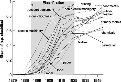
Figure 4. Shares of electrified horsepower by manufacturing sector, 1890-1954.
Table 1
Rank correlations of Electricity shares in total horsepower by manufacturing sector, 1889-1954
| 1889 | 1899 | 1909 | 1919 | 1929 | 1939 | 1954 | |
| 1889 | 1.000 | ||||||
| 1899 | 0.707 | 1.000 | |||||
| 1909 | 0.643 | 0.918 | 1.000 | ||||
| 1919 | 0.686 | 0.746 | 0.893 | 1.000 | |||
| 1929 | 0.639 | 0.718 | 0.739 | 0.871 | 1.000 | ||
| 1939 | 0.486 | 0.507 | 0.571 | 0.750 | 0.807 | 1.000 | |
| 1954 | 0.804 | 0.696 | 0.650 | 0.789 | 0.893 | 0.729 | 1.000 |
in 1890 remained among the leaders as adoption slowed down in the 1930s.
In sum, the adoption of Electricity was sweeping and widespread.Why did that adoption take as long as it did? One answer is that it was costly to set up the wiring required to electrify households early on. This is apparent from the peculiar two-stage adoption process that many factories chose in adopting Electricity. Located to a large extent in New England factory towns, textile firms around the start of the 20th century readily adapted the new technology by using an electric motor rather than steam to drive the shafts which powered looms, spinning machines and other equipment [see Devine (1983)]. Moreover, delays in the distribution of electricity made it more costly to electrify a new industrial plant fully.
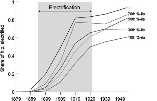
Figure 5 shows the same data as Figure 4, but now in percentile form. We build it by sorting the Electricity shares in each year and, given that only 15 sectors are represented, plotting the 2nd, 5th, 8th, 11th and 14th largest shares in each year. The percentile diffusion curves will be useful when drawing comparisons with the IT era. They also
90th %-ile
Figure 5. Shares of electrified horsepower by manufacturing sector in percentiles, 1890-1954.
help us in dating Electricity as a GPT. Linear extrapolation between the years 1890 and 1900 suggests that in 1894, about one percent of horsepower in the median industry was provided by Electricity. Whether or not this is actually the “right” percentage for dating the start of the Electrification era, we shall use a one percent share for the median industry to date the beginning of the IT era as well. This provides a common standard for choosing the left-end points of the two shaded areas.
In the century before the Electricity revolution, the technology that primarily drove manufacturing was steam. Figure 6 shows just how slowly steam was replaced between 1899 and 1939.[125] It is natural that industries such as rubber, primary metals, non-electric machinery, and stone, clay, and glass, which saw such rapid increases in electricity use over the same period, would withdraw from steam most rapidly.
Indeed, most of the industries that quickly switched over to electricity had been heavy users of steam. This is clear from Figures 4 and 6, taken together, and from the rank correlations of steam shares in total horsepower in Table 2, which decay quickly and suggest a non-uniformity in the destruction of steam technology across the manufacturing sectors.The spread of IT was also rapid, but does not appear to have been as widespread as Electricity. Figure 7 shows the share of IT equipment and software in the net capital stocks of 62 sectors from 1960 to 2001 plotted as annual percentiles.[126] Some sectors
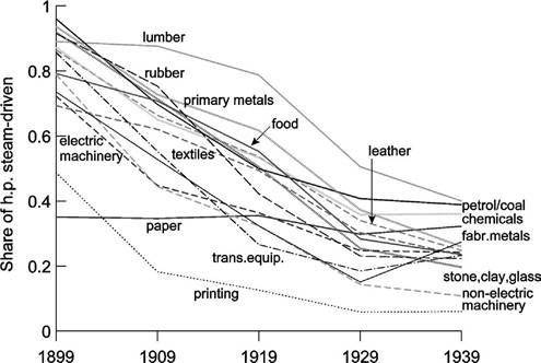
Figure 6. Shares of steam-driven horsepower by manufacturing sector, 1899-1939.
Table 2
Rank correlations of steam shares in total horsepower by manufacturing sector, 1889-1939
| 1899 | 1909 | 1919 | 1929 | 1939 | |
| 1899 | 1.000 | ||||
| 1909 | 0.825 | 1.000 | |||
| 1919 | 0.604 | 0.800 | 1.000 | ||
| 1929 | 0.525 | 0.604 | 0.832 | 1.000 | |
| 1939 | 0.261 | 0.282 | 0.496 | 0.775 | 1.000 |
adopted IT very rapidly, and by 1975 six of them (the 90th percentile) had already achieved IT equipment and software shares of more than 5 percent.
Other sectors lagged behind, and some did not adopt IT in a substantive way until after 1985.On the other hand, the rank correlations of the IT shares across sectors, shown in Table 3, are even higher than those obtained for Electrification. On the face of it then, Electrification would appear to have been the more sweeping GPT-type event because it diffused more rapidly in the U.S. economy and all sectors adopted it pretty much at the same time, whereas IT diffused rapidly in some sectors and not-so-rapidly in others. Nonetheless, the recent gains in IT shares show that the diffusion of this GPT has yet to slow down in the way that Electrification did after 1929.
So far we have discussed adoption by firms, and have used this concept to determine the dating of the two GPT-epochs. We turn to households next.
and steam. Changes in the industrial classifications and the level of detail provided in the BEA’s publicly- available fixed asset tables require us to end the series in 2001.
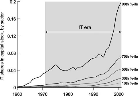
Figure 7. Shares of IT equipment and software in the capital stock by sector in percentiles, 1960-2001.
Table 3
Rank correlations of IT shares in capital stocks by sector, 1961-2001
| 1961 | 1971 | 1981 | 1991 | 2001 | |
| 1961 | 1.000 | ||||
| 1971 | 0.650 | 1.000 | |||
| 1981 | 0.531 | 0.806 | 1.000 | ||
| 1991 | 0.576 | 0.746 | 0.847 | 1.000 | |
| 2001 | 0.559 | 0.682 | 0.734 | 0.909 | 1.000 |
2.1.2. Adoptionbyhouseholds
Households also underwent Electrification and the purchase of PCs for home use during the respective GPT eras. Figure 8 shows the cumulative percentage of households that had obtained electric service and that owned a PC in each year following the arrival of the GPT.[127] If we continue to date Electricity as arriving in 1894 and the PC in 1971, Figure 8 shows that households adopted Electricity about as rapidly as they are adopting the PC. By the time the technology was officially 35 years old (in 1929), nearly 70 percent of households had electrical connections. A comparison with Figure 5 shows that this is just a little higher than the 1929 penetration of electrified horsepower
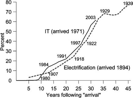
Figure 8. Percent of households with electric service and PCs during the two GPT eras.
as measured by its share in the median manufacturing sector. As in the case of firms, the Electrification of households reaches a plateau in 1929, although it resumed its rise a few years later. On the other hand, there is no sign yet that the diffusion of the computer among either households or firms is slowing down.
With households, as with firms, diffusion lags seem to arise for different reasons for the two technologies. Rural areas were difficult for Electricity to reach, but this is not the case for the PC, where the main barrier is probably the cost of learning how to use it. This barrier seems to have more to do with human capital than was the case with Electricity.
In some ways it is puzzling that the diffusion of the PC has not been much faster than that of Electricity. The price of computing capacity is falling much faster than the price of Electricity did. Affordable PCs came out in the 1980s, when the technology was some 15 years old. On the other hand, households had to wait longer for affordable electrical appliances. Only after 1915, when secondary motors began to diffuse widely and electrical appliances began to be invented, did the benefits of Electrification outweigh the costs for a majority of households. Greenwood, Seshadri and Yorukoglu (2002) document the spread of electrically-powered household appliances and argue that their diffusion helped to raise female labor-force participation by freeing up their time from housework.
2.1.3. On dating the endpoints of a GPT era
Our dating procedure reflects net adoption rates by firms, but the dates would not change much if we had instead used net adoption by households. The shaded areas in our figures are periods when the S-shaped adoption curves are, for the most part, rising. Whether or not they start to fall later should not affect the designated adoption eras. For instance, Electricity has not yet been replaced in the same way that steam was phased out in the first half of the 20th century, but the Electrification era still ends in 1930 because adoption as measured in Figures 2, 4, and 5 flattens out. Figures 2 and 6 show that the steam era must have ended sometime around 1899 because net adoption had already become negative.
Net adoption is endogenous and should reflect the profitability of the technology at hand compared to that of other technologies. The Niagara Falls dam in 1894 and the development of alternating current made it possible to produce and distribute electricity more cheaply at greater distances. Figures 4 and 5 show that at the outset, some sectors (like printing) raced ahead of others in terms of how quickly they adopted. Later on, as the technology matures, its adoption becomes more universal. Eventually, the lagging sectors tend to catch up a bit, in relative terms, but not completely. Inequality of adoption is highest in the middle of the adoption era. We also see such a temporary rise in inequality among the declining steam shares (Figure 6) at about the same time that inequality was greatest in Electricity adoption.
2.2. ImprovementoftheGPT
The second characteristic that Bresnahan and Trajtenberg suggested is improvement in the efficiency of the GPT as it ages. Presumably this would show up in a decline in prices, an increase in quality, or both. How much a GPT improves can therefore be measured by how much cheaper a unit of quality gets over time. If technology is embodied in capital, then presumably capital as a whole should be getting cheaper faster during a GPT era, but especially capital that is tied to the new technology.
To investigate these implications, we first look at the price of capital goods generally and then at the prices of capital’s components. Figure 9 is a quality-adjusted series
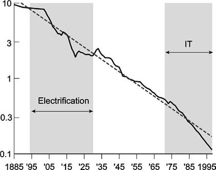
Figure 9. The price of equipment relative to consumption goods.
for the relative price of equipment as a whole, pk∣pc (i.e., relative to the consumption price index) since 1885, constructed from a number of sources with a linear time trend included.8 The figure shows that equipment prices declined most sharply between 1905 and 1920, and again after 1975. The 1905-1920 period is also the one that showed the most rapid growth of Electricity in manufacturing (see Figure 4) and in the home (see Figure 8). The post-1975 period follows the introduction of the PC.
Figure 10 considers the prices of components of the capital stock that are tied to our candidate GPTs (as well as to internal combustion), with all prices relative to the aggregate CPI. We use the price of electricity itself because deflators for electrically- powered capital are not available for the first half of the 20th century.9 Declines in motor vehicle prices should capture the improvement in internal combustion as a possible GPT.10 The use of the left-hand scale for electricity and motor vehicles and the righthand scale for computers underscores the extraordinary decline in computer prices since 1960 compared to the earlier technologies.11 While the relative prices of electricity and motor vehicles fall by a factor of 10, the index of relative computer prices falls by a factor of 10,000.
8 Krusell et al. (2000) build such a series from 1963 using the consumer price index to deflate quality- adjusted estimates of producer equipment prices from Gordon (1990, table 12.4, col. 2, p. 541). Since Gordon’s series ends in 1983, they use VAR forecasts to extend it through 1992. We start with Krusell et al. and work backward, deflating Gordon’s remaining estimates (1947-1962) with an index for non-durable consumption goods prices that we derive from the National Income Accounts. Since we are not aware of a quality-adjusted series for equipment prices prior to 1947, we use the average price of electricity as a proxy for 1902-1946, and an average of Brady’s (1966) deflators for the main classes of equipment for 1885-1902. We deflate the pre-1947 composite using the Bureau of Labor Statistics (BLS) consumer price index of all items [U.S. Bureau of the Census (1975, series E135)] for 1913-1946 and the Burgess cost of living index [U.S. Bureau ofthe Census (1975, series E184)] for 1885-1912.
9 Electricity prices are averages of all electric services in cents per kilowatt hour from U.S. Bureau of the Census (1975, series S119, p. 827) for 1903, 1907, 1917, 1922 and 1926-1970, andfromvarious issues ofthe Statistical Abstract of the United States for 1971-1989. We interpolate under a constant growth assumption between the missing years in the early part of the sample. For 1990-2000, prices are U.S. city averages (June figures) from the Bureau of Labor Statistics (http://www.bls.gov). We then set the index to equal 1000 in the first year of the sample (i.e., 1903).
10 Motor vehicle prices for 1913-1940 are annual averages of monthly wholesale prices of passenger vehicles from the National Bureau of Economic Research (Macrohistory Database, series m04180a for 1913-1927, series m04180b for 1928-1940, http://www.nber.org). From 1941-1947, they are wholesale prices of motor vehicles and equipment from U.S. Bureau of the Census (1975, series E38, p. 199), and from 1948-2000 they are producer prices of motor vehicles from the Bureau of Labor Statistics (http://www.bls.gov). To approximate prices from 1901-1913, we extrapolate backward assuming constant growth and the average annual growth rate observed from 1913-1924. We then join the various components to form an overall price index and set it to equal 1000 in the first year of the sample (i.e., 1901).
11 To construct a quality-adjusted price index, we join the “final” price index for computer systems from Gordon (1990, table 6.10, col. 5, p. 226) for 1960-1978 with the pooled index developed for desktop and mobile PCs by Berndt, Dulberger and Rappaport (2000, table 2, col. 1, p. 22) for 1979-1999. Since Gordon’s index includes mainframe computers, minicomputers, and PCs while the Berndt et al. index includes only PCs, the two segments used to build our price measure are themselves not directly comparable, but a joining of them should still reflect quality-adjusted price trends in the computer industry reasonably well. We set the index to 1000 in the first year of the sample (i.e., 1960).
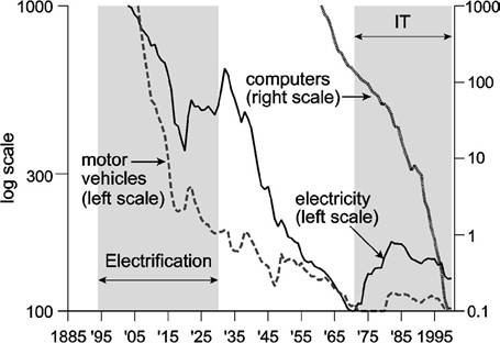
Figure 10. Price indices for products of the two GPT eras.
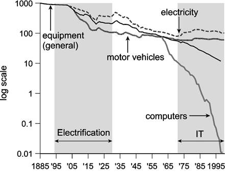
Figure 11. Comparison of the decline in general and GPT-specific equipment prices.
The more interesting question, however, is how the general decline in equipment prices relates to the declines associated more directly with the GPTs of each epoch. Figure 11 makes this comparison by plotting the relative prices of all three GPTs along with the general equipment price index on the same logarithmic scale, with the starting point for each of the GPTs normalized to the level of the general equipment index in that year. By this measure, it is clear that electricity and motor vehicle prices declined at about the same pace as that of equipment generally until the start of the IT price data, though it is also interesting that motor vehicle prices appear to have declined faster than electricity prices. After 1960, declining computer prices and rising shares of computers in equipment stocks seem to have drawn the general index downward, while computing prices fell thousands of times faster than the general index.
It can be said that the Electricity index, being the price of a kilowatt-hour, understates the accompanying technological change because it does not account for improvements in electrical equipment, and especially improvements in the efficiency of electrical motors. Such improvements may be contained in the price series for capital generally. But based on the price evidence in Figures 10 and 11, electricity, motor vehicles, and computers might all qualify as GPTs. Computers, however, are clearly the most revolutionary of the three.
2.3. Ability of the GPT to spawn innovation
The third characteristic that Bresnahan and Trajtenberg suggested was the technology’s ability to generate innovation. Any GPT will affect all sorts of production processes, including those for invention and innovation. Some GPTs will be biased towards helping to produce existing products, others towards inventing and implementing new ones. An example of a more specific technology that was heavily skewed towards future products was hybrid corn. Griliches (1957, p. 502) explains why hybrid corn was not an invention immediately adaptable everywhere, but was rather an invention of a method of inventing, a method of breeding superior corn for specific localities.
Electricity and IT have both helped reduce costs of making existing products, and they both spawn innovation, but IT seems to have more of a skew towards the latter. There is no doubt that the 1920s, especially, also saw a wave a new products powered by electricity, but as the patenting evidence will bear out, the IT era has seen an unprecedented increase in inventive activity. For example, the role of the computer in simulation should be known to many of us writing research papers. Feder (1988) describes how computers play a similar role in the invention of new drugs.
2.3.1. Patenting
Patenting should be more intense after a GPT arrives and while it is spreading due to the introduction of related new products. Figure 12, which shows the numbers of patents issued per capita on inventions annually from 1790 to 2002 and trademarks registered from 1870 to 2002, shows two surges in activity - between 1900 and 1930, and again after 1977.[128] Is it mere chance that patenting activity was most intense during our
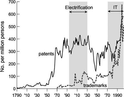
Figure 12. Patents issued on inventions and trademarks registered in the United States per million persons, 1790-2002.
GPT eras? Moreover, it appears that patenting activity picks up after the end of the U.S. Civil War in 1865, and again at the conclusion of World War II in 1945. The slowdown in patenting during the wars and the acceleration immediately thereafter suggest that there may be some degree of intertemporal substitution in the release of new ideas away from times when it might be more difficult to popularize them and towards times better suited for the entry of new products.
Does the surge in patenting reflect a rise in the number of actual inventions, or was the surge prompted by changes in the law that raised the propensity to patent? This question is important because, over longer periods of time, patents may reflect policy rather than invention. Figure 13 analyzes data described in Lerner (2000) and shows that worldwide, changes in patent policy are correlated with the patent series in Figure 12. It is possible, therefore, that the U.S. series reflects the stance of the courts regarding enforcement. Kortum and Lerner (1998) analyze this question and found that the surge of the 1990s was worldwide, but not systematically related to country-specific policy changes. They conclude that technology was the cause for the surge.
Further support for this view comes from the behavior of trademarks per capita, which we also plot in Figure 12. Trademarks behave more or less the same as patents do, except for their more sharply rising trend. Trademarks are easier to obtain than patents and are not governed by legal developments concerning patents. But with trademarks we have a different concern: Do trademarks proxy for the number of products, or do they just measure duplicative activity and the amount of competition? The answer may depend on what market one looks at. In the market for bananas, for example, Wiggins and Raboy (1996) find that brand names are correlated with measures of quality that do explain price variation, suggesting that brand names do signify product differentiation.
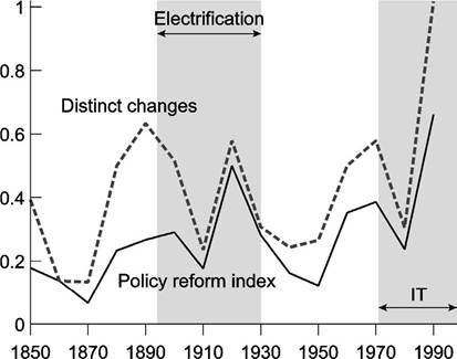
Figure 13. Indices of worldwide changes in patent laws.
2.3.2. Investment by new firms vs. investment by incumbents
New firms do not have costs sunk in old technologies and they are more flexible organizationally than existing firms. One should therefore expect to see job-reallocation waves and waves of entry and exit during the GPT eras. One measure of entry is the extent of new listings on the stock exchange. Figure 14 shows the value of firms entering the New York Stock Exchange (NYSE), the American Stock Exchange (AMEX), and NASDAQ in each year from 1885 through 2003 as percentages of total stock market value.[129] As predicted by Helpman and Trajtenberg (1998a, 1998b), initial public offerings (IPOs) surge between 1895 and 1929, and then after 1977, which again closely matches the dating of our two GPT eras.
The dashed line in Figure 14 is private investment since 1870 as a percent of the net stock of private capital in the U.S. economy as a whole, and as such is the aggregate analog of the solid line that covers only the stock market.[130] The solid line in Figure 15
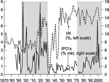
Figure 14. IPOs as a percent of stock market value, and private domestic investment as a percent of the net capital stock, 1870-2003.
shows the ratio of the solid and dashed lines in Figure 14. Inboth figures it is clear that, during the Electrification epoch, investment by stock market entrants accounted for a larger portion of stock market value than overall new investment in the U.S. economy contributed to the aggregate capital stock. This is consistent with the adoption of Electricity favoring the unencumbered entrant over the incumbent, who may have incurred substantial adjustment costs in using the new technology. We say this because aggregate investment, while indeed including new firms, has an even larger component attributable to incumbents. Moreover, the solid line in Figure 15 was highest in the early years of the Electrification period, which is when these adjustment costs would have been greatest.
Although the solid line in Figure 15 has so far stayed below unity for most of the IT era, it has rapidly risen to a higher level in recent years. This could be because IT adoption involved very large adjustment costs for both incumbents and entrants in the early years until the price of equipment and software fell enough to generate a wave of adoptions by new firms.
series in current dollars, excluding military expenditures, from Kuznets (1961b, Tables T-8 and T-8a) for 1870-1929. We construct the net capital stock using the private fixed assets tables of the U.S. Bureau of Economic Analysis (2004) for 1925-2003. Then, using the estimates of the net stock of nonmilitary capital from Kuznets (1961a, Table 3, pp. 64-65) in 1869, 1879, 1889, 1909, 1919 and 1929 as benchmarks, we use the percent changes in a synthetic series for the capital stock formed by starting with the 1869 Kuznets (1961a) estimate of $27 billion and adding net capital formation in each year through 1929 from Kuznets (1961b) to create an annual series that runs through the benchmark points. Finally, we join the resulting series for 1870-1925 to the later BEA series. The investment rate that appears in Figure 14 is the ratio of our final investment series to the capital stock series, expressed as a percentage.
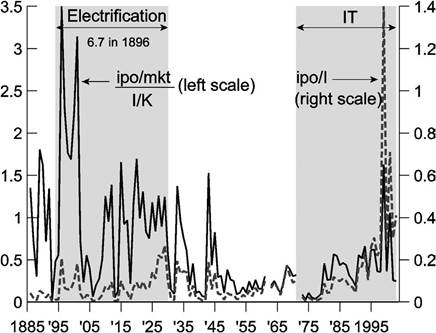
Figure 15. Otherinvestmentratios, 1885-2003.
The solid line in Figure 15 shows a downward trend mainly because the stock market became more important as a vehicle for corporate financing among industrial firms in the early part of the 20th century. IPOs are normalized by total stock market value, which was small early on, and has since become larger. The dotted line in Figure 15 shows the ratio of the dollar values of IPOs and aggregate investment. It is upward sloping for the same reason: IPOs were not that important early on because the stock market was small. After 1970, IPOs capture a much larger share of investment by new entrants than they did before World War I, for example, and even a larger fraction than in the 1920s. When we consider both lines together, we do get the impression that new firms invest more during the GPT eras than at other times.
Does the distribution of entries across sectors shed light on the role of technological factors in the entry waves? Perhaps so. Figure 16 is a scatterplot of the share of IPOs in the market capitalizations of 15 manufacturing sectors between 1890 and 1930 vs. their respective shares of horsepower driven by electricity in 1929.[131] Inotherwords, we ask whether sectors with more IPOs ended up adopting the new technology more vigorously than sectors with less entry. The regression line plotted in Figure 16 has a positive slope coefficient, though with only 15 observations it is not statistically significant.
InFigure 17, we regress IPOs over the 1971-2001 period on shares of computers and peripherals in equipment investment in 2000, and once again obtain a sectoral scatter with a positive slope coefficient, though like our result for the Electrification era, it is not statistically significant.
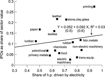
Figure 16. Scatterplot of IPOs as shares of sectoral market values, 1890-1930 vs. shares of horsepower electrified in 1929.
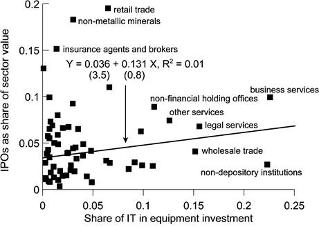
Figure 17. Scatterplot of IPOs as shares of sectoral market values, 1971-2001 vs. shares of IT in equipment investment in 2000.
3.
More on the topic Measuring the three characteristics of a GPT:
- Other symptoms of a GPT
- CONTENTS OF VOLUME 1B
- Contents
- Introduction
- DESCRIPTIVE CHARACTERISTICS
- Aghion Philippe, Durlauf Steven N. (eds.). Handbook of Economic Growth. Volume 1. Part B.North-Holland,2005. — p. 1061-1822, 2005
- The characteristics of the UNDP ART Global Initiative
- Methods of measuring and describing competition
- SECTORS
- A look at the facts