Health economics
Economics is about making decisions in conditions where scarcity exists. It is the science of choice. It is no surprise therefore that the contribution that economists can make is being increasingly recognized in the health sphere.
Public policy decisions are based not just on clinical evidence (does the intervention work?) but also on economic analysis (is the intervention worth doing?).This chapter reviews the linkage between public expenditure on health care and health outcomes. The demographic and technological factors behind an increasing public and private expenditure on health care are examined, as are the suggested causes of observed health inequalities. Organizational structures for health care provision in the UK are reviewed, especially the role of the National Health Service (NHS) and its ‘productivity’ and adaptiveness to the increasing profile of the ‘patient as consumer’! Some techniques of economic evaluation are applied to health care outcomes, including cost-utility analysis and evidence-based approaches such as Quality Adjusted Life Years (QUALYs).
Chapter 9 (Beyond markets) provides further analysis of the use of market and non-market approaches to health care and other types of provision, especially the use of ‘quasi or internal’ markets in resource allocation.
Health economics, health and health care
The policy-maker’s objective is to improve the health of the population - that is, to reduce the incidence of disease and death. Spending on health care is widely regarded as one of the things that promotes this, the assumption being that the more you spend on health care the healthier the population will be, other things being equal. But other things are not equal, because the health of the population depends not just on the resources devoted to health care but also on the resources devoted to other areas of public and private spending.
Spending on health involves an opportunity cost. The policy-maker (e.g. the Chancellor of the Exchequer) will recognize that the more you spend on health, the less will be available to spend on things such as education, local authority sports facilities, policing and the prison service, all of which will have an impact on the health of the community. Moreover, many economists believe that public spending in total has an opportunity cost - the private spending that it displaces (See also ‘Crowding out’ theory in Chapter 18, p. 364). If we decide we want to spend more on public services we must recognize that those services have to be paid for by increased taxation and as a result people’s private consumption will fall. That private consumption may have included things such as food (buying better quality but more expensive food); heating (which is particularly important for the elderly) or a winter holiday (to provide a spiritual uplift and a physical boost to see the elderly through the often cold winter). All of these are goods and services that the individual chooses to consume because they derive satisfaction or wellbeing from them. The consumption of these things makes them feel better. People spend their own money buying things from which they derive utility - that is the economist’s definition of a ‘rational’ economic agent. So if the policy-maker decides (via taxation) to deliberately reduce the capacity of households to purchase goods and services so that the increased tax receipts can be channelled to the provision of additional health care, then the policymaker has to be certain that the utility so derived is at least as great as that which the individual would have derived from spending his or her own money.Additionally, we should recognize that people make decisions about their own health - sometimes we call them ‘lifestyle choices’. There can be few people who do not recognize, in principle at least, that smoking, excessive alcohol consumption, poor diet and lack of exercise potentially damage their health.
Thus in short we need to recognize that the health of the population and the provision of health care are two quite distinct concepts.How much do we spend?
In the UK more than 80% of all spending on health care is paid for by the state in the form of the National Health Service (the NHS). Spending on the NHS constitutes the largest single area of spending on goods and services - bigger than spending on education and much bigger than spending on defence. Figure 12.1 shows a breakdown of public spending in the UK in 2010-11, with spending on health (which here means the NHS) the second largest slice of the pie, totalling £122bn. The only slice of the pie that is larger is spending on ‘social protection’ (£194bn), which is spending on ‘welfare’ - such as the state retirement pension and incapacity benefit - for which there is no direct output and is therefore regarded as a ‘transfer payment’ under National Income accounting conventions. In contrast, the NHS does produce an output and we call that output ‘health care’, which is part of the measured output of the economy. At this point, we will assume that the money spent on purchasing health care is equal to the value of the health care produced. We revisit this point later (p. 243).
In recent years, spending on the NHS has increased. However, should we measure this in ‘money terms’ (£bn) or in ‘real terms’ (£bn adjusted for inflations)? Using ‘real terms’ has the advantage of our being better able to compare one year with another, and to more accurately calculate the growth of purchasing capacity over time. But even this is not totally satisfactory. Normally the economy grows year on year (except in a recession such as that in the period 2008 -10), and in a growing economy we would expect public spending in total, and in terms of its components, also to grow. Thus it might make more sense to calculate health spending as a percentage of GDP, which is normally what we do since both the numerator and the denominator of the expression will be subject to a similar rate of inflation.
Even this is a slight simplification, however, because the rate of inflation in the health sector may be higher than the average in the rest of the economy! New technologies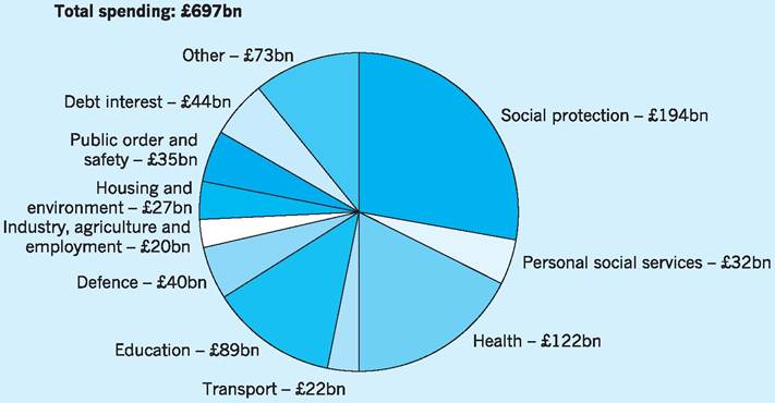
Fig. 12.1 UK government spending 2010/11.
Source: HM Treasury (2010a) Budget 2010: copy of economic and fiscal strategy report and financial statement and budget report - June 2010, p. 5. Available at: http://www.hm-treasury.gov.Uk/d/junebudget_complete.pdf
are invariably very expensive and health care is highly labour intensive, with labour-saving cost reductions more difficult to achieve in health care than they are, for example, in car manufacture or banking.
One more caveat before we look at the data. We must distinguish between ‘spending on health’ and ‘public spending on health’, as the former includes private spending on health care such as paying to go to a private consultant or dentist.
Figure 12.2 shows public spending on health (that is spending on the NHS) as a percentage of GDP. It has risen from about 4.5% of GDP in the late 1980s to about 8.5% of GDP in 2010. In other words, about £1 in every £12 of public spending spent in the economy is spent on the NHS.
As Fig. 12.2 shows, there was only a small rise in the late 1980s and 1990s, and in the early years of the former Labour government (1997-2000) spending actually fell as a proportion of GDP because spending did not keep pace with inflation. From 2000 onwards, however, there were rapid increases as the government pursued its election commitment to raise health spending to the European average.
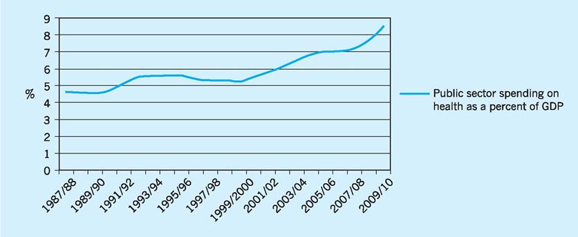
Fig. 12.2 Public spending on health as a percentage of GDP 1987/88-2009/10.
Source: Data from HM Treasury (2010b) Public Expenditure Statistical Analysis 2010, Tables 4.2, 4.3 and 4.4. Available at: http//www.hm-treasury.gov.uk/d/pesa_2010_complete.pdf
The reason for the increase in health spending is therefore, at least in part, political.
But there are also important demographic and technological reasons why we might expect to observe a rise in health spending over time.Demographic reasons
An ageing population
Most western countries have an ageing population, in the sense that the average age of the population is increasing. Although the post-war baby boom (194650) is well known, the biggest bulge in the population in the UK is represented by those who, in 2009, were in their mid-40s, as can be seen from Fig. 12.3.
In 2030 the individuals from that cohort will be in their mid-60s. They will be placing considerable demands on the health and social services sectors as they age, but there will be fewer younger people in the working population to look after them and to pay income taxes to fund their care.
Some other countries, such as Germany, face an even more serious ‘demographic time bomb’ since they experienced a more dramatic post-war boom and an equally dramatic and continuing decline in birth rates thereafter. In the UK the situation has to some extent been mitigated by the significant net inflow of migrants in the economic boom years of the early part of this century. Following EU enlargement in 2004, for example, large numbers of young people came to the UK from Eastern Europe.
People are living longer
The average age of the population is increasing, partly because birth rates are falling, but also because there has been a significant increase in life expectancy. On average people live to a much greater age than they would have done a century ago. Figure 12.4 shows that in 1900 on average women lived only to the age of 45, yet a woman born a century later in 2001 could expect to live to the age of 80. This increase in average life expectancy is itself also made up of two factors - individuals are living longer certainly, but in addition fewer individuals die young than would have
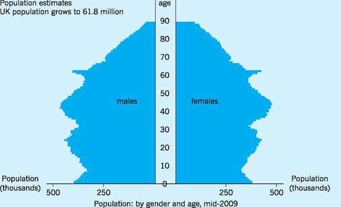
Fig.
12.3 UK population mid-2009.Source: ONS (2010) Population Estimates. Available at: http://www.statistics.gov.uk/CCI/nuqqet.asp?ID=6
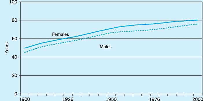
Fig. 12.4 Life expectancy at birth, England, 1900-2001.
Source: Taken from Wanless (2003) Securing Good Health for the Whole Population: population health trends, p. 5.
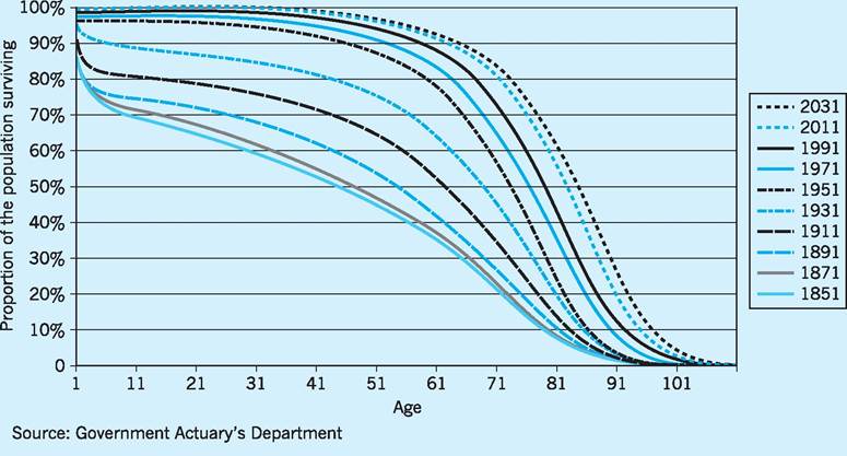
Fig. 12.5 The rectangularization of life curve, England and Wales, 1851-2031.
Source: Taken from Wanless (2003) Securing Good Health for the Whole Population: population health trends, p. 6.
been the case a century ago. This is illustrated by the rectangularization of life curve shown in Fig. 12.5. A century ago some people died as infants, some in childhood, some in their twenties, some in their thirties and so on. Now most people in advanced societies live to a ‘ripe old age’ and then die. This results in the curve shown in Fig. 12.5 becoming increasingly rectangular rather than a smooth downward-sloping curve.
While this longevity is to be celebrated, it nevertheless places greater demands on the health and social services; the very services which, ironically, are partly responsible for this increased longevity! The last year of an individual’s life is likely to be the time when he or she places the greatest demands on the health services.
In 2010 some 17% of the UK population is aged over 65 years, compared to only 11% in 1951, and some 4.5% is aged over 80 years, compared to only 1.4% in 1951. As noted above, those over 75 years, together with new born infants, are the main source of increased health care expenditure.
Technological reasons
We can do more - but it’s more expensive The growth of NHS spending is also partly due to technological advance - the increased range and complexity of interventions that are now available. When the NHS was founded in 1948 it promised to provide care for people ‘from cradle to grave’, yet the technological possibilities available 60 years later could hardly have been imagined. Joint replacements, organ transplants, heart surgery and a huge range of drug therapies - almost unknown 60 years ago - are now commonplace. Yet even these are the old technologies. Already there are newer technologies on the horizon - often derived from the integration of chemistry, microbiology, genetics and computing - which may lead to therapies which until now have been regarded as in the realms of science fiction. In the early stage of their development, however, new technologies are always expensive and they remain so until economies of scale and economies of experience bring costs down.
High income elasticity of demand for health care services
There is considerable evidence to suggest that health care spending in a wide range of economies has risen by more than in proportion to any rise in national income. In other words, the demand for health care services is highly income elastic. This is, of course, partly a reflection of ‘higher expectations’, such as the greater awareness by patients of new, if expensive, treatments and of patient rights and opportunities (Patients Charter).
Business cycle impacts
With the global recessionary conditions following the collapse of the sub-prime market in 2007/8 (see Chapter 30), the reduction in economic activity has arguably itself resulted in additional health care expenditure. Evidence has begun to accumulate that health care needs are related to aspects of deprivation, such as unemployment, low income, etc. We also note in Chapter 23 that each successive business cycle has tended to exhibit a higher level of unemployment at any given stage than have previous business cycles. Evidence has been collected which indicates that those Regional Health Authorities in the UK with the highest unemployment rates are those which issue the most prescriptions per year, suggesting that rising unemployment is associated with increasing ill health.
If we spent more, would people be healthier?
International comparisons of health spending show that health spending has increased almost everywhere in recent years and that life expectancy has also risen. Paradoxically, however, when we look at crosssectional data there is no strong association between spending on health and the average health status of the population. Nowhere is this more apparent than in the US where spending on health is almost 2.5 times higher than the average for the OECD (the group of leading industrial nations). Simplistically one might assume therefore that Americans are the ‘healthiest’ and live longest. But that is not the case. In the US one in three of the population is obese and Americans have a lower life expectancy than the OECD average.
Figure 12.6 shows expenditure on health, both public and private, in various OECD countries (OECD 2009). The darker coloured bars show state spending and the lighter coloured bars private spending. Life expectancy in those same countries is shown in Fig. 12.7 and casual inspection of the data seems to show that there is only a weak relationship between the health expenditure per capita and life expectancy. Thus, for example, Japan spends less on health care per capita than the average for the OECD but has the highest life expectancy of any country, and the US has the highest health care expenditure per capita, being far higher than anywhere else in the world, but has a life expectancy below the OECD average.
Figure 12.8 plots these two indices on the same graph in order to explore the strength of the relationship
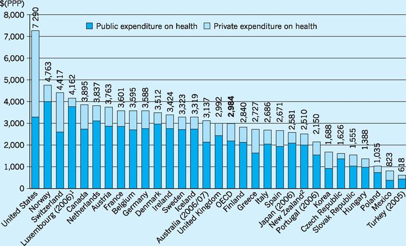
Fig. 12.6 Total health expenditure per capita, public and private 2007.
1Health expenditure is for the insured population rather than resident population.
2Current health expenditure converted from national currencies to US dollars using purchasing power parities (PPP). Source: OECD (2009) OECD Health Data 2009. Available at: www.oecd.org/health/healthdata
between health spending and life expectancy. If there were a strong relationship between health spending and life expectancy, all the points (all the countries) would lie close to a line1. That line would have a positive slope, indicating that the more you spend on health, the healthier the population becomes. The solid line in Fig. 12.8 has a positive slope, but the data points (the countries) do not fit the line very closely. Countries above the line, such as Japan, seem to be healthier than one would predict on the basis of their spending. Countries below the line, such as Hungary, are less healthy than one would predict on the basis of their spending. The US stands out as the country with the highest expenditure, but only average life expectancy. In short, spending on health care is not a very good predictor of life expectancy. The value of the R1 statistic shows that only about half (55%) of the variation in life expectancy can be explained by variations in health spending per capita2.
Moreover, the ‘line of best fit’ (the solid line), though upward-sloping, is not straight. Its slope diminishes, suggesting that for advanced countries further increases in health care spending become less and less effective in producing increases in life expectancy. The more you spend, the less extra benefit you get from it. Spending on health care has diminishing marginal effectiveness.
Health inequalities
So why is it that countries that spend more on health do not necessarily have a healthier population? There are a number of possible explanations. One is that there are countervailing lifestyle factors. For example, by international definitions 30% of the American population is obese (20% for the UK). A second is that there are genetic factors involved! There almost certainly are genetic predispositions for most diseases, but given the polyglot nature of the American
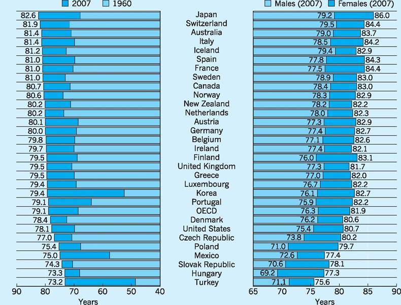
Fig. 12.7 Life expectancy in OECD countries.
Source: OECD (2009) OECD Health Data 2009. Available from: www.oecd.org/health/healthdata
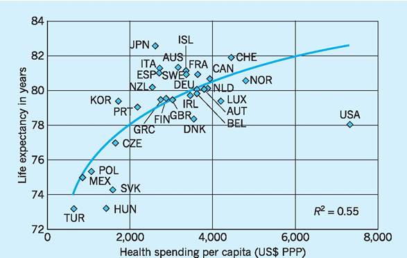
Fig. 12.8 The relationship between spending on health and life expectancy.
Source: OECD (2009) OECD Health Data 2009. Available from: www.oecd.org/health/healthdata
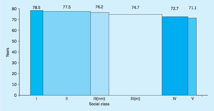
Fig. 12.9 Life expectancy by social class, males.
Note: Width is proportionate to population in each category.
Source: Taken from Wanlass (2003), Securing Good Health for the Whole Population: Population health trends, p. 9.
gene pool this explanation seems inadequate. Or perhaps the American health care system is simply inefficient so that resources are squandered? This is clearly one possible explanation, but there is a further possible explanation buried in the aggregate data.
The health status of a population can be summarized by things such as morbidity rates and mortality rates. When we look at these, we are necessarily looking at averages. A morbidity rate, for example, is calculated as the number of people with a particular disease per 100,000 population. A mortality rate is calculated as the number of people who die (of a particular disease) per 100,000 population. Average life expectancy is based on the age of all the individuals who die in a given year, and if health status is unequally distributed in the population the unhealthy minority will bring down the average life expectancy.
In all countries health status is indeed unequally distributed! The rich are healthier and live longer. The poor are unhealthier and die younger. The London Borough of Kensington and Chelsea has the highest life expectancy (for women) and (not coincidentally) has the highest income. The lowest life expectancy (for men) is in Manchester which also has one of the lowest levels of income per capita. So income is a predictor of health status, but income alone is a rather crude predictor and social scientists have tended instead to concentrate on social class, as defined by occupation.
Figure 12.9 shows life expectancy for males in each of the six social classes. The classifications are the conventional ones adopted by social scientists. Reading from left to right:
I: professional
II: managerial and technical
III(nm): skilled non-manual
III(m): skilled manual
IV: semi-skilled manual
V: unskilled
It is clear from Fig. 12.9 that life expectancy in the UK depends on occupation. Teachers and lawyers, on average, live to the age of 78.5 years. A refuse collector can expect to live for only 71.1 years. So on average men in social class I live 7.4 years longer than those in social class V. Obviously social class is correlated with income, but social class carries with it the notion of education and social norms. Those higher up the social scale may be more aware of those factors that promote good health - such as diet and exercise - and it may be these things, rather than income itself, that are the main causal factors.
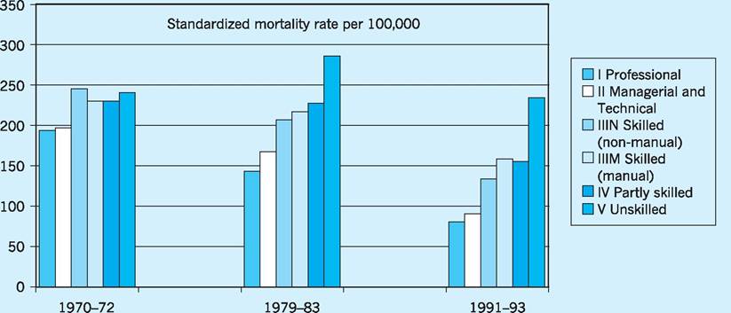
Fig. 12.10 Coronary heart disease mortality in males, England and Wales, by social class over three decades. Source: Taken from Wanless (2003), Securing Good Health for the Whole Population: Population health trends, p. 9.
The fact that health status is related to social class has been known for some time, since at least 1980 and the publication of the Black Report. This same report also suggested that inequalities were increasing over time. The Wanless Report published in 2003 seemed to confirm this. Figure 12.10 is taken from the Wanless Report and shows mortality rates by coronary heart disease (CHD) in men for three periods - the early 1970s, the early 1980s and the early 1990s. The social classes are the same as those in the previous figure. If you imagine for each time period putting a ruler between the middle of the lowest bar and the middle of the highest bar, then the slope of the ruler would be what is known as the social class gradient. Figure 12.10 clearly shows that the social class gradient has become steeper - in other words, health inequality has increased. We need to explore the reasons for this in more detail. There seems to have been a significant reduction in CHD in social class I - the incidence of CHD in the 1990s was only about a third of what it was two decades earlier. This may be due to a better knowledge amongst this social group about the dangers and causes of CHD, and to a consequent take-up of anti-hypertensive drugs, and to a reduction in smoking and improved diet. In other words, the message has got through to middle class people. But for people in social class V either the message has not got through or they have chosen to ignore it, because the incidence of CHD is not markedly different to what it was two decades earlier.
What are the implications of this health divide? Firstly, it may partly explain why the health status of the American population is so low, given the amount spent on health care. The distribution of income in the US is very uneven and there is a much bigger gap between the rich and the poor than in European societies. Middle class people in the US may in fact have quite a good health status, but the low health status of the poor will bring down the average.
In a UK context, the implication is probably that the most effective way of raising the overall health status of the population is to target these hard-to- reach groups. By definition, however, they are hard to reach!
The organization of the NHS in England
The NHS is huge. It employs over a million people and it is often claimed that the only organizations in the world that employ more people are the Indian railways (about 1.6 million) and the People’s Liberation Army of China (about 2.25 million active troops). From its inception the NHS was a somewhat monolithic organisation...
For the first time, hospitals, doctors, nurses, pharmacists, opticians and dentists are brought together under one umbrella organisation to provide services that are free for all at the point of delivery. (NHS History, 1948)... and it continued to operate in this way for the next 40 years. By the early 1990s, however, the rigidities and inefficiencies of state run monopolies were the subject of increasing criticism and a process of structural reform was begun. In 1990 the NHS Community Care Act established health authorities with the responsibility for managing their own budgets. These health authorities became ‘purchasers’. Together with GP ‘fundholders’, they would buy health care from the ‘providers’ - the hospitals and other health organizations - who in turn also became independent organizations with their own managements (NHS trusts). This was the beginning of the ‘purchaser-provider split’ (the so-called ‘internal market’). Part of the rationale for this was to break up the old NHS monopoly and to introduce market reforms (see also Chapter 9). Competition, it was felt, would act as a spur to efficiency. It may be worth recalling the political climate of the time. Margaret Thatcher had been elected to power in 1979 and the 1980s had seen a wave of privatizations, such as British Telecom and British Gas, that had brought some significant productivity gains.
Moreover, there was a growing feeling in the health service that the hospitals had too much power and influence, perhaps because historically this was where the status of the medical profession was at its highest, particularly amongst consultant surgeons. The reforms would ‘challenge the domination of hospitals within a health service that was becoming increasingly focused on services within the community, (NHS History 1990). Confusingly, both the demanders (purchasers) and suppliers (providers) became known as ‘trusts’ - Primary Care Trusts (PCTs) would buy services from hospital trusts that were deemed to provide ‘secondary care’. To most members of the lay public, this nomenclature is probably confusing, since when most people think of the NHS their immediate mental image is that of a hospital setting. In funding terms, however, only 20% of the NHS budget goes to secondary care. The remaining 80% goes to the primary care sector dominated by the PCTs that currently are responsible for the organization of GP practices, community nurses, opticians, dentists, pharmacists and so on. The way that the system is supposed to work is illustrated in Fig. 12.11 - an organizational map produced by NHS England.
The organization of the NHS is hugely complex and - in the opinion of some critics - a confusing patchwork of overlapping responsibilities. To the layman, the incomprehensibility of the organizational structure is compounded by the fact that many parts of the structure are referred to by names that give little clue about what they actually do. The name ‘trust’ is now applied to almost all organizational units that form part of the NHS - the name implying a degree of autonomy for the management of that part of the overall NHS structure. Thus hospitals are called ‘acute trusts’, except of course for those that are called ‘foundation trusts’. In addition, there are ‘ambulance trusts’, ‘mental health trusts’ and ‘care trusts’. The geographical boundaries of these trusts are not necessarily the same! There is also an additional layer of regional management called the Strategic Health Authorities (SHAs), originally 28 in number but reorganised down to 10 in 2006. Each of the SHAs provides regional management for a geographical area. Don’t confuse these SHAs with the other SHAs which are Special Health Authorities. These are national ‘arm’s length’ bodies such as the National Patient Safety Agency, the National Institute for Health and Clinical Excellence, and the NHS Appointments Commission.
The organizational map shown in Fig. 12.11 is sometimes used by PCTs to explain their function to households. Closer inspection, however, shows that Fig. 12.11 is not a good representation of the structure. SHAs (i.e. the regional SHAs) should have an arrow going in to the secondary care sector not into PCTs. And it is not entirely clear what exactly the other arrows are meant to imply!
In 2010 the incoming Coalition government announced plans for (another) fundamental reform of the NHS. The fundamental idea of purchaser and provider would remain, but the role of the PCT in co-ordinating the demands of purchasers would be abolished. Management responsibility for purchasing services would go back to GPs, which is an echo of the pre-existing ‘GP fund holding’ system that the PCTs replaced. On the supply side, many of the arm’s length bodies would be abolished or have their functions subsumed into other parts of the NHS. The regional tier of the NHS would be removed at the same time.
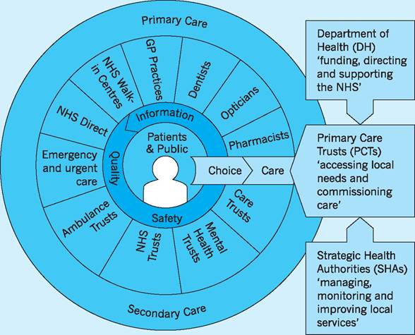
Fig. 12.11 Primary care and secondary care. Source: NHS (2010b).
In summary, the early reforms of the 1990s were inspired by the desire to reduce the domination of the hospitals in the provision of health care. More recently, however, reforms have emphasised the importance of the patient. It was stated by various official sources that Primary care trusts (PCTs) and ambulance trusts were to be reorganised as part of the government’s drive to create a patient-led NHS.
The patient as consumer
The world has changed since the NHS was established in 1948. At that time, people were quite deferential towards authority and the NHS was regarded by many as a paternalistic organization which fostered a culture of dependency. People had limited choice and little say in what happened to them. The NHS would look after you ‘from cradle to grave’ provided you did what you were told. The ethos has been summed up by the phrase: ‘doctor knows best’.
The reforms that were initiated from 1990 onward sought to encourage patients to see themselves as consumers, with the right (and the responsibility) to make informed choices about the services that they consumed. This notion, of course, applies not just to health care but to the education sector and to public services generally. In the health sector it was often accompanied by a change in the words used - patients became ‘service users’ and sometimes even ‘consumers’. In the private healthcare sector the balance of power between buyer and seller in the marketplace has always been more evenly divided. The relationship between patient and physician has always been more equal, as emphasized in this advertising slogan from the private provider, BUPA, which read simply
‘The patient will see you now, doctor.’
A senior Department of Health source said: ‘Gone will be the paternalistic days of being told by the doctor that you can’t have physiotherapy for your back pain, or referral to an orthopaedic consultant. If you have prostate cancer, you will get the information you need to choose whether to go for an operation or opt for a period of watchful waiting. If you need a hysterectomy, you will be told about the benefits and risks of minimally invasive surgery.’ (Carvel 2009)
These reforms continue. Passive patients are encouraged to become active, informed consumers who work with health service specialists to make sensible and informed decisions about the range of interventions available to them. The IT revolution has, of course, been an enabling factor; no matter what you think you may be suffering from, the Internet allows you to research into your condition. The range of information available - often from private providers in the USA - is overwhelming. Information is also available from bodies such as NICE (The National Institute for Health and Clinical Excellence) where members of the lay public can have access to information which, in former times, would have been restricted to members of the medical and nursing professions. If you really want to choose a hospital on the basis of the rate of HCAI (Healthcare Associated Infections such as MRSA) then that information is also publically available from the web (look under ‘h’ in the Health Protection Agency website).
The NHS workforce
The NHS is the largest employer in Europe, but exactly how many people work for it? Suppose we restrict our analysis to England (thus excluding Wales, Scotland and Northern Ireland) and to headcounts (multiply the headcount figures by around 0.75 to arrive at full-time equivalents). We would then find that the workforce has increased from about 1.1 million in 1999 to over 1.4 million in 2009. The breakdown is shown in Table 12.1.
One criticism often levelled at the NHS is that there are too many staff employed in administrative positions. Politicians frequently talk about ‘cutting bureaucracy’ while maintaining ‘front line staff’. The figures in the table suggest that roughly half of those employed in the NHS are in non-clinical posts - that is they are not qualified doctors, nurses or technical staff. They are administrative staff working in hospitals, GP surgeries or in central services such as IT. Over the last ten years the number of administrative staff has increased less rapidly than the number of clinical staff. What shows up most dramatically from the data, however, is the growth in the numbers of managers and senior manager (shown in the penultimate row) which has been two or three times greater than that for other grades of staff. Table 12.1 also shows that doctors account for about 10% of the workforce and that there are about three times as many nursing staff as there are doctors.
One other important feature of the NHS workforce is that doctors are relatively expensive to employ. Medicine has always been one of the highest paid professions but, in recent years, doctors’ earnings have increased significantly more than those of other professional workers such as lawyers, accountants and university lecturers. In the UK the Annual Survey of Hours and Earnings (ASHE) provides data on the earnings of various occupational groups based on a sample taken from HM Revenue and Customs PAYE records. Table 12.2 shows annual earnings for a selection of occupations, with data on both the median and the mean earnings presented. In general, if the mean is above the median, it is an indication
Table 12.1 NHS workforce (headcounts) in England (thousands).
| 1999 | 2009 | % of total in 2009 | Average annual % change 1999-2009 | |
| Doctors | 95 | 141 | 10 | 4 |
| Nurses | 330 | 417 | 29 | 2.4 |
| Scientific and technical staff | 102 | 150 | 10 | 3.9 |
| Ambulance staff | 15 | 18 | 1 | 1.9 |
| Support to clinical staff | 297 | 378 | 26 | 2 |
| Other GP practice staff | 86 | 92 | 6 | 0.7 |
| NHS infrastructure support | 171 | 236 | 16 | 3.3 |
| of which Managers and Senior Managers | 24 | 45 | 3 | 11.9 |
| TOTAL | 1098 | 1432 | 100 | 2.7 |
| Source: NHS (2010a) NHS Staff 1999-2009 Overview. | ||||
Table 12.2 Annual salary (gross), 2009, all employee jobs (£).
| Median | Mean | 20th percentile | 80th percentile | |
| All employees | 21,320 | 26,470 | 11,246 | 35,733 |
| Medical practitioners | 67,179 | 73,598 | 33,452 | 113,341 |
| Solicitors, lawyers, judges | 44,698 | 55,723 | 27,752 | 78,847 |
| Corporate managers | 37,437 | 49,527 | 23,487 | 61,926 |
| HE teaching professionals | 32,461 | 31,642 | 19,274 | 42,004 |
| Nurses | 25,700 | 24,958 | 16,044 | 33,163 |
Source: ONS (2010a) Annual Survey of Hours and Earnings (ASHE).
that the earnings distribution is skewed (has its tail) towards the right - for example, for ‘all employees’ the fact that the mean exceeds the median suggests that a few individuals receive very large salaries and this pulls the mean upwards in the direction of the skew. Notice that this is also true for doctors and solicitors, but that the reverse is true for nurses and HE teaching professionals - some individuals receive very low incomes and this skew (tail) to the left pulls the average (the mean) down. The table also reports the salary corresponding to the 20th percentile and the 80th percentile points. Thus 20% of all employees earn less than £11,246 per year and 20% of all employees earn more than £35,733.
What is clear is that doctors are relatively well paid. The average salary is about three times that of ‘all employees’ and they earn more than corporate managers, solicitors and judges. Twenty percent of doctors earn more than £113,341 per annum and doctors earn about three times as much as nurses.
Substituting factors of production
So what might be the implication of these salary levels? In the health care industry various factor inputs are used to produce an output. The inputs are various types of labour (doctors, nurses, radiographers, dental receptionists), fixed capital (hospital buildings and other equipment such as CAT scanners and ambulances) and consumables (bandages and catheters, etc.). These inputs are combined to produce an output which is health care.
In a competitive industry, if the price of a particular factor input increases (relative to the price of other inputs) the response will normally be to seek ways of using less of the factor that is now more expensive and more of other factors that are now relatively less expensive. This assumes that factor substitutability is possible, at least to some extent. The alternative to factors being substitutable would be to assume that factor inputs must always be combined in fixed proportions to produce output!
Substitutability will also apply to different types of labour within the labour market. If the price of a particular type of labour goes up, producers will seek ways of using less of the labour that has become relatively more expensive and more of the cheaper substitute. However, the extent to which producers can do so depends on the elasticity of demand for the labour in question. In 1890 in Principles of Economics Alfred Marshall explained that the demand for labour is a derived demand. It is derived from the demand for the final product or service that it helps to create (see also Chapter 14, p. 286).
The extent to which the demand for a particular type of labour will be sensitive to price changes (its elasticity) will depend on three things. Specifically, the demand for a particular type of labour will be more inelastic:
■ the more inelastic is the demand for the final product;
■ the smaller is the proportion of total costs accounted for by the labour in question;
■ the more essential is the labour in producing the final product.
We could argue that in a competitive labour market doctors can command high wages because the demand for their services is not very price sensitive (the demand for their services is inelastic). Analysing this in terms of Marshall’s principles the reasons for this are as follows.
1 The demand for the services of health care workers is inelastic because the demand for health care is itself inelastic.
2 There are a relatively small number of doctors in comparison to other health care workers such as nurses (there are three times as many nurses as doctors). Doctors therefore account for only a small proportion of total costs.
3 Doctors (traditionally) have been seen as ‘essential’ in producing health care, in other words they are difficult to substitute by other factors of production.
Taken together these three characteristics suggest that the demand for doctors’ services is inelastic.
This is only part of a complex story, however. In the UK the market for doctors is not ‘competitive’ (in the sense that economists use that term). It is dominated by the NHS - a monopoly buyer (technically known as a monopsonist) that influences the price (the wage level). Usually we would argue that monopsonists drive down the price below the competitive level (see Chapter 14, p. 288). However, many commentators have argued that the ‘new GP contract’ agreed by the Department of Health in 2004 was over-generous to GPs, paying them extra for things that they would have done anyway as part of their normal profession. There are interesting echoes here not just of the relative affluence of the medical profession but of the way in which it is sometimes viewed by others. Aneurin ‘Nye’ Bevan was the left-wing Minister of Health in the post-war Attlee government responsible for the establishment of the NHS. In order to persuade the BMA (the British Medical Association representing doctors) it had been necessary to offer concessions. Bevan later gave the famous quote that, in order to broker the deal, he had ‘stuffed their mouths with gold’.
also increases by 10% then, by definition, productivity has stayed constant. If, however, a 10% increase in inputs results in a rise in output of more than 10%, that outcome can only have been brought about if the transformation process has become more efficient. In other words, productivity must have increased.
Although the concept is straightforward, the measurement of productivity is, in practice, very difficult. If both inputs and output can be measured in physical units, and those units are homogeneous, then the measurement of productivity is straightforward. Thus if output consists of tonnes of coal and the inputs are man-hours we can easily calculate the change in labour productivity in the coal industry. Take as an example the hypothetical data shown in Table 12.3.
In Year 1 productivity is 4 tonnes per manhour (100,000/25,000) and in year 2 productivity is 5 tonnes per man hour (150,000/30,000). Between Year 1 and Year 2 there has been a 25% increase in productivity.
If, however, different grades of coal are produced - i.e. if output is heterogeneous rather than homogeneous - then we will need a way of adding together the different types of output and the only way of doing this is to use the value (the price) of the coal. Thus:
50 tonnes of type A coal valued at £5 per tonne plus 40 tonnes of type B coal valued at £6 per tonne = £250 + £240 = £490 of coal. Note that we are now measuring output in terms of values not volumes.
We could turn this into an index number (=100 in Year 1) and proceed to see how this index changes over time. Thus we have a measure of changes in output. If we do the same for inputs (type A labour, type B labour and so on) we can construct an index that measures changes in inputs and by comparing the two indices or measures we can see how productivity changes over time.
NHS productivity
The consideration of factor inputs leads on to the question of productivity in the NHS. Although it is often misunderstood, the concept of productivity is straightforward. It is the relationship between inputs and output. Thus, for example, if the quantity of inputs increases by 10% and the quantity of output
Table 12.3 Hypothetical inputs and outputs in the coal industry.
| Year 1 | Year 2 | |
| Coal output (thousands of tonnes) | 100 | 150 |
| Labour input (thousands of | 25 | 30 |
| man-hours) |
In 2004 the Office for National Statistics (ONS) published an estimate of NHS productivity changes over time. This showed that over the period 19952003 NHS output had grown by about 28% whereas NHS inputs had grown by between 32 and 39%. Since inputs had grown faster than output, this of course implies that productivity declined over the period.
This was a cause for concern because in the rest of the economy there has been a tendency for productivity to rise rather than fall. Indeed, it is this rise in the ‘efficiency’ with which resources are utilized that produces economic growth and improvements in the standard of living. On average the UK economy tends to grow by about 2-2.5% per year and only a small fraction of this can be attributed to increases in factor inputs - an increase in the workforce. The residual therefore must be the result of increases in the efficiency with which those factor inputs are transformed into output - resulting in productivity increases.
The most important factor input is labour, and the term ‘productivity’ is often taken to refer to labour productivity. Why does labour productivity tend to rise in the economy as a whole? Consider manufacturing. In the UK and throughout the world there has been a huge increase in what economists call labour-saving technical progress - basically each worker becomes more productive as a result of having more capital equipment to work with. Thus manufacturing output has increased despite the fact that far fewer people are now engaged in manufacturing. The remaining workers have computer controlled machines to produce the goods. And the same is true, broadly, in the service industries and in retailing. Recently the major supermarkets and stores such as B&Q have introduced self-service checkouts - customers scan their own purchases and pay using automated systems. One member of staff can oversee four or more of these checkouts and there is a consequent increase in labour productivity - an increase in the value of sales per member of staff employed.
These same self-service checkouts may, however, have also led to a change in the quality of the shopping experience. There is less personal contact, but there is also less queuing. The frustration of queuing has been replaced by the frustration of being told by a computer that there is an ‘unexpected item in bagging area’ (when clearly there isn’t!). So we cannot really say that the quality of the output has fallen or has increased. It’s just different. Statisticians at the ONS have exactly this problem in trying to capture changes in quality and this is particularly difficult when measuring NHS output. When a new service like NHS Direct is introduced, enabling patients to phone for advice 24 hours a day, seven days a week, is this better or worse than seeing your GP? The answer is, it is neither better nor worse, it is just different! It doesn’t replace going to see your GP, but it is available in the middle of the night and in certain circumstances it may be more appropriate.
Certain sectors of the economy may not have enjoyed the labour-saving technical progress that have characterized most of the manufacturing and service sectors. In hairdressing, for example, there are almost no opportunities for the capital-labour substitution that leads to increases in labour productivity. The number of haircuts per hairdresser has not increased so, in physical terms, output per worker is unchanged. But you pay more for a haircut now than you did 20 years ago so in value terms each stylist has become more productive in the sense that the value of what they produce per hour has increased. This illustrates the inherent pitfalls in measuring productivity - it depends on prices as well as physical quantities.
Estimates of output
As we have seen, productivity depends on inputs and on output. In the NHS obtaining an estimate of the volume (the quantity) of output is difficult. How can you add together all the different things that the NHS produces to give a meaningful measure of output? A hip replacement is not the same as treatment for breast cancer. It’s like adding together apples and pears. But again value may help here, as apples and pears are both fruit! Say apples cost 40p per kilo and pears 30p per kilo. If apple output increases from 10 kilos to 11 kilos and pear output from 10 kilos to 13 kilos, the total output of fruit therefore increases from:
(10 ? 40) + (10 ? 30) = 700p
to
(11 ? 40) + (13 ? 30) = 830p
The percentage increase is 830/700 = 18.6% [a weighted average of the increase in value of apple production
Table 12.4 The calculation of a volume index
| Unit cost (price) £ | Expenditure year 1 £ million | Number of procedures 2000 | Number of procedures 2001 | Index 2000 | Index 2001 | |
| Knee replacement | 4,785 | 165.9 | 34,662 | 39,902 | 100 | 115.1 |
| Varicose vein procedures | 835 | 33.3 | 39,923 | 42,150 | 100 | 105.6 |
| 199.2 | 74,585 | 82,052 | 100 | 113.5 |
Source: Derived from Pritchard (2004).
(10%) and value of pear production (30%)]. We can also express this as an index number. The value of output of fruit (apples and pears) increases from 100 in Year 1 to 118.6 in Year 2. And of course if the price of apples (or pears) changes we simply use the new prices for the year in question. So in this way we calculate a volume index.
Suppose we illustrate this with a further example, this time using realistic healthcare data. In Table 12.4 a knee replacement costs nearly £5,000 and a varicose vein procedure less than £1,000. These costs (prices) are assumed to reflect the utility value of each of these procedures - a knee replacement gives about five times as much extra utility to the recipient as a varicose vein procedure does. This assumption - that prices reflect how much something is ‘worth’ to the recipient - comes from the observation that economists make about how people behave when they are spending their own money. If a consumer buys a box of chocolates costing £1, you can infer that he/she derives at least one pound’s worth of satisfaction from eating the chocolates. Otherwise he/she would not buy them. And if he/she spends £500 on a flat screen television he/she must get at least £500 worth of utility from so doing. Prices reflect utility.
Between 2000 and 2001 the number of knee replacements increased from 34,662 to 39,902; i.e. an increase of 15.1% (shown in the final column). Varicose vein procedures increased by 5.6%. Taken together the overall volume of output increased by 13.5%. However, this is not a simple average of the increase in the two procedures. It is a weighted average of knee replacements and varicose vein procedures, where the weights are equal to the prices. To the non-economist this may seem a bit strange, but we use exactly the same method for calculating all aggregates - consumer spending, exports, gross national product and so on. These are all weighted averages, where the weights used are the prices paid in the market. We cannot add up physical quantities (tonnes of coal + brown shoes + haircuts) because these things are heterogeneous. So we add up the value of coal produced and sold (in money terms), the value of shoes and the value of haircuts.
So the table calculates what is called a ‘volume’ index. It is the quantity of output, and how that quantity changes over time, but it uses prices to weight the heterogeneous outputs so that they can be added up to arrive at an aggregate figure for the change in the amount of output.
Welfare Economics - Pareto
Within the context of the NHS, the word ‘rationing’ has very negative connotations. So it may be better to use the word ‘prioritization’ instead, though in practice the effect would be the same. Health service resources are finite and it follows logically that these finite resources should be used in the way that gives the greatest benefit. The implication of this is that some interventions that are technically feasible may yield very little benefit. An effective treatment is not necessarily an efficient use of society’s resources. The resources employed could be transferred to an alternative use and the net benefit to society would be increased.
The framework within which economists analyse resource allocation derives from the work of Vilfredo Pareto and is generally known as Paretian Welfare
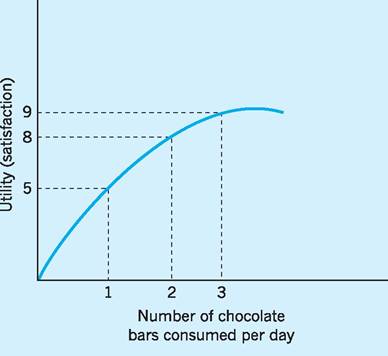
Fig. 12.12 Diminishing marginal utility.
Economics (see also Chapter 9, p. 167). This technical framework is based on a few key axioms. One of these is the notion of diminishing marginal utility. Individuals consume goods and services because it gives them utility (or satisfaction) to do so. However if we consider the consumption of chocolate bars as in Fig. 12.12 we note that as we consume additional bars so the satisfaction that we experience increases at a diminishing rate. If we consume one chocolate bar we experience 5 units of satisfaction (call this 5 utils). If we consume two bars we experience 8 units of satisfaction (8 utils). So the extra satisfaction - the marginal utility - is 3 utils. When we consume the third bar, total utility rises from 8 to 9 utils so the marginal utility of the third bar is only 1 util. And in the diagram it looks as though utility peaks at a consumption level of about three and a half bars. Beyond this point marginal utility becomes negative. Chocolate bars have diminishing marginal utility.
Everything that we consume has this fundamental characteristic. The more we have of something the less extra satisfaction we derive from consuming additional units. The rational individual will try to maximize his/her satisfaction (get as much utility as possible). To illustrate the principles involved consider the following example.
A consumer buys only two commodities, apples and bananas, both of which have diminishing marginal utility. At current consumption levels the last
apple eaten yields 10 utils of extra satisfaction (MU a = 10) and the last banana gives 18 utils (MUb = 18). Bananas cost twice as much as apples - say Pa = 1 and Pb = 2.
We have used symbols such that Pa is the price of apples and MUa is the marginal utility of apples and so on.
Is the consumer getting as much satisfaction as possible from his/her spending? The answer is ‘no’. At the margin each penny spent on apples gives 10 utils of satisfaction but each penny spent on bananas gives only 9 utils of extra satisfaction (18/2). So if some spending was transferred from bananas to apples the increased satisfaction from the extra apple consumption would more than outweigh the loss of satisfaction from the reduction in banana consumption.
In outline:
| Change in utility (approx) | |
| Cut banana consumption by 1 | -18 |
| Use resources to increase | +20 |
| apple consumption by 2 | |
| Net increase in utility | +2 |
But of course apples possess diminishing marginal utility (as do bananas) so the more apples he eats the less the extra satisfaction he gets. He will be maximizing his utility when the ratios of the marginal utilities is equal to the price ratio. That is:
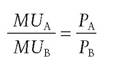
or equivalently (it’s the same equation cross-multiplied)  The same principles apply within the NHS. If we transferred resources from Bone marrow transplants to Arthritis research (from service B to service A) it might be possible to achieve a net increase in the wellbeing of the population (its utility). To do so, however, we need to be able to evaluate the utility of the outputs - that is, to put a money value on them. This is where the notion of economic evaluation comes in.
I Economic evaluation
Strictly speaking, the term economic evaluation should be restricted to the set of techniques that involve ‘evaluation’ - that is putting a money value on something. Often, however, the term is used more broadly to refer to decisions based not just on information about the clinical effectiveness of a medical intervention but its ‘cost effectiveness’ also. The question being posed is: does the use of such an intervention represent an efficient use of the resources of the NHS and more broadly of society as a whole?
Sometimes the term economic appraisal is used instead. The meaning is similar (and both terms are used rather loosely). Economic appraisal should be contrasted with financial appraisal and investment appraisal, both of which tend to be used in the private sector to refer to techniques that involve the calculation of net present value and internal rate of return to work out whether an investment is worth undertaking (see Chapter 17, p. 341). All three of these appraisal techniques have one thing in common - they recognize that there are alternative uses for the investment funds. They have an opportunity cost. Economic appraisal differs from private sector investment appraisal inasmuch as a broader range of benefits and costs are considered. In financial appraisal the decision is based on the probable effect on the company’s costs and revenues. In economic appraisal (in theory at least) a somewhat wider perspective is used.
Cost minimization analysis
If the choice is between two competing procedures where the outcomes of the two procedures are identical, the problem reduces down to that of cost minimization analysis. The decision rule is simple: choose the cheapest. Thus, for example, suppose the choice is between in-patient treatment and out-patient treatment (day-surgery) for haemorrhoids. The evidence seems to suggest that the outcomes are not significantly different. The patient is likely to recover just as quickly whether or not he stays in hospital. By choosing day surgery the hospital will avoid paying the ‘hotel services’ associated with keeping a patient in hospital overnight (probably around £350) and therefore this is the more cost-effective technique. There are other considerations that favour day-surgery - most patients would probably prefer not to stay in hospital and the risk of infection may be less. For other patients there may not be a suitable home environment. Other things being equal, however, the cheaper technique is to be preferred. Consequently, despite the increase in the number of cases treated (‘consultant episodes’), the number of beds in NHS hospitals has declined.
Figure 12.13 shows the change in the number of available beds over 20 years. Proportionally, the largest falls have been in learning disability, mental illness and geriatric beds. In all areas, care is increasingly being delivered with shorter stays in hospitals, so the number of beds needed has fallen.
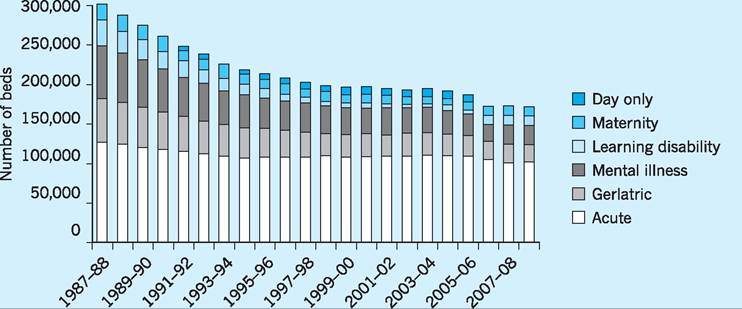
Fig. 12.13 Average daily number of available beds by sector in NHS hospitals, England, 1987/88-2008/09. Source: The King's Fund (2010).
Cost-utility analysis
This generic term is applied to situations where the choice is between two competing procedures but the outcomes are not the same and neither are the costs. Take as an example the case for the routine use of silver coated catheters. A urinary catheter is a narrow tube placed in the body to drain and collect urine from the bladder. They are often used on patients post-operatively or when the patient (who may be unconscious) cannot get out of bed to go to the toilet. In such patients a urinary tract infection (UTI) is not uncommon and these are referred to as CAUTIs (catheter associated urinary tract infections). The manufacturers of catheters have laboratory evidence that a silver alloy coating has antibacterial properties. There is some evidence that they reduce the incidence of CAUTIs in a hospital setting. A summary of one piece of research is shown here:
Silver Alloy Coated Catheters Reduce Catheter-associated Bacteriuria
H. Liedberg and T. Lundberg, British Journal of Urology, 65(4), 379-381, April 1990.
Summary - The tendency of indwelling catheters to cause urinary tract infection was evaluated in a randomised clinical study of 223 patients. A Foley catheter coated with silver alloy on both inner and outer surfaces was used in 60 patients; 60 others received a Teflonised latex Foley’s catheter and the remaining 103 patients were excluded because of antibiotic treatment, diabetes, etc.
There was a statistically significant difference in the incidence of catheter-associated bacteriuria (> 105 organisms/ml) in the 2 groups after 6 days’ catheterisation: 6 patients with the silver coated catheter developed bacteriuria compared with 22 who had the Teflonised latex catheter. This suggests that the silver impregnated urethral catheters reduce the incidence of catheter-associated urinary tract infection.
Silver coated catheters cost more than non-coated equivalents - say £10 each rather than £5 each. Is it worthwhile to routinely use the more expensive catheter rather than the cheaper alternative?
To answer this question, we should compare the additional cost with the additional benefit - remember that in economics we use marginal analysis to compare marginal costs with marginal benefits. It’s easy to work out the additional costs but the calculation of the additional benefits is less straightforward than it may at first appear.
The benefit of the use of the silver coated catheter is the UTIs prevented. On the basis of the evidence quoted in the study above (and estimates from many similar studies), we might conclude that the incidence of UTI falls from 22/60 to 6/60. Thus 16/60 UTIs are prevented. The additional cost to the hospital resulting from these had they not been prevented can be thought of as the cost of keeping these patients in hospital for additional days while the infection is treated and the cost of the drugs required to do so. Such figures will necessarily be based on averages that conceal wide variations in individual cases - in some patients the UTI will be minor and result in only a minor delay in discharge from hospital. Others may, however, already be suffering from multiple morbidities and the UTI will prove fatal.
Notice that an economic evaluation can only be as good as the clinical (statistical) evidence on which it is based. We can think of this as a two-stage process. The first stage is the clinical evidence of the improved efficacy of the new technique (such as the silver coated catheter). The second stage is the evaluation (placing a money value) of the change in costs and of the change in benefits that result from the adoption of the new technique. At the first stage it has to be clear what the comparator is - what is the new technique being compared against? And at the second stage it has to be clear whose perspective is being adopted - that of the individual hospital, the NHS (since costs may simply be passed on to other parts of the Health Service), or to the wider society, which would include the interests of the patient himself.
Evidence-based medicine
Many members of the medical and nursing professions are involved in clinical research and a huge volume of research evidence is published every year. The term evidence-based medicine relates to efforts to use the results of this research in a more systematic way. The British epidemiologist Archie Cochrane is regarded as the originator of the concept. The Cochrane Collaboration attempts to categorize studies, placing them in a hierarchy according to how valid and reliable they are deemed to be. The work of the Collaboration has led to the randomized controlled trial (RCT) being regarded as the gold standard of research. Ideally the RCT should also be ‘blind’ - which means that those participating in the research (both researchers and participants) do not know which patients are in the experimental group and which patients are in the control group. Sometimes the results of several studies on a particular topic are grouped together using meta analysis. This adds together the results from similar studies with the measured effects being a weighted average of the results of individual studies. Some statisticians, however, are sceptical of the procedure.
Quality Adjusted Life Years (QALYs)
One particularly controversial application of costutility analysis involves an attempt to measure the quality of additional life years gained as a result of the intervention. These are the infamous QALYs. The effect of an intervention (a new clinical procedure, say) is measured not just on one dimension but on two. The first dimension is the additional life years gained. This is multiplied by the second dimension, the quality of life of the patient in those remaining years. This produces a measure of Quality Adjusted Life Years (QALYs).
The two dimensions are illustrated in Fig. 12.14. The vertical axis is the ‘quality of life’, and the horizontal axis is ‘years of life’ following the treatment (or no treatment). Without treatment the patient will live for only 12 months with a quality of life rated as 0.5. The treatment being evaluated will extend the patient’s life by an additional two years (so they die after three years) and bring about an immediate improvement in the quality of life to 0.9. Thus the benefit of the treatment is the shaded area. This is the additional quality adjusted life years gained as a result of the treatment:
(3 ? 0.9) - (1 ? 0.5) = 2.2 QALYs
If the treatment costs, say, £60,000 then the cost per QALY would be £60,000/2.2 = £27,272. This figure can be compared with the cost per QALY associated with other forms of treatment. The NHS may decide not to fund those treatments that appear to offer poor
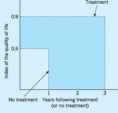
Fig. 12.14 How to calculate a QALY.
value for money. For example, if the cut-off point were £30,000 then this treatment (at only £27,272) would just come within the range of treatments that the NHS is willing to fund.
One measure of quality of life, the EQ-5D, uses the ability of the individual to function in five dimensions - mobility, pain/discomfort, self-care, anxiety/depression, usual activities. Each of the five dimensions has three possible levels - for example for mobility 1 = no problems walking about; 2 = some problems walking about; 3 = confined to bed. A completely healthy and happy individual would rate 11111. At the opposite extreme, 33333 would mean that the patient is confined to bed, is in extreme pain or discomfort, is unable to wash or dress themselves, is extremely anxious or depressed, and is unable to perform usual activities. These are assigned valuations. For example, 12323 (no problems walking, some pain, unable to wash, moderately anxious, unable to perform usual activities) is given a weight of 0.27 - roughly a quarter. So an additional 4 years of life would be worth only about one QALY.
The weights used in the EQ-5D scale were obtained by asking health professionals to ‘score’ certain health states, but there is a degree of arbitrariness involved and the approach has come under increasing criticism. The National Institute for Health and Clinical Evidence (NICE) has played down their use in recent years.
I Conclusion
We can trace the foundation of the NHS back to the Beveridge Report of 1942. The poor could not afford to access the medical treatments that were available at the time and consequently there was a ‘pent up demand’ for treatment. Access to health care free at the point of delivery would release this pent up demand and there would therefore be a significant increase in the resources required. But - it was argued - once the backlog of sickness had been removed the demand for health care would settle down at a manageable level.
As we now realize, this reasoning is incorrect. It was based on the view that medical technology would remain fixed, whereas we now realize that new treatments - and therefore new demands - are continuously emerging. It may be helpful to distinguish between need and demand. Suppose a patient is suffering from a disease for which there is no known cure or effective treatment. There is a need but not a demand. But if a treatment becomes available then there will be a resulting increase in the demand for health service resources. But if that new treatment is very expensive and is not clinically very effective it may not be a rational use of resources to provide it free to those who need it. The NHS may have to prioritize - to ration - its resources.
There is an irony here. When we consider both curative and preventative medicine, ultimately the more successful you are the more it costs you. By preventing disease and curing minor illnesses you increase life expectancy and delay the point at which death occurs. The only certain thing in life is that it ends in death. We may have slightly changed our view about how the NHS should care for people from ‘cradle to grave’, but the starting point and the end point remain the same. At the beginning, however - and especially at the end - the dignity with which we treat our fellow citizens is the measure of a civilized society.
Key points
■ Public spending on health care in the UK (i.e. NHS) has increased from 4.5% of GDP in the late 1980s to around 8.5% of GDP in 2010.
■ Demographic factors, such as an ageing population, new medical technologies and a high income-elasticity of demand for health care services, have all contributed to increased expenditure (public and private) on health care services.
■ Total spending in the UK on health care services has risen sharply over recent years and is some 10.5% of GDP in 2010, close to the EU average of 10.6% but still well below the US figure of 13.6% of GDP.
■ Life expectancy in the global economy depends on many factors other than health expenditure with the coefficient of determination (R2) being only around 0.55 as between these two variables. Social class is seen to be an important additional factor in the UK.
■ The structure of the health service is returning to a purchasers/providers separation, i.e. an internal or quasimarket.
■ There is considerable income disparity between doctors and other occupational groups within the health care sector. High remuneration of doctors is derived from an inelastic demand for health care services, doctors accounting for only a small proportion of total costs and being less easily substituted by other factors of production.
■ Estimating output and productivity in the health care sector is extremely complex, although volume indices have helped in this respect.
■ Economic evaluation of the effectiveness of health care has involved various cost minimization, cost-utility, evidence-based and QALY techniques.
Now try the self-check questions for this chapter on the Companion Website. You will also find useful links to relevant websites.
1 This is the so-called ‘line of best fit’ or ‘least 2 R1 is the so-called co-efficient of determination,
squares line’. It is that line which minimizes given by the following ratio: Explained varia- the sum of squared deviations from the line - tion divided by Total variation. sometimes called the ‘regression’ line.
References and further reading
Carvel, J. (2009) NHS constitution ends era of ‘doctor knows best’, Guardian, 21st January.
Department of Health and Social Services (DHSS) (1980) The Black Report, London, HMSO. Folland, S., Goodman, A. and Stano, M. (2009) Economics of Health and Health Care (6th edn), Harlow, Financial Times/Prentice Hall.
Gray, A., Clarke, P., Wolstenholme, J. and Wordsworth, S. (2010) Applied Methods of Costeffectiveness Analysis in Healthcare, Oxford, Oxford University Press.
Henderson, J. (2008) Health Economics and Policy (4th edn), Maso OH, South Western Educational Publishing.
HM Treasury (2010a) Budget 2010: copy of economic and fiscal strategy report and financial statement and budget report - June 2010, London, The Stationery Office.
HM Treasury (2010b) Public Expenditure Statistical Analysis 2010, London, The Stationery Office.
ONS (2010) Population Estimates, London, Office for National Statistics.
Hollingsworth, B. and Peacock, S. (2008)
Effi ciency Measurement in Health and Healthcare London, Routledge.
Liedberg, H. and Lundeberg, T. (2008) Silver alloy coated catheters reduce catheter-associated bacteriuria, online version of original article in British Journal of Urology, 65(4): 379-81, April 1990.
Marmor, T. and Wendt, C. (2011) Reforming Healthcare Systems, Cheltenham, Edward Elgar. Masis, D. P. and Smith, P. C. (2009) Health Care Systems in Developing and Transition Countries Cheltenham, Edward Elgar.
McIntosh, E., Clarke, P., Frew, E. and Louviere, J. (2010) Applied Methods of Cost-Benefit Analysis in Health Care, Oxford, Oxford University Press. Mooney, G. (2003) Economics Medicine and Health Care (3rd edn), Harlow, Financial Times/ Prentice Hall.
Mooney, G. (2010) Challenging Health Economics, Oxford, Oxford University Press. NHS NHS History, 1948, available at: http:// www.nhs.uk/NHSEngland/thenhs/nhshistory/ Pages/NHShistory1948.aspx (accessed February 2011).
NHS NHS History, 1990, available at: http:// www.nhs.uk/NHSEngland/thenhs/nhshistory/ Pages/NHShistory1990s.aspx (accessed February 2011).
NHS (2010a) NHS Staff 1999-2009 Overview, available at: http://www.ic.nhs.uk/statistics-and- data-collections/workforce/nhs-staff-numbers/nhs- staff-1999-2009-overview (accessed February 2011).
NHS (2010b) NHS Structure, available at: http:// www.nhs.uk/NHSEngland/thenhs/about/Pages/ nhsstructure.aspx (accessed February 2011).
OECD (2009) OECD Health Data 2009 - Comparing Health Statistics Across OECD
Countries, Paris, Organisation for Economic Cooperation and Development.
OECD (2010) OECD Health Data 2010: Statistics and Indicators, Paris, Organisation for Economic Cooperation and Development.
ONS (2010a) Annual Survey of Hours and Earnings (ASHE), London, Office for National Statistics.
ONS (2010b) Population Estimates, London, Office for National Statistics.
Phelps, C. (2009) Health Economics (4th edn), Harlow, Financial Times/Prentice Hall.
Pritchard, A. (2004) Measuring government health services output in the national accounts: new methodology and further analysis, Economic Trends, 613.
Smith, P., Mossialos, E., Papanicolas, I. and
Leatherman, S. (2010) Performance Measurement for Health System Improvement: Experiences, Challenges and Prospects, Cambridge, Cambridge University Press.
The King’s Fund (2010) Frequently Asked Questions, London.
Wanless, D. (2003) Securing Good Health for the Whole Population: population health trends, London, The Stationery Office.
The following websites are relevant to this chapter:
NHS: http://www.nhs.uk/NHSEngland/thenhs/ about/Pages/nhsstructure.aspx
The Cochrane Collaboration: http://www. cochrane.org/
NHS Evidence: http://www.evidence.nhs.uk/ default.aspx
OECD Health Data: www.oecd.org/health/ healthdata.
More on the topic Health economics:
- Introduction
- Contents
- BACKGROUND AND DEFINITIONS
- Introduction
- Diagnosis of Bovine Tuberculosis in Zambia
- 3 SELECTED SOCIO-ECONOMICALLY IMPORTANT WILDLIFE RELATED PATHOGENS AND DISEASES IN EUROPE
- Qatar
- Malta
- The Lesions and Diagnosis of BTB in Sudan
- Animal Husbandry