Distribution of income and wealth
In this chapter we review the changes that have taken place in the distribution of income and wealth in the UK. We see that there has been a significant increase in inequality of incomes in the UK since the late 1970s, though not at every income level.
We assess the usefulness of the Gini coefficient as an index of inequality, and use it to compare the income distribution of the UK with that of other countries. Income from employment is examined in some detail as this provides over 62% of all income received. Factors resulting in income inequality are considered together with policies which might correct the inequalities observed. Although wealth is difficult to measure, we note a progressive tendency towards a more equal distribution in the 1970s, but then a widening of the gap once more in the 1980s and 1990s and in the new millennium. In fact there is also clear evidence of greater inequality after 1979 at the top and bottom ends of the income distribution. This chapter concludes with a brief review of poverty in the UK.Distribution and justice
Throughout the history of economics, the distribution of income and wealth has been a major concern. There has been not only a desire to explain the observed pattern of distribution, but also a belief that basic issues of justice and morality were involved. Positive and normative economics are therefore difficult to separate in this area.
Commutative justice
There are two main views of justice in distribution. The first may be called ‘commutative justice’, where it is held that each person should receive income in proportion to the value of labour and capital they have contributed to the productive process. This view underlies the ideology of the free market economy, with some economists seeking to show that commutative justice will automatically be achieved under free competition, since each factor will receive the value of its marginal product.
Disparities in the distribution of income and wealth are then seen as being quite consistent with ‘commutative justice’.Distributive justice
The second view may be called ‘distributive justice’, where it is believed that people should receive income according to need. Given that people’s needs are much the same, ‘distributive justice’ implies approximate equality in income distribution. This view underlies the ideology of socialism. The socialist sees the free market as a kind of power struggle, through which certain groups are exploited; hence their advocacy of various forms of social control of the economy to achieve ‘distributive justice’. here is income from labour (wages and salaries), and from the ownership of capital (dividend and interest) and land (rent).
2 The distribution of income between factors of production, in particular between labour and capital. Advocates of the free market believe that income accrues to labour and capital according to their relative productivity, whilst critics explain their relative shares as the outcome of a continuous conflict in which capital seeks to exploit labour, and labour to resist.
3 The distribution of earnings between different types of labour. Again, believers in the free market see differences in earnings between occupational groups as being caused by differences in relative productivity. Critics explain such differentials through the relative bargaining power of the labour groups in question.
4 The distribution of wealth. In the nineteenth century virtually all wealth was held by a small elite, who lived off the profits from it, whilst the majority lived by the ‘sweat of their brows’. The injustice of this was a major spur to socialism. More recently, defenders of capitalism have argued that wealth has become progressively more evenly distributed, so that the majority benefit from profits - ‘We are all capitalists now’!
5 Poverty. Free market ideologists have always acknowledged that a small minority will be unable to compete in the labour market, and will therefore be poor; so from Adam Smith onwards most economists accepted the need for some protection of the poor.
Critics, however, have argued that poverty was, and remains, widespread.In this chapter we shall attempt to assess the facts in each of these five areas of concern, and to look more closely at the conflicting explanations. We shall start by looking at the overall distribution of income between people.
Issues in distribution
In the debate about distribution, there are five specific areas of concern.
1 The distribution of income between persons, irrespective of the source of that income. Included
I Income distribution between people
The overall picture
The most vivid illustration of income distribution is Pen’s ‘Parade of Dwarfs’ (Pen 1971). In the course of an hour the entire population passes by, each person’s height in relation to average height signifying their income in relation to average income. In the first minute we see only matchstick people such as women doing casual work. After 10-15 minutes dustmen and ticket collectors pass by, though only three feet high. After 30 minutes, when half the population has passed, skilled manual workers and senior office clerks appear, though these are still well under five feet tall. In fact we only reach the average height 12 minutes before the hour ends, when teachers, executive class civil servants, social workers and sales representatives pass by. After this, height increases rapidly. Six minutes before the end come farmers, headmasters and departmental heads of offices, standing about six feet six inches. Then come the giants: the fairly ordinary lawyer at eight feet tall, the family doctor at 21 feet, the chairman of a typical public company at over 60 feet, and various film stars and tycoons resembling tower blocks.
This illustration demonstrates two little-understood features of personal income distribution. First, the mean or average income is way above median income, the median-income receiver being the person who arrives after 30 minutes, with half the population poorer and half richer.
Roughly three-quarters of the population have less than the mean or average income. Put another way, the median income is only about 85% of average income. Broadly speaking, this is because at the top end there are considerable numbers of very rich people who pull the average up. Second, amongst the top quarter of income receivers are people in fairly ordinary professions, such as teachers and sales representatives, who would perhaps be surprised to learn that the great majority of the population were significantly less well off than themselves.Definition of income
When we come to collect precise data about income we find various problems of definition. Should we deduct taxes and add transfer payments? Should we count capital gains as income? This latter question raises the problem of distinguishing between income which is a flow, and wealth which is a stock. Income is defined in theory as the amount a person could have spent whilst maintaining the value of his wealth intact. By this definition capital gains should count as income, but for simplicity of data collection they are excluded from official tables. A further question is whether an imputed rent should be credited as income to those who own their dwelling. Again, strictly it should, as a dwelling is a potential source of income which could be spent without diminishing wealth, but for simplicity it is usually excluded. Finally, what should count as the income receiver, the individual or the household? In practice we normally use the ‘tax unit’ - the individual or family which is defined as one unit for tax purposes.
The Lorenz curve and the Gini coefficient
The conventional means of illustrating income distribution is the Lorenz curve, shown in Fig. 13.1. The horizontal axis shows the cumulative percentage of population; the vertical axis the cumulative percentage of total income they receive. The diagonal is the ‘line of perfect equality’ where, say, 20% of all people receive 20% of all income.
Table 13.1 presents figures for the distribution of income in the UK at selected dates since 1961. The data for 2008/09 are plotted in Fig. 13.1 as a continuous line, and are known as the Lorenz curve. The degree of inequality can be judged by the extent to which the Lorenz curve deviates from the diagonal. For instance, the bottom 20% received only 7.1% of total income in 2008/09, so that the vertical difference
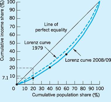
Fig. 13.1 Lorenz curve and Gini coefficient.
Table 13.1 Percentage shares of income after tax in the UK (before housing costs).
| Income receivers | 1961 | 1971 | 1979 | 1985 | 1991 | 2000/01 | 2008/09 |
| Bottom 10% | 3.7 | 4.0 | 4.2 | 4.0 | 3.0 | 2.8 | 2.6 |
| Bottom 20% | 9.4 | 9.5 | 9.9 | 9.4 | 7.4 | 7.3 | 7.1 |
| Bottom 30% | 16.3 | 16.1 | 16.7 | 15.7 | 12.9 | 12.7 | 12.6 |
| Bottom 40% | 24.1 | 23.2 | 24.3 | 22.8 | 19.5 | 19.2 | 19.1 |
| Bottom 50% | 32.7 | 32.2 | 32.9 | 30.9 | 27.2 | 26.7 | 26.6 |
| Bottom 60% | 42.2 | 41.7 | 42.5 | 40.2 | 36.2 | 35.4 | 35.3 |
| Bottom 70% | 52.9 | 52.3 | 53.2 | 50.8 | 46.6 | 45.5 | 45.3 |
| Bottom 80% | 64.8 | 64.2 | 65.5 | 63.0 | 58.9 | 57.4 | 57.0 |
| Bottom 90% | 78.8 | 78.3 | 79.6 | 77.4 | 74.0 | 72.0 | 73.4 |
| Bottom 100% | 100.0 | 100.0 | 100.0 | 100.0 | 100.0 | 100.0 | 100.0 |
| Gini coefficient | 0.260 | 0.262 | 0.248 | 0.279 | 0.337 | 0.350 | 0.340 |
Sources: Department for Work and Pensions (2010) Households Below Average Income (HBAI) 1994/5-2008/9; Goodman and Shephard (2002).
between the Lorenz curve and the diagonal represents inequality. To assess inequality over the whole range of the income distribution, the Gini coefficient is calculated. It is the ratio of the area enclosed between the Lorenz curve and the diagonal, to the total area underneath the diagonal. If there was no inequality (i.e. perfect equality), the Lorenz curve would coincide with the diagonal, and the above ratio would be zero. If there was perfect inequality (all the income going to the last person) then the Lorenz curve would coincide with the horizontal axis until that last person, and the above ratio would be 1. The Gini coefficient therefore ranges from zero to 1 with a rise in the Gini coefficient suggesting less equality. The value of the Gini coefficient is, in fact, calculated for each year in Table 13.1.
The figures from Table 13.1, as well as confirming the conclusions we drew from Pen’s ‘Parade of Dwarfs’, show that during the 1960s and early 1970s the Gini coefficient remained relatively constant, suggesting no significant change in the distribution of income. The period from 1971 to 1979 saw a sustained fall in the coefficient, suggesting that the income distribution became progressively more equal. However, the trend has been broken since 1979, with the Gini coefficient rising, i.e. less equality.
The Gini coefficient can, however, only give an overall impression. More detailed inspection shows that the bottom 20% of income receivers were worse off in 2008/09 with only 7.1% of income, compared to 9.9% in 1979. What has happened is that the relative position of the lower-income groups has worsened, and that of some of the higher-income groups improved. The top 10% received 26.6% of income in 2008/09 but only 20.4% in 1979. When one Lorenz curve lies below another at every point we can confidently say that a rise in the Gini coefficient must mean less equality. This appears to be the case for all deciles of income in 2008/09 as compared to 1979. If the Lorenz curves intersect we have to balance less equality at one part of the income distribution with greater equality at another part.
If we had compared the 1961 and 1971 Lorenz curves, we would have found just such an intersection. For instance, there was less equality for the bottom 50% of income earners in 1971 (32.2% of income) than in 1961 (32.7% of income). However, there was greater equality for the bottom 20% of income earners in 1971 (9.5% of income) than in 1961 (9.4% of income). So the rise in the overall Gini coefficient, from 0.260 in 1961 to 0.262 in 1971, must be treated with some care as it does not, in this case, mean less equality throughout the income distribution.
In more recent times the Gini coefficient has continued to rise, despite attempts by successive Labour governments between 1997 and 2010 to reverse this trend through the introduction of new tax and benefit systems designed to be redistributive in nature (i.e. benefit the lower-income groups much more than higher-income groups). In fact the average incomes of the higher-income groups have grown at least as fast as those of the lower-income groups since 1997. We discuss possible reasons behind such an outcome later in the chapter.
International comparisons
International comparisons of income distributions and their associated Gini coefficients have been difficult to undertake because various countries have different definitions of income and different methods of collecting data. However, at this stage it might be useful to compare the Gini coefficient in a sample of countries and also trace the changes over time. In Table 13.2 we find that the UK’s Gini coefficient is sixth highest of the sample of 14 countries. In fact, if the whole group of 30 OECD countries had been included, the UK would have come seventh highest in terms of the Gini coefficient, which reinforces the fact that the UK has a relatively high inequality of income vis-a-vis some of its competitors. Inequality in the US is also striking, while countries such as Belgium, Denmark and Sweden have low income inequalities by this measure.
Table 13.2 I ncome distribution: the Gini coefficient (after tax and transfers): mid-1980s to mid-2000s.
| Mid-1980s | Mid-1990s | Mid-2000s | |
| Mexico | 0.45 | 0.52 | 0.47 |
| Turkey | 0.43 | 0.49 | 0.43 |
| Portugal | 0.35 | 0.36 | 0.38 |
| US | 0.34 | 0.36 | 0.38 |
| Italy | 0.31 | 0.35 | 0.35 |
| UK | 0.33 | 0.37 | 0.34 |
| Japan | 0.30 | 0.32 | 0.32 |
| Spain | 0.37 | 0.34 | 0.32 |
| Germany | 0.26 | 0.27 | 0.30 |
| France | 0.31 | 0.28 | 0.28 |
| Norway | 0.32 | 0.26 | 0.28 |
| Belgium | 0.27 | 0.29 | 0.27 |
| Denmark | 0.22 | 0.21 | 0.23 |
| Sweden | 0.20 | 0.21 | 0.23 |
Source: OECD (2010) StatExtracts, Income distribution - Inequality.
In terms of changes in the income distribution, the Gini coefficient rose in many countries between the mid-1980s and mid-1990s - especially in the UK - but the picture between the mid-1990s and mid-2000s has been more varied across nations, with countries as diverse as the US, Germany and Portugal experiencing an increase in the Gini coefficient while the UK, Mexico, Turkey and Spain showed a fall in the Gini coefficients (less inequality). The OECD report from which these coefficients are derived concludes that the economic growth of recent decades has, overall, tended to benefit the rich more than the poor (OECD 2010).The report also notes that a key driver of income inequality has been the number of low skilled and poorly educated who are out of work and the incidence of people living on their own or in one-parent households.
Income distribution between factors of production
Definition of factors
In analysing the share of income between labour, capital and land there are initial problems of definition. First, under labour do we include workers and managers, thereby combining wages and salaries, since both are paid in return for work? Some argue that salaries for managers include a profit element, since managers exert direct control over capital and they carry entrepreneurial risks. In practice it is impossible to separate any profit element in salaries, and payments to workers and managers are counted together. More difficult is the income of the selfemployed, since this undoubtedly includes payment for both labour and capital services; a separate category is, in fact, usually made for the self-employed.
Measurement of factor shares
Table 13.3 shows the income to various factors as a percentage of gross value added at factor cost (national income before adjustment for taxes/subsidies) and provides an insight into the distribution of national income by factor shares. The table is in the new format introduced in 1998 by the government to
Table 13.3 Factor shares as a percentage of gross value added at factor cost.
| 1973 | 1977 | 1981 | 1989 | 2009 | |
| Compensation of employees | 66.4 | 66.6 | 67.9 | 63.8 | 62.2 |
| Gross operating surplus | 24.5 | 24.9 | 23.4 | 27.1 | 25.2 |
| Non-financial companies | |||||
| Private corporations | 17.8 | 17.5 | 17.4 | bgcolor=white>23.119.0 | |
| Public corporations | 3.2 | 3.8 | 3.7 | 1.5 | 0.8 |
| Financial corporations | 3.5 | 3.6 | 2.3 | 2.5 | 5.4 |
| Other income* | 9.1 | 8.5 | 8.7 | 9.1 | 12.6 |
| Total | 100.0 | 100.0 | 100.0 | 100.0 | 100.0 |
*Includes mixed income and the operating surplus of the non-corporate sector (proxy variable for self-employment income).
Source: ONS (2010b) United Kingdom Economic Accounts, Quarter 2, ONS Economic Trends (various).
conform to European national income practices. The ‘compensation of employees’ corresponds to incomes which employees earn from employment, while ‘gross operating surplus’ covers mainly the profits to various corporate bodies, both private and public. The ‘other income’ includes what is called ‘mixed income’ (largely income from unincorporated businesses owned by householders) and the operating surpluses of other unincorporated bodies such as partnerships. Although not precise, the ‘other income group’ can be thought of as a proxy for ‘self-employed income’.
Labour’s share of total income has increased from approximately 50% in 1900 to 62.2% in 2009. Table 13.3 shows that over the last 36 years, the percentage shares going to various factors have been relatively steady, although the share of total income going to labour fell and to profits rose significantly between 1981 and 1989 as the relatively slow rise in real wages and the economic recovery helped shift income away from employment and towards corporate profits.
One may question the importance of factor shares in overall income distribution. Whether the changes in factor shares shown in Table 13.3 reflect greater inequality in household incomes depends on how unequally distributed these earnings from different factor sources are across the various income groups. For example, the table suggests that the distribution of factor shares has shifted away from employment and towards self-employment and profits (‘gross operating surplus’ and ‘other income’) since 1981. If we knew that income from these two sources is more unevenly distributed across income groups than income from employment, then this shift in factor shares towards self-employment and profits could result in an increase in the overall inequality of income between different groups of people. Studies have, in fact, shown that income from self-employment and from investments (rent, dividends and interest) are more important sources of income for the lowest and highest income groups than for the middle income groups.
There are two main types of theoretical explanation of factor shares. The first emphasizes the role of market forces and starts with a microeconomic analysis of factor markets. If there is perfect competition in goods and factor markets, each factor will receive precisely its marginal revenue product; in other words, it will receive income in proportion to its productive value. The rising share to the factor labour would be viewed from this standpoint as reward for a greater contribution to production.
An alternative approach has been to explain factor shares in terms of power. Marx saw capitalists as exploiting labour, receiving ‘surplus value’ from the fact that the efforts of workers yield returns over and above their wages. Marx believed that this exploitation would increase as production became more capital-intensive and labour was displaced, creating a pool of unemployment which would depress wages, and therefore the share of labour in National Income. Eventually, the decline in people’s ability to purchase the output of the capitalist factories, combined with the workers’ resentment at their poverty, would cause crisis and revolution.
Neither theory is wholly adequate. Assumptions, such as perfect competition in labour markets, required by orthodox theory are clearly unrealistic (see Chapter 14). Similarly, Marx’s prediction of a declining wage and factor share for labour has not been fulfilled.
I The earnings distribution
Since over 62% of total income accrues to the factor labour (Table 13.3), it follows that differing returns to the various factors (labour, capital or land) are unlikely to be the main explanation of income inequality. Rather, we must turn our attention to variations in income between different groups within the factor labour, i.e. the earnings distribution.
Earnings by occupation
Table 13.4 shows the relative median gross earnings for the main occupational groups based on the Annual Survey of Hours and Earnings (ASHE). This survey replaced the previous ‘New Earnings Survey’ from 2004 onwards and contains comprehensive data on many aspects of earnings. The data in Table 13.4 represent the gross median weekly earnings of certain occupations as a proportion of the gross median weekly earnings of all occupations. From the table it can be seen that managers and senior officials earn 46% above the average for all occupations and enjoy similar earnings to those in professional occupations (e.g. scientists, engineers, teachers, accountants, etc.). Associate professionals and technical occupations (technicians, therapists, prison officers, etc.) earn, on average, 13% above the median earnings for the whole country. It is also true to say that many occupations classed as ‘manual’ (e.g. process, plant and machine operatives) earn more than ‘non-manual’ workers, such as those in sales or personal services. Indeed, a more detailed analysis also reveals that certain manual occupations, such as construction operatives, vehicle assemblers, stevedores and heavy goods vehicle drivers, earn the equivalent or more than further education teachers or healthcare managers. Although the picture is complicated, it can be seen that substantial inequality of occupational earnings is clearly present in UK society.
A hidden source of inequality between occupations is the difference in value of fringe benefits and pension entitlement. As early as 1979 the Diamond Commission found that this typically adds 36% to the pre-tax salary of a senior manager, and 18% to that of a foreman, whilst unskilled workers enjoy few or no such benefits.
Earnings by sex
Table 13.5 shows the ratio of female to male gross weekly earnings in 2009. It can be seen that, on
Table 13.4 Relative earnings by occupational groups, 2009.*
| Occupational group | Median gross weekly wage (all occupations = 100) |
| Managers and senior officials | 146 |
| Professional occupations | 142 |
| Associate professional and technical occupations | 113 |
| Administrative and secretarial occupations | 76 |
| Skilled trades occupations | 93 |
| Personal service occupations | 67 |
| Sales and customer service occupations | 61 |
| Process, plant and machine operatives | 85 |
| Elementary occupations | 66 |
| All occupations | 100 |
| *Full-time employees on adult rates, whose pay for the survey period was unaffected by absence and who have been in | |
| Source: Adapted from ONS (2010a) Annual Survey of Hours and Earnings 2009. | |
Table 13.5 Relative earnings by sex, 2009.
| Occupational group | Median gross weekly wage (female/male ratio) | ||
| Managers and senior officials | 72 | (78) | |
| Professional occupations | 83 | (89) | |
| Associate professional and technical occupations | 80 | (89) | |
| Administrative and secretarial occupations | 79 | (89) | |
| Skilled trades occupations | 56 | (70) | |
| Personal service occupations | 92 | (81) | |
| Sales and customer service occupations | 68 | (92) | |
| Process, plant and machine operatives | 67 | (71) | |
| Elementary occupations | 44 | (79) | |
| All occupations | 63 | (80) | |
| Note: Figures in brackets are for full-time male/female workers. | |||
| Source: Adapted from ONS (2010a) Annual Survey of Hours and Earnings 2009. | |||
average, women earn only 63% of men’s wages in the same occupational groups. Women’s wages seem to lag at the upper managerial end of the occupational spectrum and also in the skilled and elementary occupations. Their relative income is higher in the professional and administrative groups, where there appears to have been more equal treatment over time. The position of women improved significantly during the 1970s - a period which saw the introduction of equal pay legislation, as for example between 1970 and 1976 when the ratio of women’s average weekly wages to that of men rose from 50% to 61%. Nevertheless, Table 13.5 would suggest that little improvement has taken place in overall male/female wage ratios since that period.
However, the comments made above cover all male and female workers, both full- and part-time. If we look at the ratios for full-time workers only (in brackets), then the overall ratio of male to female weekly gross wage rises to an average of 80%. This clearly indicates the influence of lower part-time payments made to female labour.
Earnings trends
Figure 13.2 shows that there have been significant changes over time in the real earnings gap between high and low wage earners. The figure traces the growth in real hourly (male) earnings between 1966 and 2009 of people positioned at three different points on the income distribution scale. The 50th percentile line traces the increases in the real hourly earnings of workers receiving the median (‘average’) wage over the period. Similarly, the 90th percentile represents the growth of real hourly earnings of workers who are 90% of the way up the income distribution, while the 10th percentile shows the growth of real hourly earnings for those whose income is only 10% of the way up the income distribution. Of course the 90th percentile is likely to include some of the people in the ‘managers and senior officials’ category in Table 13.5, while the 10th percentile will include some of those in the ‘elementary occupations’ category.
Between 1966 and 1978 the three categories moved roughly in line with each other. However, major differences have emerged since then between those on low and high pay. For example, the real pay for average earners (50th percentile) increased by 46% between 1978 and 2009, whilst the real pay for those near the top of the income scale (90th percentile) increased by as much as 60% over the same time period. On the other hand, those with earnings near the bottom of the income scale (10th percentile) hardly benefited at all over this period. The relative position of workers near the bottom of the income scale was in fact the lowest since records began in 1886.
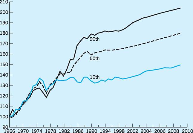
Fig. 13.2 Real hourly male earnings by percentile (Index 1966 = 100). Sources: Various ONS publications and Financial Times (1994).
Explanation of earnings differentials
In seeking to explain the earnings distribution there are two main theoretical approaches, similar to those we considered above for factor shares.
Market theory
The first, the ‘market theory’, starts from an assumption of equality in net advantages for all jobs, i.e. that money earnings and the money value placed on working conditions are equal for all jobs. It also assumes that labour has a high degree of occupational and geographical mobility, so that if there is any inequality in net advantages, labour will move to the more advantageous jobs until equality is restored. Thus, differences in actual earnings must be caused by compensating differences in other advantages. Job satisfaction is one compensating advantage: enjoyable or safe jobs will be paid less than irksome or risky ones; this may partly explain the relatively high wage of manual workers such as coalface miners and chemical, gas and petroleum plant operators. Still more important are differences in training. Training and education are regarded as investments in ‘human capital’, in which the individual forfeits immediate earnings, and bears the cost of training, in the prospect of higher future earnings; this may in part explain the high earnings of professional groups. In fact, one study found that some 30% of the disparities in real hourly male wages shown in Fig. 13.2 could be explained by increases in educational differentials over the period (Gosling et al. 2000). Market theory therefore proposes that relative occupational earnings reflect non-monetary advantages between occupations, and the varying length and cost of required training.
Proponents of this theory agree that it is not wholly adequate, and would recognize differences in natural ability as also affecting earnings. However, others, whilst still broadly advocating market theory, have suggested a more fundamental objection, namely that labour is in fact highly immobile. The most recent study of income immobility among the rich and poor found that groups of people at the extreme ends of the income distribution tend to be subject to intergenerational immobility (Johnson and Reed 1996). This research attempted to assess whether the income level and unemployment experiences of fathers were related to the subsequent experiences of their sons. The results were interesting in that the sons of those fathers who were unemployed were also more likely to end up being unemployed. Indeed, the sons of fathers whose income was in the bottom 20% of income earners were three times more likely to remain in the same income group than those sons whose fathers’ incomes were above average. Similarly, the sons of fathers whose income was in the top 20% of earners were three times as likely to end up in the same income group as their father than those sons whose fathers’ incomes were in the bottom 20% of income earners. However, the survey also showed that the more able children of poor parents do have a better chance of moving into higher income bands than less able children, making it very important to make sure that good quality education is available to all. From what we have noted above, a combination of social, occupational and geographic immobility can have a significant effect on the earnings distribution, especially at the upper and lower ends of the distribution, contrary to the simple predictions of market theory.
Segmented markets
The second theoretical approach places ‘immobility’ at the very centre of its analysis. This approach sees the labour market as ‘segmented’, i.e. divided into a series of largely separate (non-competing) occupational groups, with earnings determined by bargaining power within each group. Some groups, especially professional bodies, have control over the supply of labour to their occupations, so that they can limit supply and maintain high earnings. Other occupational groups have differing degrees of unionization and industrial power. The relatively high earnings of the relatively small number of printworkers and coalminers in the UK up to the mid-1980s may be explained in part by their history of effective and forceful collective bargaining, whilst the fragmented nature of agricultural and catering work may have contributed to their low pay. In this approach bargaining power is held to outweigh the effects of free market forces. A UK study on the relationship between wage inequality and union density during the 1980s largely substantiated these conclusions (Gosling 1995). It found that wage inequality increased as trade union influence weakened. The significant weakening of trade union power in the UK in the 1980s may therefore have played a part in the observed increase in the inequality of income. In particular, various groups of labour which do not have strong market power will suffer more than proportionately as a result of any decline in trade union bargaining positions. In similar vein, research by the IMF (Prasad 2002) identified inequalities in circumstances as between occupations as the major factor in accounting for the observed growth in UK wage disparities.
These two theoretical approaches to the distribution of earnings need not be regarded as mutually exclusive. Market theory can itself be used to analyse bargaining power, with professional bodies and trade unions affecting the supply of labour, and the elasticity of labour demand determining the employment effects of their activities. More fundamentally, it may be suggested that labour, whilst fairly immobile in the short run, is highly mobile in the long run. Thus, whilst the exertion of bargaining power may affect differentials in the short run, in the long run labour will move in response to market forces, and thereby erode such differentials.
However, it is obvious from Fig. 13.2 that the wage differential between those on low and those on high wages has not been eroded; in fact it actually widened between 1978 and 2009. Although the reasons for such a trend are complex, they seem to lie in both inter-industry and intra-industry shifts which have occurred in the UK labour market. For example, the inter-industry employment shift from manufacturing to services has tended to increase the number of lower-paid jobs. However, there also seem to have been intra-industry employment shifts, namely a shift in demand within industries in favour of non-manual, better educated, workers. Even when the proportion of workers with degrees rose from 8% to 11% during the 1980s, their wages continued to rise as demand for such workers rose even faster than their supply. At the other end of the scale, although the percentage of workers with no qualifications fell from 46% to 32%, the unemployment rate among this group actually rose from 6.5% to 16.4% over the 1980s. In other words the demand for such workers fell even faster than the fall in their supply. The drive towards international cost competitiveness and the introduction of new technology have increased the demands for a more skilled and flexible workforce (OECD 1996), leaving workers with low skills, poor family backgrounds and inflexible work attitudes to occupy the low-paid jobs. These trends are also linked to age. For example, young people who are poorly qualified and have low earnings are less likely to experience increasing real earnings with age than are their predecessors (Gosling et al. 1994).
Another interesting theory linked to the segmented market hypothesis has been suggested by Daniel Cohen (Cohen 1998). He suggests that there is no longer a single market even for a particular kind of skill or occupation, i.e. there is an intra-skill dimension to earnings differentials. For example, top law firms may require secretaries whose pay will reflect their value to the company, while secretaries of similar capabilities working for less profitable law firms will earn considerably less. In other words, an individual’s earnings prospects may depend on the nature and profitability of the company which employs them, so that even modest differences in skill may be magnified into significant earnings differentials. In this sense earnings differentials may substantially exceed any skill differentials, even within a given occupation.
The above attempts to explain the presence of wage differentials did not explicitly seek to clarify the reasons for earnings differentials by sex, so clearly shown in Table 13.5. Such differentials could be due, for example, to some element of discrimination which might exist in the labour market between men and women, even though they were identical workers. For instance, until December 1975, when it was made illegal, collective agreements between employers and employees often included clauses which prescribed that female wage rates should not exceed a certain proportion of the male wage. The examples of wage differentials noted above were made possible because of the preponderance of males in most unions. The state has also been active in allowing this wage differential to exist. For example, up to 1970 when the Equal Pay Act was passed, the police pay structure provided for a differential wage structure for men and women up to the rank of ordinary sergeant, while the pay structure for more senior sergeant ranks included only male rates. Obviously, female policewomen were felt to be able to achieve only the lower grades and even here were not seen as of equal value to males (Tzannatos 1990).
On the other hand, the observed differentials could be regarded as being due to genuine differences which exist (or are perceived to exist) between male and female labour. For instance, it is often observed that employers make certain assumptions about the ‘average’ female worker, i.e. as being one who will not be working for long before leaving to have a child. As a result, employers may be more reluctant to train female workers, who are then placed at a disadvantage as compared to their male counterparts. By acquiring fewer skills, the female worker inevitably receives less pay. Again, female workers are often constrained in competing with male workers by the need to seek employment in the catchment area of their husbands’ employment. Such restrictions can again result in a lower wage as compared to that received by the more mobile male counterpart.
Whatever the causes of wage differentials between males and females, there is no doubt that they still exist, even after the initial improvements in the early 1970s following the Equal Pay Act of 1970 and the Sex Discrimination Act of 1975.
The distribution of wealth
Definition of data collection
Wealth is notoriously difficult to define. The most obvious forms of wealth are land, housing, stocks and shares and other financial assets. In addition, many households hold several thousands of pounds- worth of durable goods: cars, carpets and furnishings, electrical goods and so on. All these together are known as ‘marketable wealth’. But many ordinary families, whilst owning little land and few shares, may have substantial pension rights. In the case of private schemes these usually derive from contributions into a fund, which in turn is used to buy assets; whilst in the state scheme it derives from contributions which entitle people to future income from government revenues. It is the ownership of marketable wealth plus occupational and state pension rights which is often presented in the data (e.g. Table 13.6).
There are also considerable problems in obtaining information about wealth. Britain has no wealth tax, and so no regular wealth valuations are made. Attempts have been made to do this via sample surveys, but people are often reluctant to reveal their economic circumstances in sufficient detail to draw reliable conclusions. The only time that wealth is
Table 13.6 Ownership of marketable wealth.
| Percentage of wealth owned by: | 1971 | 1976 | 1986 | 2006 |
| Most wealthy 1% of population | 31 | 21 | 18 | 21 |
| Most wealthy 5% of population | 52 | 38 | 36 | 40 |
| Most wealthy 10% of population | 65 | 50 | 50 | 54 |
| Most wealthy 25% of population | 87 | 71 | 73 | 77 |
| Most wealthy 50% of population | 97 | 92 | 90 | 94 |
| Source: HMRC (2010) Distribution of Personal Wealth Inland Revenue Statistics (various). | ||||
publicly evaluated is when substantial amounts are transferred from one person to another, usually at death, when wealth is assessed for capital transfer tax. By analysing these figures in terms of age and sex, it is possible to take the dead as a sample of the living, and so estimate the overall wealth distribution. Of course, there is an obvious likelihood of sampling error, especially in estimating the wealth of the young. The procedure also ignores certain bequests, such as those to surviving spouses, which are not liable to tax. Nevertheless, it is the best method available.
Concentration of wealth
Table 13.6 shows the Inland Revenue’s estimate of the overall wealth distribution, excluding occupational and state pension rights. As we might expect, wealth is much more unequally distributed than income. For example, the most wealthy 1% of the population own 21% of the wealth, whilst the top 10% own as much as 54% of wealth and the top 50% own 94% of wealth (i.e. the bottom half own only 6% of wealth).
But perhaps more significant than the absolute figures is the astonishingly rapid reduction in inequality, especially in the early 1970s. The wealth of the richest 1% fell in five years from 31 to 21% of the total, whilst for the richest 10% it fell from 65 to 50% (Table 13.6). This reflects the high rate of inflation in those years, which rapidly eroded the value of financial assets, and also the steep decline in the prices of stocks and shares and commercial land. Over a much longer period we observe a steady reduction in wealth inequality. In 1924 the wealthiest 1% owned 60% of marketable wealth (i.e. excluding occupational and state pension rights); this had fallen to 42% in 1951, and is now 21%. A major reason for this has been death duties, and more recently capital transfer tax (inheritance tax). This is a progressive tax, and helps break up the largest wealth holdings as they pass from one generation to another.
Despite the continuing influences of these factors, changes in the distribution of wealth were much more modest in the 1980s and 1990s, as can be observed from Table 13.6. Recently, however, it has been argued that ‘new wealth’ is being created in the UK as the rapid spread of home ownership and the rise in house prices means that inheriting such properties may allow both middle- and working-class people to benefit in the future. The percentage of UK households owning their own homes rose from 56% in 1980 to 70% in 2009. Although this may improve the wealth situation of many middle- and workingclass income earners, it will create even more problems for the children of the 25% or more parents who may never own their own homes. It may also further increase the regional disparity of wealth as a result of regional house price differentials.
Though it is an emotive issue, one may doubt that the wealth distribution is a primary source of income inequality. We have already seen that the main source of income inequality is not between capital and labour, but between different groups of labour.
I Poverty
Definition
There has been much debate as to the definition of poverty. Some have tried to define it in absolute terms. For example, Rowntree (1901), who made a major study of poverty just over a century ago, concluded that poverty was having insufficient income to obtain the minimum means necessary for survival, namely basic food, housing and clothing. Others have sought to define it in relative terms: Townsend (1973), in his survey of poverty, saw it as the inability to participate in the customary activities of society, which then might have included taking an annual holiday away from home, owning a refrigerator, having sole use of an indoor WC, and so on.
In some ways, the grinding poverty experienced in pre-Second World War Britain is no longer present. For example, studies by the Department of Social Security on ‘Households below average income’ have shown that amongst the poorest 10% of UK income earners, the percentage who have access to some basic consumer benefits were as follows: fridge/fridge freezer (99%), washing machine (88%), central heating (77%), telephone (76%), video (72%) and car or van (53%). Although these figures suffer from measurement problems, the improvement over the last 20 years in these percentages has been significant. However, such data do not always capture the more complicated aspects of poverty and the relative positions of different groups in UK society.
On a more practical level the ‘official’ poverty level (defined as the minimum acceptable income level) used by many researchers in the UK is given by the level of Income Support. On the other hand, the Child Poverty Action Group (CPAG) has defined the ‘margins of poverty’ as those people whose incomes are below Income Support plus 40%. Income Support is set by governments, and may be affected not only by the needs of the poor, but also by general political policy. It also ignores other aspects of economic deprivation not directly related to money income, such as inadequate housing, schools, health care and suchlike.
Another important source of statistics on poverty is derived from the Households Below Average Income published by the government’s Department for Work and Pensions. Using these statistics, the poverty line is most often defined as those households whose income is either below 50% of the mean household income or below 60% of the median household income. In recent years the government has tended to use the latter definition because it is in line with EU practice, and because it is arguably a better measure for capturing the gap between the standard of living enjoyed by the poorest families and the ‘typical’ (median) family. Even so, there is sometimes inconsistency, as when using a poverty measure of below 50% (not 60%) of the median household income (as in Table 13.7). The CPAG, on the other hand, continues to use the former definition.
These various measures, together with information on the distribution of income which is supplied by the Institute for Fiscal Studies, provide useful insights into the incidence of low income and poverty. However, they fail to account for other forms of poverty such as those frequently shown in statistics of homelessness or of ill-health.
Incidence of poverty
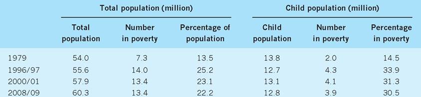
When we look at some of these suggested measures of poverty we find some disturbing results. Data show that the number of people receiving Income Support (including income-based Jobseeker’s Allowance) has risen from 3.0 million in 1978 to 5.1 million in 2010. If we add to these figures the people who depend
Table 13.7 The growth of poverty (defined as earnings less than 60% of average income), 1979-2009.
Source: Department for Work and Pensions (2010) Households Below Average Income 1994/5-2008/9, and previous issues.
Table 13.8 Child poverty by type of family and income, 1998-2009.
1Relative to the percentage of all UK children to be found in the groups.
2The percentage of children in the various groups where the household earns less than 60% of median income (AHC), i.e. the percentage of children in households classed as being in poverty.
Sources: Department for Work and Pensions (2010) Households Below Average Income 1994/95-2008/09; Brewer etal. (2006).
upon these benefits, e.g. children, then the total number dependent on these benefits in 2010 was 12.2 million people, or 20% of the total population.
To help clarify the growth of poverty in the UK it may be helpful to study the results of the Households Below Average Income report, published in 2010 (Table 13.7). Using the definition of ‘poverty’ as those households who earn less than 60% of the average income after housing costs, we can see that between 1979 and 2009 the total number of people in poverty has increased from 7.3 million to 13.4 million, suggesting that the percentage of the total population in poverty has nearly doubled over the period. The number of children who live in poverty has increased from 2 million to 3.9 million over the same period, suggesting that the percentage of children in poverty has also doubled between 1979 and 2009. By 2009, therefore, some 22% of the total UK population and 30% of UK children were living in households earning less than half the average income.
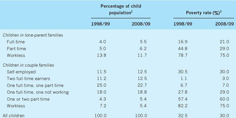
Over the past decade the target of reducing child poverty has been a particular policy issue of successive Labour governments and Table 13.8 provides an insight into this issue between 1998 and 2009. Poverty rates are highest for children in workless families, being 75% in 2008/09 for both lone parents and couples. In addition, families composed of couples with only part-time employment had relatively high child poverty rates of 60% in 2008/09. In contrast, groups such as full-time working lone parents, couples with two full-time earners, and couples with one full-time and one part-time earner, all had below- average child poverty rates. Table 13.8 also shows that there has been general progress in reducing poverty in most groups, with particular success for single parents and couples in workless families.
Although it would seem that governments have succeeded in reducing child poverty, they have not been able to meet their own targets. For example, the government aimed to cut child poverty by 25% between 1989/99 and 2004/05, but the actual fall has been only 17.2%, based on after housing cost (AHC) figures. In actual numbers, this means that the number of children in poverty fell from 4.1 million to 3.4 million, instead of falling further to 3 million between those dates - a shortfall of 0.4 million. Although government policy has undoubtedly made major inroads into alleviating child poverty, the
Table 13.9 The European child wellbeing and poverty index.
| Rank | Country | Health | Subjective wellbeing | Children’s relationships | Material resources | Behaviour and risk | Education | Housing and environment |
| 1 | Netherlands | 2 | 1 | 1 | 7 | 4 | 4 | 9 |
| 2 | Sweden | 1 | 7 | 3 | 10 | 1 | 9 | 3 |
| 3 | Norway | 6 | 8 | 6 | 2 | 2 | 10 | 1 |
| 4 | Iceland | 4 | 9 | 4 | 1 | 3 | 14 | 8 |
| 5 | Finland | 12 | 6 | 9 | 4 | 7 | 7 | 4 |
| 6 | Denmark | 3 | 5 | 10 | 9 | 15 | 12 | 5 |
| 7 | Slovenia | 15 | 16 | 2 | 5 | 13 | 11 | 19 |
| 8 | Germany | 17 | 12 | 8 | 12 | 5 | 6 | 16 |
| 9 | Ireland | 14 | 10 | 14 | 20 | 12 | 5 | 2 |
| 10 | Luxembourg | 5 | 17 | 19 | 3 | 11 | 16 | 7 |
| 11 | Austria | 26 | 2 | 7 | 8 | 19 | 19 | 6 |
| 12 | Cyprus | 10 | - | - | 13 | - | - | 11 |
| 13 | Spain | 13 | 4 | 17 | 18 | 6 | 20 | 13 |
| 14 | Belgium | 18 | 13 | 18 | 15 | 21 | 1 | 12 |
| 15 | France | 20 | 14 | 28 | 11 | 10 | 13 | 10 |
| 16 | Czech Rep | 9 | 22 | 27 | 6 | 20 | 3 | bgcolor=white>22|
| 17 | Slovakia | 7 | 11 | 22 | 16 | 23 | 17 | 15 |
| 18 | Estonia | 11 | 20 | 12 | 14 | 25 | 2 | 25 |
| 19 | Italy | 19 | 18 | 20 | 17 | 8 | 23 | 20 |
| 20 | Poland | 8 | 26 | 16 | 26 | 17 | 8 | 23 |
| 21 | Portugal | 21 | 23 | 13 | 21 | 9 | 25 | 18 |
| 22 | Hungary | 23 | 25 | 11 | 23 | 16 | 15 | 21 |
| 23 | Greece | 29 | 3 | 23 | 19 | 22 | 21 | 14 |
| 24 | UK | 24 | 21 | 15 | 24 | 18 | 22 | 17 |
| 25 | Romania | 27 | 19 | 5 | - | 24 | 27 | - |
| 26 | Bulgaria | 25 | 15 | 24 | - | 26 | 26 | - |
| 27 | Latvia | 16 | 24 | 26 | 22 | 27 | 18 | 26 |
| 28 | Lithuania | 22 | 27 | 25 | 25 | 28 | 24 | 24 |
| 29 | Malta | 28 | 28 | 21 | — | 14 | — | — |
Source: CPAG (2009).
prospects of it being able to meet its ambitious target were always rather slim. However, its decisions to increase substantially the amount of cash to be transferred to low-income families with children and also its ‘welfare to work’ policies (see Chapter 19) have meant that more workless parents have found work and hence increased their real incomes (Hills and Stewart 2005).
At this stage it might be useful to investigate the situation regarding child wellbeing and child poverty in European countries. A league table produced by Bradshaw and Richardson (2009) contains 43 separate indicators divided into seven domains as seen in Table 13.9. These domains include health (indicators of infant mortality, etc.); subjective wellbeing (how children feel about their lives, etc.); children’s relationships (how children get on in school); material resources (indicators of child poverty); behaviour and risk (indicators of violence); education (indicators of achievement/youth inactivity); and housing and environment (indicators of overcrowding/housing problems). As can be seen, the UK is 24th out of 29 in the overall ranking in this league table, which is well below its economic ranking amongst the same countries in Europe. The UK is not even in the top third of European countries in any of the domains - its ‘best’ score is 15th for children’s relationships! This new assessment of child wellbeing and child poverty signifies a call for more government action in the UK. The Child Poverty Act of 2010 makes meeting the 2020 target of ‘eradicating’ child poverty legally binding in the UK and provides a huge challenge to future UK governments, especially in a period of economic downturn.
Whatever our definition, there are clearly large numbers of adults and children in ‘poverty’, suggesting that it is most effectively tackled by a wide range of initiatives over a prolonged period of time. For example, the National Minimum Wage (NMW) introduced in 1998 has, as one of its objectives, the reduction of income inequalities at work (see Chapter 14, page 288). However, in this respect its impacts have been rather modest, perhaps because the NMW has not been uprated in line with average earnings.
Conclusion
After some move towards greater equality of income distribution between 1961 and 1979, the process has been significantly reversed since the end of the 1970s. Income from employment provides over 62% of all income received, and must be a focus for any attempt to explain the inequality that does exist. Variations in income by occupation, by sex and by skill levels clearly contribute to such inequality. Together with the rise of inequality of income from employment, the growth of self-employment in recent years has also contributed to greater inequality in overall income. Wealth is more unequally distributed than income, and although there has been a progressive tendency towards a more equal distribution since the early 1970s, this process slowed down markedly in the 1980s and actually went into reverse in the 1990s with growing wealth inequality. Poverty is a serious phenomenon in the UK, no matter how we define it. The large numbers and varied characteristics of those in poverty suggest that government policy must be wide-ranging and sustained if poverty levels are to be reduced substantially. In a detailed analysis of income distribution and poverty in the UK, Joyce et al. (2010) indicate that the future course of living standards, inequality and poverty will be highly uncertain in the UK. They point out that how the public finances are rebalanced in the near future appears to be the ‘single most important determinant of the future path for living standards, poverty and inequality’ during the period 2010-15.
Key points
■ The Gini coefficient (G) is the ratio of the area between the Lorenz curve and the diagonal to the total area beneath the diagonal.
■ Where G = 0, we have perfect equality; where G = 1, we have perfect inequality.
■ Where Lorenz curves intersect, we must be particularly careful in using the Gini coefficient.
■ Since 1979, the Gini coefficient has tended to rise in the UK.
■ Inequality as measured by the Gini coefficient is higher in the UK than for the average of EU countries, but is lower than for the US.
■ Since employment accounts for around 62% of all factor income, the labour market must be a major source of any income inequalities observed.
■ Significant differences in earnings can be observed by type of occupation and by gender, though the latter gap has narrowed in recent years.
■ Household characteristics such as age, unemployment, single parenthood, etc., also play a key role in income inequality.
■ The distribution of wealth is even more unequal than the distribution of income.
■ Poverty can be expressed in both absolute and relative terms. Using a variety of indicators, the incidence of poverty has clearly increased in the UK since 1979, although real progress has been made in combatting poverty in recent times.
Now try the self-check questions for this chapter on the Companion Website. You will also find useful links to relevant websites.
References and further reading
Adam, S. and Brewer, M. (2003) Children, well-being, taxes and benefits, Economic Review, 20(3), February; 20(4), April, 27-30. Atkinson, A. B. (1999) The distribution of income in the UK and OECD countries in the twentieth century, Oxford Review of Economic Policy, 15(4): 56-75.
Bradshaw, J. and Richardson, D. (2009) An index of child wellbeing in Europe, Child Indicators Research, April, 319-51.
Brewer, M., Goodman, A., Shaw, J. and Sibieta, L. (2006) Poverty and Inequality in Britain, London, Institute for Fiscal Studies.
Cohen, D. (1998) The Wealth of the World and the Poverty of Nations, Cambridge MA, MIT Press.
CPAG (2009) Child Wellbeing and Child Poverty: Where the UK Stands in the European Table, Spring, London, Child Poverty Action Group.
Department for Work and Pensions (2010) Households Below Average Income (HBAI), London, The Stationery Office.
Department of Employment (1999) New Earnings Survey, Part D, London, The Stationery Office.
Financial Times (1994) Economic Viewpoint, 30th June.
Goodman, A. and Shephard, A. (2002) Inequality and Living Standards in Great Britain: Some Facts, Briefing Note no. 19, London, Institute for Fiscal Studies.
Gosling, A. (1995) Wages and Unions in the British Labour Markets, Working Paper, University College, London.
Gosling, A., Machin, S. and Meghir, C. (1994) What has Happened to Wages?, Commentary No. 43, London, Institute for Fiscal Studies 67(4): 635-66.
Gosling, A., Machin, S. and Meghir, C. (2000) The changing distribution of male wages in the UK, Review of Economic Studies, 67.
Gregg, H. and Machin, S. (1994) Is the UK rise in inequality different?, in Barrell, R. (ed.) The UK Labour Market: Comparative Aspects and Institutional Developments, Cambridge, Cambridge University Press, 93-125.
Griffiths, A. (2003) Taxes, transfers and the distribution of income: UK experience 1997-2001, British Economy Survey, 32(2): 14-18.
Hills, J. and Stewart, K. (2005) A More Equal Society? New Labour, Poverty, Inequality and Exclusion, Bristol, Policy Press.
HMRC (2010) Distribution of Personal Wealth, London, HM Revenue and Customs.
Jenkins, S. P. (1996) Recent trends in the UK income distribution: What has happened and why?, Oxford Review of Economic Policy, 12(1): 29-46.
Johnson P. and Reed, H. (1996) Intergenerational mobility among the rich and poor: results from the National Child Development Survey, Oxford Review of Economic Policy, 12(1): 127-8.
Joyce, R, Muriel, A., Phillips, D and Sibieta, L. (2010) Poverty and Inequality in the UK 2010, Commentary C116, London, Institute for Fiscal Studies.
Machin, S. (1996) Wage inequality in the UK, Oxford Review of Economic Policy, 12(1): 47-64.
OECD (1996) Technology, Productivity, and Job Creation, April, Paris, Organisation for Economic Cooperation and Development.
OECD (2008) Growing Unequal: Income Distribution and Policy, October, Paris, Organisation for Economic Cooperation and Development.
OECD (2010) StatExtracts, Income distribution - Inequality, Paris, Organisation for Economic Cooperation and Development.
ONS (2010a) Annual Survey of Hours and Earnings 2009, London, Office for National Statistics.
ONS (2010b) United Kingdom Economic Accounts, London, Office for National Statistics. Pen, J. (1971) Income Distribution, London, Pelican.
Prasad, E. S. (2002) Wage inequality in the UK 1975-1999, IMF Staff Papers, 49(3): 339-63. Rowntree, S. (1901) Poverty - A Study of Town Life, London, Macmillan.
Sutherland, H. and Piachaud, D. (2001) Reducing child poverty in Britain: an assessment of government policy 1997-2001, Economic Journal, 111, F85-F101.
Townsend, P. (1973) The Social Minority, London, Allen Lane.
Tzannatos, Z. (1990) Sex differences in the labour market, Economic Review, May, 31-6. UNDP (2010) Human Development Report 2010: The Real Wealth of Nations: Pathways to Human Development, New York, United Nations Development Programme.
More on the topic Distribution of income and wealth:
- SOME FACTS ON THE INCOME AND WEALTH DISTRIBUTION
- Contents
- In a handbook devoted to income distribution, a chapter devoted to macroeconomics should start by clarifying the role of macroeconomics.
- TAKING ECONOMIC THEORY SERIOUSLY
- INTRODUCTION
- INTRODUCTION
- LONG-RUN TRENDS IN WEALTH INEQUALITY
- THE LONG-RUN EVOLUTION OF WEALTH CONCENTRATION
- SUMMARY AND CONCLUSIONS
- WEALTH AND GENDER