Images
This section includes full-size versions of all labelled images from the book, organized by chapter or module. Links provided with the images will return you to the location in the main text where the image appears.
The full-size images in this section can also be accessed from their locations in the main text. 
About the Cover An ocelot (Leopardus pardalis) stands on a buttress root on the forest floor in the Amazon rainforest, Ecuador. Ocelots occur in thickly vegetated habitats throughout tropical and subtropical areas of the Americas. They are generally nocturnal, hunting small rodents, amphibians, and reptiles using their acute senses of sight and hearing to detect prey. Demand for their beautiful coats have made them a target for hunters, prompting protections in many countries where they occur. © Pete Oxford/Minden Pictures Back to text
1 The Web of Life
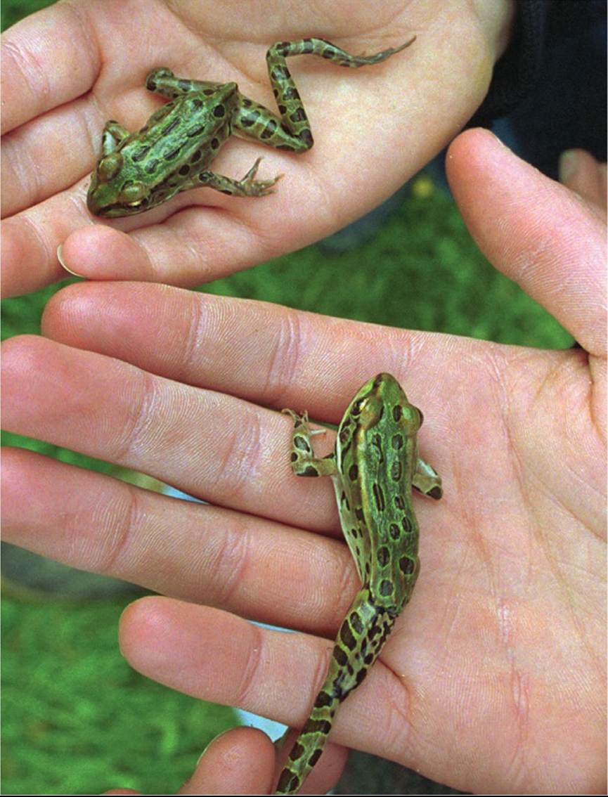
FIGURE 1.1 DeformedLeopardFrog With its misshapen legs, these frogs show one of the types of limb deformities that have become common in leopard frogs and other amphibian species. © Craig Line/Associated Press Back tθ text
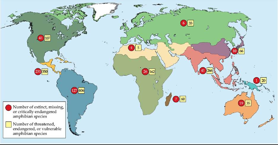
FIGURE 1.2 AmphibiansinDecline In many regions of the world, amphibian species face increased risk of extinction. Each pair of numbered circles and squares is associated with one color-coded region on the map. (Map after AmphibiaWeb. 2019.
https://amphibiaweb.org/declines/declines.html. University of California, Berkeley, CA, USA. Accessed 25 Sep 2019; B. G. Holt et al. 2013. Science 339: 74-78. Data archived at http://macroecology.ku.dk/resources/wallace.) Back to text
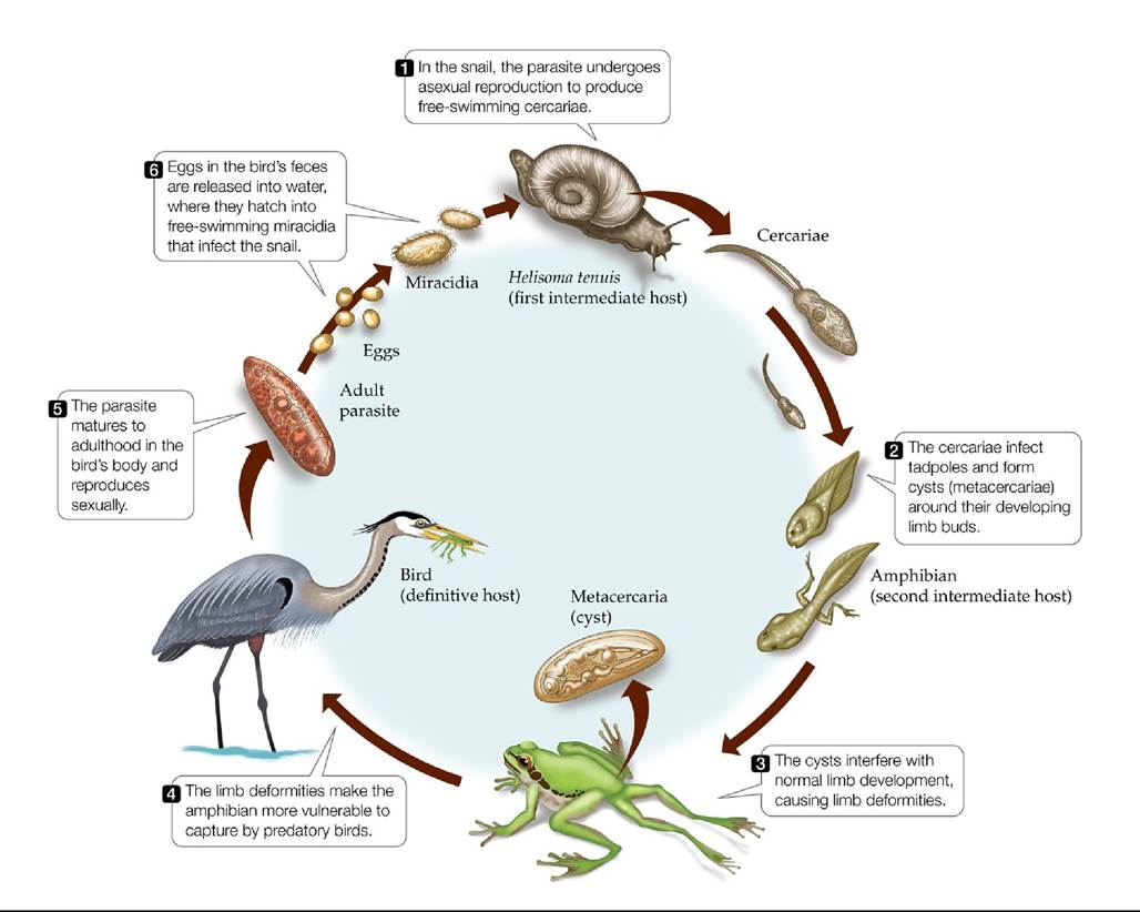
FIGURE 1.3 TheLifeCycleofRibeiroia TheparasiticflatwormRibeiroiausesthree different kinds of hosts: snails, fishes or larval amphibians, and birds or mammals.
Many other parasites have similarly complex life cycles. Some parasites, like Ribeiroia, can alter the appearance or behavior of their second intermediate host in ways that make the host more vulnerable to predation by their final or definitive host. Back to text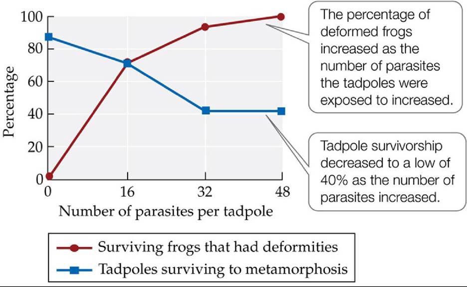
FIGURE 1.4 ParasitescanCauseAmphibianDeformities Thegraphshowsthe relationship between the numbers of Ribeiroia parasites that tadpoles were exposed to and their rates of survival and deformity. Initial numbers of tadpoles were 35 in the control group (0 parasites) and 45 in each of the other three treatments.
Estimate the number of tadpoles in the control group that survived, as well as the number that had deformities.
(After P. T. J. Johnson et al. 1999. Science 284: 802-804.) Back tθ text
FIGURE 1.5 Do the Effects of Ribeiroia and Pesticides Interact in Nature? To test the effects of Ribeiroia and pesticides on frog deformities in the field, screened cages were placed in six ponds. Three of the six ponds contained detectable levels of pesticides; the other three did not.
Based on the results shown here, do pesticides acting alone cause frog deformities? Do the results indicate that pesticides affect frogs? If so, do they indicate how? Explain.
(After J. M. Kiesecker. 2002. Proc Natl Acad Sci USA 99: 9900-9904. © 2002 National Academy of Sciences, U.S.A.) Back to text
FIGURE 1.6 Pesticides May Weaken Tadpole Immune Systems In a laboratory experiment, wood frog (Lithobates sylvaticus) tadpoles were exposed to low or high concentrations of the pesticide esfenvalerate and then exposed to 50 Ribeiroia parasites per
tadpole. The tadpoles were then examined for (A) numbers of eosinophils (a type of white blood cell used in the immune response) and (B) numbers of Ribeiroia cysts.
Two types of controls were used: one in which only parasites were added to the tadpoles' containers (“control”), and another in which both parasites and the solvent used to dissolve the pesticide were added (“solvent control”). Error bars show one standard error (SE) of the mean.What was the purpose of using two types of controls in this experiment?
(After J. M. Kiesecker. 2002. Proc NatlAcad Sci USA 99: 9900-9904. © 2002 National Academy of Sciences, U.S.A.) Back to text
FIGURE 1.7 Rapid Spread of a Deadly Disease Within 13 years, West Nile virus had spread from its North American point of entry (New York City) to all of the lower 48 states. Birds are a primary host for West Nile virus, which may help to explain its rapid spread. Mosquitoes transmit the disease from birds and other animal hosts to people. Numbers show the cumulative number of human cases in each state by December 31, 2020. Not shown: Data for Alaska (2 cases; first reported case in 2018), Hawaii (1 case in 2014), and Puerto Rico (1 case in 2012). (Data from Centers for Disease Control and Prevention.) Back tθ text
FIGURE 1.8 An Ecological Hierarchy As suggested by this series of photographs, life in the rocky intertidal ecosystem can be studied at a number of levels, from individuals to the biosphere. These levels are nested within one another, in the sense that each level is composed of groups of the entity found in the level below it. Back to text
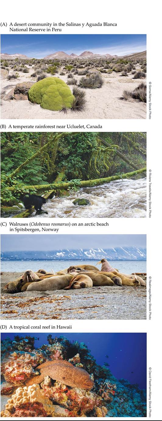
FIGURE 1.9 A Few of Earth's Many Communities These photo-graphs show (A) a desert community in Peru; (B) a temperate rainforest in Canada; (C) walruses on an arctic beach in Norway; and (D) a coral reef with a variety of corals and sponges in Hawaii.
Back to text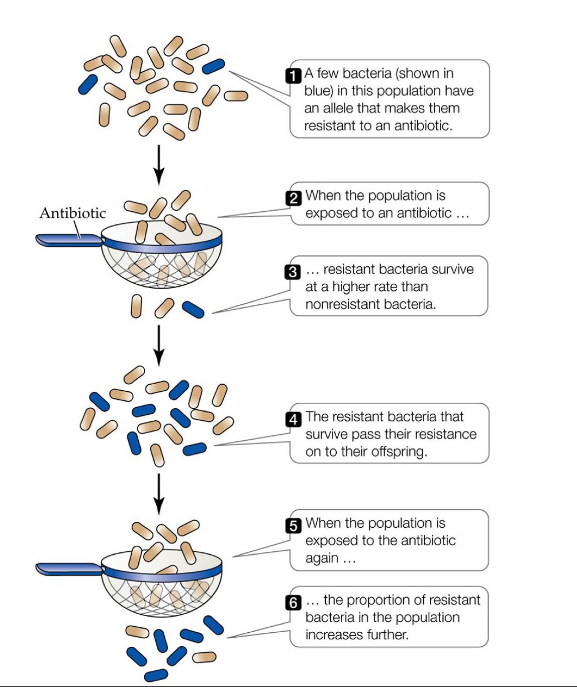
FIGURE 1.10 NaturalSelectioninAction As shown in this diagram, in which a sieve represents the selective effects of an antibiotic, natural selection can cause the frequency of antibiotic resistance in bacteria to increase over time. Back to text
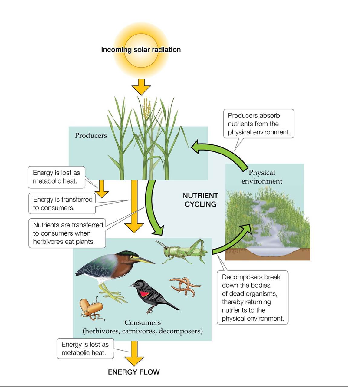
FIGURE 1.11 HowEcosystemsWork Each time one organism eats another, a portion of the energy originally captured by a producer is lost as heat given off during the chemical breakdown of food by cellular respiration. As a result, energy flows through the ecosystem in a
single direction and is not recycled. Nutrients such as carbon and nitrogen, on the other hand, cycle between organisms and the physical environment.
Describe the three main steps by which a nutrient cycles through an ecosystem.
Back to text
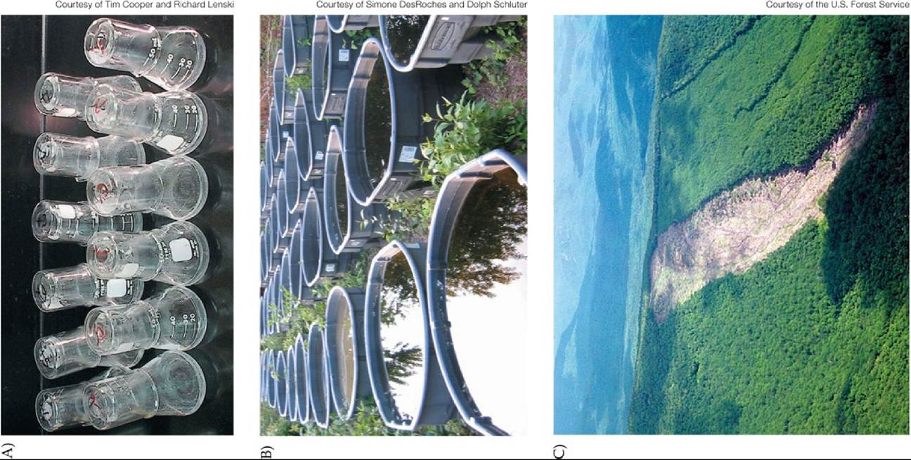
FIGURE 1.12 EcologicalExperiments The spatial scale of experiments in ecology ranges from (A) laboratory experiments to (B) small-scale field experiments conducted in natural or artificial environments to (C) large-scale experiments that alter major components of an ecosystem, as seen in this clear-cut watershed. Back to text
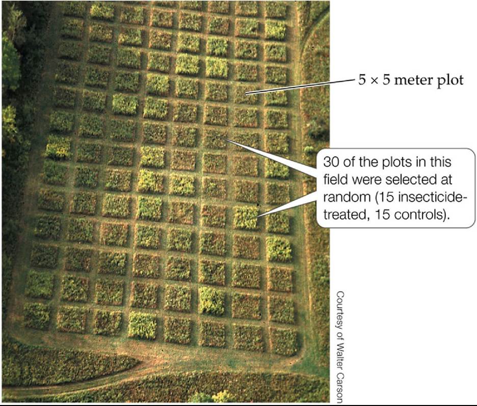
FIGURE A Carson and Root's Field Experiment This aerial photograph shows the field divided (by mowing) into 112 plots, each 5 ? 5 m. Thirty of these plots were used in the experiment described here; the rest of the plots were used in other experiments. Back to text
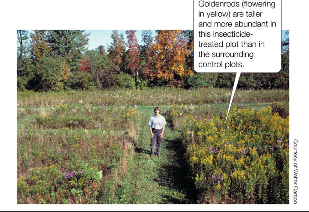
FIGURE B Carson and Root's Results A plot sprayed with insecticide (right) is shown surrounded by several control plots.
Back to text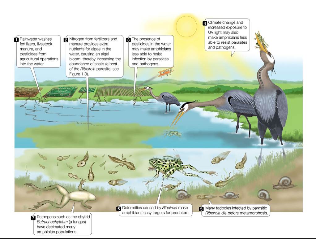
FIGURE 1.13 Complex Causation of Amphibian Deformities and Declines Aswehave seen, amphibian deformities can be caused by parasites such as Ribeiroia. However, other factors—many of them a result of human actions—may interact to cause amphibian deformities and declines. (After A. R. Blaustein and P. T. J. Johnson. 2003. SciAm 288: 60-65.) Back tθ text
2 The Physical Environment
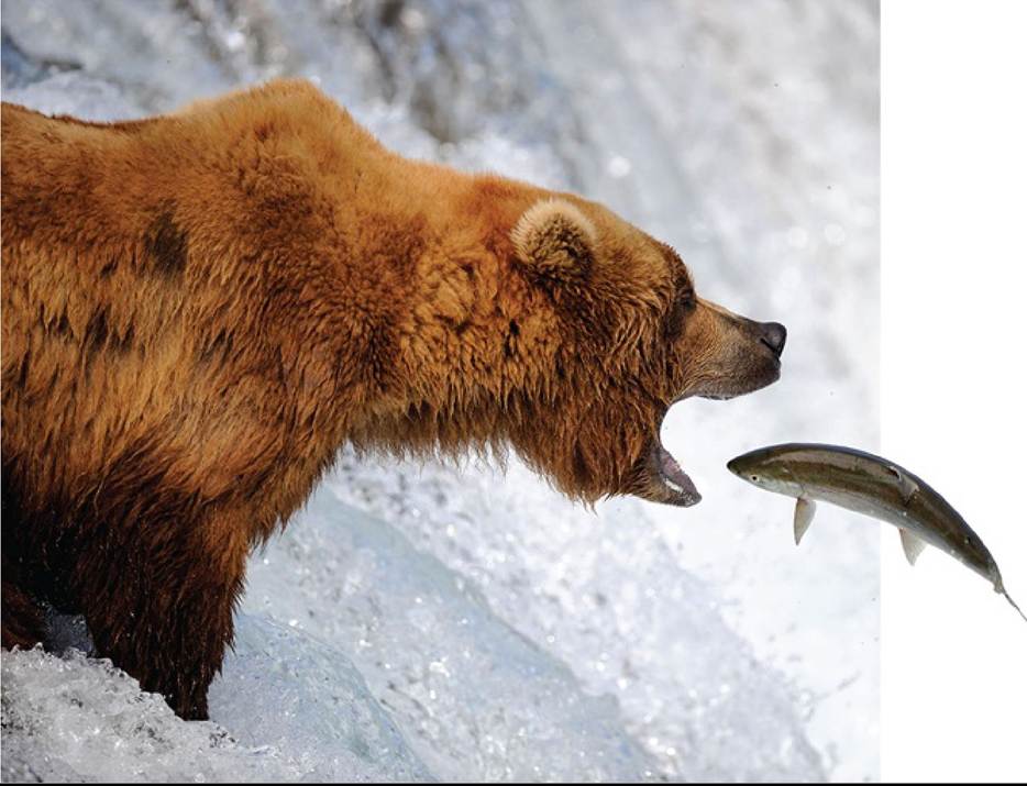
FIGURE 2.1 A Seasonal Opportunity Grizzly bears feed on salmon migrating upstream in streams and rivers in Alaska to reproduce. The size of the salmon run each year depends in part on physical conditions in the Pacific Ocean, many miles away. © Eric Baccega/NPL/Alamy Stock Photo Back to text
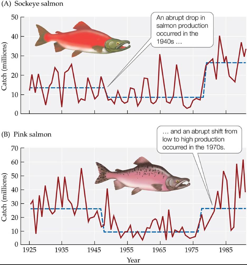
FIGURE 2.2 Changes in Salmon Harvests over Time Records of commercial harvests of
(A) sockeye salmon and (B) pink salmon in Alaska over 65 years show abrupt drops and increases in production. Solid lines represent annual catch; dashed lines are a statistical fit to the data. (After S. R. Hare and R. C. Francis. 1994. In Climate Change and Northern Fish Populations. Can Spec Publ Fish Aquat Sci 121. R. J. Beamish [Ed.], pp. 357-372. National Research Council of Canada: Ottawa. © Canadian Science Publishing or its licensors.) Back tθ text
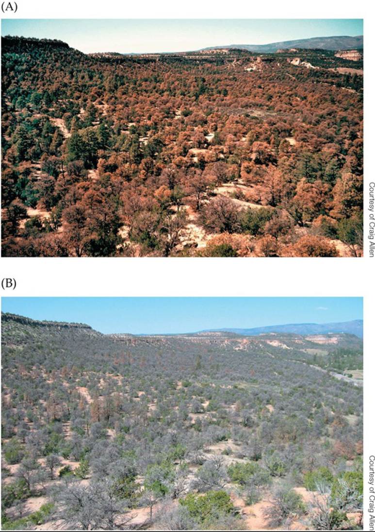
FIGURE 2.3 WidespreadMortalityinPinonPines Extremehightemperaturesanda historic drought from 2000 to 2003 killed large areas of pinon pines (Pinus edulis) throughout the southwestern United States. (A) Here, stands in the Jemez Mountains, New Mexico, begin to show substantial needle death due to water and temperature stress, combined with a bark beetle outbreak in October 2002.
(B) By May 2004, most of the trees had died. Back to text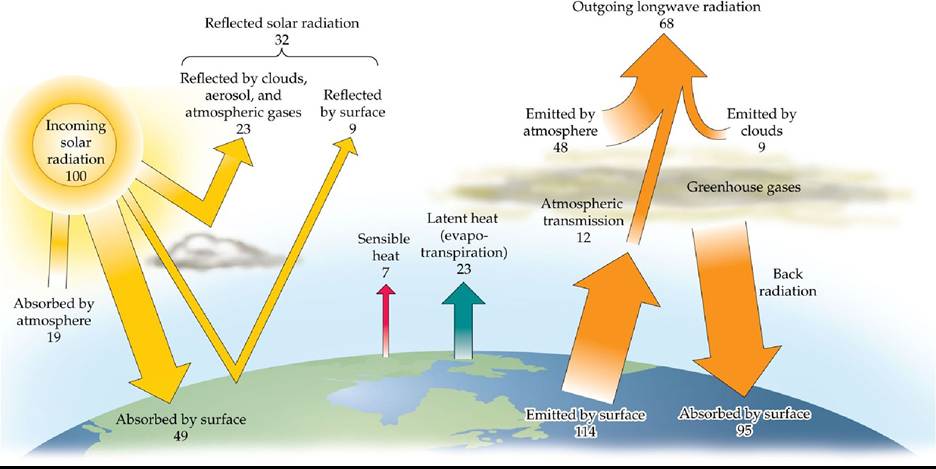
FIGURE 2.4 Earth's Energy Balance Average annual energy balance for Earth's surface and atmosphere, including gains from solar radiation and gains and losses due to emission of infrared radiation, latent heat flux, and sensible heat flux. The numbers are gains and losses of energy, given as percentages of the average annual incoming solar radiation at the top of Earth's atmosphere (342 W/m2).
What component of Earth's energy balance would be influenced by an increase in greenhouse gases? What would the effect on Earth’s energy balance be if there were an increase in atmospheric aerosols?
(After J. T. Kiehl and K. E. Trenberth. 1997. BullAm Meteorol Soc 78: 197-208. © American Meteorological Society. Used with permission.) Back tθ text
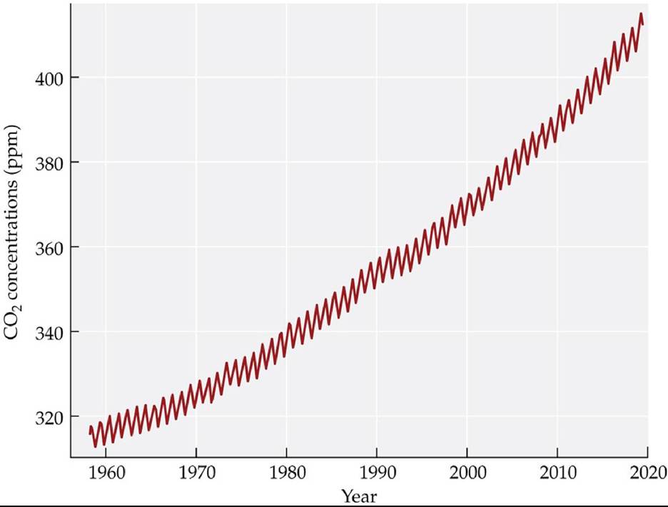
FIGURE 2.5 Increasing Atmospheric Carbon Dioxide The trend in monthly atmospheric carbon dioxide concentrations measured at Mauna Loa Observatory. Average annual carbon dioxide concentrations have risen by 301% since they were first monitored at the Mauna Loa Observatory in 1958 by Charles Keeling. Similar measurements are now made globally by the U.S. National Oceanic and Atmospheric Administration. (After U.S. NOAA, Earth System Research Laboratory, Global Monitoring Division. (⅛⅝ https://www.esrl.noaa.gov/gmd/ccgg/trends/full.html; C. D. Keeling et al. 2001.1. Global Aspects, SIO Reference Series, No. 01-06. Scripps Institution of Oceanography: San Diego, CA. Data last updated August 2019.) Back to text
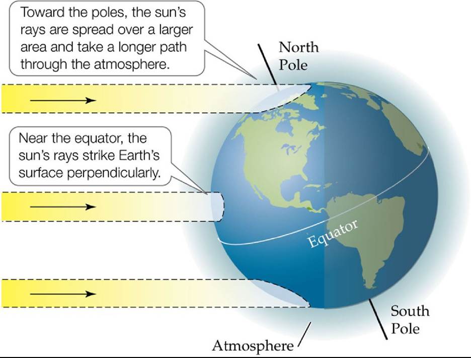
FIGURE 2.6 Latitudinal Differences in Solar Radiation at Earth's Surface The angle of the sun's rays affects the intensity of the solar radiation that strikes Earth's surface. Back to text
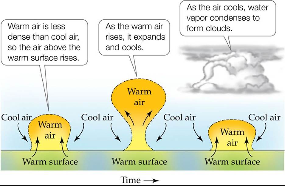
FIGURE 2.7 Surface Heating and Uplift Differential solar heating of Earth's surface leads to the uplift of pockets of air over the warmest surfaces. Back to text
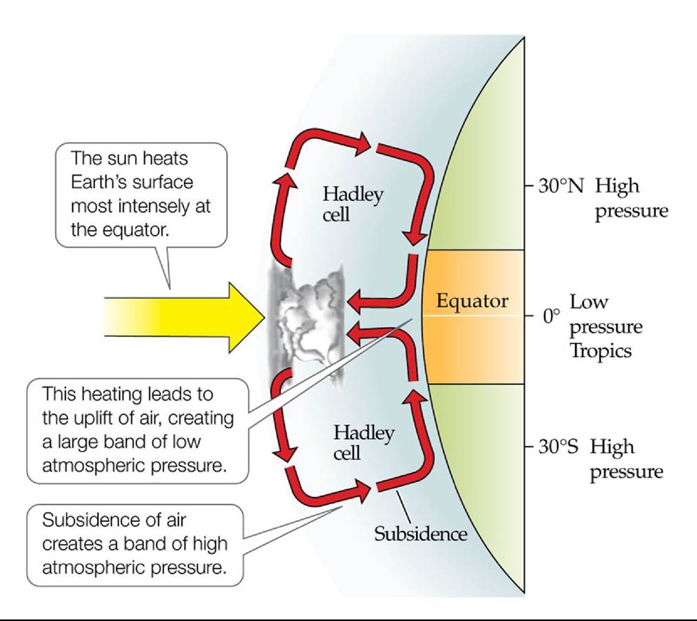
FIGURE 2.8 Tropical Heating and Atmospheric Circulation Cells The heating of Earth's surface in the tropics causes air to rise and release precipitation. Back to text
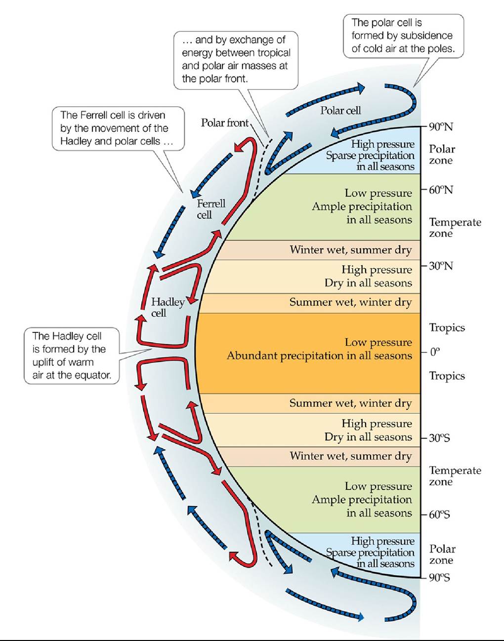
FIGURE 2.9 Global Atmospheric Circulation Cells and Climate Zones Thedifferential heating of Earth's surface by solar radiation gives rise to atmospheric circulation cells, which determine Earth's major climate zones. Back to text
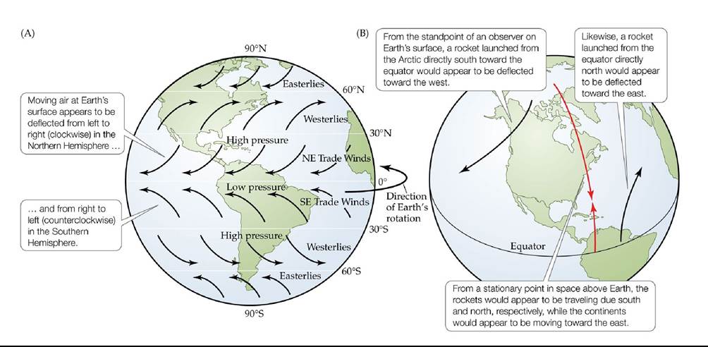
FIGURE 2.10 The Coriolis Effect on Global Wind Patterns (A) The Coriolis effect results from Earth's rotation. (B) Visualization of the Coriolis effect using rockets. Back to text
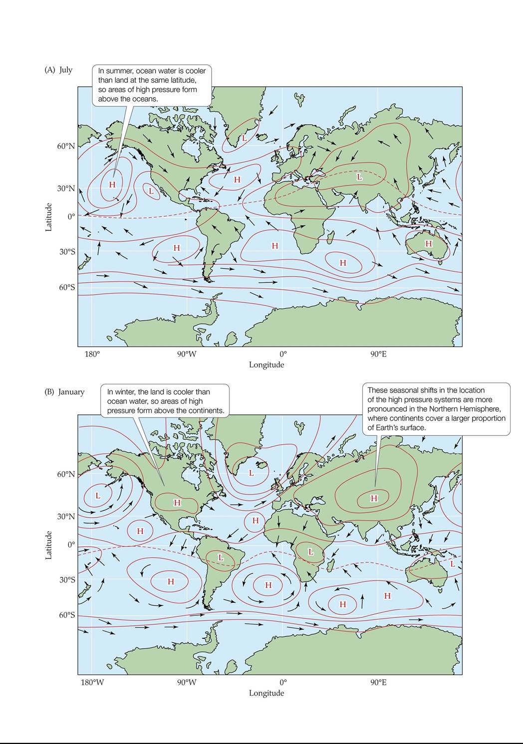
FIGURE 2.11 Prevailing Wind Patterns The difference in heat capacity between the oceans and the continents leads to seasonal changes in atmospheric pressure cells that influence prevailing wind patterns. Back to text
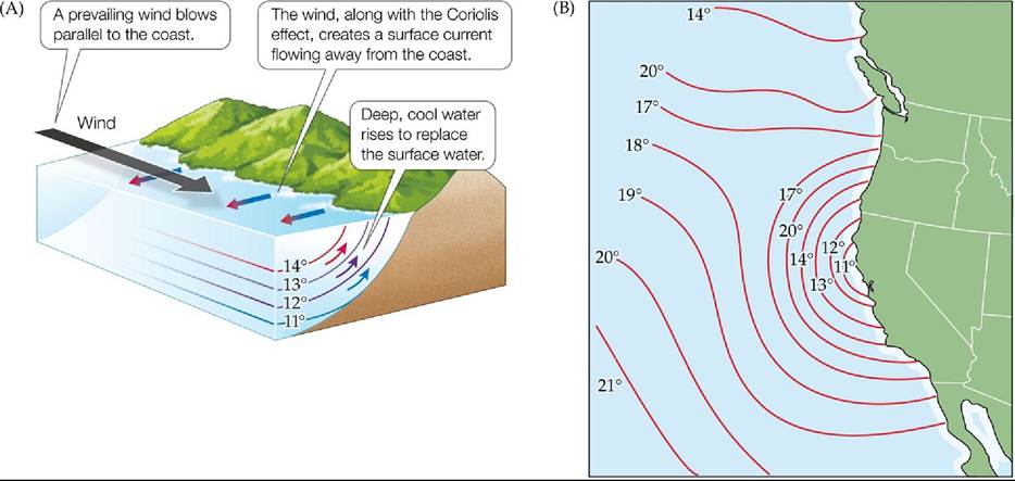
FIGURE 2.12 Upwelling of Coastal Waters (A) Wind blowing parallel to the coast causes surface water to flow away from the coast, pulling deep water upward to replace it. (B) Upwelling influences surface water temperatures off the west coast of North America. Ocean temperatures are shown in °C. Back to text
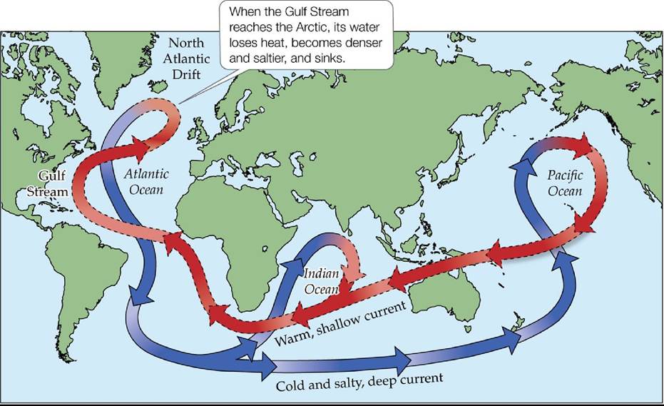
FIGURE 2.13 The Great Ocean Conveyor Belt An interconnected system of surface and deep ocean currents transfers energy between tropical and polar regions. The red arrows with dashed outlines represent shallow currents, and the blue arrows with solid outlines represent deeper currents. (After Hugo Ahlenius, UNEP/GRID-Arendal. 2007.
http://maps.grida.no/go/graphic/world-ocean-thermohaline-circulation1.) Back tθ text
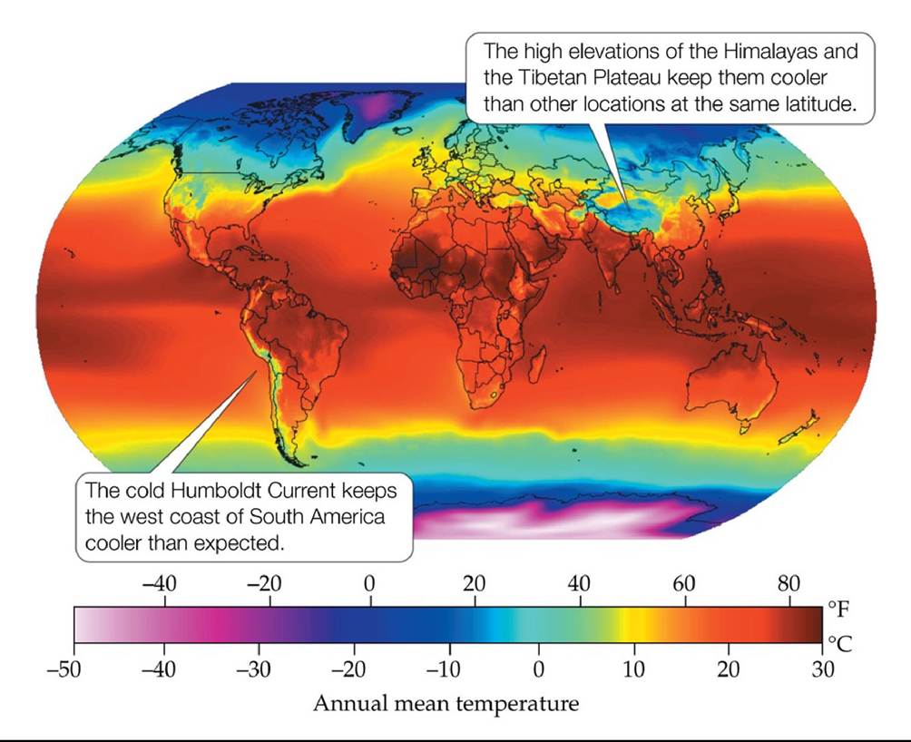
FIGURE 2.14 GlobalAverageAnnualTemperatures Averageannualairtemperatures tend to vary with latitude, but oceanic circulation and topography alter this pattern. Back to text
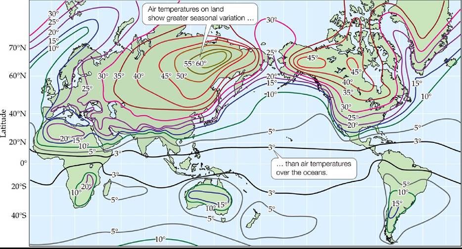
FIGURE 2.15 AnnuaiseasonaITemperatureVariation Seasonaltemperaturevariationis expressed as the difference in average monthly temperature between the warmest and coldest months (in °C).
What is the effect of continent size on the magnitude of seasonal temperature variation?
(After A. H. Strahler and A. N. Strahler. 2005. Physical Geography, 3rd ed. John Wiley and Sons: Hoboken, NJ. Compiled by John E. Oliver.) Back to text
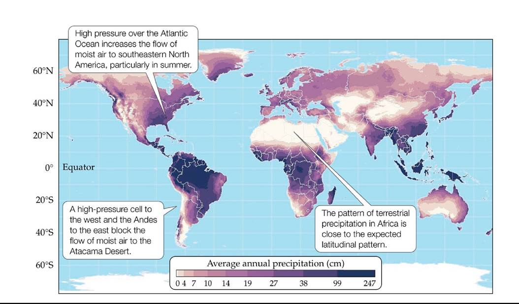
FIGURE 2.16 AverageAnnualTerrestrialPrecipitation Thelatitudinalpatternof precipitation deviates from what would be expected based on atmospheric circulation patterns alone (see Figure 2.9). (Courtesy of the Center for Sustainability and the Global Environment [SAGE] through their Atlas of the Biosphere, (⅛⅝ https://nelson.wisc.edu/sage/data-and-models/maps.php. Data from CRU 0.5 Degree Dataset [M. G. New et al. 2000. J Climate 13: 2217-2238].) Back to text
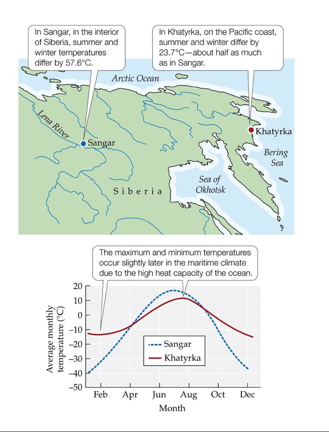
FIGURE 2.17 Average Monthly Temperatures in a Continental and a Maritime Climate
The difference in seasonal temperature variation between two locations in Siberia at about the same latitude and elevation illustrates the effect of the high heat capacity of ocean water. (Data from NOAA GHCN-Monthly, version 2; T. C. Peterson and R. S. Vose. 1997. Bull Am Meteorol Soc 78: 2837-2849.) Back to text
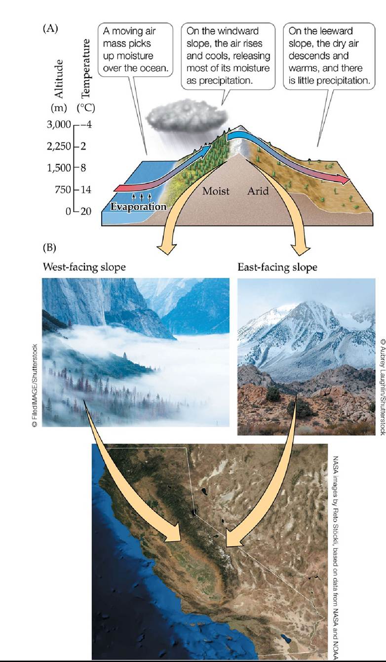
FIGURE 2.18 The Rain Shadow Effect (A) Precipitation tends to be greater on the windward slope of a mountain range than on the leeward slope. (B) Vegetation on west-facing and east-facing slopes in the Sierra Nevada of California reflects the rain shadow effect.
Which slope aspect (north, south, east, or west) on a north-south-trending mountain range in the tropical zone would have the highest precipitation, and which aspect would be in the rain shadow?
Back to text
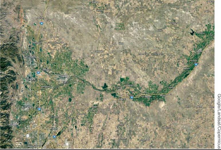
Satellite Image of the South Platte River Drainage Basin, Colorado The Rocky Mountains are to the west. The green circles and rectangles are irrigated cropland found along the South Platte River flowing eastward. The surrounding area is a mix of dryland crops and short-grass steppe. Back to text
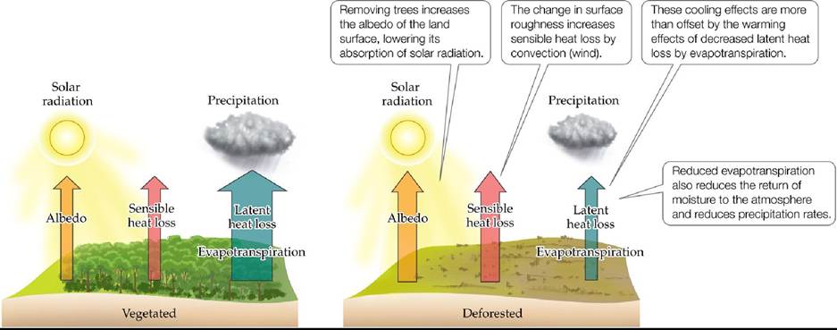
FIGURE 2.19 The Effects of Deforestation Illustrate the Influence of Vegetation on
Climate The conversion of forest to pasture in the tropics results in a number of changes in energy exchange with the atmosphere. (After J. A. Foley et al. 2003. Front Ecol Environ 1: 38-44.) Back to text
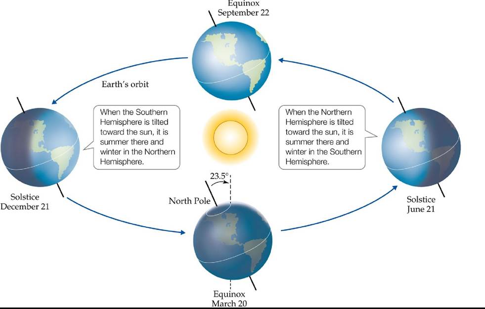
FIGURE 2.20 The Tilt of Earth's Axis Causes Seasonal Changes As Earth orbits the sun over the course of a year, its orientation relative to the sun changes because of the tilt of its axis of rotation. The resulting changes in the intensity of solar radiation create seasonal climate variation. (After C. D. Ahrens. 2005. Essentials of Meteorology. Thomson Brooks/Cole: Boston, MA.) Back to text
FIGURE 2.21 Wet and Dry Seasons and the ITCZ Seasonalityofprecipitationinthe tropics is associated with movement of the intertropical convergence zone (ITCZ) between the tropics of the Northern and Southern Hemispheres. Thus, Tampico, Mexico, reaches its maximum precipitation levels from July to October and has a dry season from November to April, whereas Viposa, Brazil, has a wet season from October to February and a dry season from April to August. (Data from NOAA GHCN-Monthly, version 2; T. C. Peterson and R. S. Vose. 1997. Bull Am Meteorol Soc 78: 2837-2849.) Back to text
FIGURE 2.22 Lake Stratification Lake stratification, which occurs primarily in summer in temperate and polar regions, results from the effects of temperature on water density. Seasonal changes in water temperature result in the turnover of water that mixes little during summer and winter.
Why would seasonal changes in lake stratification be unlikely to occur in tropical lakes?
(After S. Dodson. 2004. Introduction to Limnology. McGraw Hill: New York.) Back tθ text
FIGURE 2.23 El Nino Southern Oscillation (ENSO) ElNinoeventshavewidespread climate effects that vary seasonally, altering temperature and precipitation patterns at a global scale. (Courtesy of NOAA Tropical Atmosphere Ocean Project.) Back tθ text
FIGURE 2.24 Global Variation in Salinity at the Ocean Surface Variations in the salinity of ocean surface waters reflect the concentrating effect of evaporation, dilution by melting sea ice, and precipitation. Back to text
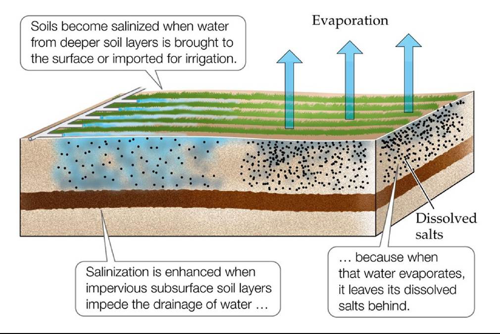
FIGURE 2.25 Salinization Salinization of soils is disrupting agricultural production in many areas, especially in arid regions. Back to text
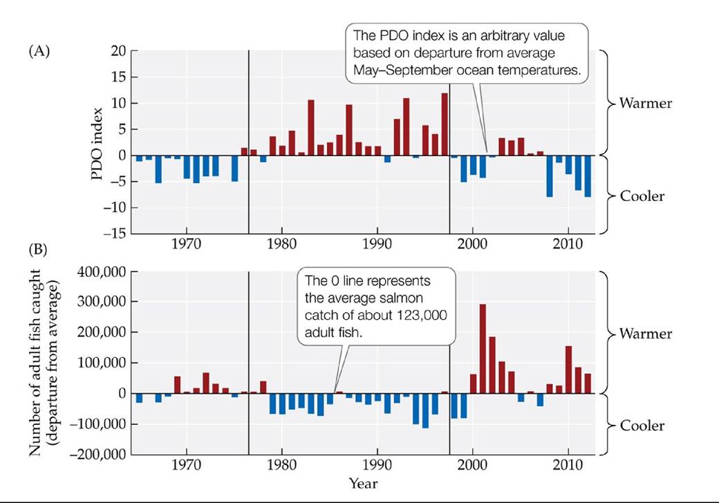
FIGURE 2.26 Effect of the PDO on Salmon Catch in the Northwest United States (A) Summer average PDO index, 1965-2012. Red and blue bars indicate ocean temperatures that are warmer or cooler than average, respectively. (B) Departures from the average (123,131 fish) in numbers of adult Chinook salmon returning to the Columbia River (Washington and Oregon) to spawn, 1965-2012.
How frequently does the cool phase of the PDO correspond to a greater- than-average catch of salmon? Conversely, how often does a warm phase of the PDO correspond to a lower-than-average catch of salmon?
(After W. T. Peterson et al. 2013. Ocean Ecosystem Indicators of Salmon Marine Survival in the Northern California Current. National Marine Fisheries Service: Newport, OR; Seattle, WA.) Back tθ text
3 The Biosphere
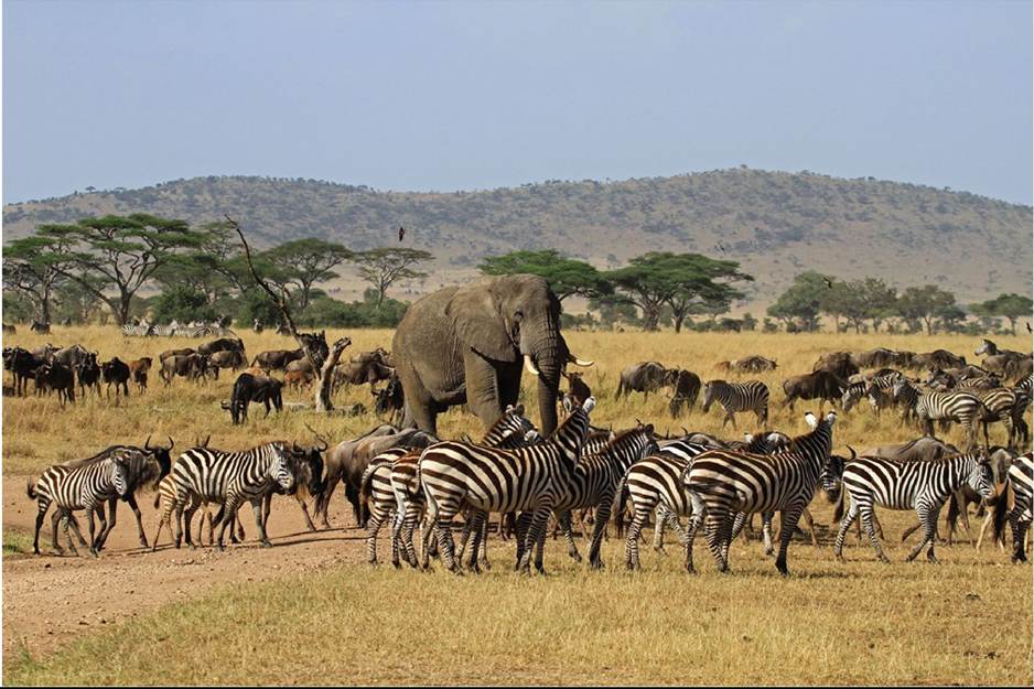
FIGURE 3.1 The Serengeti Plain of Africa Large, diverse herds of native animals migrate across the Serengeti in search of food and water. © bayazed/Shutterstock.com Back to text
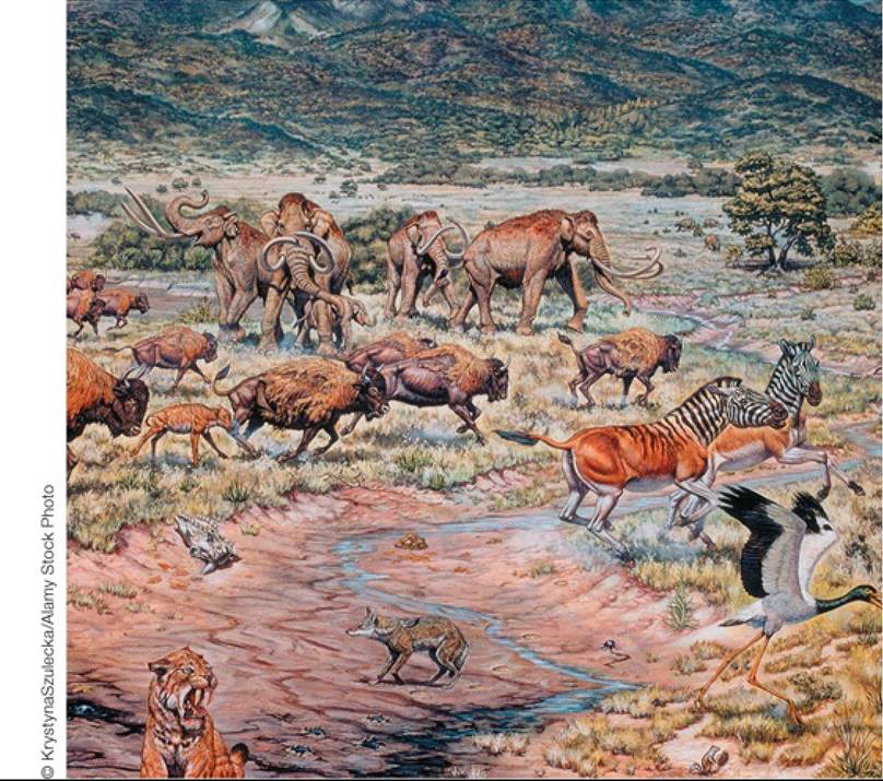
FIGURE 3.2 Pleistocene Animals of the Great Plains Theanimalsofthegrasslandsof central North America 13,000 years ago included woolly mammoths, horses, and giant bison. Many of these large mammals went extinct within a short time between 13,000 and 10,000 years ago. Back to text
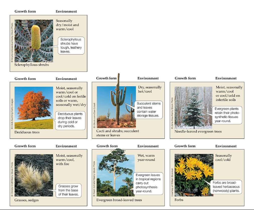
FIGURE 3.3 Plant Growth Forms The growth form of a plant is an evolutionary response to the environment, particularly climate and soil fertility. Back to text
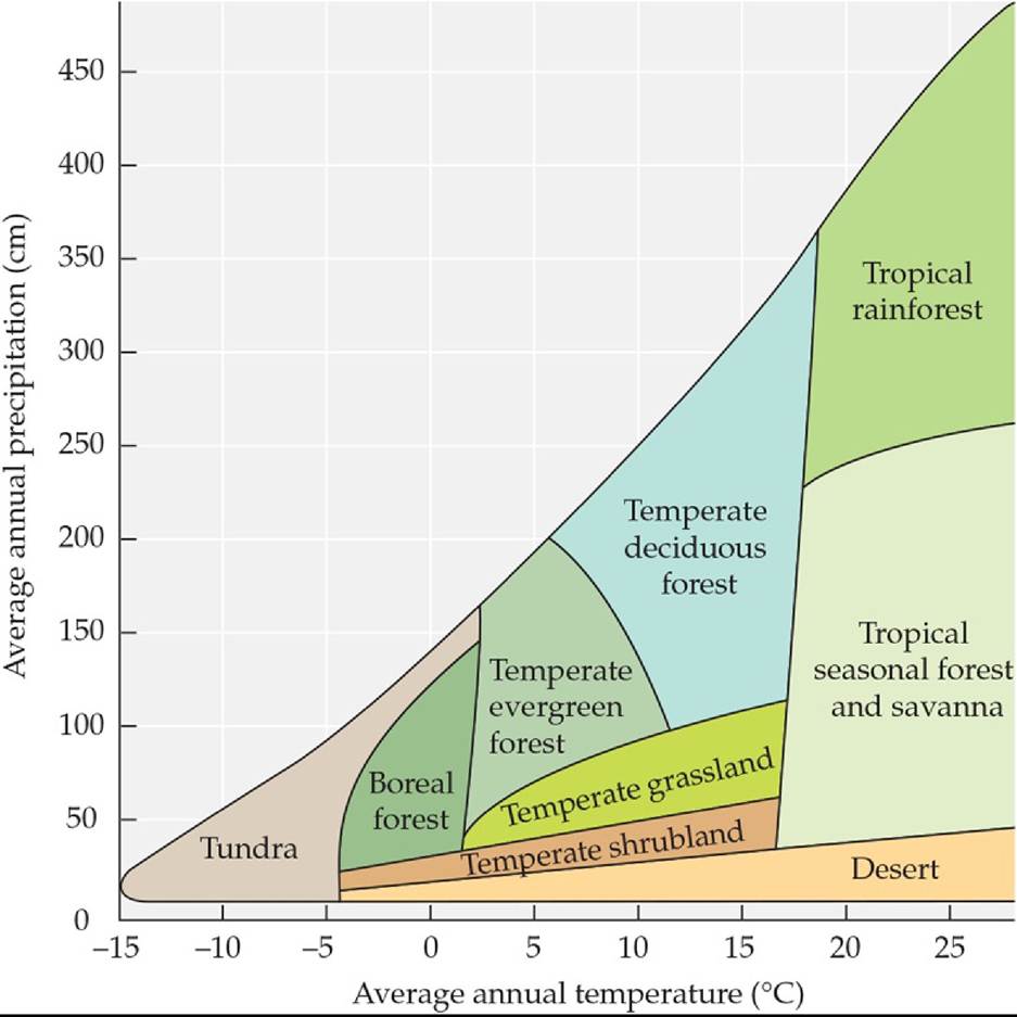
FIGURE 3.4 Biomes Vary with Average Annual Precipitation and Temperature When plotted on a graph of precipitation and temperature, the nine major terrestrial biomes form a triangle.
What factor(s) might result in grasslands or shrublands “invading” climate space occupied by forest or savanna?
(After R. H. Whittaker. 1975. Communities and Ecosystems. Macmillan: London.) Back tθ text
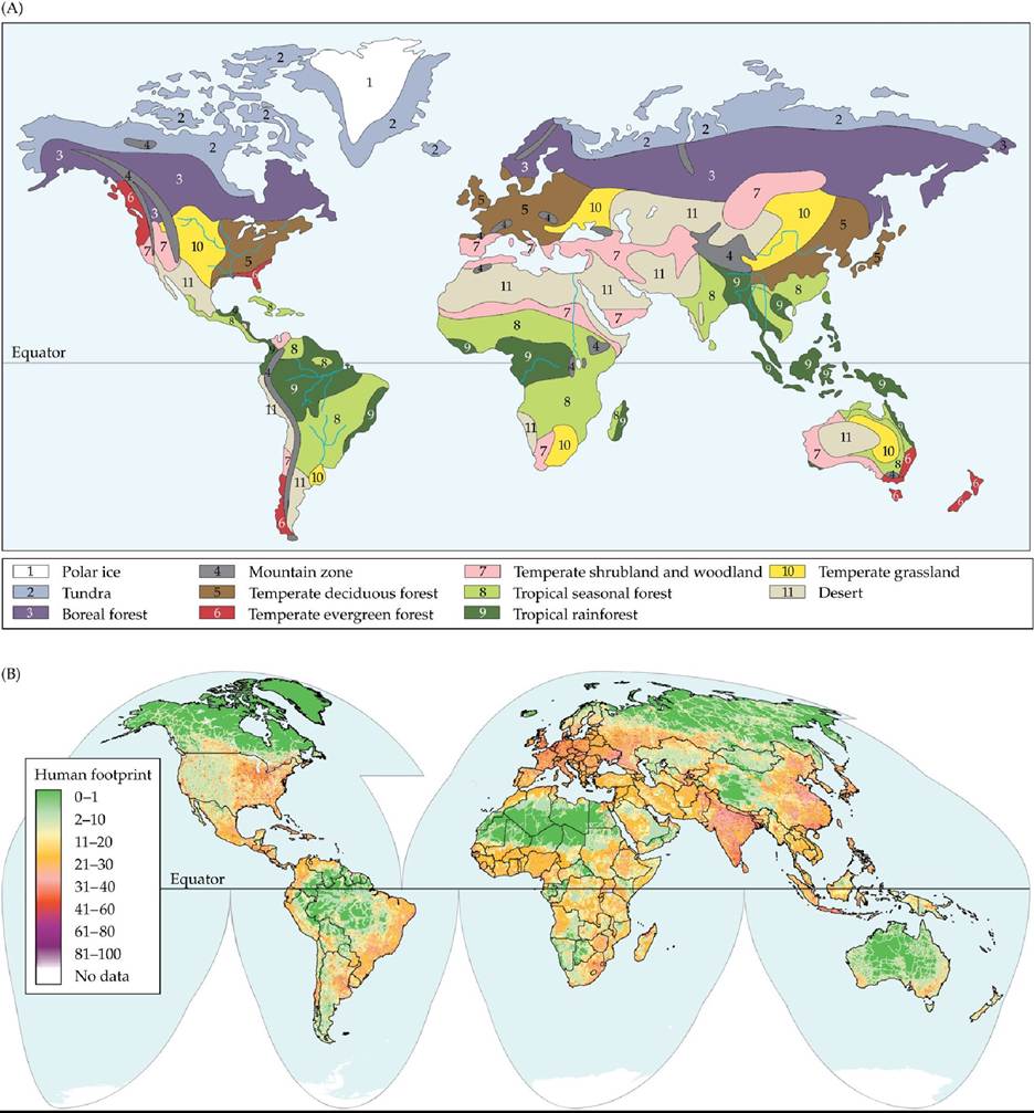
FIGURE 3.5 Global Biome Distributions Are Affected by Human Activities Thepotential distributions of biomes differ from their actual distributions because human activities have altered much of Earth's land surface. (A) The potential global distribution of biomes. (B) Alteration of terrestrial biomes by human activities. The “human footprint” is a quantitative measure (100 = maximum) of the overall human impact on the environment based on geographic data describing human population size, land development, and resource use.
Which biomes in North America and Eurasia appear to have been most affected by human activities? In other words, which biomes in (A) overlap
most with areas of high human impact in (B)? In South America and on the Indian subcontinent, which biome has been most degraded by human activity?
(B from E. W. Sanderson et al. 2002. BioScience 52: 891-904.) Back tθ text
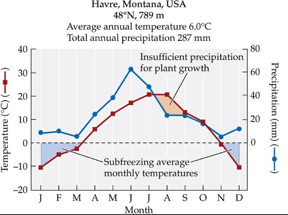
A Sample Climate Diagram A climate diagram contains the name of the climate station where conditions were recorded (Havre, Montana, in this example), its geographic location in latitude, and its elevation. In Havre, there are extended periods of subfreezing temperatures from November to March (blue shaded areas). Frosts do occur outside this time frame, but these isolated events are not reflected in average monthly temperatures. A period of low water availability (orange area) typically occurs from mid-July to October. (Data from NOAA GHCN- Monthly, version 2; T. C. Peterson and R. S. Vose. 1997. BullAm Meteorol Soc 78: 2837-2849.)
Back to text
© Hoang Dinh Nam/AFP/Getty Images
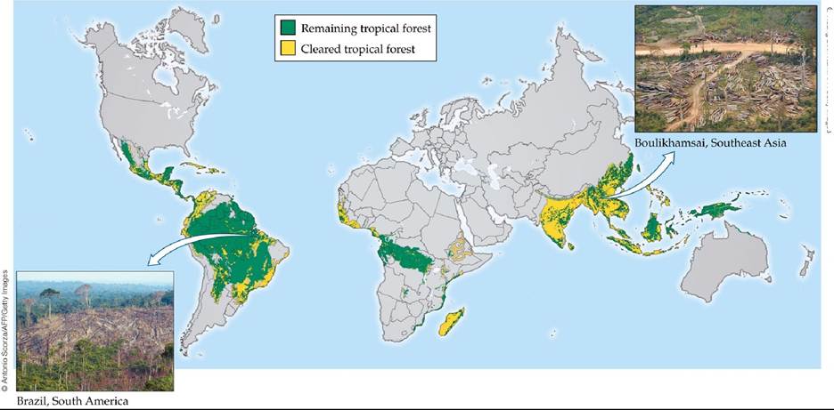
FIGURE 3.6 Tropical Deforestation Large areas of tropical rainforest and seasonal forests have been cleared over the past 40 years, primarily for agricultural and pastoral development. The loss of these tropical forests has large consequences for loss of biodiversity, regional climate, and carbon uptake and storage. (Map based on data from 2005. After S. L. Pimm and C. Jenkins. 2005. Sci Am 293: 66-73.) Back to text
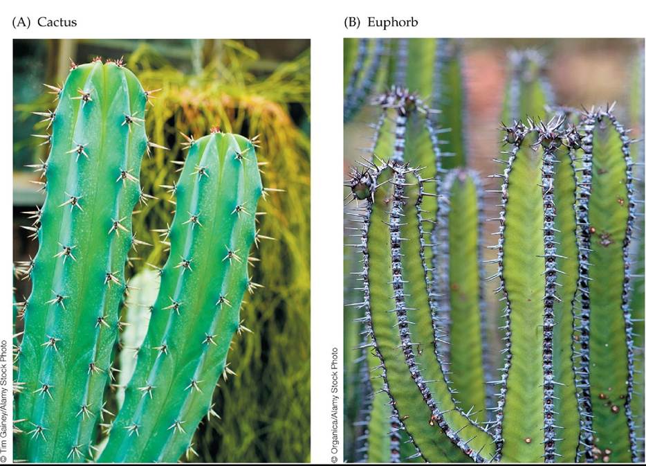
FIGURE 3.7 Convergence in the Forms of Desert Plants (A) The blue candle cactus (Myrtillocactus geometrizans) is native to the Chihuahuan Desert of Mexico. (B) Euphorbia polyacantha has cactus-like characteristics. Although only distantly related, both species have succulent stems, water-conserving photosynthetic pathways, upright stems that minimize midday sun exposure, and spines that protect them from herbivores. These traits evolved independently in each species. Back to text
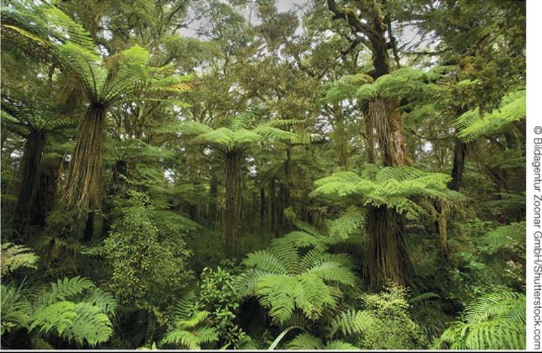
FIGURE 3.8 Temperate Rainforest Rainforests occur in temperate zones with high precipitation (over 5,000 mm, or 200 inches) and relatively mild winter temperatures. Here, understory tree ferns grow beneath the canopy trees at Horseshoe Falls in western Tasmania, Australia. Back to text
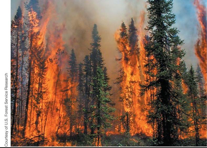
FIGURE 3.9 Fire in the Boreal Forest Despite the cold climate of the boreal forest, fire is an important part of its environment. Back to text
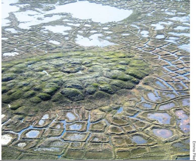
FIGURE 3.10 SoilPolygonsandPingo Pingos are small hills found in the Arctic, formed by an intrusion of water that freezes in the subsurface permafrost zone, thrusting the soil above it upward. The polygons on the periphery of the pingo result from freezing and thawing of soils, a process that pushes coarse soil materials toward the edges and finer soil to the middle of the polygons. Back to text
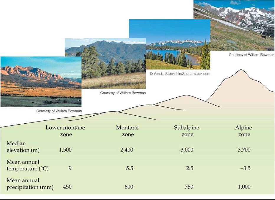
FIGURE 3.11 Mountain Biological Zones An elevational transect on the eastern slope of the southern Rocky Mountains passes through climate conditions and biome-like assemblages similar to those found along a latitudinal gradient between Colorado and northern Canada.
Would you expect the same biological zonation on east-facing and westfacing slopes in a temperate mountain range near the west coast of a continent?
(Data from J. W. Marr. 1967. Ecosystems of the East Slope of the Front Range of Colorado. University of Colorado Press: Boulder, CO.) Back tθ text
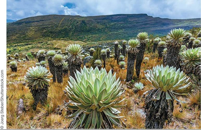
FIGURE 3.12 Tropical Alpine Plants Frailejon (Espeletia spp.) grows in alpine grasslands in the Ecuadorian Andes. Its growth form, characterized by a circle of leaves (rosette), is typical of plants in the tropical alpine zones of South America and Africa. The adult leaves help protect the developing leaves and stems at the apex of the plant from nightly frosts. Such giant rosettes are found exclusively in the tropical alpine zone and do not have analogs in the Arctic or Antarctic. Back to text
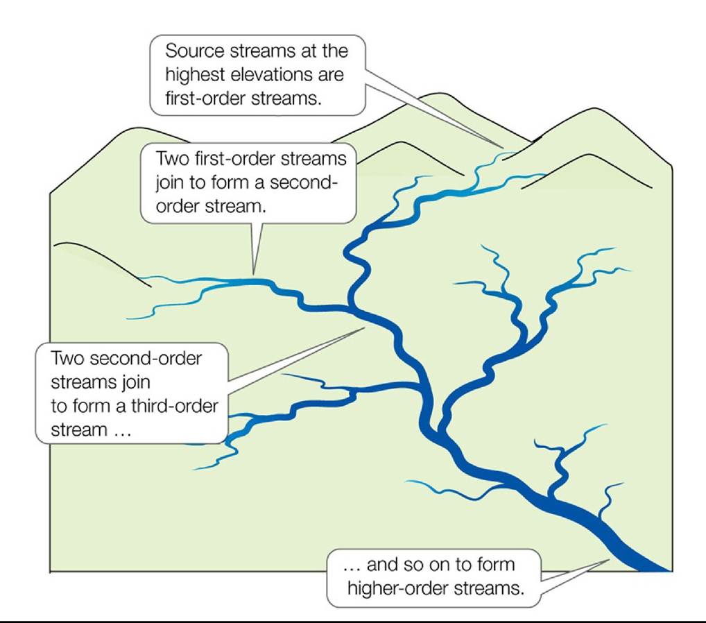
FIGURE 3.13 Stream Orders Stream order affects environmental conditions, community composition, and the energy and nutrient relationships of communities within the stream. Back to text
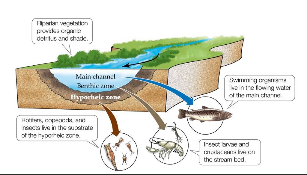
FIGURE 3.14 Spatial Zonation of a Stream Biological communities in a stream vary according to water velocity, inputs of plant material from riparian vegetation, the size of particles on the streambed, and the depth of the stream.
Where in this stream would you expect oxygen concentrations to be highest and lowest?
Back to text
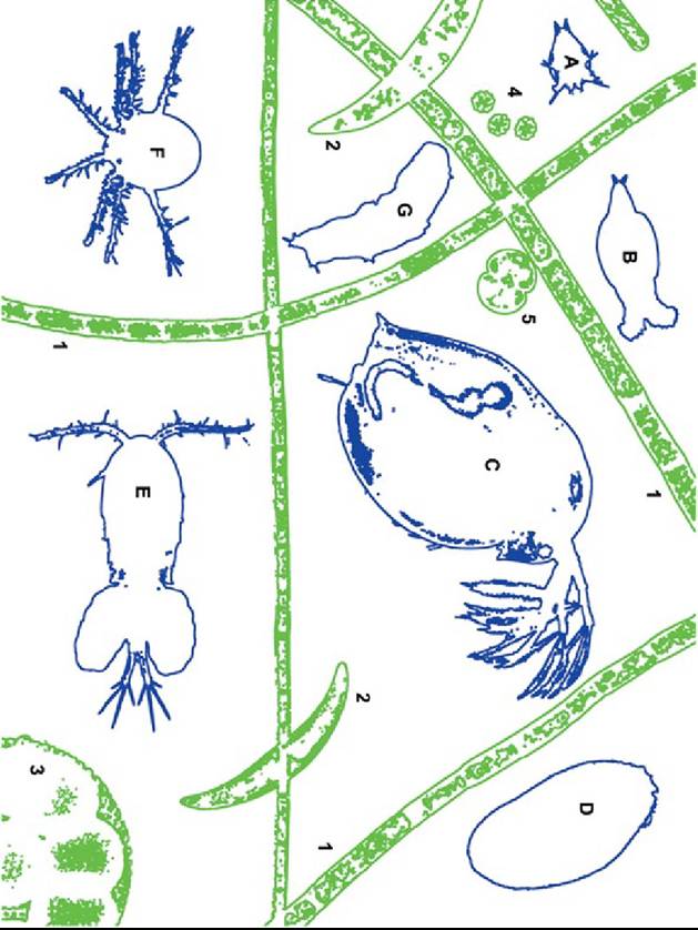
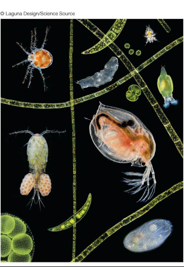
FIGURE 3.15 ExamplesofLakePlankton In this composite image of plankton from a pond, phytoplankton (green in the key) include filamentous algae (1), Closterium sp. (2), Volvox sp. (3), and other green algae (4, 5). Zooplankton (blue in the key) include a larval copepod (A), rotifer (B), water flea (Daphnia sp., C), ciliated protist (D), adult copepod (Cyclops sp.) with egg sacs (E), mite (F), and tardigrade (G). Back to text
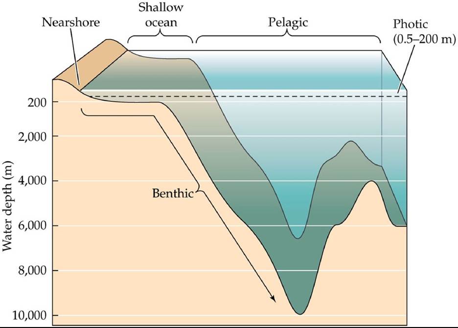
FIGURE 3.16 Marine Biological Zones Biological zones in the ocean are categorized by water depth and by their physical locations relative to shorelines and the ocean bottom. Back to text
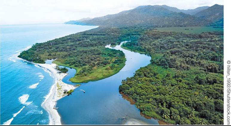
FIGURE 3.17 Estuaries Are Junctions between Rivers and Oceans Themixingoffresh and salt water gives estuaries a unique environment with varying salinity. Rivers bring in energy and nutrients from terrestrial ecosystems. Back to text
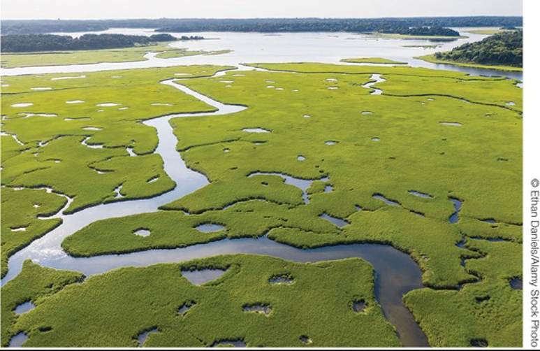
FIGURE 3.18 Salt Marshes Are Characterized by Salt-Tolerant Vascular Plants
Emergent vascular plants form salt marshes in shallow nearshore zones. Back to text
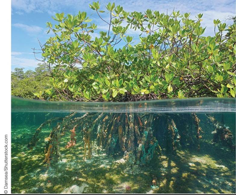
FIGURE 3.19 Salt-Tolerant Evergreen Trees and Shrubs Form Estuarine Mangrove
Forests The mangrove roots trap mud and sediments and provide habitat for other marine organisms. Back to text
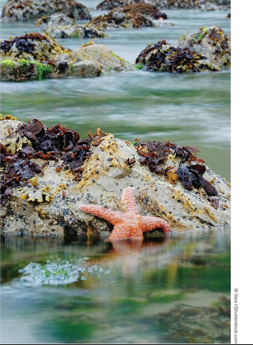
FIGURE 3.20 The Rocky Intertidal Zone: Stable Substrate, Changing Conditions Rocky shorelines provide a stable substrate to which organisms can anchor themselves, but those organisms must cope with the shift from terrestrial to marine conditions that occurs with each tide, as well as wave action. Sessile organisms must be resistant to temperature changes and desiccation. Mobile organisms often take refuge in tide pools to avoid exposure to the terrestrial
environment. Back to text
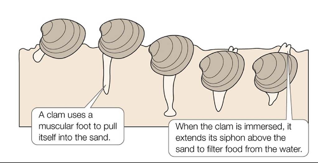
FIGURE 3.21 BurrowingClams Clams, like most animals of sandy shorelines, live in the sandy substrate. Back to text
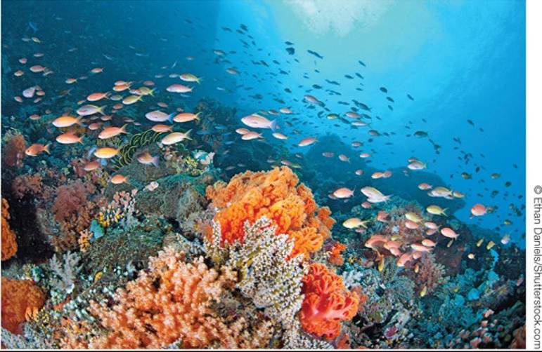
FIGURE 3.22 A Coral Reef Corals, like this one off North Sulawesi, Indonesia, create habitat for a diverse assemblage of marine organisms. Back to text
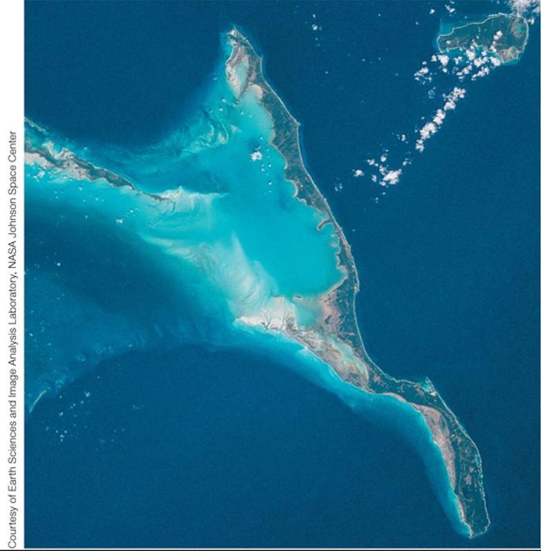
FIGURE 3.23 Coral Reefs Can Be Seen from Outer Space Long Island, in the Bahamas, was formed by coral reefs, which can be seen on the fringes of the island in this satellite photograph. Back to text
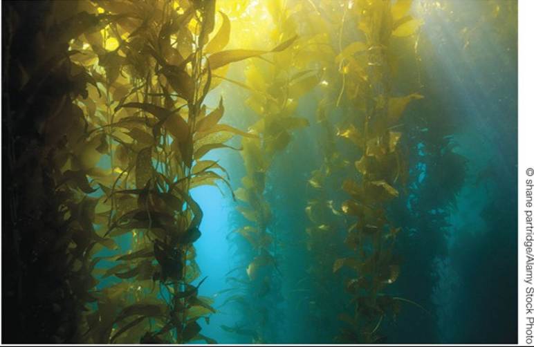
FIGURE 3.24 AKelpBed Giant kelp are brown algae (order Laminariales) that attach themselves to the solid bottom in shallow ocean waters, providing food and habitat for many other marine organisms. Back to text
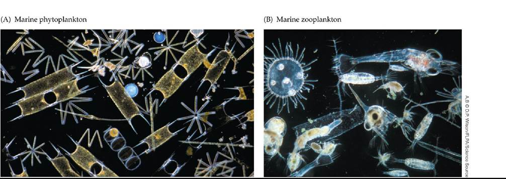
FIGURE 3.25 Plankton of the Pelagic Zone (A) This sample of marine phytoplankton includes several species of diatoms, including Biddulphia sinensis (the rectangular cells with the concave ends) and Thalassiothrix. (B) These marine zooplankton include adult copepods and the larval stages of various organisms, including the zoea (spherical) larva of a crab. Back to text
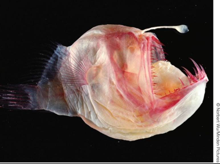
FIGURE 3.26 A Denizen of the Deep Pelagic Zone Anglerfish (Melanocetus spp.) are named for their unique strategy for capturing prey. In the lightless depths, the bioluminescent organ on the fish's forehead attracts prey to a position where they are easily engulfed by the huge, tooth-filled mouth. Back to text
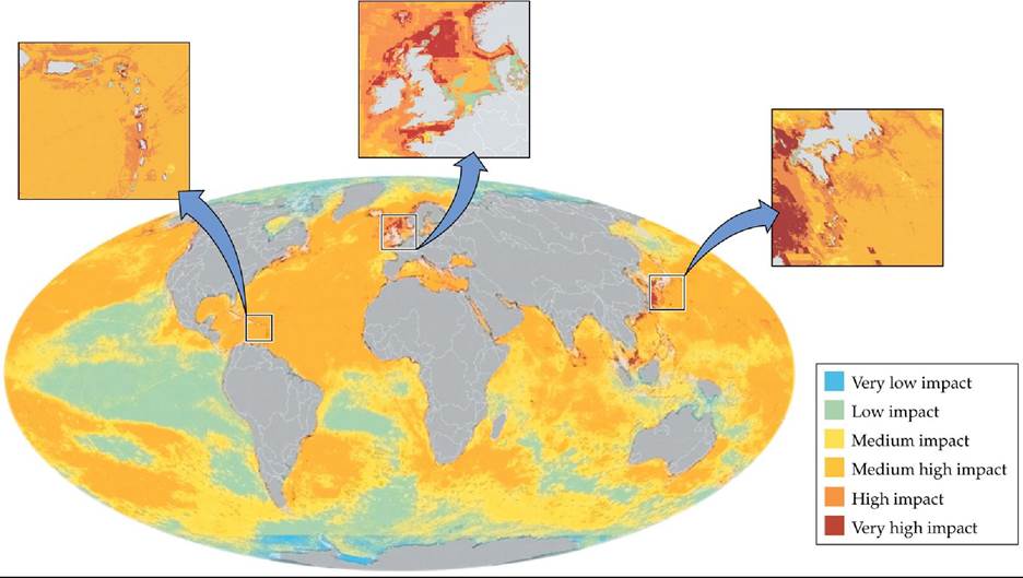
FIGURE 3.27 HumanlmpactsontheOceans Theimpactsofgreenhousegasemissions, pollutant inputs, and overfishing have varied in different regions of the oceans. The colors represent the degree of impact, which was quantified using expert judgments of 17 different environmental impact factors. The enlarged areas from the Caribbean Sea (left), North Atlantic Ocean (center), and western Pacific Ocean (right) show greater detail of more heavily impacted areas. Note the correspondence between the areas of high and very high impact with areas of significant human impact in the adjacent terrestrial regions in Figure 3.5. (From B. S. Halpern et al. 2008. Science 319: 948-952.) Back tθ text
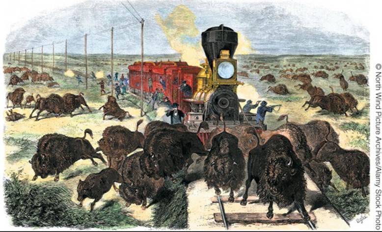
FIGURE 3.28 BuffaloHunting The arrival of large numbers of Euro-Americans in the Great Plains in the nineteenth century led to a mass slaughter of bison, facilitated by the construction of railroad lines and the use of high-powered rifles. Back to text
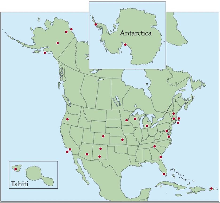
FIGURE 3.29 Long-Term Ecological Research Sites Twenty-eight research sites constitute the U.S. Long-Term Ecological Research (LTER) Network. These sites encompass deserts, grasslands, forests, mountains, lakes, estuaries, agricultural systems, and cities. Researchers measure long-term changes in ecosystems and perform experiments at these sites to better understand ecological dynamics over decades to centuries. Back to text
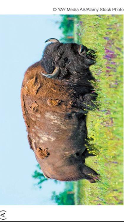
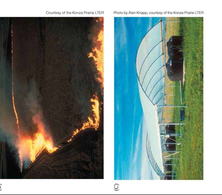
FIGURE 3.30 Research at the Konza Prairie LTER Site Long-term research and experiments are investigating the effects of the frequencies of (A) grazing, (B) fire, and (C) precipitation on the diversity and function of the tailgrass prairie ecosystem. Back to text
4 Coping with Environmental Variation: Temperature and Water
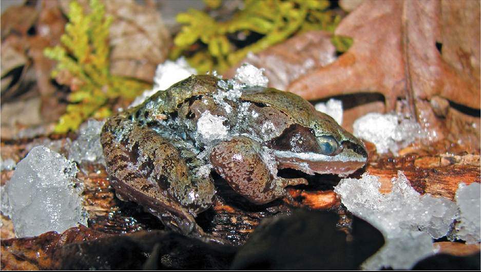
FIGURE 4.1 A Frozen Frog Wood frogs (Rana sylvatica) spend winters in a partially frozen state, without breathing and with no circulation or heartbeat. Courtesy of J. M. Storey Back to text
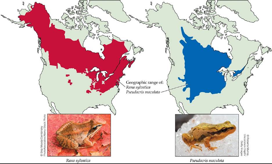
FIGURE 4.2 Northern Exposure Wood frogs (Rana sylvatica) and boreal chorus frogs (Pseudacris maculata) have geographic ranges that extend into the boreal forest and tundra biomes. (Range data from IUCN [International Union for Conservation of Nature], Conservation International & NatureServe. 2008. The IUCN Red List of Threatened Species Version 2019-2. https://www.iucnredlist.org/species/58728/78907321 and https://www.iucnredlist.org/species/136004/78906835. Downloaded on 14 June 2019.) Back to text
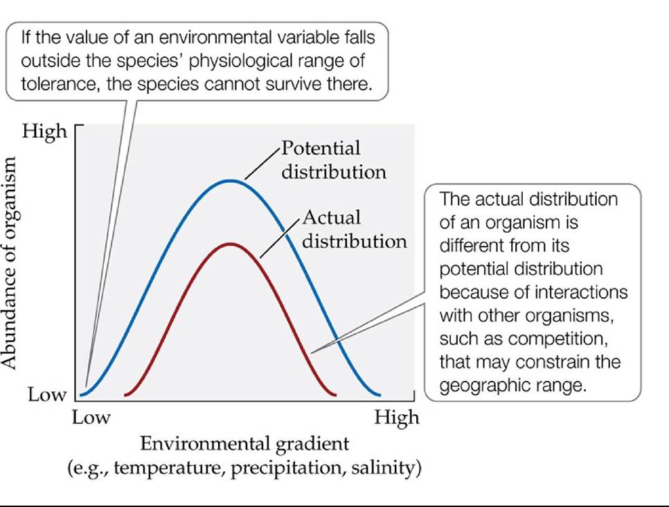
FIGURE 4.3 AbundancevariesacrossEnvironmentalGradients Theabundanceofan organism reaches a theoretical maximum at some optimal value across an environmental gradient and drops off at either end at values that constrain the potential geographic distribution of the organism. The actual abundance curve is likely to differ from the potential abundance curve because of biological interactions. Back to text
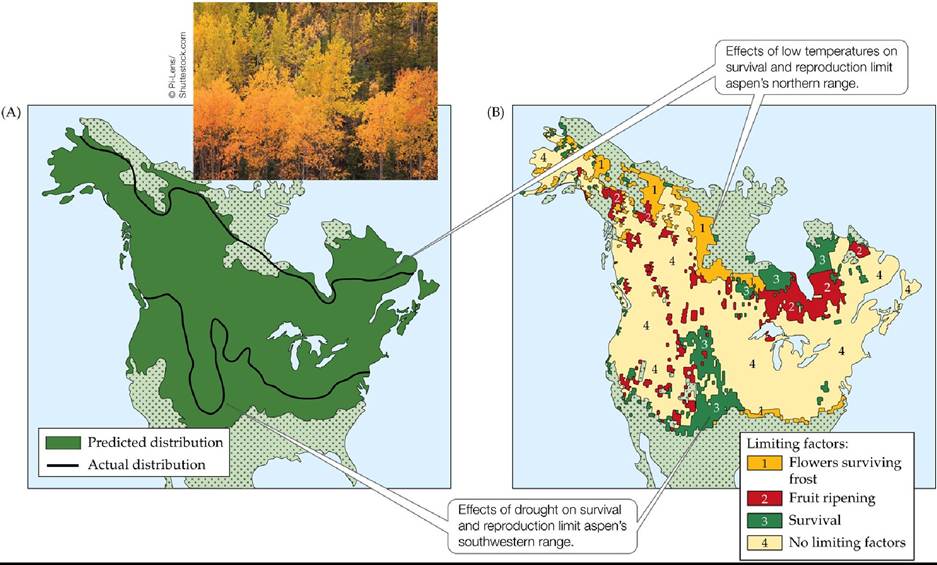
FIGURE 4.4 ClimateandAspenDistribution Thegeographicdistributionoftheaspen (Populus tremuloides; golden trees in the photo) is associated with climate. (A) Predicted distribution of aspen, based on the effects of climate factors on survival and reproduction observed in natural populations, mapped with the actual distribution. (B) Climate factors limiting the distribution of aspen, based on observations of natural populations.
The future climate is predicted to be warmer throughout the interior of western North America and drier in the central portions of the continent. How will these changes influence the geographic distribution of aspen?
(After X. Morin et al. 2007. Ecology 88: 2280-2291.) Back tθ text
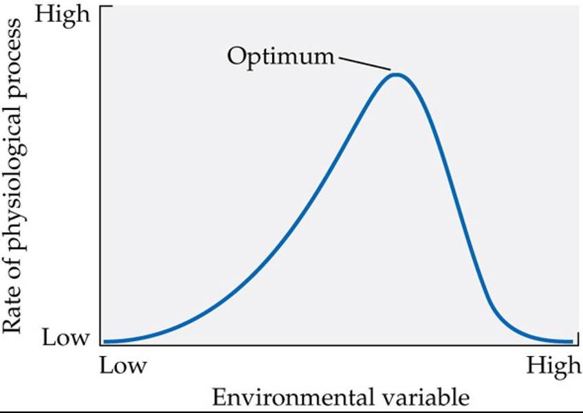
FIGURE 4.5 EnvironmentaicontrolofphysiologicalProcesses Theratesof
physiological processes are greatest under a set of optimal environmental conditions (e.g., optimal temperature, optimal water availability). Deviations from the optimum cause a decrease in the rates of physiological processes. Back to text
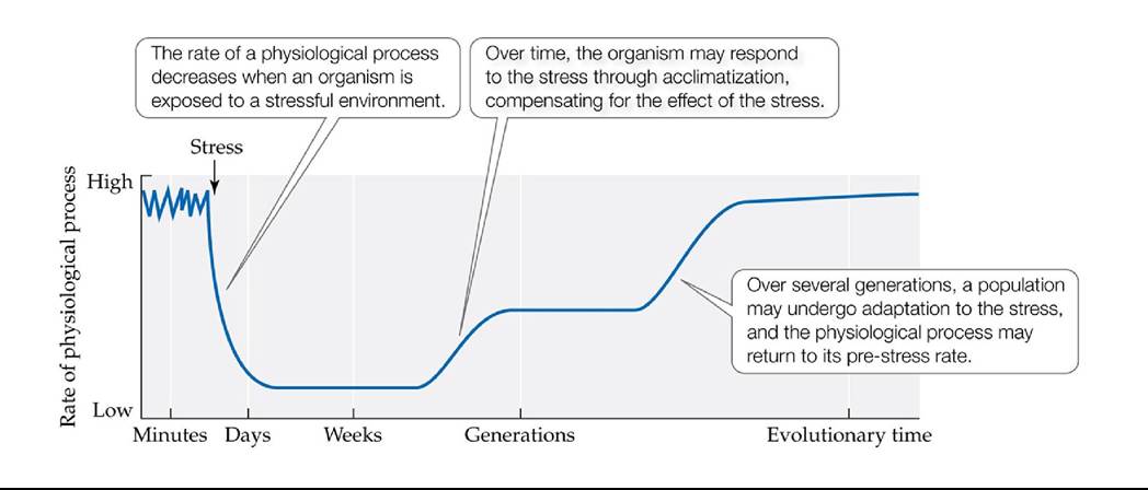
FIGURE 4.6 OrganismalResponsestoStress Organismsrespondtostressoverdifferent time scales. (After H. Lambers et al. 1998. Plant Physiological Ecology. Springer: New York.) Back tθ text
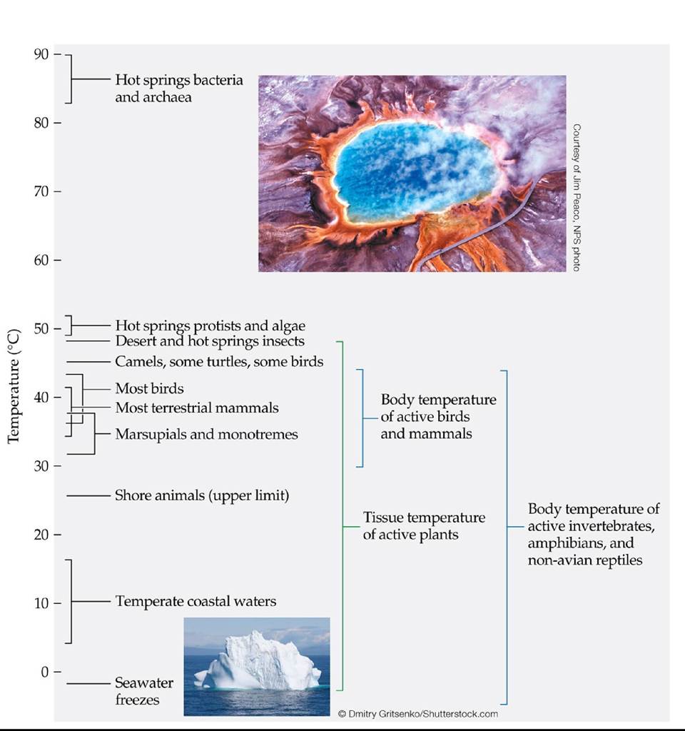
FIGURE 4.7 Temperature Ranges for Life on Earth Living organisms are known to exist in extreme environments, ranging from hot springs to freezing seas. (After P. Willmer et al. 2005.
Environmental Physiology of Animals. Blackwell Publishing: Malden, MA.) Back tθ text
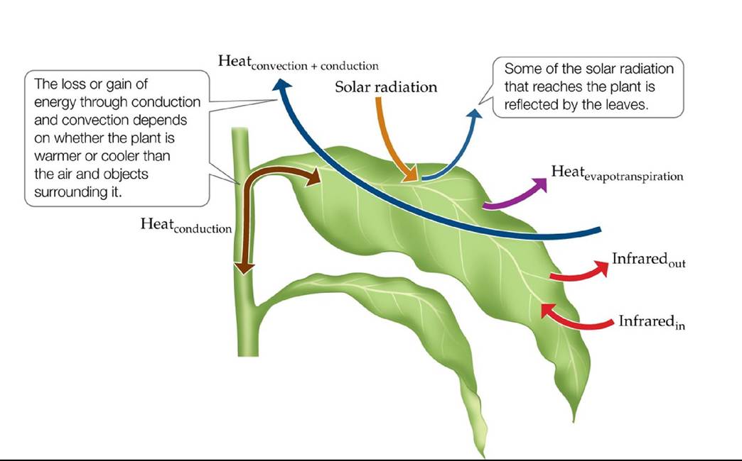
FIGURE 4.8 EnergyExchangeinTerrestrialPlants Thetemperatureofaplantis determined by the balance between inputs of energy from and outputs of energy to the environment. (After P. S. Nobel. 1983. Biophysical Plant Physiology and Ecology. W. H. Freeman: New York.) Back to text
Courtesy of G. H. Holroyd and A. t√1. Heatherington
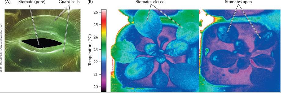
FIGURE 4.9 Stomates Control Leaf Temperature by Controlling Transpiration (A)
Specialized guard cells control a stomate's degree of opening. Open stomates allow CO2 to diffuse in for photosynthesis, and they allow water to transpire out, cooling the leaves. (B) Leaf temperatures vary with the degree of stomatal opening. The plant on the right has open stomates and is transpiring freely, while the plant on the left, kept under identical conditions, has closed stomates, a lower transpiration rate, and a temperature 1°C-2°C (2°F-4°F) higher, as indicated by thermal infrared imaging.
Cooling of leaves using transpiration may be particularly important in what biomes?
Back to text
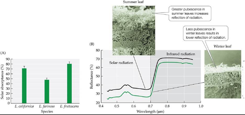
Micrographs courtesy of J. Ehleringer
FIGURE 4.10 Sunlight, Seasonal Changes, and Leaf Pubescence (A) Solar heating of leaves varies according to the amount of pubescence on those leaves. The pubescent leaves of the desert shrub Encelia farinosa absorb a lower percentage of the incoming solar radiation than the leaves of two nonpubescent species: E. californica, native to the coastal sage community of California, and E. frutescens, an inhabitant of moister desert wash communities. Encelia farinosa is therefore less dependent on transpiration for leaf cooling than the other two species. Error bars show 1 standard error of the mean. (B) Encelia farinosa produces greater amounts of pubescence on its leaves in summer than in winter, representing acclimatization to hot summer temperatures. The photos are scanning electron micrographs of leaf cross sections.
Why might temperature regulation associated with greater reflection of solar radiation via pubescence be more important in deserts than in a warm, moist biome such as the tropical rainforest?
(A after J. R. Ehleringer and C. S. Cook. 1990. Oecologia 82: 484-489.) Back tθ text
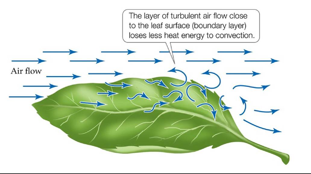
FIGURE 4.11 ALeafBoundaryLayer Air flowing close to the surface of a leaf is subject to friction, which causes the flow to become turbulent and lowers convective heat loss from the leaf to the surrounding air. Back to text
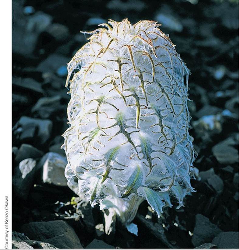
FIGURE 4.12 A Woolly Plant of the Himalayas ThesnQwlQtus(Saussureametfusa)Has dense pubescence surrounding its emergent flowering stems, which provides them with thermal insulation. Back to text
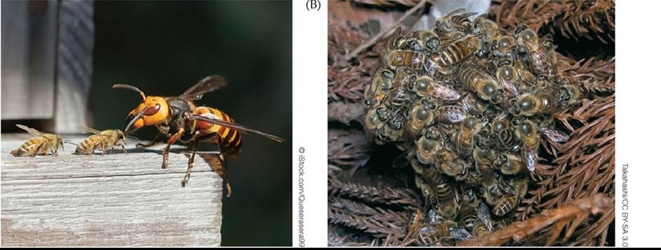
FIGURE 4.13 Internal Heat Generation as a Defense Beescangenerateheatby contracting their flight muscles. Japanese honeybees (Apis cerana) use internal heat generation as a defense against Asian giant hornets (Vespa mandarinia) that attack bee colonies. (A) When a hornet enters a nest, the honeybees swarm the larger invader. (B) The defensive ball of bees surrounding an invading hornet generates enough heat that temperatures in the center exceed the upper lethal temperature for the hornet (about 47°C, 117°F), thus killing the invader. Back to text
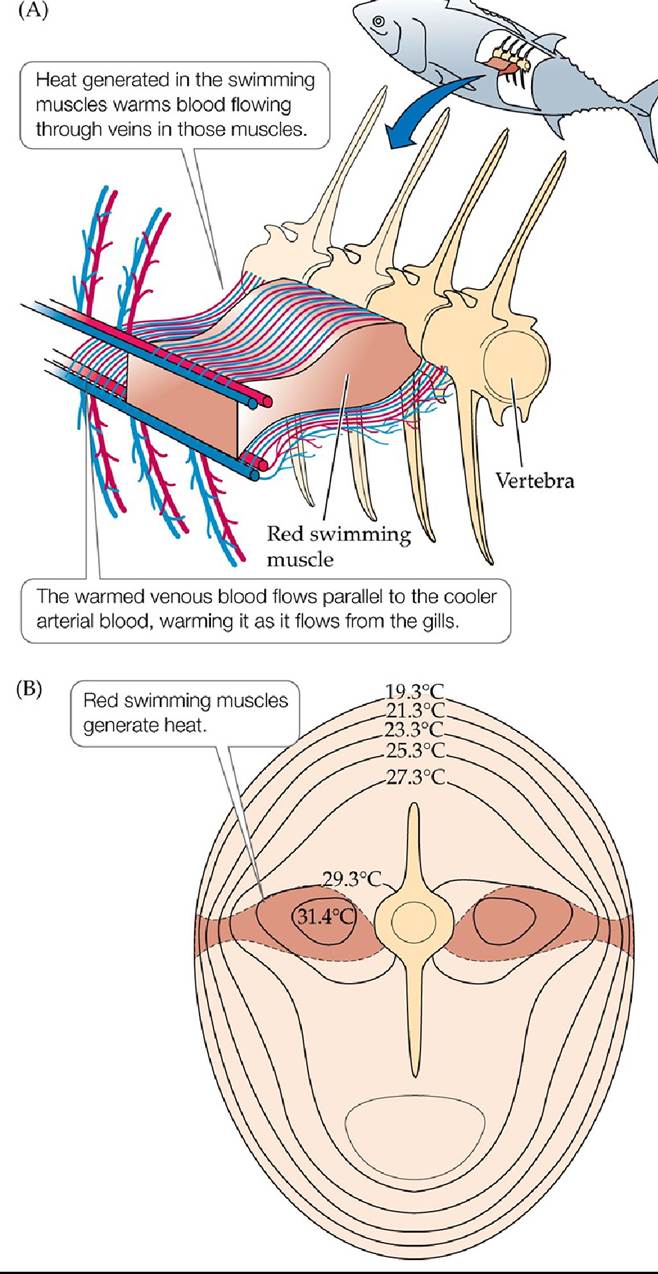
FIGURE 4.14 InternalHeatGenerationbyTuna (A) Heat generated in the red swimming muscles of the skipjack tuna, used for cruising through the water, warms blood flowing through them, which is carried toward the body surface in veins. Those veins run parallel to arteries carrying cool oxygenated blood from the gills, warming that blood before it reaches the swimming muscles. (B) A cross section of the tuna shows that its core remains warmer than the surrounding water. Back to text
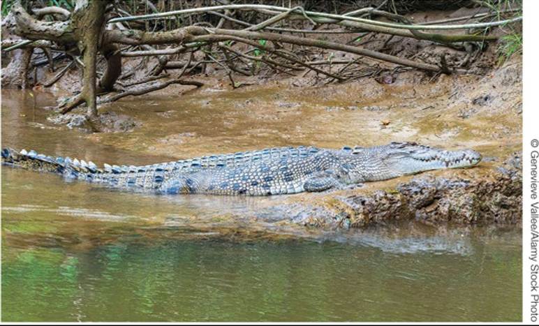
FIGURE 4.15 Mobile Animals Can Use Behavior to Adjust Body Temperature An adult female saltwater crocodile (Crocodylus porosus) sunning itself on the riverbank, Daintree River, Daintree National Park, Far North Queensland.
What components of energy exchange are affected by the behavior of this crocodile?
Back to text
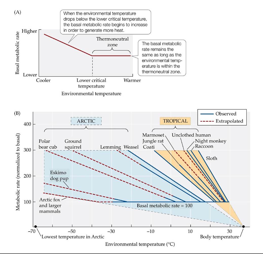
FIGURE 4.16 Metabolic Rates in Endotherms Vary with Environmental Temperatures
(A) An endotherm’s resting, or basal, metabolic rate stays constant throughout a range of environmental temperatures known as the thermoneutral zone. When environmental temperatures reach a lower limit, known as the lower critical temperature, the endotherm’s metabolic rate increases to generate additional heat. (B) The thermoneutral zones and lower critical temperatures of endotherms vary with their habitats. The lower critical temperatures of Arctic endotherms are lower than those of tropical endotherms, and their metabolic rates increase more slowly below those lower critical temperatures, as shown by the shallower slopes of the curves. (B after P. F. Scholander et al. 1950. Biol Bull 99: 237-258.) Back tθ text
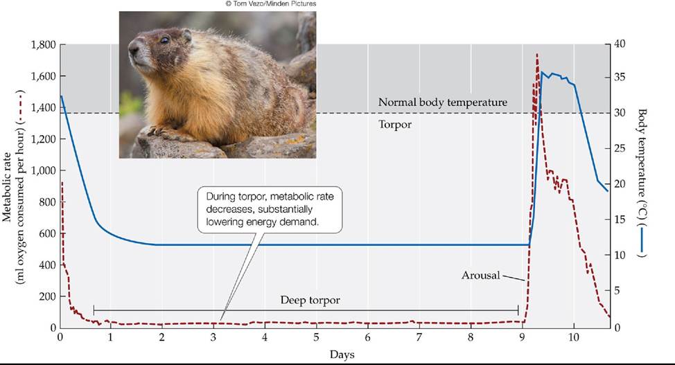
FIGURE 4.17 Long-TermTorporinMarmots Torpor allows yellow-bellied marmots
(Marmota flaviventris) to conserve energy during winter, when food is scarce and the demand for metabolic energy to keep warm is high. Regular cycles of arousal and return to torpor occur for unknown reasons. (After K. Armitage et al. 2003. CompBiochemPhys 134A: 101-114.) Back tθ text
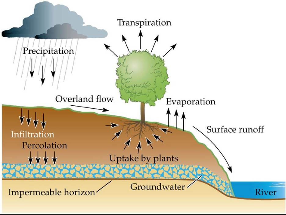
FIGURE 4.18 What Determines the Water Content of Soil? Thewatercontentofsoilis determined by the balance between water inputs (infiltration of precipitation and overland flow of water) and outputs (percolation to deeper layers, evapotranspiration) and by the capacity of the soil to hold water. Soil water storage capacity and the rate of percolation are dependent on soil texture. (After P. J. Kramer. 1983. Water Relations of Plants. Academic Press: Cambridge, MA.) Back to text
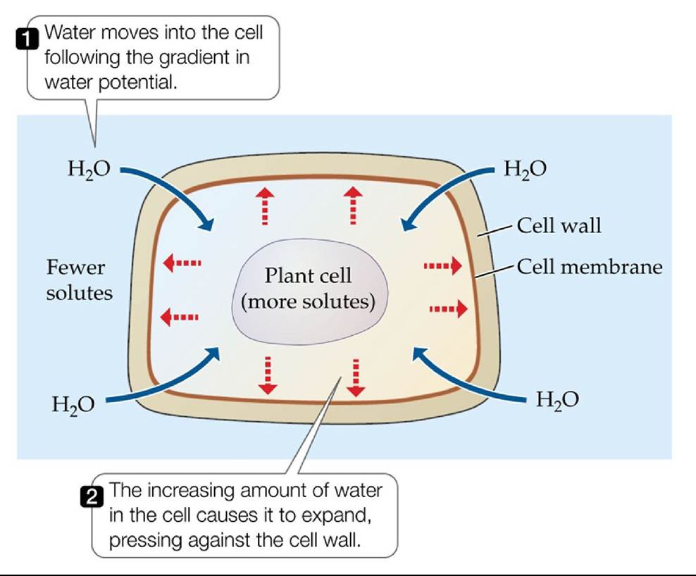
FIGURE 4.19 Turgor Pressure in Plant Cells When a plant cell is surrounded by water with a solute concentration lower than its own, water moves into the cell, while solutes in the cell are prevented from moving out by the cell membrane. The increasing amount of water in the cell causes the cell to expand, pressing against the cell wall. Back to text
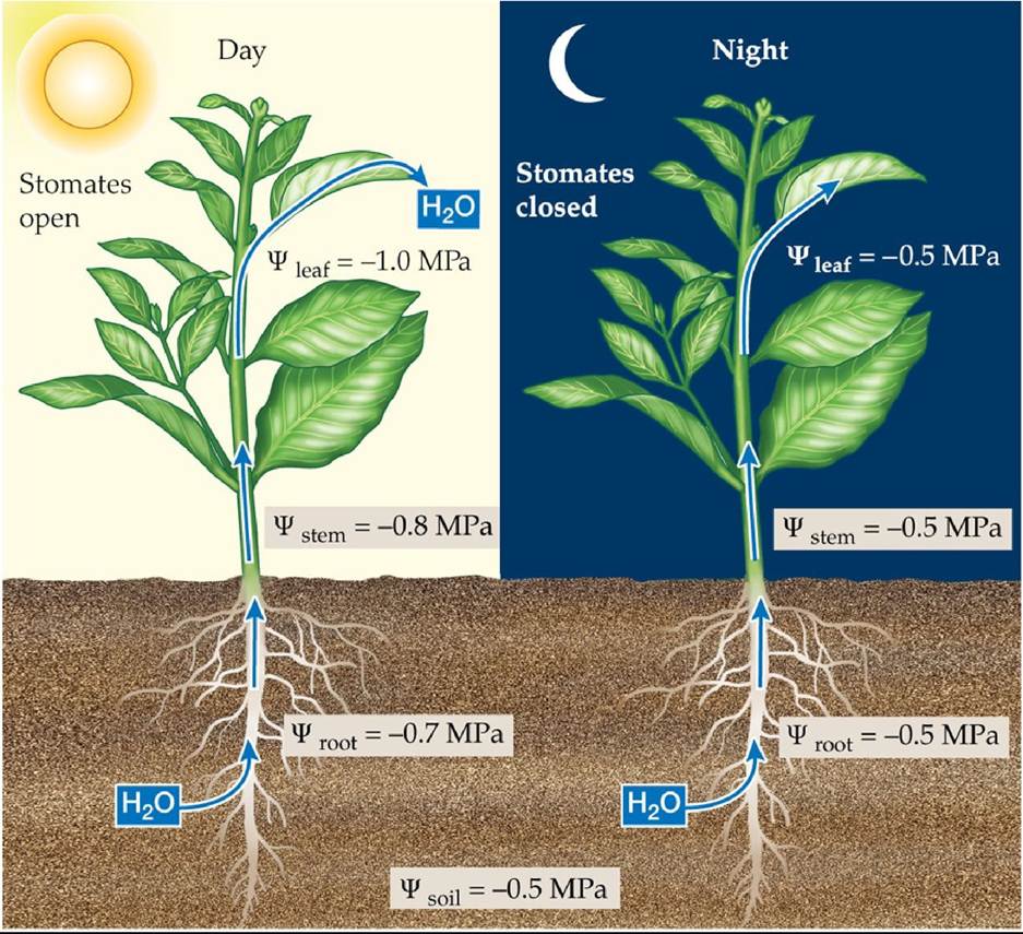
FIGURE 4.20 The Daily Cycle of Dehydration and Rehydration Duringtheday1Whenthe stomates are open, transpiration results in a gradient of water potential from leaf to stem, stem to roots, and roots to soil. At night, when the stomates are closed, water potential equilibrates as the plant rehydrates. Back to text
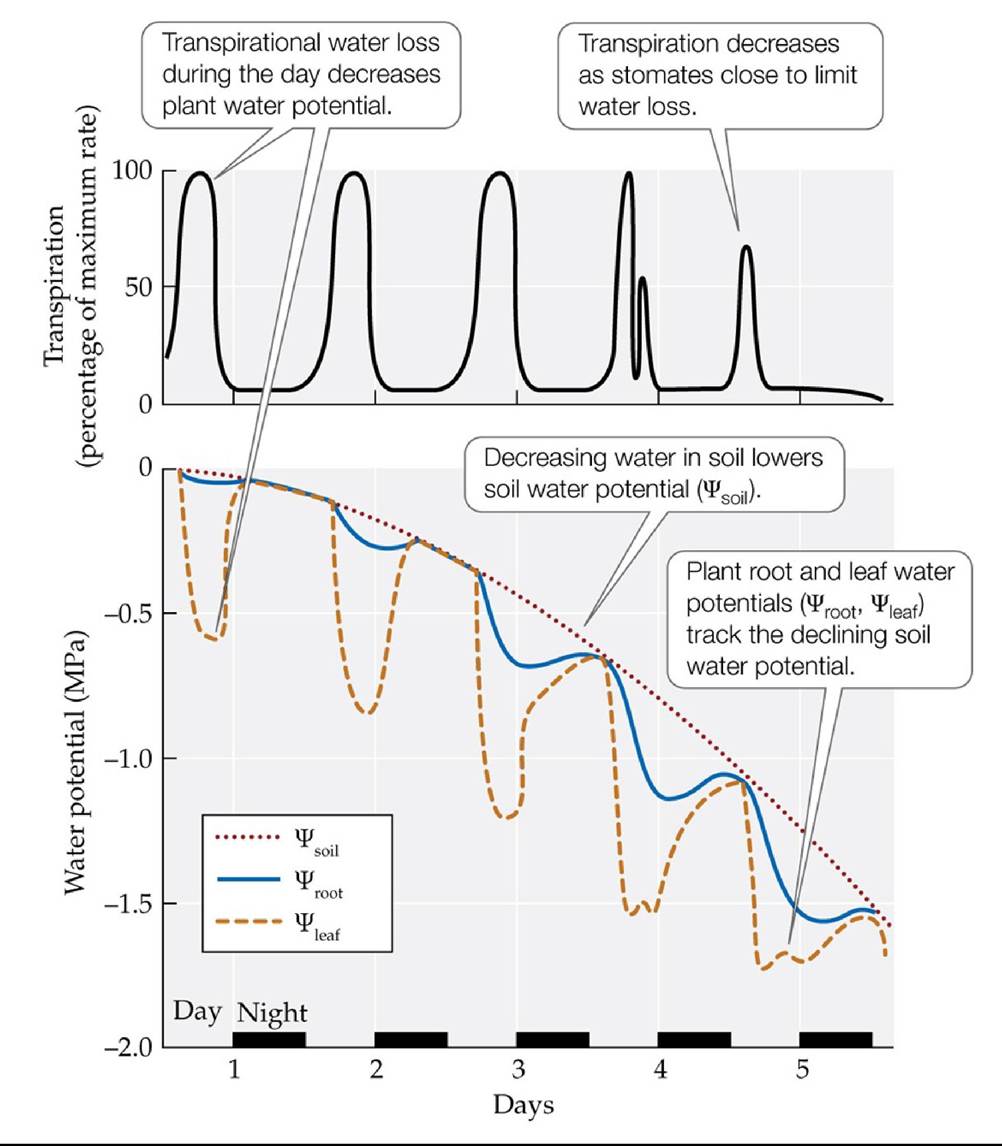
FIGURE 4.21 How Plants Cope with Depletion of Soil Water Ifsoilwaterisnot recharged, transpiration will deplete it, leading to progressive drying of the soil and a decrease in soil water potential.
As the soil dries, stomates may close at midday and reopen later in the
afternoon, as seen on day 4 in the graph. Assuming the air temperature is cooler later in the day, what influence would this have on plant water loss?
(Top, after A. H. Fitter and R. K. Hay. 1987. Environmental Physiology of Plants. Academic Press: London; bottom, after R. D. Slatyer. 1967. Plant-Water Relationships. Academic Press: Cambridge, MA.) Back tθ text
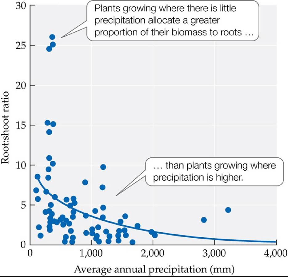
FIGURE 4.22 Allocation of Growth to Roots versus Shoots Is Associated with
Precipitation Levels The ratio of root biomass to leaf and stem (shoot) biomass increases with decreasing precipitation in shrubland and grassland biomes. Allocation of more biomass to roots in dry soils provides more water uptake capacity to support leaf function. (After K. Mokany et al. 2006. Global Change Biol 12: 84-96.) Back tθ text
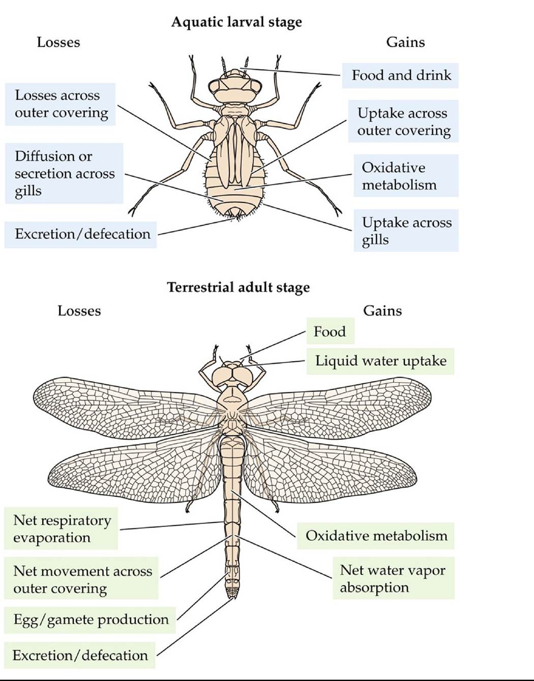
FIGURE 4.23 Gains and Losses of Water and Solutes in Aquatic and Terrestrial Animals Exemplified by Different Life Stages of a Dragonfly (After P. Willmer et al. 2005.
Environmental Physiology of Animals, 2nd ed. Blackwell Publishing: Malden, MA; E. B. Edney. 1980. In Insect Biology in the Future, M. Locke [Ed.], pp. 39-58. Academic Press: Cambridge, MA.) Back tθ text
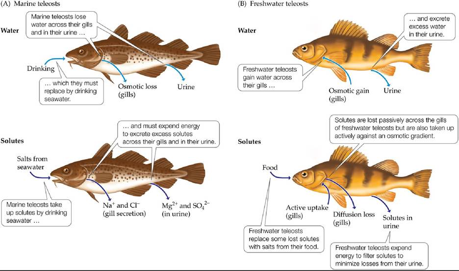
FIGURE 4.24 Water and Salt Balance in Marine and Freshwater Teleost Fishes Marine and freshwater teleost fishes face opposite challenges in maintaining water and solute balance.
(A) Marine teleosts are hypoosmotic to their environment: they tend to lose water and gain solutes. (B) Freshwater teleosts are hyperosmotic to their environment: they tend to gain water and lose solutes. (After K. Schmidt-Nielsen. 1979. Animal Physiology: Adaptation and Environment. Cambridge University Press: Cambridge.) Back tθ text
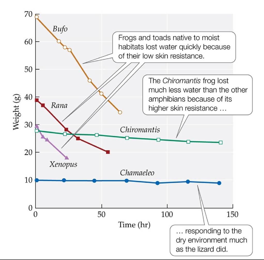
FIGURE 4.25 Resistance to Water Loss Varies among Frogs and Toads Amphibians were kept under uniform dry environmental conditions (25°C, 20%-30% relative humidity) to examine their rates of water loss, measured as loss of body weight. A lizard (Chamaeleo) was also tested for comparative purposes.
How could you estimate the resistances of these species to water loss quantitatively using this graph?
(After K. Schmidt-Nielsen. 1979. Animal Physiology: Adaptation and Environment. Cambridge University Press: Cambridge; based on J. P. Loveridge. 1970. Arnoldia [Rhodesia] 5: 1-6. National Museum of Southern Rhodesia.) Back to text
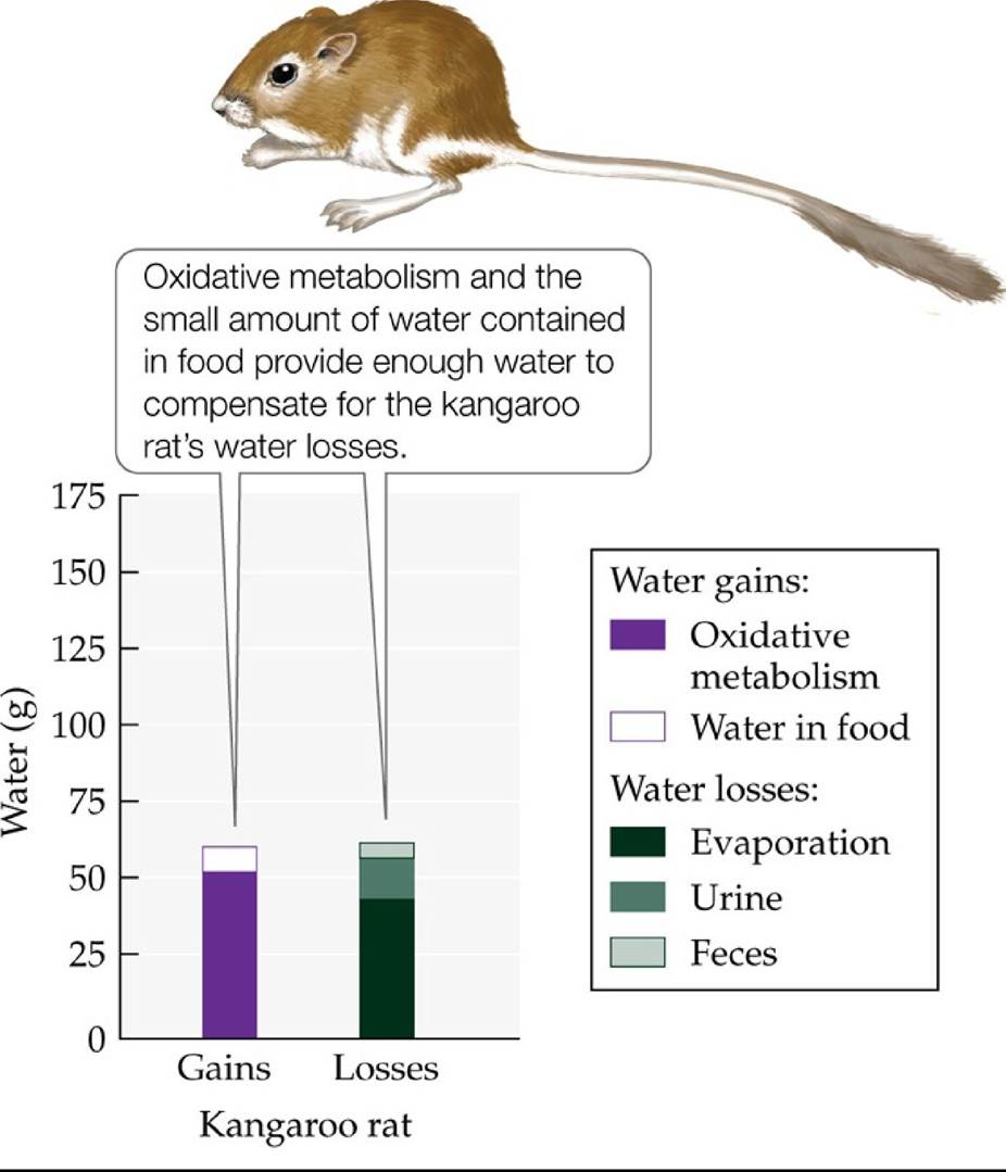
FIGURE 4.26 Water Balance in the Kangaroo Rat Under dry laboratory conditions (25°C, 25% relative humidity), kangaroo rats, native to deserts of western North America, do not require liquid water to survive. (After K. Schmidt-Nelson. 1997. Desert Animals. Clarendon Press: Oxford.) Back to text
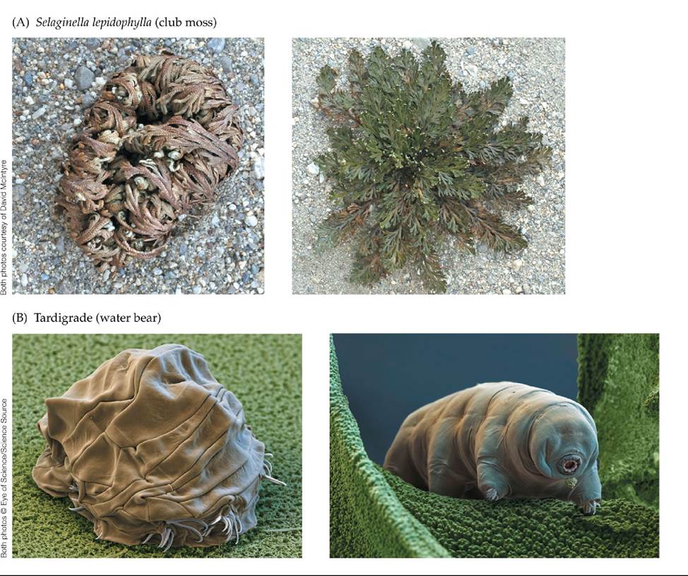
FIGURE 4.27 Desiccation-TolerantOrganisms (A) The leaves of the club moss
Selaginella Iepidophylla reach a very low moisture content during prolonged periods without rain (left); within 6 hours of receiving water, the leaves are functional and carrying out photosynthesis (right). (B) Water bears (tardigrades) are small invertebrates (less than 1 mm in length) found in aqueous environments, including oceans, lakes and ponds, soil water, and the water films on vegetation. Water bears contract and cease metabolism when they and their environment dry up (left) but rehydrate when moisture returns (right). Back to text
5 Coping with Environmental Variation: Energy
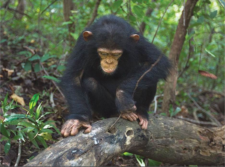
FIGURE 5.1 Nonhuman Tool Use This chimpanzee uses a plant stem as a tool to forage for termites. Chimpanzees were the first nonhuman animals documented using tools to forage for food. © Anup Shah/Minden Pictures Back tθ text
© Prisma by Oukas Presssegentur GmbHZAIamy Stock Pfioto
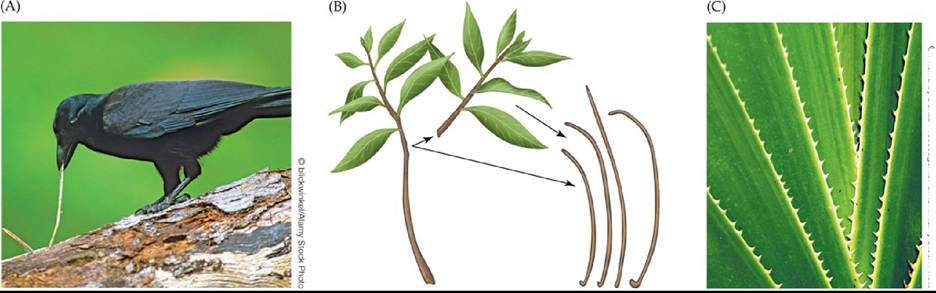
FIGURE 5.2 Tools Manufactured by New Caledonian Crows (A)Crowsusethetoolsthey make to probe for food in the cavities and crevices of trees. (B) Hooked twig tools, made from shoots of trees. The birds use their bills to form the hook while holding the stick with their feet. (C) The crows also can create tools from the serrated leaves of Pandanus plants. (B after G. R. Hunt. 1996. Nature 379: 249-251.) Back tθ text
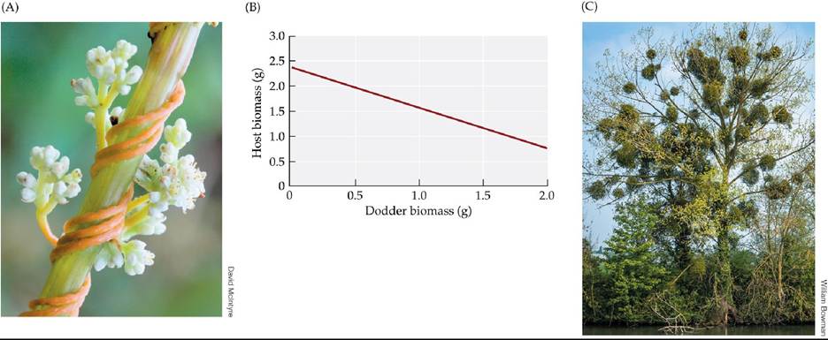
FIGURE 5.3 Plant Parasites (A) Dodder (Cuscuta sp.), a holoparasite that lacks chlorophyll, is shown here wrapped around the stem of a jewelweed plant. (B) Increasing amounts of European dodder (Cuscuta europaea) biomass result in decreasing growth of its host plant, stinging nettle (Urtica dioica). (C) Mistletoe, like the green mistletoe (Ileostylus micranthus) seen here, is a hemiparasite: despite having photosynthetic tissues of its own, mistletoe draws water, nutrients, and some of its energy from its host tree. (B after T. Koskela et al. 2002. Evolution 56: 899908.) Back to text
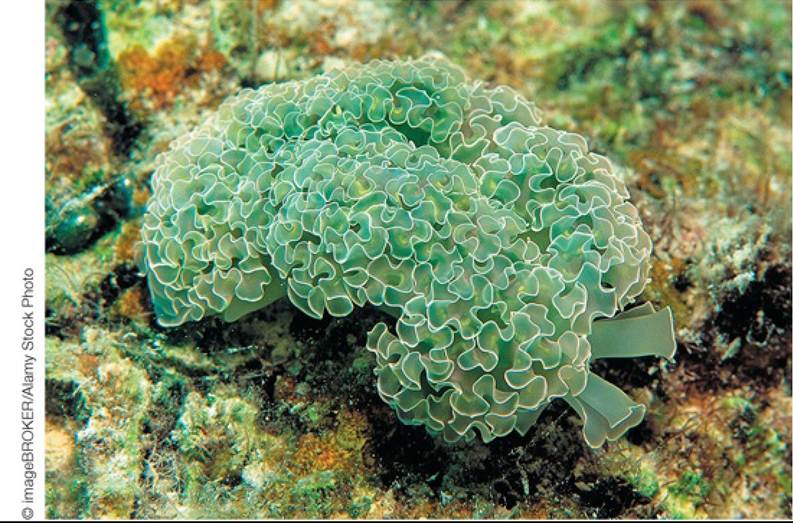
FIGURE 5.4 Green Sea Slug The green color of this lettuce sea slug (Elysia crispata) is associated with the chloroplasts it has taken into its digestive system. The chloroplasts can supply enough energy to the sea slug to maintain it for several months without food. Back to text
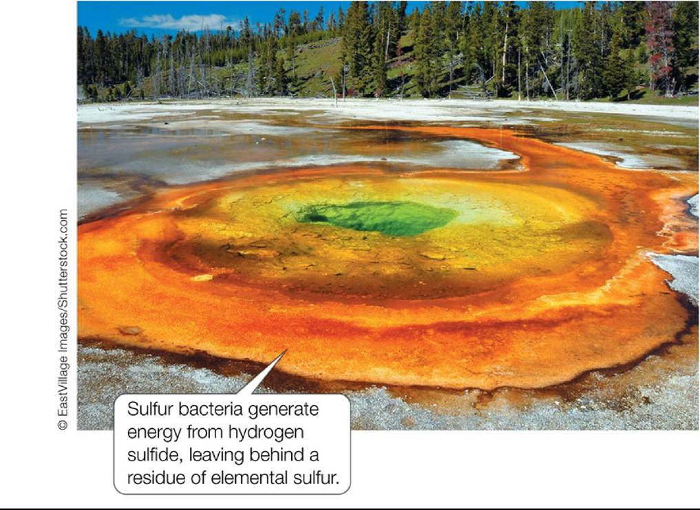
FIGURE 5.5 SulfurDepositsfromChemosyntheticBacteria Sulfurbacteriathrivein sulfur hot springs with water temperatures as high as 110°C (230°F). Back to text
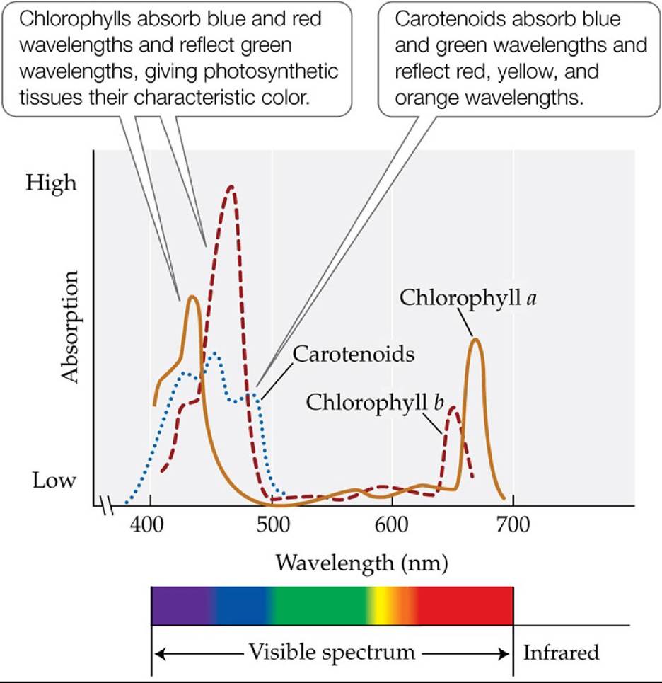
FIGURE 5.6 Absorption Spectra of Plant Photosynthetic Pigments Plantstypically contain several light-absorbing pigments, which absorb light of different wavelengths. (After C. J.
Avers. 1985. Molecular Cell Biology. Addison-Wesley: Boston, MA.) Back tθ text
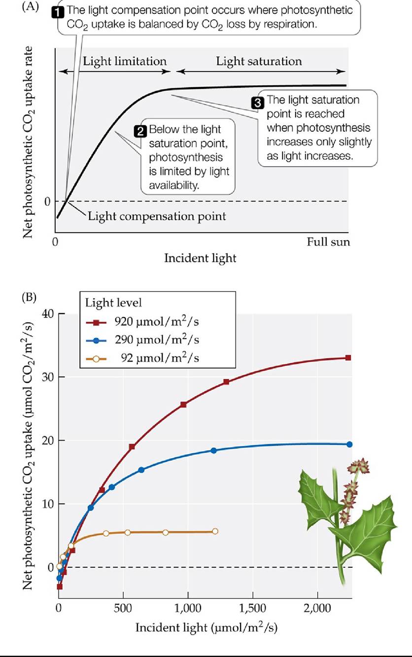
FIGURE 5.7 Plant Responses to Variations in Light Levels (A) Photosynthetic light response curve. (B) Spearscale (Atriplex triangularis) plants grown at different light levels in growth chambers acclimatized to those light levels. Their light response curves indicate that adjustments in the light saturation point occurred. Small, but ecologically significant, changes in the light compensation point occur in many other species, facilitating CO2 uptake at low light levels.
Why might the light saturation point of a plant be below the maximum light level the plant is likely to be exposed to?
(B after O. Bjorkman. 1981. In Physiological Plant Ecology I: Encyclopedia of Plant Physiology, O. L. Lange et al. [Eds.], pp. 57-101. Springer: New York.) Back tθ text
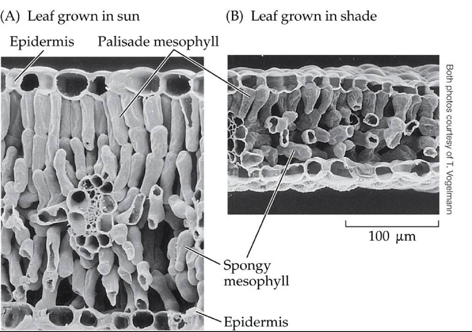
FIGURE 5.8 Effects of Light Level on Leaf Structure Golden banner (Thermopsis montana) leaves adjust morphologically to changes in light levels. Leaves grown at high light
levels (A) are thicker, have more photosynthetic cells (palisade and spongy mesophyll), and have greater numbers of chloroplasts than leaves grown at low light levels (B). Back to text
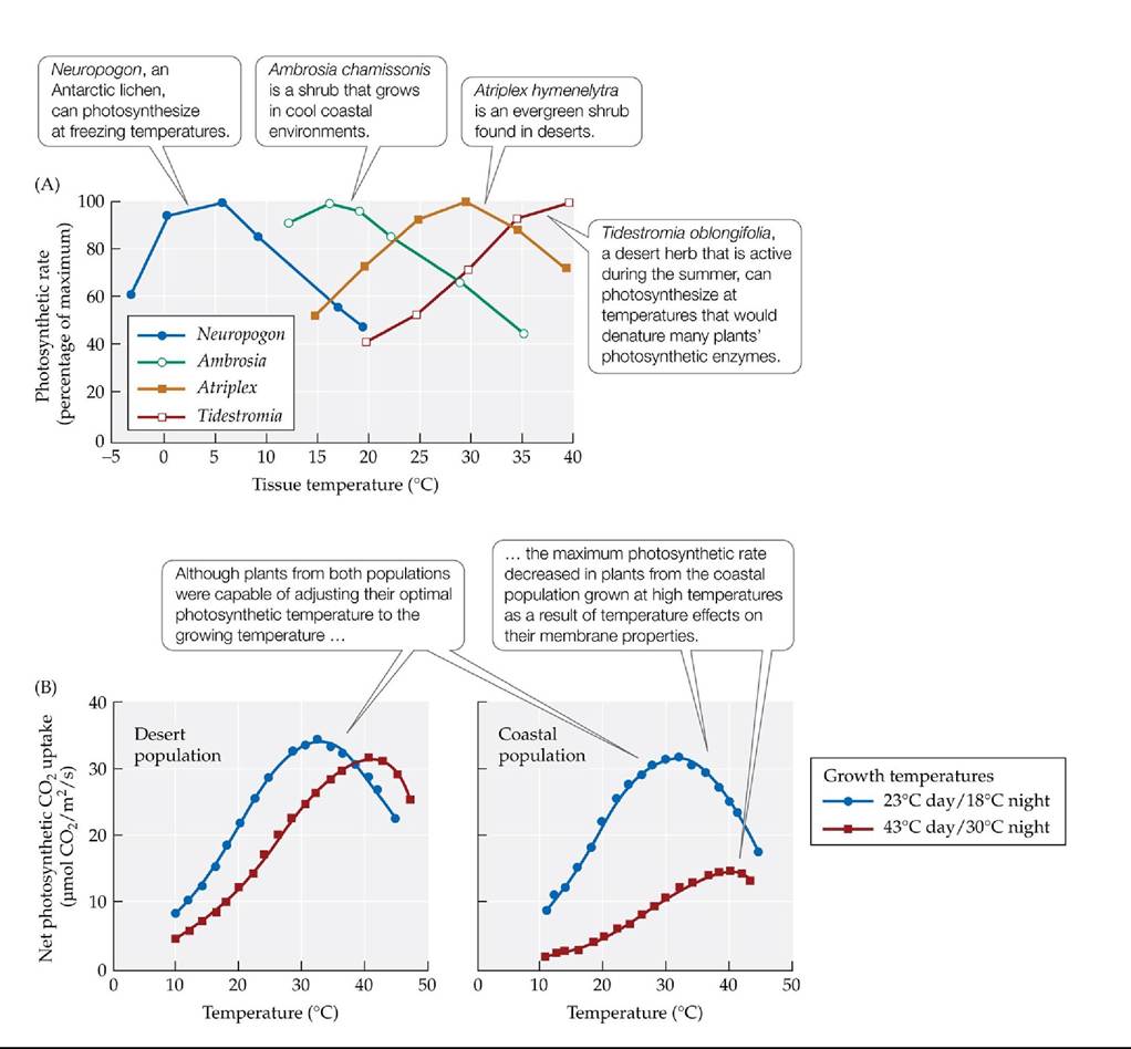
FIGURE 5.9 Photosynthetic Responses to Temperature (A) The temperatures at which plants and lichens reach their maximum photosynthetic rates correspond to the range of environmental temperatures in the native habitat of the species. (B) Acclimatization to different growth temperature regimes by plants from different populations of Atriplex Ientiformis, a shrub that occurs in the hot Mojave Desert and in cool coastal zones of California. The two growth
temperature regimes are representative of the two habitats the species occupies. (A after H. A. Mooney. 1986. In Plant Ecology, M. J. Crawley [Ed.]. Blackwell Science Ltd: Oxford. Based on O. L. Lange and L. Kappen. 1972. Antarctic Research Series 20: 80-95. American Geophysical Union; H. A. Mooney et al. 1983. Oecologia 57: 38-42; H. A. Mooney et al. 1976. Carnegie Institution Year Book 75: 410-413. B after R. W. Pearcy. 1977. PlantPhysiol 59: 795-799.) Back to text
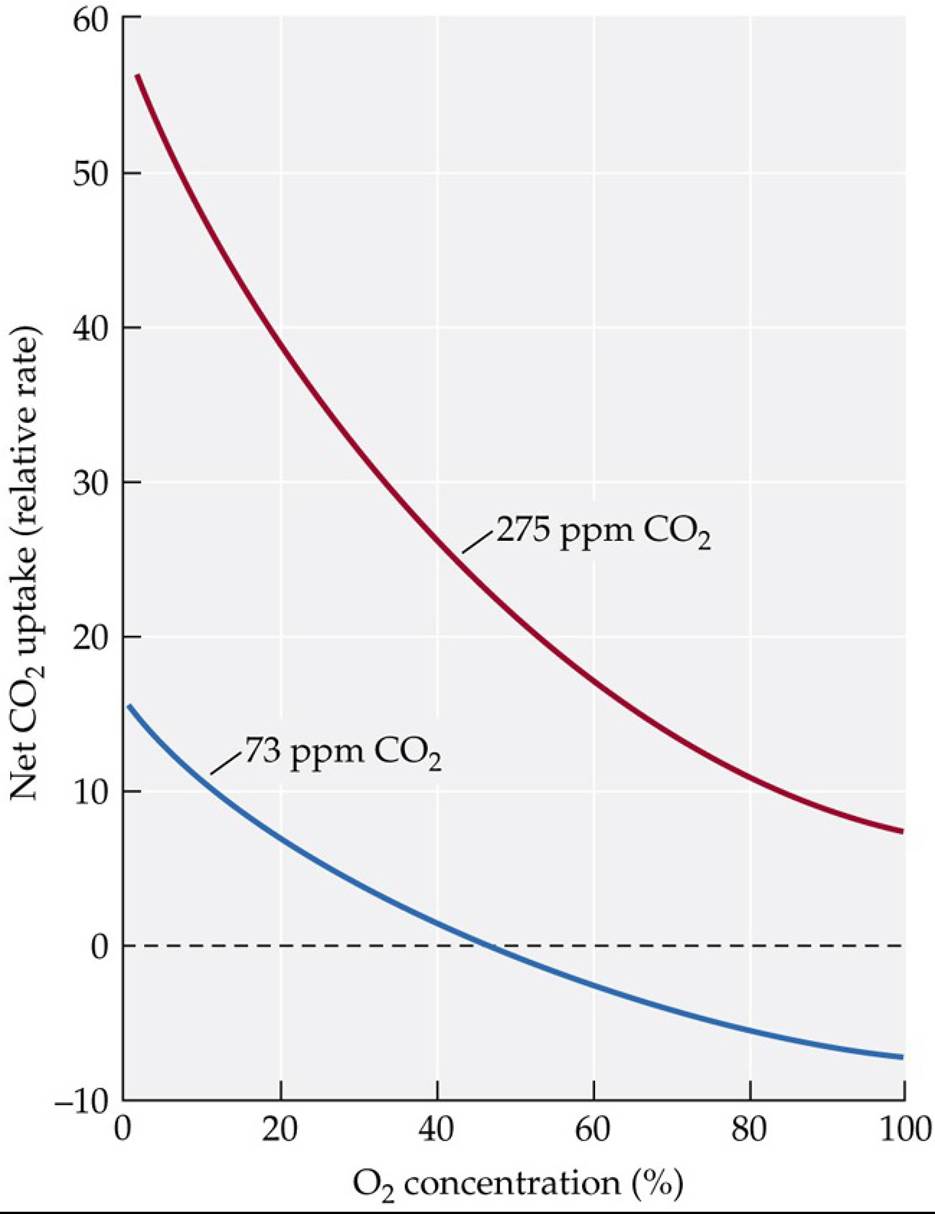
FIGURE 5.10 Influence of Oxygen Concentration on PhotosynthesisAsthe
atmospheric oxygen concentration increases, net photosynthetic uptake of CO2 decreases because of greater photorespiration, as shown here for soybean leaves in light levels equal to about 20% of full sun.
Why does the net rate of CO2 uptake drop below zero at high oxygen levels for leaves exposed to 73 ppm CO2?
(After M. L. Forrester et al. 1966. PlantPhysiol 41: 428-431.) Back tθ text
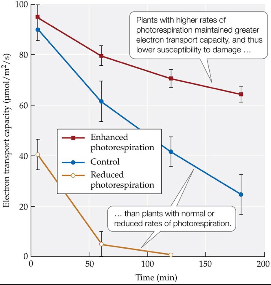
FIGURE 5.11 Does Photorespiration Protect Plants from Damage by Intense Light?
The ability of plants to process light energy for photosynthesis (electron transport capacity) under conditions that promote damage to photosynthetic membranes (high light levels, low CO2 concentrations) is greater in genetically altered plants with high rates of photorespiration than in control plants or in genetically altered plants with low rates of photorespiration. Error bars show ± one standard error (SE) of the mean. (After A. Kozaki and G. Takeba. 1996. Nature 384: 557-580.) Back to text
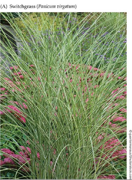
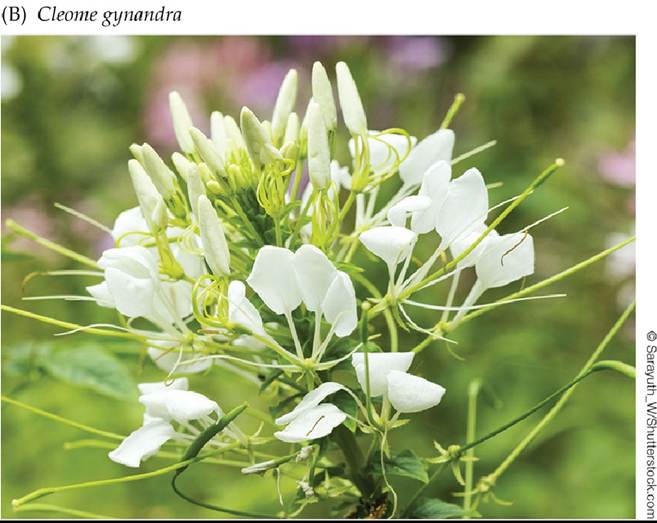
FIGURE 5.12 Plants with the C4 Photosynthetic Pathway The C4 photosynthetic pathway has evolved multiple times. It is found in plants of 18 different families encompassing a variety of growth forms, from switchgrass (Panicum virgatum) (A) to eudicots such as Cleome gynandra, commonly found in Africa (B). Back to text
FIGURE 5.13 Morphological Specialization in the Leaves of C4 Plants Thespatial separation of CO2 uptake (in the mesophyll cells) and the Calvin cycle (in the bundle sheath cells) minimizes photorespiration and maximizes photosynthetic rates under high temperatures. Back to text
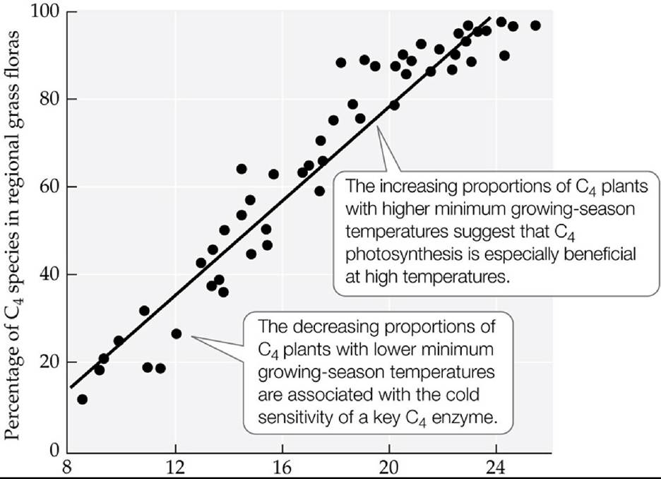
Average January minimum temperature (0C)
FIGURE 5.14 C4 Plant Abundance and Growing-Season Temperatures The proportions of C4 plants in Australian grass- and sedge-dominated communities correlate with the average minimum growing-season temperatures in the different locations.
Using the data in this graph and the seasonal temperature trends from the climate diagrams in Concept 3.1 (assume that the monthly minimum
temperature is 5°C cooler than the monthly average), what biome(s) should lack C4 species?
(After P. W. Hattersley. 1983. Oecologia 57: 113-128.) Back tθ text
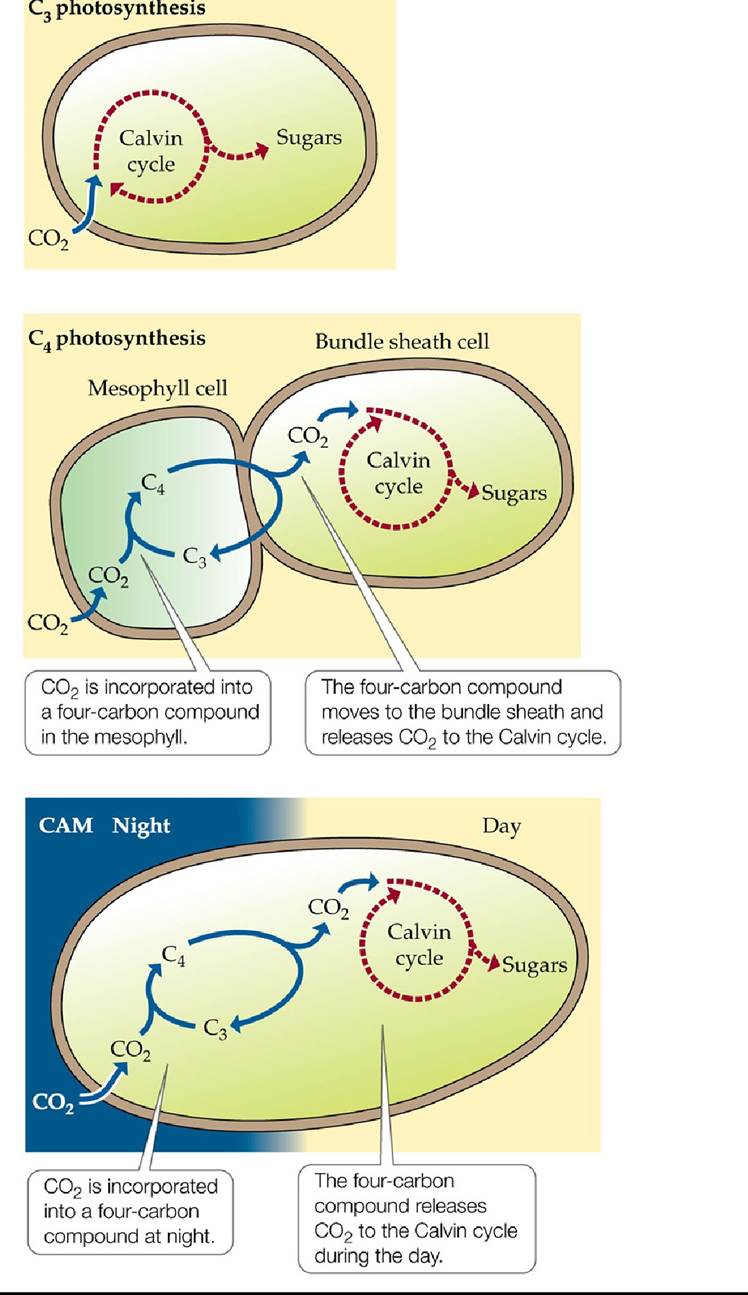
FIGURE 5.15 C3, C4, and CAM Photosynthesis Compared All three photosynthetic pathways fix carbon and produce sugars, but C4 photosynthesis separates these steps spatially, while CAM separates them temporally. Back to text
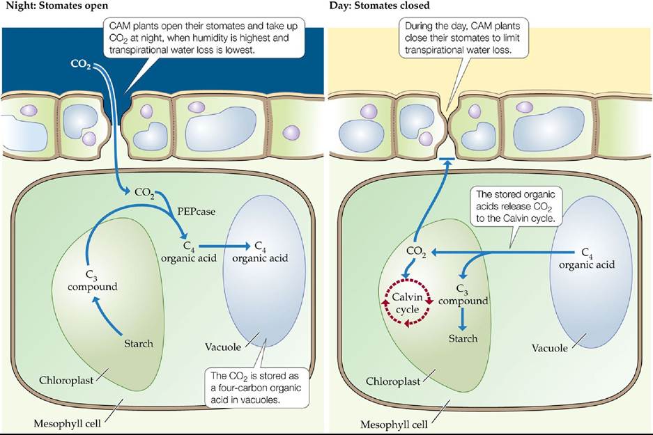
FIGURE 5.16 Crassulacean Acid Metabolism Plants using CAM open their stomates and take up CO2 at night, then run the Calvin cycle during the day. Back to text
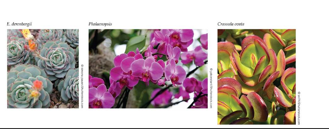
FIGURE 5.17 Examples of Plants with the CAM Photosynthetic Pathway MostCAM plants are found in arid and saline regions or in other habitats where water availability is periodically low. Back to text
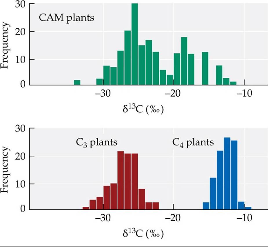
Carbon Isotopic Composition of Plants with Different Photosynthetic Pathways Plants with the C3 photo-synthetic pathway show the greatest discrimination against 13C (and thus the most negative δ 13C, expressed in parts per thousand), while C4 and CAM plants are more enriched in 13 13 4
C (have a less negative δ C).
Why is the range of δ 13C values for CAM plants larger, bridging the values for C3 and C4 plants?
(After M. A. Maslin and E. Thomas. 2003. QuatSci Rev 22: 1729-1736.) Back tθ text
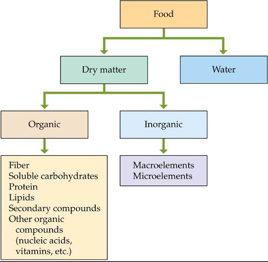
FIGURE 5.18 CategoricalBreakdownofFoodChemistry Foodchemistrycanbe complex, but these simple categories help ecologists understand how groups of chemicals influence the benefits of food for heterotrophs. (After W. H. Karasov and C. Martinez del Rio. 2007. Physiological Ecology: How Animals Process Energy, Nutrients, and Toxins. Princeton University Press: Princeton, NJ.) Back to text

FIGURE 5.19 AnEnvironmentalDisaster Oil pours from the fractured wellhead of the Deepwater Horizon oil drilling rig at the seafloor 1,700 m (5,700 feet) below the surface. About 57,000 barrels (9.1 million liters) were released each day for more than 3 months. The impact of this disaster may have been somewhat lessened by the activities of marine microorganisms that were able to use the oil as an energy source. Back to text
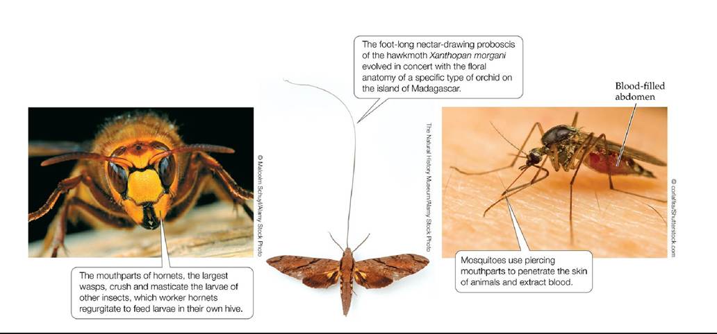
FIGURE 5.20 Variations on a Theme: Insect Mouthparts Differences in the morphology of insect mouthparts reflect different strategies for effectively acquiring and consuming the food types the insects prefer. Back to text
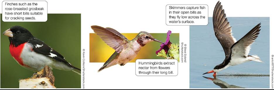
FIGURE 5.21 Variations on a Theme: Bird Bills Bird bill morphology is associated with the feeding behavior of a species and enhances the acquisition of its preferred food resources. Back to text
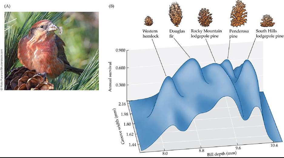
FIGURE 5.22 Crossbill Morphology, Food Preference, and Survival Rates (A)Red crossbill (Loxia curvirostra). (B) A three-dimensional plot of Craig Benkman's data shows the relationship between bill morphology (groove width and bill depth) and annual survival rates in five incipient crossbill species. Each incipient species shows an “adaptive peak” in association with the conifer species it preferentially feeds on; that is, each incipient species has higher survival rates when feeding on the conifer species its bill morphology is best suited to exploit. The cones shown are drawn to relative scale. (B after C. W. Benkman. 2003. Evolution 57: 1176-1181.) Back to text
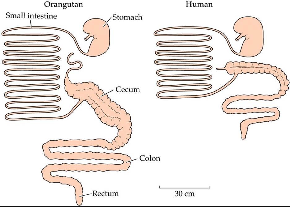
FIGURE 5.23 Herbivores Have Long Digestive Systems Compared with omnivorous humans, herbivorous primates such as the orangutan have longer digestive systems. The greater volume and absorptive area of herbivore digestive tracts serve to enhance energy absorption from poor-quality food. (After O. M. Wrong et al. 1981. The Large Intestine: Its Role in Mammalian Nutrition and Homeostasis. Halsted: New York.) Back to text
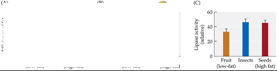
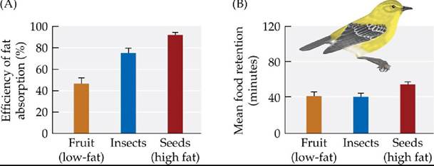
FIGURE 5.24 Adjustment of Digestion Efficiency with a Changing Diet Migrating warblers consume different diets in different parts of their ranges. To investigate the influence of fat content in the diet on their efficiency of fat absorption, researchers fed captive birds diets that were high (seed), medium (insect), or low (fruit) in fat, then measured the efficiency of fat absorption (the proportion of the fat in the diet taken up by the birds). The increase in the efficiency of fat absorption that accompanied a high-fat diet (A) was associated with longer food retention times (B) and greater production of a fat-degrading enzyme (lipase) by the pancreas (C).
Error bars show one SE of the mean. (After W. H. Karasov and C. Martinez del Rio. 2007. Physiological Ecology: How Animals Process Energy, Nutrients, and Toxins. Princeton University Press: Princeton, NJ.) Back to text
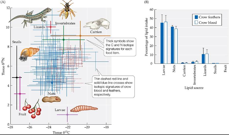
FIGURE 5.25 Diet Selection and Energy Gain by New Caledonian Crows (A) Each of the different food items available to the crows has a unique combination of C and N stable isotopes. Knowing the isotopic composition of the potential food sources provides a tool to estimate what proportion of an individual crow's diet comes from each item. (B) Estimated contributions of the food items to dietary lipid intake based on the isotopic composition of crow blood and feathers. Error bars show one SE of the mean. (After C. Rutz et al. 2010. Science 329: 1523-1526.) Back to text
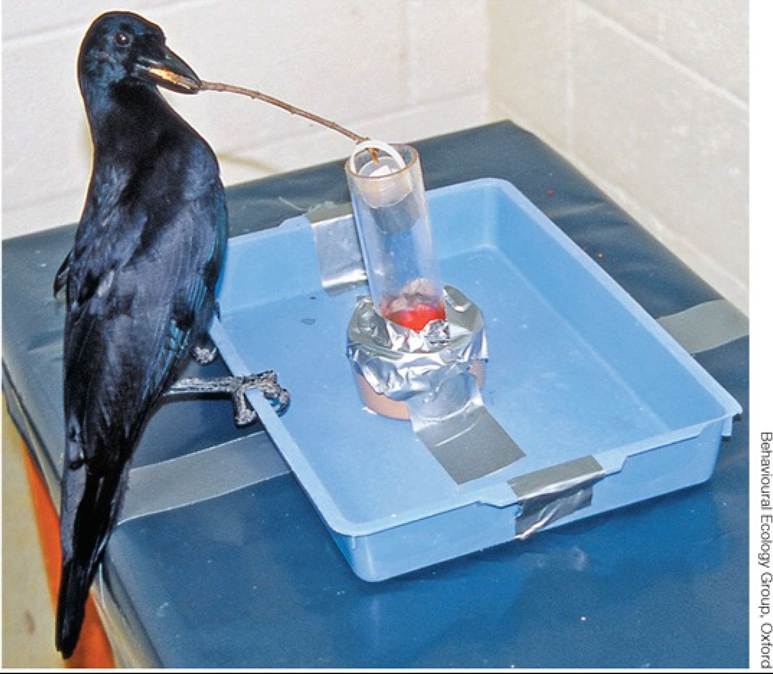
FIGURE 5.26 Untutored Tool Use in Captive Crows A captive New Caledonian crow (Corvus moneduloides) uses a stick tool to retrieve food from artificial crevices in a laboratory setting, despite never having been exposed to tool use, either by humans or by other birds. Back to text
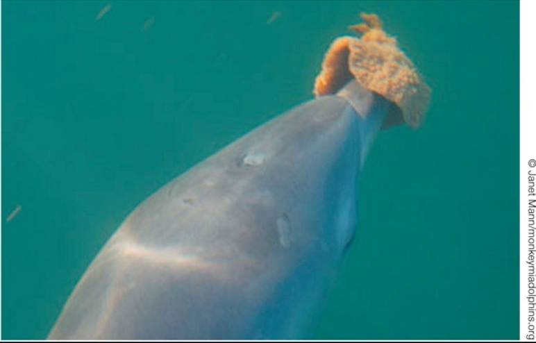
FIGURE 5.27 Dolphin Nose Gear in Shark Bay, Australia Abottlenosedolphinwearsa sponge to protect its rostrum while foraging on the seafloor. Back to text
6 Evolution and Ecology
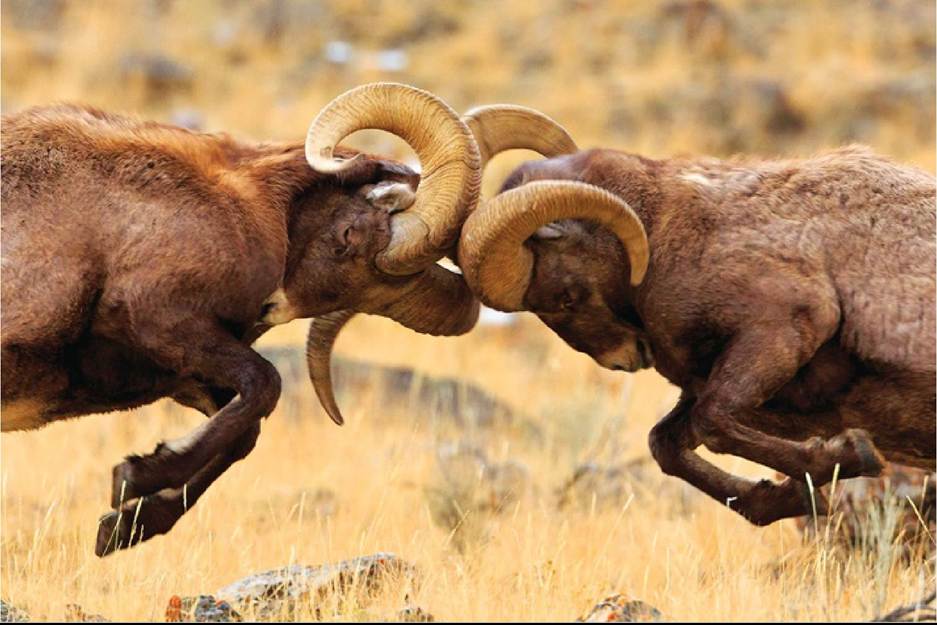
FIGURE 6.1 Fighting over the Right to Mate Two bighorn rams butt heads to establish dominance and mating rights. Large horns are beneficial to a ram's success with this dominance ritual. © Jason Savage Back to text
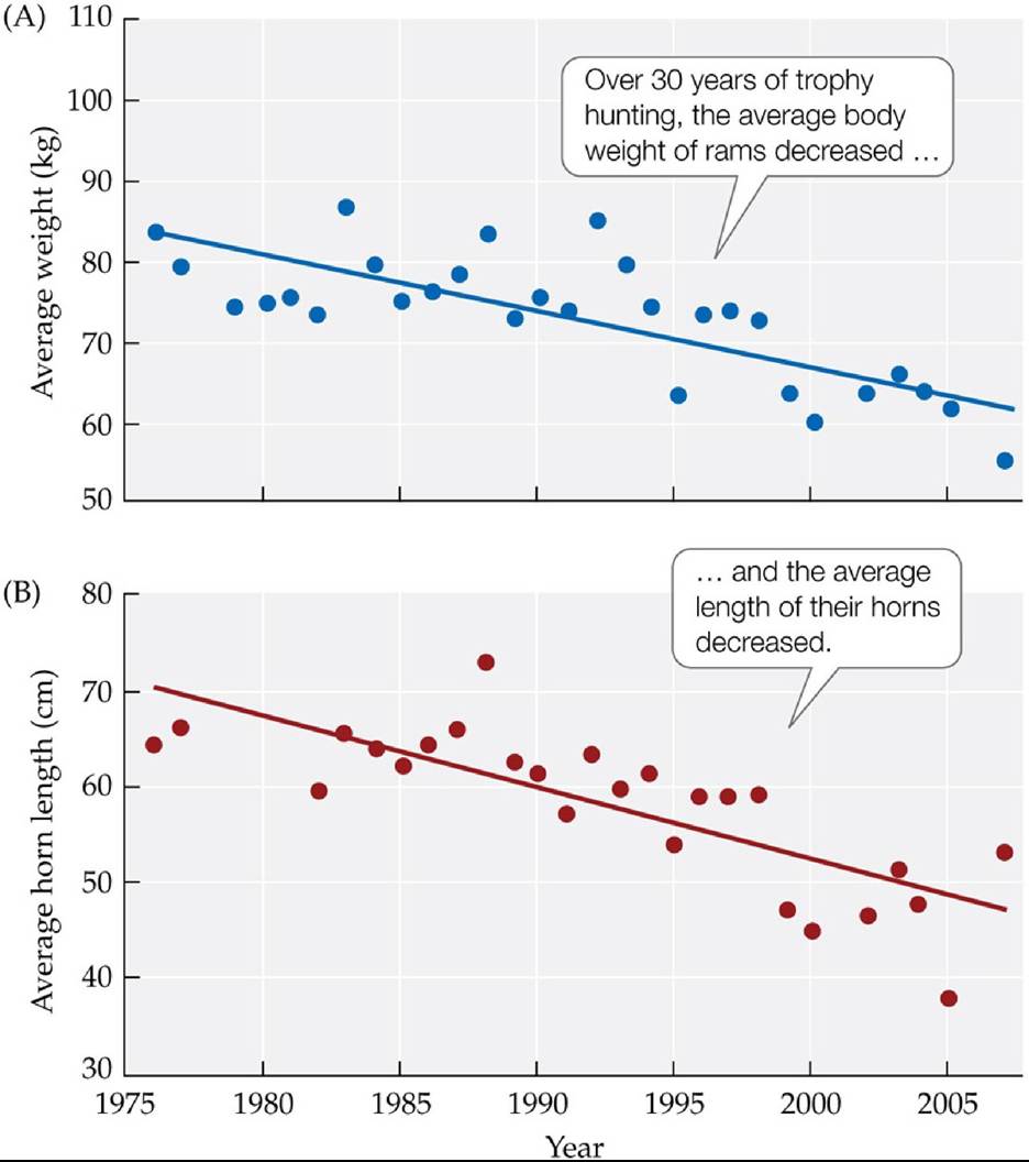
FIGURE 6.2 Trophy Hunting Decreases Ram Body and Horn Size Coltmanand colleagues tracked the body weights (A) and horn lengths (B) of rams in a bighorn sheep population on Ram Mountain (Alberta, Canada) that was subjected to trophy hunting over a 30year period. The changes in horn length occurred across multiple generations of sheep and thus indicate a change in the average characteristics of the sheep born from one generation to the next. (After D. W. Coltman et al. 2003. Nature 426: 656-658.) Back tθ text
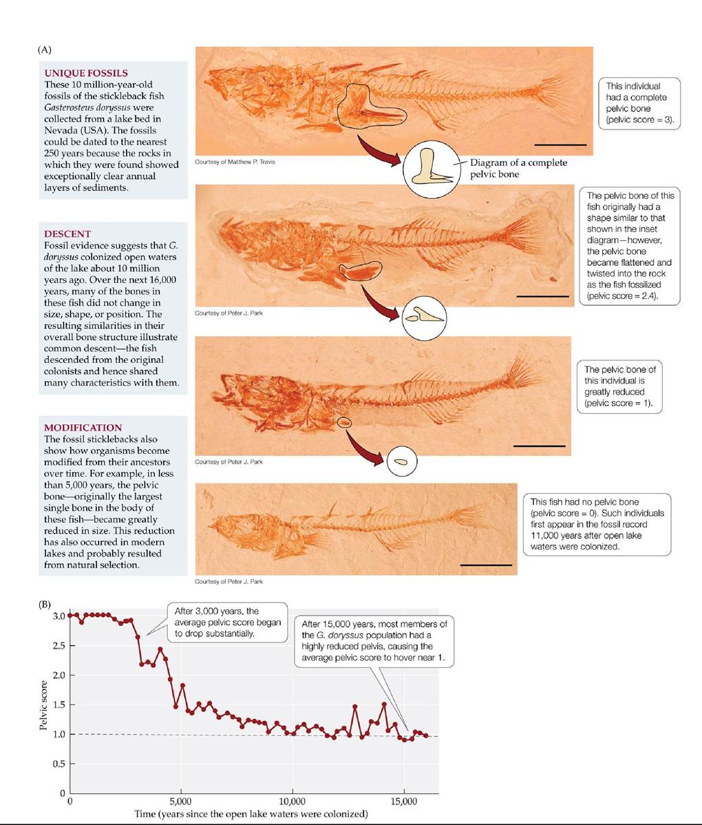
FIGURE 6.3 Descent with Modification Michael Bell and colleagues have analyzed thousands of 10-million-year-old fossils of the stickleback fish Gasterosteus doryssus. Their specimens are unique in that the lake bed in which they were found is so finely layered that the ages of the fossils can be determined to the nearest 250-year interval. (A) Representative G.
doryssus fossils, showing how the pelvic bone became reduced over time; the scale bar for each fossil is 1 cm. (B) The average pelvic score at different times. Fossil pelvic bones were scored by size according to a scale that ranged from 3 (complete bone) to 0 (no bone). (B after M. A. Bell et al. 2006. Paleobiology 32: 562-577.) Back tθ text
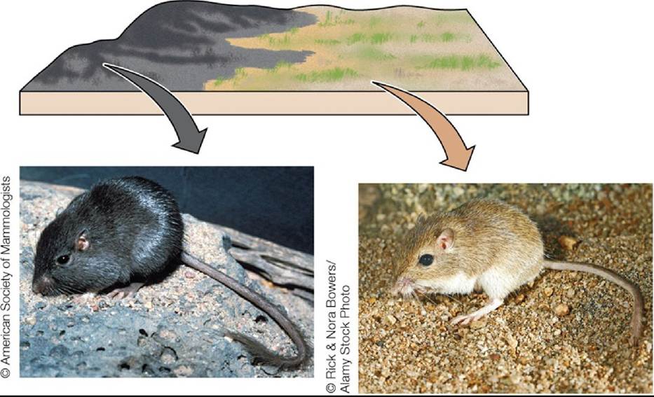
FIGURE 6.4 Natural Selection Can Result in Differences between Populations Populations of rock pocket mice (Chaetodipus intermedius) that live on dark lava formations in Arizona and New Mexico have dark coats, while nearby populations that live on light-colored rocks have light coats. In each population, natural selection has favored individuals whose coat colors match their surroundings, making them less visible to predators. Back to text
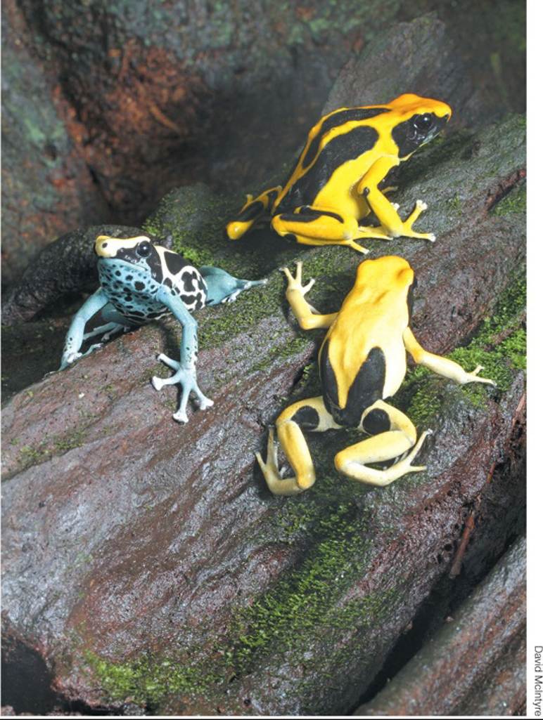
FIGURE 6.5 Individuals in Populations Differ in Their Phenotypes Poisondartfrogs (Dendrobates tinctorius) show great variation in color and pattern. Native to northern South America, these frogs live in isolated patches of forest. Their bright colors are thought to serve as a warning to predators of a poison excreted from their skin. Individual frogs likely also differ in other morphological traits as well as in biochemical, behavioral, and physiological traits. Back to text
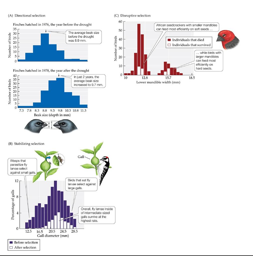
FIGURE 6.6 Three Types of Natural Selection (A) Directional selection favors individuals at one phenotypic extreme. A prolonged drought in the Galapagos archipelago resulted in directional selection on the beak size of the seed-eating medium ground finch (Geospiza fortis). As a result of the drought, most of the available seeds were large and hard to crack, so birds with large beaks, which could more easily crack those seeds, had an advantage over birds with smaller beaks. (B) Stabilizing selection favors individuals with an intermediate phenotype. Eurosta flies parasitize goldenrod plants, causing the plant to produce a gall in which the fly larva matures as it feeds on the plant. The preferences of Eurosta's own predators and parasites result in stabilizing selection on gall size. Field observations showed that wasps that parasitize and kill the fly larvae prefer small galls, while birds that eat the fly larvae prefer large galls. As a result, larvae in galls of intermediate size have an advantage. (C) Disruptive selection favors individuals at both extremes. African seedcrackers (Pyrenestes ostrinus) depend on two major food plants in their
environment. Birds with smaller mandible sizes can feed on one plant's soft seeds most efficiently, while birds with larger mandibles can feed on the other plant's hard seeds most efficiently. Thus, individuals with mandible sizes that are either relatively small or relatively large have an advantage.
In (B), do birds or wasps appear to provide stronger selection pressure on gall size? Explain.
(A after B. R. Grant and P. R. Grant. 2003. BioScience 53: 965-975; B after A. E. Weis and W. G. Abrahamson. 1986. Am Nat 127: 681-695; C after T. B. Smith. 1993. Nature 363: 618-620.) Back tθ text
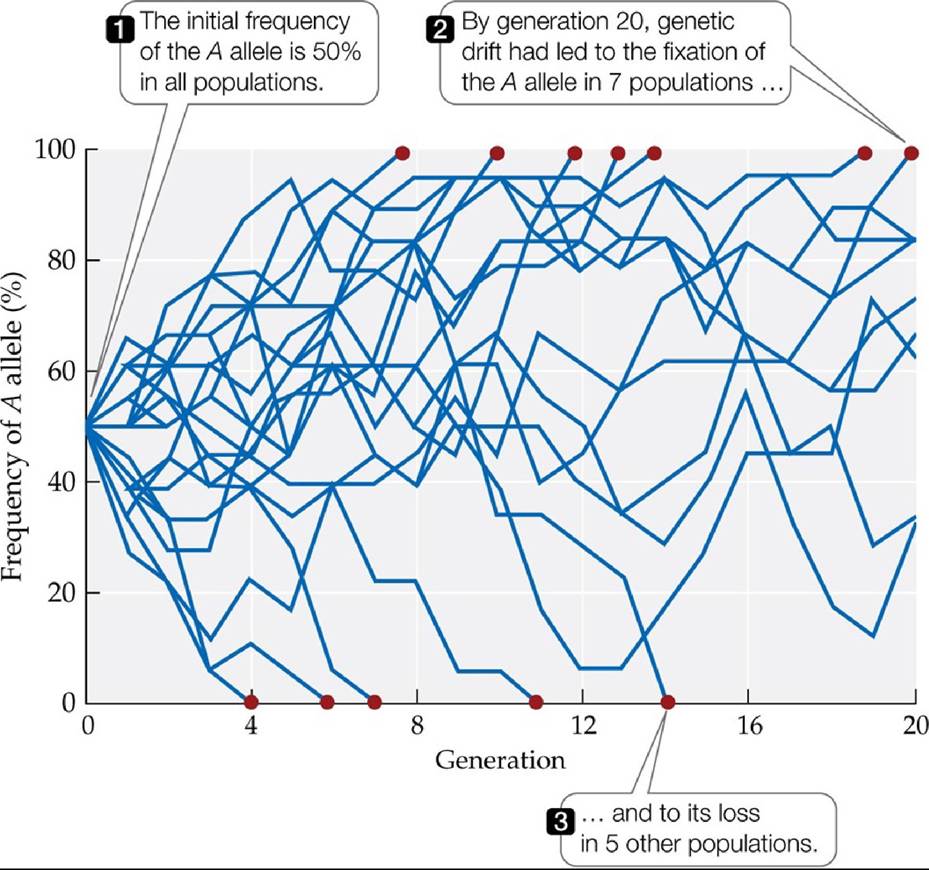
FIGURE 6.7 Genetic Drift Causes Allele Frequencies to Fluctuate at Random Resultsof a computer simulation of genetic drift in 20 populations for a gene with two alleles, A and a. Each population has nine diploid individuals (18 alleles) in each generation. In small populations such as these, genetic drift has rapid effects.
At the start of the simulation, how many A alleles and how many a alleles did each population have? At generation 20, how many populations still had both alleles? Predict what would eventually happen to the frequency of the A allele in those populations.
(After D. Hartl and A. Clark. 1989. Principles of Population Genetics, 2nd ed. Oxford University Press/Sinauer: Sunderland, MA.) Back tθ text
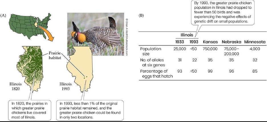
FIGURE 6.8 HarmfulEffectsofGeneticDrift (A) As a result of habitat loss, the Illinois population of greater prairie chickens dropped from millions of birds in the 1800s to 25,000 in 1933 and, finally, to fewer than 50 birds in 1993. (B) As the Illinois population shrank in size, genetic drift led to a loss of alleles and to a rise in the frequencies of harmful alleles, thereby reducing egg-hatching rates. The table compares the 1993 Illinois populations with historical populations in Illinois and with populations in Kansas, Nebraska, and Minnesota, none of which experienced as severe a drop in population size. (After J. L. Bouzat et al. 1998. Am Nat 152: 1-6; R. C. Anderson. 1970. Trans Illinois State Acad Sci 63: 214. CC BY-NC-SA 4.0.) Back tθ text
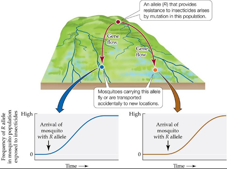
FIGURE 6.9 Gene Flow: Introducing Alleles for Insecticide Resistance Inthisidealized scenario, an allele that causes resistance to organophosphate insecticides arises by mutation in one population of mosquitoes and then spreads by gene flow to two other populations. If mosquitoes in those two other populations are exposed to the insecticide, natural selection causes the frequency of the resistance allele to increase rapidly. Back to text
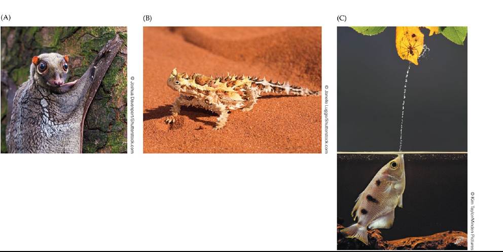
FIGURE 6.10 SomeStrikingAdaptations (A) The extensive skin extending from the neck to the limbs and to the toes and fingers of the Sundra flying lemur (Galeopterus variegatus) allows this animal to glide from tree to tree in the rainforest canopies of Southeast Asia. (B) The thorny devil (Moloch horridus) has adapted to withstand the dry scrubland and desert of central Australia. The animal's scales are ridged so that it can absorb water by simply touching it. (C) This archerfish (Toxotes chatareus) catches a spider by shooting a jet of water into the air. Field observations show that these fish will squirt repeatedly at potential prey and that they can reliably hit targets at heights of up to eight times their body length. Back to text
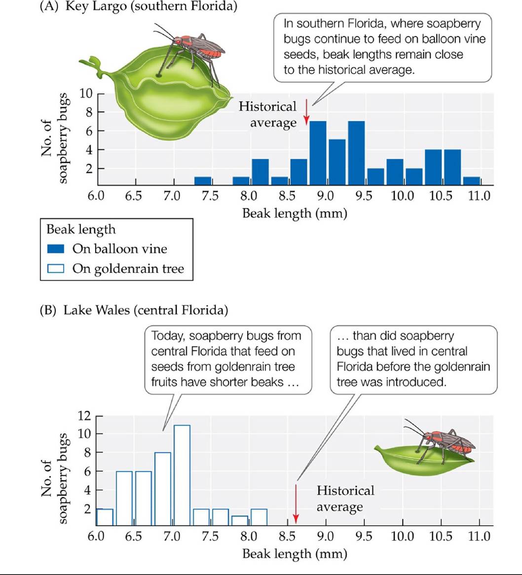
FIGURE 6.11 Adaptive Evolution in Soapberry Bugs Soapberry bug populations in southern Florida feed on the seeds of their native host, the balloon vine (A), while soapberry bug populations in central Florida feed on the seeds of an introduced plant, the goldenrain tree (B). The beak lengths of insects feeding on the goldenrain tree decreased by 26% in 35 years,
providing a better match to the smaller fruits of this introduced plant. Red arrows indicate beak length historical averages (obtained from museum specimens collected before the introduction of goldenrain trees). (After S. P. Carroll and C. Boyd. 1992. Evolution 46: 1052-1069.) Back tθ text
FIGURE 6.12 Rapid Adaptive Evolution in Anole Lizards Hurricanes can be a very strong selective force for anole lizards found on small islands in the Caribbean Sea. Following two hurricanes in a 2-week period, researchers found that, compared to the lizards analyzed prior to the hurricane, the surviving lizards had wider footpads and shorter legs (A), which are two genetically based traits. These traits were experimentally shown to enhance the ability of the lizards to cling to dowels resembling branches under high winds (B). Back to text
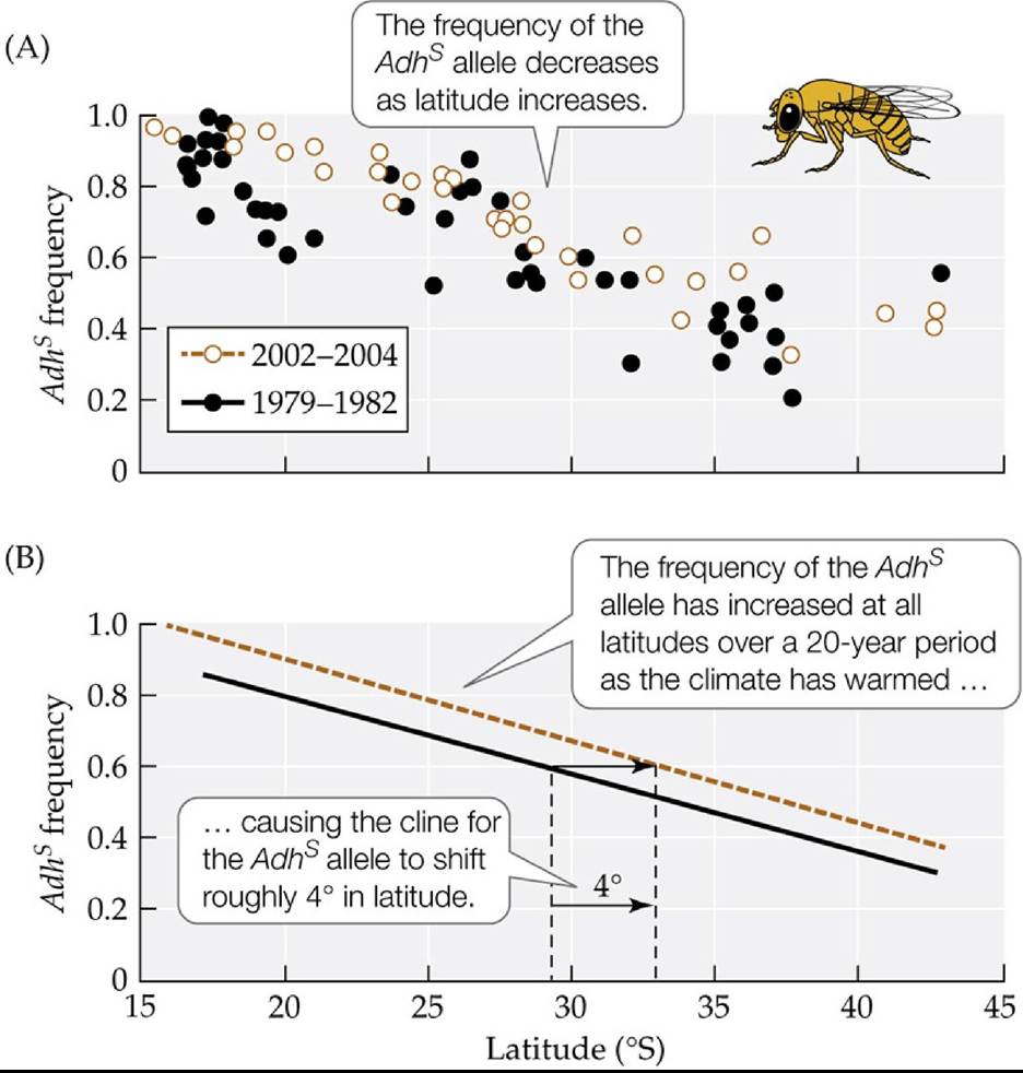
FIGURE 6.13 Rapid Adaptive Evolution on a Continental Scale TheAdhgeneencodesa metabolically important enzyme, alcohol dehydrogenase, used to detoxify alcohol. Previous field and laboratory studies indicate that the Adhs allele of this gene is selected against in cooler environments, such as those found at high latitudes. (A) Frequencies of the Adhs allele in coastal Australian Drosophila melanogaster populations in 1979-1982 and in 2002-2004. (B) Regression lines calculated from the data in part A show that between 1979-1982 and 2002-2004, the cline of the Adhs allele shifted 4° toward the South Pole as the region's average temperatures increased by 0.5°C. (After P. A. Umina et al. 2005. Science 308: 691-693.) Back tθ text
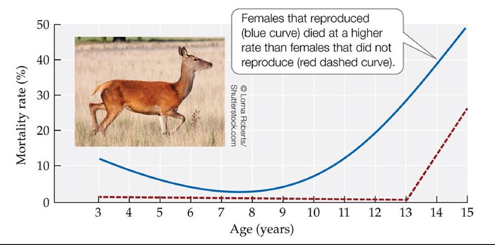
FIGURE 6.14 Trade-Off between Reproduction and Survival Female red deer that reproduced had a lower probability of surviving to the next year than did females that did not reproduce, as the energy and resources invested into rearing young made reproducing red deer more susceptible to disease and environmental stress.
Is the additional risk of mortality that results from reproduction the same for females of all ages? Explain.
(After T. H. Clutton-Brock et al. 1983. JAnimEcol 52: 367-383.) Back tθ text
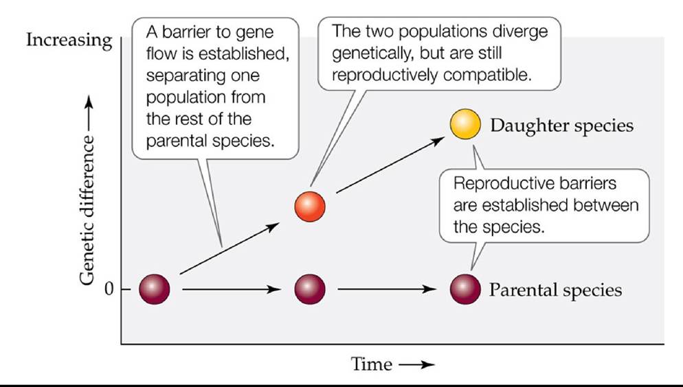
FIGURE 6.15 Speciation by Genetic Divergence Once genetic divergence begins, the time required for speciation varies tremendously, from a single generation (perhaps a single year), to a few thousand years, to millions of years in most cases. Back to text
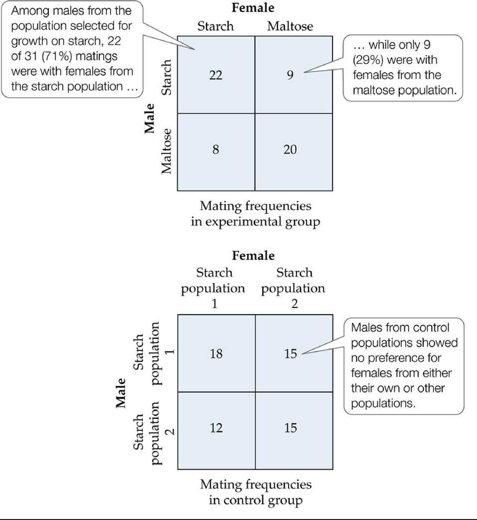
FIGURE 6.16 Reproductive Barriers Can Be a By-Product of Selection Afterlyear (about 40 generations) in which experimental populations of Drosophila pseudoobscura fruit flies were selected for growth on different sources of food, most matings occurred between flies selected to feed on the same food source. No such mating preference was observed in control populations that were not subjected to selection, regardless of whether the control populations were reared on starch (shown here) or maltose (not shown). To reduce the chance that the food eaten by the larvae would produce a body odor in adults that influenced the results, all flies used in the mating preference tests were reared for one generation on a standard cornmeal medium.
(After D. M. B. Dodd. 1989. Evolution 43: 1308-1311.) Back tθ text
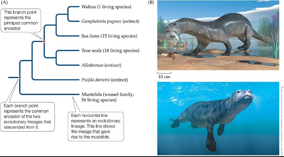
Both reconstructions © Canadian Museum of Nature
FIGURE 6.17 An Evolutionary Tree of the Pinnipeds (A)Thisbranchingtreeisa representation of the evolutionary history of modern seals and their close relatives that is based on recent fossil finds. This research indicates that the marine mammals known as pinnipeds probably share a common ancestor with modern weasels and their relatives. (B) Reconstructions of Puijila darwini based on fossils show that extinct close relatives of pinnipeds were similar morphologically to some living mustelids, such as otters. P. darwini appears to have foraged both on land (above) and in the water (below). (A after N. Rybczynski et al. 2009. Nature 458: 1021-1024.) Back to text
FIGURE 6.18 Life Has Changed Greatly over Time Back to text
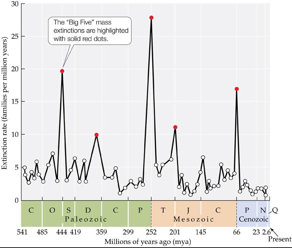
FIGURE 6.19 The “Big Five” Mass Extinctions Five peaks in extinction rates are revealed by a graph of extinction rates over time in families of marine invertebrates. Back to text
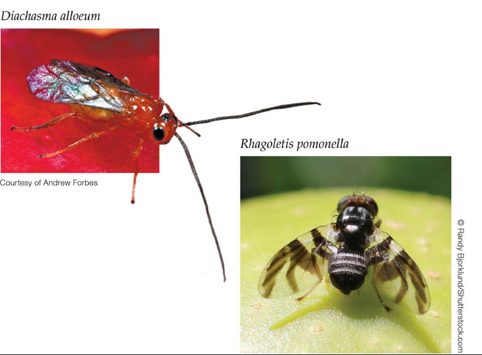
FIGURE 6.20 A Chain of Speciation Events Driven by Ecological Interactions? In the last 200 years, populations of the fly Rhagoletis pomonella that feed on apples have diverged genetically from their parent species, forming an incipient fly species. This change also appears to be leading to the formation of a new wasp species, Diachasma alloeum, that parasitizes members of apple-feeding Rhagoletis populations. Back to text
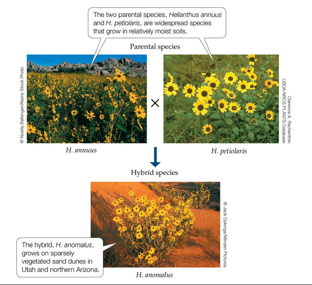
FIGURE 6.21 A Hybrid That Lives in a New Environment The two sunflower species
Helianthus annuus and H. petiolaris gave rise to a new hybrid species, H. anomalus. This species grows in a drier environment than either of the two parental species. Back to text
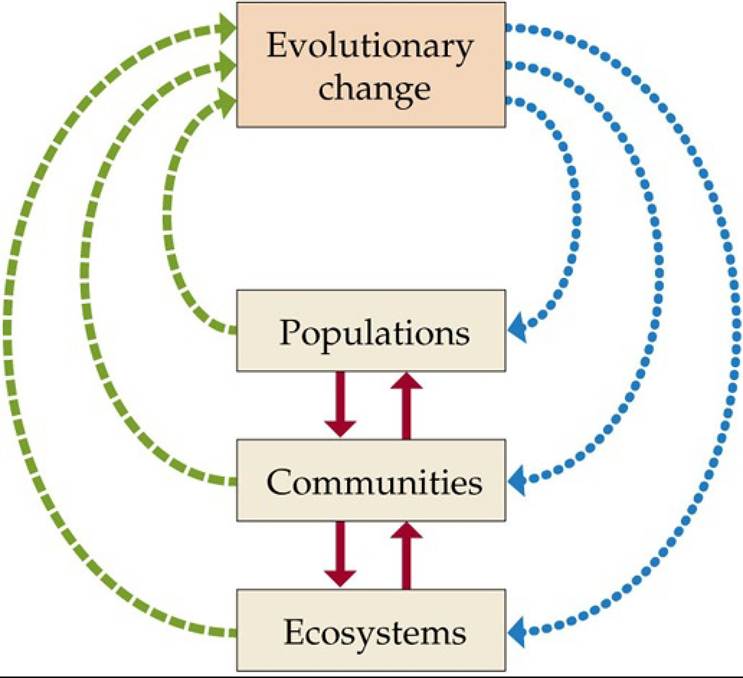
FIGURE 6.22 Rapid Feedback Effects Can Occur between Ecological and Evolutionary
Factors Ecological change in a population, community, or ecosystem can drive evolutionary change over short periods of time (green, dashed arrows). Similarly, evolutionary change can alter events at the population, community, or ecosystem level (blue, dotted arrows). A change at one level of ecological organization can cause additional changes at other levels (red, solid arrows), as when an increase in the population size of one species alters nutrient cycling in ecosystems. Back to text
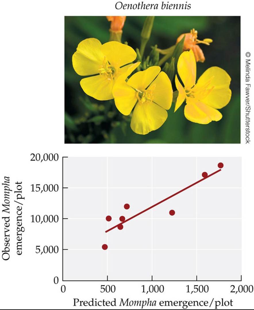
FIGURE 6.23 Feedback of Food Plant Evolution on Insect Abundance Caterpillarsofthe moth Mompha brevivittella eat the seeds of the evening primrose (Oenothera biennis). Some plant genotypes are more resistant to moth attack than others, indicating that moth abundance could change depending on plant genotype frequencies. In a 3-year field experiment, evolutionary changes in O. biennis genotype frequencies were correlated to moth abundance, indicating a feedback from evolution to ecology.
Suppose that eco-evolutionary feedbacks between changes in plant genotype frequency and moth abundance did not occur. Redraw this figure assuming that was the case.
(After A. A. Agrawal et al. 2013. Am Nat 181: S35-S45.) Back tθ text
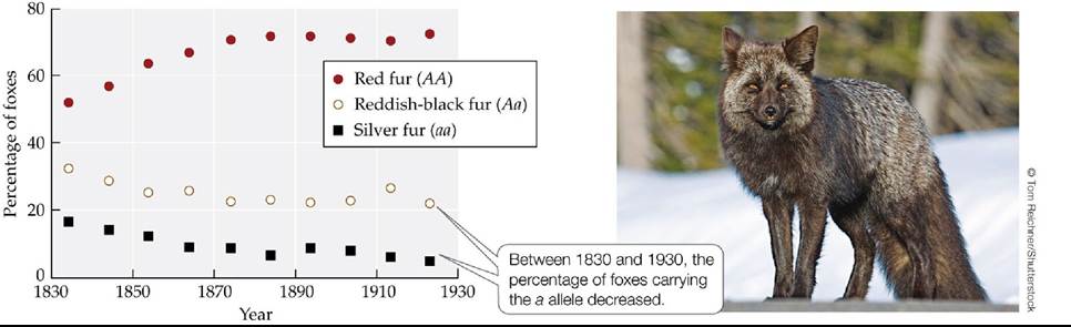
FIGURE 6.24 Hunting Resulted in the Decline of Silver Foxes Individualredfoxes (Vulpes fulva) of genotype AA have red fur, and individuals of genotype Aa have reddish-black fur. Individuals of genotype aa are known as “silver foxes” because the tips of their hairs have a silver tint (photo). Hunters preferentially killed silver foxes because their furs yielded 2.5-4 times the price of other red fox furs.
Based on the graph, estimate the initial (ca. 1832) and final (ca. 1923) frequencies of genotypes AA, Aa, and aa. Next, use the genotype frequencies that you estimated to compute the initial and final frequencies of the a allele. Hint: See footnote in Concept 6.1.
(After C. S. Elton. 1942. Voles, Mice and Lemmings: Problems in Population Dynamics. Oxford University Press: Oxford.) Back to text
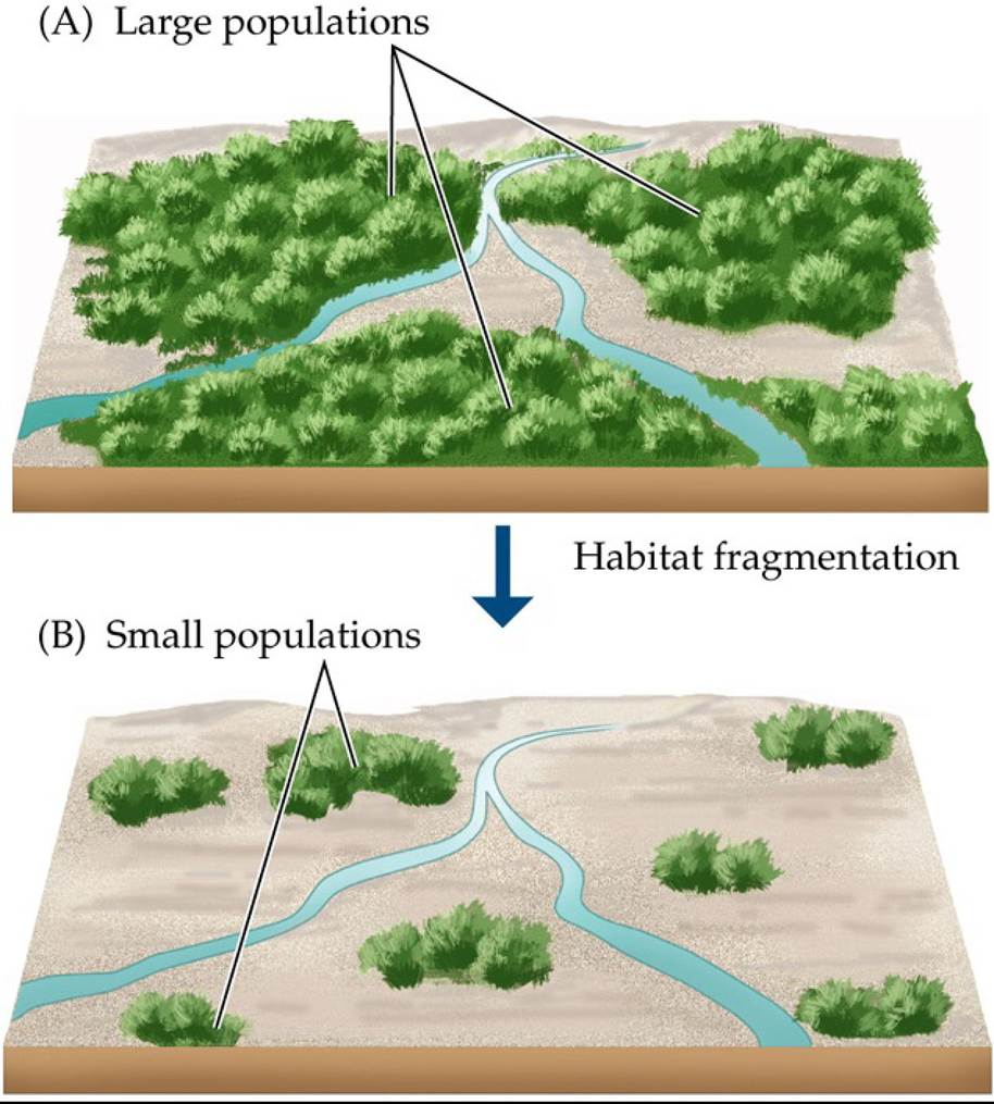
FIGURE 6.25 Evolutionary Effects of Habitat Fragmentation on a Hypothetical Species
(A) Prior to habitat fragmentation, there are many individuals in each population of the species, and the distances between populations are short. (B) When human activities remove large portions of the habitat, the population sizes shrink, and the distances between populations increase, causing evolutionary changes that decrease the potential for adaptive evolution of the species and increase its risk of extinction. Back to text
7 Life History
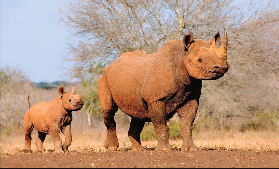
FIGURE 7.1 Offspring Vary Greatly in Size and Number Organismsproducealarge range of offspring numbers and sizes. A rhinoceros produces a single calf that weighs 40-65 kg (90-140 pounds). On the other end of the spectrum, many plants produce hundreds to thousands of seeds that are less than a millimeter long and weigh as little as 0.8 μg (roughly one fifty-billionth the weight of a rhinoceros calf). © Jiri Balek/Shutterstock.com Back to text

FIGURE 7.2 Life in a Sea Anemone Clownfish (Amphiprion percula) form hierarchical groups of unrelated individuals that live and reproduce among the tentacles of their anemone host (Heteractis magnifica).
Predict the sex of each of these clownfish (assuming that they live together as a group of four fish in an anemone host). Explain your answer.
Back to text
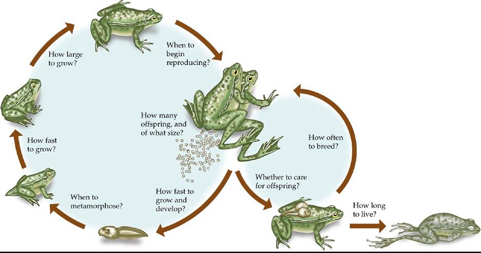
FIGURE 7.3 Life History Strategy The timing and nature of life history events shapes the overall life cycle of an organism. Although life history options are presented here as questions, the life history strategy is determined by effects of natural selection, not the choices of the individual organism. Back to text
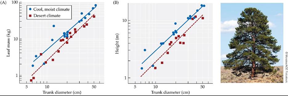
FIGURE 7.4 Plasticity of Growth Form in Ponderosa Pines (A) Ponderosa pine trees (Pinus ponderosa) in cool, moist climates allocate more resources to leaf production than do trees in desert climates. (B) Desert trees are shorter than those grown in cooler climates, but for a given height, they have thicker trunks.
Use the solid (regression) line in (B) to estimate the trunk diameter of a tree that is 5 m tall and grows in a cool, moist climate versus the trunk diameter of a tree of the same height that grows in a desert climate.
(After R. M. Callaway et al. 1994. Ecology 75: 1474-1481.) Back tθ text
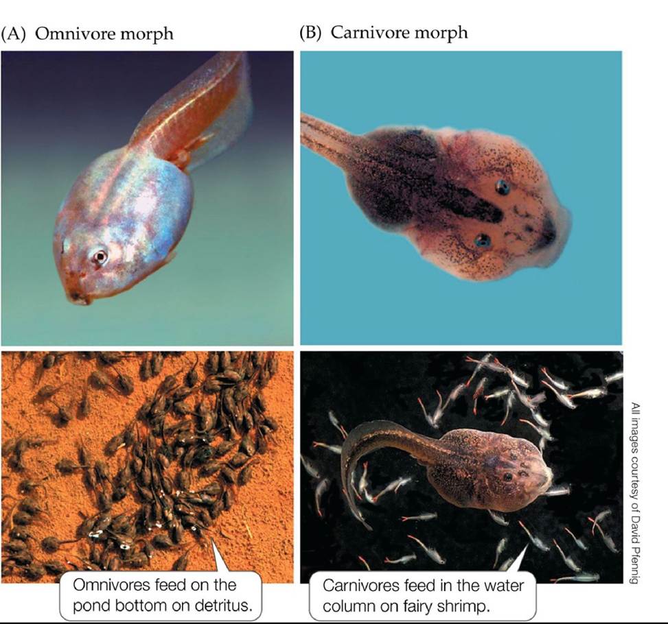
FIGURE 7.5 Phenotypic Plasticity in Spadefoot Toad Tadpoles Spadefoot toad (Spea
multiplicata) tadpoles can develop into small-headed omnivores (A) or large-headed carnivores (B), depending on the food they consume early in development. Later in development, omnivores and carnivores feed on different food sources that are located in different portions of their habitat. Back to text
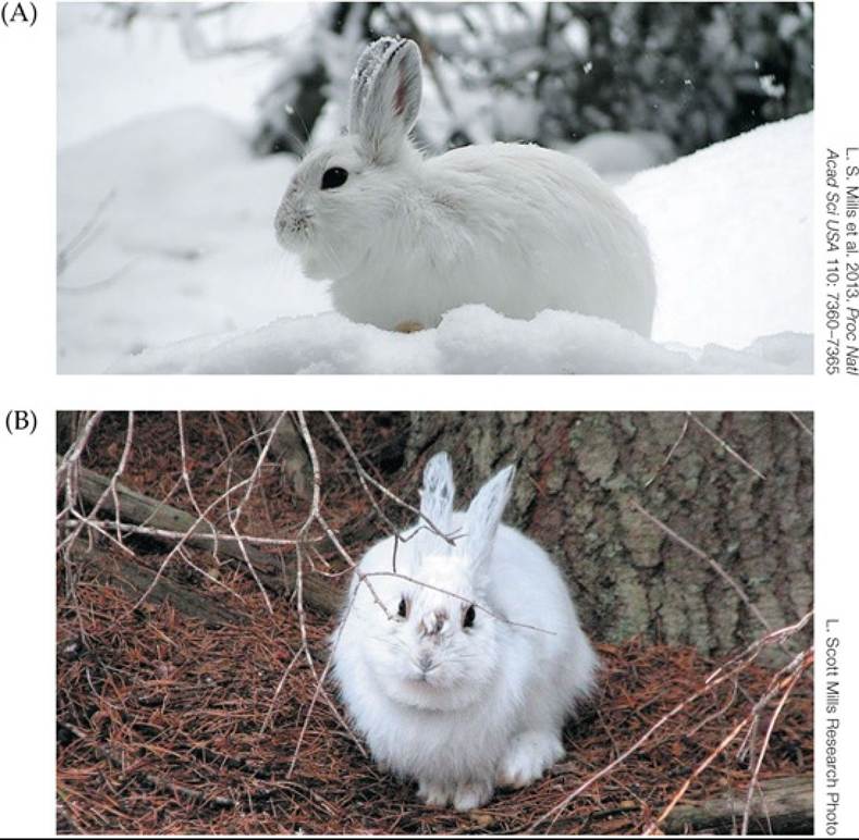
FIGURE 7.6 Camouflage Mismatch in Snowshoe Hares (A) Historically, snowshoe hares changed their color from brown to white at a time of year that matched the onset of snowfall, causing them to be well-camouflaged all winter. (B) With climate warming, snowfall now begins later in the year. However, the date of the fall coat-color change has remained the same, causing an increase in the number of days that snowshoe hares experience a camouflage mismatch. Back to text
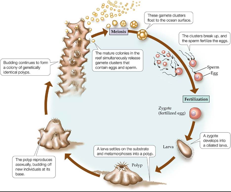
FIGURE 7.7 Life Cycle of a Coral Reef-forming coral colonies grow by asexual reproduction before producing eggs and sperm. The sexually produced offspring establish new colonies.
Would the larva shown in the diagram be genetically identical to the polyp to its left? Would two different larvae be genetically identical to each other? Explain.
Back to text
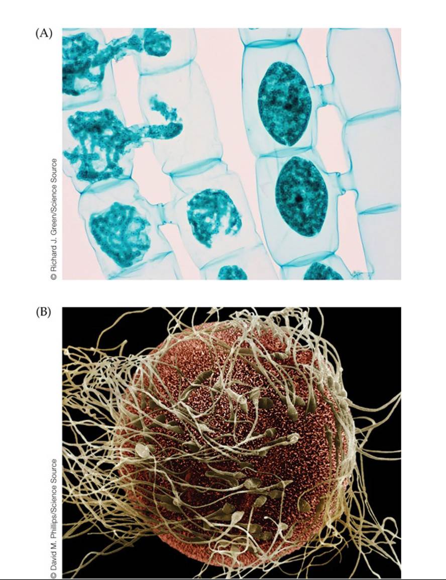
FIGURE 7.8 IsogamyandAnisogamy (A) An isogamous species: two gametes of the single-celled alga Spirogyra fusing. (B) An anisogamous species: fertilization of a human egg, showing the difference in size between egg and sperm. Back to text
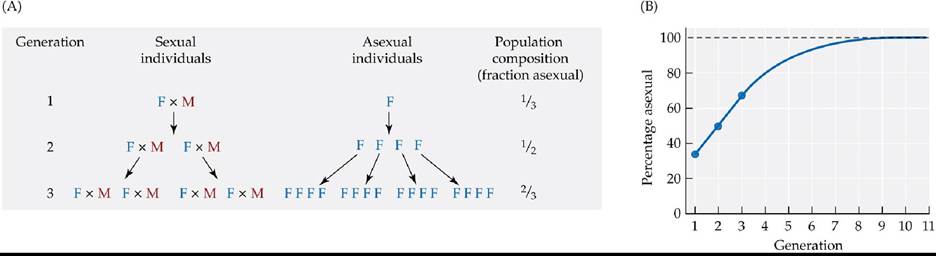
FIGURE 7.9 The Cost of Sex One cost of sex is referred to as the “cost of males.” Imagine a population in which there are both sexual and asexual individuals. Assume that each sexual or asexual female can produce four offspring per generation, but half of the offspring produced by the sexual females are male and must pair with females to produce offspring. Under these conditions, the asexual individuals (A) will increase in number more rapidly and (B) in less than 10 generations will constitute nearly 100% of the population.
In generation 2 there are four sexual and four asexual individuals. How many sexual and asexual individuals are there in generation 3? How many of each will there be in generation 4? Explain your results in terms of the cost of males.
Back to text
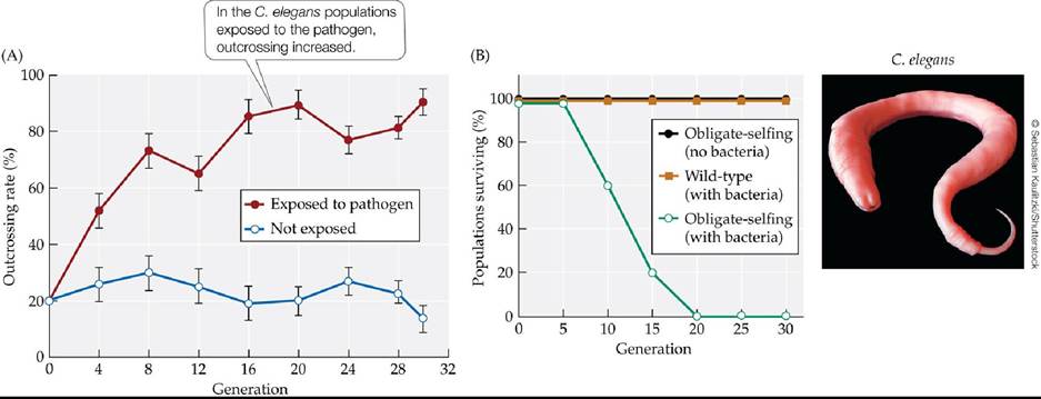
FIGURE 7.10 Benefits of Sex in a Challenging Environment (A) Outcrossing rates were measured over time in wild-type populations of the nematode worm Caenorhabditis elegans.
Some C. elegans populations were exposed to the bacterial pathogen Serratia marcescens, while others were not. Error bars show ± one standard error of the mean. (B) Percentage of replicate wild-type and obligate-selfing C. elegans populations surviving under different treatments.
In (A), which curve shows results for the control populations? Explain your choice and interpret the results shown by the two curves.
(After L. T. Morran et al. 2011. Science 333: 216-218.) Back tθ text
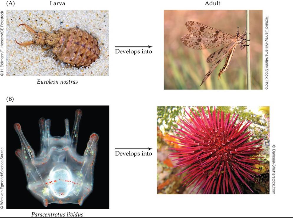
FIGURE 7.11 The Pervasiveness of Complex Life Cycles Most groups of animals include members that undergo metamorphosis. (A) Familiar examples are insects such as the antlion, which develops from a larva that lives in soil. (B) Most marine invertebrates have free-swimming larval stages, including echinoderms such as sea urchins. Back to text
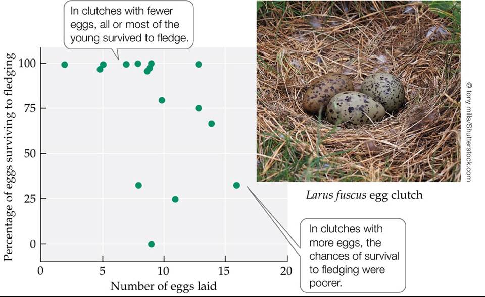
FIGURE 7.12 ClutchsizeandSurvival Lesser black-backed gulls typically lay three eggs in a clutch. However, when they are manipulated experimentally to produce larger clutches of eggs, their offspring have reduced chances of survival to fledging. (After R. G. Nager et al. 2000. Ecology 81: 1339-1350.) Back tθ text

FIGURE 7.13 Seed Size-Seed Number Trade-Offs in Plants (AfterO. A. Stevens. 1932.Am
JBot 19: 784-794.) Back tθ text
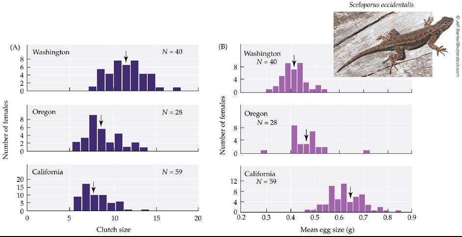
FIGURE 7.14 Egg Size-Egg Number Trade-Off in Fence Lizards Western fence lizards in northern populations produced (A) larger clutches and (B) smaller eggs than those in southern populations. The arrow points to the average for each population. (After B. Sinervo. 1990. Evolution 44: 279-294.) Back tθ text
David McIntyre
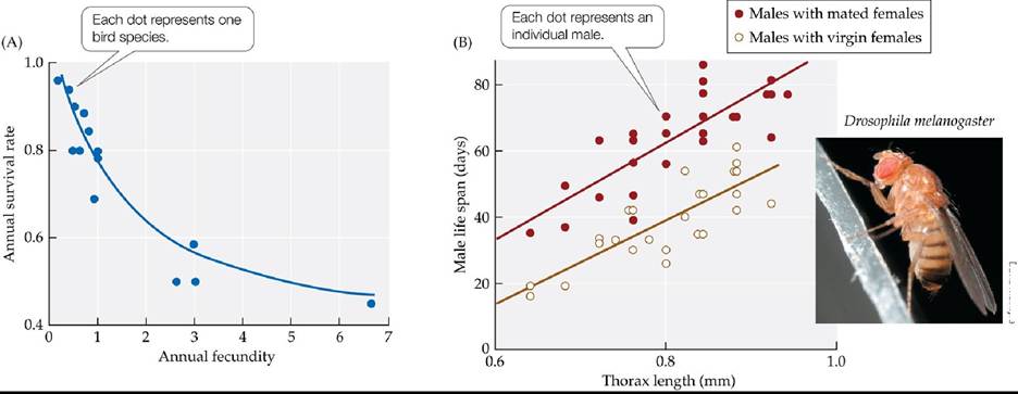
FIGURE 7.15 Trade-Offs between Reproduction and Survival (A) In a comparison of 14 different bird species, the annual survival rate declines as annual fecundity increases. (B) Life span versus size (thorax length in millimeters) for male Drosophila kept with eight virgin females
or eight previously mated females. Regression lines represent average male life spans.
In (B), what is the average life span of male flies with a 0.8-mm thorax kept with virgin females? How does this compare with that of males of the same size kept with previously mated females?
(A after R. E. Ricklefs. 1977. Am Nat 111: 453-478; B after L. Partridge and M. Farquhar. 1981. Nature 294: 580-582.) Back tθ text
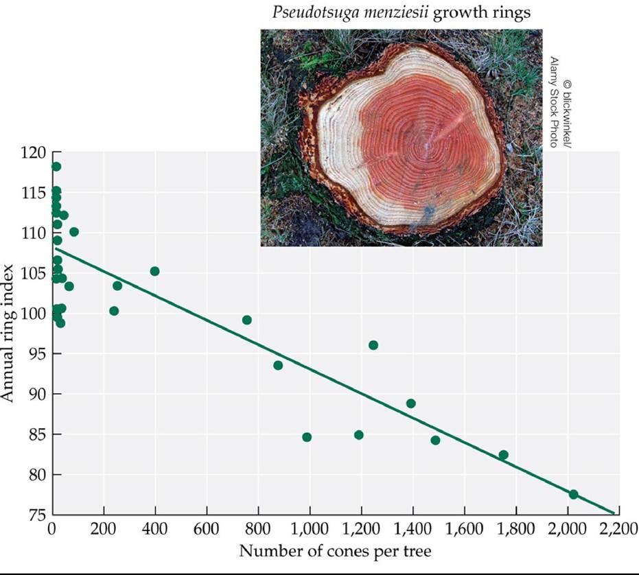
rings (a measure of growth rate) declines in Douglas fir trees that produce many cones. (After S. Eis et al. 1965. Can JBot 43: 1553-1559.) Back tθ text
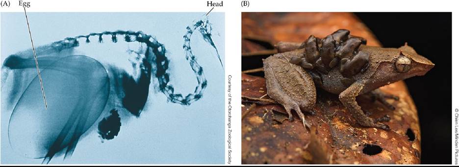
FIGURE 7.17 ParentalInvestment (A) This X-ray photograph shows the size of a kiwi egg in proportion to the female's body size. (B) A male horned land frog (Sphenophryne cornuta) carries its young on its back, from tadpole stage to small offspring, as shown here. Back to text
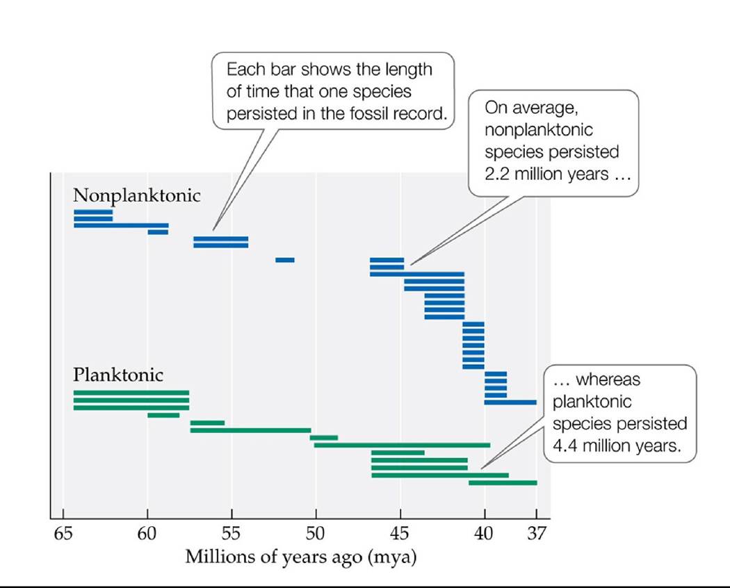
FIGURE 7.18 Developmental Mode and Species Longevity Species of marine snails that undergo direct development without a swimming larval stage (nonplanktonic) have become extinct more rapidly than those with swimming larvae (planktonic). (After T. A. Hansen. 1978. Science 199: 885-887.) Back tθ text
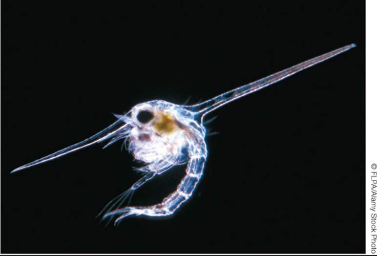
FIGURE 7.19 Specialized Defensive Structures in Marine Invertebrate Larvae The planktonic (floating) larvae of the sand crab Corystes Cassivelaunus have defensive head spines that can make them difficult for fish to eat. Back to text
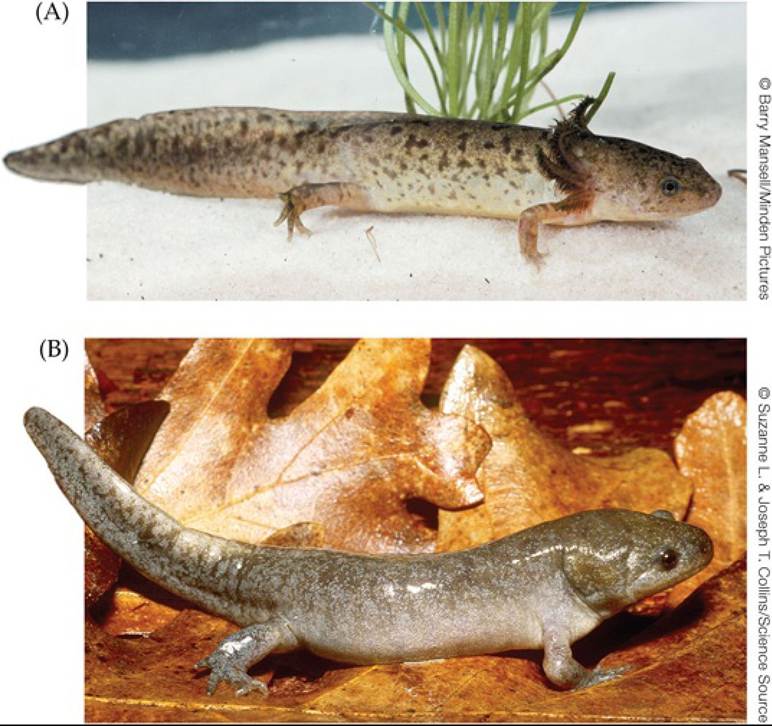
FIGURE 7.20 Paedomorphosis in Salamanders The mole salamander Ambystoma talpoideum can produce both (A) paedomorphic aquatic adults and (B) terrestrial metamorphic adults. Back to text
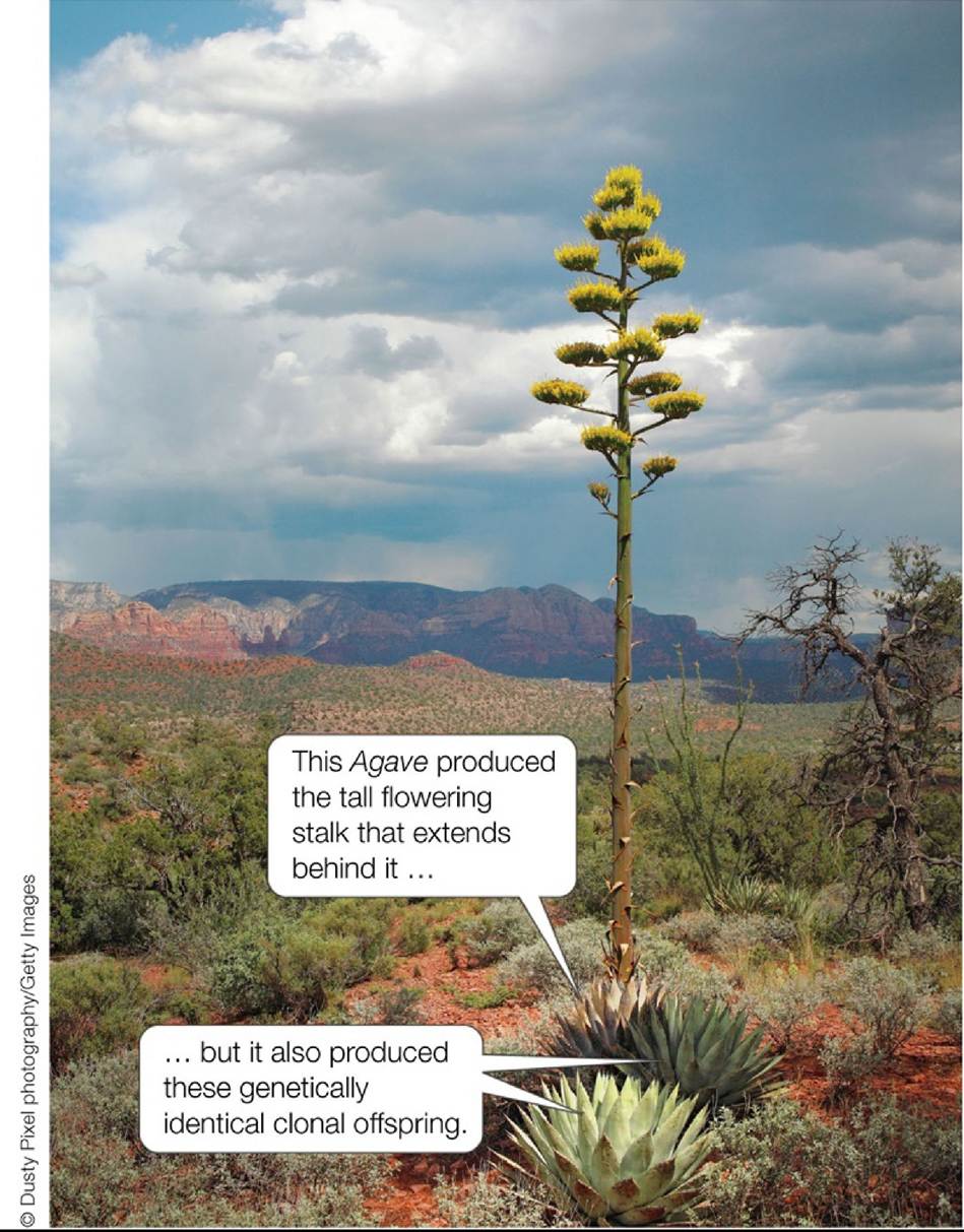
FIGURE 7.21 Agave: A Semelparous Plant? The Agave individual that produced the tall
flowering stalk will die shortly after it flowers and so can be viewed as semelparous. But the individual that flowered also produced genetically identical clonal offspring. Thus, the genetic individual will live on after flowering, and in that sense it is not semelparous after all. Back to text
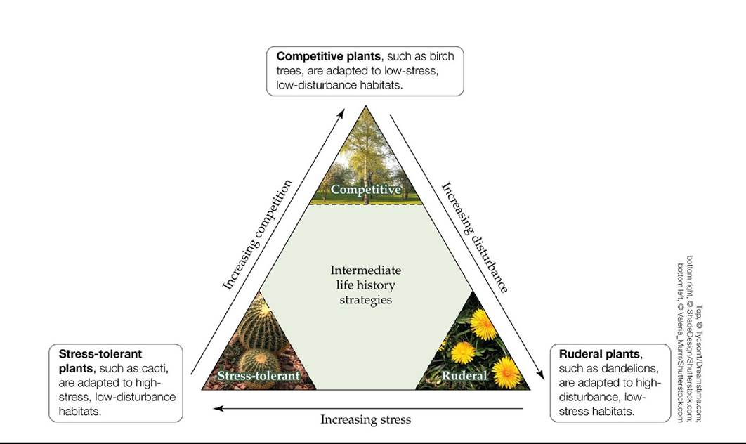
FIGURE 7.22 Grime's CSR Model Grime categorized plant life histories within a triangle whose axes indicate the degree of competition, disturbance, and stress in the habitat type to which plants are adapted. Intermediate life history strategies are shown in the center of the triangle. (After J. P. Grime. 1977. Am Nat 111: 1169-1194.) Back tθ text
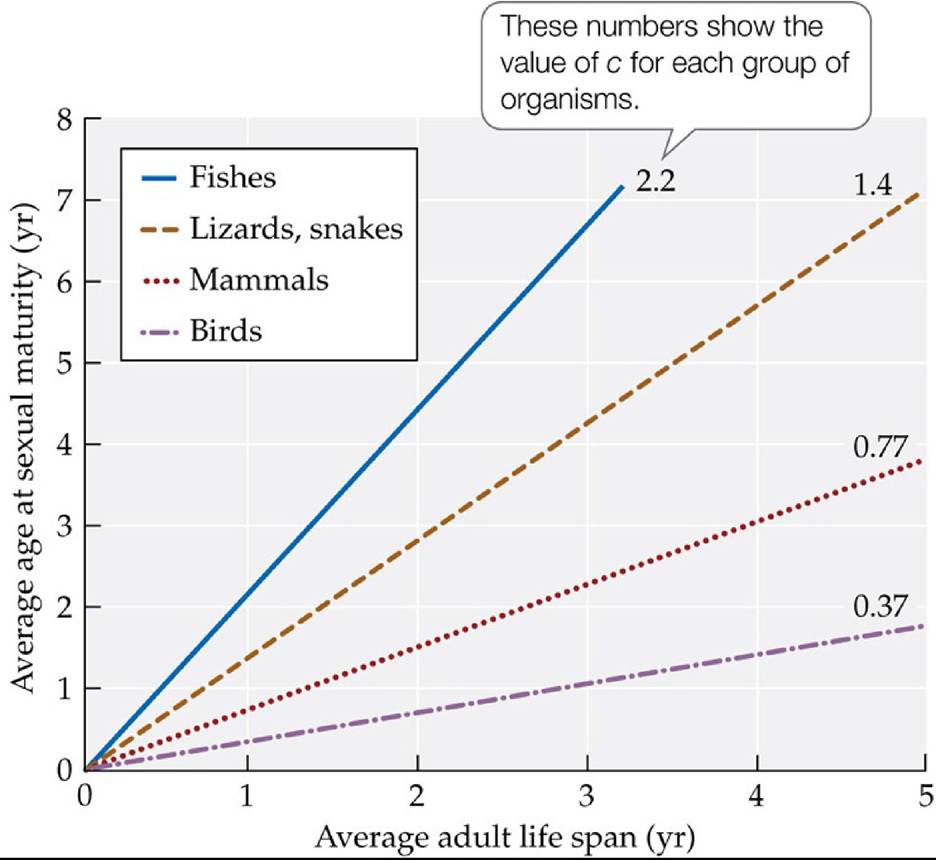
FIGURE 7.23 ADimensionlessLifeHistoryAnalysis Theaverageageatwhichfemales reach sexual maturity is plotted against the average female life span for different groups of organisms. The slope of each line yields the dimensionless ratio c: the average age of maturity divided by the average life span.
In groups of organisms for which c > 1, do most individuals live long enough to reproduce? Explain.
(After E. L. Charnov and D. Berrigan. 1990. Evol Ecol 4: 273-275.) Back tθ text
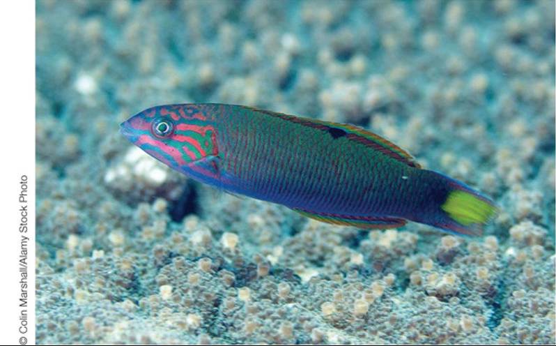
FIGURE 7.24 SequentialHermaphroditism Themoonwrasse(Thalassomalunare) exhibits sequential hermaphroditism. Wrasses live among coral reefs in tropical and temperate seas. In some species, a change in sex, from female to male, may be accompanied by a change in color. Back to text
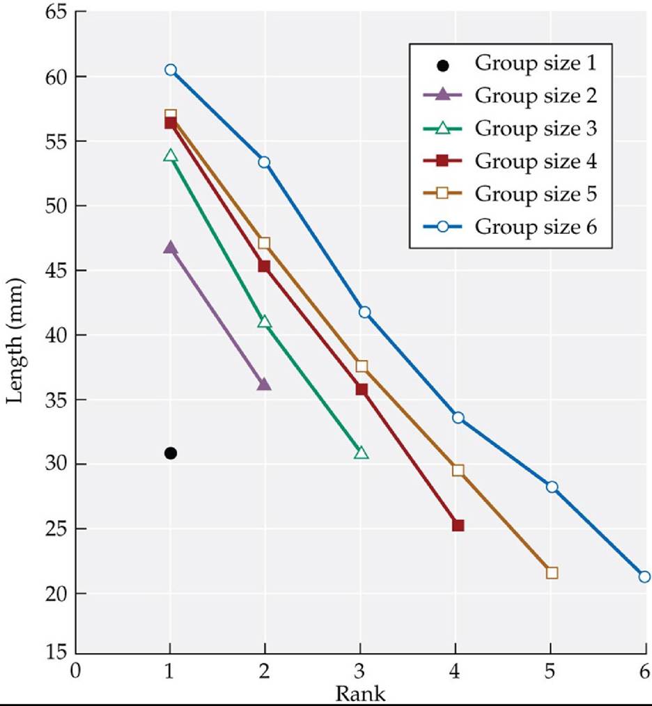
FIGURE 7.25 ClownfishSizeHierarchies Clownfishwithinananemoneregulatetheir growth to maintain a hierarchy in which each fish belongs to a distinct size class. Anemones may be home to between one and six fish, and the size of each fish is determined by that fish's rank and the size of the group in which it lives. (After P. M. Buston. 2003a. Nature 424: 145-146.) Back to text
8 Behavioral Ecology
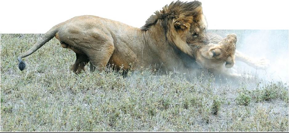
FIGURE 8.1 KillingtheCub The male African lion shown here is attempting to kill the juvenile offspring of another male; such attempts often succeed. Why might this behavior be evolutionarily adaptive for the murdering male? © Laura Romin & Larry Dalton/Alamy Stock Photo Back to text
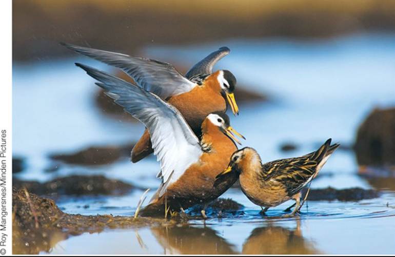
FIGURE 8.2 Females That Fight to Mate with Choosy Males Red phalarope (Phalaropus fulicarius) females (the two birds on the left) are larger and more colorful than the males of their species (on the right). In this species, the females fight over the right to mate with the males—and the males choose which females they will mate with. Back to text
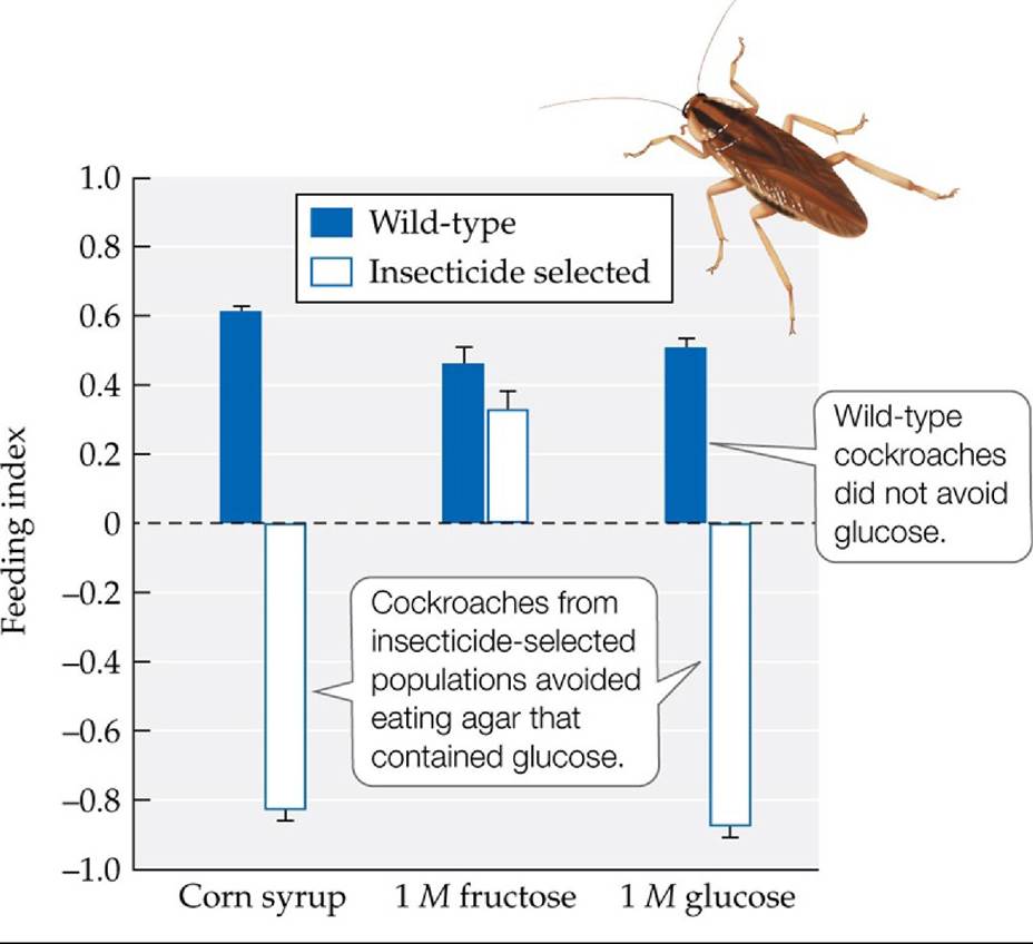
FIGURE 8.3 An Adaptive Behavioral Response Feeding behavior in two populations of the German cockroach (Blattella germanica), one of which (wild-type) had no prior exposure to insecticides, while the other had been exposed to insecticides. Cockroaches could choose to eat plain (unsweetened) agar, agar that contained one of three sources of sugar—fructose, glucose, or corn syrup (which contains both fructose and glucose)—or both. The diets the cockroaches selected were characterized by a feeding index ranging from 1.0 (indicating that 100% of their diet consisted of agar containing glucose) to -1.0 (indicating that 100% of their diet consisted of plain agar). Error bars show one standard error (SE) of the mean.
Give both a proximate and an ultimate explanation for glucose aversion in
B. germanica.
(After J. Silverman and D. N. Bieman. 1993. JlnsectPhysiol 39: 925-933.) Back tθ text
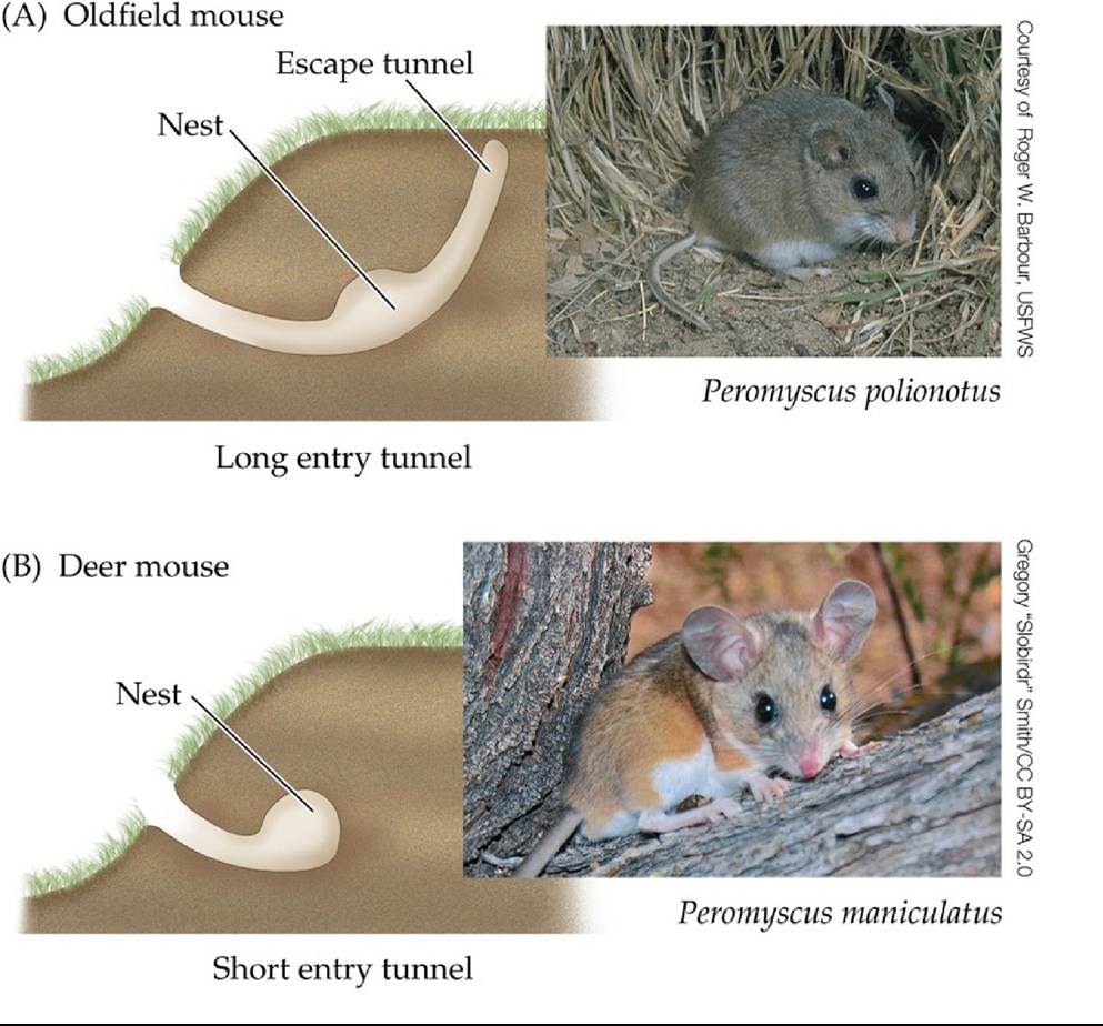
FIGURE 8.4 Distinctive Mouse Burrows (A) The oldfield mouse (Peromyscus polionotus) constructs a complex burrow with a long entrance tunnel and an escape tunnel. (B) The deer mouse (P. maniculatus) constructs a simpler burrow, with a short entrance tunnel and no escape tunnel. (After E. Callaway. 2013. Nature 493: 284.) Back tθ text
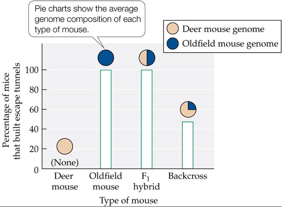
FIGURE 8.5 The Genetics of Escape Tunnel Construction Thegraphshowsthe proportions of deer mice, oldfield mice, Fi hybrids, and backcross mice (i.e., offspring of a hybrid mouse and a deer mouse) that constructed burrows with escape tunnels.
Do the colors shown in the pie charts match what you would expect based on the types of mice used in this study? Explain.
(After J. N. Weber et al. 2013. Nature 493: 402-405.) Back tθ text
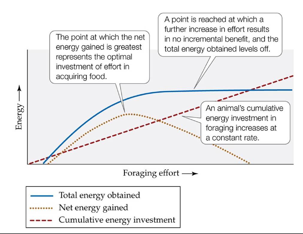
FIGURE 8.6 Conceptual Model of Optimal Foraging The net energy gained from foraging (dotted curve) equals the total energy obtained from the food acquired (solid curve) minus the cumulative energy invested in acquiring that food (dashed curve). This simple model can be used to test whether animals forage in a manner that results in the maximum benefit, based on estimates for the total energy obtained and the cumulative energy invested.
Suppose you could estimate the net energy gained at different levels of foraging effort expended by lizards eating ants in the desert. How could you use that information to test whether the lizards foraged optimally?
(After G. Parker and J. Smith. 1990. Nature 348: 27-33.) Back tθ text
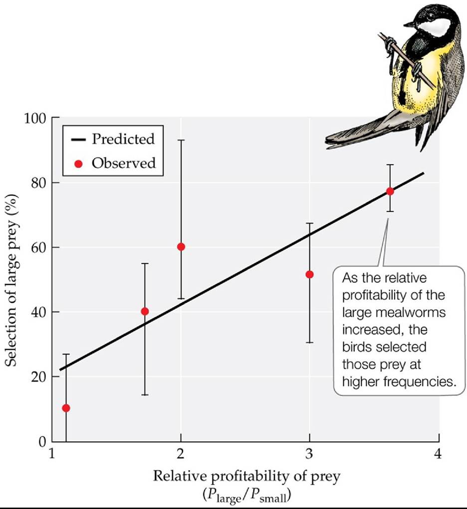
FIGURE 8.7 Effect of Profitability on Food Selection Krebs et al. used an optimal diet selection model, along with measurements of prey handling time for individual birds, to predict the rate at which great tits (Parus major) would select large over small mealworms as their encounter rates with the two prey types were varied (expressed as the calculated ratio of profitabilities of the prey types), where profitability refers to the energy per unit of handling time. Error bars show ± one SE of the mean. (After J. B. Krebs et al. 1977. Anim Behav 25: 30-38.) Back tθ text
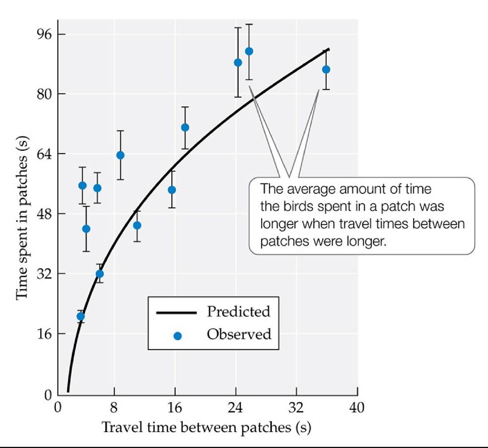
FIGURE 8.8 Effect of Travel Time between Patches Inalaboratoryexperiment1Cowie used the marginal value theorem to predict how the travel time between patches would affect the average amount of time great tits (Parus major) spent in a patch. Error bars show ± one SE of the mean. (After R. J. Cowie. 1977. Nature 268: 137-139.) Back tθ text
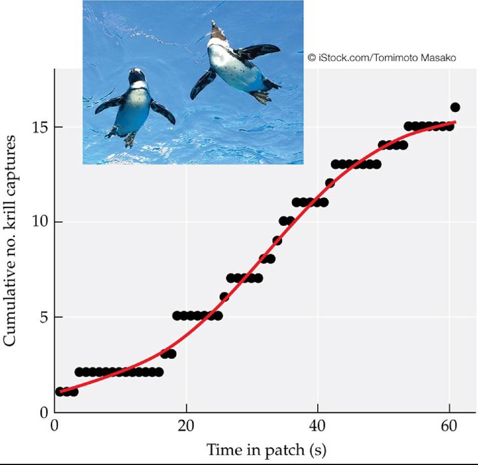
FIGURE 8.9 ForaginginAdeliePenguins The relationship between the amount of time spent in a patch of krill (Euphausia Crystallorophias) by foraging Adelie penguins (Pygoscelis adeliae) versus the richness of the patch (as estimated by the rate of krill captures). The data support the prediction of the marginal value theorem that foragers will spend greater time in richer patches than in those with fewer prey. (After Y. Y. Watanabe et al. 2014. Proc R Soc B 281: 20132376.) Back to text
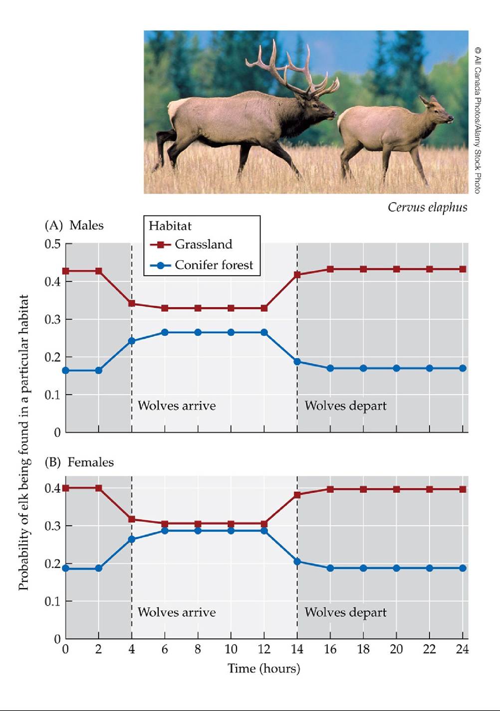
FIGURE 8.10 Movement Responses of Male and Female Elk Resultsfromastatistical analysis of daily movement patterns of male (A) and female (B) elk show that the probability of finding elk in grasslands drops when wolves arrive, then rises when wolves depart.
Compare and contrast how male and female elk respond to the presence of wolves.
(After S. Creel et al. 2005. Ecology 86: 3387-3397.) Back tθ text
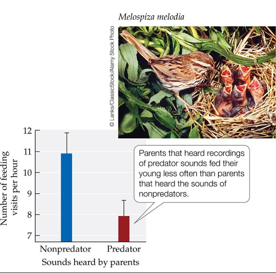
FIGURE 8.11 Young Receive Less Food When Parents Fear Predators Thenumberof times per hour that song sparrow parents feed their offspring drops when the parents are exposed to recordings of sounds made by predators. Error bars show one SE of the mean. (After L. Y.
Zanette et al. 2011. Science 334: 1398-1401.) Back tθ text
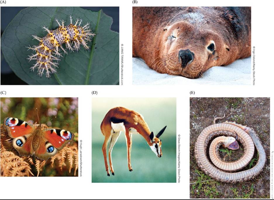
0lthe cost of fear on the number of offspring that survived to young adulthood.
(After L. Y. Zanette et al. 2011. Science 334: 1398-1401.) Back tθ text
9 Population Distribution and Abundance
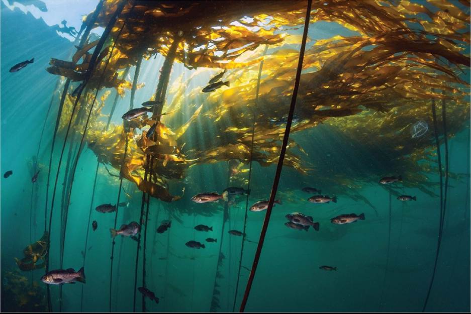
FIGURE 9.1 Kelp Forests Depend on Sea Urchin Population Control Thebullkelp Nereocystis Iuetkeana is one of several species that make up the kelp forests found off the coasts of some Aleutian islands. Research shows that the presence or absence of kelp forests near these islands is influenced by the population control of sea urchins by sea otters. ©Alex Mustard/NPL/Alamy Stock Photo Back tθ text
FIGURE 9.2 Do Sea Urchins Limit the Distribution of Kelp Forests? Meandensitiesof the kelp Laminaria in 50-m2 plots increased dramatically after urchins were removed. (After D. O.
Duggins. 1980. Ecology 61: 447-453.) Back tθ text
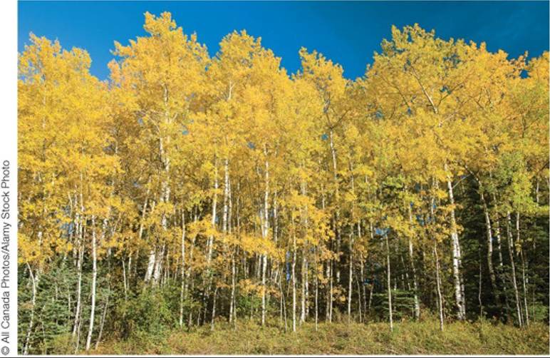
FIGURE 9.3 Aspen Groves: One Tree or Many? These quaking aspen (Populus tremuloides) growing in western Colorado could represent multiple different genetic individuals, each established from a seed. However, it is also possible that each of these aspens is part of one “tree,” having been produced asexually from the root buds of a single genetic individual. Back to text
Clones form by:
Plant
Animal
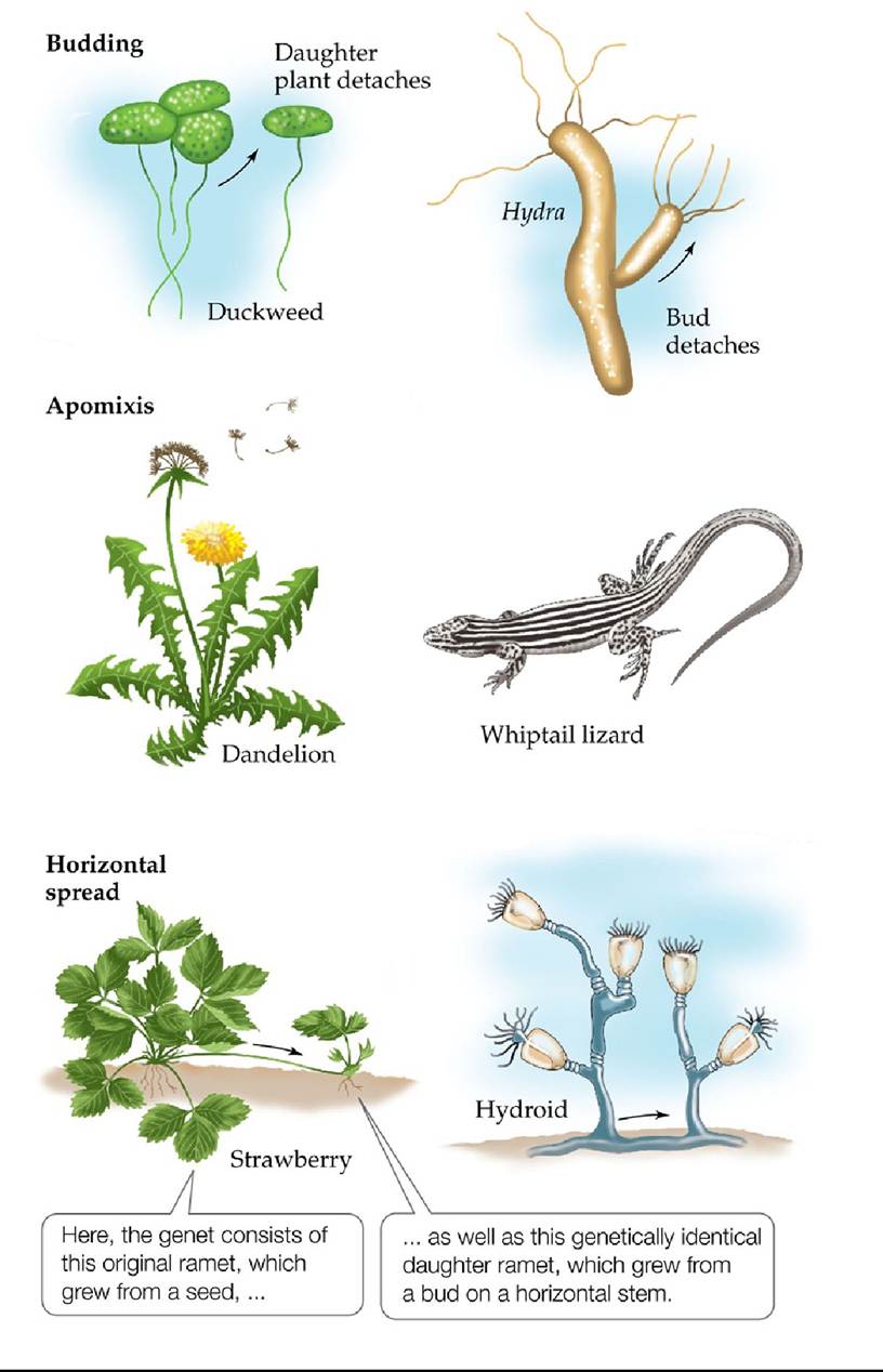
FIGURE 9.4 Plants and Animals That Form Clones Many plants and animals reproduce asexually, thereby forming clones of genetically identical individuals. Examples of asexual reproduction include budding (in which clonal offspring detach from the parent), apomixis (in which clonal offspring are produced from unfertilized eggs; also known as parthenogenesis), and horizontal spread (in which clonal offspring are produced as the organism grows).
How might groups of genetically identical individuals be identified in clones that form by budding? By apomixis? By horizontal spread?
Back to text
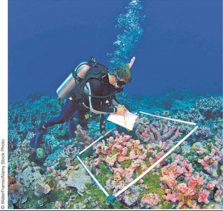
FIGURE A An Underwater Quadrat A marine biologist uses a square quadrat to count the numbers of individuals of different coral species found on a reef off the Caroline Islands, Micronesia. Back to text
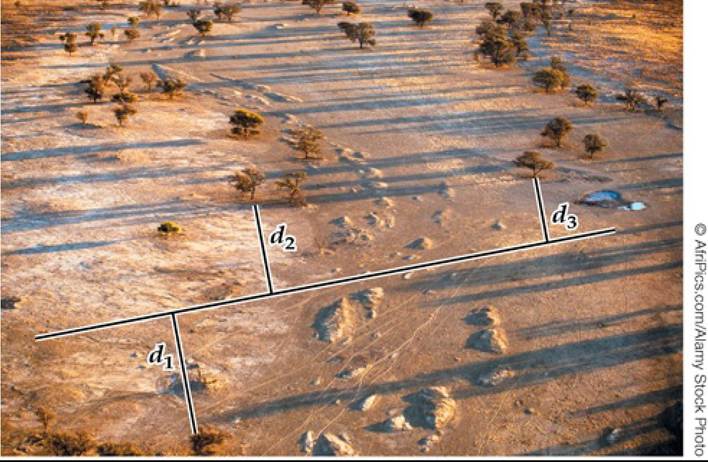
FIGURE B Counting Trees from a Line Transect The density of these camelthorn trees (Acacia erioloba) in Kgalagadi Transfrontier Park, South Africa, could be estimated using a line transect, as shown here. Back to text
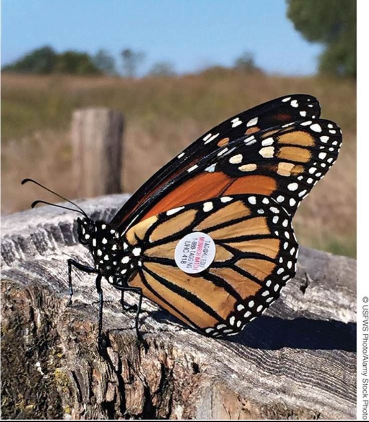
FIGURE C Release of Marked Butterfly To obtain mark-recapture estimates of butterfly abundance, ecologists tag and then release them back into their habitat (note tag on the left wing). Back to text
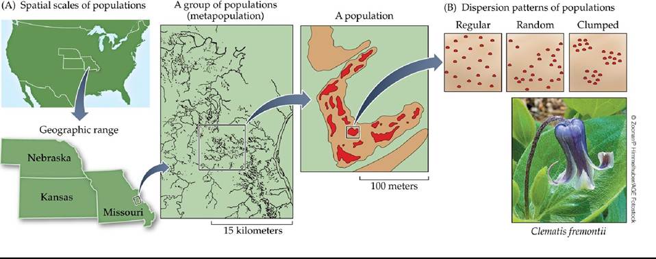
FIGURE 9.5 Many Populations Have a Patchy Distribution Thedistributionand abundance of the herbaceous perennial Clematis fremontii are patchy over different spatial scales. (A) Populations occur within limestone meadows. A group of populations makes up a metapopulation, and multiple metapopulations make up the geographic range (in this case, Missouri, Kansas, and Nebraska). (B) Individuals within a population show one of three different dispersion patterns. (A after R. O. Erickson. 1945. Ann Mo Bot Gard 32: 413-460.) Back tθ text
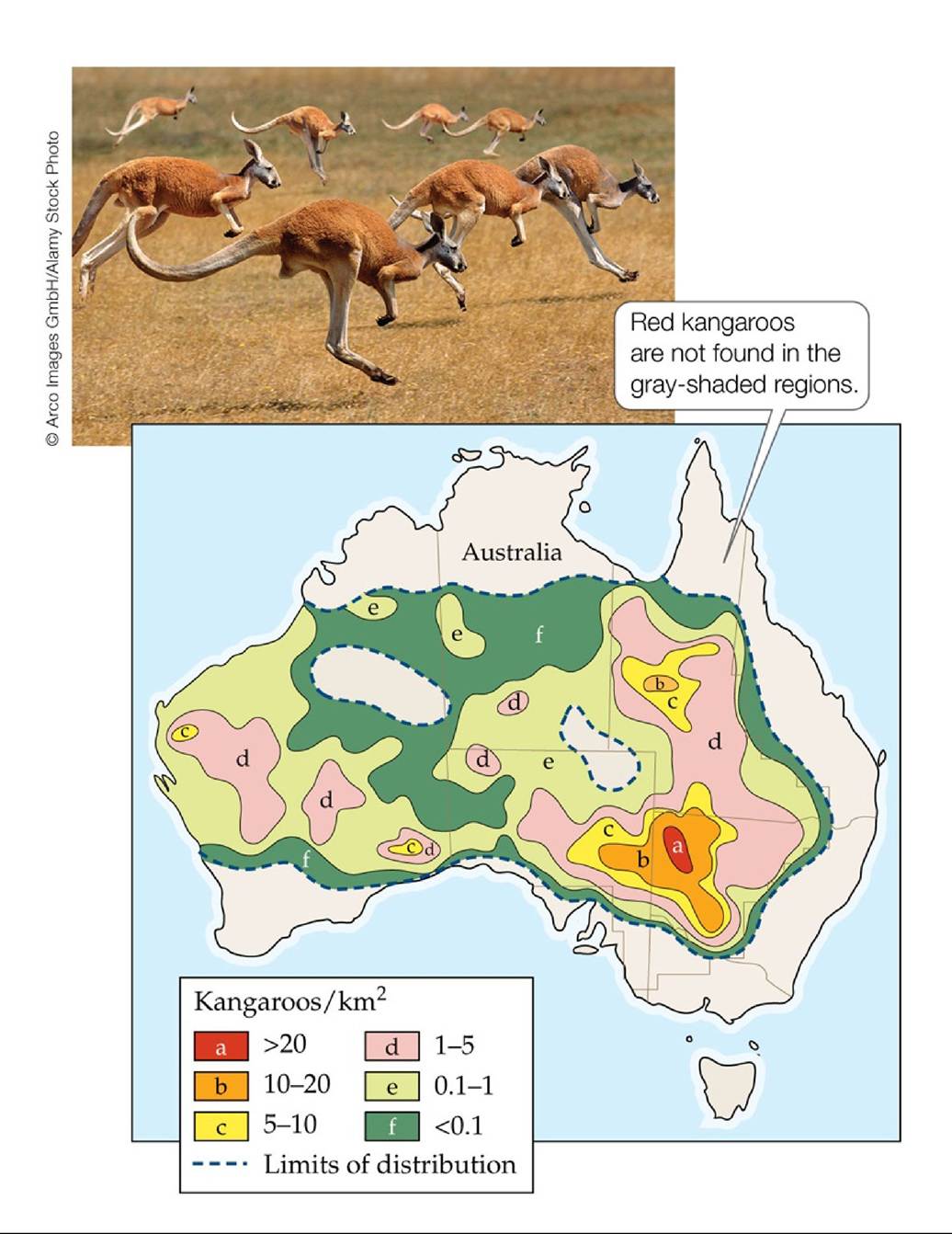
FIGURE 9.6 Abundance Varies throughout the Geographic Range of a Species The map shows abundances of the red kangaroo (Macropus rufus) throughout its range in Australia. These data were based on aerial surveys conducted from 1980 to 1982. (After G. Caughley et al. 1987. Kangaroos: Their Ecology and Management in the Sheep Rangelands of Australia. Cambridge University Press: Cambridge.) Back tθ text
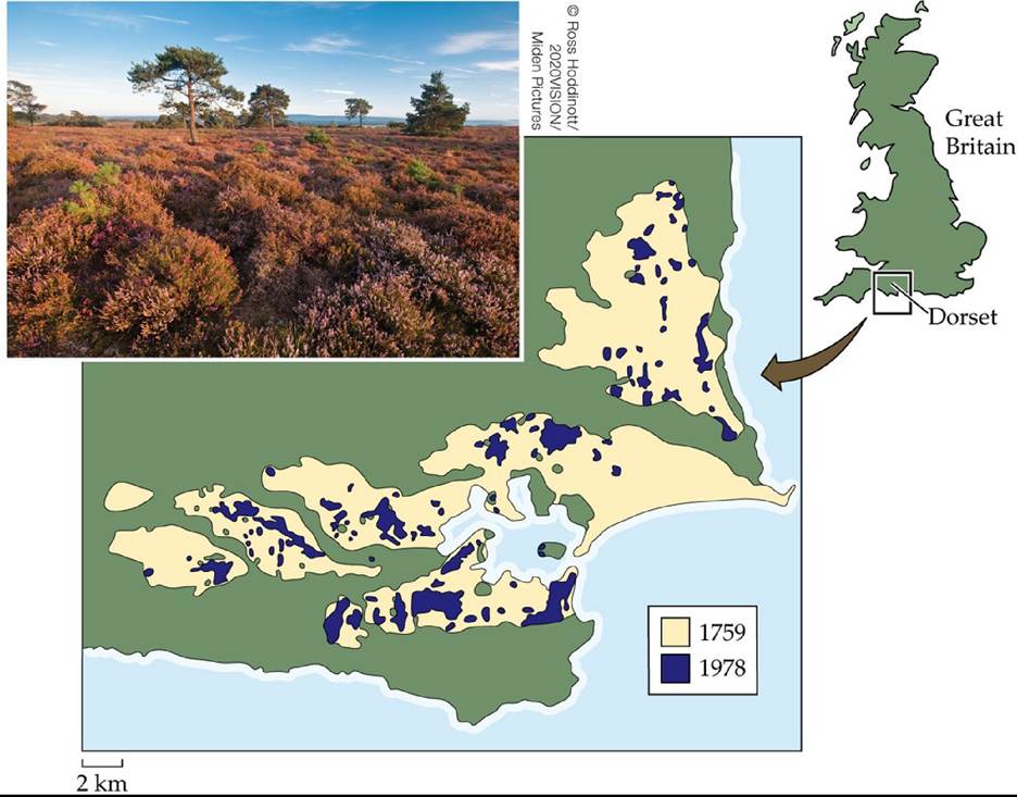
FIGURE 9.7 Fragmentation of Dorset Heathlands The low-lying shrub-covered heathlands of Dorset, England, reached their maximum extent in Roman times, 2,000 years before the present. From 1759 to 1978, the decline of this habitat type accelerated: the total area of heathlands shrank from 400 km2 to less than 60 km2, and the number of patches increased greatly.
How many patches of heathland were present in 1759? In 1978? Use your answers to estimate the average patch size in 1759 and 1978. (After N. R. Webb and L. E. Haskins. 1980. Biol Conserv 17: 281-296.) Back tθ text
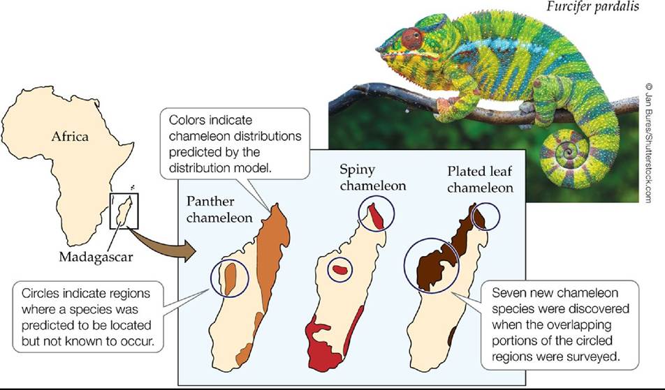
FIGURE 9.8 Predicted Distributions of Madagascar Chameleons The predicted distributions of 3 of 11 species of chameleons are shown for the panther chameleon (Furcifer pardalis), the spiny chameleon (F verrucosus), and the plated leaf chameleon (Brookesia stumpffi). All 11 of the predicted distributions proved accurate. (After C. J. Raxworthy et al. 2003. Nature 426: 837-841.) Back tθ text
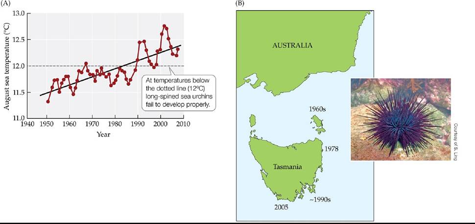
FIGURE 9.9 A Climate-Driven Range Extension Winter water temperatures along the east coast of Tasmania in August, the most important month for offspring production in long-spined sea urchins (A). The map in (B) shows the years in which long-spined sea urchins were first observed at points along the Tasmanian coast. (After S. Ling et al. 2009. Proc Natl Acad Sci USA 106: 2234122345. © 2009 National Academy of Sciences, U.S.A.) Back tθ text
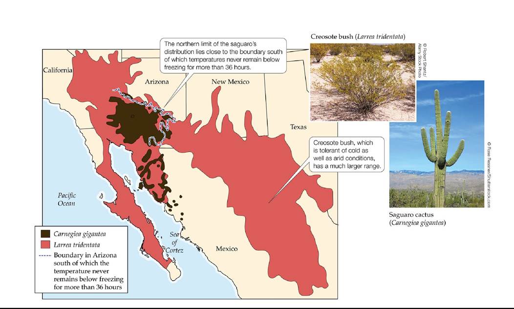
FIGURE 9.10 The Distributions of Two Drought-Tolerant Plants Thegeographic distribution of creosote bush (Larrea tridentata) is much larger than that of saguaro cactus (Carnegiea gigantea). (After T. W. Yang. 1970. JArizonaAcad Sci 6: 41-45; F. Shreve and I. L. Wiggins. 1951. Vegetation and Flora of the Sonoran Desert. Carnegie Institute of Washington: Washington, DC.) Back to text
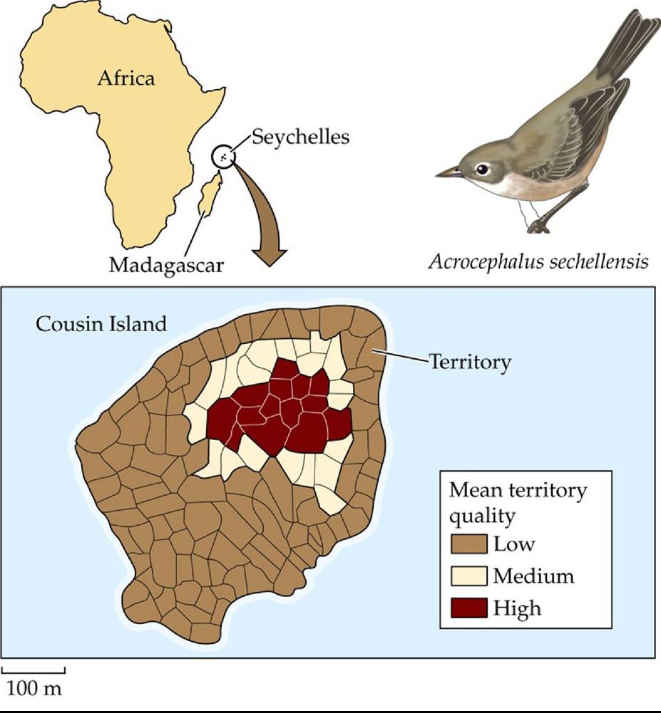
FIGURE 9.11 FoodResourcesAffectHabitatSuitability ThemeanqualityofSeychelles warbler territories on Cousin Island across the years 1986 to 1990. Territories were grouped into three quality categories: high, medium, and low. High-quality territories were clustered inland; these territories had high vegetation cover, little wind, and abundant insects. Coastal areas had lower-quality territories because salt spray led to defoliation, which lowered insect abundance. (After J. Komdeur. 1992. Nature 358: 493-495.) Back tθ text
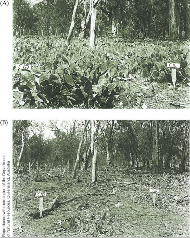
FIGURE 9.12 HerbivorescanLimitPlantDistributions In Australia, the moth
Cactoblastis cactorum was used to control populations of an introduced cactus, Opuntia stricta.
(A) A dense thicket of O. stricta 2 months before the release of the moth. (B) The same stand 3 years later, after the moth had killed the cacti by feeding on their growing tips. Back to text
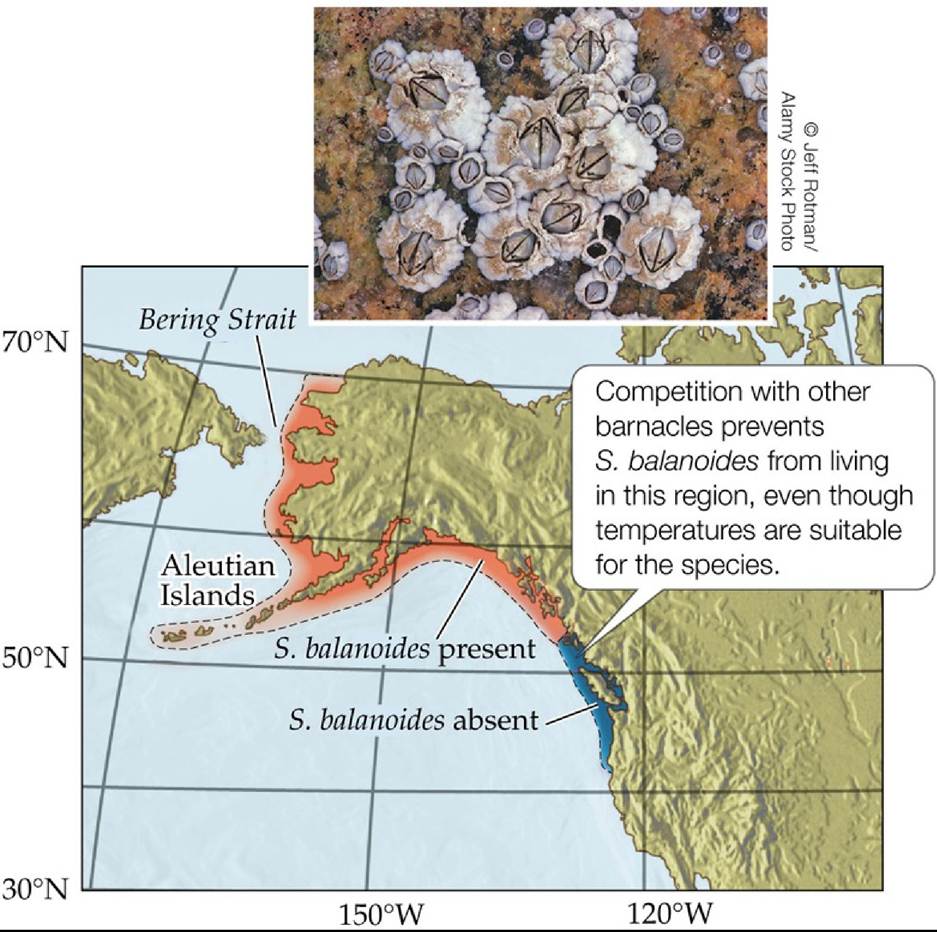
FIGURE 9.13 Joint Effects of Temperature and Competition on Barnacle Distribution Although temperatures are suitable for the barnacle Semibalanus balanoides throughout the red- and blue-shaded regions, it is excluded from the southern region potentially by its competitors. In the red-shaded regions, temperatures are colder and S. balanoides is the superior competitor.
Is global warming likely to increase or decrease the geographic range of S. balanoides? Explain.
Back to text
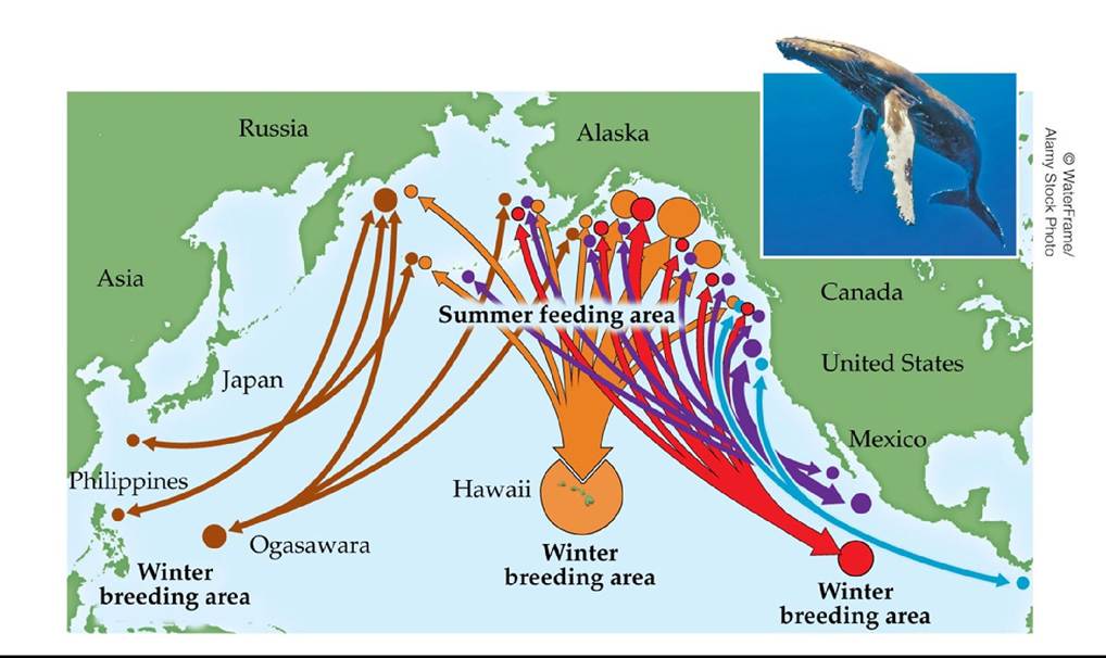
FIGURE 9.14 Migration of North Pacific Humpback Whales Five separate populations (represented by different-colored arrows) of the North Pacific humpback whale (Megaptera novaeangliae) migrate between their winter breeding grounds off Mexico, Hawaii, and Japan and their summer feeding grounds in the Gulf of Alaska and the Northeast Pacific coast. (Map after https://hawaiihumpbackwhale.noaa.gov/explore/humpback whale.html. Migration data from SPLASH Research.) Back to text
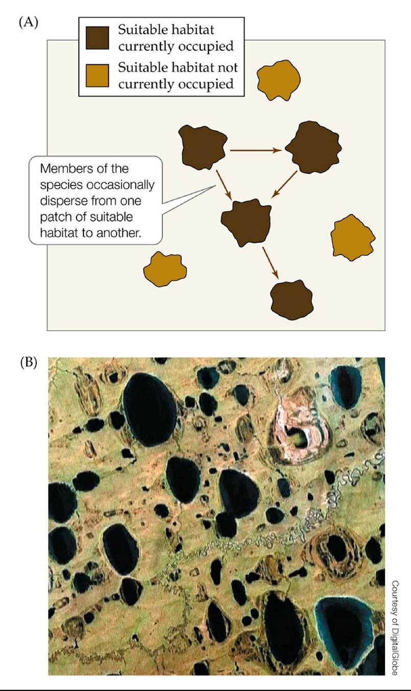
FIGURE 9.15 TheMetapopulationConcept A metapopulation is a set of spatially isolated populations linked by dispersal. (A) Seven patches of suitable habitat for a species are diagrammed, four of which are currently occupied and three of which are not. The area outside of these seven patches represents unsuitable habitat. (B) Satellite image of a group of lakes in northern Alaska that are sometimes connected to one another by temporary streams that form after the snow melts or after periods of heavy rainfall. Back to text
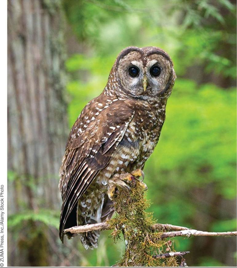
FIGURE 9.16 The Northern Spotted Owl The northern spotted owl (Strix Occidentalis Caurina) thrives in old-growth forests of the Pacific Northwest; such forests include those that have never been cut, or have not been cut for 200 years or more. Back to text
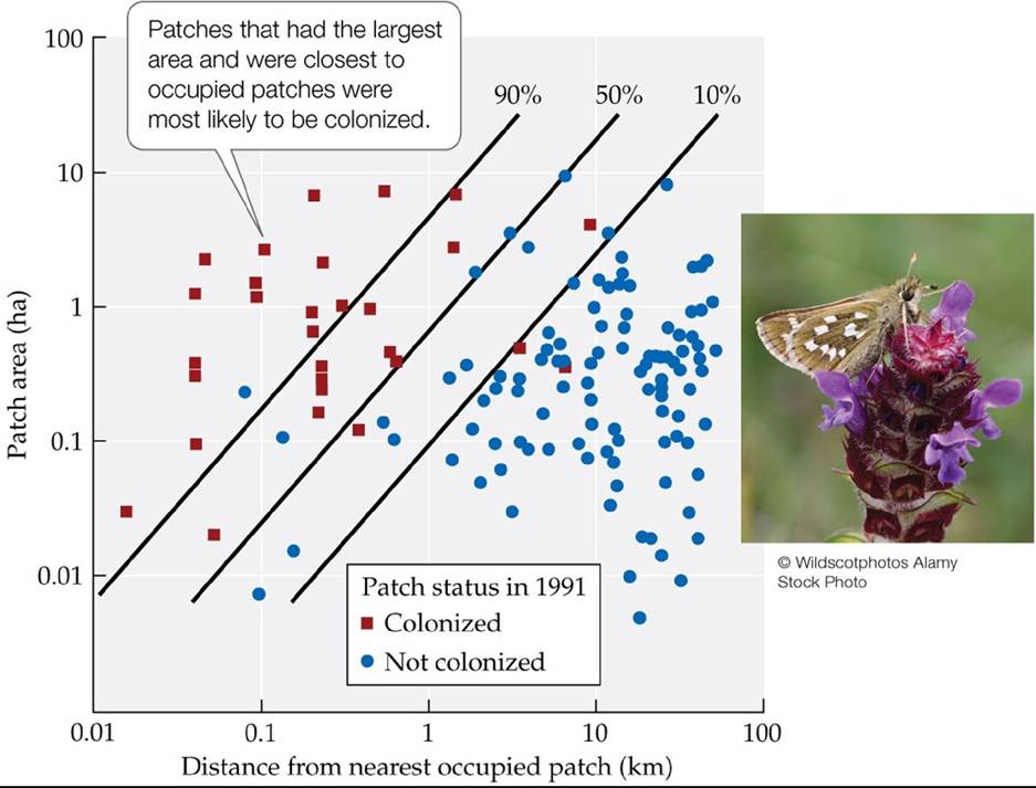
FIGURE 9.17 Colonization in a Butterfly Metapopulation Colonization of suitable habitat from 1982 to 1991 by the skipper butterfly Hesperia comma was influenced by patch area and patch isolation (distance to the nearest occupied patch). Each square or circle represents a patch of suitable habitat that was not occupied by H. comma in 1982. The lines show the combinations of patch area and patch isolation for which there was a 90%, 50%, and 10% chance of colonization (as calculated from a statistical analysis of the data).
Based on these results, estimate the chance of colonization for a 1-ha patch located 1 km away from the nearest occupied patch.
(After C. D. Thomas et al. 1992. Oecologia 92: 563-567; C. D. Thomas and T. M. Jones. 1993. J Anim Ecol
62: 472-481.) Back tθ text
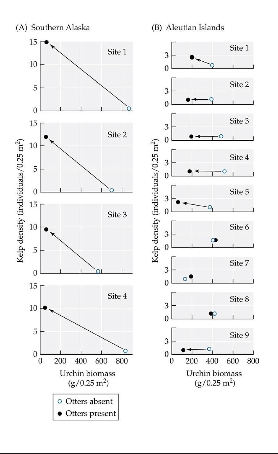
FIGURE 9.18 The Effect of Otters on Urchins and Kelp Plotsofkelpdensityversussea urchin biomass measured at sites in southern Alaska and in the Aleutian Islands before and 2 years after the return of otters. (A) Two years after otters colonized four sites in southern Alaska, urchin biomass had declined considerably, and kelp density had increased substantially at all sites. (B) Two years after otters colonized nine sites in the Aleutian Islands, sea urchin biomass had declined at six of the sites, but kelp showed clear signs of recovery at only two of the sites. Arrows indicate a decline in urchin biomass and (at some sites) an increase in kelp density in the presence of otters.
For the nine sites in (B), list the six sites where urchin biomass declined; also list the two sites where kelp density increased.
(After J. A. Estes and D. O. Duggins. 1995. Ecol Mongr 65: 75-100.) Back tθ text
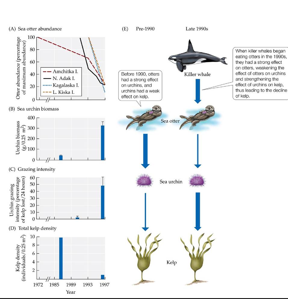
FIGURE 9.19 Killer Whale Predation on Otters May Have Led to Kelp Declines Declines in otter abundance over time (A) are associated with (B) a rise in urchin biomass, (C) an increase in the intensity of urchin grazing on kelp, and (D) a decrease in kelp density. (E) The proposed mechanisms for these changes. Strengths of the effects are indicated by the thicknesses of the arrows. Error bars in (B) and (C) show one standard error of the mean. (After J. A. Estes et al. 1998.
Science 282: 5388.) Back tθ text
10 Population Dynamics
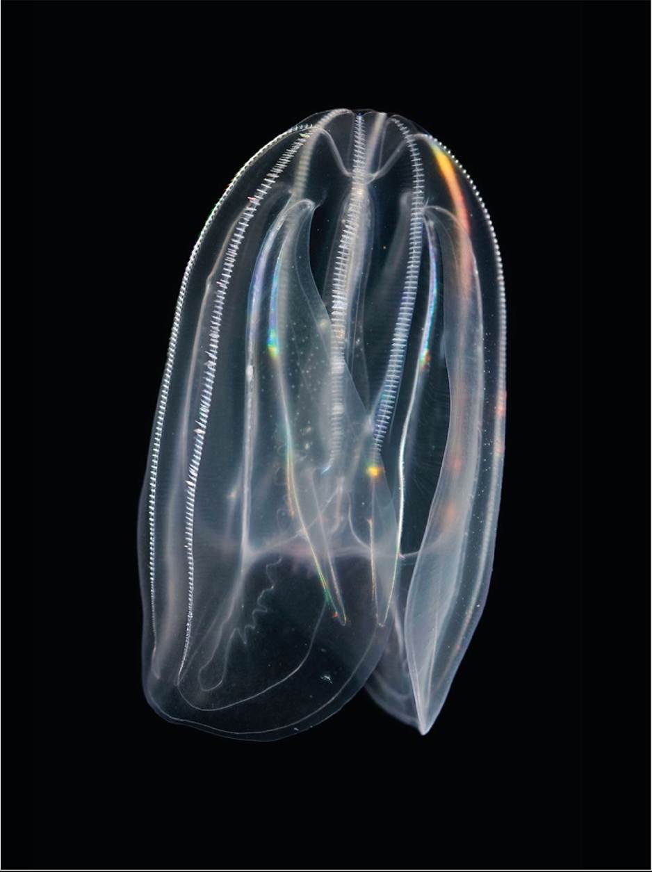
FIGURE 10.1 APotentInvader The comb jelly Mnemiopsisleidyiwas introduced from the east coast of North America to the Black Sea, wreaking havoc in its new ecosystem upon its arrival. © Super Nova Images/Alamy Stock Photo Back tθ text
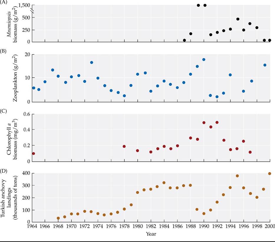
FIGURE 10.2 Changes in the Black Sea Ecosystem The graphs track long-term changes in four components of the Black Sea ecosystem: (A) mean biomass of the invasive species Mnemiopsis leidyi (first measured in 1987), (B) mean biomass of zooplankton, (C) mean biomass of chlorophyll a (an indicator of phytoplankton abundance), and (D) Turkish anchovy landings. (After A. E. Kideys. 2002. Science 297: 1482-1484.) Back to text
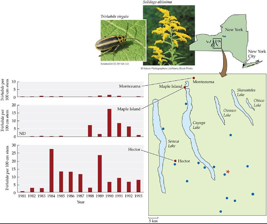
FIGURE 10.3 PopulationsAreDynamic Changes in abundances of the beetle Trirhabda virgata on tall goldenrod plants over time at Montezuma, Maple Island, and Hector, 3 of the 22 sites used in the study. Five of these sites were located close to one another and are indicated on the map by an asterisk; all other sites are indicated by dots.
In what year or years did Trirhabda abundance vary greatly over space? Explain.
(After R. B. Root and N. Cappuccino. 1992. Ecol Monogr 62: 393-420; additional data from R. B. Root, personal communication.) Back to text
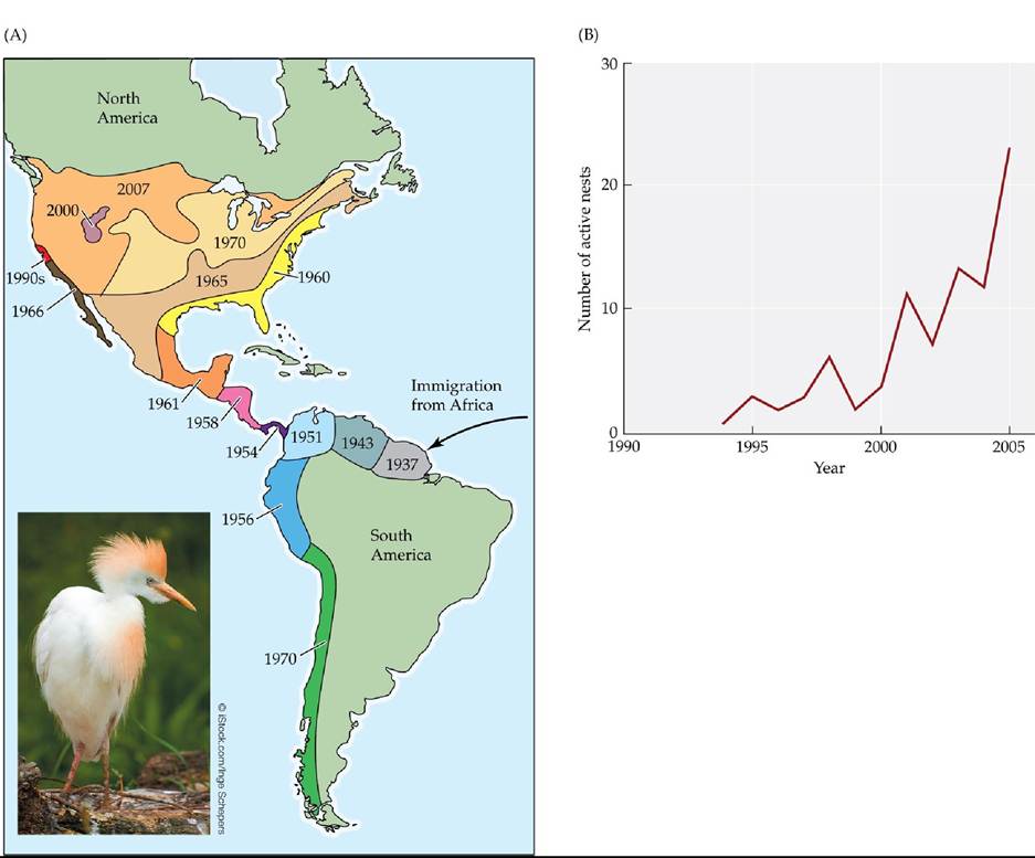
FIGURE 10.4 ColonizingtheNewWorld (A) The cattle egret subspecies Bubulcus ibis ibis dispersed from Africa to South America in the late 1800s. Once it established colonies in the northeastern region of South America, it then spread rapidly to other parts of South and North America. The contour lines and dates show the edges of the cattle egret's range at different times. (B) The number of active cattle egret nests observed annually within wetlands of the San Francisco Bay area after it first colonized this region in the early 1990s. (A after R. L. Smith. 1974. Ecology and Field Biology, 2nd ed. Harper & Row: New York; S. Osborn. 2007. In The Birds of North America Online, A. Poole [Ed.]. Cornell Lab of Ornithology: Ithaca, NY; B. after J. P. Kelly et al. 2007. Waterbirds 30: 455-478.) Back to text
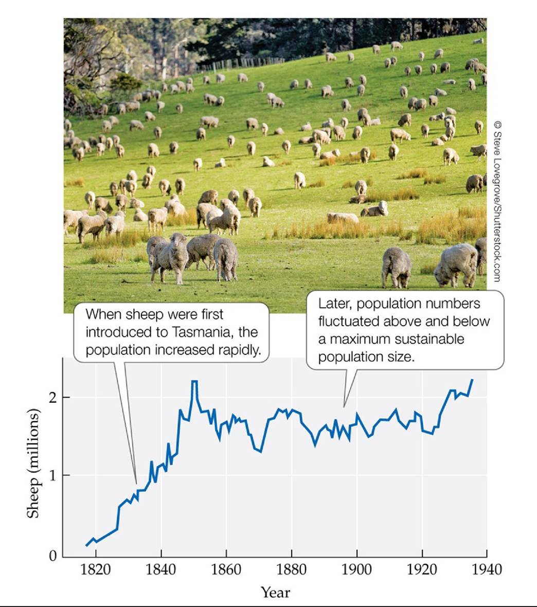
FIGURE 10.5 Logistic Growth Rises First, Then Levels Off Population growth rarely matches a classic logistic curve (see Figure 11.13). For sheep introduced to the island of Tasmania, the population increased rapidly and then leveled off with fluctuation above and below a carrying capacity or maximum sustainable population size. (After J. Davidson. 1938. Trans R Soc S
Aust 62: 342-346. CC BY-NC-SA 3.0.) Back tθ text
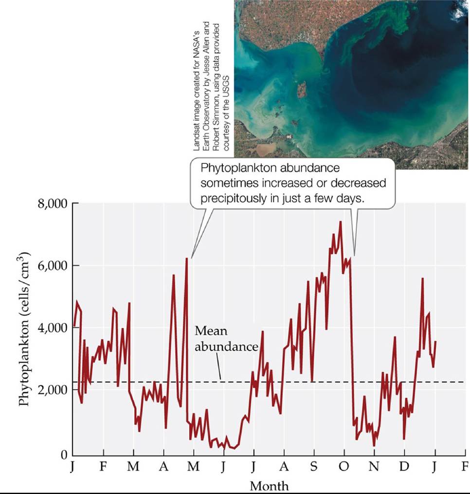
FIGURE 10.6 PopulationFluctuations Variationinphytoplanktonabundanceinwater
samples taken from Lake Erie during 1962, showing fluctuations above and below the overall mean abundance of 2,250 cells per cubic centimeter. The inset shows an October 2011 phytoplankton “bloom” (a rapid increase in phytoplankton numbers) in the lake. (After C. C. Davis. 1964. Limnol Oceanogr 9: 275-283.) Back tθ text
FIGURE 10.7 PopulationscanExplodeinNumbers When conditions are favorable, a population outbreak can occur in which the numbers of individuals increase very rapidly. The cockroaches covering the kitchen in this exhibit from the National Museum of Natural History represent the number that could have been produced by a single pregnant female in a few generations. Back to text
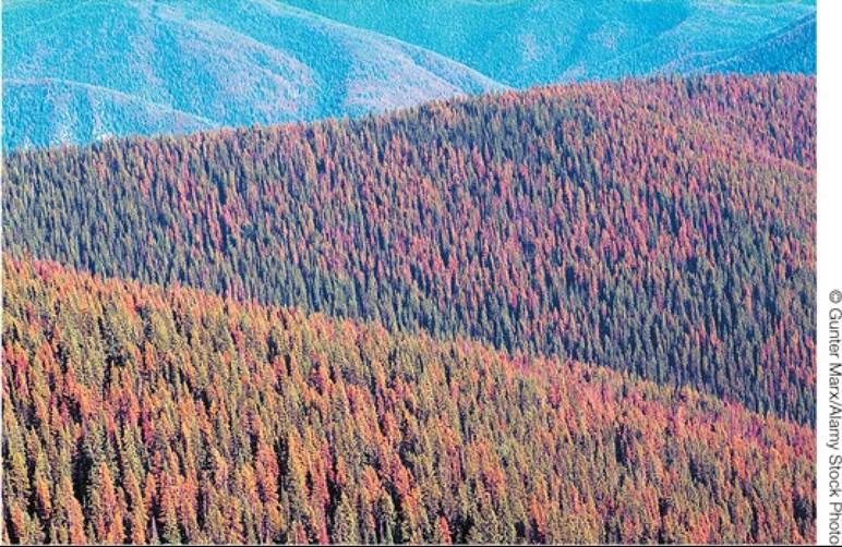
FIGURE 10.8 ConsequencesofanInsectOutbreak This aerial view shows the red foliage of lodgepole pine (Pinus contorta) trees killed by an outbreak of mountain pine beetles in British Columbia, Canada. Back to text
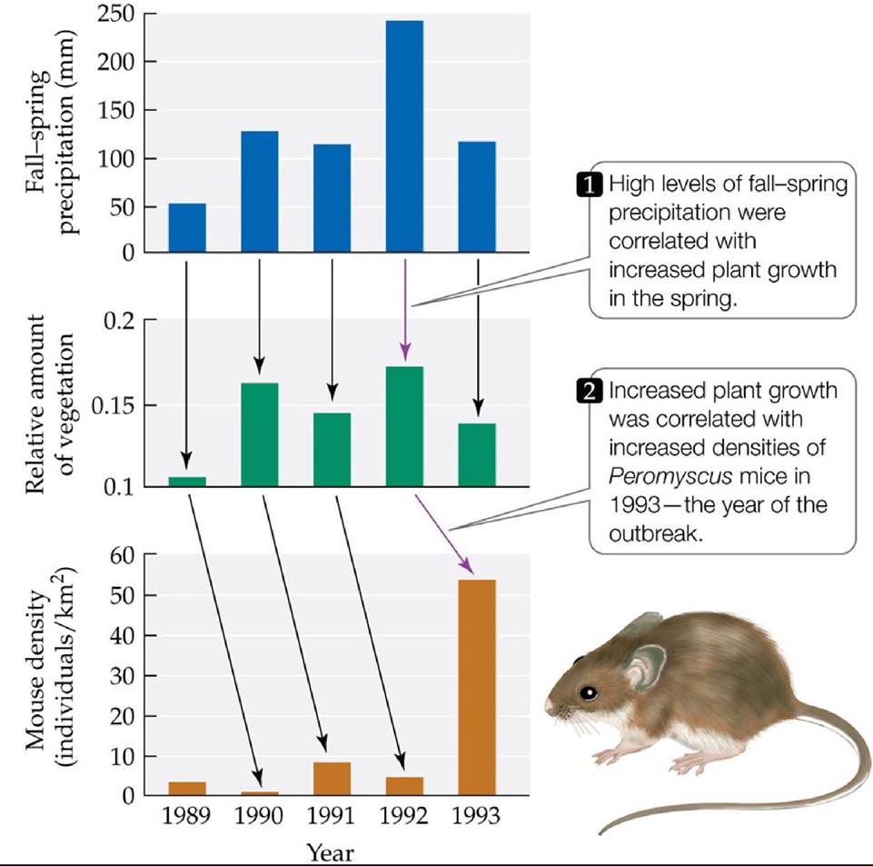
FIGURE 10.9 From Rain to Plants to Mice Theoutbreakofhantaviruspulmonary syndrome in the southwestern United States in 1993 may have been caused by a series of interconnected events. (After T. L. Yates et al. 2002. BioScience 52: 989-998.) Back tθ text
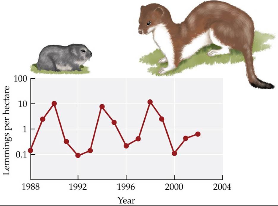
FIGURE 10.10 A Population Cycle In northern Greenland, collared lemming (Dicrostonyx groenlandicus, left) abundance tends to rise and fall every 4 years. In this location, the population cycle appears to be driven by predators, the most important of which is the stoat (Mustela erminea, right). In other regions, lemming population cycles may be driven by food supply.
Based on data from 1988 through 2000, how many lemmings per hectare would you have expected there to be in 2002? Explain your reasoning.
(After O. Gilg et al. 2003. Science 302: 5646.) Back tθ text
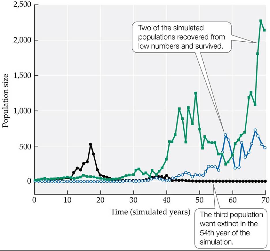
FIGURE 10.11 Fluctuations Can Drive Small Populations Extinct Simulatedgrowthof three populations in which the population growth rate varied at random from year to year. This variation over time was intended to simulate random variation in environmental conditions. Each simulated population began with 10 individuals but ended with variable population sizes, including one population that went extinct. Back to text
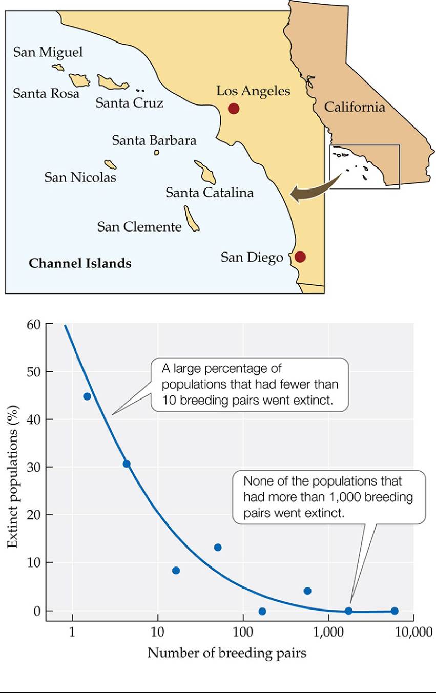
FIGURE 10.12 Extinction in Small Populations AmongbirdpopulationsontheChannel
Islands, the percentage of populations that went extinct declined rapidly as the number of breeding pairs in the population increased.
Assume that a population is at high risk (>30%) of extinction. Use the graph to estimate the total number of breeding pairs the population should have to reduce its risk of extinction to 5%.
(After H. L. Jones and J. M. Diamond. 1976. Condor 78: 526-549.) Back tθ text
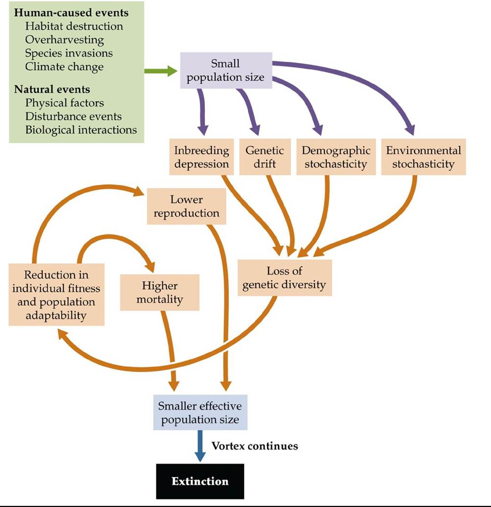
FIGURE 10.13 ExtinctionVortex Human-caused and natural events can reduce the effective population size of species, resulting in the loss of genetic diversity, and eventually leading to population- and species-level extinctions. Back to text
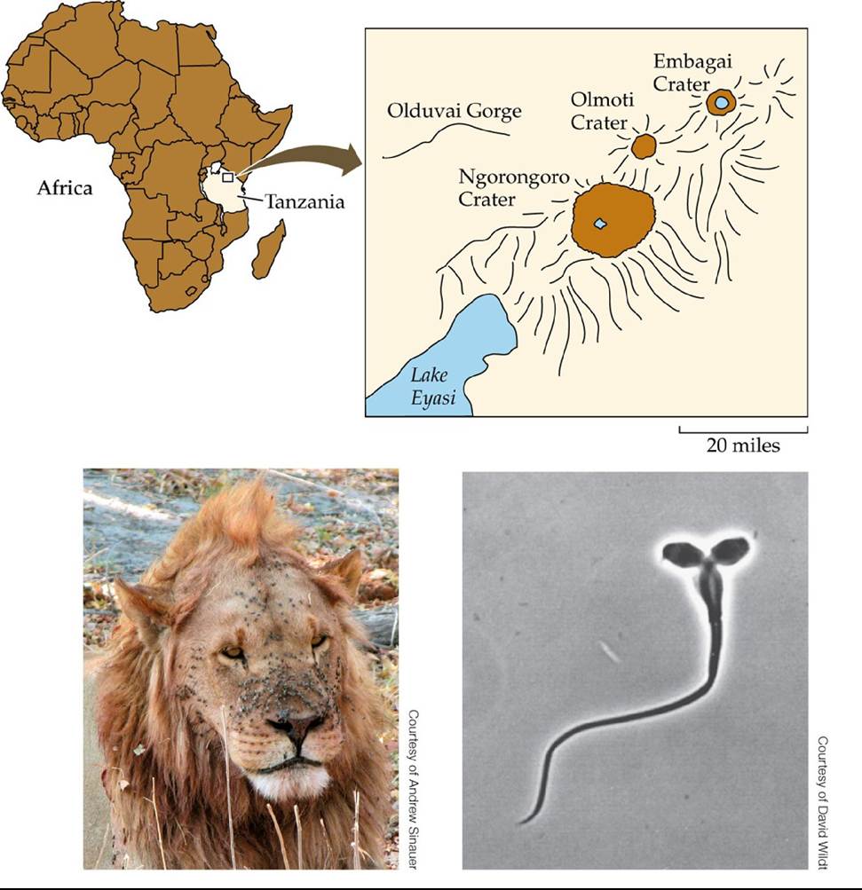
FIGURE 10.14 APlagueofFlies In 1962, the population of lions in the 260-km2 (100- square-mile) Ngorongoro Crater of Tanzania was nearly driven to extinction by a catastrophic outbreak of biting flies similar to those on the face of this male. Lions became covered with infected sores and eventually could not hunt, resulting in many deaths. In the population that descended from the few survivors, genetic drift and inbreeding depression have led to frequent sperm abnormalities, such as this “two-headed” sperm. Back to text
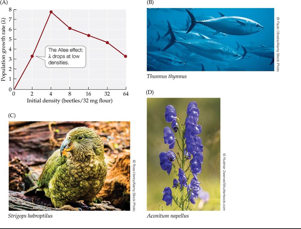
FIGURE 10.15 Allee Effects Can Threaten Small Populations Alleeeffectsoccurwhen the growth rate of a population decreases as population density decreases. (A) In laboratory experiments with the flour beetle Tribolium, population growth rates reached their lowest point at the lowest initial density. Allee effects can be important in animals such as (B) bluefin tuna (Thunnus thynnus), which form schools whose protective or early warning systems function poorly at small population sizes. Allee effects are also important in species in which individuals have difficulty finding mates at low population densities; there are many such species, including (C) kakapos (Strigops habroptilus) and (D) monkshood (Aconitum napellus). (A after F. Courchamp et al. 1999. Trends Ecol Evol 14: 405-410.) Back tθ text
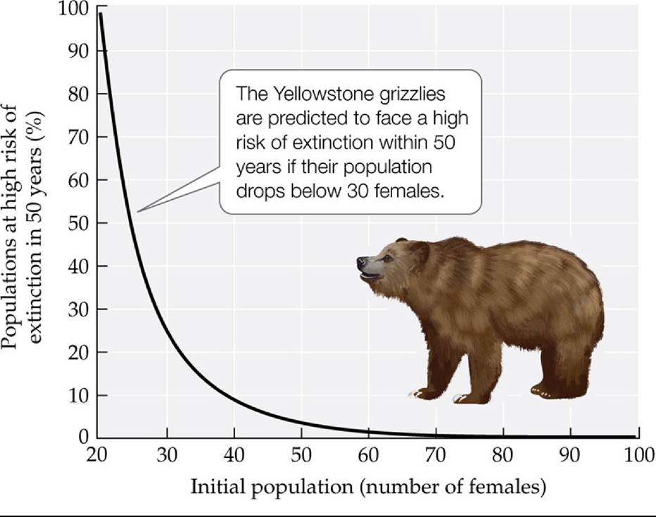
FIGURE 10.16 EnvironmentaistochasticityandpopuIationSize Thisgraphplotsthe risk that the Yellowstone grizzly bear population will be close to extinction in 50 years against the population size (number of females). By studying 39 consecutive years of census data, researchers found that the average population growth rate of Yellowstone grizzlies could lead to explosive growth if it remained constant from year to year. The risk of extinction increased dramatically when random variation in environmental conditions dropped the population size to 40 females or less. (After W. F. Morris and D. F. Doak. 2002. Quantitative Conservation Biology: Theory and Practice of Population Viability. Oxford University Press/Sinauer: Sunderland, MA.) Back tθ text
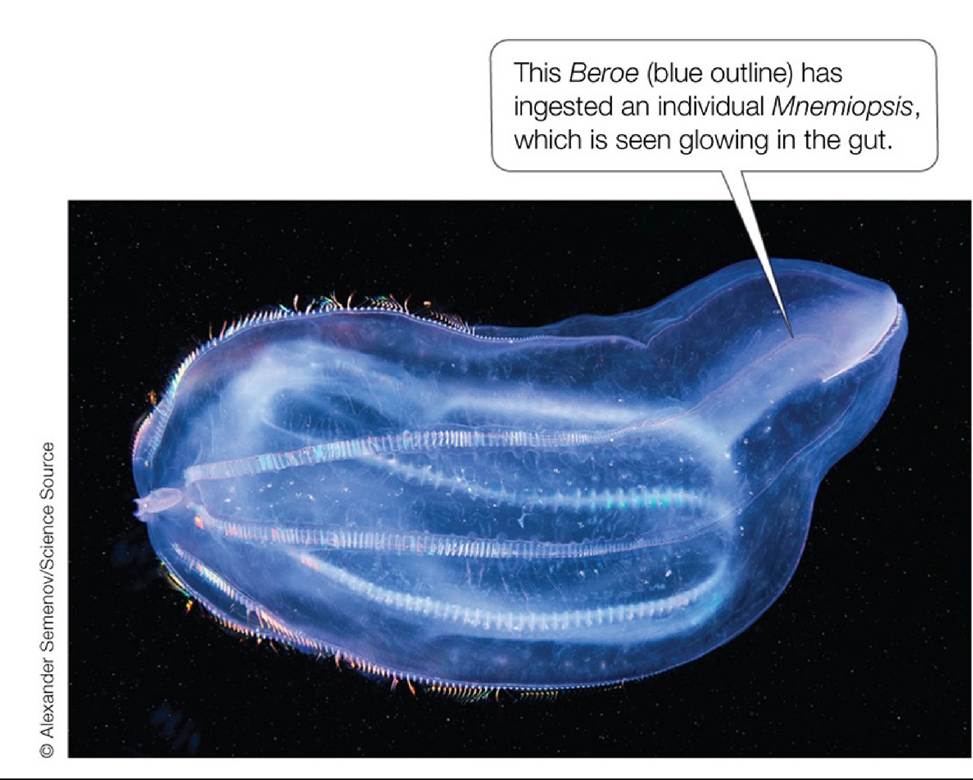
FIGURE 10.17 InvaderversusInvader Another invasive comb jelly species, the predator Beroe, brought Mnemiopsis under control, thus contributing to the recovery of the Black Sea ecosystem. Back to text
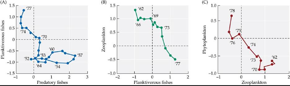
FIGURE 10.18 Ecosystem Changes in the Black SeaAbundanceindicesof(A) planktivorous and predatory fishes, (B) zooplankton and planktivorous fishes, and (C) phytoplankton and zooplankton. In each graph, the organisms whose abundance is plotted on the ó-axis are eaten by the organisms whose abundance is plotted on the x-axis. (Planktivorous fishes eat both zooplankton and phytoplankton, but they have a greater effect on zooplankton abundance than on phytoplankton abundance.) Numbers on the plots indicate years, beginning in 1952. In the abundance indices, data are standardized to have a mean of 0 and a variance of 1.
Referring to (A), describe predatory and planktivorous fish abundance from 1952 to 1957. Next, summarize how abundances of phytoplankton, zooplankton, planktivorous fishes, and predatory fishes changed in the 1970s. Finally, convert your summary of abundance changes in the 1970s into a chain of feeding relationships, where arrow thickness indicates the strength of each relationship (see Figure 9.19, in which similar chains are shown for Alaska). Is the chain you drew more similar to that in Alaska pre- 1990 or that in Alaska in the late 1990s? Explain.
(After G. M. Daskalov et al. 2007. Proc Natl Acad Sci USA 104: 10518-10523. © National Academy of Sciences, U.S.A.) Back to text
11 Population Growth and Regulation
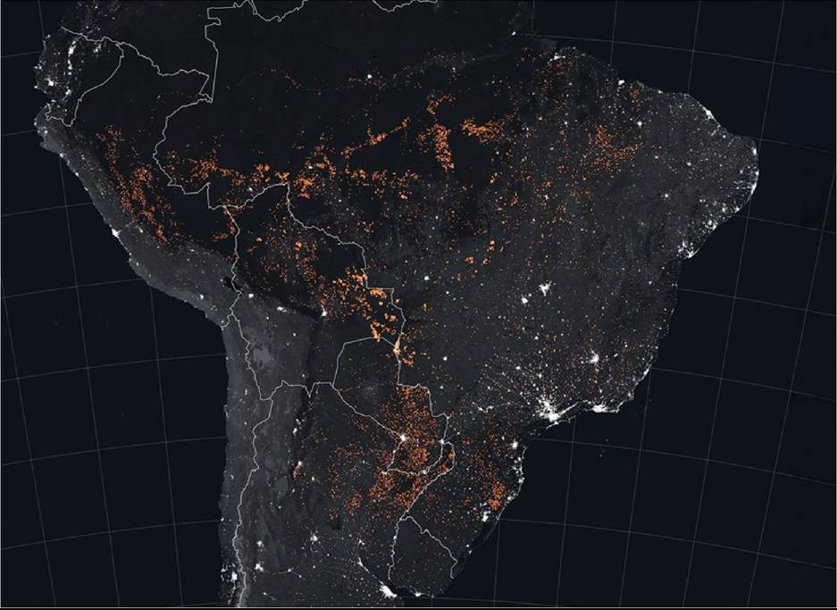
FIGURE 11.1 Amazon on Fire This late-night NASA satellite image of South America shows the vast area over which large, intense, and persistent fires are burning in this region of the world (red areas). Fire activity in the Amazon varies considerably from year to year, driven by changes in human activity and climate. The timing and location of fires in 2019 (when this photo was taken) suggest that they were associated with extensive land clearing that year rather than regional drought conditions. Courtesy of NASA Earth Observatory Back to text
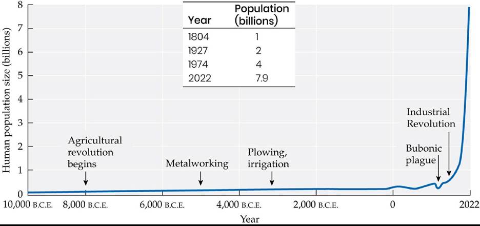
FIGURE 11.2 Explosive Growth of the Human Population Thesizeofthehuman population increased relatively slowly until 1804, when the effects of the Industrial Revolution took hold. Since that time our population has increased in size to 7.9 billion people in 2022. (Based on estimates by the History Database of the Global Environment [HYDE] and the United Nations.
Visualization from OurWorldinData.org. CC BY-SA 4.0/Max Roser. Retrievedfrom https://ourworldindata.org/world-population-growth.) Back tθ text
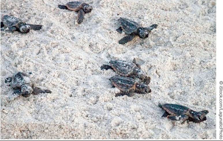
FIGURE 11.3 DashtotheSea These loggerhead sea turtle hatchlings have emerged from nests in the sand and must reach the sea to survive. On land, eggs and hatchlings face threats from predators, beach development, and artificial lighting (which can disrupt the hatchlings’ sense of direction, preventing them from reaching the sea). Loggerhead turtles also face threats in the marine environment from predators, commercial fisheries (turtles can be caught accidentally in nets and traps), collisions with boats, and pollution. Back to text
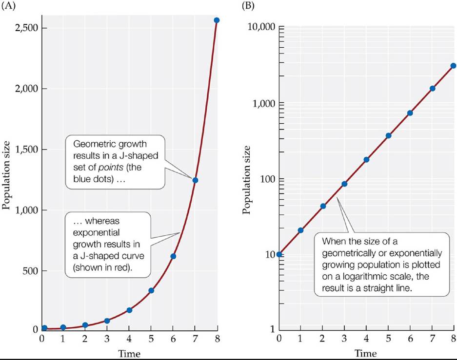
FIGURE 11.4 GeometricandExponentialGrowth (A) The blue dots plot the size of a geometrically growing population that begins with 10 individuals and doubles in each discrete time period (i.e., No = 10 and λ = 2). The red curve plots exponential growth in a comparable population that reproduces continuously, also beginning with 10 individuals and having a growth rate of r = ln(2) = 0.69. (B) When the population sizes represented by the blue circles and the red curve in (A) are plotted on a logarithmic scale, the result is a straight line. Back to text
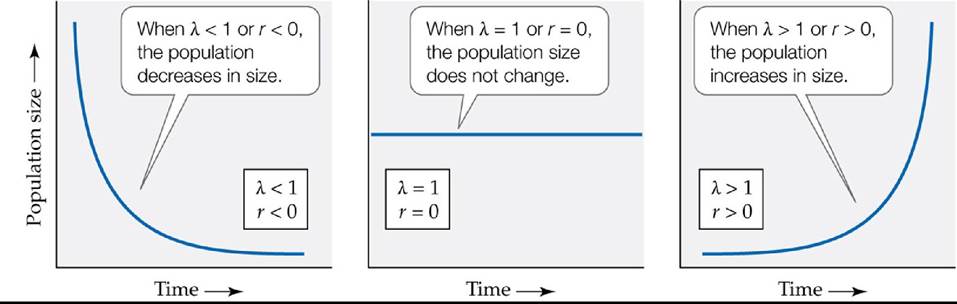
FIGURE 11.5 How Population Growth Rates Affect Population Size Depending on the value of λ or r, a population with an exponential growth pattern will decrease in size, remain the same size, or increase in size. Back to text
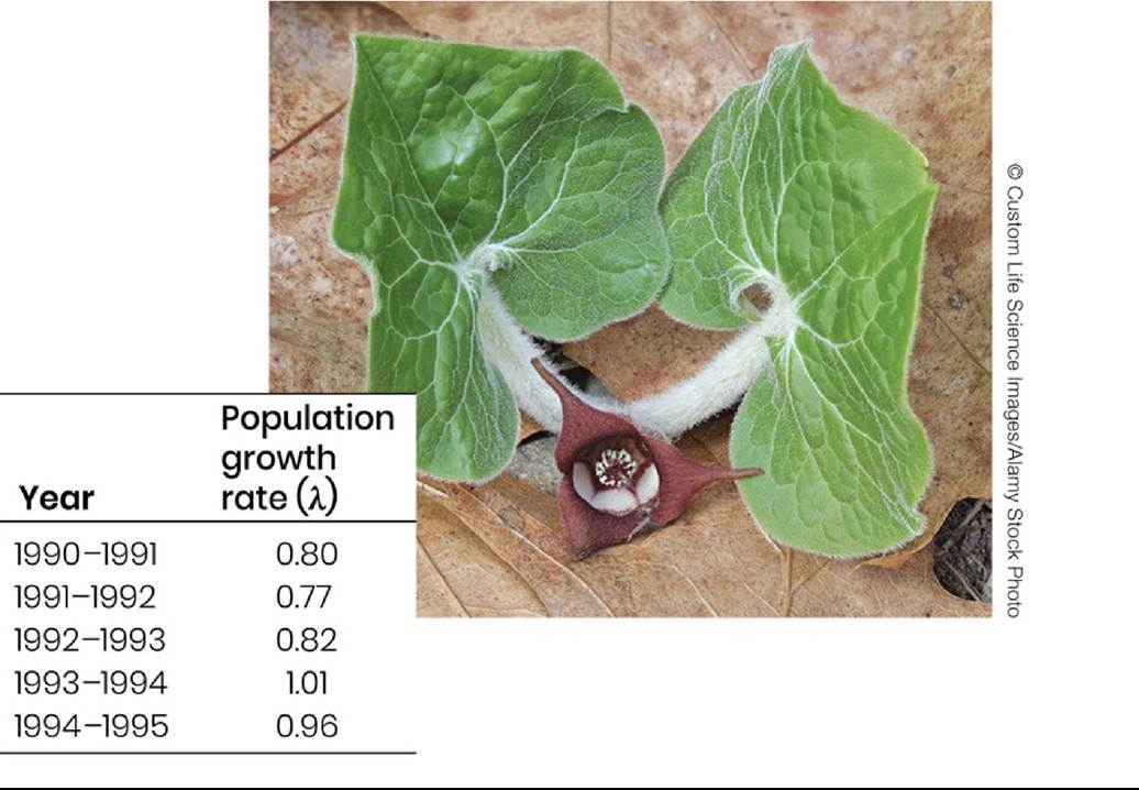
FIGURE 11.6 Some Populations Have Low Growth RatesThegrowthratesofa population of wild ginger (Asarum canadense) in a young forest vary from year to year. The maximum growth rate in this forest is 1.01. However, growth rates are often less than 1.0, suggesting that the population will decline in size unless conditions improve. (Data from H. Damman and M. L. Cain. 1998. JEcol 86: 13-26.) Back tθ text
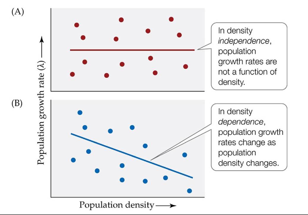
FIGURE 11.7 Comparing Density Independence and Density Dependence Each point represents one population. (A) Density independence. (B) Density dependence. In this example, population growth rates decrease as population density increases. Back to text
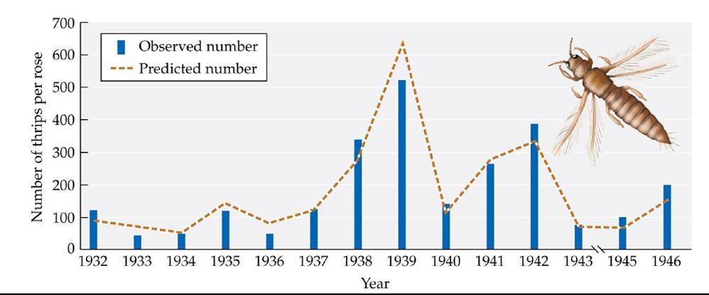
FIGURE 11.8 Weather Can Influence Population Size DavidsonandAndrewartha accurately predicted the mean number of thrips per rose observed in Adelaide, Australia, using an equation based on four weather-related variables. (After J. Davidson and H. Andrewartha. 1948. J Anim Ecol 17: 200-222.) Back tθ text
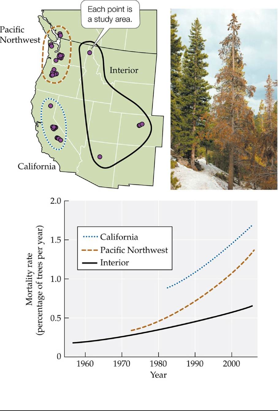
FIGURE 11.9 Rising Tree Mortality Rates Trends in coniferous tree mortality rates for 76 study plots located in the three regions of the western United States shown on the map. (After P. J. van Mantgem et al. 2009. Science 323: 521-524.) Back tθ text
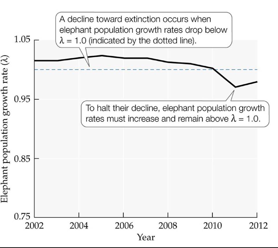
FIGURE 11.10 Will Elephants Become Extinct in the Wild? Population growth rates (λ) for 306 elephant populations show that elephants have been in decline across the African continent since 2010. (After G. Wittemyer et al. 2014. Proc NatlAcad Sci USA 111: 13117-13121.) Back to text
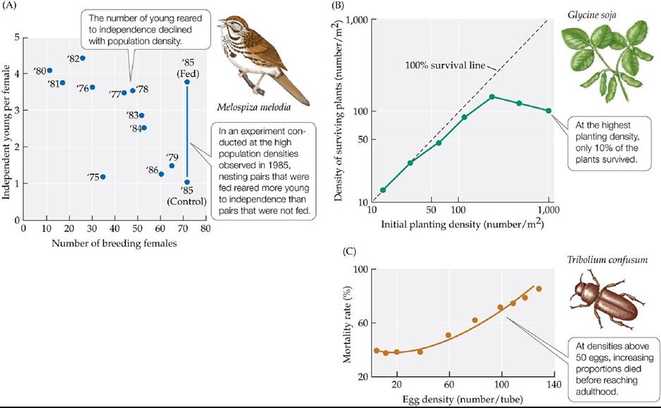
FIGURE 11.11 Examples of Density Dependence in Natural Populations (A) Numbers of young song sparrows reared to independence on Mandarte Island at different densities of breeding females. The number next to each point indicates the year of observation (1975-1986). (B) Density of surviving soybeans 93 days after they were planted at densities ranging from 10 to 1,000 seeds per square meter. (C) Mortality rates in flour beetles at various egg densities.
In (A), based on data from years other than 1975, how many young song sparrows per female would you have expected to be reared to independence in 1975? Explain your reasoning and describe factors that could have caused the observed results.
(A after P. Arcese and J. N. M. Smith. 1988. JAnim Ecol 57: 119-136; B after J. A. Yoda et al. 1963. JBiol 14: 107-120; C after T. S. Bellows, Jr. 1981. J Anim Ecol 50: 139-156.) Back tθ text
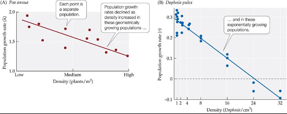
FIGURE 11.12 Population Growth Rates May Decline at High Densities Eachpoint represents one population. (A) The geometric population growth rate (λ) of the grass Poa annua is density dependent, as is (B) the exponential growth rate (r) of the water flea Daphnia pulex.
Are high-density populations increasing in size in (A)? In (B)? Explain.
(A after R. Law. 1975. Unpublished PhD thesis. University of Liverpool; B after P. W. Frank et al. 1957. Physiol Zool 30: 287-305.) Back tθ text
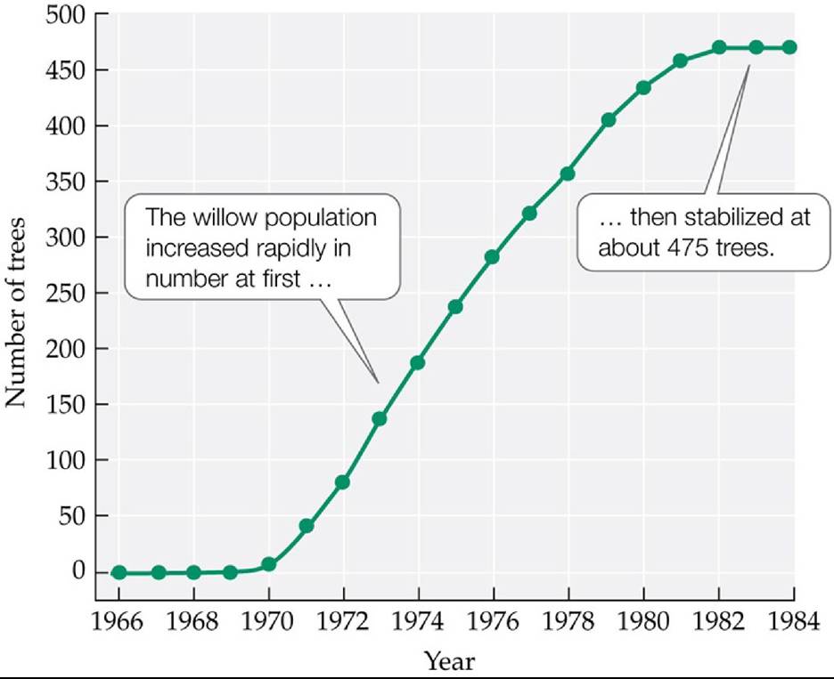
FIGURE 11.13 An S-Shaped Growth Curve in a Natural Population AtasiteinAustralia, heavy grazing by rabbits had prevented willows from colonizing the area. The rabbits were removed in 1954, opening up new habitat for willows. When willows colonized the area in 1966, ecologists tracked the growth of their population. (After M. C. Alliende and J. L. Harper. 1989. JEcol 77: 1029-1047.) Back to text
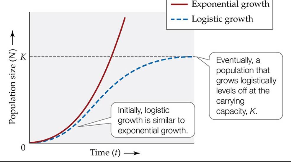
FIGURE 11.14 Comparison of Logistic and Exponential Growth Over time, logistic growth differs greatly from the unlimited growth of a population that increases exponentially. In the logistic equation, as the population size (N) becomes increasingly close to the carrying capacity, K, how does that affect the term (1 - N/K)? Why does this cause N to stop increasing in size?
Back to text
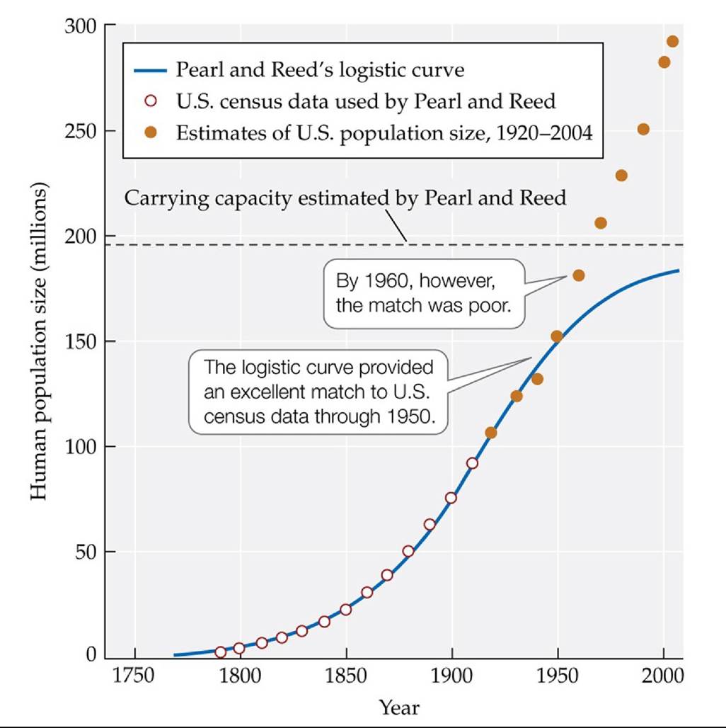
FIGURE 11.15 Fitting a Logistic Curve to the U.S. Population Size In 1920, Pearl and
Reed fitted a logistic curve to U.S. census data for 1790-1910. They estimated the nation’s carrying capacity (K) as 197 million people. (Data through 1910 from R. Pearl and L. J. Reed. 1920.
Proc Natl Sci Acad USA 6: 275-288; other data from Statistical Abstracts, U.S. Census Bureau.) Back tθ text
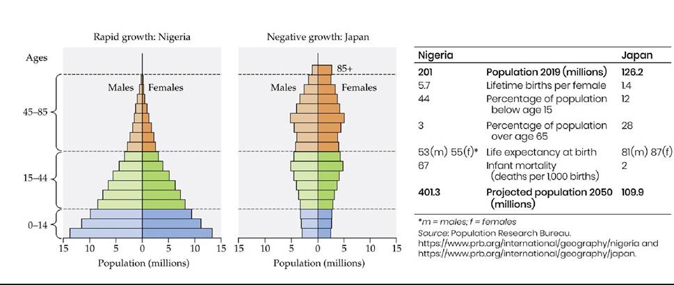
FIGURE 11.16 Age Structure Influences Growth Rate in Human Populations Population pyramids for Nigeria and Japan show age structures that are typical of human populations with rapidly growing populations (Nigeria) and with growth rates that are negative or close to zero (Japan). The main reproductive ages (15-44) are shown in green. (After L. Roberts. 2011. Science 333: 540-543. Pyramids from United Nations, DESA, Population Division. World Population Prospects 2019/CC BY 3.0 IGO. (⅛⅝ https://population.un.org/wpp/Graphs/DemographicProfiles/Pyramid/392 and https://population.un.org/wpp/Graphs/DemographicProfiles/Pyramid/566.) Back to text
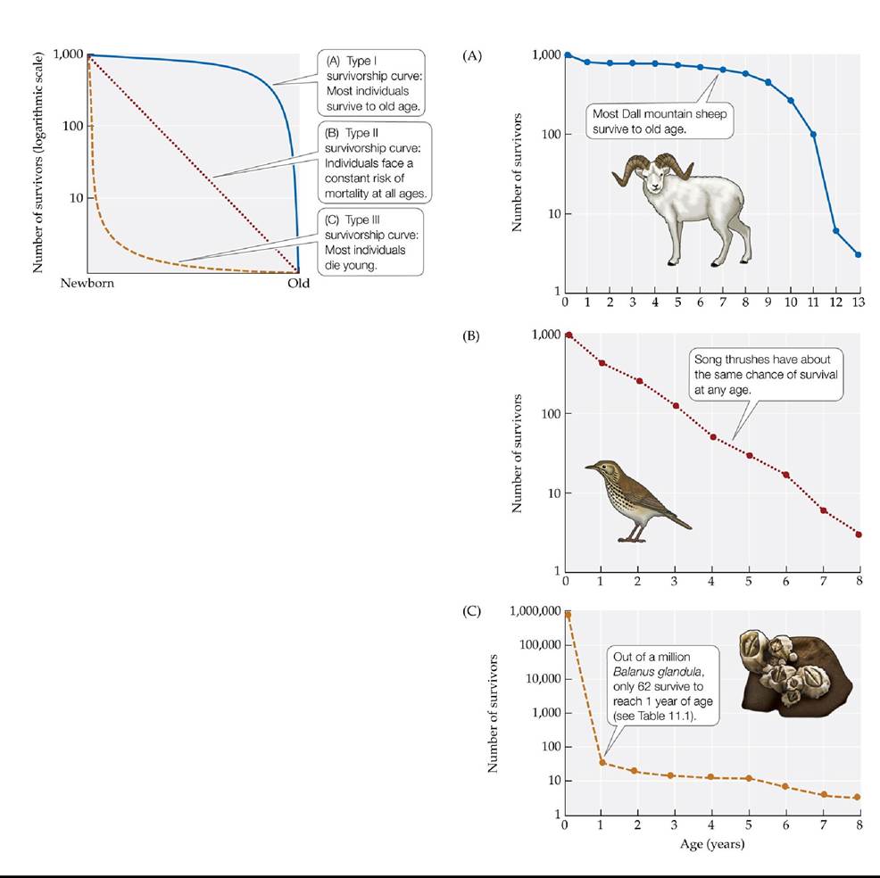
FIGURE 11.17 ThreeTypesofsurvivorshipCurves Ecologistsrecognizethreegeneral types of survivorship curves. Survivorship curves are given for (A) the Dall mountain sheep, (B) the song thrush, and (C) the acorn barnacle Balanus glandula. Notice that the number of survivors has been plotted on a logarithmic scale.
What percentage of Dall mountain sheep survive to age 11?
(A,B after E. S. Deevey. 1947. Q Rev Biol 22: 283-314; C after J. H. Connell. 1970. Ecol Monogr 40: 4978.) Back to text
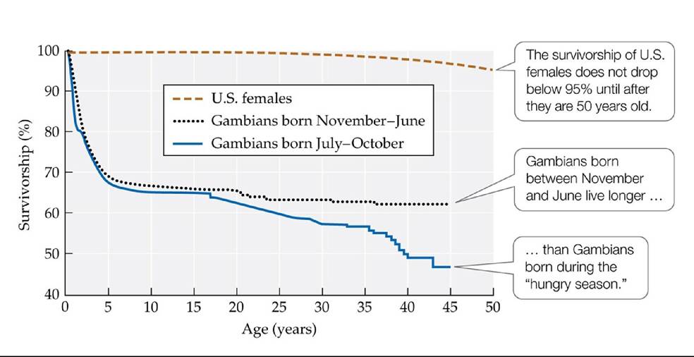
FIGURE 11.18 Survivorship Varies among Human Populations IntheUnitedStates, survivorship (lχ) does not drop greatly until old age. In Gambia, many people die at much younger ages.
The proportion of Gambians born in the hungry season who live to age 45 is roughly the same as the proportion of U.S. females who live to what age (see Table 11.2)?
(U.S. data from E. Arias. 2015. National Vital Statistic Reports 64. National Center for Health Statistics: Hyattsville, MD; Gambia data from S. E. Moore et al. 1997. Nature 388: 434.) Back to text
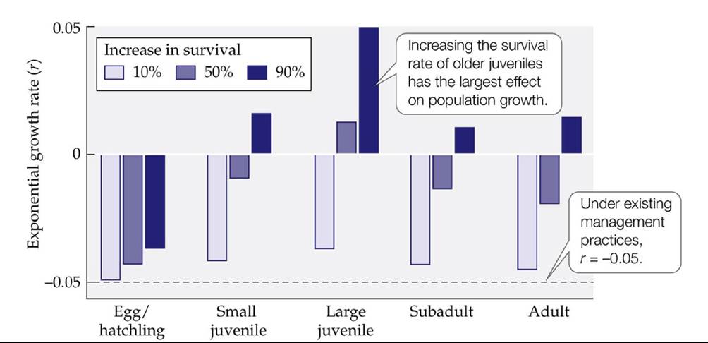
FIGURE A Management Practices and Sea Turtle Population Growth Rates Researchers used life table data to identify the age-specific death rates that most strongly influenced the population growth rate of loggerhead sea turtles. (After L. B. Crowder et al. 1994. Ecol Appl 4: 437445.) Back to text
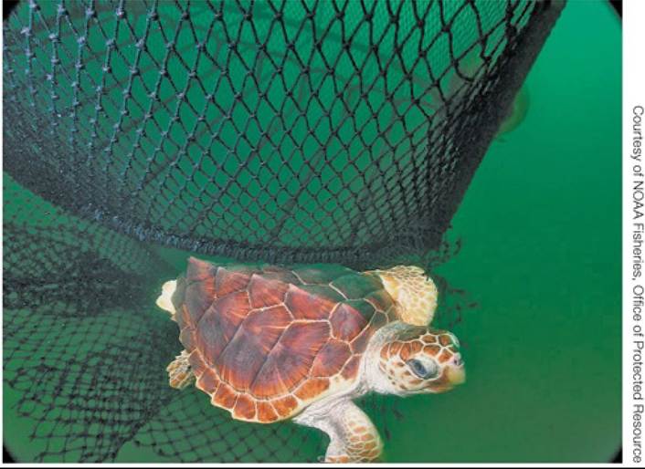
FIGURE B Turtle Excluder Device (TED) Back to text
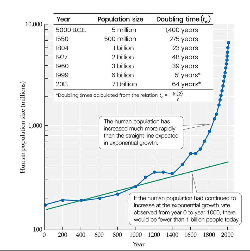
FIGURE 11.19 FasterthanExponential A plot of the logarithm of the human population size over the last 2,000 years differs dramatically from the straight line expected if it were growing exponentially. Back to text
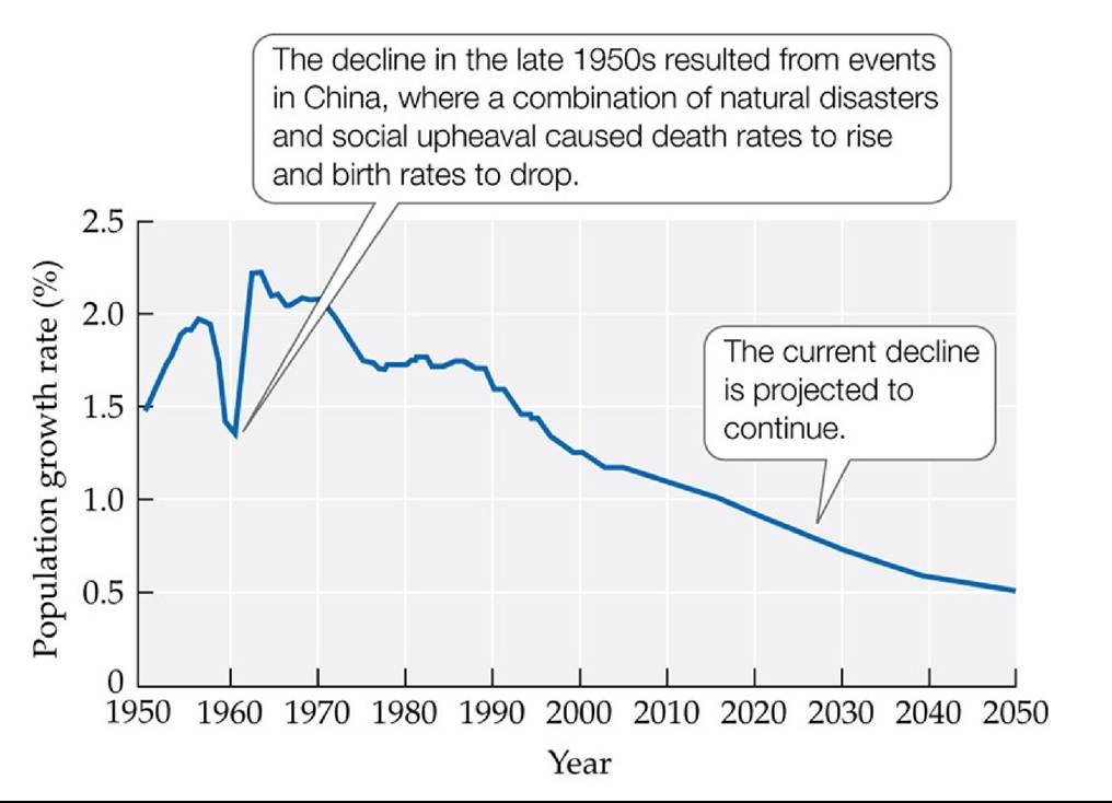
FIGURE 11.20 World Population Growth Rates Are Dropping Annual world population growth rates have declined since the early 1960s. (Data from U.S. Census Bureau, International Data Base, June 2011 update.)
In 2050, will the human population still be increasing in size? Explain.
Back to text
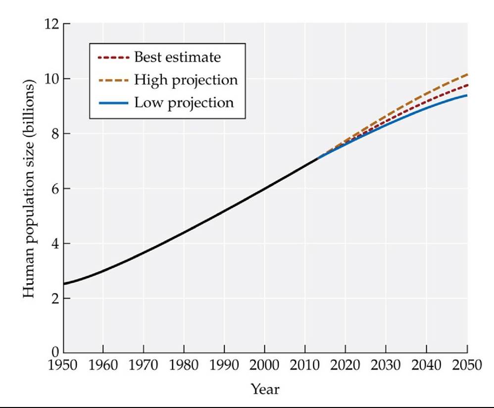
FIGURE 11.21 United Nations Projections of Human Population Size Thehuman population is expected to increase to 9.7 billion by 2050; low and high projections range from 8.3 billion to 10.9 billion.
Using the best-estimate curve shown here and the annual growth rate estimated for the human population in 2050 (see Figure 11.20), approximately how large will our population be in 2051?
(From United Nations, Department of Economic and Social Affairs, Population Division. 2019. World Population Prospects 2019: Data Booklet [ST/ESA/SER.A /424].) Back to text
12 Predation
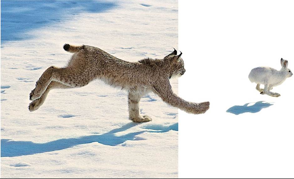
FIGURE 12.1 Predator and Prey A snowshoe hare (Lepus americanus) flees from its specialist predator, the Canada lynx (Lynx canadensis). © Tom Brakefield/Digital Vision Back to text
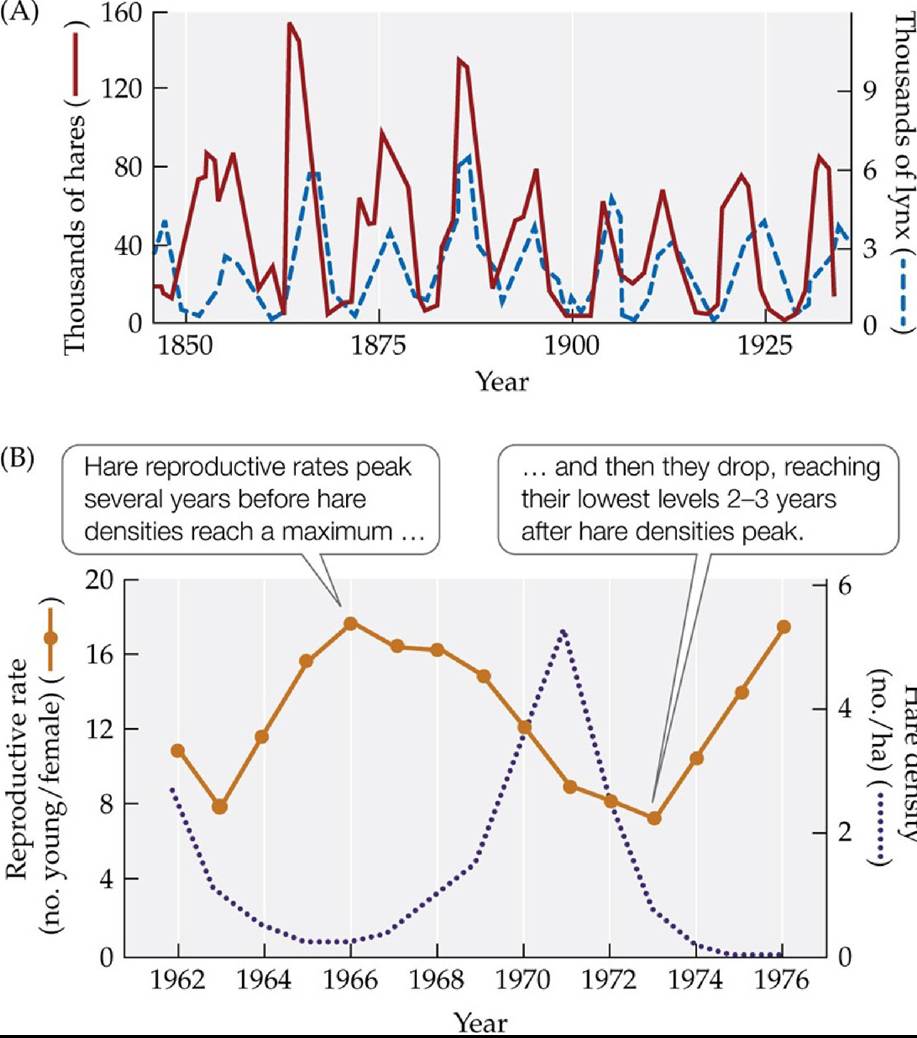
FIGURE 12.2 Hare Population Cycles and Reproductive Rates (A)Historicaltrapping data from the Hudson's Bay Company indicate that numbers of both hares and lynx fluctuated in a 10-year cycle. (B) The highest hare reproductive rates do not coincide with the highest hare densities.
In (A), does the peak abundance of one species typically occur after the peak abundance of the other species? Describe the observed pattern and
hypothesize why it might occur.
(A after D. A. MacLulich. 1936. J R Astron Soc Can 30: 233-246; B after J. R. Cary and L. B. Keith. 1979. Can J Zool 57: 375-390.) Back tθ text
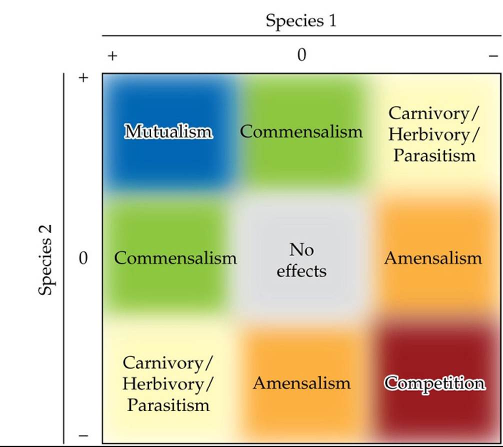
FIGURE 12.3 TypesofTwospeciesInteractions Interactionsbetweentwospeciescanbe grouped based on whether the effect of the interacting species (here denoted as species 1 and species 2) is negative (-), positive (+), or neutral (0). The strength of the two species' interaction
increases from the center (no effect) to the corners. (After E. G. Pringle. 2016. PLOS Biol 14: e2000891.) Back to text
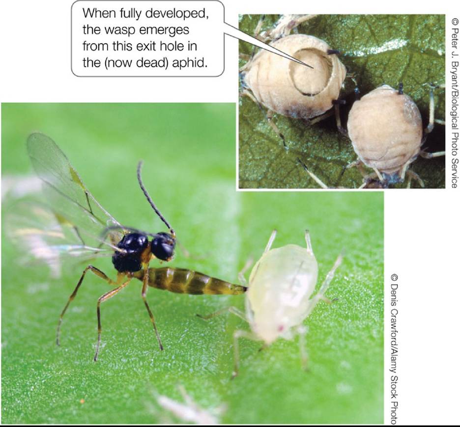
FIGURE 12.4 Are Parasitoids Carnivores or Parasites? Parasitoids such as the wasp Aphidius colemani, shown here depositing an egg into an aphid, can be considered unusual carnivores because during their lifetime they eat and slowly kill only one prey individual. Parasitoids can also be viewed as unusual parasites that eat all or most of their host, thereby killing it. Back to text
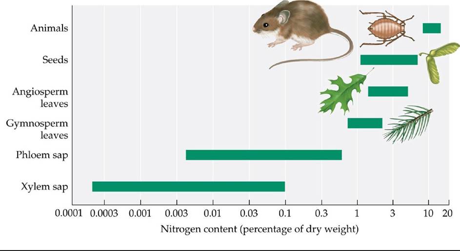
FIGURE 12.5 The Nitrogen Contents of Plants and Animals Differ Nitrogenisan essential component of any animal's diet. Body tissues of animals have much higher nitrogen content than those of plants. Of plant tissues, leaves tend to have the highest nitrogen content of any plant parts other than seeds. (After W. J. Mattson, Jr. 1980. Ann RevEcol Syst 11: 119-161.) Back to text
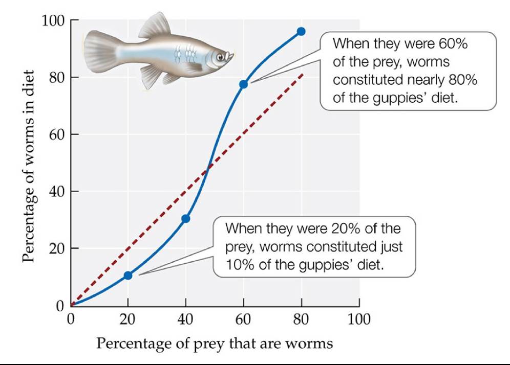
FIGURE 12.6 A Predator That Switches to the Most Abundant Prey Guppiesfocused their foraging efforts on whichever prey species was most common in their habitat: aquatic worms (tubificids) or fruit flies. The dashed red line indicates the results that would have been expected if the guppies had captured worms according to their availability instead of switching to whichever prey species was more abundant (solid blue line). (After W. W. Murdoch et al. 1975. Ecology 56: 1094-1105.) Back to text
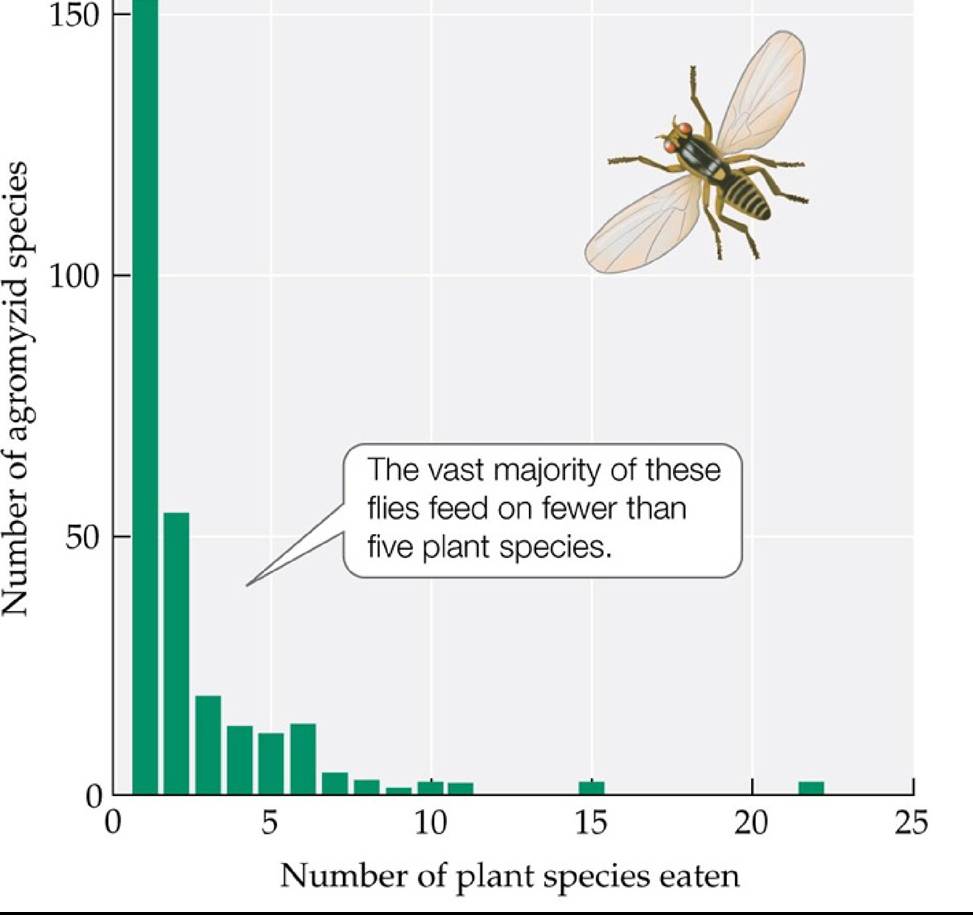
FIGURE 12.7 Most Agromyzid Flies Have Narrow Diets Thelarvaeofagromyzidfliesare leaf miners that live inside leaves and feed on leaf tissue.
Using the data in the graph, make a rough estimate of the percentage of agromyzid fly species that feed on fewer than five host plant species.
(After K. A. Spencer. 1972. Handbooks for the Identification of British Insects, Diptera, Agromyzidae, Vol. X, Part 5G. Royal Entomological Society: London.) Back tθ text
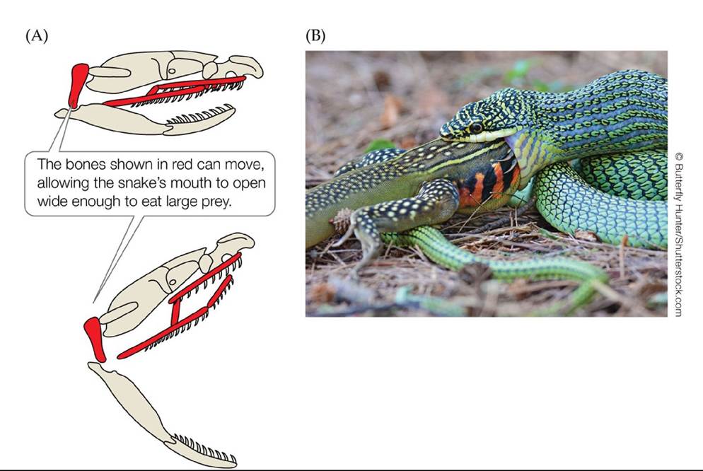
FIGURE 12.8 How Snakes Swallow Prey Larger Than Their Heads (A)Snakeshave movable skull bones that allow them to swallow surprisingly large prey. (B) This golden tree snake (Chrysopelea ornate) eating a butterfly lizard larger than its head. Back to text
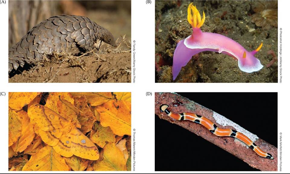
FIGURE 12.9 Adaptations to Escape Being Eaten Prey have evolved a wide range of mechanisms to escape from predators, including (A) physical features, such as the armor of the ground pangolin of South Africa (Manis temmenickii); (B) toxins, advertised by bright warning colors such as those of the nudibranch Hypselodoris bullockii; (C) crypsis, or camouflage, as in this female Saturniid moth (Rhodinia fugax), which blends in with the leaf litter on the forest floor; and (D) mimicry, as in this terrestrial flatworm (Bipalium everetti) that resembles a snake. Back to text
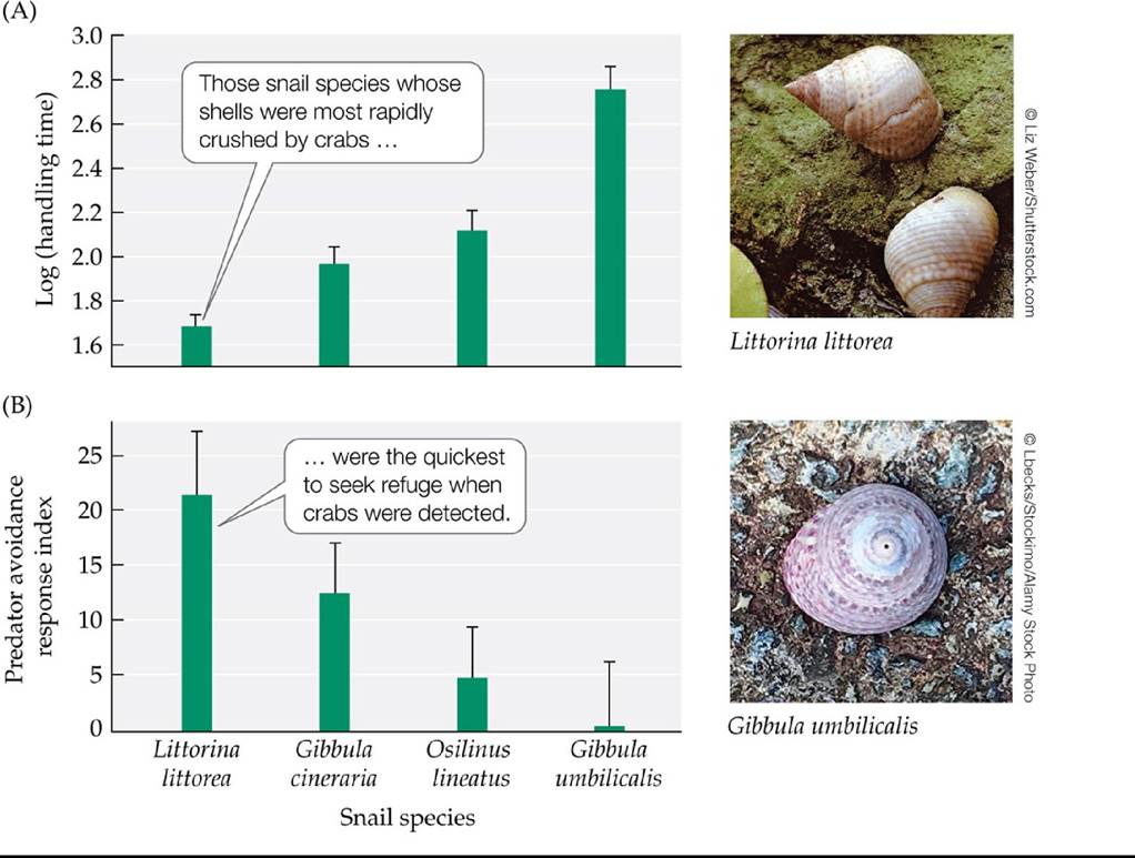
FIGURE 12.10 A Trade-Off in Snail Defenses against Crab Predation? (A)Handlingtime taken by green crabs (Carcinus maenas) to manipulate and crush the shells of each of four snail species. (B) Index of the strength of the predator avoidance response of each of four snail species; larger values indicate a more rapid behavioral response to crabs. Error bars show one standard error of the mean. (After P. A. Cotton et al. 2004. Ecology 85: 1581-1584.) Back to text
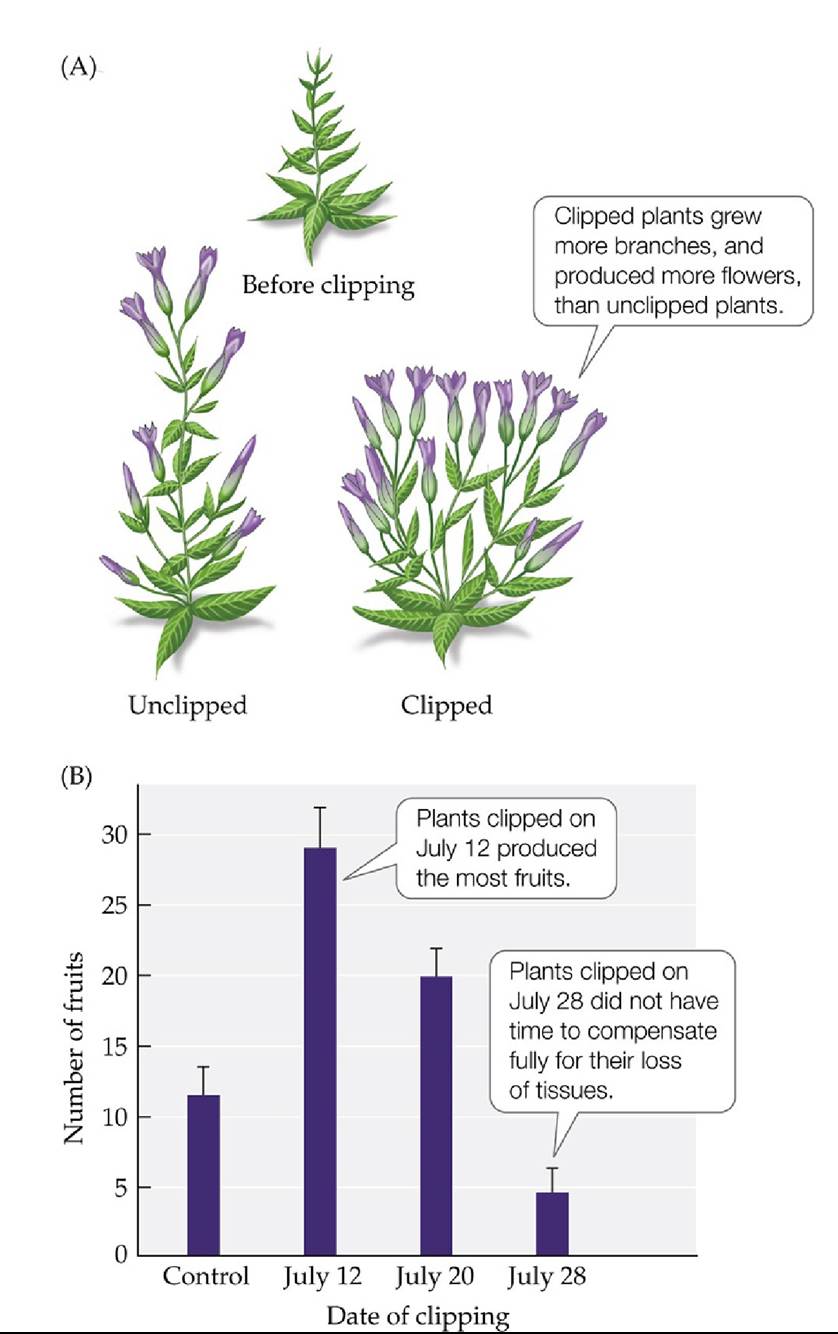
FIGURE 12.11 Compensating for Herbivory Field gentians (Gentianella campestris) were clipped at different times during the growing season to simulate herbivory. (A) The shape and production of flowers in unclipped (control) and clipped plants. (B) Numbers of fruits produced by control plants and plants clipped on different dates. Error bars show one standard error of the mean.
How many fruits would you expect to be produced by a field gentian that compensates fully for clipping? Explain your reasoning.
(After T. Lennartsson et al. 1998. Ecology 79: 1061-1072.) Back tθ text
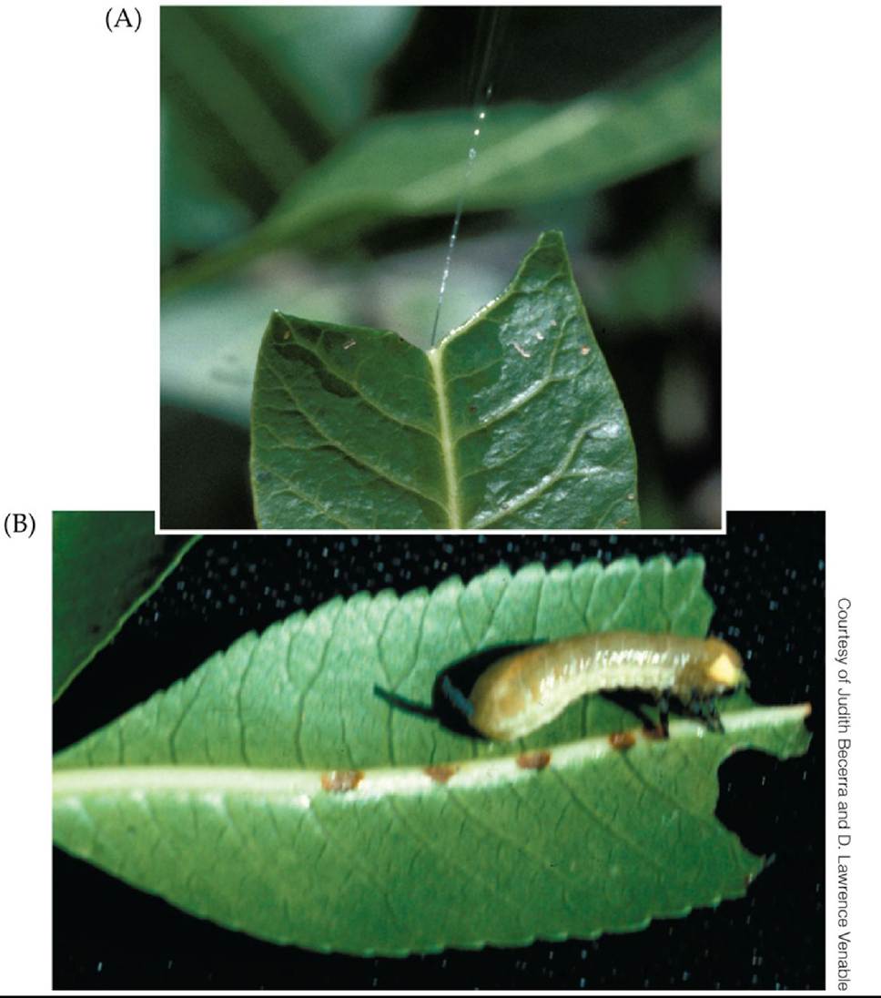
FIGURE 12.12 Plant Defense and Herbivore Counter-defense Someplantsinthegenus Bursera store toxic resin under high pressure in leaf canals. (A) When herbivores eat the leaves, they chew through these canals, causing the resin to be squirted up to 2 m from the leaf. (B) The larvae of some beetles in the genus Blepharida can disable this defense by chewing slowly through the canals, releasing the pressure in a gradual and harmless way. Back to text
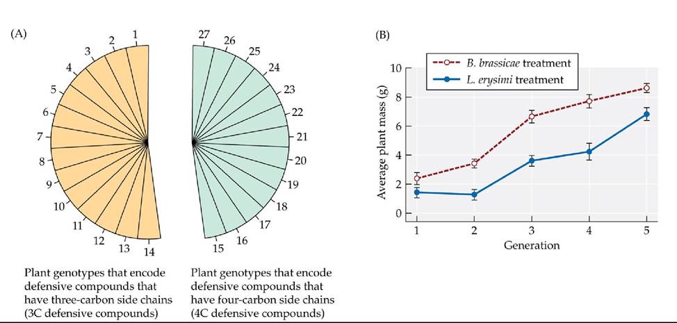
FIGURE 12.13 Does Herbivory Cause Evolution in Plant Populations? (A)Thispiechart shows the equal proportions of 27 Arabidopsis thaliana genotypes used at the start of an experiment testing the hypothesis that herbivory by aphids caused evolution in experimental plant populations. Yellow indicates plant genotypes that encode defensive compounds that have three- carbon side chains (3C defensive compounds), while blue indicates plant genotypes that encode defensive compounds that have four-carbon side chains (4C defensive compounds). (B) The herbivory by aphids (two species were used, Brevicoryne brassicae and Lipaphis erysimi) caused the average mass of A. thaliana plants to increase from generation to generation, indicating an evolutionary response by plant populations. Error bars show ± one standard error of the mean. (After T. Zust et al. 2012. Science 338: 116-119.) Back tθ text
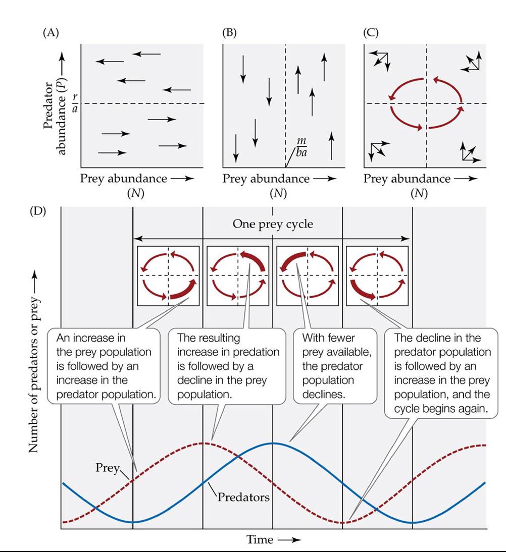
FIGURE 12.14 The Lotka-Volterra Predator-Prey Model Produces Population Cycles
(A) Considering the prey population first, the abundance of prey does not change when dN/dt = 0, which occurs when P = r/a (see Equation 12.1). (B) Similarly, considering the predator population, the abundance of predators does not change when dP/dt = 0, which occurs when N = m/ba. Combining the results in parts (A) and (B) shows that the combined abundances of predator and prey populations (represented by the red vectors) have an inherent tendency to cycle (C). These cycles are shown here in two ways: (C) by plotting the abundances of predators and prey populations together, and (D) by plotting the abundance of both predators and prey versus time;
the four inset diagrams in (D) show the combined effect of prey and predator abundance. In (D), note that the predator abundance curve is shifted one-fourth of a cycle behind the prey abundance curve. Back to text
FIGURE 12.15 In a Simple Environment, Predators Drive Prey to Extinction (A) C. B.
Huffaker constructed a simple laboratory environment to test for conditions under which predators and prey would coexist and produce population cycles. He placed oranges in a few positions in an experimental tray to provide food for the herbivorous six-spotted mite (Eotetranychus sexmaculatus); the remainder of the positions contained inedible rubber balls. (B) When a predatory mite (Typhlodromus occidentalis) was introduced into this simple environment, it drove the prey to extinction, causing its own population to go extinct as well. (B after C. B. Huffaker. 1958.
Hilgardia 27: 343-383.) Back tθ text
FIGURE 12.16 Predator-Prey Cycles in a Complex Environment Huffakermodifiedthe simple laboratory environment shown in Figure 12.15 to create a more complex environment that aided the dispersal of the prey species but hindered the dispersal of the predator. Under these conditions, predator and prey populations coexisted, and their abundances cycled over time. The top panels show the locations within the environment of prey (shaded regions) and predators (circles) at five different points in time. (After C. B. Huffaker. 1958. Hilgardia 27: 343-383.) Back to text
FIGURE 12.17 A Beetle Controls a Noxious Rangeland Weed Klamath weed (Hypericum perforatum), which poisons cattle, once covered about 4 million acres of rangeland in the western United States. (A) This photograph, taken in 1949, shows a field completely covered with flowering Klamath weed. (B) The leaf-feeding beetle Chrysolina quadrigemina was introduced in 1951 in the hope of controlling Klamath weed. This graph tracks densities of beetles and of Klamath weed (as a percentage of plant cover) in plots after the beetle's introduction.
Explain how a plant community might change after C. quadrigemina reduced the density of Klamath weed.
(B after C. Huffaker and C. Kennett. 1959. A ten-year study of vegetational changes associated with biological control of Klamath weed. J Range Manage 12: 69-82. doi:10.2307/3894934. Material used with permission of the publisher.) Back to text
FIGURE 12.18 Lizard Predators Can Drive Their Spider Prey to Extinction The experimental introduction of lizards to small islands in the Bahamas greatly increased the rate at which their spider prey became extinct. Error bars show one standard error of the mean. The photograph shows Thomas Schoener on one of the study islands. (After T. W. Schoener and D. A. Spiller. 1996. Nature 381: 691-694.) Back tθ text
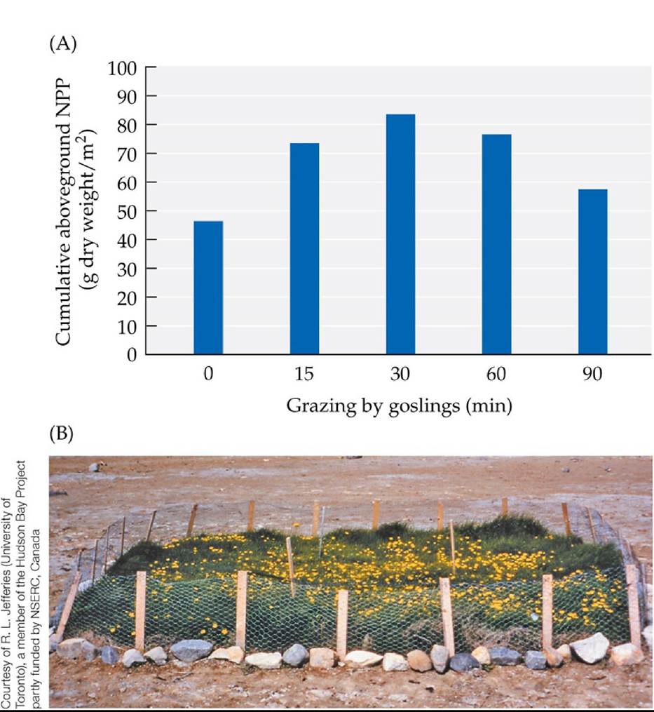
FIGURE 12.19 Snow Geese Can Benefit or Decimate Marshes (A)Whenlightlygrazed (for a single 15- to 90-minute episode) by snow goose goslings, salt marsh plants increased their subsequent cumulative production of new biomass compared with no grazing, because of the nitrogen added by the defecating geese. (B) Heavy grazing by high densities of snow geese can convert salt marshes to mudflats, as seen by comparing this small remnant of marsh (protected from geese) with the surrounding mudflat (a former marsh that was grazed heavily by geese). (A after D. S. Hik and R. L. Jefferies. 1990. JEcol 78: 180-195.) Back tθ text
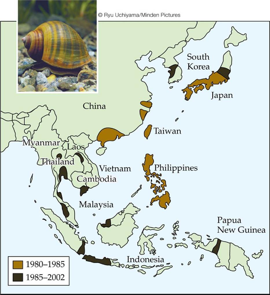
FIGURE 12.20 The Geographic Spread of an Aquatic Herbivore Sinceitsintroductionto Taiwan in 1980, the golden apple snail (Pomacea canaliculata) has spread rapidly across parts of Southeast Asia, threatening rice crops and native plant species. The map shows the regions the snail had occupied by 1985 and by 2002. (After J. O. L. Carlsson et al. 2004. Ecology 85: 1575-1580.) Back to text
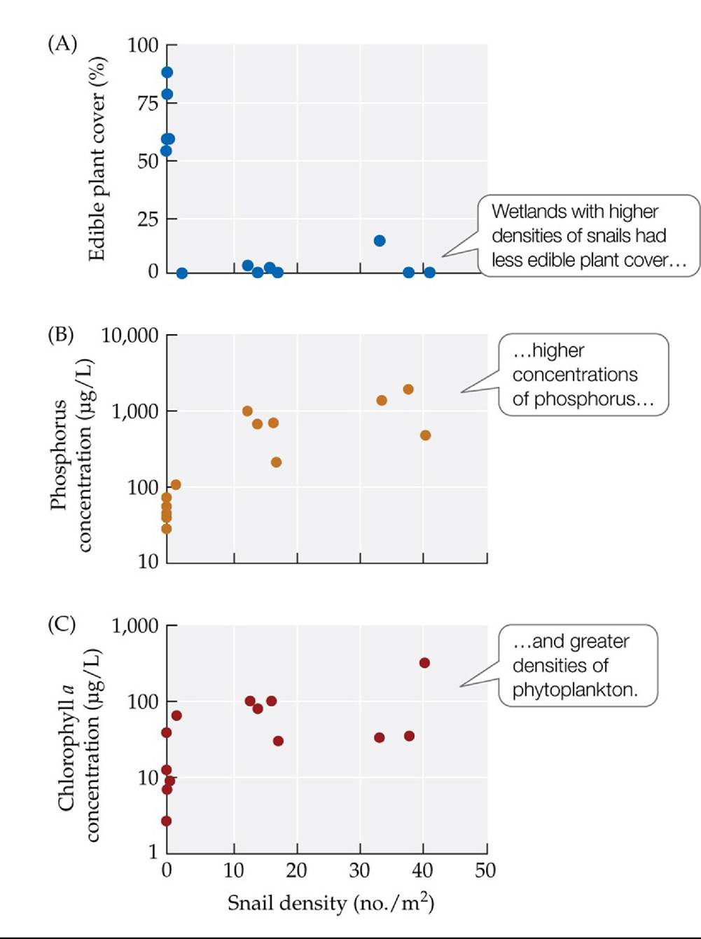
FIGURE 12.21 A Snail Herbivore Alters Aquatic Communities NilsCarlssonand colleagues measured characteristics of 14 natural wetlands in Thailand that differed in their densities of golden apple snails (Pomacea canaliculata). (A) Percentage of the wetlands covered by edible plant species. (B) Concentrations of phosphorus in the water. (C) Chlorophyll a concentrations (an indicator of phytoplankton biomass). Note the log scale in (B) and (C). Experiments conducted separately indicated that all the trends shown here could have been caused by the snail.
In (B), compare the average total phosphorus concentration in wetlands without snails with that in wetlands with snails.
(After J. O. L. Carlsson et al. 2004. Ecology 85: 1571-1580.) Back tθ text
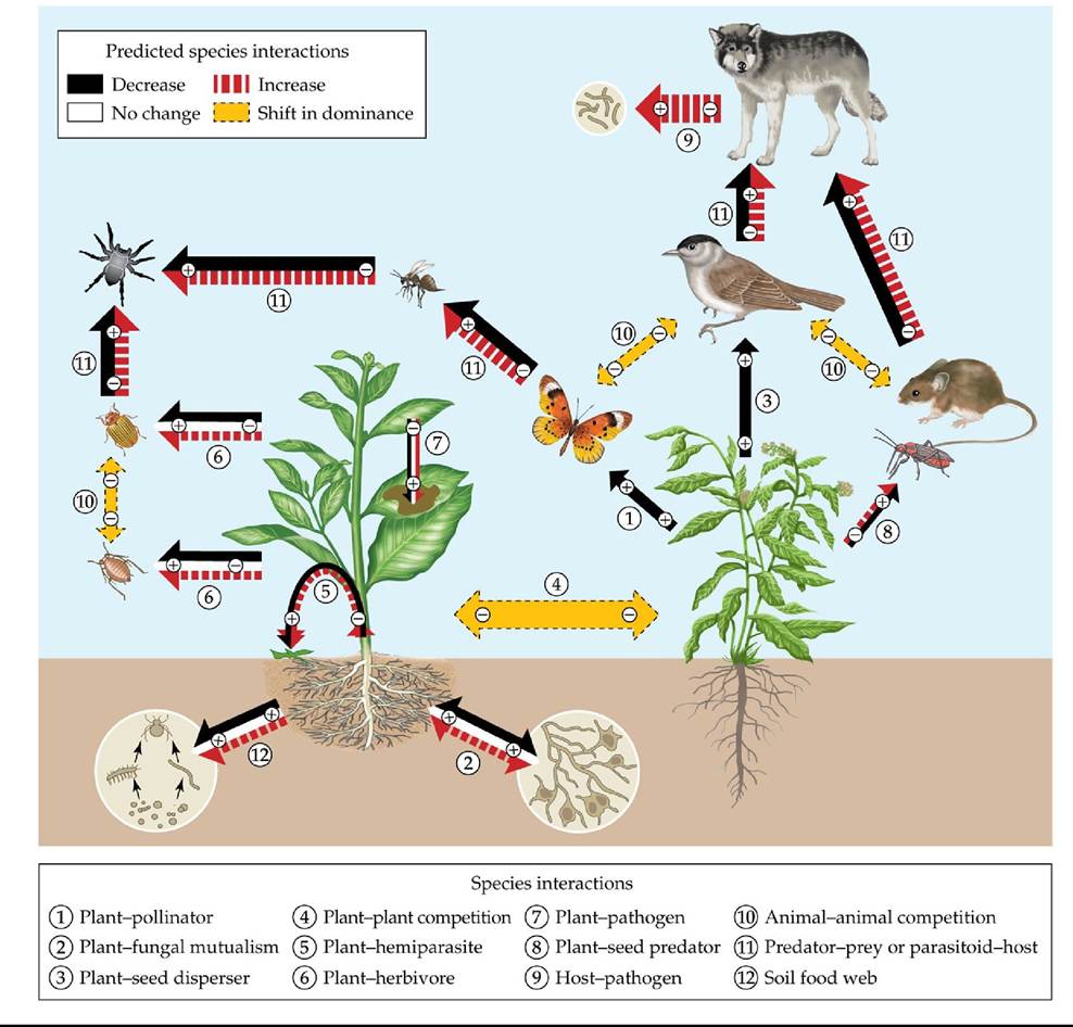
FIGURE 12.22 Climate Change Alters Species Interactions Thisdiagramprovidesan overview of a literature review of how climate change is predicted to alter species interactions in terrestrial systems, including some with parasites, in studies that tested for the effects of increased temperature, changing rainfall patterns, or increased frequency of extreme weather events. Arrows with solid outlines indicate nutrient and energy flow; double-headed arrows with dotted outlines indicate competition. A + or - symbol within an arrow indicates benefit or cost to each participant. (After J. M. Tylianakis et al. 2008. EcolLett 11: 1351-1363.) Back tθ text
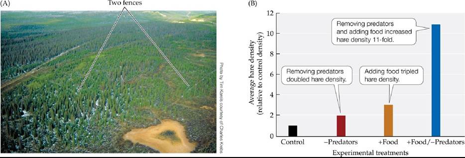
FIGURE 12.23 Both Predators and Food Influence Hare Density (A)Thisaerial photograph shows one of the 1-km2 snowshoe hare study sites described in the text. (B) Average hare densities relative to their densities in control blocks of forest. (B after C. J. Krebs et al. 1995. Science 269: 1112-1115.) Back tθ text
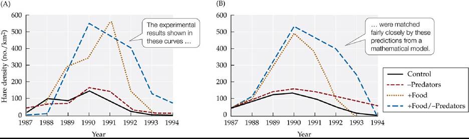
FIGURE 12.24 A Vegetation-Hare-Predator Model Predicts Hare Densities Accurately The model assumes that hare population densities are influenced by feeding relationships across three levels: vegetation (the hares' food), hares, and predators. Parameters for the model were estimated from field data. When the investigators compared the predictions of their model with the experimental results of Krebs et al. (1995), they found a reasonably good match between (A) the experimental results and (B) the model's predictions. (After A. A. King and W. M. Schaffer. 2001. Ecology 82: 814-830.) Back tθ text
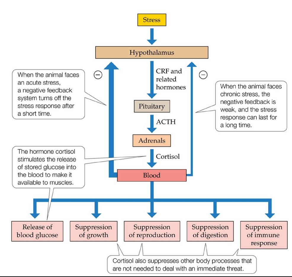
FIGURE 12.25 The Stress Response When an animal is stressed, the hypothalamus releases a hormone called CRF, which stimulates a cascade of reactions that affect a number of body processes. (After R. Boonstra et al. 1998. EcolMonogr 79: 371-394.) Back tθ text
13 Parasitism
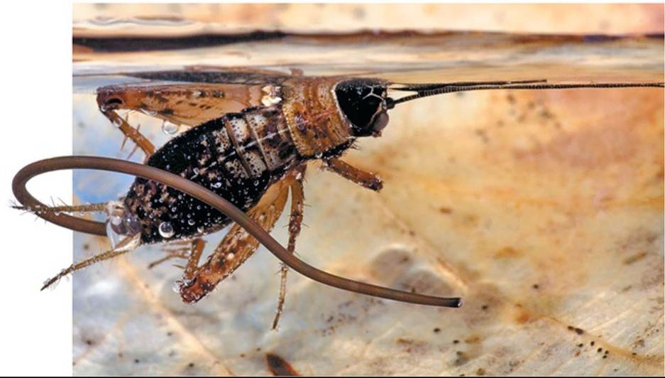
FIGURE 13.1 DriventoSuicide The behavior of this wood cricket (NemQbiussylvestris) was manipulated by the hairworm (Paragordius tricuspidatus) emerging from its body. By causing the cricket to jump into water (where it drowns), the parasite is able to continue its life cycle. © Pascal Goetgheluck/Science Source Back tθ text
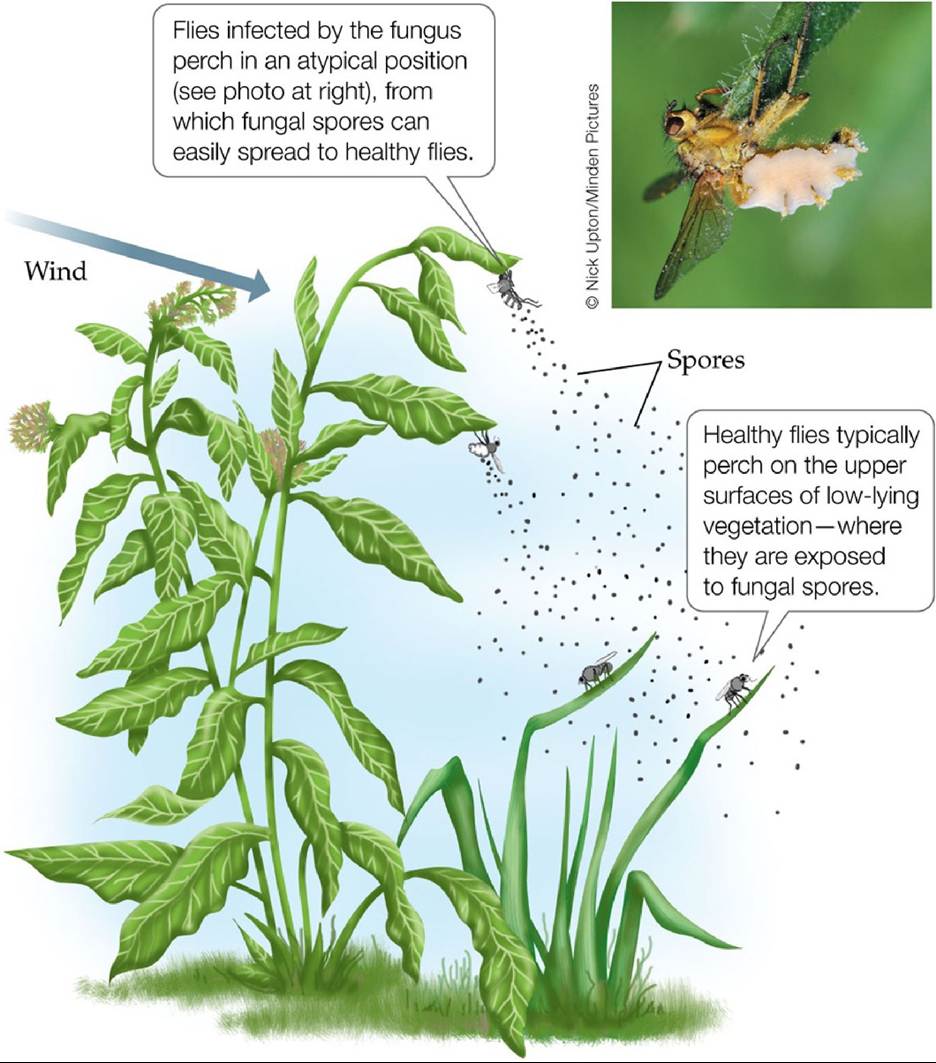
FIGURE 13.2 EnslavedbyaFungus Shortly before they die from the infection, yellow dung flies infected by the fungus Entomophthora muscae move to the downwind side of a relatively tall plant and perch on the underside of one of its leaves. This position increases the chance that fungal spores released by Entomophthora will land on healthy yellow dung flies. (After D. P. Maitland. 1994. Proc R Soc London 258B: 187-193.) Back tθ text
FIGURE 13.3 The Human Body as Habitat for Symbionts Differentpartsofourbodies provide suitable habitat for a wide range of symbionts, many of which are parasites; only a few examples are shown here. Some of these organisms are pathogens that cause disease. Back to text
FIGURE 13.4 Many Species Are Host to More Than One Parasite Species In a study conducted in Britain, most host species were found to harbor more than one parasite species. The number of parasite species shown here for fishes, birds, and mammals includes only helminth worm parasites and hence is an underestimate of the actual number of parasite species found in these vertebrates.
Averaging across the six groups of organisms other than vertebrates (which we exclude because the data underestimate the true number of parasites), what is the average number of parasite species per host? Suppose the number of parasite species was determined for a previously unstudied host from one of the six groups. Is it likely that the number of parasites in that host would be close to the average you calculated? Explain.
(After P. D. Stiling. 2002. Ecology: Theories and Applications, 4th ed. Prentice-Hall: Upper Saddle River, NJ.) Back to text
FIGURE 13.5 Ectoparasites A wide range of parasites live on the outer surfaces of their hosts, feeding on host tissues. Examples include (A) the corn smut fungus (Ustilago maydis), seen here growing on an ear of corn, and (B) the velvet mite (Trombidium spp.), which in its larval form feeds parasitically on the blood of insects, such as this sawfly larva. Back to text
FIGURE 13.6 Endoparasites Many parasites live within the body of their host, feeding on the host's tissues or robbing it of nutrients. (A) The tapeworm Taenia taeniaeformis uses the suckers and hooks shown here to attach to the intestinal wall of its mammalian host, often a rodent, rabbit, or cat. Once attached, an adult can grow to over 5 m (16 feet) in length. (B) The bacterium Mycobacterium tuberculosis causes the lung disease tuberculosis, which kills 1-2 million people each year. (C) This section of a potato tuber shows the destruction wrought by Erwinia carotovora, a bacterium that causes soft rot. Affected areas become soft with decay and develop a distinctive foul odor. Back to text
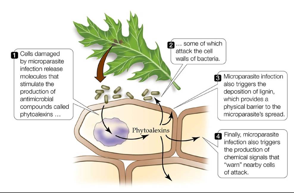
FIGURE 13.7 NonspecificPlantDefenses Plantscanmountanonspecificdefensive response that is effective against a broad range of fungal and bacterial microparasites. Back to text
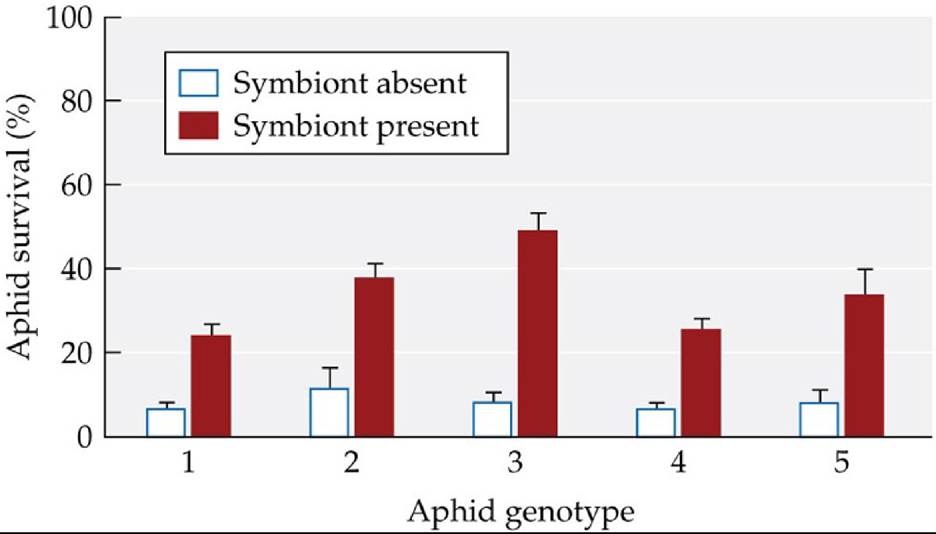
FIGURE 13.8 Protected by a Symbiont Pea aphids (Acyrthosiphon pisum) of five different genotypes were exposed to the pathogenic fungus Pandora neoaphidis. For each of these genotypes, some aphids were inoculated with the bacterial symbiont Regiella insecticola, while other aphids lacked the symbiont. Aphids harboring the symbiont survived at higher rates than did aphids lacking the symbiont. Error bars show one standard error of the mean. (After C. L. Scarborough et al. 2005. Science 310: 1781.) Back tθ text
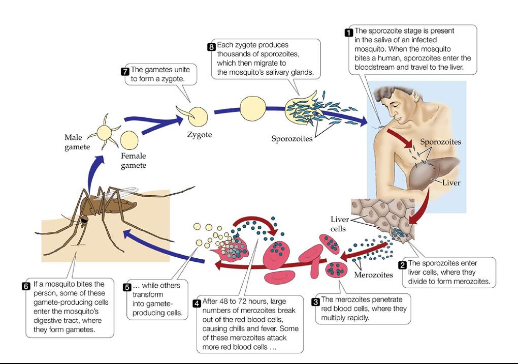
FIGURE 13.9 Life Cycle of the Malaria Parasite The life cycle of the protist Plasmodium falciparum includes specialized stages that facilitate the dispersal of this endoparasite from one host to another. The sporozoite stage, for example, enables the parasite to disperse from an infected mosquito to a human host.
Which stage in the life cycle enables the parasite to disperse from a human host to a mosquito?
Back to text
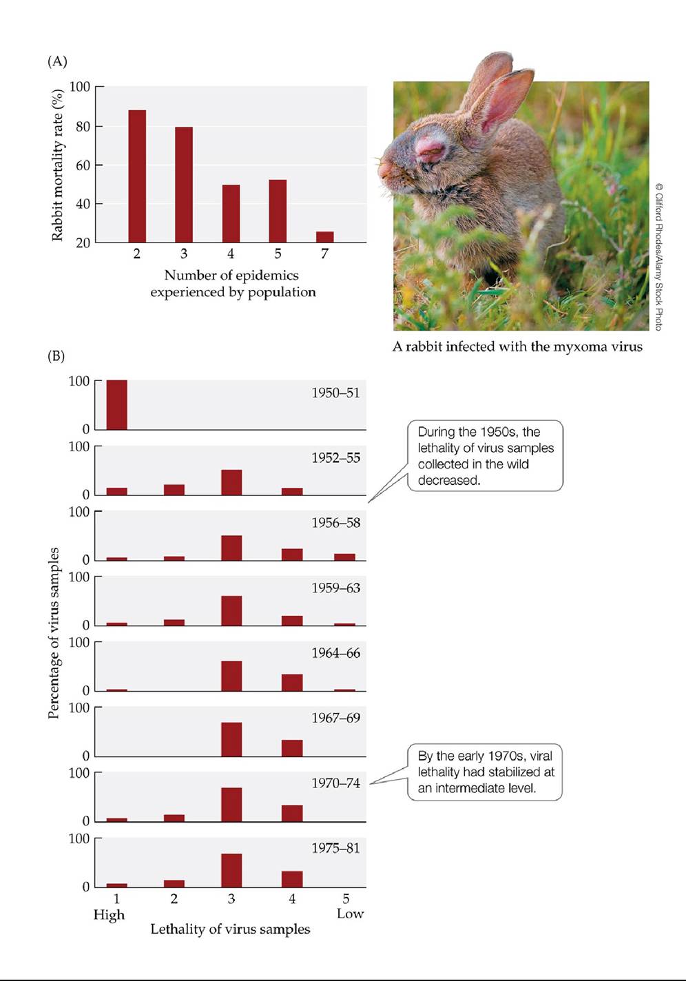
FIGURE 13.10 Coevolution of the European Rabbit and the Myxoma Virus (A)Afterthe introduction of the myxoma virus to Australia, researchers periodically tested its lethality by collecting rabbits from a wild population and exposing them to a standard strain of the virus that killed 90% of naive (unselected) laboratory rabbits. Over time, mortality in those wild rabbits declined as the number of epidemics increased and the population evolved resistance to the virus. (B) The lethality of virus samples collected in rabbits in the wild also declined, as was determined when they were tested against a standard (unselected) line of rabbits. (A, extracted from P. J. Kerr and S. M. Best. 1998. Myxoma virus in rabbits. In Genetic resistance to animal diseases. M. Mdller and G. Brem (Eds.). Rev Sci Tech Off Int Epiz 17(1): 256-268. Available at: http://dx.doi.Org/10.20506/rst.17.1.1081. World Organisation for Animal Health at (⅛⅝ www.oie.int; B after R. M. May and R. M. Anderson. 1983. Proc R Soc London 219B: 281-313.) Back to text
FIGURE 13.11 Adaptation by Parasites to Local Host Populations The graph shows the frequencies with which Microphallus parasites from three lakes in New Zealand (Lake Mapourika, Lake Wahapo, and Lake Paringa) were able to infect snails (Potamopyrgus antipodarum) from the same three lakes. Error bars show one standard error of the mean.
Do snails with poor defenses against parasites from their own lake also have poor defenses against parasites from other lakes? Explain.
(After C. M. Lively. 1989. Evolution 43: 1663-1671.) Back to text
FIGURE 13.12 Parasites Infect Common Host Genotypes More Easily Than Rare Genotypes In a laboratory experiment, Dybdahl and Lively compared rates of Microphallus infection in four common snail genotypes (A-D, represented by blue dots) and in a group of 40 rare snail genotypes (E, represented by a red triangle). The parasites and snails in this experiment were all taken from the same lake. (After M. F. Dybdahl and C. M. Lively. 1998. Evolution 52: 1057-1066.) Back to text
FIGURE 13.13 ParasitescanReduceHostReproduction Researchersinfected experimental populations of the beetle Adalia decempunctata with a sexually transmitted mite parasite (Coccipolipus hippodamiae). Over the next 25 days, they monitored the proportions of the eggs laid by female beetles from (A) control and (B) infected populations that hatched. Each curve represents the eggs laid by a single female. (After K. M. Webberley et al. 2004. JAnimEcol 73: ι-ιo.) Back to text
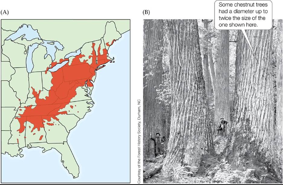
FIGURE 13.14 Parasites Can Reduce Their Host's Geographic Range (A) The original distribution of the American chestnut (Castanea dentata) is shown in darker, shaded region. Although a few chestnut trees remain standing, a fungal parasite drove this once-dominant species virtually extinct throughout its entire former range. (B) Chestnuts were once important timber trees (note the two loggers shown in the photograph). (Range detail courtesy of Elbert L. Little, Jr. 1970. Atlas of United States Trees. U.S. Department of Agriculture, Forest Service, and other publications.) Back to text
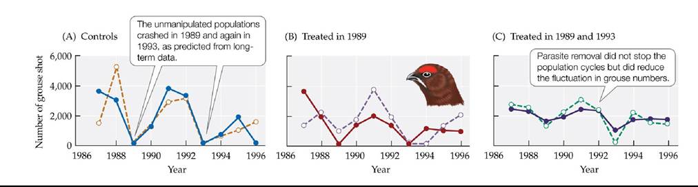
FIGURE 13.15 Parasite Removal Reduces Host Population Fluctuations Hudsonetal. studied the effects of parasites on the cycling of six red grouse populations subjected to three treatments: (A) two control populations, (B) two populations treated for nematode parasites in 1989, and (C) two populations treated for parasites in 1989 and 1993.
If parasite removal completely stopped the population cycles, how might the results in (C) differ from those actually obtained?
(After P. J. Hudson et al. 1998. Science 282: 2256-2258.) Back tθ text
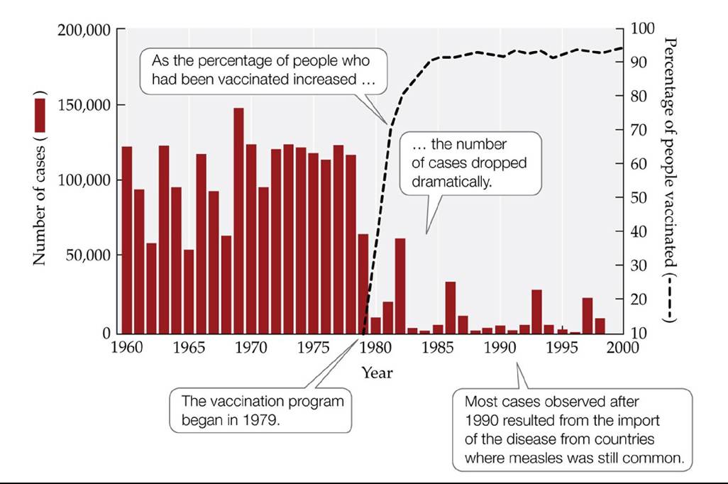
FIGURE 13.16 Vaccination Reduces the Incidence of Measles in Humans Theresultsof a measles vaccination program in Romania show that lowering the density of susceptible individuals can control the spread of a disease. Measles often kills (especially in populations that are poorly nourished or that lack a history of exposure to the disease) and can cause severe complications in survivors, including blindness and pneumonia. (After P. M. Strebel and S. L. Cochi. 2001. Nature 414: 695-696.) Back tθ text
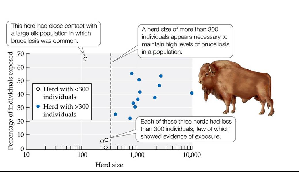
FIGURE 13.17 Determining Threshold Population Densities for Disease Control The percentage of bison that showed evidence of previous exposure to brucellosis was monitored in six national parks in the United States and Canada. By plotting this percentage versus the size of each of 16 bison herds, researchers obtained a rough estimate of the threshold density for establishment of the disease (200-300 individuals, the upper bound of which is shown by the dashed line). (After A. Dobson and M. Meagher. 1996. Ecology 77: 1026-1036.) Back tθ text
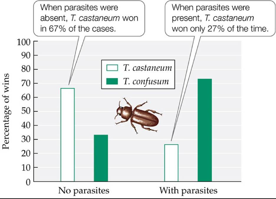
FIGURE 13.18 Parasites Can Alter the Outcome of Competition ThomasPark performed competition experiments using populations of the flour beetles Tribolium castaneum and T. confusum that were or were not infected with a protist parasite. (After T. Park. 1948. Ecol Monogr 18: 267-307.) Back tθ text
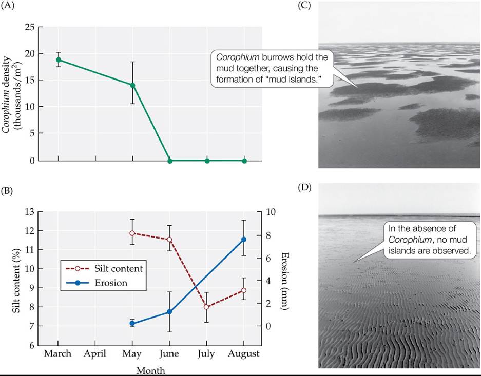
FIGURE 13.19 Parasites Can Alter the Physical Environment Infectionoftheamphipod Corophium volutator by a trematode parasite affects not only the host, but its entire tidal mudflat community. (A) The trematode can drive amphipod populations to local extinction. (B) In the absence of Corophium, the erosion rate increases and the silt content of the mudflats decreases. (C,D) The overall physical structure of the mudflats also changes [compare (C) with (D)]. Error bars show ± one standard error of the mean. (After K. N. Mouritsen et al. 1998. JMarBiolAssoc U.K. 78: 1167-1180; K. N. Mouritsen and R. Poulin. 2002. Parasitology 124: S101-S117.) Back tθ text
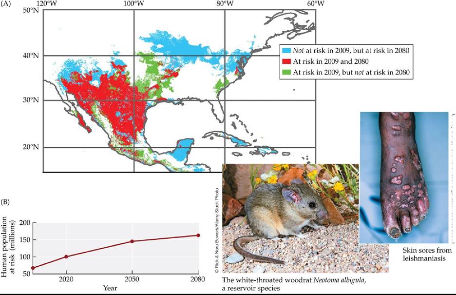
© Andy Crump, TDR, World Health OrganizationZScience Source
FIGURE 13.20 Climate Change May Increase the Risk of Leishmaniasis in North
America Leishmaniasis can cause severe skin sores, difficulty breathing, immune system impairment, and other complications that can lead to death. There are currently 1 million new cases each year. Leishmaniasis is caused by protists in the genus Leishmania and spread by sand flies (bloodsucking insects in the genera Lutzomyia and Phlebotomus). In addition to infecting humans, the pathogen can persist in several reservoir species (rodents in the genus Neotoma). (A) Change in the geographic regions in which people are predicted to be at risk from leishmaniasis due to the presence of at least one vector and reservoir species. (B) Change in numbers of people predicted to be at risk due to the presence of at least one vector and reservoir species. (After C. Gonzalez et al. 2010. PLOS Neglected Trop Dis 4: 1-16.) Back tθ text
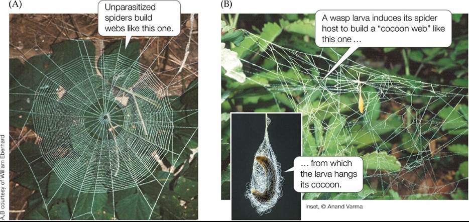
FIGURE 13.21 Parasites Can Alter Host Behavior The parasitoid wasp Hymenoepimecis argyraphaga dramatically alters the web-building behavior of the orb-weaving spider Plesiometa argyra. (A) The web of an uninfected spider. (B) The “cocoon web” of a parasitized spider. (After W. G. Eberhard. 2001. JArachnol 29: 354.) Back tθ text
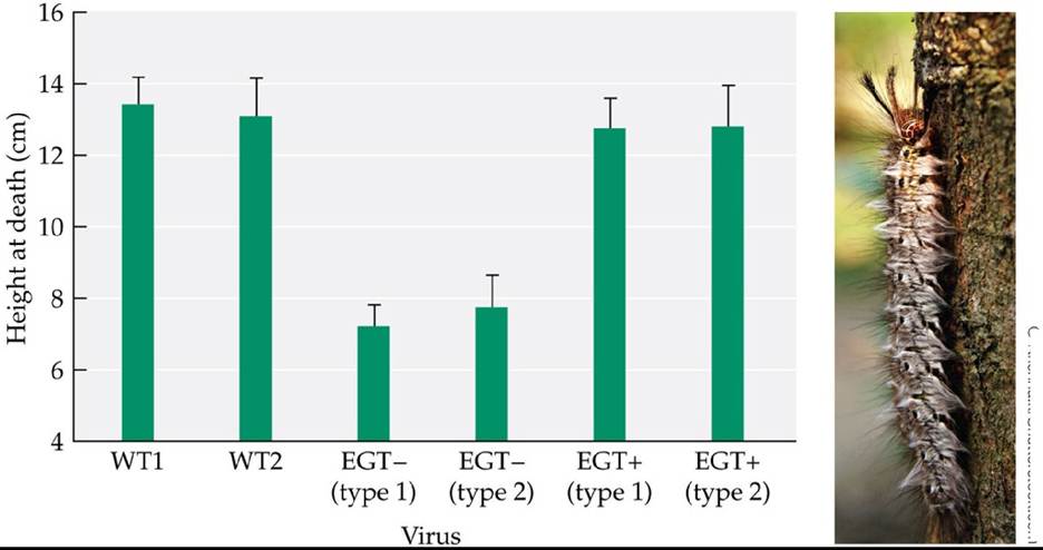
© Krlshna.k∕Shutterstock.com
FIGURE 13.22 A Parasite Gene That Enslaves Its Host Spongymothsinfectedbyavirus (Lymantria dispar nucleopolyhedrovirus, or LdMNPV) climb to high locations before they die—a behavior that benefits the virus but not the moth. To test the hypothesis that a particular viral gene (the egt gene) affects this behavior, researchers reported the height at death of spongy moth caterpillars reared in cages and subjected to the following treatments: WT viruses (two different natural, or wild-type, viruses); EGT- viruses (two different experimental viruses from which the egt gene had been removed); and EGT+ viruses (two different experimental viruses from which the egt gene was first removed, then replaced). Error bars show one standard error of the mean.
Explain why the researchers included the WT and EGT+ treatments.
(After K. Hoover et al. 2011. Science 333: 1401.) Back tθ text
14 Competition
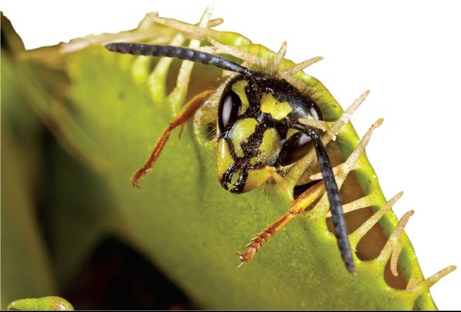
FIGURE 14.1 A Plant That Eats Animals Attracted to the plant's sweet-smelling nectar, this wasp is about to become a meal. Although the Venus flytrap typically captures insects, it can also feed on other animals, such as slugs and small frogs. © Chris Mattison/Alamy Stock Photo Back to text
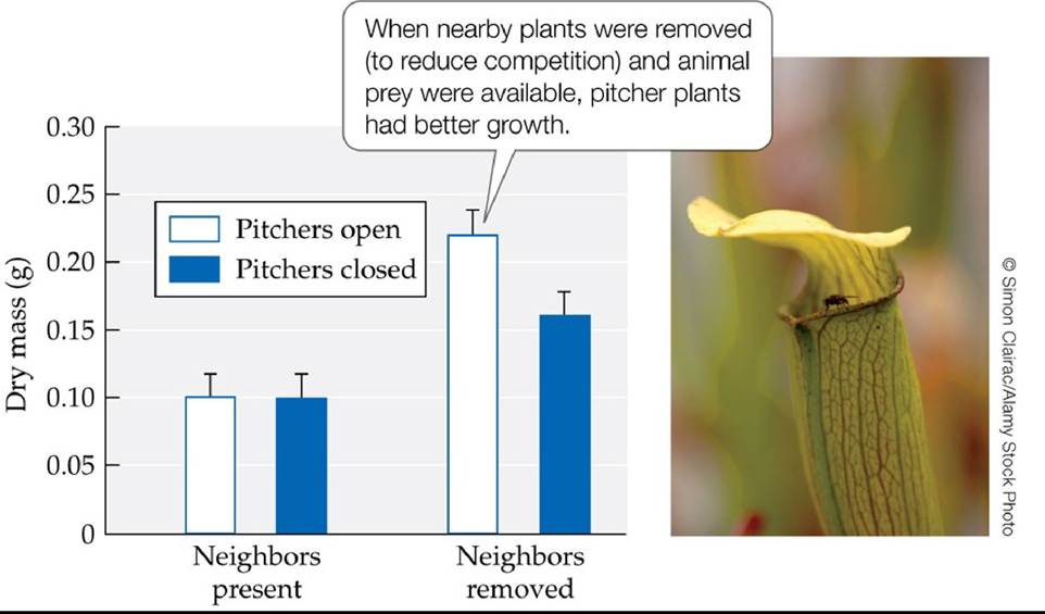
FIGURE 14.2 Competition Decreases Growth in a Carnivorous Plant To test the effects of competition on the carnivorous pitcher plant Sarracenia alata, the growth of control plants (“neighbors present”) was compared with the growth of plants whose noncarnivorous competitors were weeded and clipped (“neighbors removed”). Neighbor removal increased plant growth, especially when animal prey were available. Error bars show one standard error of the mean. (After J. S. Brewer. 2003. Ecology 84: 451-462.) Back tθ text
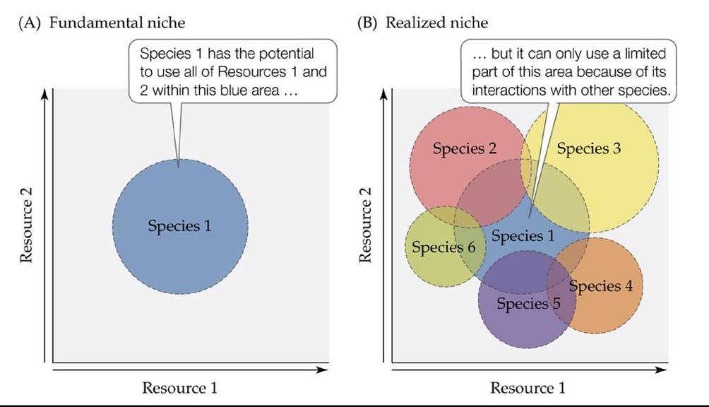
FIGURE 14.3 The Concept of the Fundamental and the Realized Niche Inthis conceptual representation of species 1's use of two resources, (A) its fundamental niche is contained within the entire blue area, but (B) the use of resources in that area is limited by interactions with other species, which set the limits of its realized niche. Back to text
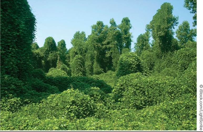
FIGURE 14.4 Interference Competition in Plants Aformidable competitor, the kudzu vine
(Pueraria montana) has grown over and completely covered these Georgia trees and shrubs, competing with them for light. Back to text
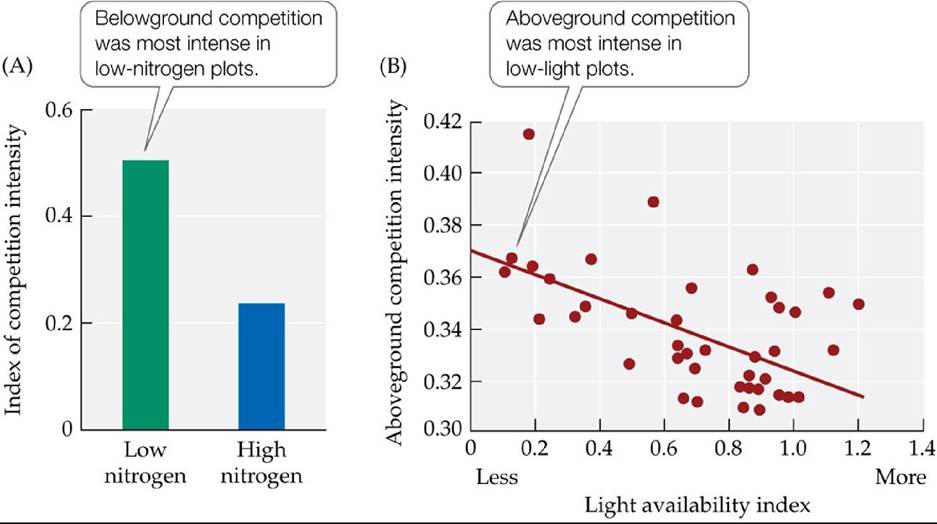
FIGURE 14.5 Resource Availability Affects the Intensity of Competition (A)Intransplant experiments with the grass Schizachyrium scoparium, belowground competition between plant species for nutrients increased in intensity when soil nutrients were scarce. (B) Similarly, aboveground competition for light increased as light levels decreased. (After S. D. Wilson and D. Tilman. 1993. Ecology 74: 599-611.) Back tθ text
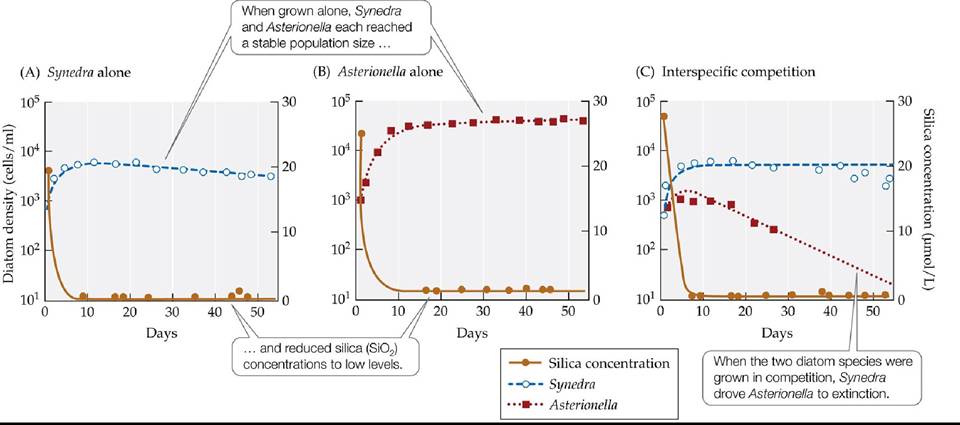
FIGURE 14.6 CompetitionIsOftenAsymmetrical DavidTilmanandhiscolleagues demonstrated competition between two diatom species for silica by growing them alone and in competition with each other. Synedra (A) reduced silica concentrations to lower levels than did Asterionella (B) This result may explain why Synedra outcompeted Asterionella when the two species were grown together (C).
Suppose a third diatom species reduced the concentration of silica to 5 μmol∕L when grown alone. Predict what would happen if this species were grown in competition with Asterionella.
(After D. Tilman et al. 1981. Limnol Oceanogr 26: 1020-1033.) Back tθ text
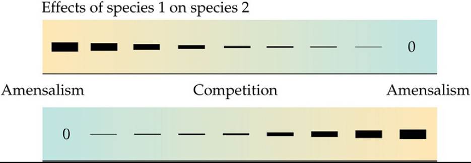
Effects of species 2 on species 1
FIGURE 14.7 AcontinuumofCompetitiveEffects Competitionmayaffectmembersof both species equally, or the members of one species may be harmed more than are members of the other species. The thickness of the bars represents the strength of the competitive effects and the -/0 represents amensalism.
Indicate the interactions that represent asymmetrical competition.
Back to text
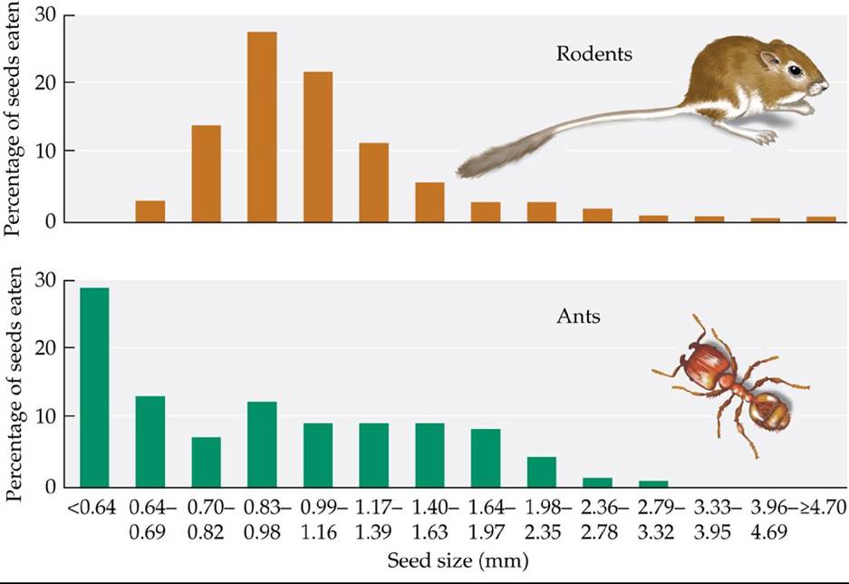
FIGURE 14.8 Ants and Rodents Compete for Seeds Thereisextensiveoverlapinthe sizes of seeds eaten by ants and by rodents. Removal experiments showed that these two distantly related groups compete for this food source. (After J. H. Brown and D. W. Davidson. 1977. Science 196: 4292.) Back tθ text
© M. I, WaIkerZScience Source
FIGURE 14.9 Competition in Paramecium G. F. Gause grew three species of Paramecium in tubes filled with a liquid medium containing bacteria and yeast cells. (A) When grown alone, Paramecium caudatum and P bursaria each showed logistic population growth and reached carrying capacity. When grown together, each species showed slower population growth, but they were able to coexist by feeding on different food items. (B) When P. caudatum was grown with P. aurelia, it experienced local extinction.
Predict what would happen if P. aurelia and P. bursaria were grown together. Explain.
(A after G. F. Gause. 1935. Verifications Experimentales de la Theorie Mathematique de la Lutte pour la Vie. Hermann et Cie: Paris; B after G. F. Gause. 1934. The Struggle for Existence. Williams & Wilkins: Baltimore, MD.) Back to text
FIGURE 14.10 Do Cyanobacteria Partition Their Use of Light? Twotypesof cyanobacteria, BS1 and BS2, were grown together under (A) green light (550 nm), (B) red light (635 nm), and (C) “white” light (the full spectrum, which includes both green and red light). BS1 absorbs green light more efficiently than it absorbs red light; the reverse is true for BS2. Only BS1 persists when the two types are grown together under green light, and only BS2 persists when they are grown under red light. However, both types persist under white light, suggesting that BS1 and BS2 coexist by partitioning their use of light. (After M. Stomp et al. 2004. Nature 432: 104-107.) Back to text
FIGURE 14.11 Character Displacement Competition for resources can cause competing species to change over time. Imagine that two fish species that once lived apart and tended to catch prey of about the same size are brought together in a single lake. (A) When the two species first come together, there is considerable overlap in the resources they use. (B) As the two species interact over time, the characteristics they use to obtain prey may evolve such that they tend to catch prey of different sizes. Back to text
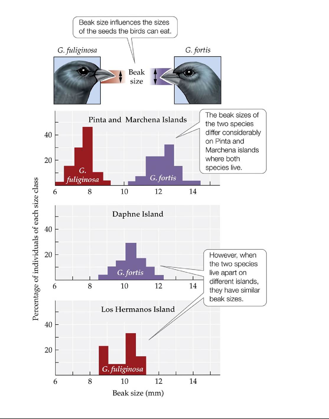
FIGURE 14.12 CompetitionShapesBeakSize OnislandsharboringbothGeospzza fuliginosa and G. fortis, competition between these two species of Galapagos finches may have had a selective effect on the sizes of their beaks. (After D. Lack. 1947. Darwin’s Finches. Cambridge University Press: Cambridge.) Back tθ text
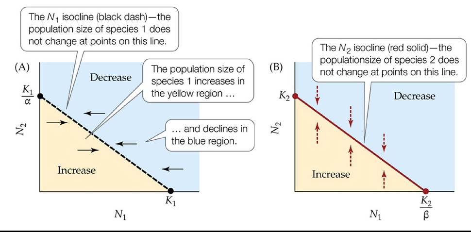
FIGURE 14.13 Graphical Analyses of Competition The zero population growth isoclines from the Lotka-Volterra competition model can be used to predict changes in the population sizes of competing species. (A) The Wi isocline. The change in population size of species 1 (indicated by black solid arrows) increases in the yellow region and decreases in the blue region. (B) The W^ isocline. The change in population size of species 2 (indicated by red dashed arrows) increases in the yellow region and decreases in the blue region. Back to text
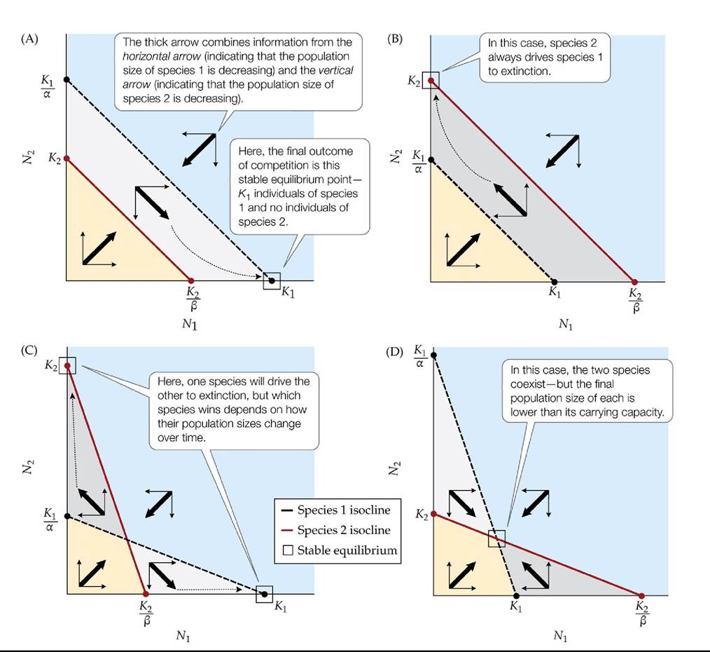
FIGURE 14.14 Outcome of Competition in the Lotka-Volterra Competition Model The outcome of competition depends on how the N1 and isoclines are positioned relative to one
another. (A) Competitive exclusion of species 2 by species 1; species 1 always wins. (B) Competitive exclusion of species 1 by species 2; species 2 always wins. (C) The two species cannot coexist; either species 1 or species 2 wins depending on population sizes of both species. (D) Species 1 and species 2 coexist. The box in each graph indicates a stable equilibrium point— a combination of population sizes of the two species that, once reached, does not change over time.
In (B), if K2 = 1,000 and if species 1 went extinct when N2 = 1,200, how would the population size of species 2 change after the extinction of species 1?
Back to text
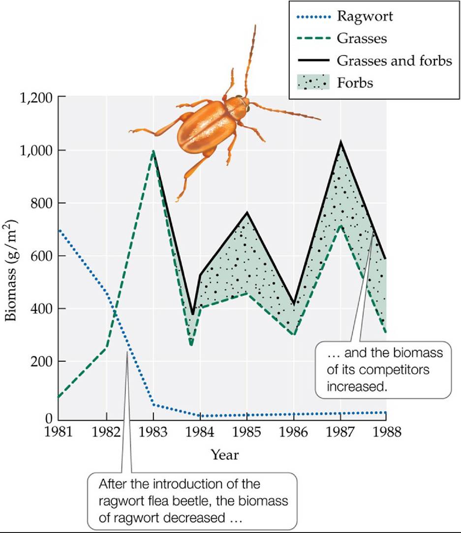
FIGURE 14.15 Herbivores Can Alter the Outcome of Competition Ragwortfleabeetles are herbivores that feed on ragwort (Senecio jacobaea), an invasive plant species. The graph tracks the biomasses of ragwort, grasses, and forbs (broad-leaved herbaceous plants) at a site in western Oregon after the flea beetle was introduced there in 1980. The results show that in the absence of the flea beetle, ragwort was a superior competitor, but it declined precipitously when the beetle was introduced. (After P. McEvoy et al. 1991. Ecol Appl 1: 430-432.) Back tθ text
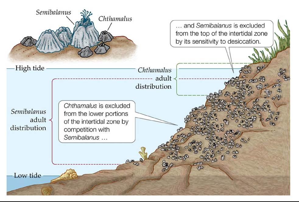
FIGURE 14.16 SqueezedOutbyCompetition Removal experiments at a field site in
Scotland showed that competition mediated by the physical environment determines the local distribution of two species of barnacles, Chthamalus stellatus and Semibalanus balanoides. (After J. H. Connell. 1961b. Ecology 42: 710.) Back tθ text
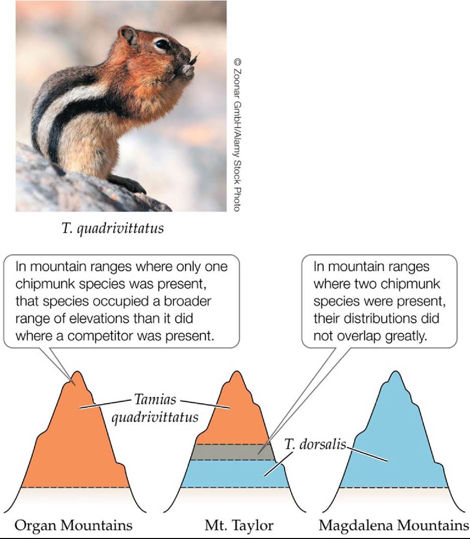
FIGURE 14.17 A Natural Experiment on Competition between Chipmunk Species Observations of the distributions of Tamias chipmunks on mountain ranges in New Mexico suggest that competition may restrict the preferred habitats in which they live. In competition, T. quadrivittatus was restricted to less desirable colder elevations compared to T. dorsalis. Similar results were obtained for Tamias species living in Nevada. (After M. V. Lomolino et al. 2006.
Biogeography, 3rd ed. Oxford University Press/Sinauer: Sunderland, MA.) Back tθ text
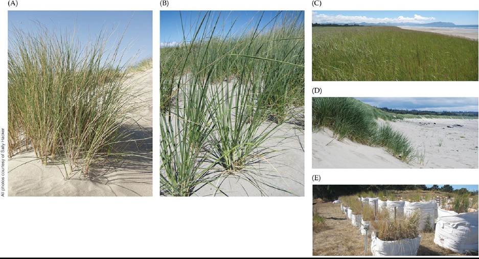
FIGURE 14.18 Implications of Climate Warming to Competition of Invasive Species
Warming from climate change affects the competitive interactions of two non-native beachgrass species with consequences for dune ecosystems. (A) European beachgrass Ammophila arenaria. (B) American beachgrass A. breviligulata. (C) Dune covered in A. breviligulata in Oregon. (D) Dune covered in A. arenaria. (E) Beachgrass competition experiment that manipulated warming. (After R. Biel and S. D. Hacker. 2021. Oecologia 197: 757-770.) Back tθ text
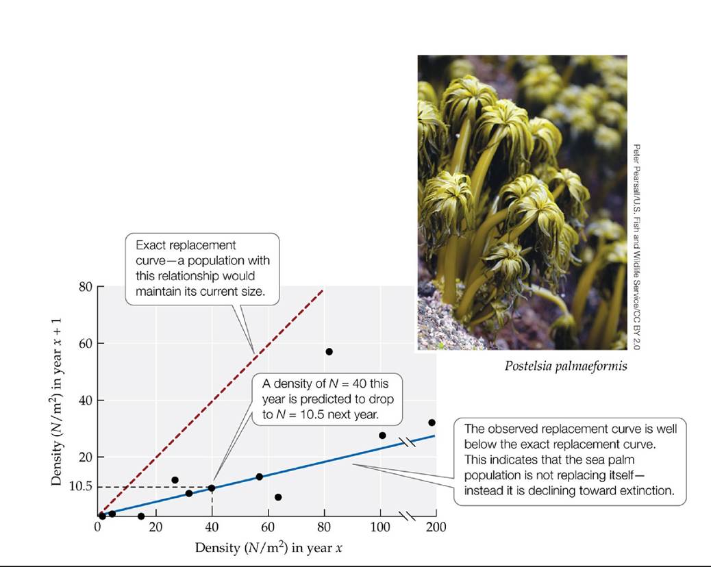
FIGURE 14.19 Population Decline in an Inferior Competitor Lacking Disturbance In this graph, each point represents an observed change in density (N, the number of individuals per square meter) from one year (year x) to the next (year x + 1) at sites where sea palms are growing in competition with mussels and lack disturbance. These points can be used to estimate a replacement curve (solid blue line), which shows the extent to which sea palm individuals replace themselves over time without disturbance. The exact replacement curve (dashed red line) shows the densities at which the population size would not change from one year to the next.
Based on the observed replacement curve (the solid blue line), how many years would it take for a sea palm population to decline from 100 individuals to fewer than 20 individuals?
(After R. T. Paine. 1979. Science 205: 685-687.) Back tθ text
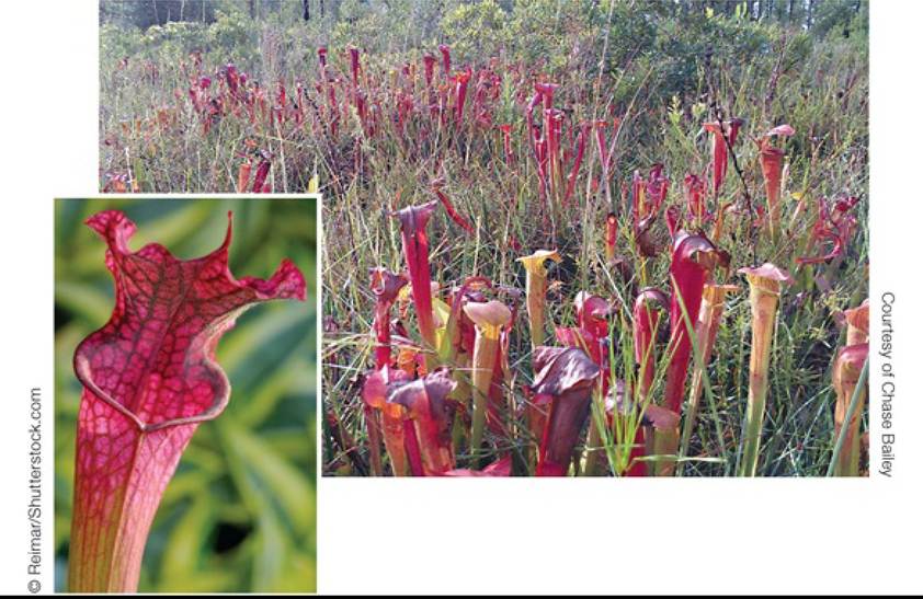
FIGURE 14.20 CoexistenceinaNutrient-PoorEnvironment ThepitcherplantSarracenza alata, seen in the close-up at the left, coexists with noncarnivorous plants that can compete with it for both nutrients and light. Back to text
15 Mutualism and Commensalism
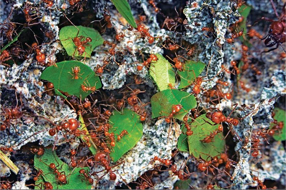
FIGURE 15.1 Collecting Food for Their Fungi Fungus-growing ants (Atta cephalotes) in
Costa Rica carry leaf segments to their colony, where the leaves will be fed to the fungus (the gray material) the ants cultivate for food. © Martin Dohrn/Minden Pictures Back to text
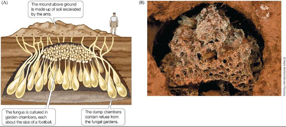
FIGURE 15.2 The Fungal Garden of a Leaf-Cutter Ant (A)Adiagrammaticrepresentation of a large Atta leaf-cutter ant colony. (B) This photo shows a cutaway view of a garden chamber in a central Paraguay colony of the leaf-cutter ant Atta laevigata. Inside the chamber is a specialized structure called a gongylidia, which is produced by the cultivated fungus and eaten by the ants. (A after B. Holldobler and E. O. Wilson. 1990. The Ants. Belknap Press of Harvard University Press: Cambridge, MA; modified from J. C. M. Jonkman, in Weber 1979.) Back tθ text
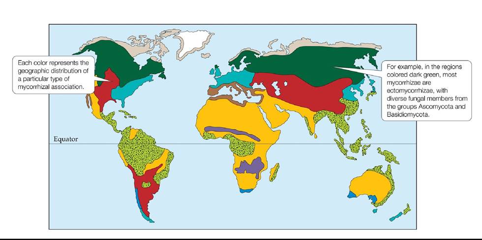
FIGURE 15.3 Mycorrhizal Associations Cover Earth's Land Surface Each color on the
map shows the region in which one of eight major types of mycorrhizal associations is found (see Fitter 2005 to learn which fungi are involved in each of these eight mycorrhizal associations). Notice that the locations of the different types of mycorrhizal associations correspond fairly closely to the locations of major terrestrial biomes (see Figure 3.5A).
What types of plants are likely to be involved in the mycorrhizal association shown in the light green stippled areas? (Hint: Refer to Figure 3.5A.)
(After A. H. Fitter. 2005. J Ecol 93: 231-243; based on D. J. Read. 1991. Experientia 47: 376; D. J. Read et al. 2004. Can JBot 82: 1243-1263.) Back tθ text
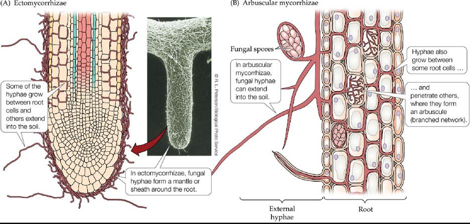
FIGURE 15.4 TwoMajorTypesofMycorrhizae Mycorrhizae can be classified as (A) ectomycorrhizae or (B) arbuscular mycorrhizae. In arbuscular mycorrhizae, hyphae can live between the root cells and penetrate the cell wall.
Describe morphological features that distinguish ectomycorrhizae from arbuscular mycorrhizae.
(After A. D. Rovira et al. 1983. In Inorganic Plant Nutrition [Encyclopedia of Plant Physiology, new series, Vol. 15B], A. Lauchli and R. L. Bieleski [Eds.], pp. 61-93. Springer: New York.) Back tθ text
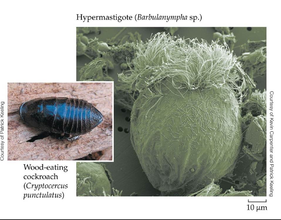
FIGURE 15.5 A Protist Gut Mutualist This wood-eating cockroach (like other wood-eating insects, such as termites) would starve if gut mutualists such as the protist shown here (a hypermastigote) did not help it to digest wood. The hypermastigote can break down cellulose, a major structural component of wood that the cockroach cannot digest on its own. Back to text
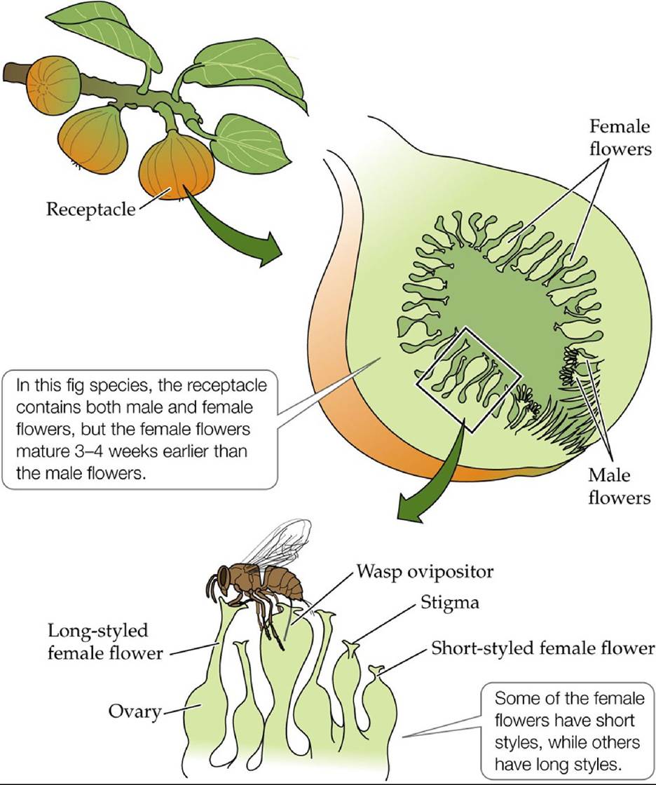
FIGURE 15.6 Fig Flowers and the Wasp That Pollinates Them Thereceptacleand flowers of a typical monoecious fig tree, Ficus sycomorus. (After J. L. Bronstein. 1992. In Insect
Plant Interactions, Vol. 4, E. A. Bernays [Ed.], pp. 1-44. CRC Press: Boca Raton, FL.) Back tθ text
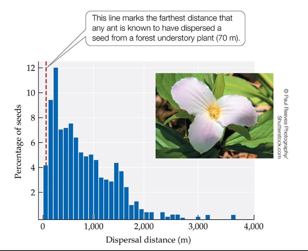
FIGURE 15.7 Deer Can Move Plant Seeds Long Distances Theseestimatesofthe distances that white-tailed deer disperse the seeds of the forest understory plant Trillium grandiflorum are based on observations of deer movements and of the length of time that deer retain plant seeds in their digestive tracts (from the time they eat the seeds until they defecate them). Although T. grandiflorum seeds are also dispersed by ants, deer move the seeds much farther. (After M. Vellend et al. 2003. Ecology 84: 1067-1072.) Back tθ text
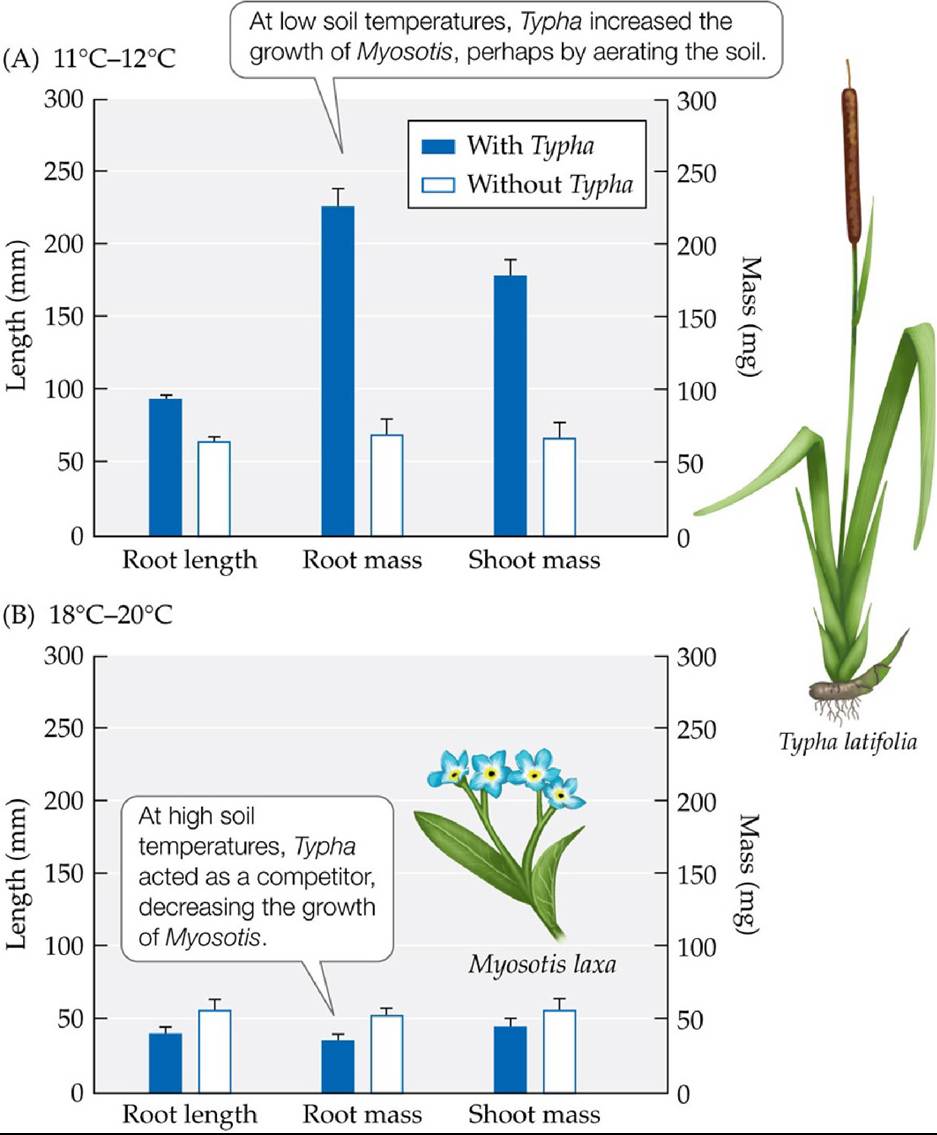
FIGURE 15.8 From Benefactor to Competitor The growth of the small-flower forget-me- not Myosotis laxa under (A) low soil temperatures (11°C-12°C) and (B) high soil temperatures (18°C-20°C) in the presence and absence of the cattail Typha Iatifolia was measured by changes in three parameters: root length (left y-axis), root mass (right y-axis), and shoot mass (right y-
axis). Error bars show one standard error of the mean.
Under what conditions does Myosotis laxa best grow? Explain.
(After R. M. Callaway and L. King. 1996. Ecology 77: 1189-1195.) Back tθ text
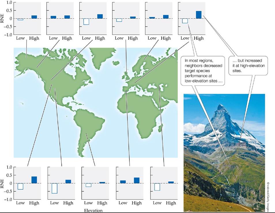
FIGURE 15.9 Neighbors Increase Plant Growth at High-Elevation Sites The relative neighbor effect (RNE, defined as the growth of the target plant species when neighboring plants are present minus its growth when neighbors are removed) of alpine plants was measured in plots at high and low elevations in 11 regions. Plant growth was measured as change in biomass (for most sites) or in leaf number. RNE values greater than zero (in blue) indicate that neighbors increased the growth of target species; RNE values less than zero (in white) indicate that neighbors decreased the growth of target species. (After R. M. Callaway et al. 2002. Nature 417: 844-848.) Back tθ text
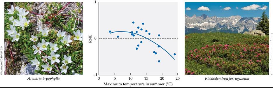
© imageBROKER/Alamy Stock Photo
FIGURE 15.10 Neighbors Ameliorate Cold Temperatures in Alpine Plants Therelative neighbor effect (RNE, defined in Figure 15.9) of alpine plants changes from positive (above zero) to competitive (below zero) as temperature increases at lower elevations. (After R. M. Callaway et al. 2002. Nature 417: 844-848.) Back tθ text
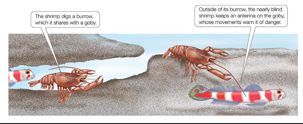
FIGURE 15.11 A Seeing-Eye Fish In environments with little protective cover, a habitat mutualism between an alpheid (pistol) shrimp and a goby benefits both partners. Back to text
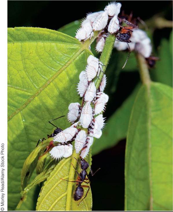
FIGURE 15.12 AFacultativeMutualism Antsoftenformfacultativemutualismswith insects that secrete honeydew, a sugar syrup substance on which the ants feed. The ants shown here will protect these Ecuadorian treehoppers from predators and parasites in exchange for honeydew. Back to text
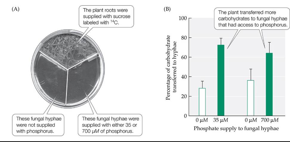
FIGURE 15.13 RewardingThoseWhoRewardYou Researcherstestedthehypothesis that Medicago truncatula plants allocate more carbohydrates to those mycorrhizal fungi that provide them with higher concentrations of phosphorus, a key plant nutrient. (A) They used a splitplate design to separate the fungal hyphae into two groups. Some fungal hyphae lacked access to phosphorus, while other fungal hyphae were supplied with either 35 or 700 μM of phosphorus. (B) They then tracked the proportion of sucrose (labeled with 14C) that the plant provided to each group of hyphae. Error bars show one standard error of the mean. (After E. T. Kiers et al. 2011. Science 333: 880-882.) Back tθ text
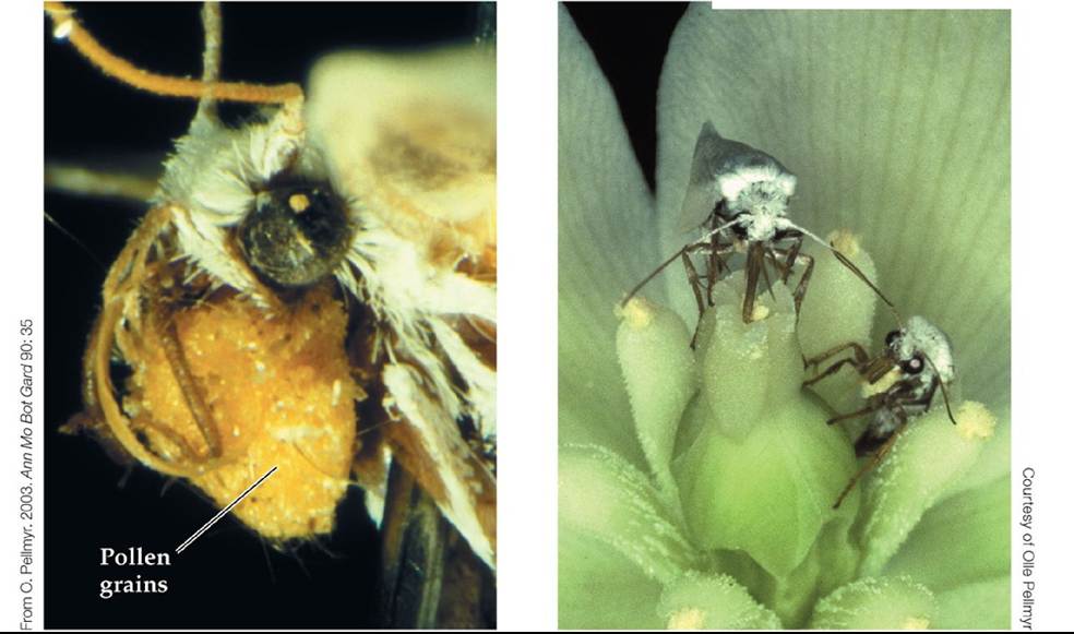
FIGURE 15.14 Yuccas and Yucca Moths Yucca filamentosa has an obligate relationship with its exclusive pollinator, the yucca moth Tegeticula yuccasella. (A) The female moth collects pollen from a yucca flower using specialized mouthparts. She may carry a load of up to 10,000 pollen grains, nearly 10% of her own weight. (B) The moth at the lower right of this photo is laying eggs in the ovary of a yucca flower; the moth at the top is placing pollen on the stigma. Back to text
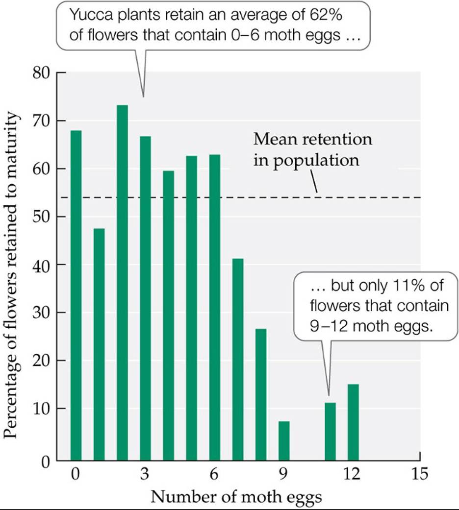
FIGURE 15.15 APenaltyforCheating Yucca plants selectively abort flowers in which yucca moths have laid too many eggs. (After O. Pellmyr and C. J. Huth. 1994. Nature 372: 257-260.) Back to text
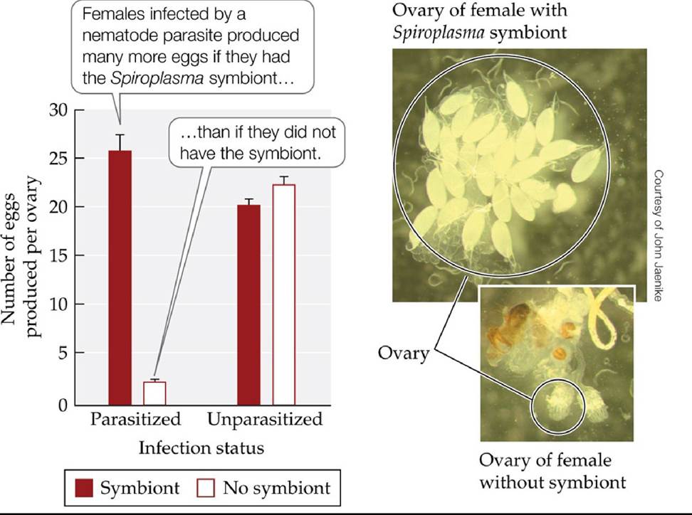
FIGURE 15.16 A Symbiont Increases the Fertility of Its Host Bacteriainthegenus
Spiroplasma are obligate symbionts that live within the cells of their host, the fruit fly Drosophila neotestacea. The graph shows the number of eggs produced by laboratory-reared female flies that either had Spiroplasma symbionts (red bars) or did not have Spiroplasma symbionts (white bars), and that either were infected by the nematode parasite Howardula (parasitized) or were not infected by it (unparasitized). Howardula can sterilize female flies and reduce the mating success of male flies. Error bars show one standard error of the mean. (After J. Jaenike et al. 2010. Science 329: 212-215.) Back tθ text
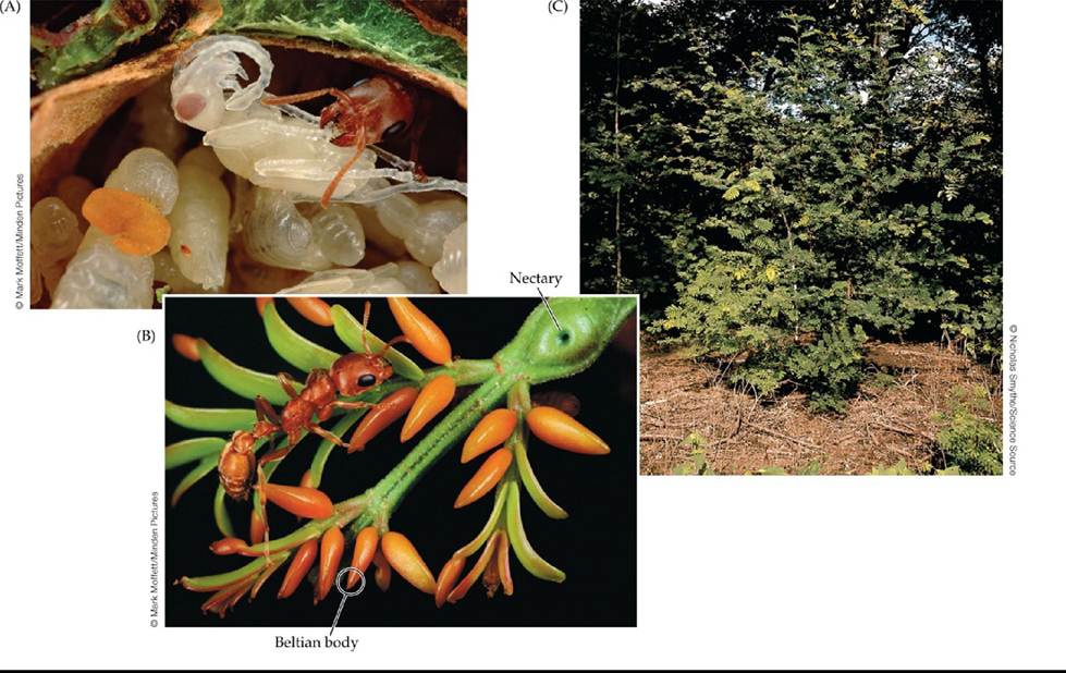
FIGURE 15.17 An Ant-Plant Mutualism (A) Acacia ants (Pseudomyrmex spinicola) tending to larvae and pupae inside an acacia thorn. (B) A nectary at the base of a leaf and Beltian bodies at the leaflet tips. (C) Ants have removed the plants that grew near this acacia, creating a competitor-free zone for the plant. Back to text
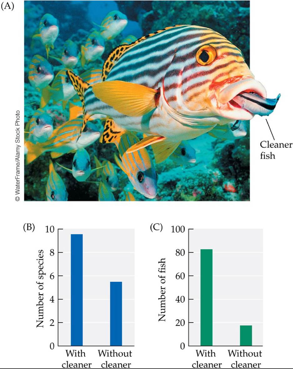
FIGURE 15.18 Ecological Effects of the Cleaner Fish Labroides dimidiatus (A) Looking for parasites, a cleaner fish places its head within the mouth of a much larger client, this sweetlips
fish. The experimental removal of L. dimidiatus from small reefs within the Great Barrier Reef of Australia led to (B) a drop in the number of fish species found on the reefs and (C) a decrease in the total abundance of fish on the reefs. (B,C after A. S. Grutter et al. 2003. CurrBiol 13: 64-67.) Back to text
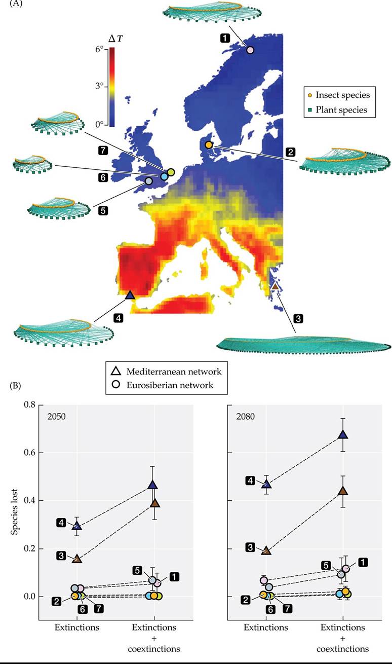
FIGURE 15.19 Plant-Pollinator Extinctions Predicted Under Climate Warming (A) Researchers measured the effects of the predicted increase in temperature (ΔT is the change in temperature in the warmest month from 2020 to 2080) on seven plant-pollinator networks (the green squares represent plants, the orange circles represent pollinator insects, and the solid lines represent interactions) across Europe. (B) Plant species extinctions and subsequent coextinctions of pollinators within each pollination network at two times in the future, 2050 and 2080. Error bars show one standard error of the mean. The different numbers identify different networks, with the triangles representing the Mediterranean networks and the circles representing the Eurosiberian networks. (After J. Bascompte et al. 2019. SciAdv 5: eaav2539.) Back tθ text
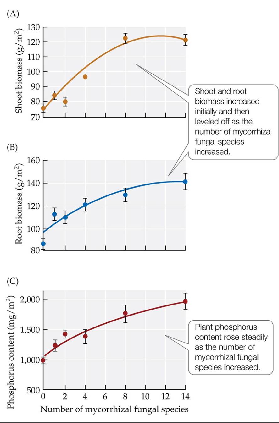
FIGURE 15.20 Mycorrhizal Fungal Species Richness Affects Ecosystem Properties Researchers measured the effects of the number of mycorrhizal fungal species in the soil on (A) mean shoot biomass, (B) mean root biomass, and (C) mean phosphorus content in mixtures of 15 species of plants grown from seed in a field experiment. Error bars show ± one standard error of the mean. (After M. van der Heijden et al. 1998. Nature 396: 69-72.) Back tθ text
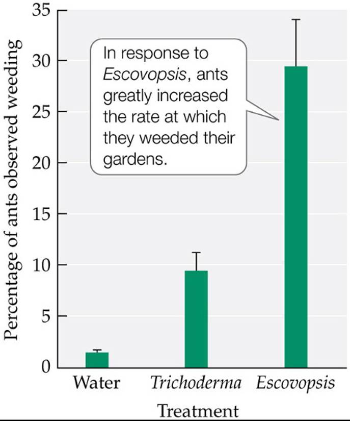
FIGURE 15.21 A Specialized Parasite Stimulates Weeding by Ants Currie and Stuart measured the frequency with which the leaf-cutter ant Atta colombica weeded its fungal gardens after colonies were exposed to water, Trichoderma viride (a generalist fungal parasite), and the
specialized fungal parasite Escovopsis. Error bars show one standard error of the mean.
Suppose 2% of ants were observed weeding in colonies exposed to water, 20% in colonies exposed to Trichoderma, and 20% in colonies exposed to Escovopsis. Propose a hypothesis that might explain these results.
(After C. R. Currie and A. E. Stuart. 2001. R Soc 268: 1471.) Back tθ text
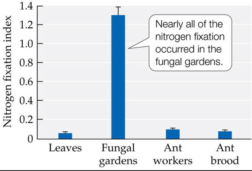
FIGURE 15.22 NitrogenFixationinFungalGardens When researchers measured nitrogen fixation activity in different parts of the colonies of leaf-cutter ants, they found that most of it was taking place in the fungal gardens. In addition, bacteria from genus Klebsiella were isolated from the fungal gardens and shown to fix nitrogen. Error bars show one standard error of the mean. (After A. A. Pinto-Tomas et al. 2009. Science 326: 1120-1123.) Back tθ text
16 The Nature of Communities
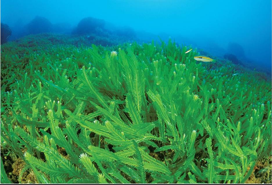
FIGURE 16.1 Invading Seaweed Caulerpa taxifolia rapidly invaded and dominated marine communities in the Mediterranean Sea. © Roberto Rinaldi/Minden Pictures Back to text
FIGURE 16.2 Spread of Caulerpa in the Mediterranean Sea Caulerpa taxifolia first invaded the waters off Monaco and France. By 2000, this algal species had reached Croatia and Tunisia.
Using the order of appearance on the map, describe the possible invasion pathways of Caulerpa within this region.
(After A. Meinesz et al. 2001. Biol Inv 3: 201. Based on A. Meinesz. 1997. Le roman noir de l'algue “tueuse”: Caulerpa taxifolia contre la Mediterranee. Belin Editeur: Paris.) Back tθ text
FIGURE 16.3 DefiningCommunities Ecologistsoftendelineatecommunitiesbasedon their physical attributes or their biological attributes.
Of the four communities shown in this figure, which are mostly defined by physical attributes and which are mostly defined by biological attributes? Back to text
FIGURE 16.4 SubsetsofspeciesinCommunities Ecologistsmayusesubsetsofspecies to define communities. These examples show three ways in which such subsets could be designated. (A) All the bird species in a community could be grouped together by taxonomic affinity. (B) All the species that use pollen as a resource could be grouped together as a guild. (C) All the plant species in a community that have nitrogen-fixing bacteria (e.g., legumes) could be placed in the same functional group. Back to text
FIGURE 16.5 Food Webs and Interaction Webs (A) Food webs describe trophic or energetic connections among species within a community. (B) Interaction webs include both trophic interactions (vertical arrows) and non-trophic (horizontal arrows) competitive and positive interactions. Back to text
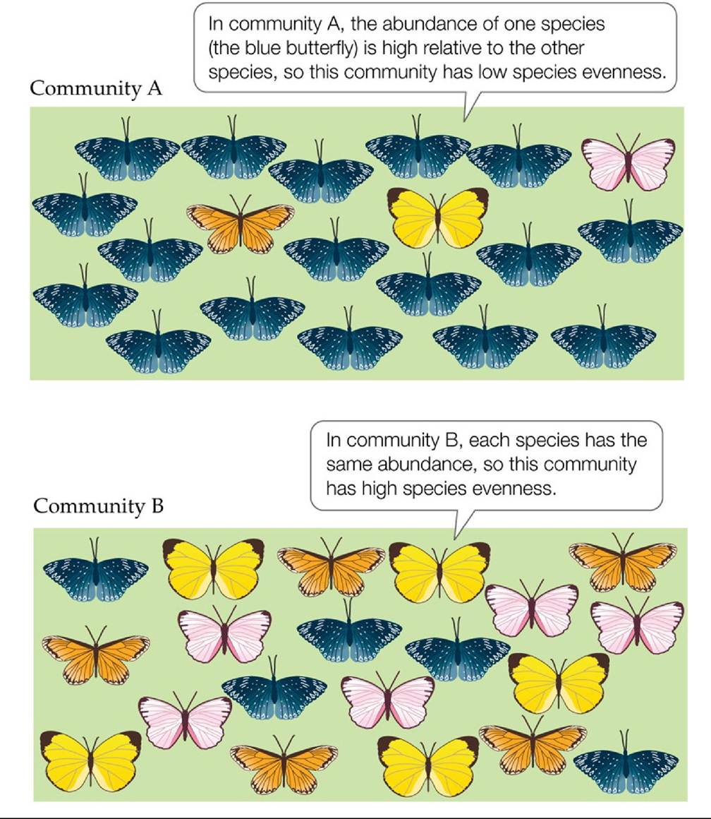
FIGURE 16.6 Species Richness and Species Evenness These two hypothetical butterfly communities have the same number of species (species richness) but different relative abundances (species evenness). Species diversity, as measured using the Shannon index, is lower in community A (see Table 16.1). Back to text
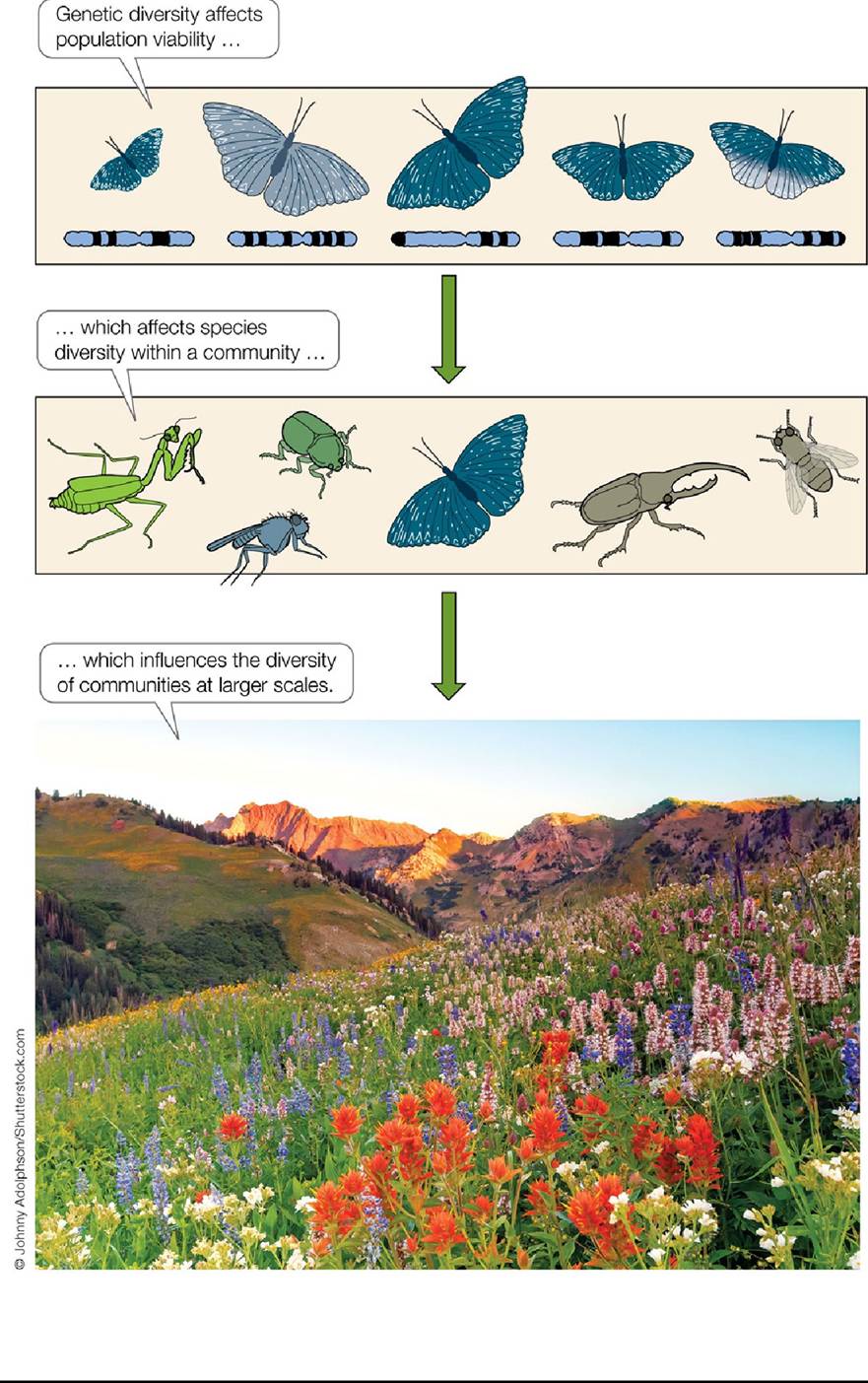
FIGURE 16.7 BiodiversityconsidersMultiplespatiaIScaIes Diversitycanbemeasured at spatial scales that range from genes to species to communities. The term “biodiversity” encompasses diversity at all of these scales. Back to text
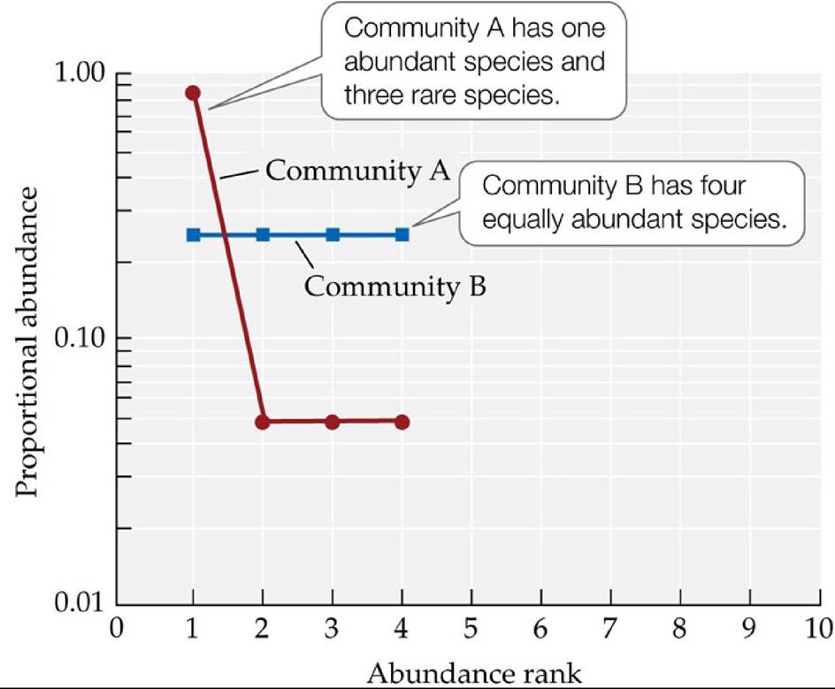
FIGURE 16.8 Are Species Common or Rare? Using rank abundance curves, we can see that the two hypothetical butterfly communities in Figure 16.6 differ in the commonness and rarity of the same four species. Back to text
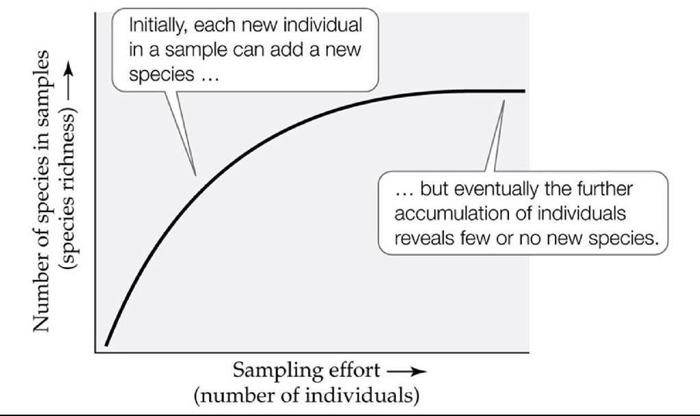
FIGURE 16.9 When Are All the Species Sampled? Speciesaccumulationcurvescanhelp us determine when most or all of the species in a community have been observed. In this hypothetical example, the number of new species observed in each sample decreases after about half the individuals in the samples have accumulated. Back to text
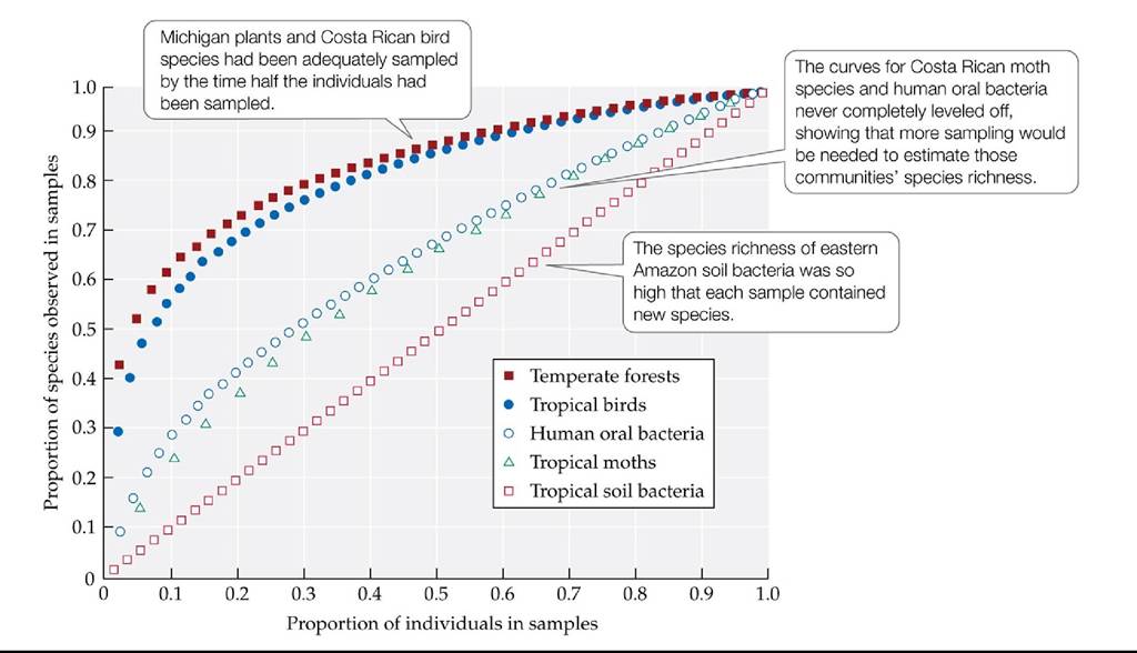
FIGURE 16.10 Communities Differ in Their Species Accumulation Curves Hughesand colleagues found that communities of five different types varied greatly in the sampling effort that would be needed to estimate their species richness. The data sets were standardized by calculating for each data point the proportions of the total number of individuals and species that had been sampled up to that point.
Based on the graph, which of these communities would require more sampling to adequately estimate their species richness? Which would require very little additional sampling?
(After J. B. Hughes et al. 2001. Appl Environ Microbiol 67: 4399-4406.) Back tθ text
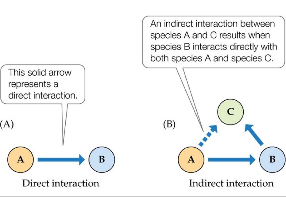
FIGURE 16.11 Directandlndirectspecieslnteractions (A)Adirectinteractionoccurs between two species. (B) An indirect interaction (dashed arrow) occurs when the direct interaction between two species is mediated by a third species. Back to text
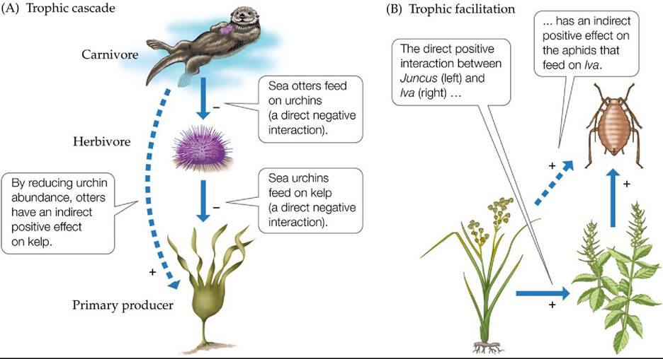
FIGURE 16.12 IndirectEffectsinInteractionWebs (A) A trophic cascade occurs when a carnivore feeds on an herbivore and thus has an indirect positive effect on a primary producer that is eaten by that herbivore. (B) Trophic facilitation occurs when a consumer is indirectly helped by a positive interaction between its prey and another species. Back to text
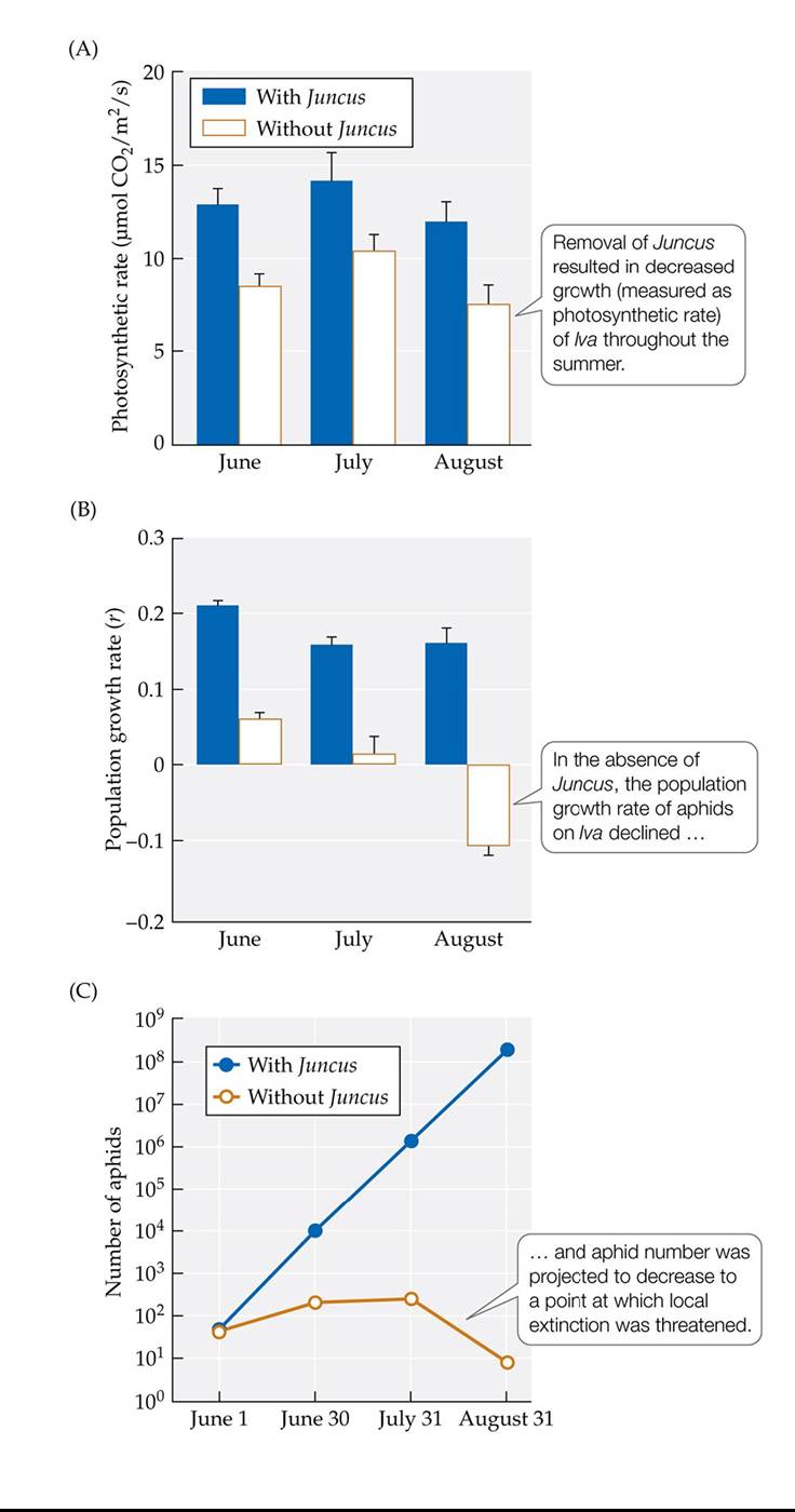
FIGURE 16.13 Results of Trophic Facilitation in a New England Salt Marsh Removal experiments demonstrated that aphids are indirectly facilitated by the rush Juncus gerardii, which has a direct positive effect on the shrub Iva frutescens, on which the aphids feed. (A) Photosynthetic rate of Iva with and without Juncus. (B) Growth rate of aphid populations with and without Juncus. (C) Projected numbers of aphids with and without Juncus. Error bars show one standard error of the mean. (After S. D. Hacker and M. D. Bertness. 1996. Am Nat 148: 559-575.) Back to text
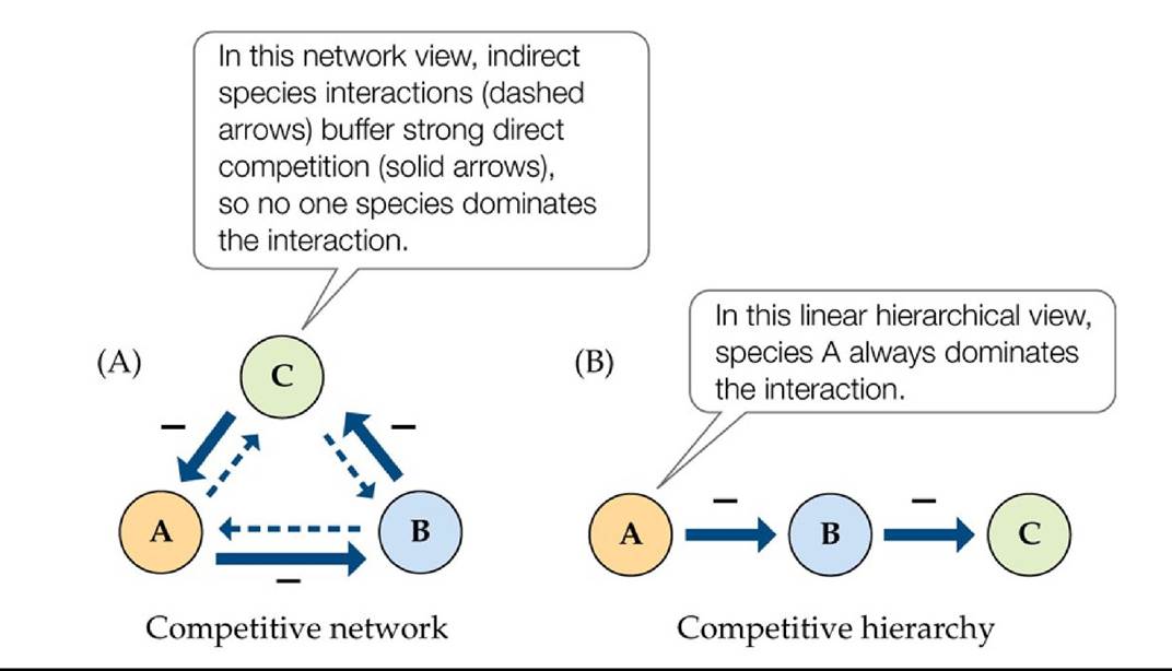
FIGURE 16.14 Competitive Networks versus Competitive Hierarchies Back to text
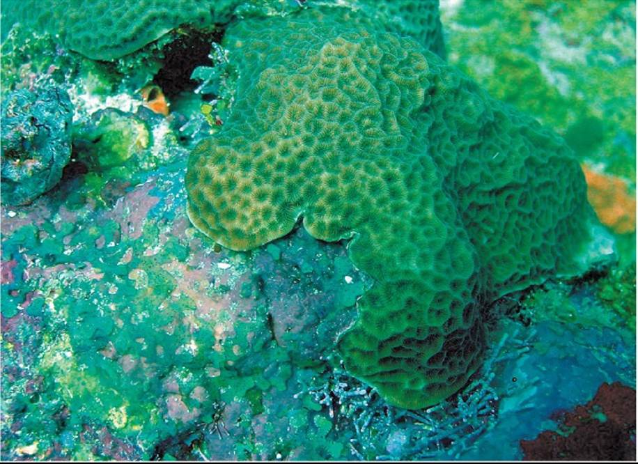
Coudssy ot Roberl S. Steneck
FIGURE 16.15 Competitive Networks in Coral Reef Communities Encrusting invertebrates and algae compete for space on coral reefs by overgrowing one another, but no one species consistently “wins” this competition. Back to text
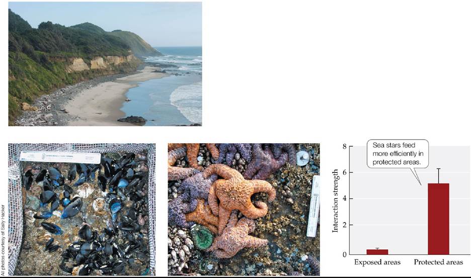
How Much Does Predation by Sea Stars Matter? It Depends (Top left) The coastline at Strawberry Hill, Oregon. Plots with (bottom left) and without (middle) cages that excluded sea stars were set up in both wave-exposed and wave-protected areas along the rocky shore. (Bottom right) When mussels were counted and interaction strengths calculated, the results showed that interaction strength was greater in protected than in exposed areas. Error bars show one standard error of the mean. (Graph after B. A. Menge et al. 1996. Food Webs: Integration of Patterns and Dynamics, G. A. Polis and K. O. Winemiller [Eds.], pp. 258-274. Chapman & Hall: New York.) Back to text
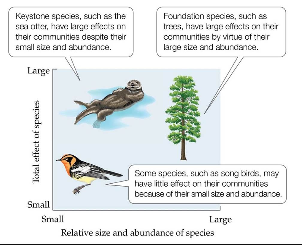
FIGURE 16.16 Foundation versus Keystone Species Species that have large effects on their communities may or may not do so by virtue of their large size and abundance. Some species (lower left-hand corner) have little overall effect relative to their size and abundance, especially if they are redundant in the community. (After M. E. Power et al. 1996b. BioScience 46: 609-620.) Back to text
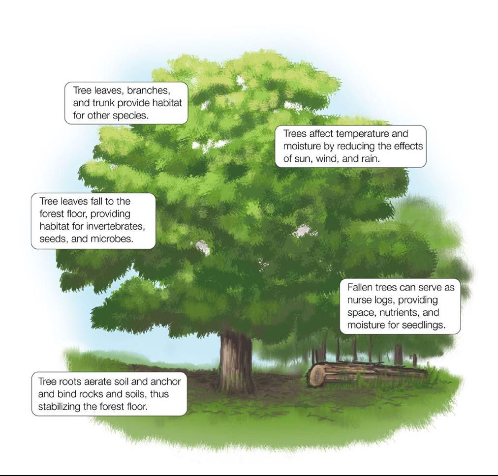
FIGURE 16.17 Trees Are Foundation and Ecosystem Engineering Species Treesnot only provide food for and compete with other species, but also act as ecosystem engineers by creating, modifying, or maintaining physical habitat for themselves and other species. (After C. G. Jones et al. 1997. Ecology 78: 1946-1957.) Back tθ text
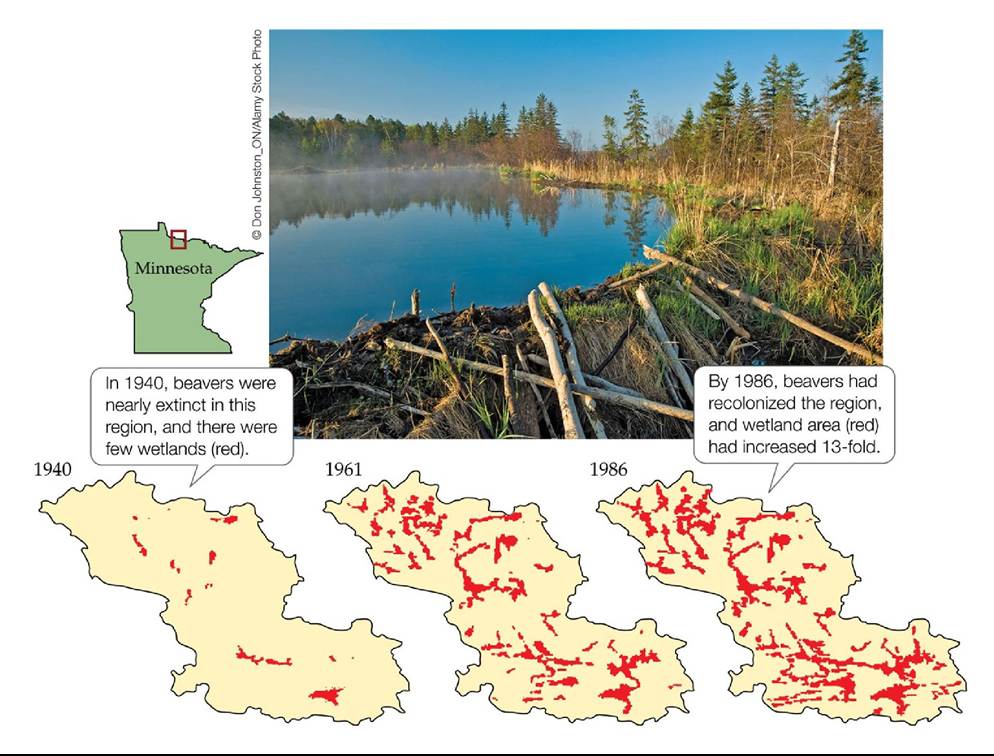
FIGURE 16.18 Beavers Are Keystone Species and Ecosystem Engineers Bydamming streams, beavers created networks of different types of wetlands (shown in red) in a 45-km2 watershed on Minnesota’s Kabetogama Peninsula, thus increasing biodiversity within the region.
Why are beavers both keystone species and ecosystem engineers?
(After R. J. Naiman et al. 1988. BioScience 38: 753-762.) Back tθ text
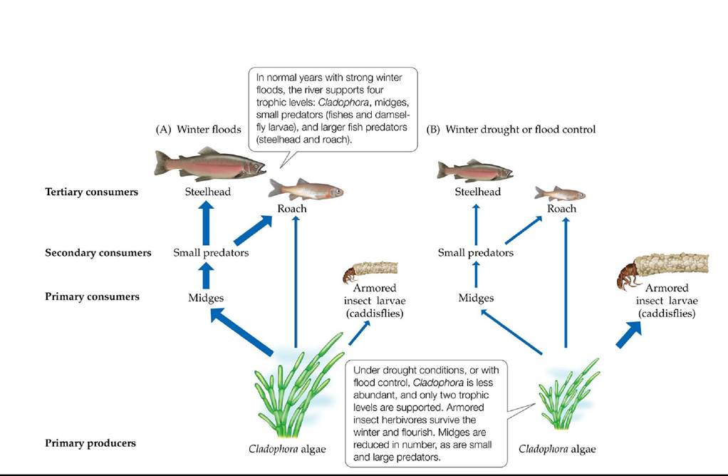
FIGURE 16.19 Context Dependence in River Food Webs Environmental changes alter the relative importance of different trophic levels in the Eel River of Northern California during winter floods (A) and winter droughts or flood control conditions (B). Wider arrows represent stronger interactions. (After M. E. Power et al. 1996a. In Food Webs: Integration of Patterns and Dynamics, G. A. Polis and K. O. Winemiller [Eds.], pp. 286-297. Chapman & Hall: New York.) Back tθ text
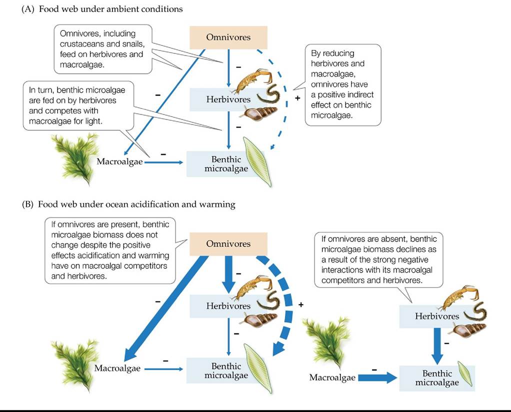
FIGURE 16.20 Food Webs in an Acidic and Warming World (A)Theinteractionwebof species in an estuarine community off the western coast of Sweden. (B) The effects of ocean acidification and warming on the interaction web with (left) and without (right) omnivores. The biomass of benthic microalgae did not change with omnivores (left) but declined without them (right). Thicker arrows represent stronger interactions. (After C. Alsterberg et al. 2013. Proc Natl Acad Sci USA 110: 8603-8608.) Back tθ text
FIGURE 16.21 AMediterraneanSeagrassMeadow Nativecommunitieslikethisone, dominated by the seagrass Posidonia oceanica, can be replaced by invasive Caulerpa taxifolia. Compare this photograph with Figure 16.1. Back to text
Yl Change in Communities
FIGURE 17.1 OnceaPeacefulMountain Before the eruption on May 18, 1980, Mount St. Helens, in southwestern Washington State, had a diversity of communities, including alpine meadows, old-growth forests, and lakes and streams. © Steve Terrill/Getty Images Back to text
FIGURE 17.2 A Transformed Mount St. Helens OrganismsonMountSt-Helenswere scorched, pounded by pumice, covered in mud, and blown down by the eruption. The eruption had different effects on the geology of the mountain at different locations, creating many new habitats.
Given that the blast was directed to the north, which habitats experienced the most change and which experienced the least?
(Map after V. H. Dale et al. 2005. Ecological Responses to the 1980 Eruption of Mount St. Helens. Springer: New York.) Back tθ text
FIGURE 17.3 ChangeHappens Coral reef communities in the Indian Ocean have experienced large changes over the last few decades. The agents of change have been both subtle and catastrophic, natural and human-caused. Back to text
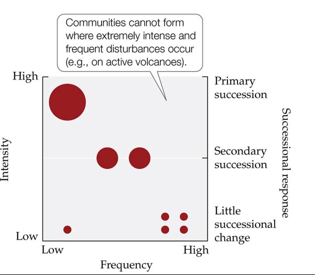
FIGURE 17.4 ThespectrumofDisturbance How much biomass is removed (the intensity, or severity, of disturbance) and how often it is removed (the frequency of disturbance) can influence the amount of change (represented by the size of the red circles) that occurs and the type of succession that is possible afterward (right side of the graph).
Describe how the type of organism being studied might influence whether we classify a disturbance as being intense or frequent.
Back to text
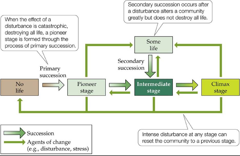
FIGURE 17.5 TheTrajectoryofsuccession Asimplemodelofsuccessioninvolves transitions between stages driven by species replacements over time. Theoretically, these changes ultimately result in a climax stage that experiences little change. There is some argument, however, about whether succession can ever lead to a stable end point. Back to text
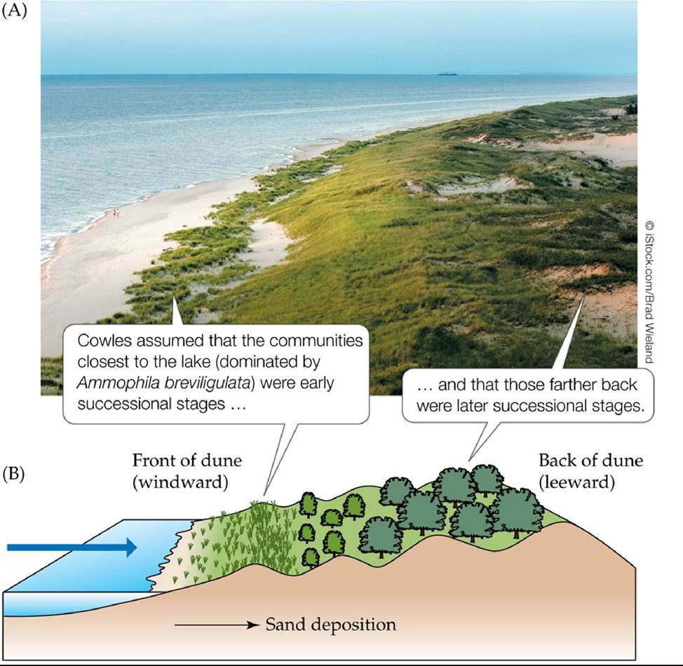
FIGURE 17.6 SpaceforTimeSubstitution (A) The portion of a dune nearest the shoreline on Lake Michigan is covered with Ammophila. (B) When Henry Chandler Cowles studied succession on these dunes, he assumed that the earliest successional stages occurred on the newly deposited sand at the front of the dune, and that later successional stages occurred at the back of the dune. Back to text
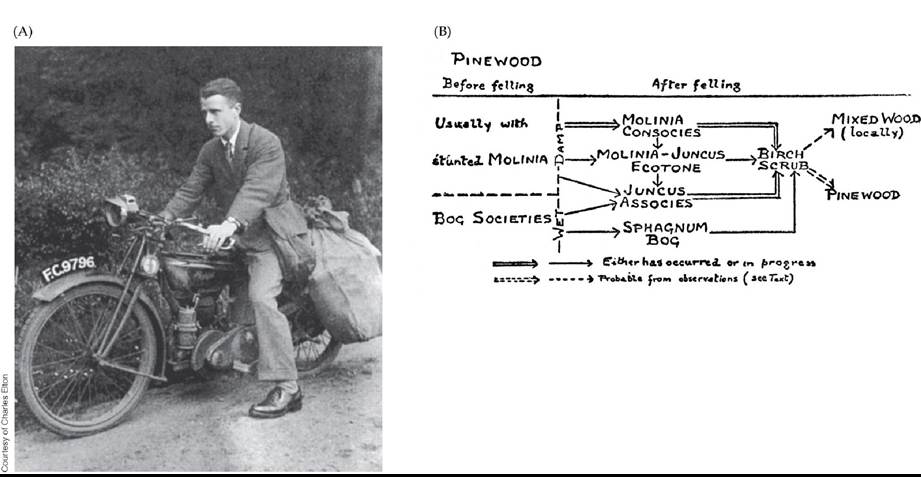
FIGURE 17.7 Elton's Context-Dependent View of Succession (A)CharlesEltonatthe age of 25, a year before the publication of his first book, Animal Ecology (1927). (B) Elton's book contained this diagram of succession in pine forests after logging. The successional trajectory differed depending on the moisture content of a particular area: wetter areas became sphagnum bogs, while slightly drier areas became wetlands containing rushes (Juncus) and grasses (Molinia). Eventually, these communities all became birch scrub but then ultimately diverged into pine woods or mixed woods, again depending on moisture. (B from V. S. Summerhayes and P. H. Williams. 1926. JEcol 14: 203-243.) Back tθ text
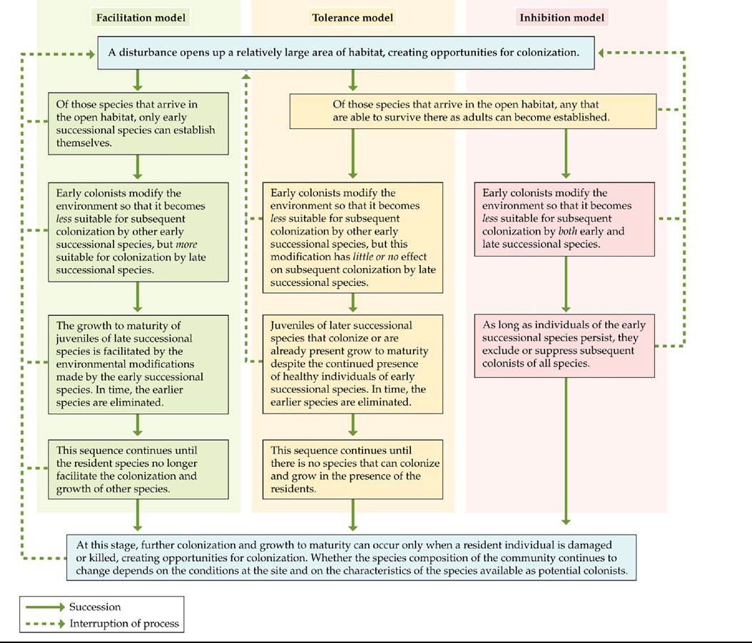
FIGURE 17.8 ThreeModelsofsuccession Connellandsiatyerproposedthree conceptual models—the facilitation, tolerance, and inhibition models—to describe succession.
(After J. H. Connell and R. O. Slatyer. 1977. Am Nat 111: 982.) Back tθ text
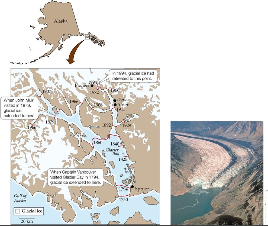
© WildrierdpixZShutterstock
FIGURE 17.9 Glacial Retreat in Glacier Bay, Alaska Over more than 200 years, the melting of glaciers has exposed bare rock to colonization and succession.
Based on the locations of the glaciers over time, describe where the oldest and youngest communities are located.
(After F. S. Chapin et al. 1994. Ecol Monogr 64: 149-175.) Back tθ text
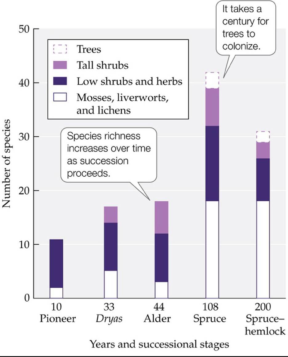
FIGURE 17.10 Successional Communities at Glacier Bay, Alaska Plantspeciesrichness has generally increased over the 200 years following glacial retreat. (After W. A. Reiners et al. 1971. Ecology 52: 55-69.) Back tθ text
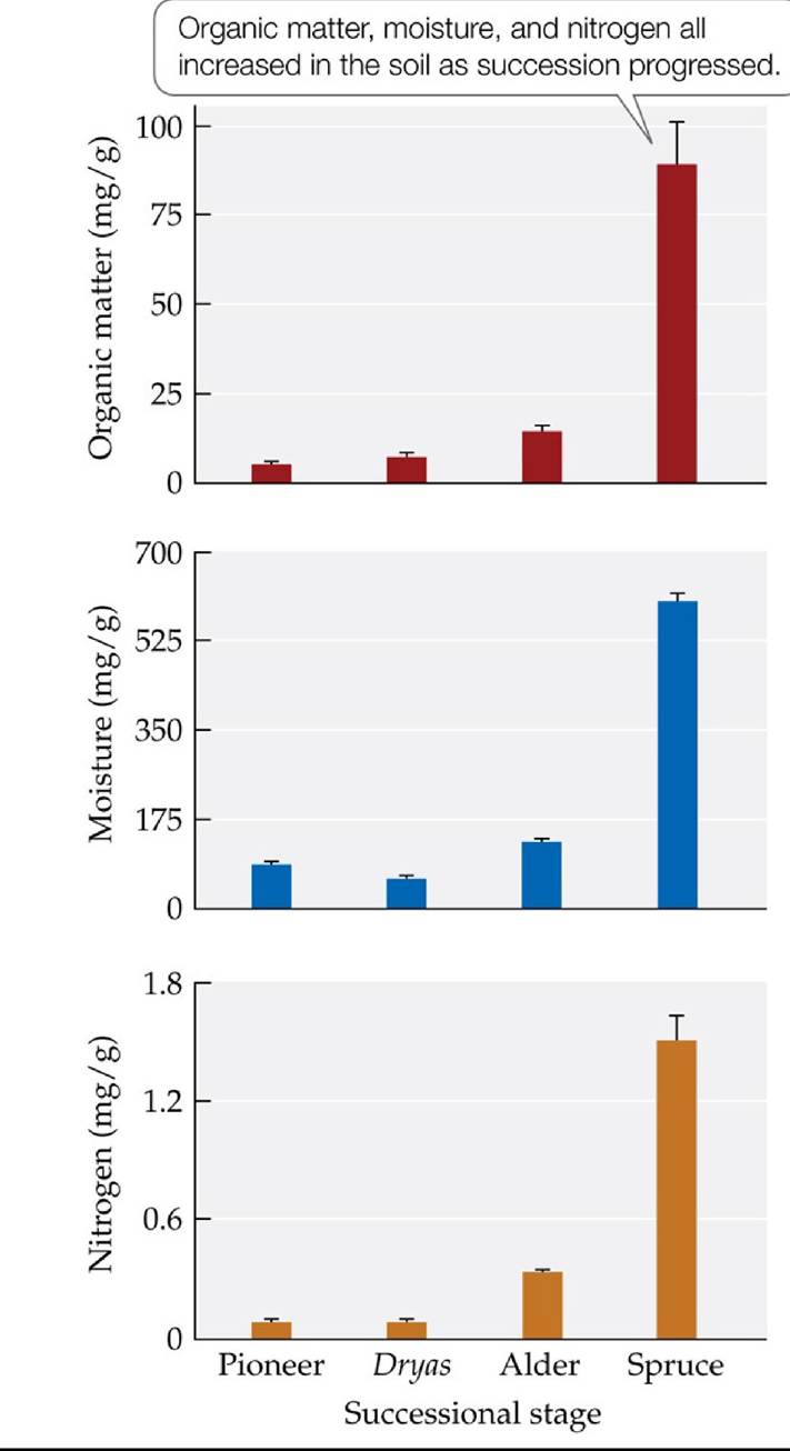
FIGURE 17.11 Soil Properties Change with Succession Chapinandcolleaguesstudied the properties of the soils in each of four successional stages at Glacier Bay. Error bars show one standard error of the mean. (After F. S. Chapin et al. 1994. Ecol Monogr 64: 149-175.) Back to text
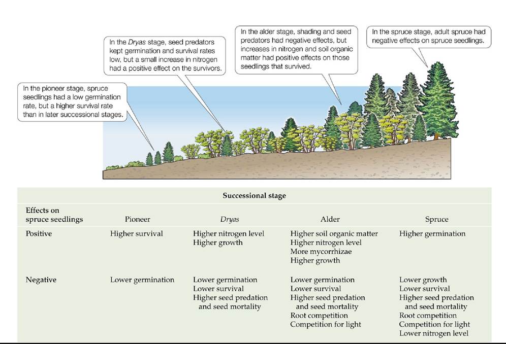
FIGURE 17.12 Both Positive and Negative Effects Influence Succession The relative contributions of positive and negative effects of other species on spruce seedling establishment changed across successional stages in Glacier Bay, Alaska. Positive effects equaled or outweighed negative effects in the first three stages, but the opposite was seen in the last spruce stage. (After F. S. Chapin et al. 1994. Ecol Monogr 64: 149-175.) Back tθ text
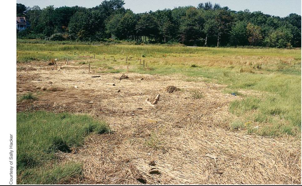
FIGURE 17.13 Wrack Creates Bare Patches in Salt Marshes Atidaldepositofwrackat
Rumstick Cove, Rhode Island, where Bertness and Shumway conducted their research on secondary succession. This dead plant material smothers living plants, creating bare patches with high soil salinity. Back to text
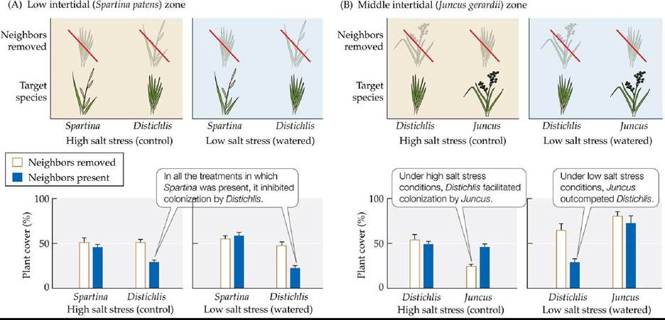
FIGURE 17.14 New England Salt Marsh Succession Is Context DependentThe trajectory of succession in salt marshes depends on soil salinity and the physiological tolerances of plant species. The kinds of interactions observed differed between the low intertidal zone (A) and the middle intertidal zone (B). Error bars show one standard error of the mean. (After M. D. Bertness and S. W. Shumway. 1993. Am Nat 142: 718-724.) Back tθ text
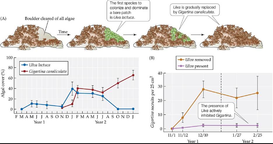
FIGURE 17.15 Algal Succession on Southern California Boulders Is Driven by
Inhibition (A) Drawings and data from a 2-year study of the successional sequence of algae in bare patches on boulder fields in the rocky intertidal zone of Southern California. (B) In a study that lasted 4 months, Sousa performed removal experiments on concrete blocks to understand the mechanisms of succession in this ecosystem. Error bars show ± one standard error of the mean. (After W. P. Sousa. 1979. Ecol Monogr 49: 227-254.) Back tθ text
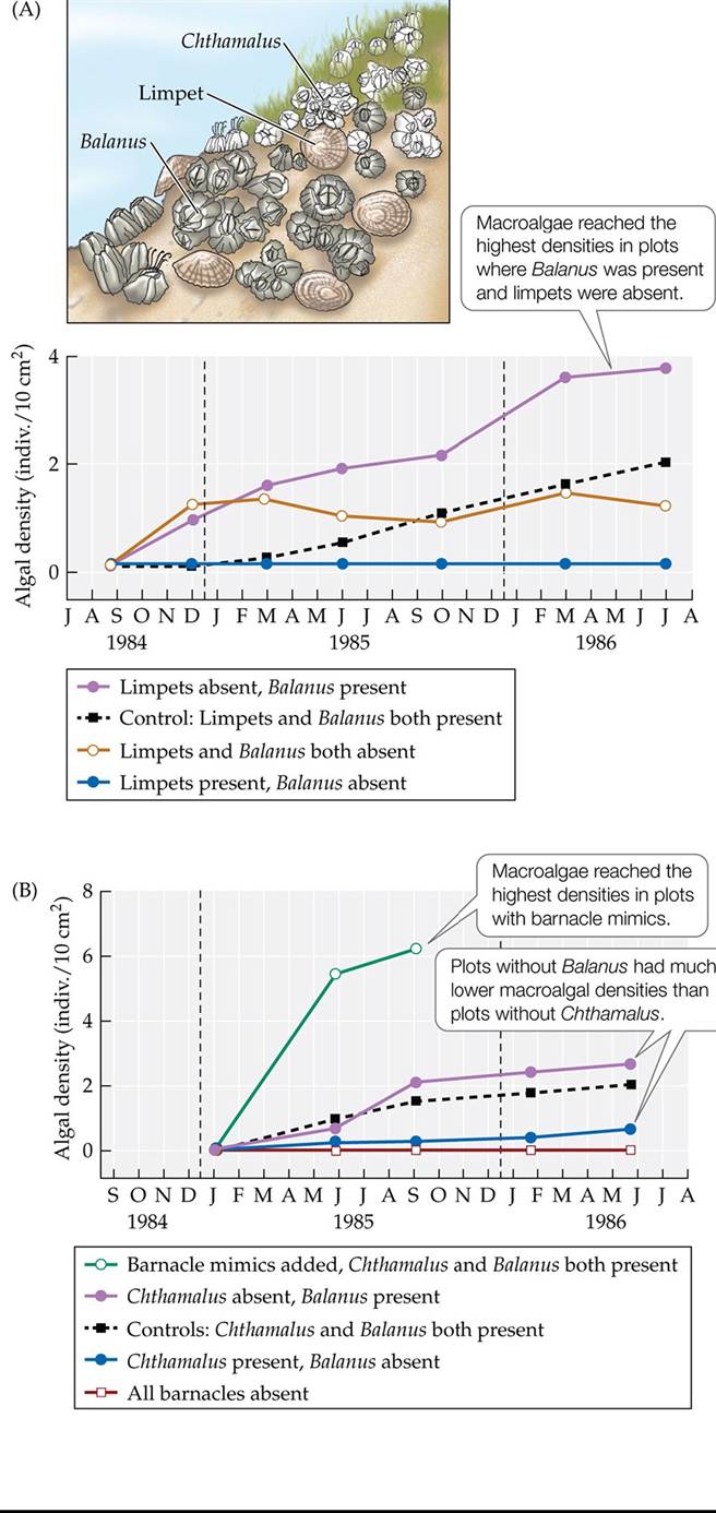
FIGURE 17.16 Algal Succession on the Oregon Coast Is Driven by Facilitation (A) Changes in macroalgal densities over time were measured in plots from which Balanus barnacles, limpets, or both had been removed. The results suggested that Balanus facilitates macroalgae by reducing limpet grazing. (B) To understand the mechanisms of the facilitation, large barnacle mimics were added to some plots and compared with plots from which the real barnacle species —Balanus, Chthamalus, or both—had been removed. The results suggested that the larger the barnacle species, the better it protects macroalgae against limpet grazing and desiccation. (After T. M. Farrell. 1991. Ecol Monogr 61: 95-113.) Back tθ text
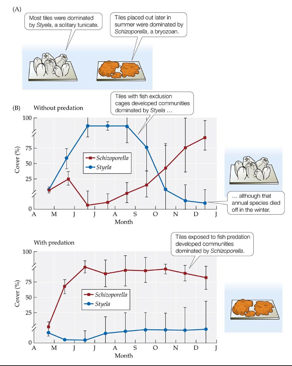
FIGURE 17.17 Fouling Communities Show Alternative States JohnSutherlandstudied
succession in fouling communities by suspending ceramic tiles from a dock in North Carolina and allowing invertebrates to colonize them. (A) Two types of communities developed on the tiles over time, one dominated by Styela and another by Schizoporella. (B) Different communities developed depending on whether the tiles were protected from fish predation. Error bars show ± one standard error of the mean.
Based on the results shown in (B), which fouling species did fish prefer to eat? Which species was the competitive dominant?
(After J. P. Sutherland. 1974. Am Nat 108: 859-873.) Back tθ text
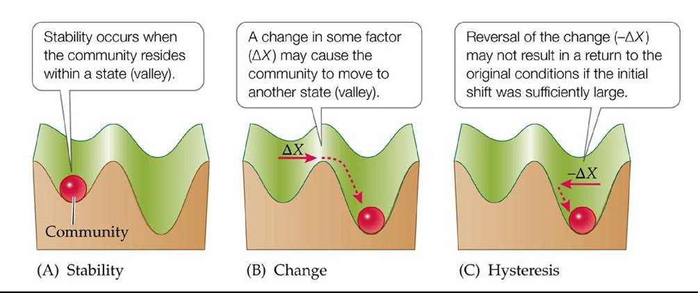
FIGURE 17.18 A Model of Alternative Stable States (A) A community is represented by a ball that moves within a landscape of community states (valleys). (B) Note that some valleys can be deeper than others, suggesting the magnitude of change (ΔX) needed to shift the community from one state to another. (C) Hysteresis occurs when reversal of the change (-ΔX) does not return the community to its original state. (After B. E. Beisner et al. 2003. FrontEcol Environ 1: 376382.) Back to text
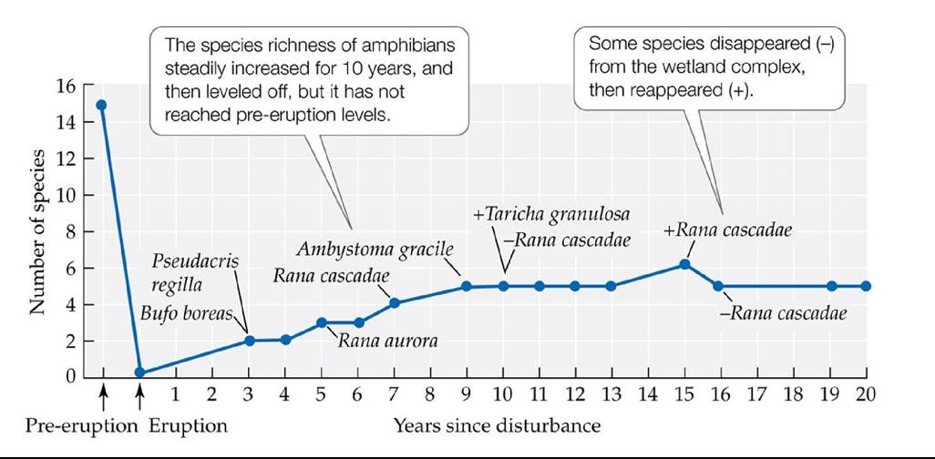
FIGURE 17.19 RapidAmphibianColonization Frogandsalamanderspeciesrapidly colonized a wetland complex in the Pumice Plain on Mount St. Helens. (After C. M. Crisafulli et al. 2005. In Ecological Responses to the 1980 Eruption of Mount St. Helens, V. H. Dale et al. [Eds.], pp. 183197. Springer: New York.) Back tθ text
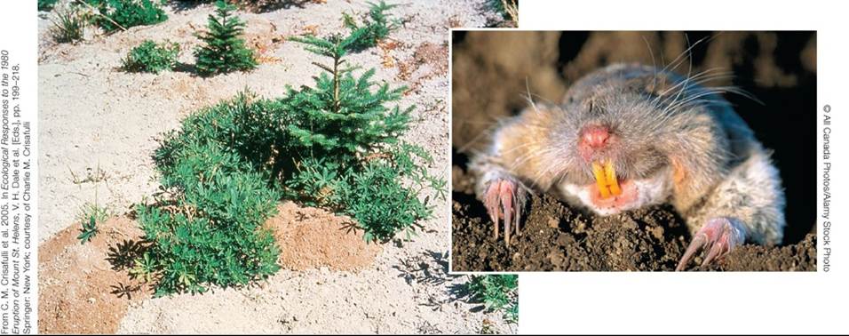
FIGURE 17.20 Pocket Gophers to the Rescue The burrowing activity of northern pocket gophers, some of which survived the eruption underground, brought organic matter, seeds, and fungal spores to the soil surface, creating microhabitats, like this one in the Pumice Plain, where
plants could grow. Back to text
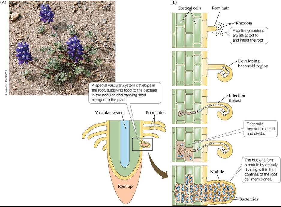
FIGURE 17.21 Dwarf Lupines and Nitrogen-Fixing Bacteria (A) Dwarf lupine (Lupinus lepidus), a legume with symbiotic nitrogen-fixing bacteria, was the first plant to colonize Mount St. Helens. (B) Root nodule development is the result of a strong interaction between the plant and the bacteria. Back to text
18 Biogeography
FIGURE 18.1 Diversity Abounds in the Amazon FreshwaterfishcaughtintheAmazon
River on display in a market in Manaus, Brazil. © Alexandre Rotenberg/Alamy Stock Photo Back to text
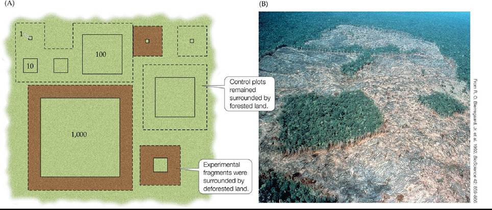
FIGURE 18.2 Studying Habitat Fragmentation in Tropical Rainforests The Biological
Dynamics of Forest Fragments Project (BDFFP) near Manaus, Brazil, was designed to study the effects of habitat fragment size on species diversity. (A) Plots of four sizes (1, 10, 100, and 1,000 ha) were designated before logging took place, then either isolated by logging or left surrounded by forest as controls. (B) Aerial photo of a 10-ha and a 1-ha fragment isolated in 1983.
Why didn't the experimental manipulation involve removing forest from the fragments?
(A after R. O. Bierregaard, Jr. et al. 2001. Lessons from Amazonia: The Ecology and Conservation of a Fragmented Forest. Yale University Press: New Haven, CT.) Back tθ text
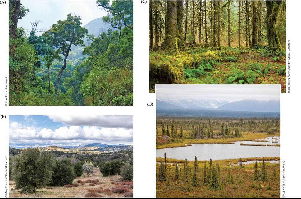
FIGURE 18.3 ForestsaroundtheWorld Forest biomes vary greatly in their species composition and species richness. (A) A tropical rainforest in Brazil. (B) Oak woodland in Southern California. (C) Lowland temperate evergreen forest in the Pacific Northwest. (D) Boreal spruce forest in Denali National Park, Alaska. Back to text
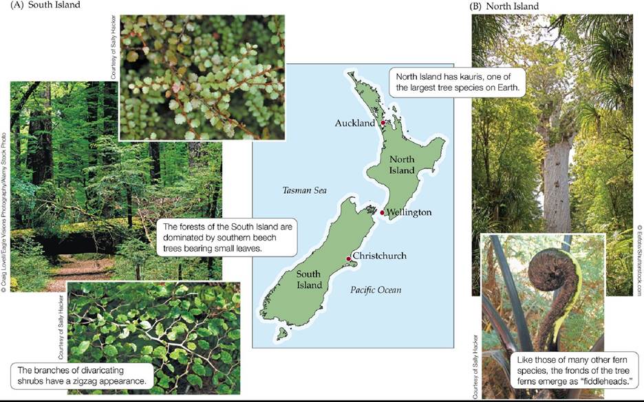
FIGURE 18.4 Forests of the North and South Islands, New Zealand Thetwoislandsof New Zealand span a large latitudinal gradient (35°S-47°S) and thus have different forest types. (A) The forests of the South Island are dominated by beeches. (B) The forests of the warmer North Island have greater tree species diversity and a different species composition than those on the South Island (see Table 18.1). Back to text
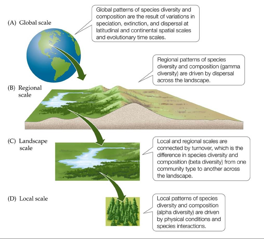
FIGURE 18.5 Interconnected Spatial Scales of Species Diversity The arrows represent
the relationships between, and processes important to, species diversity and composition at (A) global, (B) regional, (C) landscape, and (D) local scales. Back to text
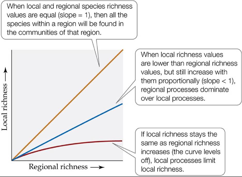
FIGURE 18.6 What Determines Local Species Richness? The relative influences of local and regional processes in a community can be determined by plotting local species richness against regional species richness.
Would you ever have a local to regional species richness relationship that had a slope of more than 1? Why or why not?
(After H. V. Cornell and J. H. Lawton. 1992. JAnimEcol 61: 1-12.) Back tθ text
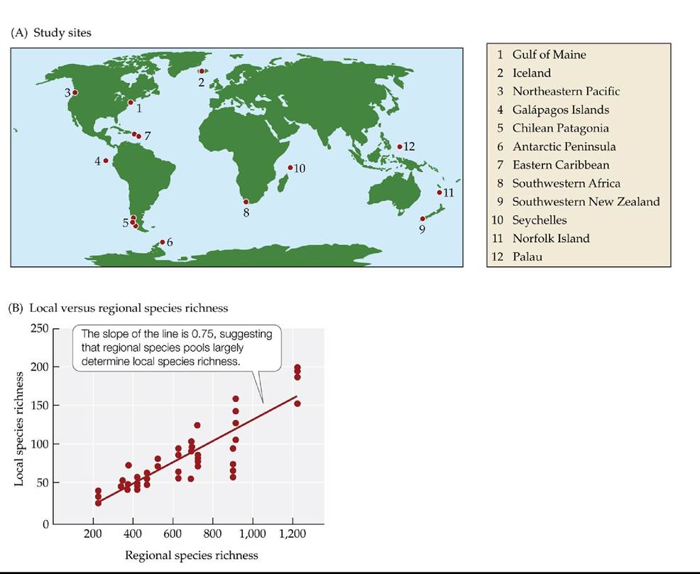
FIGURE 18.7 Marine Invertebrate Communities May Be Limited by Regional
Processes Among shallow subtidal marine invertebrate communities, regional species richness explains approximately 75% of the local species richness. (A) The 12 regions of the world where the 49 sampling sites were located. (B) A plot of local species richness against regional species richness. Each dot represents one of the 49 sampling sites. (After J. D. Witman et al. 2004. Proc Natl Acad Sci USA 101: 15664-15669. © National Academy of Sciences, U.S.A.) Back tθ text
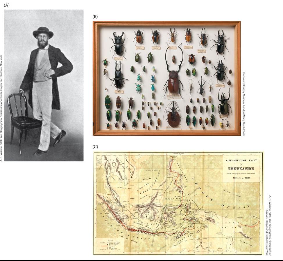
FIGURE 18.8 Alfred Russel Wallace and His Collections (A)AphotographofWallace taken in Singapore in 1862, during his expedition to the Malay Archipelago. (B) Part of Wallace's rare beetle collection from the Malay Archipelago, found in an attic by his grandson in 2005. (C) A map of the Malay Archipelago illustrating Wallace's travels. Back to text
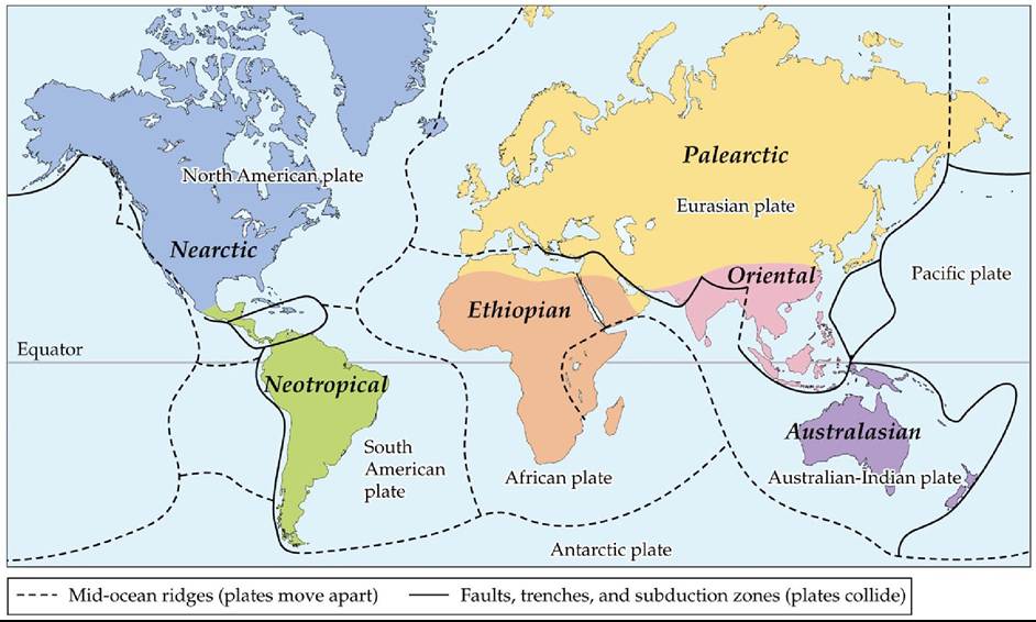
FIGURE 18.9 Six Biogeographic Regions Wallace identified six biogeographic regions using the distributions of terrestrial animals. These six regions roughly correspond to Earth's major tectonic plates.
Compare Wallace's 6 regions with the 11 biogeographic divisions shown in Figure 1.2. What types of data were used to expand the number of regions to 11?
(Based on A. R. Wallace. 1876. The Geographical Distribution of Animals. Harper and Brothers: New York.) Back to text
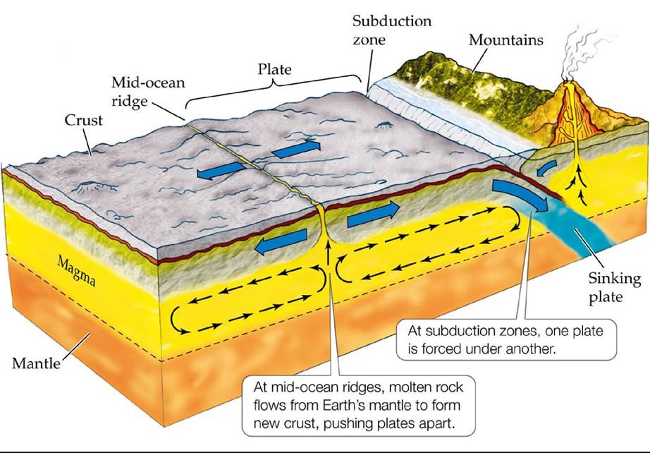
FIGURE 18.10 MechanismsofContinentalDrift Overgeologictime1Currentsgenerated deep within Earth's molten rock mantle move sections of Earth's crust across its surface. Back to text
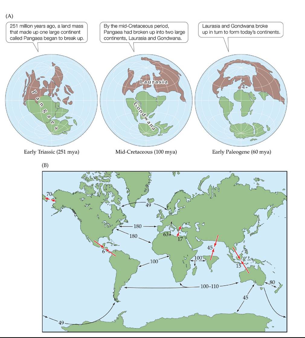
FIGURE 18.11 The Positions of Continents and Oceans Have Changed over Geologic
Time The locations of continents and oceans have changed dramatically over the last 251 million years because of continental drift. (A) The breakup of Pangaea. (B) A summary of the movements that led to the configuration of the continents we know today. Larger, red arrows are labeled with the time (in millions of years) since land masses joined; Smaller, black arrows are labeled with the time since land masses separated.
As land masses separated, would you expect speciation to increase? Why or why not?
(After E. C. Pielou. 1979. Biogeography. Wiley: Hoboken, NJ.) Back tθ text
FIGURE 18.12 Studies of Latitude and Species Diversity Confirm Conventional
Wisdom The relationship between species diversity and latitude (measured at 20° increments), tallied for a variety of taxonomic groups, shows that most are negative correlations (i.e., increasing species diversity with decreasing latitude). (After M. R. Willig et al. 2003. Annu Rev Ecol Syst 34: 273-309.) Back tθ text
FIGURE 18.13 SeabirdsDefyconventionalWisdom Globalseabirdspeciesrichness shows a latitudinal pattern opposite to that of most faunas. (A) Species richness among seabirds is high in temperate and polar regions and much lower in the tropics. (B) Species composition also shows strong latitudinal differences. (A, data from P. Harrison. 1987. A Field Guide to Seabirds of the World. Penguin Random House: London.) Back tθ text
FIGURE 18.14 Hypotheses Proposed to Explain the Latitudinal Gradient in Species
Richness (A) The tropics have a higher diversification rate (speciation rate - extinction rate) than temperate areas do, so they have accumulated species faster. (B) The tropics have had more time for diversification than temperate areas have, so they have accumulated more species. (C) Because their productivity is higher, the tropics have a higher carrying capacity than temperate areas, so more species can coexist there. (After G. G. Mittelbach et al. 2007. Ecol Lett 10: 315-331.) Back to text
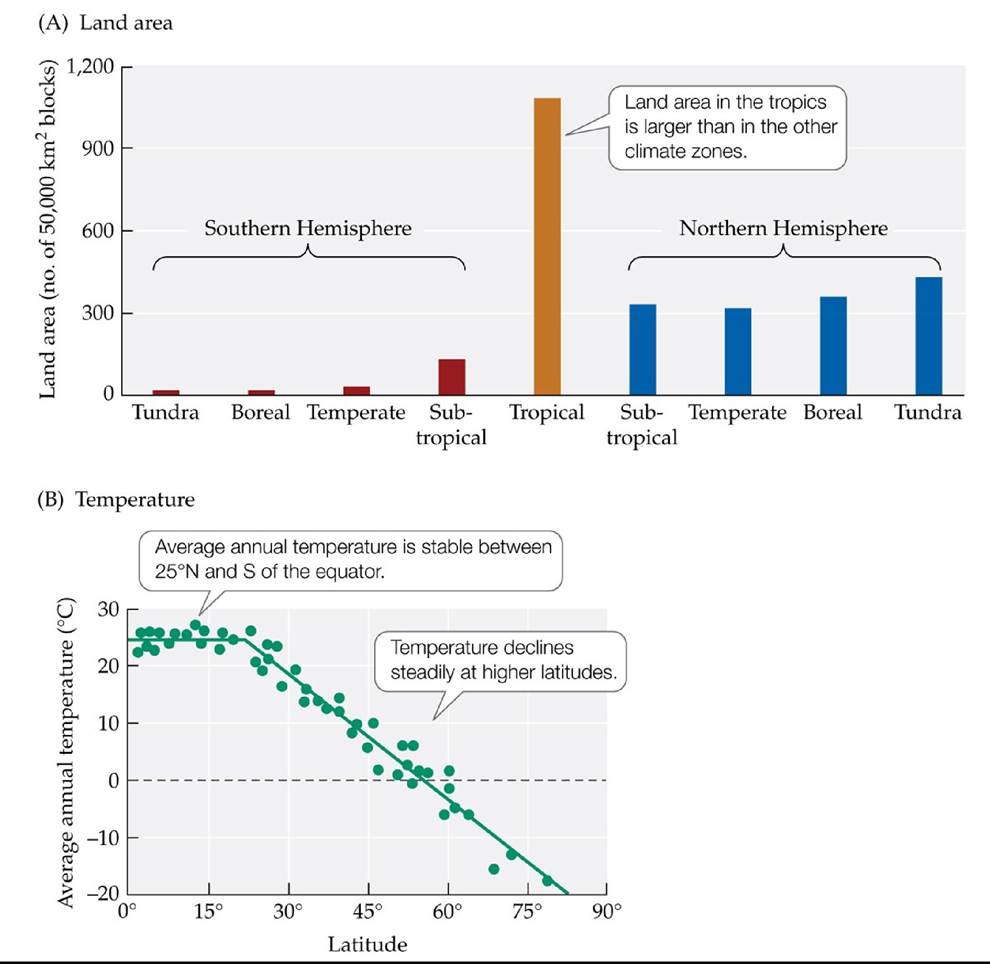
FIGURE 18.15 Do Land Area and Temperature Influence Species Diversity? Michael Rosenzweig hypothesized that two characteristics of the tropics lead to high speciation rates and low extinction rates: (A) their land area and (B) their stable temperatures. (After M. L. Rosenzweig. 1992. JMammol 73: 715-730.) Back tθ text
FIGURE 18.16 The Tropics Are a Cradle and a Museum for Speciation Extantandfossil marine bivalve taxa were examined to evaluate the hypothesis that longer evolutionary histories in the tropics contribute to the latitudinal gradient in species diversity. (A) Climate zones of first occurrence of marine bivalve taxa (based on families of fossils). (B) Range limits of modern marine bivalve taxa with tropical origins.
What is meant by the tropics being a cradle and a museum for diversity?
(After D. Jablonski et al. 2006. Science 314: 102-106.) Back tθ text
FIGURE 18.17 Latitudinal Species Diversity Gradients Vary with Climate Thelatitudinal species diversity gradients under fluctuating global temperature through the Phanerozoic. Tropical peaks in species diversity (open symbols) are restricted to cold, “icehouse” conditions, whereas temperate peaks in diversity (solid symbols) occur during warm, “greenhouse” intervals. Note that during the icehouse conditions of the Neogene, a short warming period during the Pleistocene interglacial period led to a peak in diversity at temperate latitudes. Circles are terrestrial examples, and triangles are marine examples. (After P. D. Mannion et al. 2014. Trends Ecol Evol 29: 42-50. CC by 3.0) Back to text
FIGURE 18.18 Thespecies-AreaRelationship The first species-area curve, for British plants, was constructed by H. C. Watson in 1859. (After M. Rosenzweig. 1995. SpeciesDiversity in Space and Time. Cambridge University Press: Cambridge; based on data in C. B. Williams. 1964. Patterns in the Balance of Nature. Academic Press: London; H. C. Watson. 1859. Cybele Britannica: or British Plants and Their Geographical Relations 4: 379. Longman and Company: United Kingdom.) Back to text
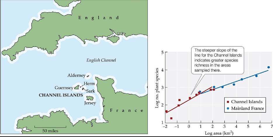
Species-Area Relationships of Island versus Mainland Areas Species-area curves for plant species on the Channel Islands and in mainland France show that the slope of a linear regression equation (z) is greater for the islands than for the mainland areas. (After M. Rosenzweig. 1995. Species Diversity in Space and Time. Cambridge University Press: Cambridge; based on data in C. B. Williams. 1964. Patterns in the Balance of Nature. Academic Press: London.) Back to text
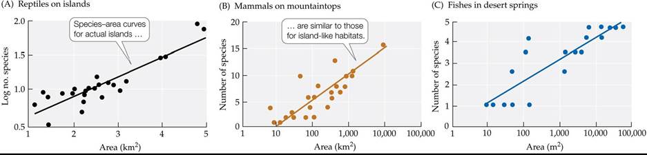
FIGURE 18.19 Species-Area Curves for Islands and Island-Like Habitats Species-area curves plotted for (A) reptiles on Caribbean islands, (B) mammals on mountaintops in the American Southwest, and (C) fishes living in desert springs in Australia all show a positive relationship between area and species richness. (A after S. J. Wright. 1981. Am Nat 118: 726-748; B after M. V. Lomolino et al. 1989. Ecology 70: 180-194; C after A. Kodric-Brown and J. H. Brown. 1993. Ecology 74: 1847-1855.) Back to text
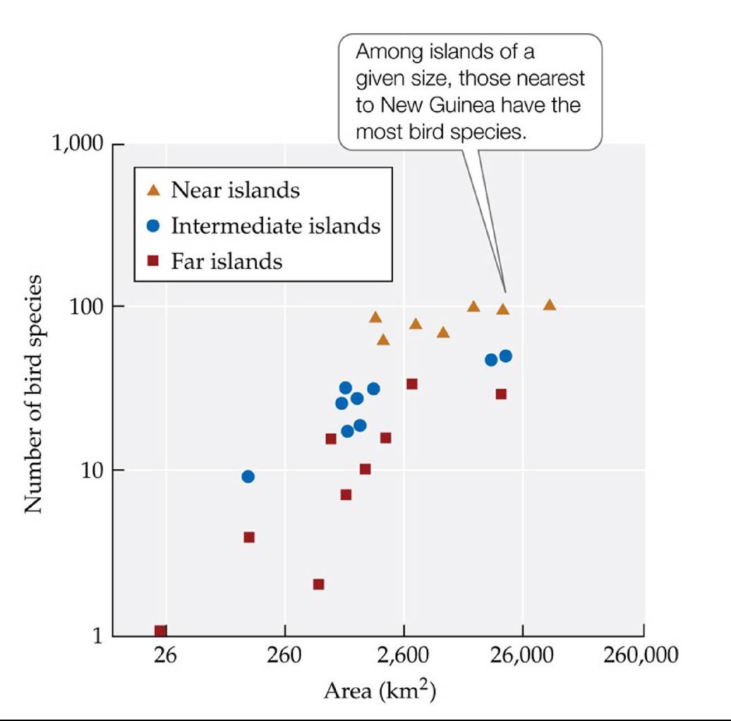
FIGURE 18.20 Area and Isolation Influence Species Richness on Islands MacArthur and Wilson plotted species-area relationships for birds on islands of different sizes and at different distances from source populations (on New Guinea). (After R. H. MacArthur and E. O. Wilson. 1963. Evolution 17: 373-387.) Back tθ text
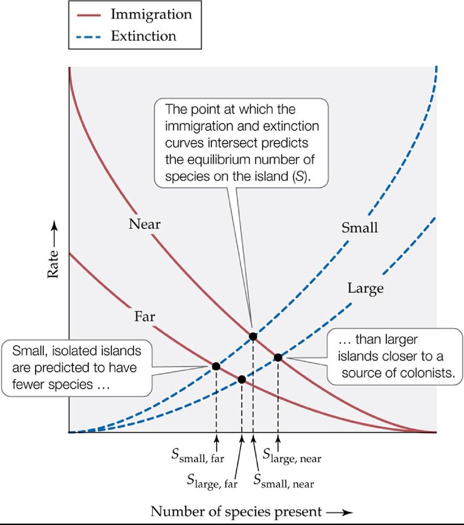
FIGURE 18.21 The Equilibrium Theory of Island Biogeography MacArthur and Wilson's theory emphasized the balance between species immigration rates and species extinction rates for islands of different sizes and at different distances from a source of colonizing species. (After R. H. MacArthur and E. O. Wilson. 1963. Evolution 17: 373-387.) Back tθ text
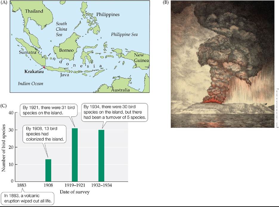
Parker & Coward, Britan. 1888
FIGURE 18.22 TheKrakatauTest (A) The eruption of the small volcanic island of Krakatau, near Sumatra and Java, in 1883 provided a natural test of the equilibrium theory of island biogeography. (B) A drawing based on a photo taken from a ship a few hours before the major eruption. (C) By 1921, the number of bird species had reached 31, and in 1934, it was at 30 —the equilibrium number predicted by MacArthur and Wilson's theory. Turnover, however, was five times higher than the theory had predicted. (C after R. H. MacArthur and E. O. Wilson. 1963.
Evolution 17: 373-387; based on data from K. W. Dammerman. 1948. The Fauna of Krakatau: 1883-1933. Noord-Hollandsche Uitg.-Mig.) Back tθ text
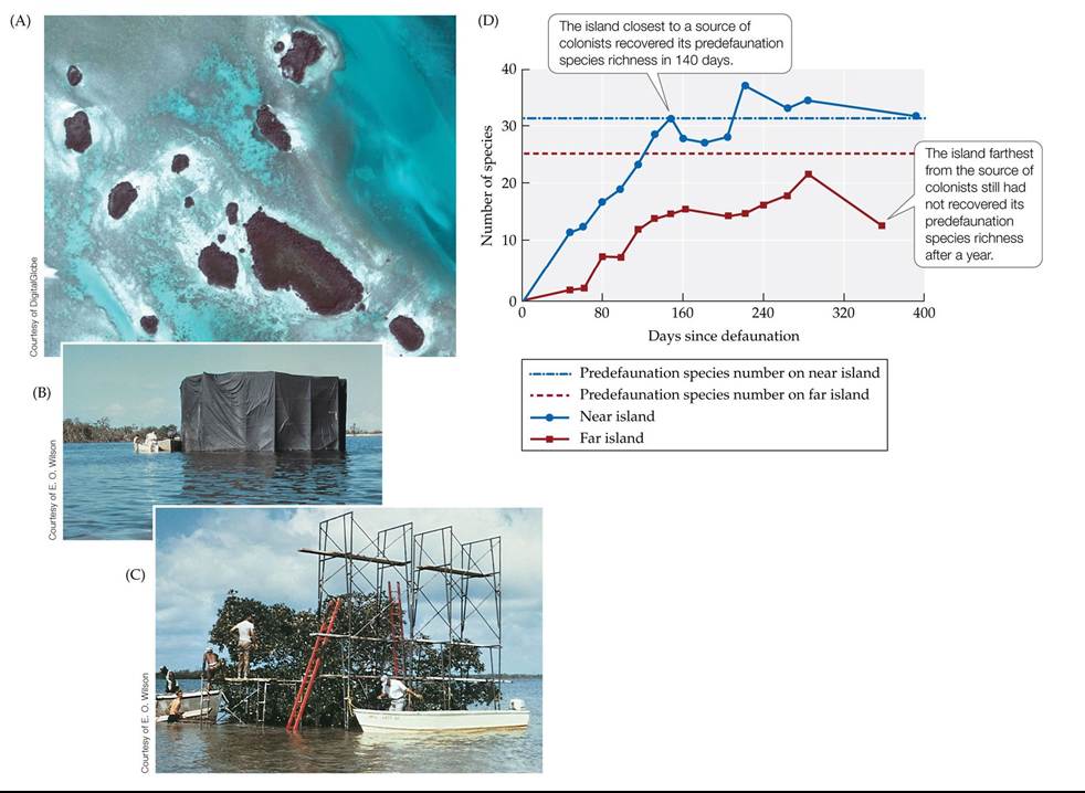
FIGURE 18.23 TheMangroveExperiment (A) To test the equilibrium theory of island biogeography, Simberloff and Wilson surveyed small mangrove islands located at different distances from larger mangrove stands. (B) They then defaunated some of the islands using fumigation tents. (C) They sampled and recorded the number of insect species that recolonized the islands, using scaffolding to reach all parts of the canopy. (D) Results for two islands, one near and one far from a source of colonists. (D after D. S. Simberloff and E. O. Wilson. 1969. Ecology 50: 278-296.) Back to text
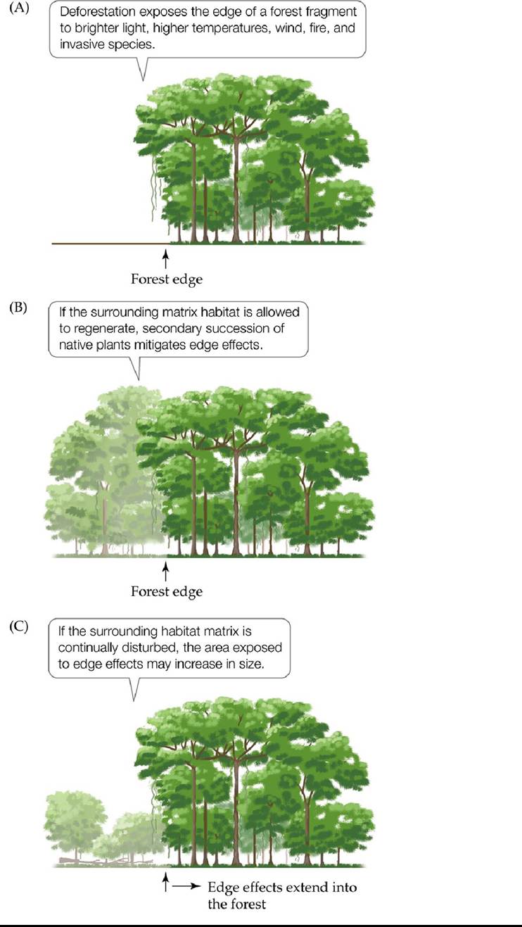
FIGURE 18.24 TropicalRainforestsontheEdge The BDFFP's research showed that deforestation subjects the forest fragments that remain to negative edge effects. (After C. Gascon et al. 2000. Science 288: 1356-1358.) Back tθ text
19 Species Diversity in Communities
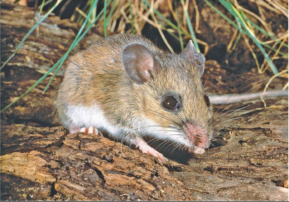
FIGURE 19.1 Deer Mice Trigger Hantavirus Infection in Humans Canthenumberof small-mammal species affect the transmission of hantavirus by the deer mouse? © E.R. Degginger/Alamy Stock Photo Back tθ text
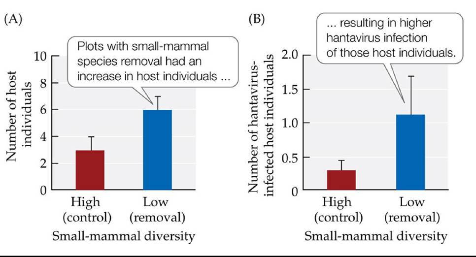
FIGURE 19.2 Disease Transmission Increased with Species Diversity Loss An experiment in Panama showed that plots with small-mammal diversity removal (low-diversity plots) increased in (A) the number of rodent host individuals and (B) the number of hosts infected with the hantavirus compared with the control (high-diversity plots). Error bars show one standard error (SE) of the mean. (After F. Keesing et al. 2010. Nature 468: 647-652.) Back tθ text

FIGURE 19.3 A View from Above Looking at these mountains in Glacier National Park, Montana, it is easy to see that the landscape is made up of a patchwork of communities of different types. Back to text
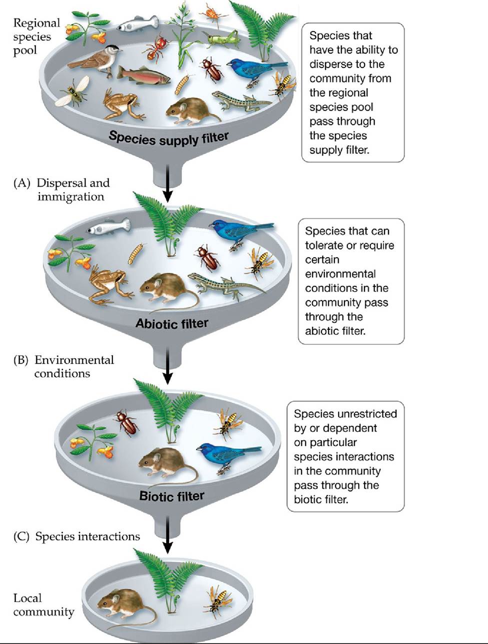
FIGURE 19.4 Community Membership: A Series of Filters Speciesendupinalocal community by passing through a series of “filters” that determine community membership. Species are lost at each filter, so local communities contain a fraction of the species in the regional pool. In practice, all the filters work at the same time, rather than in series as the figure suggests.
Would it make sense for the fish and frog species in the regional pool to be present in the local community shown in the figure? Explain.
(After J. H. Lawton. 2000. In Community Ecology in a Changing World, O. Kinne [Ed.], Excellence in Ecology, Vol. 11. Ecology Institute: Luhe, Germany.) Back tθ text
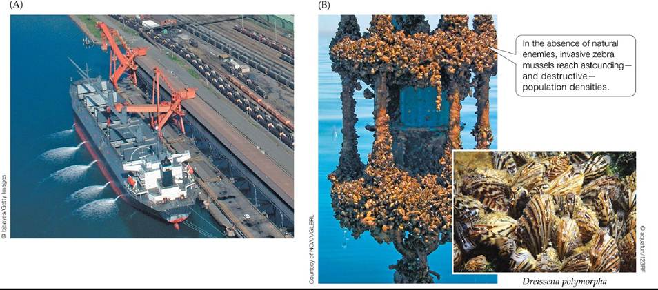
FIGURE 19.5 Humans Are Vectors for Invasive Species (A) Large and fast oceangoing ships can carry marine species to all parts of the world in their ballast water. (B) The zebra mussel, a destructive invader of the inland waterways of the United States, was carried there from Russia in ballast water. Back to text
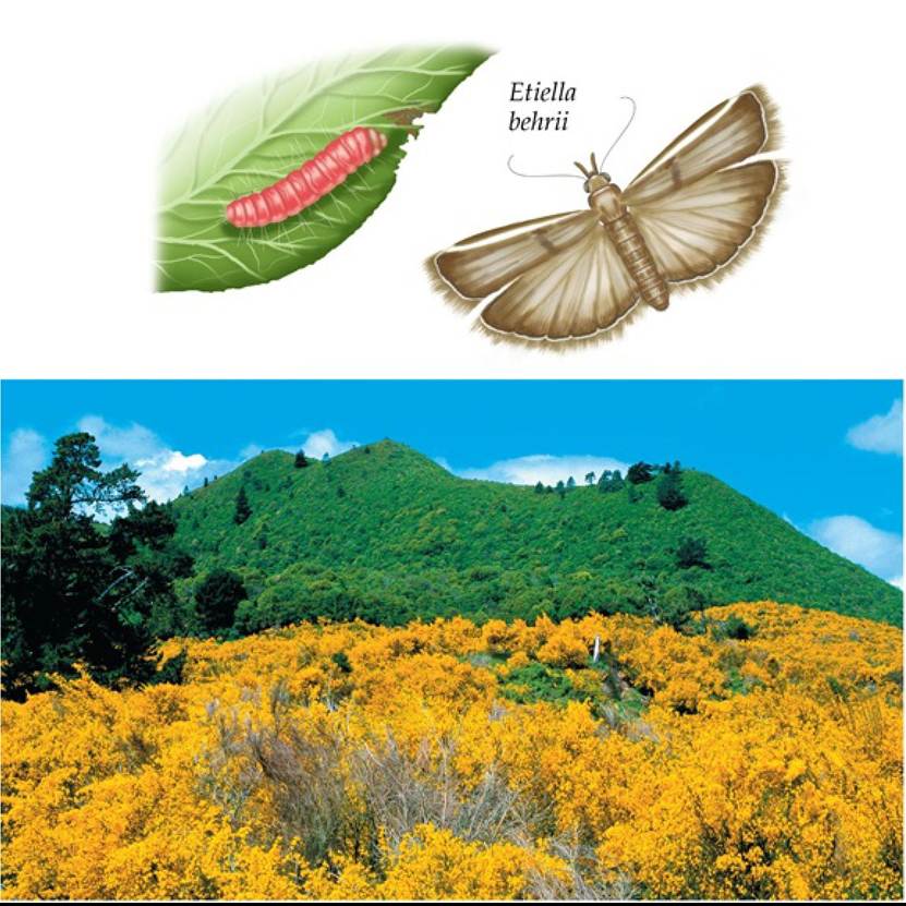
© Arco Images GnnbHZAIamy Stock Photo
FIGURE 19.6 Stopping Gorse Invasion? Herbivory by adults and larvae of the native lucerne seed web moth (Etiella behrii) has slowed, but not stopped, an invasion of the non-native gorse shrub Ulex europaeus (the plants with yellow flowers) in Australia. Back to text
FIGURE 19.7 The Five Consequences of Climate Change for Species Invasions (A) Consequences 1 and 2 directly affect the invasion pathway for new non-native species.
Consequences 3, 4, and 5 are emergent after an invader has become established and spread, and they have management implications. Delta (Δ) means “change in.” (B) The European green crab (Carcinus maenas) has invaded estuaries along the U.S. Pacific coast. (A after J. J. Hellmann et al. 2008. Conserv Biol 22: 534-543.) Back tθ text
FIGURE 19.8 ResourcePartitioning Speciescoexistencewithincommunitiesmaydepend on how the species divide resources. (A) The principle of resource partitioning along a resource spectrum. (B,C) Two characteristics of communities that can result in higher species richness.
Which panel shows the most resource partitioning? Which shows the least? (After J. Hill and R. Hill. 2001. Prog Phys Geogr 25: 326-354.) Back tθ text
FIGURE 19.9 ResourcePartitioningbyWarblers RobertMacArthurstudiedthehabitat and food choices of five species of warblers in New England forests. He found that the warblers partition resources by feeding in different parts of the same trees. The colored shaded areas in each tree diagram represent the parts of trees where each warbler species fed most often. (After R. H. MacArthur. 1958. Ecology 39: 599-619.) Back tθ text
FIGURE 19.10 Bird Species Diversity Is Higher in More Complex Habitats MacArthur and MacArthur plotted bird species diversity against foliage height diversity (a measure of habitat complexity) for 13 different communities. Both kinds of diversity were calculated for each community, using the Shannon index (H). (After R. H. MacArthur and J. W. MacArthur. 1961. Ecology 42: 594-598.) Back tθ text
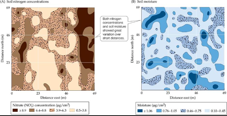
FIGURE 19.11 ResourceDistributionMaps Mapping of (A) nitrogen concentrations and (B) soil moisture in an abandoned agricultural field revealed considerable small-scale variation (μg∕cm2 = micrograms per square centimeter). (From G. P. Robertson et al. 1988. Ecology 69: 15171524.) Back to text
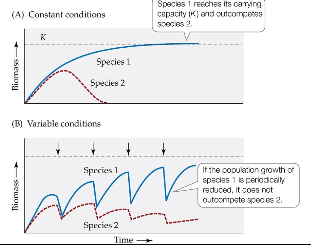
FIGURE 19.12 The Outcome of Competition under Constant and Variable Conditions (A) Under constant conditions, species 1 (the dominant competitor) outcompetes species 2 when it reaches its own carrying capacity (K). (B) If disruptive processes such as disturbance, stress, or predation (represented by the arrows) reduce the population growth of species 1, it will not reach its carrying capacity and will not outcompete species 2, thus allowing coexistence. (After M. Huston. 1979. Am Nat 113: 81-101.) Back tθ text
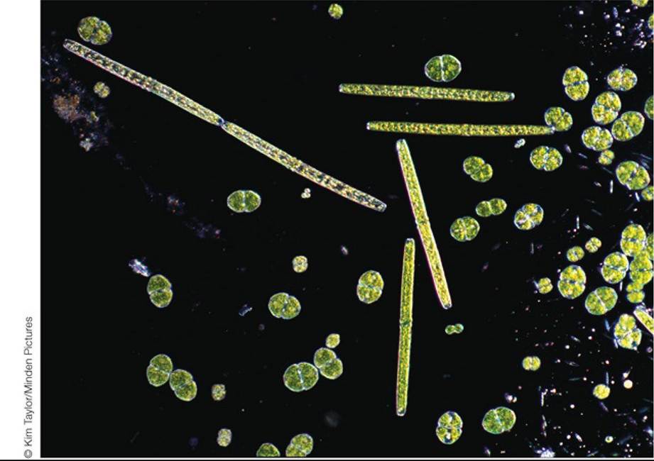
FIGURE 19.13 ParadoxofthePlankton Phytoplankton from a freshwater lake. How can so many species coexist using the same set of basic resources? G. E. Hutchinson suggested that the answer is the influence of environmental variation over time. Back to text
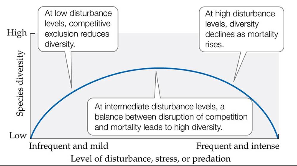
FIGURE 19.14 ThelntermediateDisturbanceHypothesis Speciesdiversityisexpected to be greatest at intermediate levels of disturbance, stress, or predation. (After J. H. Connell. 1978. Science 199: 1302-1310.) Back tθ text
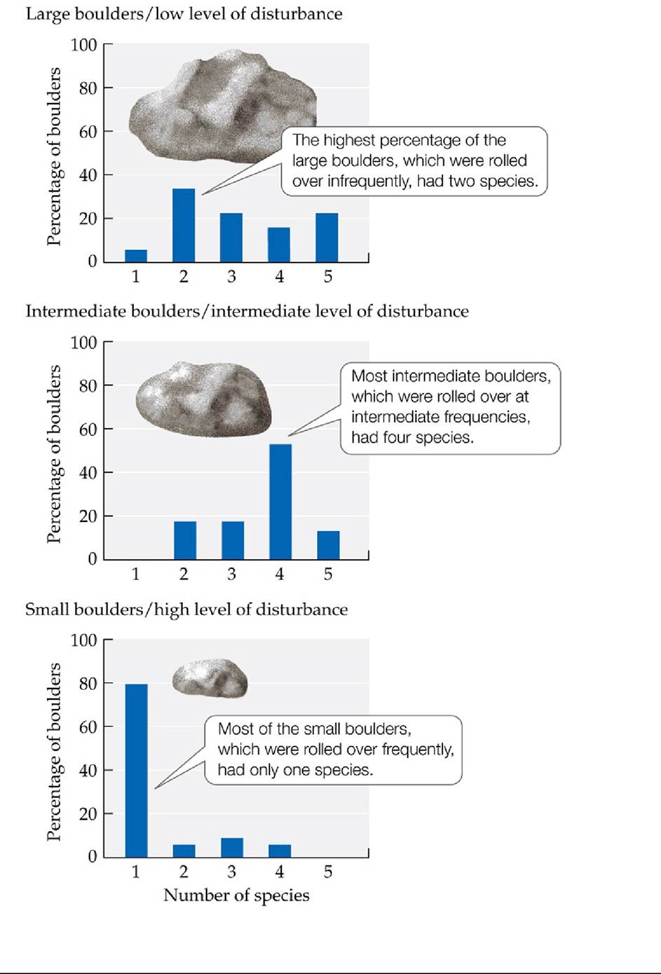
FIGURE 19.15 A Test of the Intermediate Disturbance Hypothesis Marineintertidal communities were surveyed on boulders that differed in the level of disturbance they experienced from being rolled over by wave action.
Which size boulder had the lowest species richness, and why?
(After W. P. Sousa. 1979a. Ecology 60: 1225-1239.) Back tθ text
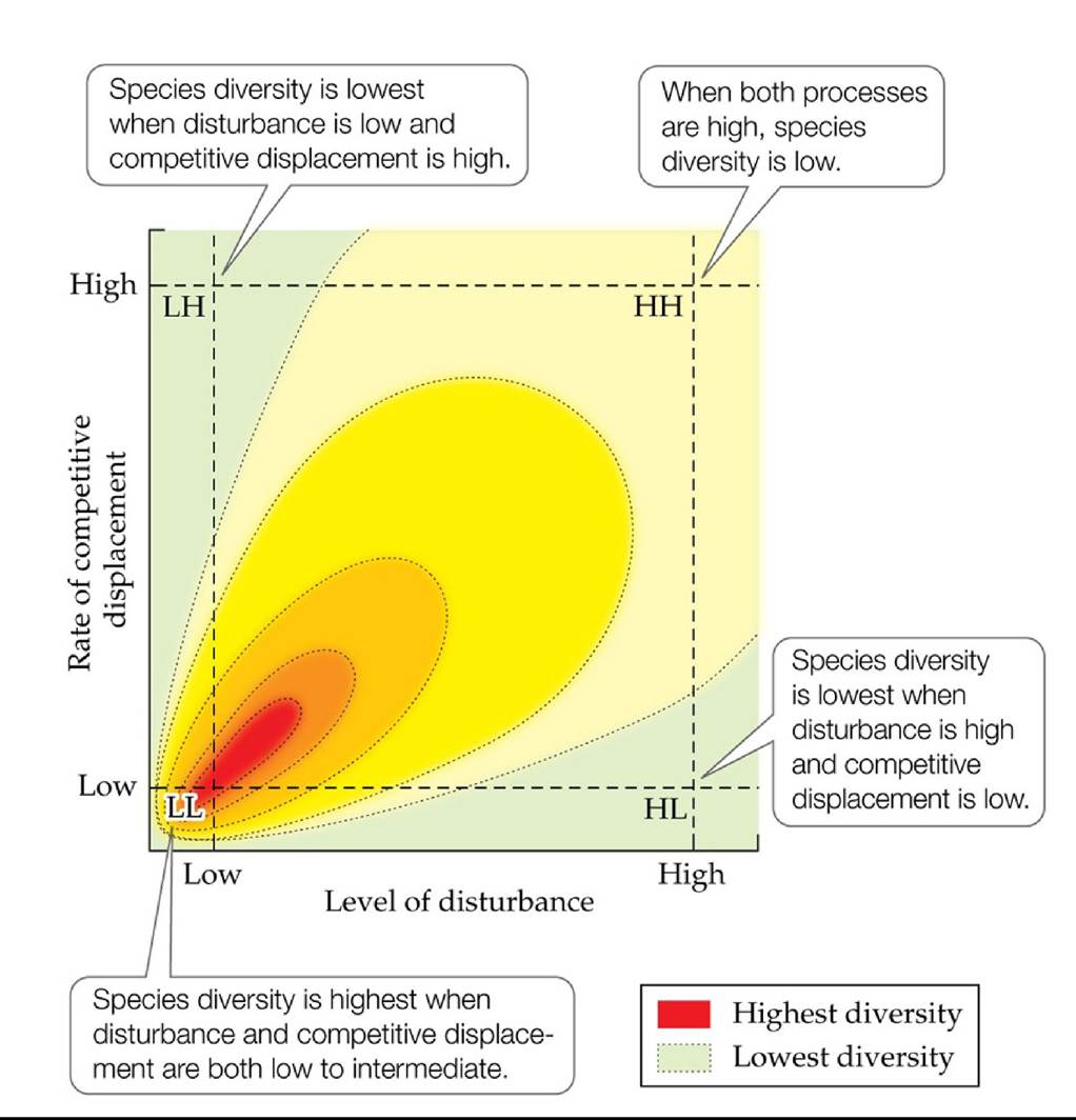
FIGURE 19.16 TheDynamicEquilibriumModel Thedynamicequilibriummodelpredicts that species diversity will be highest when the frequency and intensity of disturbance and the rate of competitive displacement are both low to intermediate. (After M. Huston. 1979. Am Nat 113: 81- ιoι.) Back to text
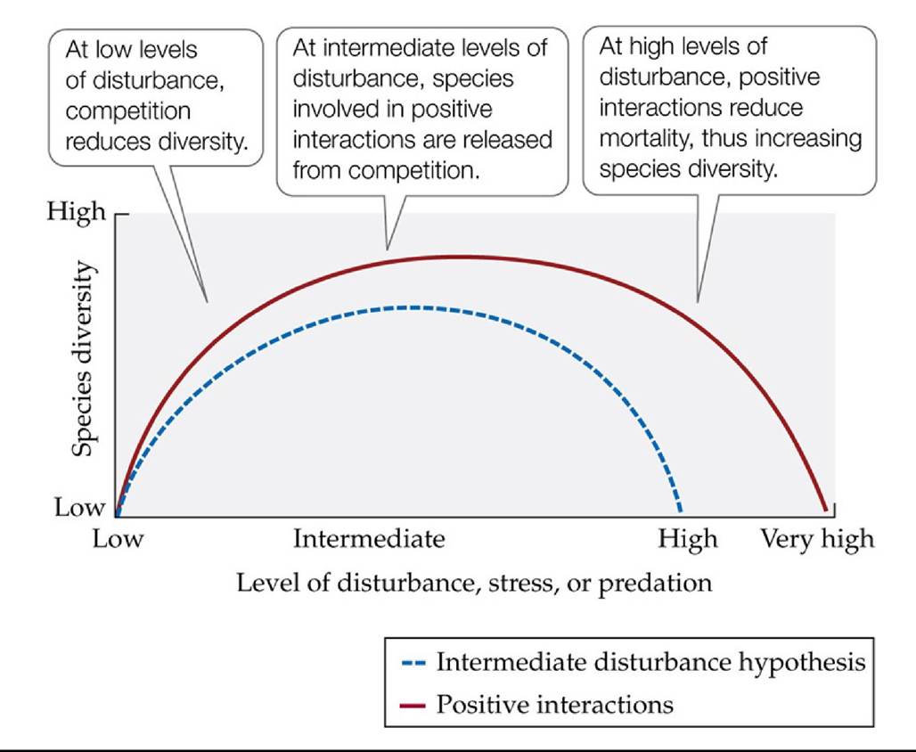
FIGURE 19.17 Positive Interactions and Species Diversity The intermediate disturbance hypothesis has been elaborated to include positive interactions. (After S. D. Hacker and S. D.
Gaines. 1997. Ecology 78: 1990-2003.) Back tθ text
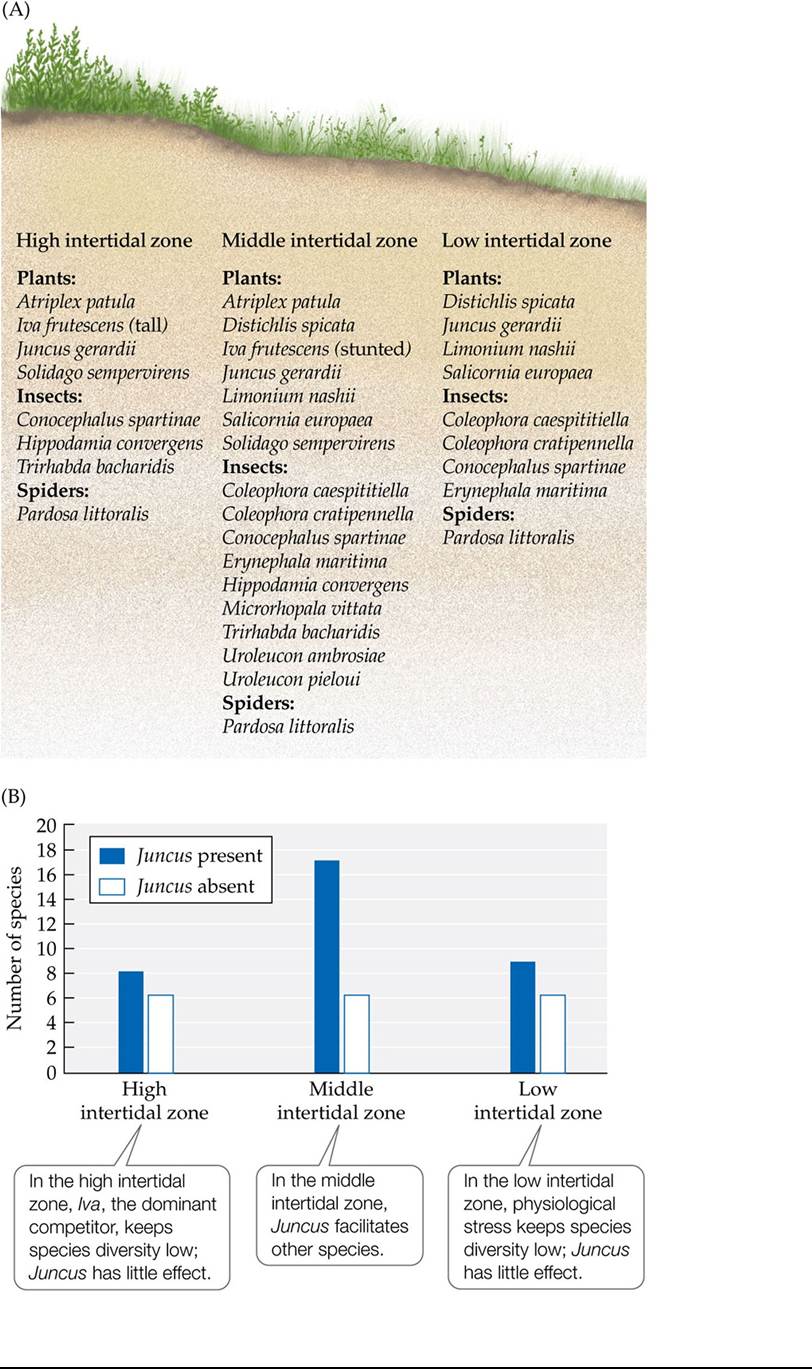
FIGURE 19.18 Positive Interactions: Key to Diversity in Salt Marsh Communities? (A)
Surveys of plant and arthropod species diversity in a New England salt marsh show diversity to be greatest in the middle intertidal zone. (B) Experiments suggest that the high diversity of plants and arthropods in this zone is controlled by the direct and indirect effects of the facilitating rush species Juncus gerardii as well as by a decrease in the effect of the dominant competitor, Iva frutescens, due to physical stress. (After S. D. Hacker and S. D. Gaines. 1997. Ecology 78: 19902003.) Back to text
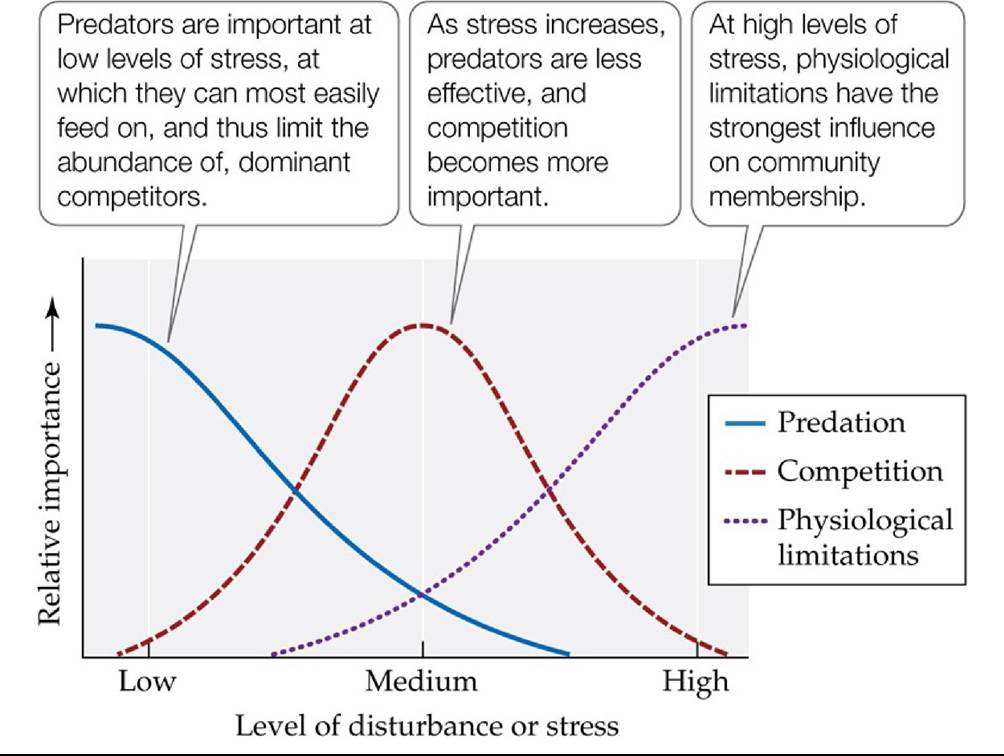
FIGURE 19.19 The Menge-Sutherland Model Menge and Sutherland’s model of influences on community diversity is similar to the intermediate disturbance hypothesis (see Figure 19.14), but it accounts for the effect of predation separately from that of stress or
disturbance. (After B. A. Menge and J. P. Sutherland. 1987. Am Nat 130: 730-757.) Back tθ text
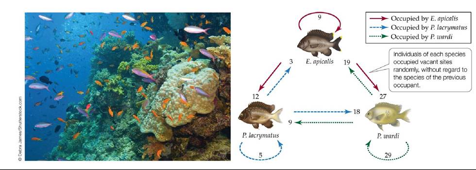
FIGURE 19.20 A Test of the Lottery Model Peter Sale tested the lottery model using coral reef fishes living on the Great Barrier Reef of Australia. By counting the individuals of three fish species (Eupomacentrus apicalis, Plectroglyphidodon Iacrymatus, and Pomacentrus wardi) that occupied vacated sites, he found that the species of the new occupant was random and unrelated to the species that had previously occupied the site. The drawings represent the original occupants of vacated sites, and the colored arrows pointing to each drawing show the number of individuals of another species (straight arrows) or the same species (circular arrows) that took over those sites when they became vacant. (Data from P. F. Sale. 1979. Oecologia 42: 159-177.) Back to text
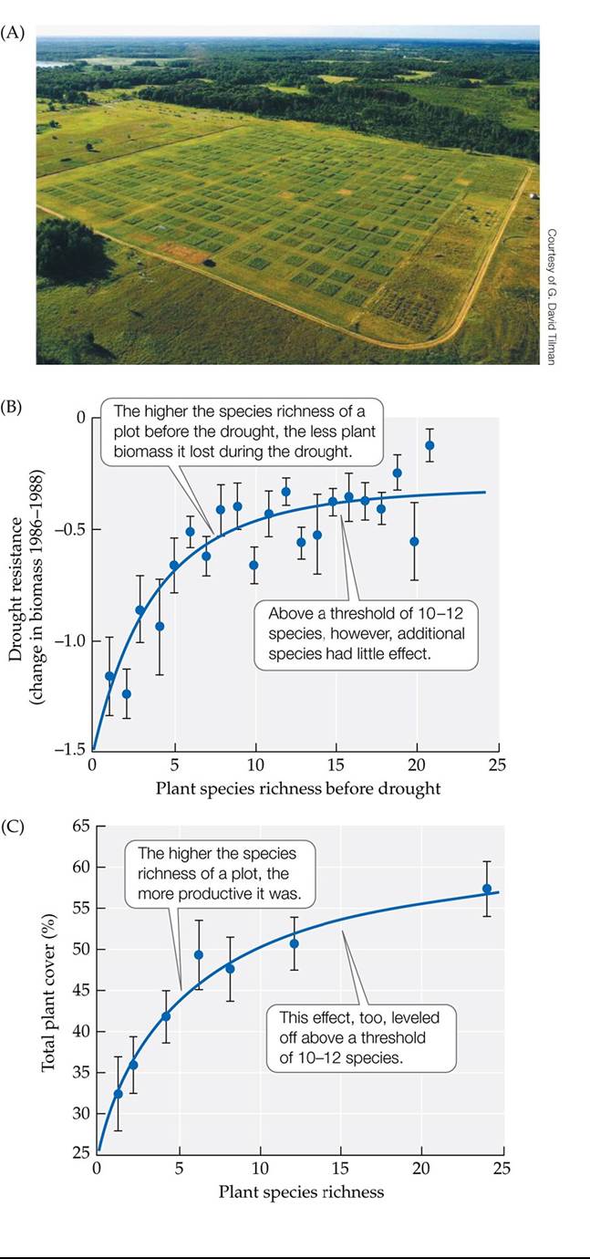
FIGURE 19.21 SpeciesDiversityandCommunityFunction (A)Tilmanandcolleagues used their prairie plots at the Cedar Creek site in Minnesota to test the effects of species richness on community function. (B) First, they measured the effects of a drought on plant biomass in plots that varied in species richness. (C) They then created plots that varied in species richness, though all had the same density of individual plants, and measured biomass in those plots after 2 years of growth. Error bars show ± one standard error (SE) of the mean. (B after D. Tilman and J. A.
Downing. 1994. Nature 367: 363-365; C after D. Tilman et al. 1996. Nature 379: 718-720.) Back tθ text
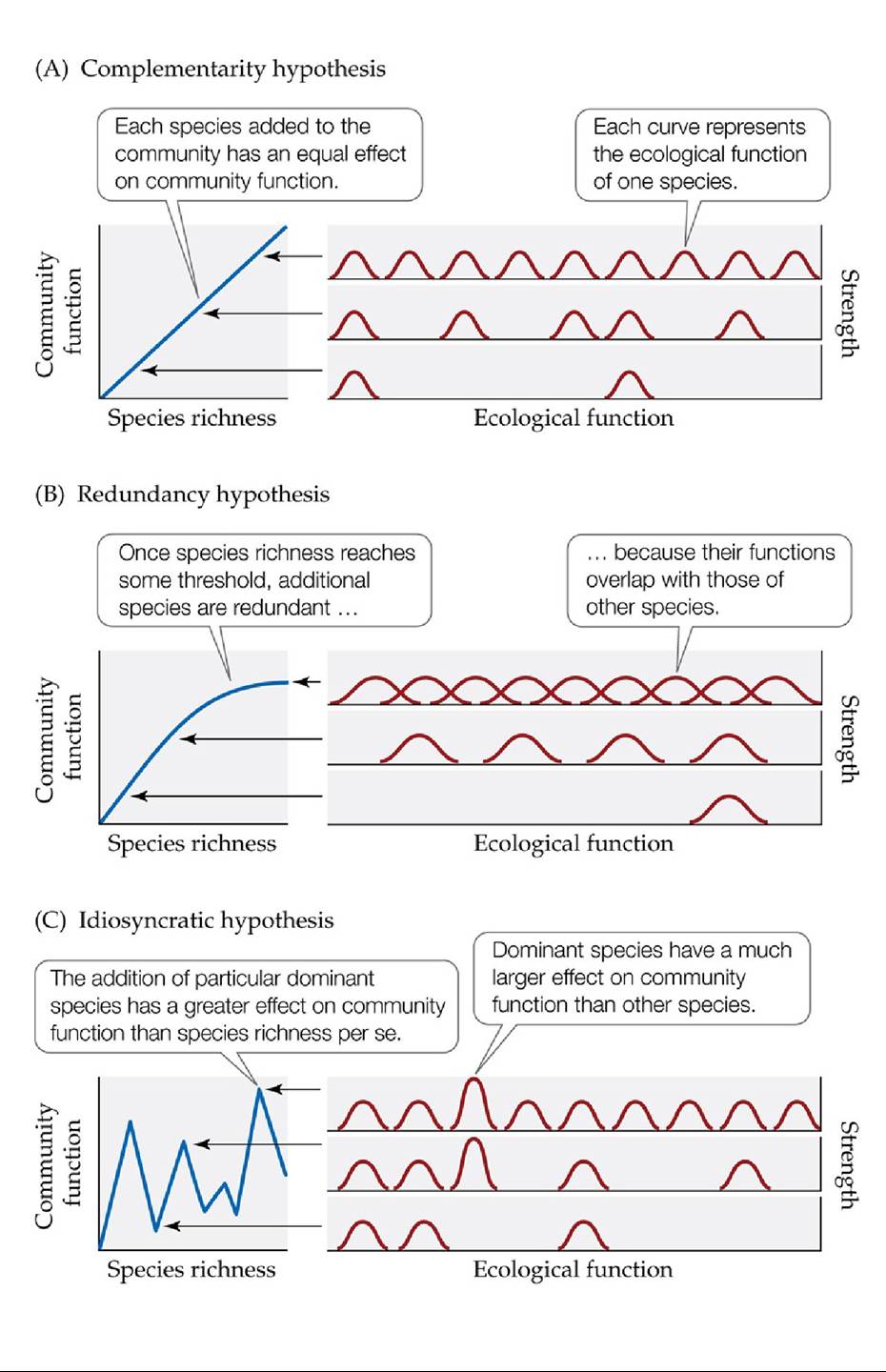
FIGURE 19.22 Hypotheses on Species Richness and Community Function Atleast three possible relationships between species diversity and community function and their corresponding hypotheses have been proposed. Two variables distinguish these hypotheses: the degree of overlap in the ecological functions of species, and variation in the strength of the ecological functions of species. (After G. Peterson et al. 1998. Ecosystems 1: 6-8.) Back to text
20 Production
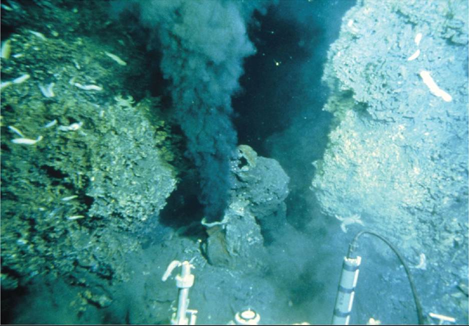
FIGURE 20.1 BlackSmokerVent A hydrothermal vent emits superheated water as hot as 400°C, rich in iron sulfide, known as a “black smoker.” Despite the high temperature and toxic nature of the water, abundant life surrounds these features. © Dr. Ken MacDonald/Science Source Back to text
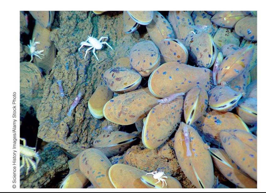
FIGURE 20.2 Life around a Hydrothermal Vent Mussels in the genus Bathymodiolus are scattered near a hydrothermal vent, with several crabs lacking pigmentation in their carapaces. Back to text
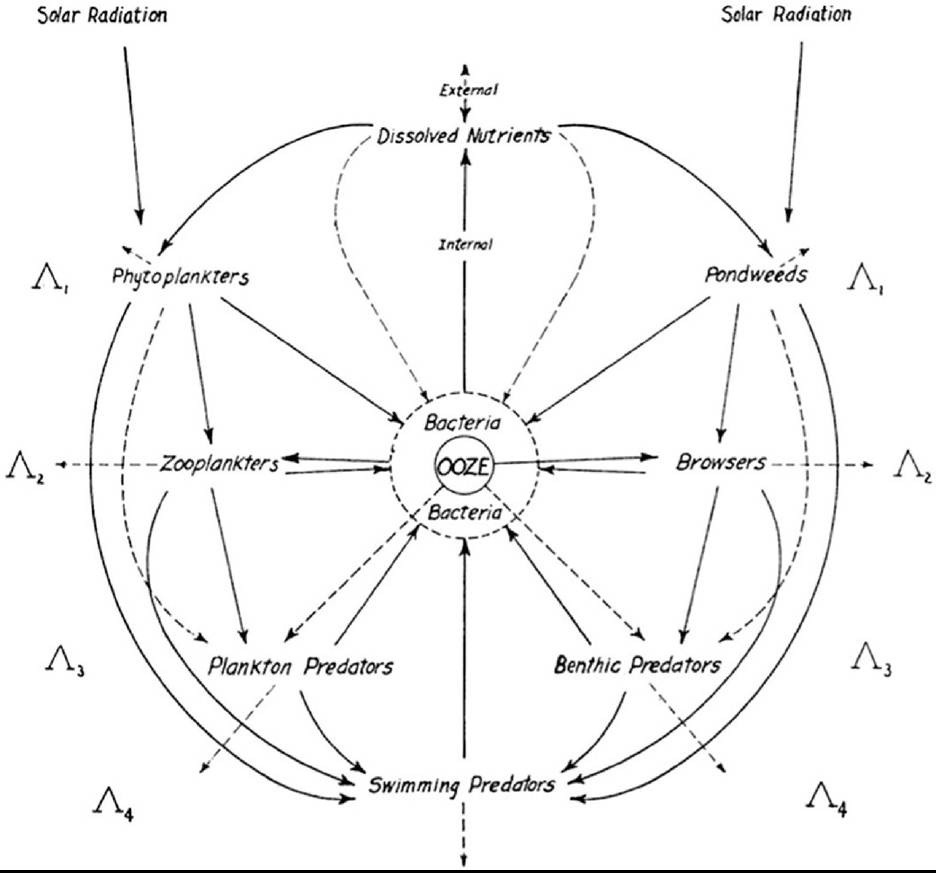
FIGURE 20.3 EnergyFlowinaLake RaymondLindeman1Sdiagramdescribesthe movement of energy among groups of organisms at Cedar Bog Lake, Minnesota. Note the general functional categories of organisms Lindeman used, as well as the central position of “ooze” (organic matter) in the diagram. The subscripts next to the uppercase Greek lambdas represent trophic levels. (From R. L. Lindeman. 1942. Ecology 23: 399-418.) Back tθ text
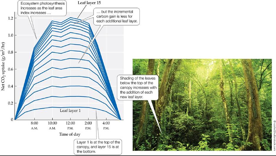
FIGURE 20.4 Diminishing Returns for Added Leaf Layers Rates of photosynthesis (expressed here as CO2 uptake) for a tropical rainforest increase as the number of leaf layers, or leaf area index, increases, but the increase is smaller with each additional leaf layer. (After W. Larcher. 1980. Physiological Plant Ecology. Springer: New York; based on L. H. Allen and E. R. Lemon. 1976. In Vegetation and the Atmosphere, Vol. 2, J. L. Monteith [Ed.], pp. 265-308. Academic Press: London.) Back to text
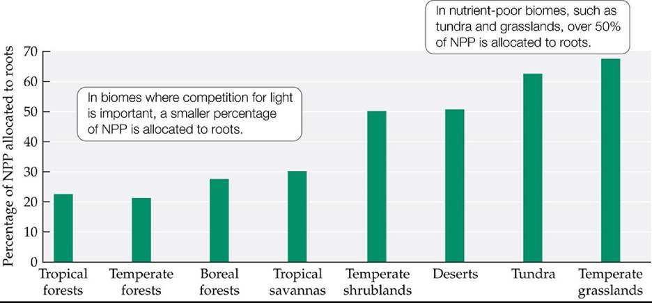
FIGURE 20.5 AllocationofNPPtoRoots The proportion of NPP that plants allocate to roots varies with the resources available to them.
In addition to low supplies of resources in the soil, what other factors might favor greater allocation of NPP to tissues below the soil surface?
(After B. Saugier et al. 2001. In Terrestrial Global Productivity, J. Roy, B. Saugier, and H. A. Mooney [Eds.], pp. 543-557. Academic Press: San Diego, CA.) Back tθ text
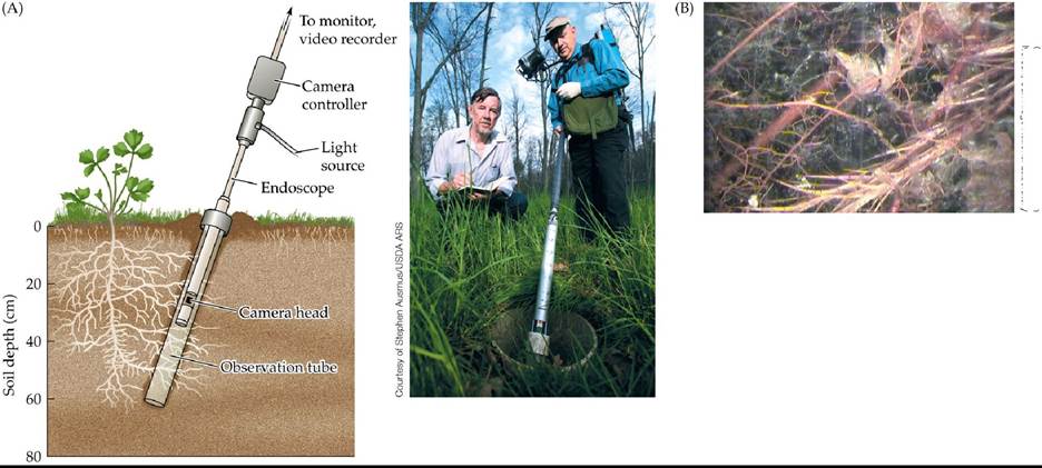
Courtesy of Joanne Childs and Colleen Iversen. Oak Ridge National Laboratory
FIGURE 20.6 A Tool for Viewing Belowground Dynamic (A)Minirhizotronsallow researchers to observe the dynamics of root growth and death belowground. (B) A view of roots from a minirhizotron tube installed in a bog ecosystem in northern Minnesota. Small-diameter roots from ericaceous shrubs can be seen in the foreground against a background of decomposing Sphagnum mosses and peat. Back to text
FIGURE 20.7 Remote Sensing of NPP Global NPP estimated using a satellite-based sensor [Moderate Resolution Imaging Spectroradiometer (MODIS)]. Note the latitudinal patterns in NPP corresponding to climate zones.
In addition to zones of upwelling, what other coastal zones have high rates of NPP as indicated in this map?
Back to text
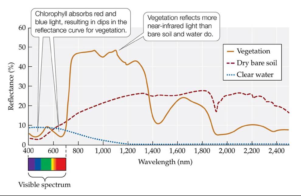
FIGURE A Spectral Signatures of Vegetation, Clear Water, and Bare Soil Note the low reflectances of blue and red wavelengths for vegetation. (After A. R. Huete. 2004. In Environmental Monitoring and Characterization, J. F. Artiola et al. [Eds.], pp. 183-206. Academic Press: Amsterdam.) Back to text
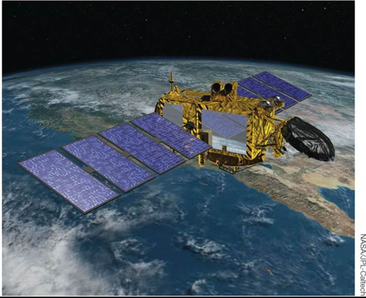
FIGURE B RemoteSensingbySatellite Remotesensinginstrumentsmountedonsatellites can measure the reflectance of solar radiation from Earth to provide ecologists with large-scale measurements of NPP and other phenomena. Back to text
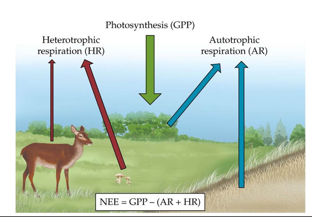
FIGURE 20.8 Components of Net Ecosystem Exchange (NEE) Netecosystemexchange includes all of the components of an ecosystem that either take up CO2 (autotrophs, through photosynthesis) or release CO2 (both autotrophs and heterotrophs). Back to text
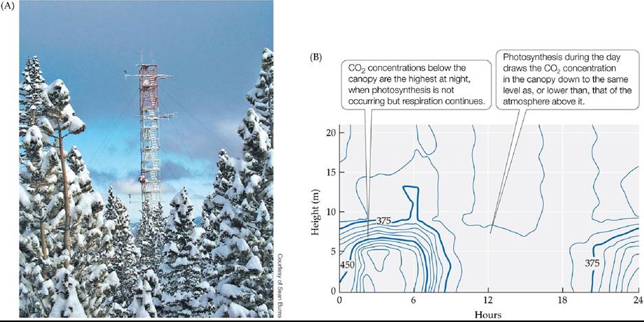
FIGURE 20.9 EddycovarianceEstimatesofNEE (A)Atowerprojectingabovea subalpine forest on Niwot Ridge, Colorado. Instruments attached to the tower measure the microclimate (temperature, wind speed, radiation) and atmospheric CO2 concentrations at frequent intervals. These measurements are used to estimate net ecosystem exchange of CO2. (B) Concentrations of CO2 (in parts per million) from the ground surface to above the canopy in a boreal forest in Siberia, measured over the course of a 24-hour period in the summer. Average canopy height was 16 m.
What would the daily pattern of CO2 concentrations look like during the summer in a community made up primarily of cacti?
(B after D. Y. Hollinger et al. 1998. Agr For Meteorol 90: 291-306.) Back tθ text
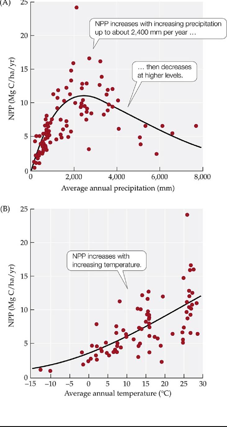
FIGURE 20.10 Global Patterns of Terrestrial NPP Are Correlated with Climate The graphs show the relationships between NPP and (A) precipitation and (B) temperature in terrestrial ecosystems worldwide. (Mg = 106 g.) (After E. A. G. Schuur. 2003. Ecology 84: 1165-1170.) Back to text
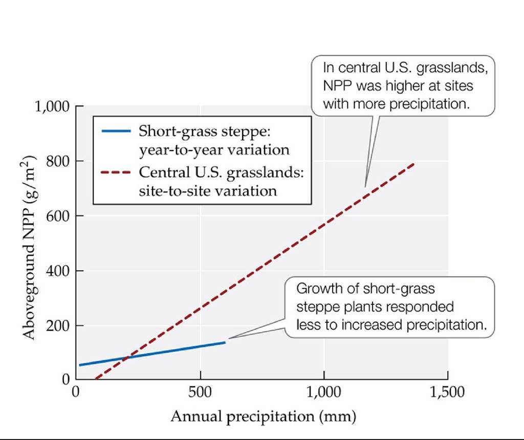
FIGURE 20.11 The Sensitivity of NPP to Changes in Precipitation Varies among
Grassland Ecosystems The relationship between aboveground NPP and precipitation is shown for a short-grass steppe ecosystem and for several grassland ecosystems of different types at different sites in the central United States. (After W. K. Lauenroth and O. E. Sala. 1992. Ecol Appl 2: 397-403.) Back to text
FIGURE 20.12 Nutrient Availability Influences NPP in Alpine Communities (A)Fertilized plots in an alpine dry meadow community in the Colorado Rocky Mountains, dominated by sedges, forbs, and grasses (see Figure 3.11). (B) Fertilization of plots in a resource-poor dry meadow and a resource-rich wet meadow with nitrogen (N), phosphorus (P), and both N and P showed that nutrient availability limits NPP.
In which community would you expect a higher proportion of belowground NPP? Would the allocation to belowground NPP change in response to fertilization?
(B after W. D. Bowman et al. 1993. Ecology 74: 2085-2098.) Back tθ text
FIGURE 20.13 Growth Responses of Alpine Plants to Added Nitrogen Theeffecton
plant growth of low to high nitrogen levels (with all other nutrients maintained at optimal concentrations) indicated that alpine plant species vary substantially in their ability to increase growth in response to an increase in nitrogen availability. (After W. D. Bowman and C. J. Bilbrough. 2001. Plant Soil 233: 283-290.) Back tθ text
FIGURE 20.14 Limnocorrals A researcher snorkels within a contained area (Iimnocorral) in McKinley Lake near Cordova, Alaska, subjected to experimental fertilization to examine the effects of nutrients on NPP. Back to text
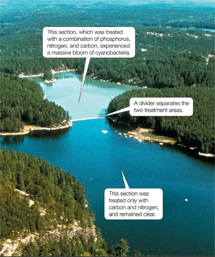
Photo by E. Debruyn, courtesy Fisheries and Oceans Canada
FIGURE 20.15 Response of a Lake to Phosphorus Fertilization Experimental Lake 226 was divided into two sections as part of David Schindler’s experiments on the effects of nutrient availability on NPP. Back to text
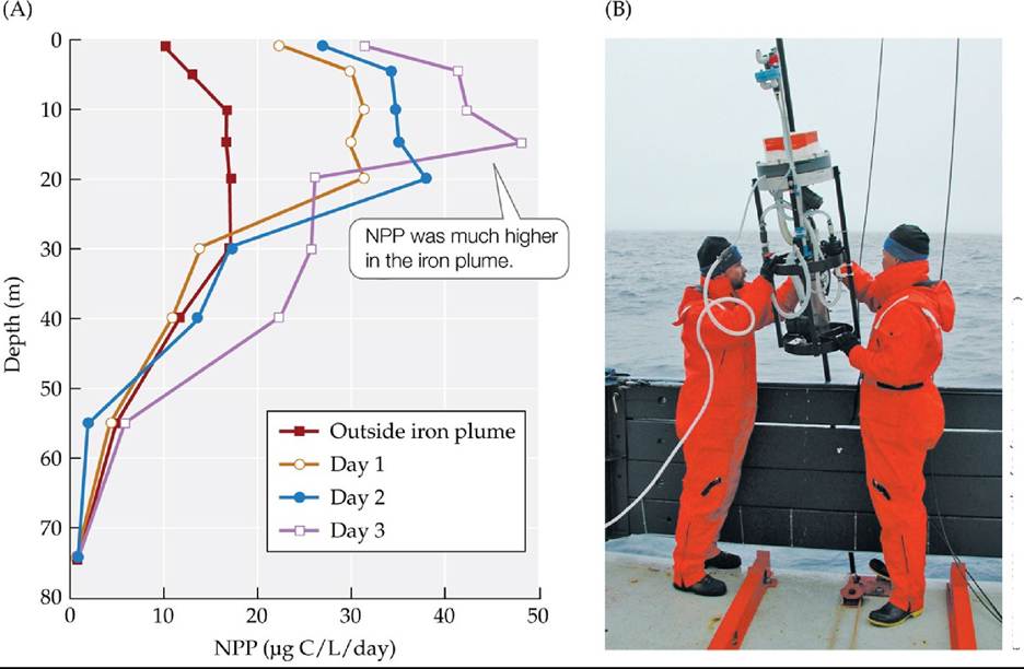
© Ken Johnson/Monterey Bay Aquarium Research Institute
FIGURE 20.16 Effect of Iron Fertilization on Marine NPP IronExlreleasedaplumeof iron into the equatorial Pacific Ocean to study the effects of iron fertilization on NPP. (A) This vertical profile shows primary production at various depths outside and inside the iron plume on three specific days: 1, 2, and 3 days following the release of the iron. (B) Researchers deploy a pump to add iron to the ocean. (A after J. H. Martin et al. 1994. Nature 371: 123-129.) Back to text
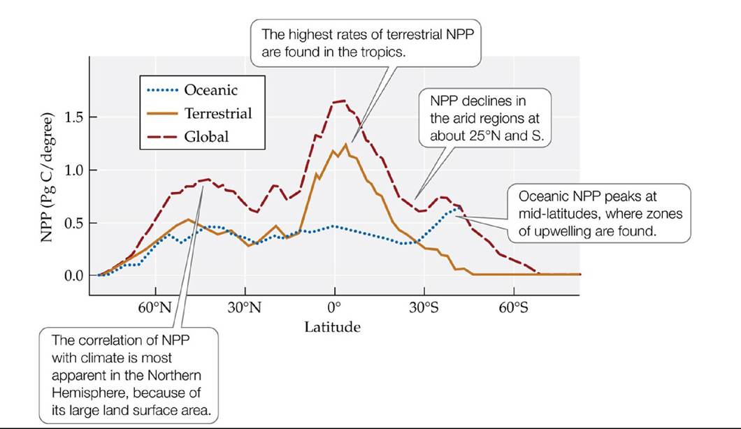
FIGURE 20.17 Latitudinal Variation in NPP These estimates of NPP are based on satellite remote sensing data. Note the strong correlation of the terrestrial pattern with patterns in global average annual temperature (see Figure 2.14) and precipitation (see Figure 2.16). (After C. B. Field et al. 1998. Science 281: 237-240.) Back tθ text
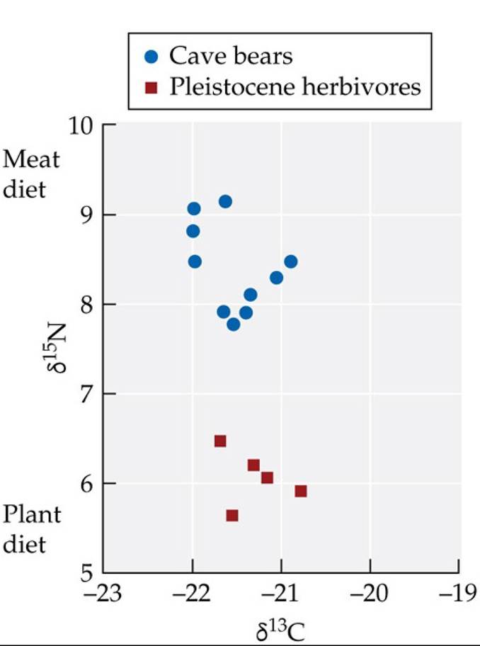
FIGURE 20.18 Isotopic Composition and Diet Carbon and nitrogen isotope composition of bones of museum specimens of cave bears and herbivores from about 20,000 years ago. The isotopic compositions are expressed as ratios of heavier to lighter isotopes compared with a standard. Higher numbers mean more of the heavier isotope. (After G. V. Hilderbrand et al. 1996. CanJZool 74: 2080-2088.) Back tθ text
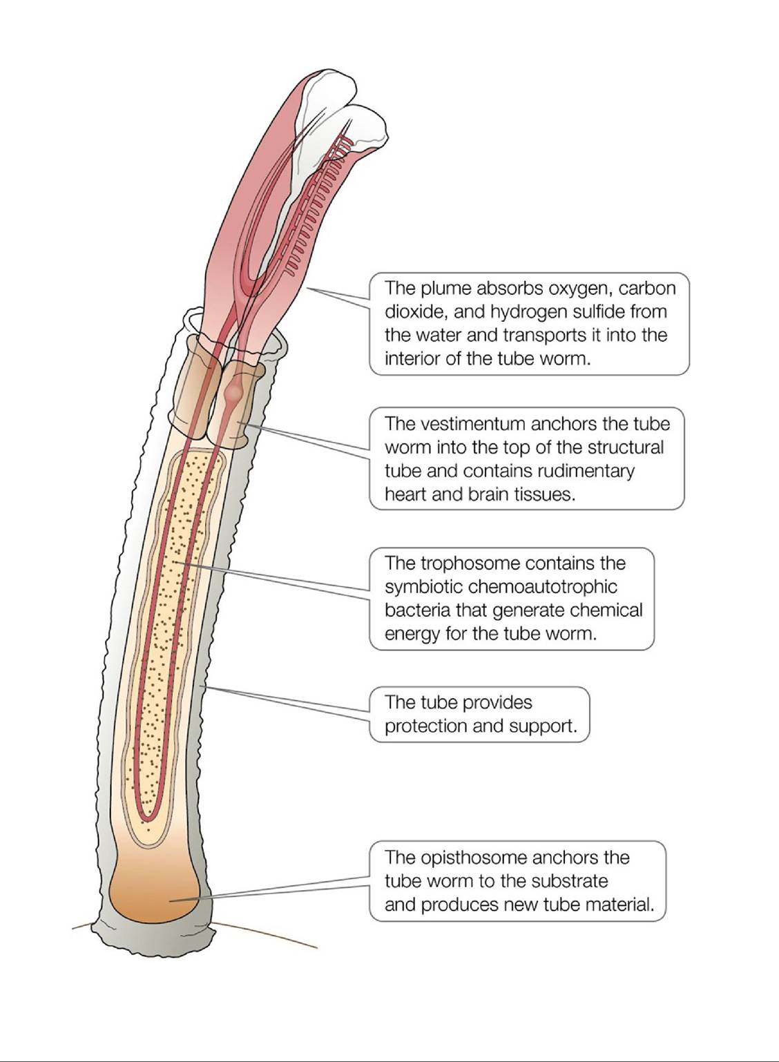
FIGURE 20.19 Riftia Anatomy Riftia tube worms have a number of specialized structures that make them well adapted to their hydrothermal vent environment. Back to text
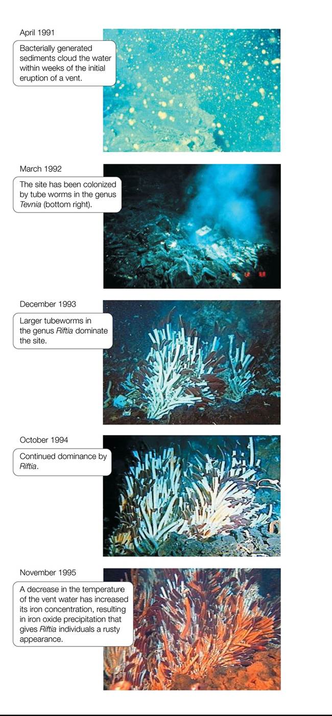
FIGURE 20.20 Succession in Hydrothermal Vent Communities Species composition and abundances in a hydrothermal vent community change over time following the eruption of a hot spring. (From T. M. Shank et al. 1998. Deep-Sea Res II 45: 465-515.) Back tθ text
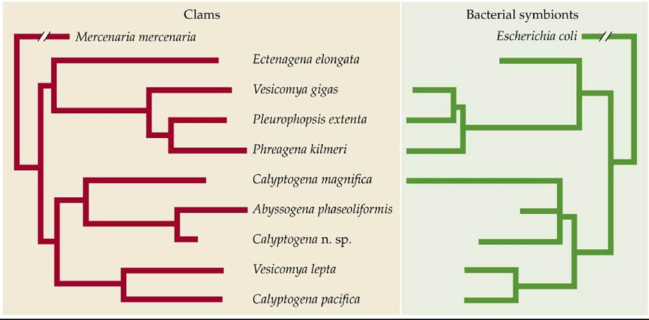
FIGURE 20.21 Coevolution of Vent Clams and Their Symbiotic Bacteria The
phylogenetic trees of vesicomyid clams collected from hydrothermal vents and their accompanying chemoautotrophic bacterial symbionts show remarkable parallels, suggesting that these species have coevolved. (After A. S. Peek et al. 1998. Proc Natl Acad Sci USA 95: 9962-9966. © 1998 National Academy of Sciences, U.S.A.) Back tθ text
21 Energy Flow and Food Webs
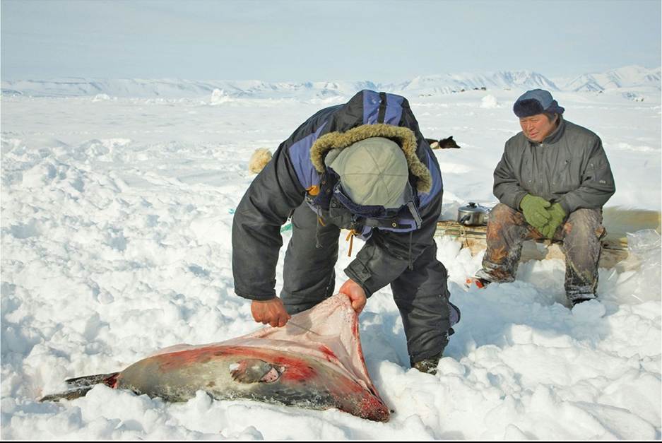
FIGURE 21.1 Subsistence Hunting Inuit hunters skin a seal they have successfully hunted in a remote, very sparsely populated Arctic region. © blickwinkel/Alamy Stock Photo Back to text
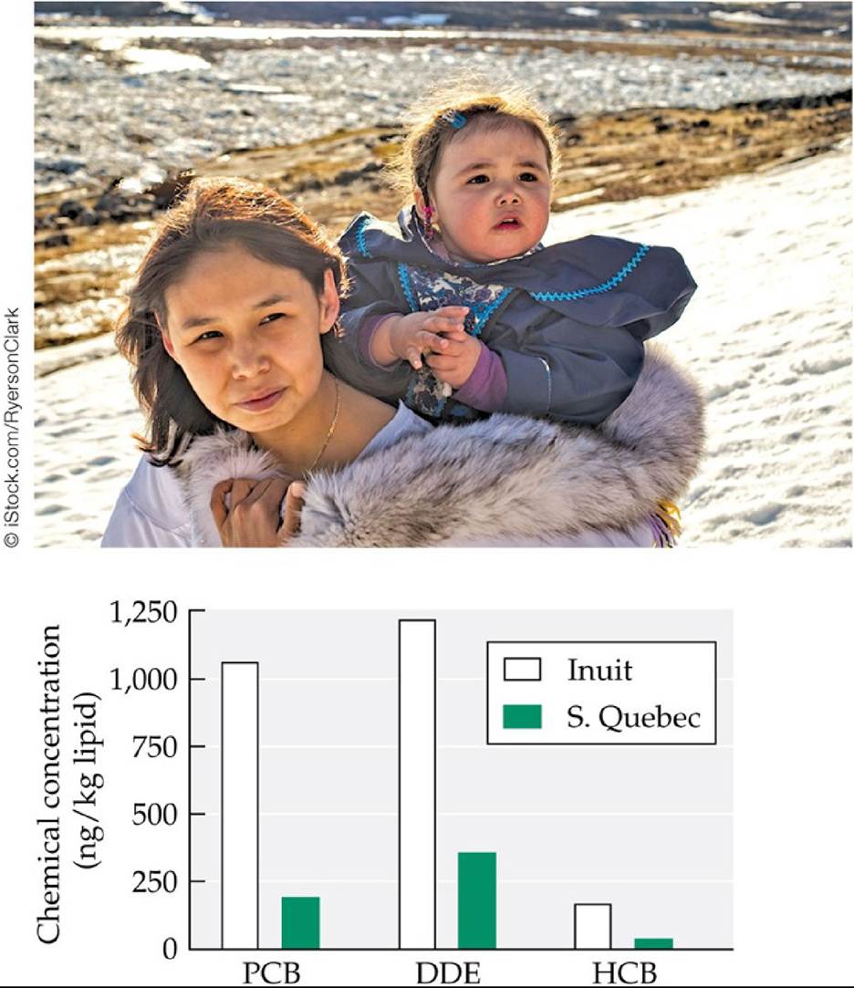
FIGURE 21.2 Persistent Organic Pollutants in Canadian Women ThebreastmilkofInuit mothers from Arctic Canada was found to contain substantially higher concentrations of polychlorinated biphenyls (PCBs) and two other POPs—dichlorodiphenyldichloroethylene (DDE, a pesticide similar to DDT) and hexachlorobenzene (HCB, an agricultural fungicide)—than that of mothers from southern Quebec. (After E. Dewailly et al. 1993. Environ Health Perspect 101: 618-620.) Back to text
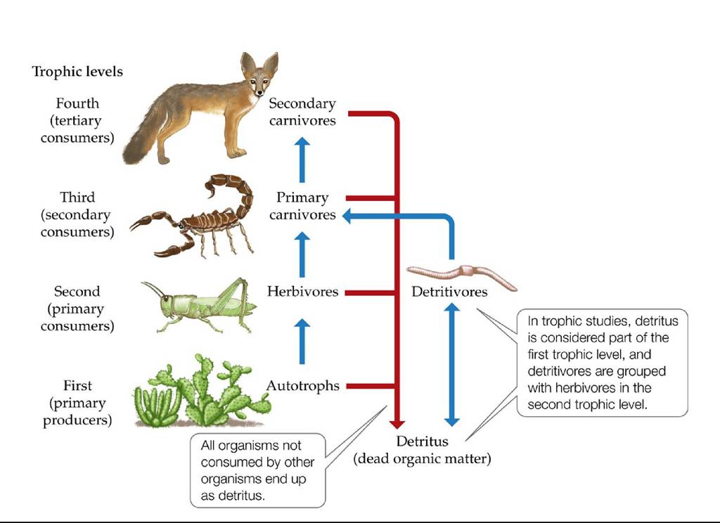
FIGURE 21.3 Trophic Levels in a Desert Ecosystem Each trophic level is characterized by the number of feeding steps by which it is removed from autotrophs (primary producers). Back to text
© aquapix/Shutterstock.com
Bohadschia argus
Mycena internιpta
FIGURE 21.4 Ecosystem Energy Flow through Detritus Detritus is consumed by a multitude of organisms, including fungi such as Mycena interrupta in Myrtle Forest and Leopard sea cucumber (Bohadschia argus) in the Great Barrier Reef. Back to text
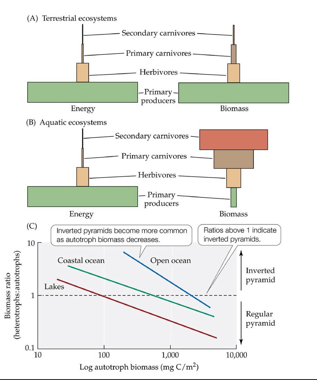
FIGURE 21.5 Trophic Pyramid Schemes (A) In terrestrial ecosystems, energy and biomass pyramids are usually similar. (B) In many aquatic ecosystems, the biomass pyramid is inverted relative to the energy pyramid. (C) Inverted biomass pyramids in aquatic ecosystems are
most common in nutrient-poor waters with low autotroph biomass. (A,B after F. S. Chapin et al. 2002. Principles OfTerrestrial Ecosystem Ecology. Springer-Verlag: New York. C after J. M. Gasol et al. 1997. Limnol Oceanogr 42: 1353-1363.) Back tθ text
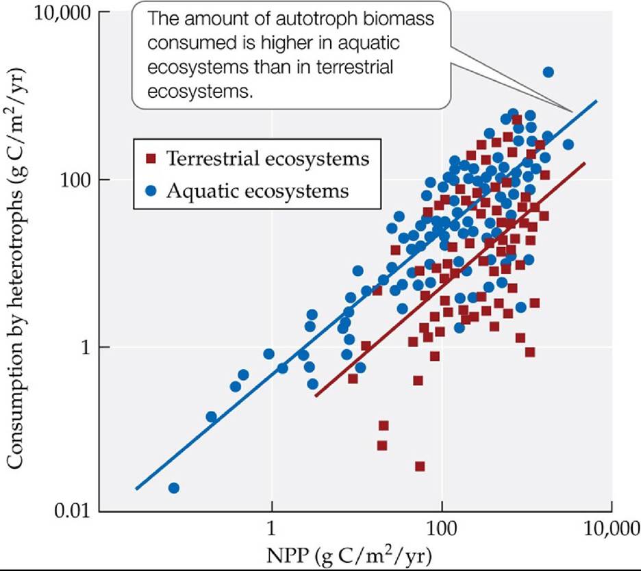
FIGURE 21.6 Consumption of Autotroph Biomass Is Correlated with NPP The amount of autotroph biomass consumed increases with increasing available NPP in both terrestrial and aquatic ecosystems. (After J. Cebrian and J. Lartigue. 2004. Ecol Monogr 74: 237-259.) Back tθ text
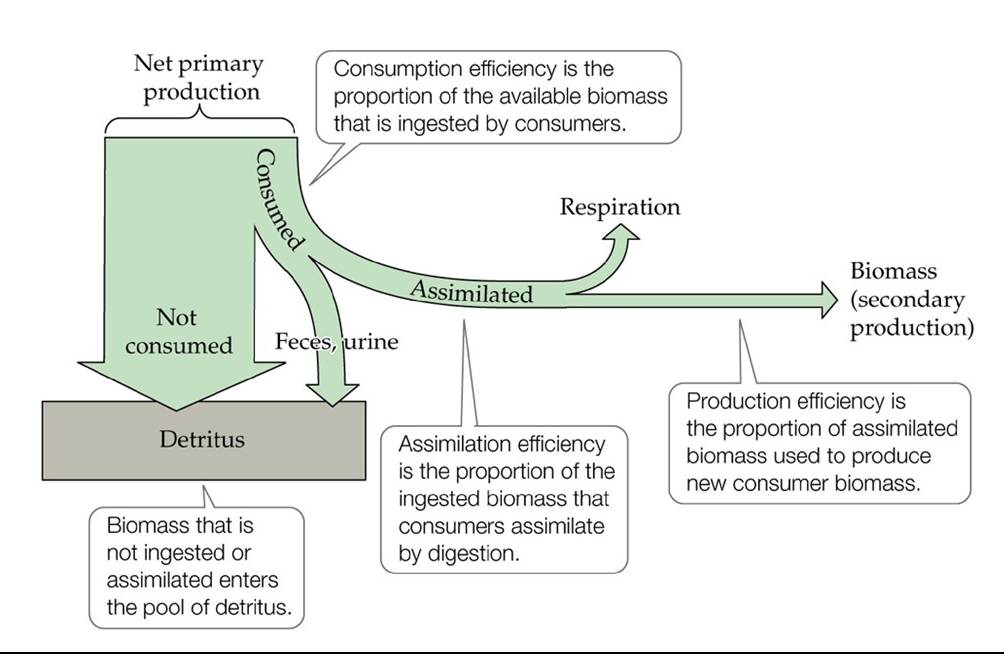
FIGURE 21.7 EnergyFlowandTrophicEfficiency Theproportionofenergytransferred between trophic levels depends on efficiencies of consumption, assimilation, and production.
How do the trends in consumption efficiency vary in Figure 21.6? What does this variation suggest about differences in consumption efficiency in aquatic versus terrestrial ecosystems?
(After F. S. Chapin et al. 2002. Principles of Terrestrial Ecosystem Ecology. Springer-Verlag: New York.) Back to text
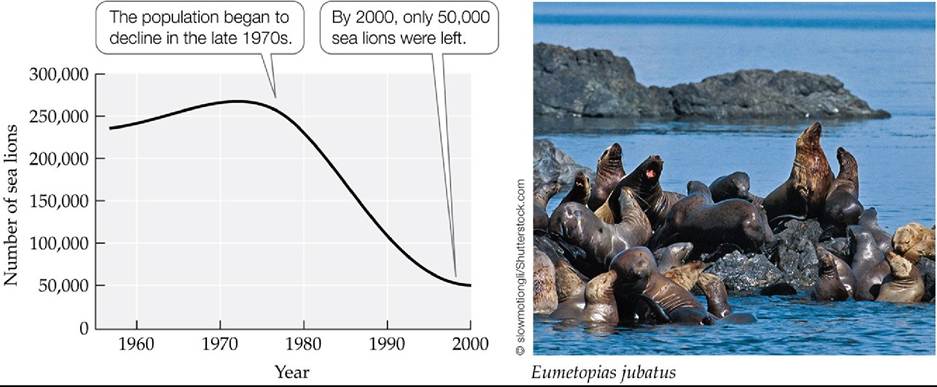
FIGURE 21.8 Steller Sea Lion Population Decline in Alaska Thepopulationofsealions in the Gulf of Alaska and the Aleutian Islands decreased by about 80% over 25 years. (After A. W.
Trites and C. P. Donnelly. 2003. Mamm Rev 33: 3-28; based on A. W. Trites and P. A. Larkin. 1996. Aquat
Mamm 22: 153-166; A. W. Trites, unpublished data.) Back tθ text
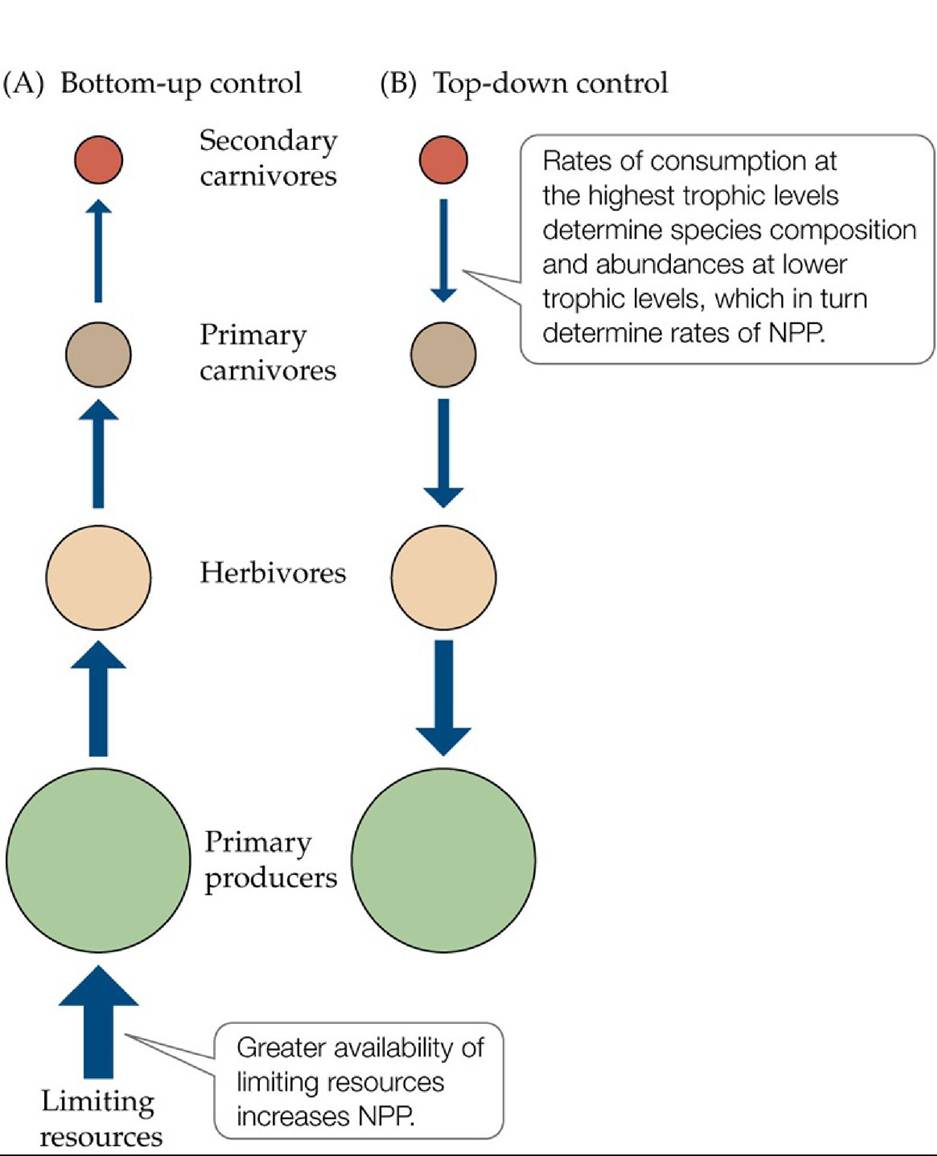
FIGURE 21.9 Bottom-Up and Top-Down Control of NPP Productioninanecosystemcan
be viewed as being controlled (A) by limiting resources or (B) by controls exerted on the species composition and abundances of autotrophs by consumption at higher trophic levels. Back to
text
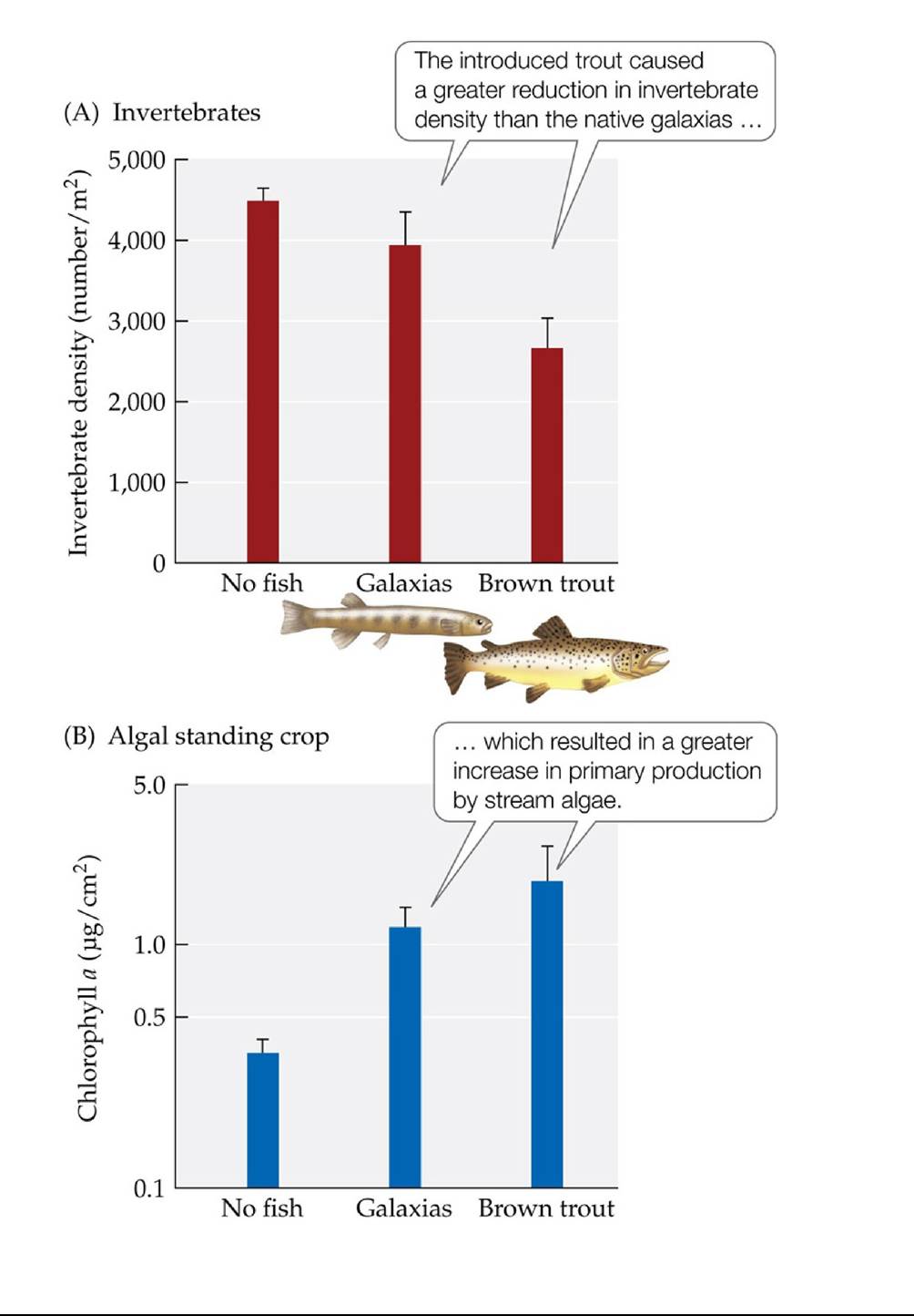
FIGURE 21.10 AnAquaticTrophicCascade FleckerandTownsendusedartificialstream channels to study the effects of non-native brown trout and a native fish (galaxias) on stream invertebrates and algae in the Shag River, New Zealand. (A) Effects on invertebrate density. (B) Effects on algal biomass, as estimated using chlorophyll concentrations in stream water. Error bars show one SE of the mean.
What factor other than overall consumption rate might explain why the presence of brown trout results in a larger increase in primary production than the presence of native galaxias?
(After A. S. Flecker and C. R. Townsend. 1994. Ecol Appl 4: 798-807.) Back tθ text
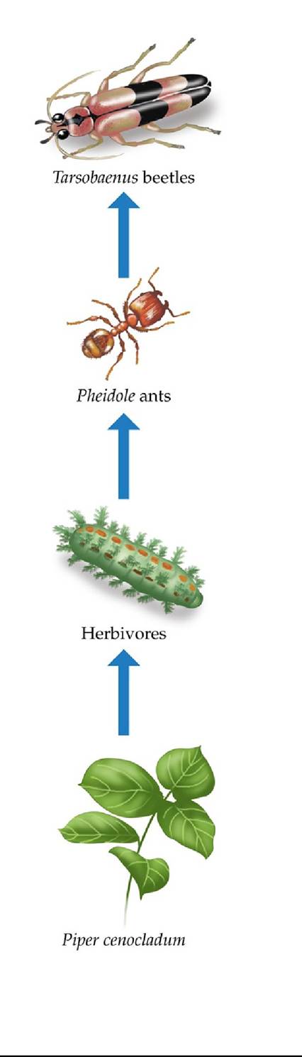
FIGURE 21.11 ATerrestrialTrophicCascade Trophicinteractionsintheunderstory ecosystem of a lowland tropical rainforest in Costa Rica. Piper cenocladum trees are consumed by herbivores but provide shelter for Pheidole ants, which consume herbivores attacking the trees. Pheidole ants are consumed by Tarsobaenus beetles. Both ants and beetles also consume food bodies produced by the trees. (After L. A. Dyer and D. K. Letourneau. 1999a. Proc NatlAcad Sci USA 96: 5072-5076. © 1999 National Academy of Sciences, U.S.A.) Back tθ text
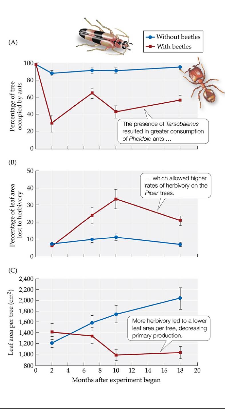
FIGURE 21.12 Effects of a Trophic Cascade on Production Atrophiccascadeina tropical rainforest understory ecosystem (see Figure 21.11) was shown to have important effects on (A) predation, (B) herbivory, and (C) production. Error bars show ± one SE of the mean. (After L. A. Dyer and D. K. Letourneau. 1999a. Proc Natl Acad Sci USA 96: 5072-5076. © 1999 National Academy of Sciences, U.S.A.) Back tθ text
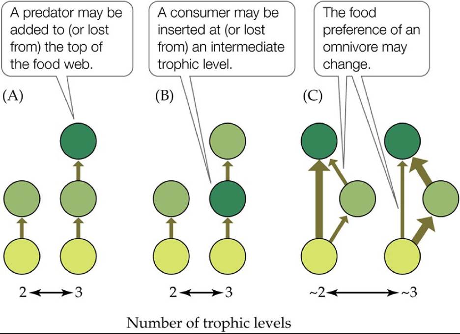
FIGURE 21.13 Changes in the Number of Trophic Levels Circles represent species at different trophic levels, and the thickness of the arrows represents the amount of energy flowing between species pairs. Differences among ecosystems in the number of trophic levels may occur because of (A) the addition or loss of a consumer at the top level, (B) the insertion or loss of a consumer at an intermediate level, or (C) a change in the preferred feeding level of an omnivore. (After D. M. Post and G. Takimoto. 2007. Oikos 116: 775-782.) Back tθ text
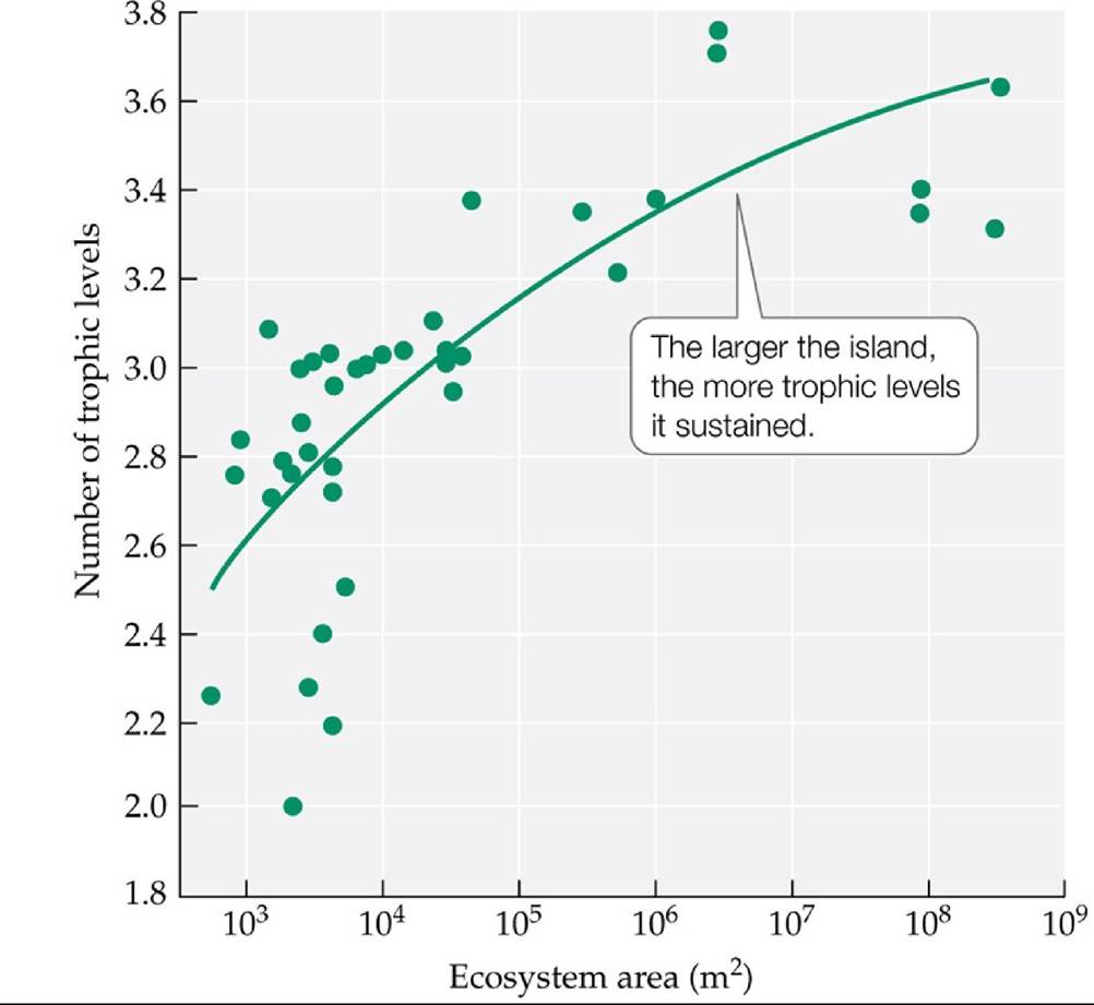
FIGURE 21.14 Ecosystem Size Is Correlated with the Number of Trophic Levels On islands in the Bahamas, Takimoto and colleagues found that as island size increased, the number of trophic levels also increased. (After G. Takimoto et al. 2008. Ecology 89: 3001-3007.) Back to text
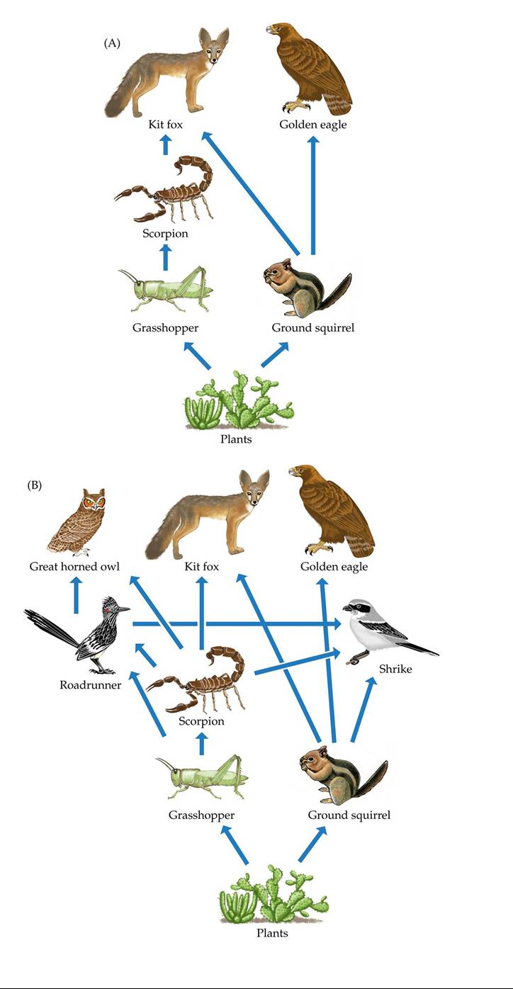
FIGURE 21.15 DesertFoodWebs Food webs may be simple or complex depending on their purpose. (A) A simple six-member food web for a representative North American desert. (B) Addition of more participants to the food web adds realism, but the inclusion of additional species adds complexity. Back to text
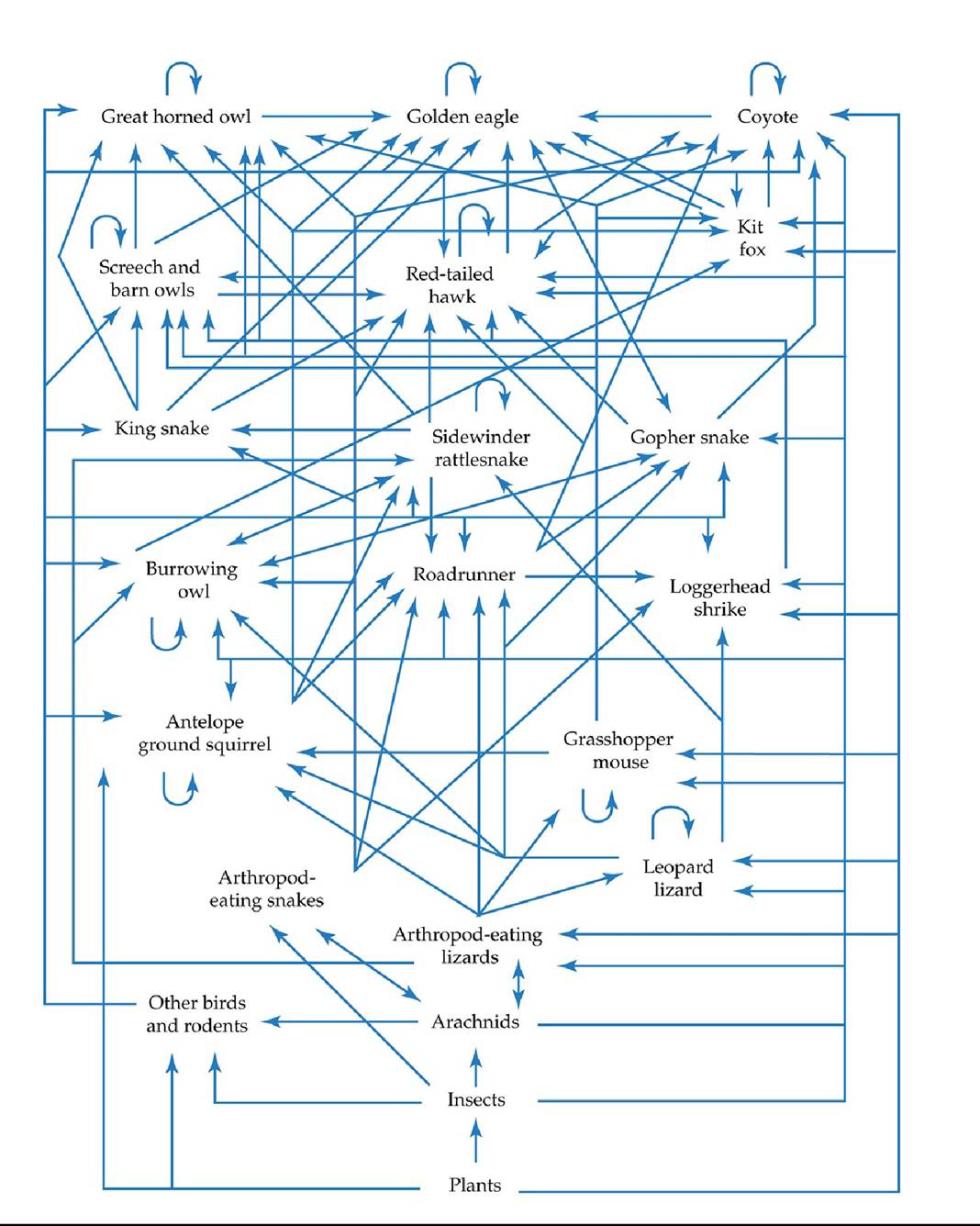
FIGURE 21.16 FoodwebsCanBeComplex In this North American desert food web, complexity overwhelms any interpretation of interactions among the members. Even this food web, however, lacks the majority of the trophic interactions in the ecosystem.
How many of the organisms or feeding groups depicted in this food web consume both plants and animals as food sources? What does this suggest about the frequency of omnivory in this food web?
(From G. A. Polis. 1991. Am Nat 138: 123-155.) Back tθ text
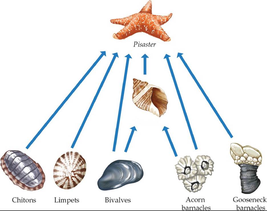
Nucella
FIGURE 21.17 An Intertidal Food Web This food web from the rocky intertidal zone of Mukkaw Bay, Washington State, was used by Robert Paine to investigate the strength of the interaction between the sea star Pisaster ochraceus and its prey. (After R. T. Paine. 1966. Am Nat
100:65-75.) Back to text
FIGURE 21.18 Plant Diversity and Stability in Food Webs Greaterplantdiversity enhanced the stability of arthropod communities in experimental plots. The potential mechanisms of this effect include greater and more stable plant biomass. Plant diversity, which is associated
with greater habitat complexity, may be associated with greater abundance and diversity of predators, which may lead to greater top-down influences on herbivores and plants (trophic cascades). In addition, plant diversity enhances the diversity of the arthropod community as a whole, enhancing portfolio effects, which keep overall abundance stable. (After N. M. Haddad et al. 2011. Ecol Lett 14: 42-46.) Back tθ text
FIGURE 21.19 Bioaccumulation and Biomagnification Levels of mercury (a toxic heavy
metal) show bioaccumulation and biomagnification in a Czech pond ecosystem. (After P
Houserova et al. 2007. Environ Pollut 145: 185-194.) Back tθ text
© topseller/Shutterstock.com
FIGURE 21.20 BiologicaipumpingofPoIIutants Spawningsalmonactasbiological pumps, concentrating toxins from the oceans in their bodies and transporting them en masse to freshwater ecosystems. (After E. M. Krummel et al. 2003. Nature 425: 255-256.) Back tθ text
22 Nutrient Supply and Cycling
FIGURE 22.1 Biological Soil Crust on the Colorado Plateau Biologicalsoilcrustsarea common feature in the deserts of the Colorado Plateau. The surface topography and coloration of the crust are clearly visible in this photo. Courtesy of William Bowman Back to text
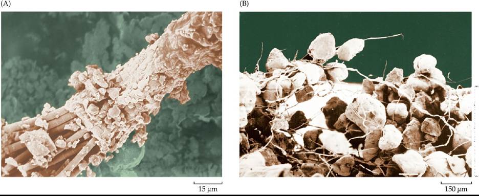
Both images courtesy of Jayns BeinapZUSGS
FIGURE 22.2 Cyanobacterial Sheaths Bind Soil into Crusts (A) Cyanobacterial strands surround themselves with a sheath of mucilaginous material as they move through the soil. (B) The sheaths left behind by the cyanobacteria help to bind soil particles together and protect soils from erosional loss. Back to text
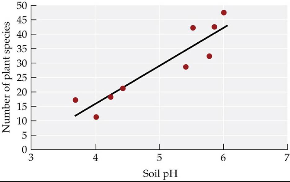
FIGURE 22.3 Species Richness Increases with Decreasing Soil Acidity Vascular plant species richness in the Alaskan Arctic tundra varies with soil acidity. The gradient in soil acidity is primarily due to differences in parent material: less acidic soils (with higher pH) are associated with greater loess deposits. (After L. Gough et al. 2000. J Ecol 88: 54-66.) Back to text
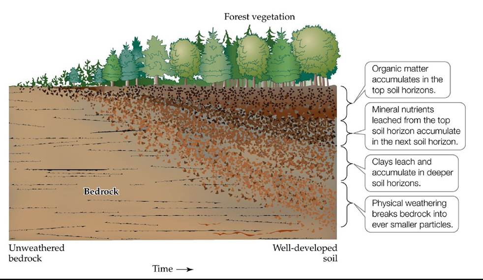
FIGURE 22.4 DevelopmentofsoilHorizons Soils develop over time as parent material is weathered and broken up into ever finer soil particles, increasing amounts of organic matter accumulate in the soil, and materials are leached and deposited in deeper soil layers. The rate of soil development is dependent on the climate, the parent material, and the organisms associated with the soil.
Given what you’ve learned about primary production in Chapter 20 and about the climate factors that determine weathering and soil development in this chapter, what do you think the horizons of a desert soil would look like? (After N. C. Brady and R. R. Weil. 2001. The Nature and Property of Soils. Prentice-Hall: Upper Saddle River, NJ.) Back to text
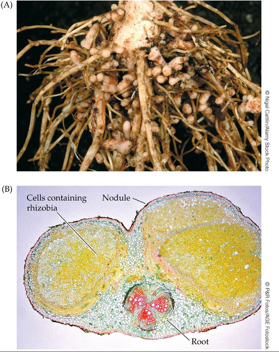
FIGURE 22.5 LegumesFormNitrogen-FixingNodules (A)Theseswollennodulesonthe
roots of a red clover (Trifolium pratense) plant contain nitrogen-fixing bacteria. (B) Cells inside this soybean root nodule (yellow in this micrograph) are filled with rhizobia. Back to text
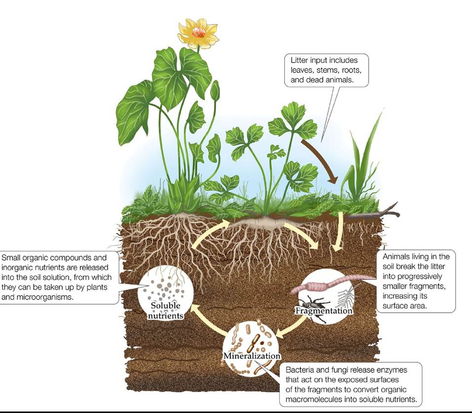
FIGURE 22.6 Decomposition Decomposition of organic matter in the soil provides an important input of nutrients into terrestrial ecosystems. Similar steps occur in freshwater and marine ecosystems.
How would the use of a nonselective pesticide (i.e., one that does not target any specific animals) to control insect herbivores affect the rate of decomposition in a lawn ecosystem?
Back to text
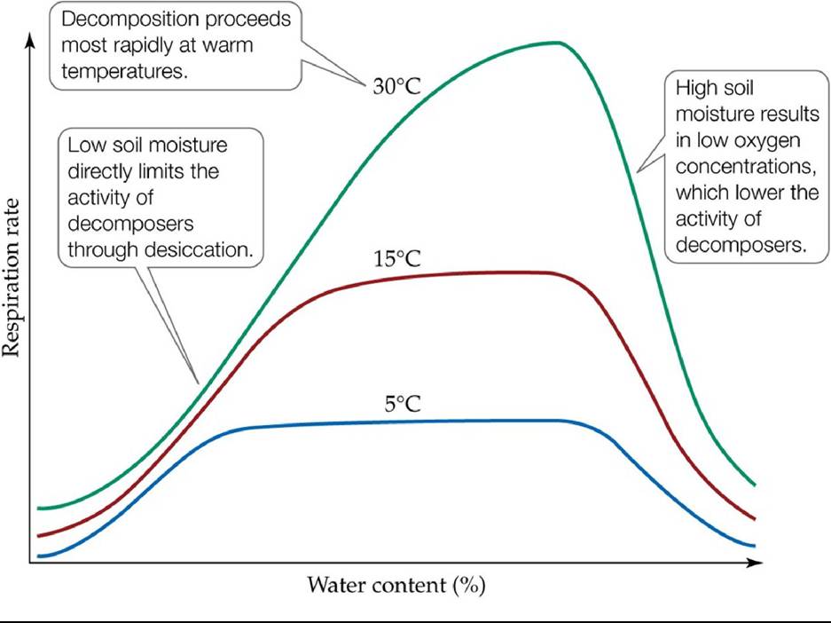
FIGURE 22.7 Climate Controls the Activity of Decomposers Changesinsoilmicrobial respiration, used as an estimate of decomposition, are modeled as a function of soil moisture at different temperatures. (After E. A. Paul and F. E. Clark. 1996. Soil Microbiology and Biochemistry.
Academic Press: San Diego, CA; F. L. Bunnell and D. E. N. Tait. 1974. In Soil Organisms and Decomposition in Tundra. Tundra Biome Steering Committee: Stockholm, Sweden.) Back tθ text
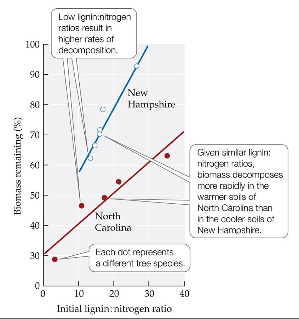
FIGURE 22.8 Lignin Decreases the Rate of Decomposition The rate of decomposition of leaf litter, expressed as the percent of biomass remaining, decreases as the ratio of lignin to nitrogen in the litter increases. This ratio varies among forest tree species. Note, however, that climate also has an important influence on decomposition rates. (After J. M. Melillo et al. 1982. Ecology 63: 621-626.) Back tθ text
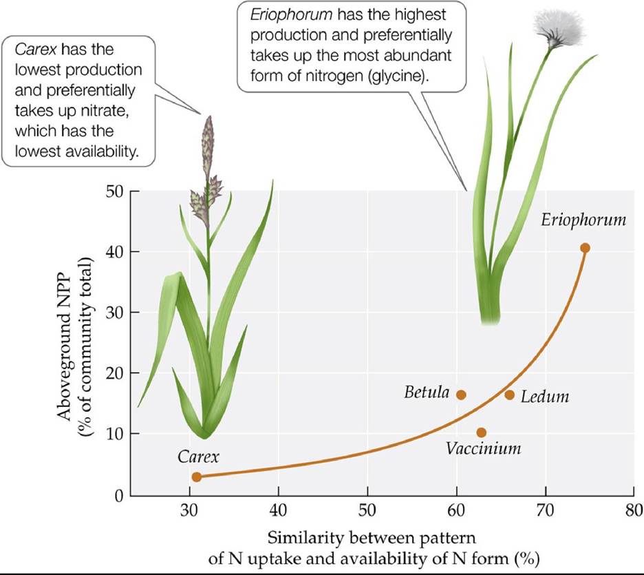
FIGURE 22.9 CommunityDominanceandNitrogenUptake Dominanceofaspeciesina plant community in the Alaskan Arctic tundra (measured by proportional contribution to the community’s total NPP) is related to the similarity between the plant's preferred form of nitrogen (ammonium, nitrate, or glycine, a small amino acid) and the availability of that form in the soil. (After R. B. McKane et al. 2002. Nature 415: 68-71.) Back tθ text
FIGURE 22.10 NutrientCycles A generalized nutrient cycle, showing the movements of a nutrient among the components of an ecosystem and the potential pathways for inputs and losses. Back to text
FIGURE 22.11 Nitrogen Cycle for an Alpine Ecosystem, Niwot Ridge, Colorado Boxes represent pools of nitrogen, measured in grams per square meter; arrows represent flows of nitrogen, measured in grams per square meter per year. Note the large amount of nitrogen passing through soil microorganisms, which indicates a high turnover rate for nitrogen in this relatively small pool. (After W. D. Bowman and T. R. Seastedt. 2001. Structure and Function of an Alpine Ecosystem, Niwot Ridge, Colorado. Oxford University Press: New York.) Back tθ text
FIGURE 22.12 Catchments Are Common Units of Ecosystem Study A drainage basin (known as a catchment or watershed) associated with a single stream system (blue lines), with boundaries determined by topographic divides (outlined in white), is a unit commonly used in terrestrial ecosystem studies to measure inputs and outputs of nutrients. This catchment is the upper Hunters Creek basin, draining the south side of Longs Peak in Rocky Mountain National Park.
What assumptions are made in this simple input-output model of a catchment that may not be realistic? (Hint: Compare this figure with Figure 22.13.)
Back to text
FIGURE 22.13 Biogeochemistry of a Catchment This conceptual model depicts the major pathways of nutrient movement into, through, and out of a catchment. (After G. E. Likens and F. H. Bormann. 1995. Biogeochemistry of a Forested Ecosystem. Springer: New York.) Back tθ text
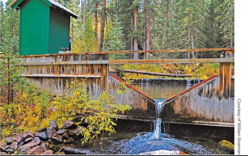
FIGURE A Measuring Water Flow A weir on Fool Creek in the Fraser Experimental Forest, Colorado. Back to text
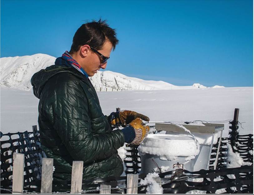
Gtxiriesy α! Jennifer Moree
FIGURE B MeasuringDeposition A wet deposition collector is serviced on Niwot Ridge, Colorado. The bucket on the right is covered except during precipitation events. Back to text
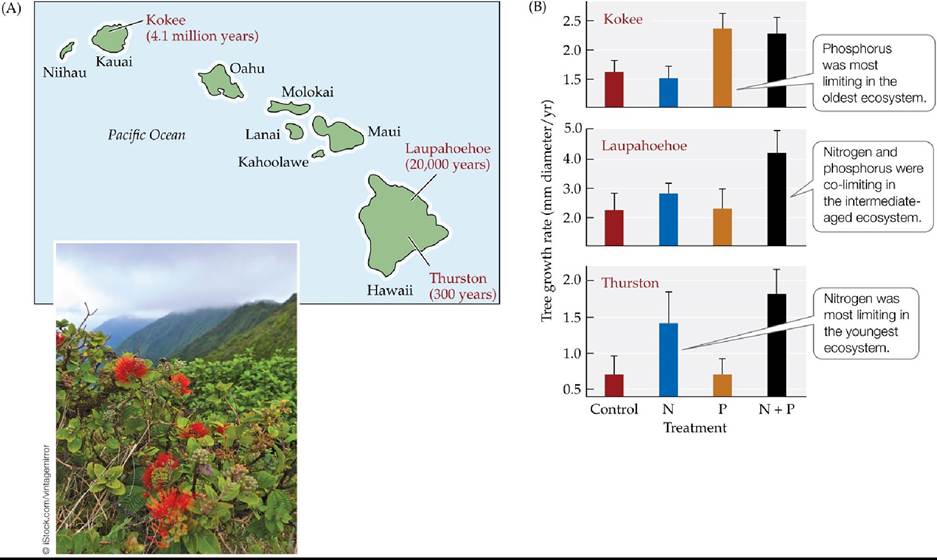
FIGURE 22.14 Nutrient Limitation of Primary Production Changes with Ecosystem Development (A) Fertilization experiments were conducted in three ecosystems of different ages in the Hawaiian Islands: Thurston (300 years old), Laupahoehoe (20,000 years old), and Kokee (4.1 million years old). Vegetation at all three sites is dominated by a single tree species, Ohi'a (Metrosideros polymorpha). (B) Ohi'a growth rates in response to fertilization treatments with nitrogen (N), phosphorus (P), and both (N + P) in the three ecosystems. The more an added nutrient increased tree growth, the more limiting it was assumed to be. Note the differences in the ranges of the y axes. Error bars show one SE of the mean. (A after T. E. Crews et al. 1995. Ecology 76: 1407-1424; B after P. M. Vitousek and H. Farrington. 1997. Biogeochemistry 37: 63-75; Thurston data from P. M. Vitousek et al. 1993. Biogeochemistry 23: 197-215; Kokee data from D. Herbert et al. 1999. Ecology 80: 908-920.) Back to text
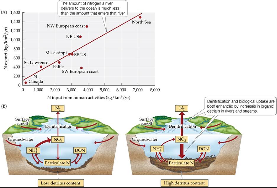
FIGURE 22.15 Rivers Are Important Modifiers of Nitrogen Exports Nitrogenthatenters rivers from terrestrial ecosystems is not simply carried to the ocean. (A) The rates of nitrogen exports to the North Atlantic Ocean from major drainage basins are correlated with rates of nitrogen inputs into rivers by human activities. The export rates, however, are substantially lower than the input rates because of biogeochemical processing of the nitrogen in the rivers (notice the difference between the scales in the x and y axes). (B) Denitrification and biological uptake are two of the main processes that lower the export of nitrogen from drainage basins. Both processes are enhanced when benthic detritus is high. DON, dissolved organic nitrogen. (A after R. W.
Howarth et al. 1996. Biogeochemistry 35: 75-139; B after E. S. Bernhardt et al. 2005. BioScience 55: P219- P230.) Back to text
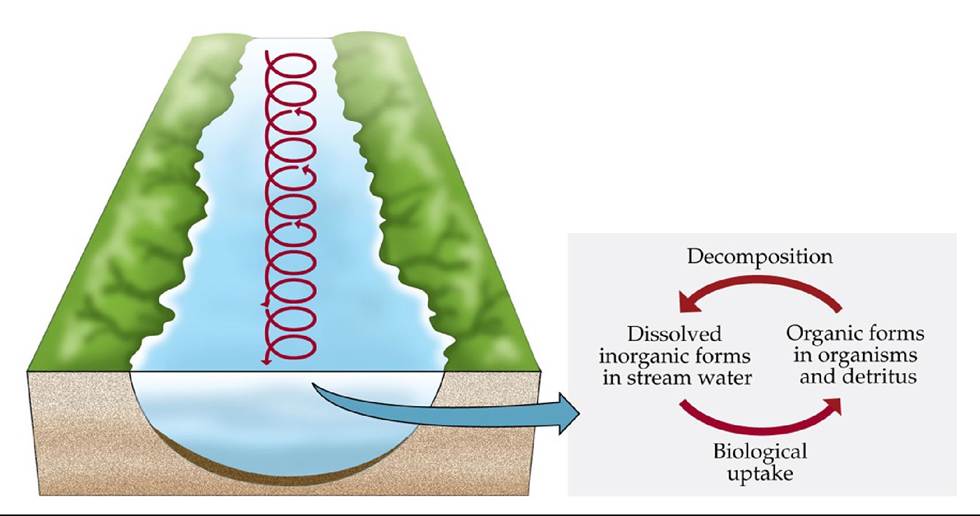
FIGURE 22.16 Nutrient Spiraling in Stream and River Ecosystems Cyclingofnutrients as the water moves downstream results in repeated spirals of nutrient uptake and release. Back to text
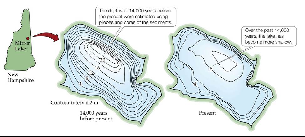
FIGURE 22.17 Lake Sediments and Depth Sediments accumulate at the bottom of a lake over time, making it progressively shallower and leading to eutrophication. Changes in the depth
contours of Mirror Lake in New Hampshire show the accumulation of sediments there over the past 14,000 years. (After M. B. Davis et al. 1985. In An Ecosystem Approach to Aquatic Ecology: Mirror Lake and Its Environment, G. E. Likens [Ed.], pp. 345-366. Springer: New York.) Back tθ text
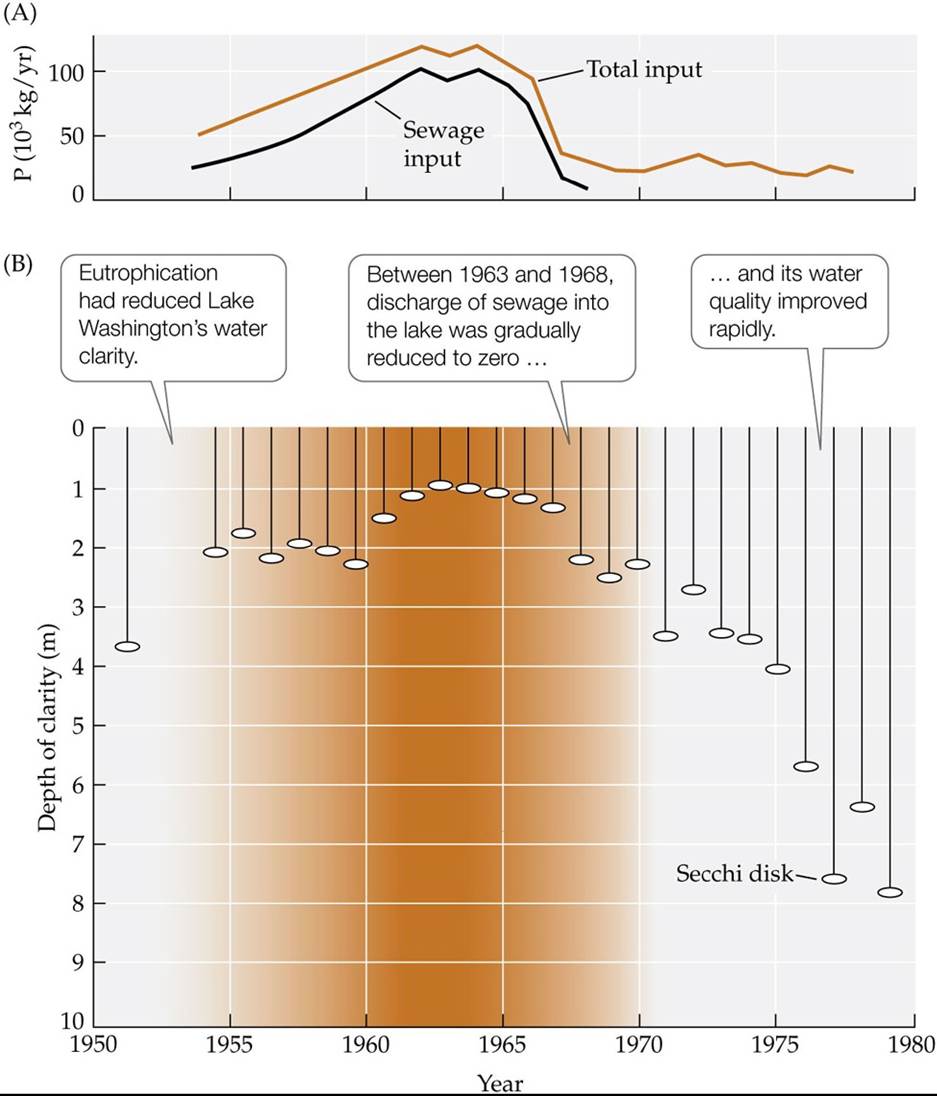
FIGURE 22.18 LakewashingtoniReversalofFortune Inputsoftreatedsewagebetween the 1940s and the 1960s caused eutrophication in Lake Washington; cessation of sewage inputs between 1963 and 1968 increased lake clarity. (A) Phosphorus inputs. (B) Measurements of water clarity made with a Secchi disk.
While the story of Lake Washington seems to be a clear “experimental”
demonstration of pollution influencing the nutrient status of a lake, what would make it an even more convincing example?
(After W. T. Edmondson and A. H. Litt. 1982. Limnol Oceanogr 27: 272-293.) Back tθ text

FIGURE 22.19 Zones of Upwelling Enhance Nutrient Supply for Marine Ecosystems Phytoplankton blooms (green areas), fed by upwelling of nutrient-rich deep ocean water, can be seen off the coast of the Pribilof Islands (Alaska) in this satellite image. Back to text
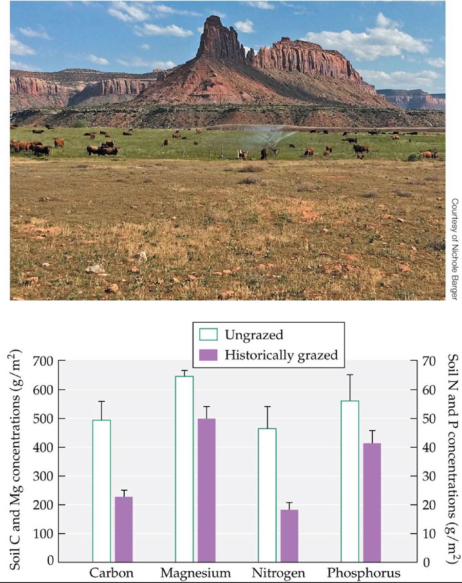
FIGURE 22.20 Loss of Biocrusts Results in Smaller Nutrient Supplies Historically grazed soils in Canyonlands National Park contained less carbon, magnesium, nitrogen, and
phosphorus than soils that had never been grazed. Error bars show one SE of the mean. (Graph after J. C. Neff et al. 2005. Ecol Appl 15: 87-95.) Back tθ text
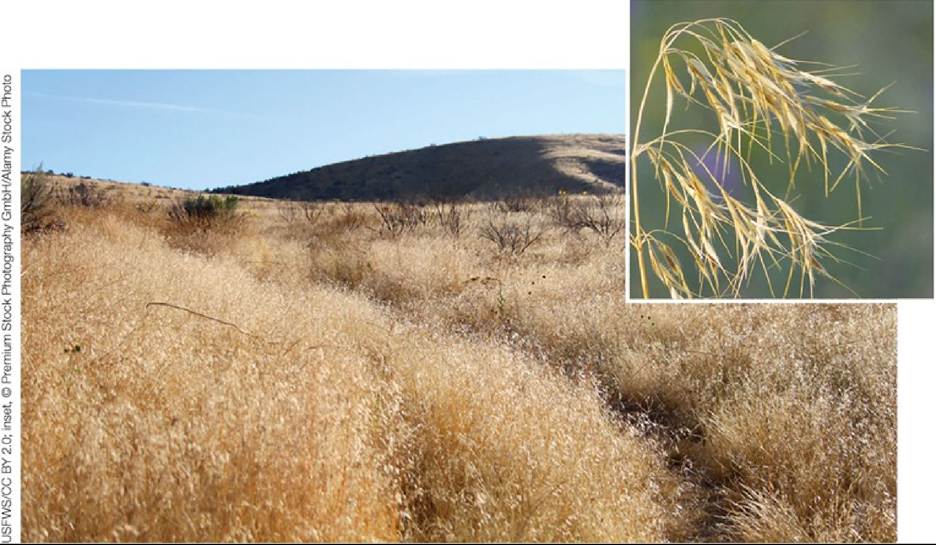
FIGURE 22.21 ScourgeoftheIntermountainWest Large areas of the intermountain West of North America are now dominated by cheatgrass (Bromus tectorum), an invasive species that increases fire frequencies, outcompetes native plants for resources, and spreads rapidly across the landscape. Back to text
23 Conservation Biology
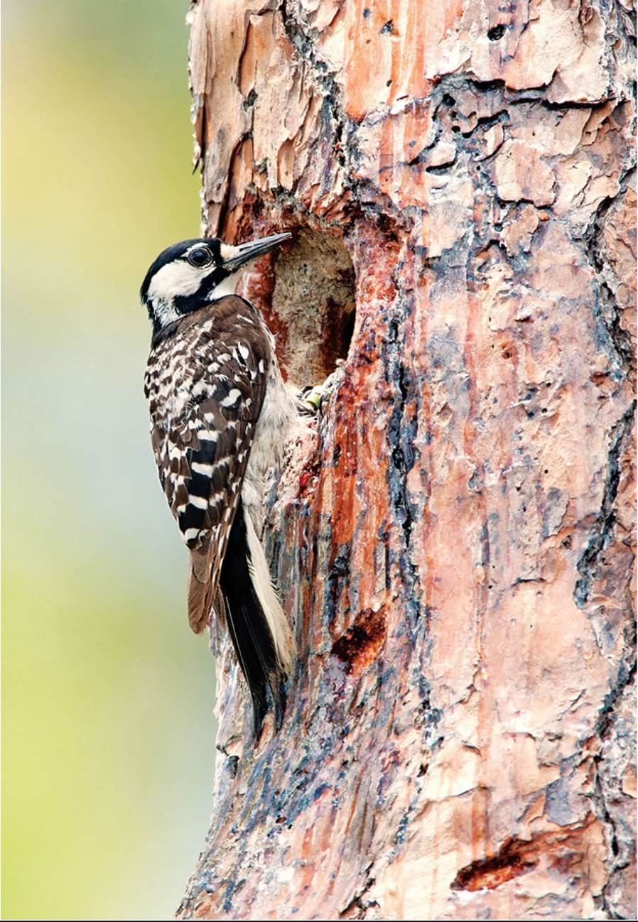
FIGURE 23.1 The Red-Cockaded Woodpecker: An Endangered Species Afemalered- cockaded woodpecker (Picoides borealis) approaches her nest cavity. This species was once abundant throughout the pine savannas (communities dominated by grasses intermixed with pine trees) of the United States but has been severely reduced in numbers by the loss of its required habitat. © William Leaman/Alamy Stock Photo Back tθ text
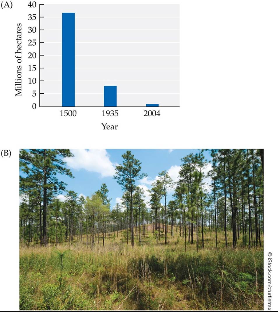
FIGURE 23.2 Decline of the Longleaf Pine Savanna Community (A)Theestimatedarea covered by Iongleaf pine savanna at different times. The cover of this community has not changed from 2004 to the present. (B) As seen in this photograph from the southeastern United States, Iongleaf pine (Pinus palustris) savanna consists of open forest with a grass understory.
Estimate the hectares of Iongleaf pine savanna that existed in 1500, 1935,
and 2004. Was the annual loss of Iongleaf pine savanna greater from 1500 to 1935, or from 1935 to 2004?
(A after D. H. Van Lear et al. 2005. For Ecol Manage 211: 150-165; based on data from C. C. Frost. 1993. Tall Timbers Fire Ecol Conf 18: 17-44; W. G. Wahlenberg. 1946. Longleaf pine: Its use, ecology, regeneration, protection, growth, and management. C.L. Pack Forestry Foundation & USDA Forest Service; USDA Natural Resource Conservation Service, Longleaf Pine Initiative: Washington, DC. Accessed November 13, 2019. »«♦* https://www.nrcs.usda.gov/wps/portal/nrcs/detailfull/national/home/?
&cid=nrcsdev11 023913.) Back to text
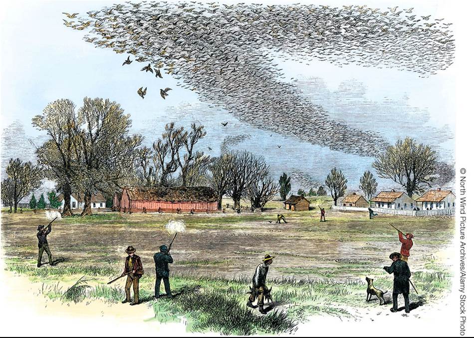
FIGURE 23.3 The Passenger Pigeon: From Great Abundance to Extinction The passenger pigeon (Ectopistes migratorius), once one of the most abundant birds in North America, was hunted extensively in the nineteenth century. The last passenger pigeon died in the Cincinnati Zoo in 1914. The ecological effects of its extinction on the eastern deciduous forest, coincident with the loss of the American chestnut (see Concept 13.4), are difficult to estimate but are presumed to be considerable. Back to text
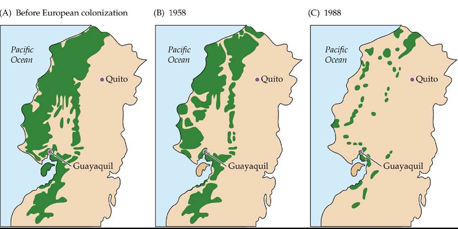
FIGURE 23.4 Loss of Forest Cover in Western Ecuador Between 1958 and 1988, a growing human population and government policies intended to stimulate economic development led to rapid deforestation in western Ecuador. Green indicates forest cover. The extensive loss of forest habitat in this region is estimated to have resulted in the loss of more than 1,000 endemic species. (After C. H. Dodson and A. H. Gentry. 1991. Ann Mo Bot Gard 78: 273-295. Permission granted by Missouri Botanical Garden Press, St. Louis.) Back tθ text
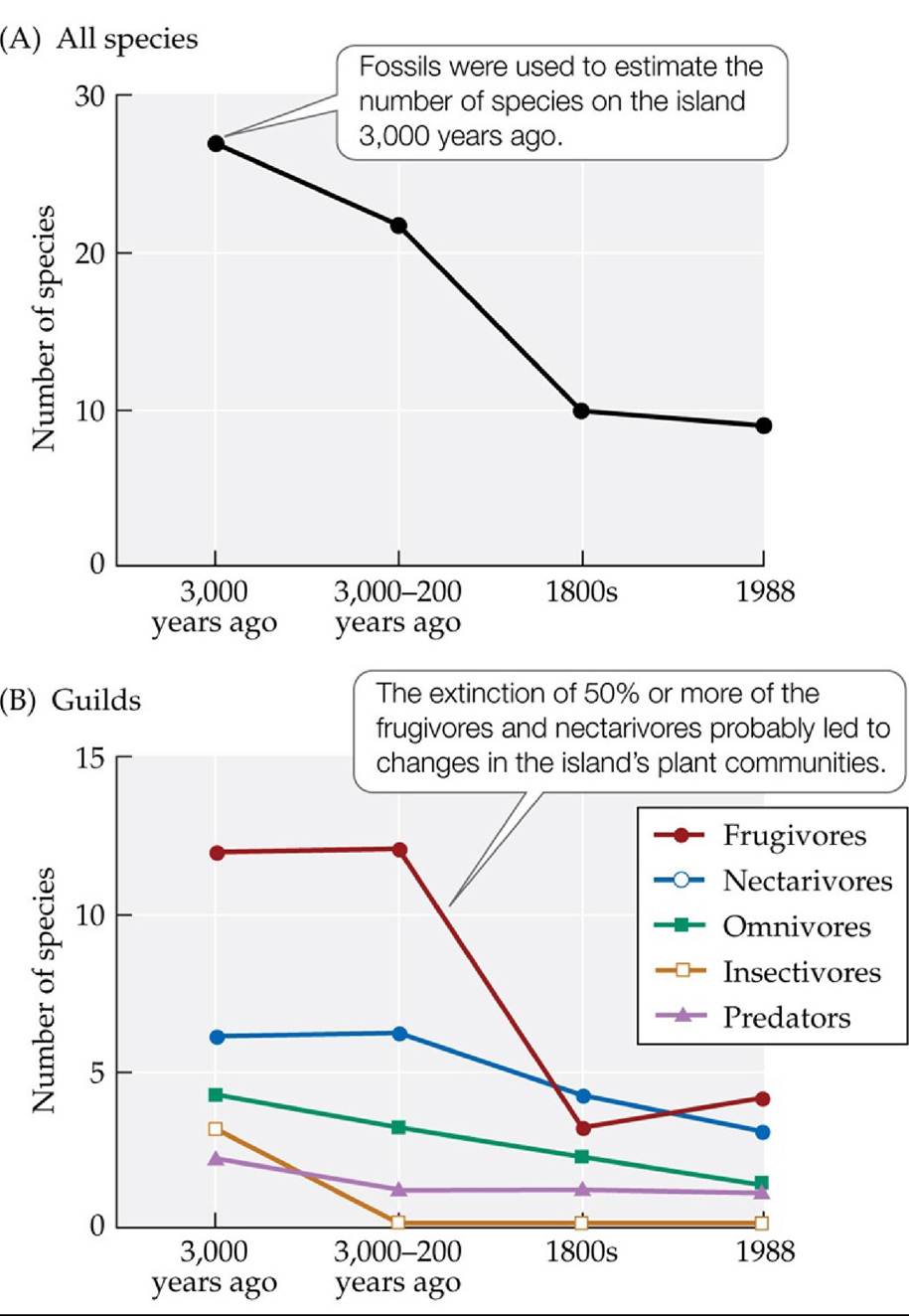
FIGURE 23.5 Humans Have Been Causing Extinctions for Millennia Trendsovertimein
(A) the total number of bird species and (B) the number of species classified by feeding guild found in the Pacific island ‘Eua in the nation of Tonga. Prehistoric extinctions (3,000-200 years ago) occurred on many Pacific islands as a result of hunting and the introduction of rats, dogs, and pigs.
Speculate on reasons why losses of birds that feed on fruit (frugivores) or nectar (nectarivores) may have affected the island's plant communities. (Hint: See the discussion of mutualism in Concepts 15.1 and 15.2.) (After D. W. Steadman. 1995. Science 267: 1123-1131.) Back tθ text
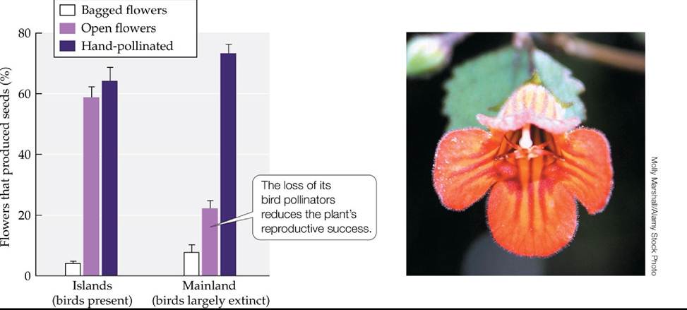
FIGURE 23.6 Loss of Bird Pollinators Reduces Reproductive Success in a New
Zealand Shrub Birds that pollinate the shrub Rhabdothamnus solandri are nearly extinct on the New Zealand mainland, but densities of these birds remain high on nearby islands. Researchers recorded the percentage of R. solandri flowers that reproduced successfully (produced seeds) on island and mainland sites for each of three treatments: bagged flowers (which allowed only selfpollination), open flowers (which allowed bird pollination), and open flowers that were hand- pollinated. Error bars show one SE of the mean.
Identify the control and experimental treatments in this study, and explain what can be learned from each of the three treatments.
(After S. H. Anderson et al. 2011. Science 331: 1068-1071.) Back tθ text
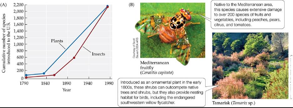
© Dennis FratesZAIamy Stock Photo
FIGURE 23.7 SpecieslntroductionsArelncreasingGIobaIIy The number of non-native species that have become established in the United States has increased about fivefold over the past century for various organisms, including molluscs, fishes, terrestrial vertebrates, and (A) plants and insects. Similar patterns are seen in many other countries. Photographs in (B) show two examples of introduced species. (After U. S. Congress, Office of Technology Assessment. 1993.
Harmful Non-Indigenous Species in the United States. U.S. Government Printing Office: Washington, DC, based on contractor reports done for OTA.) Back to text
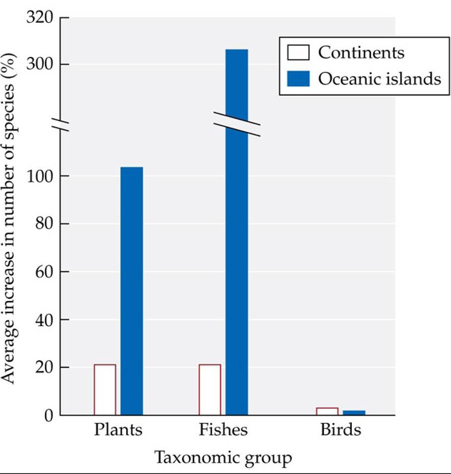
FIGURE 23.8 Introductions of Non-Native Species Can Increase Regional Biodiversity
The introduction of non-native species to new regions has led to sizable increases in the numbers of species found on oceanic islands and within continental regions for plants and fishes, but not for birds.
The introduction of non-native plants to new regions is associated with a decrease in the global diversity of plants. Explain how that can be true given the results shown in this figure.
(After D. F. Sax and S. D. Gaines. 2003. TrendsEcolEvol 18: 561-566.) Back tθ text
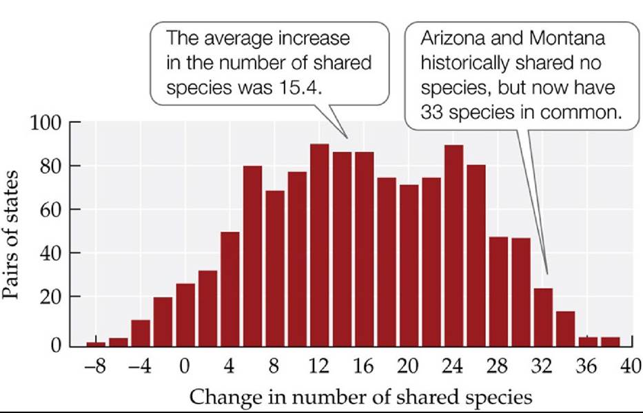
FIGURE 23.9 U.S. Fish Faunas Are Undergoing Taxonomic Homogenization The numbers of fish species shared by pairs of the 48 conterminous U.S. states have increased since European settlement. (After F. J. Rahel. 2000. Science 288: 854-856.) Back tθ text
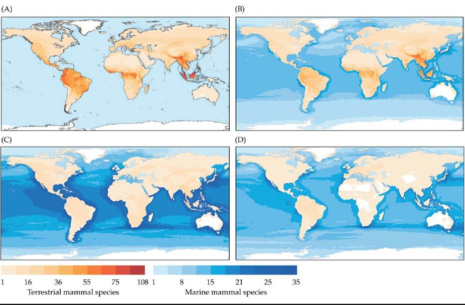
FIGURE 23.10 ThreatstoMammalSpecies Globally, 22% of mammal species are threatened by extinction. These maps show the numbers of terrestrial and marine mammal species in various parts of the globe that are negatively affected by (A) habitat loss, (B) overexploitation, (C) accidental mortality, and (D) pollution.
Contrast the threats to land mammals with those to marine mammals.
(From J. Schipper et al. 2008. Science 322: 225-230.) Back tθ text
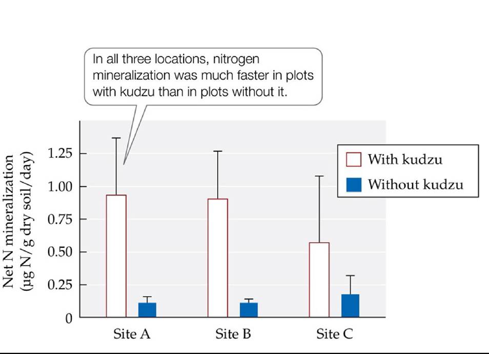
FIGURE 23.11 Invasive Species Can Alter the Nitrogen Cycle AtthreesitesinGeorgia, net nitrogen mineralization rates (an index of how rapidly nitrogen cycling occurs in an ecosystem) were much higher in soils supporting kudzu than in soils with native vegetation. Error bars show one SE of the mean. (After J. E. Hickman et al. 2010. ProcNatlAcadSci USA 107: 10115-10119.) Back to text
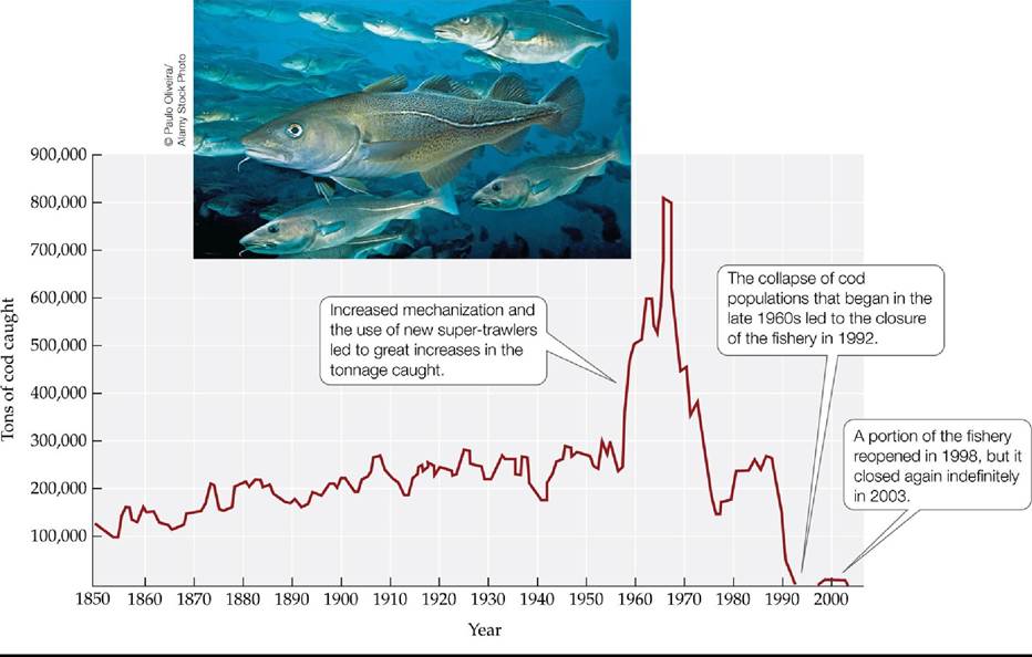
FIGURE 23.12 The Collapse of the Cod Fishery Changes over time in the amount of cod (Gadus morhua) caught off the coast of Newfoundland, Canada. Overharvesting led to the collapse of cod populations, which still have not recovered.
Based on data prior to 1950, roughly how many tons of cod could have been harvested in a sustainable manner? Explain.
(After Millennium Ecosystem Assessment. 2005. Ecosystems and Human Well-Being: Biodiversity Synthesis. World Resources Institute: Washington, DC.) Back tθ text
FIGURE 23.13 Overharvesting Has Led to a Decline in the Sizes of Top Marine
Predators Photographs of trophy fish caught on charter fishing boats based in Key West, Florida, in (A) 1957 and (B) 2007. In commercial and recreational fisheries, the largest fish are often the preferred prey. (C) The total length of trophy fish declined more than 50% between 1960 and 2007. Error bars show ± one SE of the mean. (C after L. McClenachan. 2009. Conserv Biol 23: 636643.) Back to text
FIGURE 23.14 Persistent Organic Pollutants That Disrupt the Endocrine System Are a
Growing Threat to Marine Mammals In British Columbia, the concentrations of PCBs (A) and PBDEs (B) found in killer whales (Orcinus orca) and harbor seals (Phoca vitulina) are very high.
Error bars show one SE of the mean. (After P. S. Ross. 2006. Can JFish Aquat Sci 63: 224-234, based on data from P. S. Ross et al. 2000. Mar Pollut Bull 40: 504-515; P. S. Ross et al. 2004. Environ Toxicol Chem 23: 157-165; S. Rayne et al. 2003. Environ Sci Technol 36: 2847-2854; P. S. Ross, unpublished data.) Back to text
FIGURE 23.15 Different Biomes Face Different Principal Threats The effects of different types of threats on different biomes over the past 50-100 years were examined as part of the Millennium Ecosystem Assessment, an international collaboration among more than 1,000 ecologists commissioned by the United Nations. The color and shape of each box indicates the
effect of the threat to date; the direction of the arrow indicates the trend in that threat.
At a global scale, what factors have been the most important threats to diversity over the past decades, and what factors are projected to be the most important in the future? How do these current and future threats differ between terrestrial and marine biological zones?
(After Millennium Ecosystem Assessment. 2005. Ecosystems and Human Well-Being: Biodiversity Synthesis. World Resources Institute: Washington, DC.) Back tθ text

FIGURE 23.16 Genetic Rescue of the Florida Panther Withdepletedgeneticdiversity, frequent genetic defects, and a precariously small population size (fewer than 25 individuals), the Florida panther (Puma concolor coryi) seemed doomed to extinction in the early 1990s. The gene flow that resulted from the translocation of eight females from P. concolor populations in Texas helped to reverse these trends. Error bars show one SE of the mean. (After W. E. Johnson et al. 2010. Science 329: 1641-1645.) Back tθ text
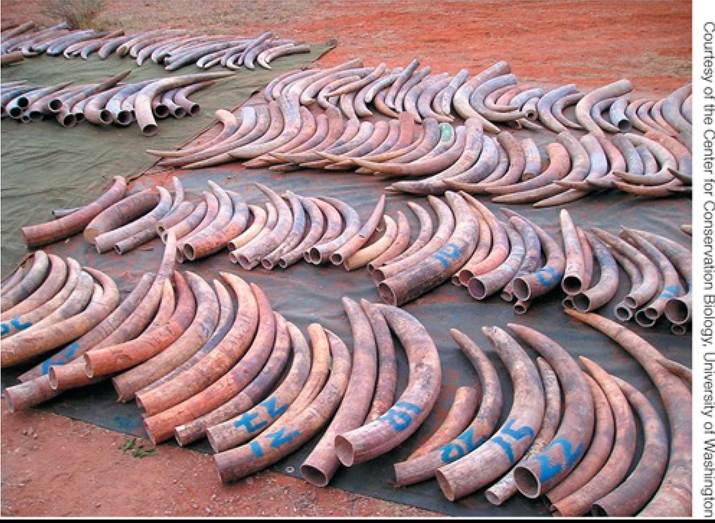
FIGURE A Ivory from the 2002 Seizure in Singapore Back to text
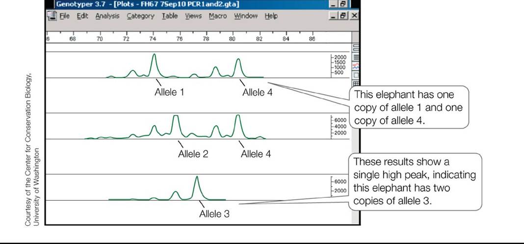
FIGURE B Identifying Individual Elephants DNA from elephant tusks can be analyzed using molecular genetic techniques that detect individual-specific alleles. The graphs show results for three elephants; the highest peak(s) on each graph represent(s) specific alleles. Back to text
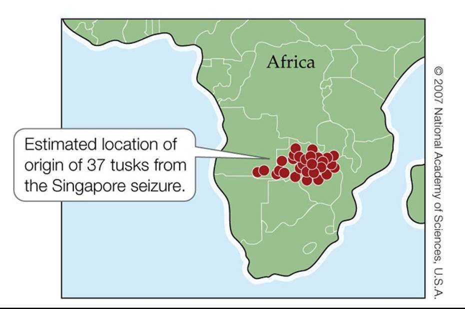
FIGURE C Tracking Contraband Ivory DNA methods indicated that the ivory shown in Figure A came from a relatively small geographic region—a finding that differed from what law enforcement officials had originally suspected. Each red dot shows the estimated location of origin of one individual elephant. (After S. K. Wasser et al. 2007. Proc Natl Acad Sci USA 104: 4228-4233.) Back to text
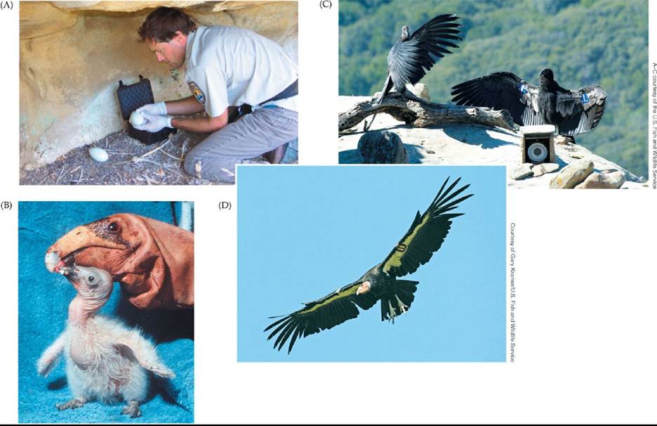
FIGURE 23.17 Ex Situ Conservation Efforts Can Rescue Species from the Brink of
Extinction Ex situ efforts to save the California condor (Gymnogyps californianus) involve multiple steps. (A) To reduce inbreeding and increase the number of eggs that hatch successfully, a U.S. Fish and Wildlife Service biologist removes eggs from the wild (to be taken to an ex situ breeding facility) and replaces them with one egg from the San Diego Zoo. (B) At the San Diego Zoo, condor chick “Hoy” is being fed by a condor-feeding puppet to avoid its becoming acclimated to humans. (C) Two condors at the time of their release (spring 2000). The instrument in the right foreground is a scale from which condor weight can be read by telescope when a bird perches on it. (D) This adult, with a wingspan of 9 feet, was bred in captivity and later released. Back to text
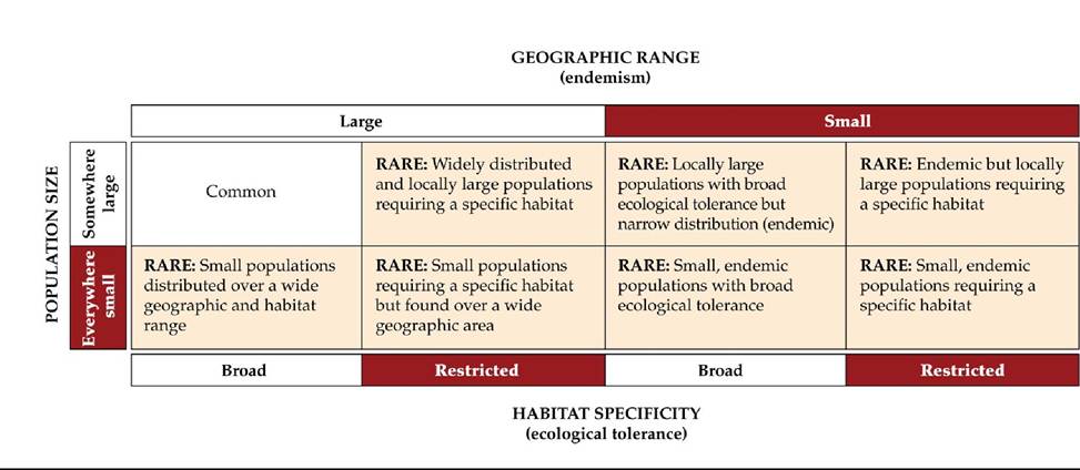
FIGURE 23.18 Seven Forms of Rarity Appropriate conservation measures for a rare species depend on the size of its geographic range, the sizes of its populations, and its habitat specificity. (After D. Rabinowitz. 1981. In The Biological Aspects of Rare Plant Conservation, H. Synge [Ed.], pp. 205-217. John Wiley & Sons Ltd: New York.) Back tθ text
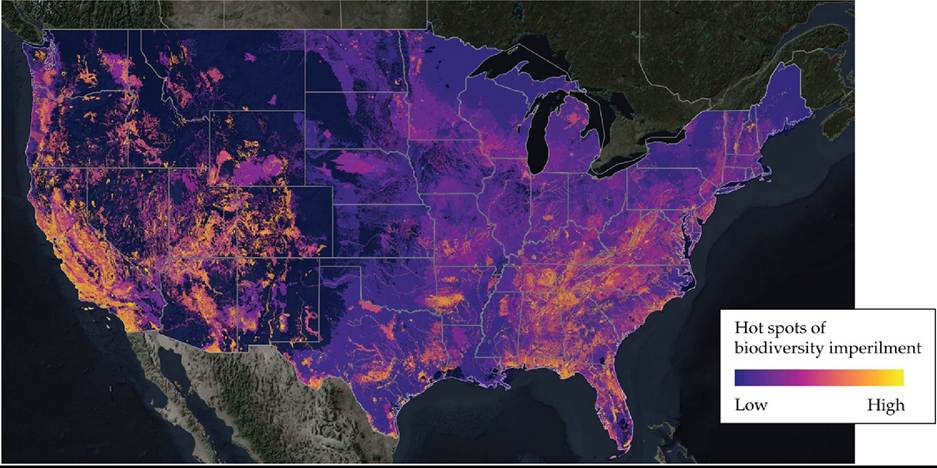
FIGURE 23.19 Hot Spots of Imperilment The compilation of NatureServe data on the location of imperiled species and their geographic ranges in the United States has permitted the identification of the critical areas to protect. California, Hawaii, the Florida Panhandle, and the
southern Appalachian Mountains are “hot spots” of imperilment—they have high concentrations of imperiled species due to their high rates of endemism. (Copyright 2022, NatureServe and the NatureServe Network, 2550 South Clark Street, Suite 930, Arlington VA 22202, USA. All Rights Reserved) Back to text
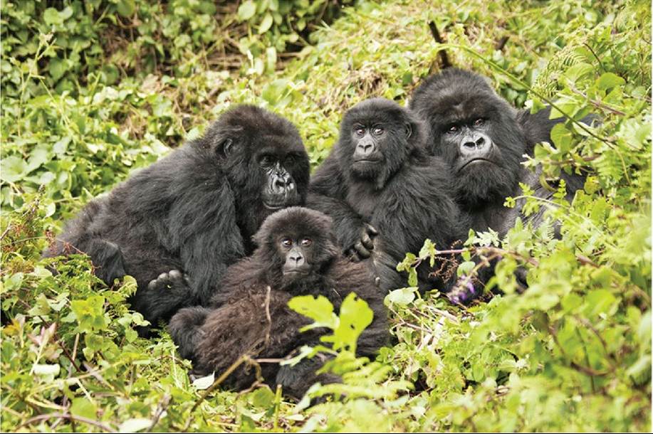
O Mary Ann McDonald∕ShutteComposition and Structure This map of lodgepole pine (Pinus contorta var. Iatifolia) forest in Yellowstone National Park shows five different age classes of
forest. Structural complexity varies across the landscape, as seen in the varying degree of natural fragmentation. (From D. B. Tinker et al. 2003. Landscape Ecol 18: 427-439.) Back tθ text
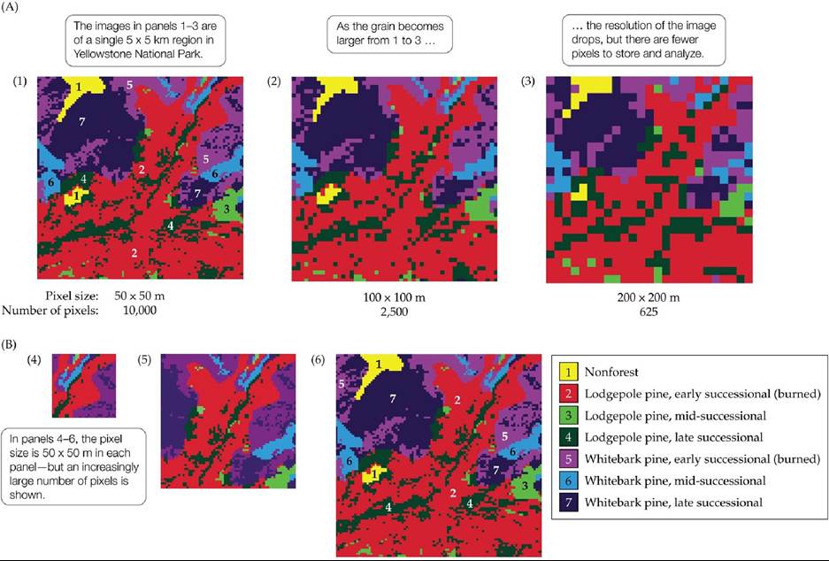
FIGURE 24.6 Effects of Grain and Extent (A) Panels 1-3 show the effect of increasing grain, measured here as pixel size. (B) Panels 4-6 show the effect of increasing extent.
The grain in panel 1 of (A) is identical to the grain in which of the panels of (B)?
(After M. G. Turner et al. 2001. Landscape Ecology in Theory and Practice: Pattern and Process. Springer: New York.) Back to text
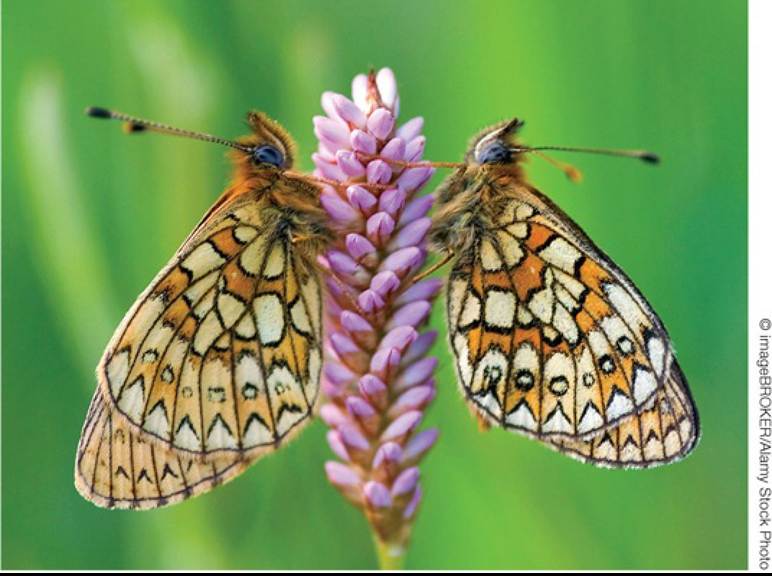
FIGURE 24.7 TheBogFritillaryButterfly Thetravelpatternsofthesebutterflies (Proclossiana eunomia) are influenced by features of the surrounding landscape. Butterflies will hesitate to leave the patches they inhabit if there is not another suitable habitat patch nearby, but they will traverse a matrix of unsuitable habitat when the next patch is close. Back to text
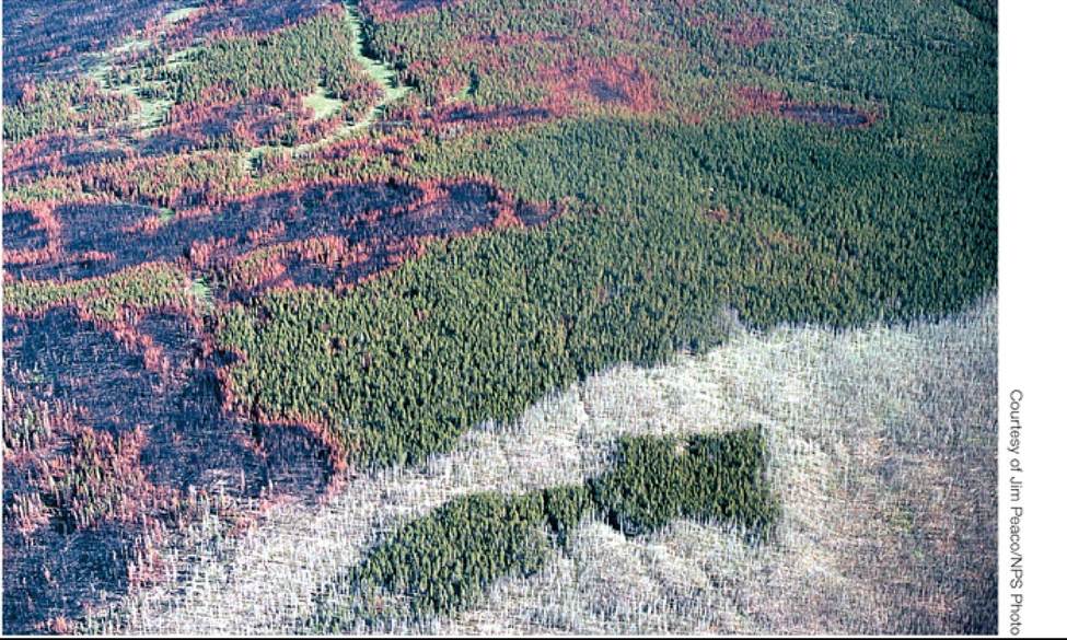
FIGURE 24.8 DjsturbancesGanShapeLandscapeRatterns Thefiresthatburned through nearly one-third of Yellowstone National Park in the summer of 1988 resulted in a complex mosaic of burned and unburned patches. Areas that appear black in this aerial view of Madison Canyon were burned by intense crown fires, and brown patches were burned by severe ground fires, both of which killed most or all of the vegetation. Back to text
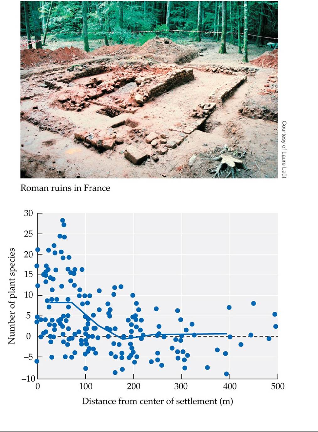
FIGURE 24.9 LandscapeLegacies In central France, the legacy of Roman farming settlements, abandoned for nearly two millennia, is still reflected by higher plant species richness in the forest that replaced them. More plant species were found closer to the center of settlement sites, including more species that prefer a higher soil pH. The y axis represents departure from the mean calculated for plots 100-500 m from the settlement. (After E. Dambrine et al. 2007. Ecology 88: 1430-1439.) Back tθ text
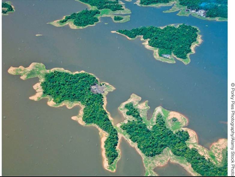
FIGURE 24.10 The Islands of Lago Guri An aerial view of Lago Guri, Venezuela. This lake was formed when 4,300 km2 (1.1 million acres) of forested land were inundated by a hydroelectric dam, leaving isolated islands of tropical forest. Back to text
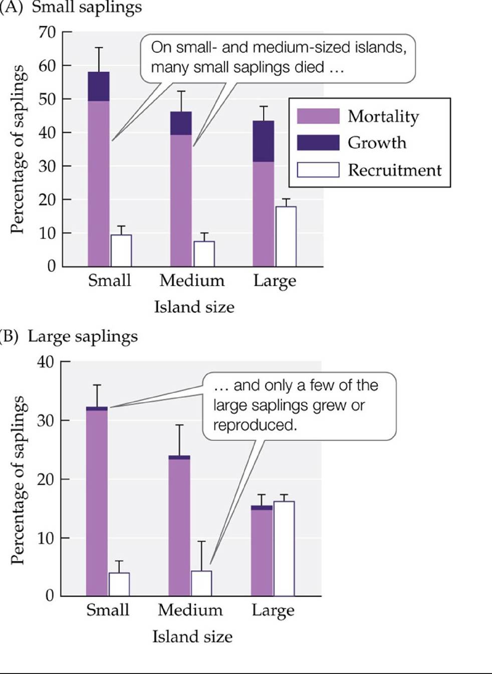
FIGURE 24.11 Effects of Habitat Fragmentation by Lago Guri Thehighabundancesof herbivores on small and medium-sized islands in Lago Guri caused a dramatic decline in sapling establishment and survival. The bars show the percentages of (A) small saplings and (B) large saplings in study plots that left their size class through either mortality or growth to a larger size, as well as the number of saplings recruited to each size class, over a 5-year period. Error bars show one SE of the mean. (After J. Terborgh et al. 2006. JEcol 94: 253-263.) Back tθ text
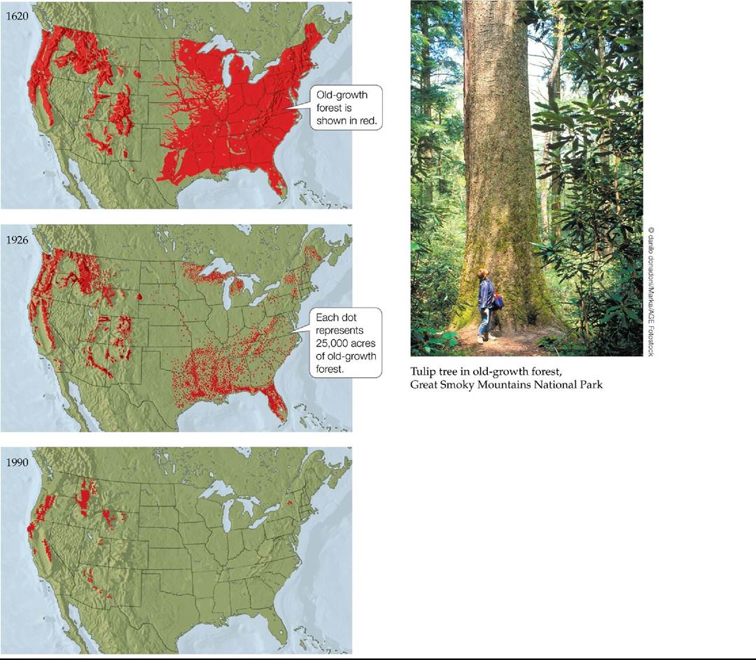
FIGURE 24.12 Loss and Fragmentation of U.S. Old-Growth Forests Beginning in 1620, vast regions of old-growth forest (also known as ancient or virgin forest) in the United States were cut down to provide lumber and to make room for agriculture, housing, and other forms of development. (Adapted from A. Gould et al. 2001. In Global Systems Science: A New World View. The Lawrence Hall of Science. University of CA, Berkeley. © The Regents of the University of California. http://www.globalsystemsscience.org/studentbooks/anwv/ch3/. Based on C. O.
Paullin. 1932. Atlas of Historical Geography of the United States. Carnegie Institution of Washington and the American Geographical Society of New York: Washington, DC, and New York; R. Findley and J. P. Blair. 1990. Nat Geogr 178: 106-136.) Back to text
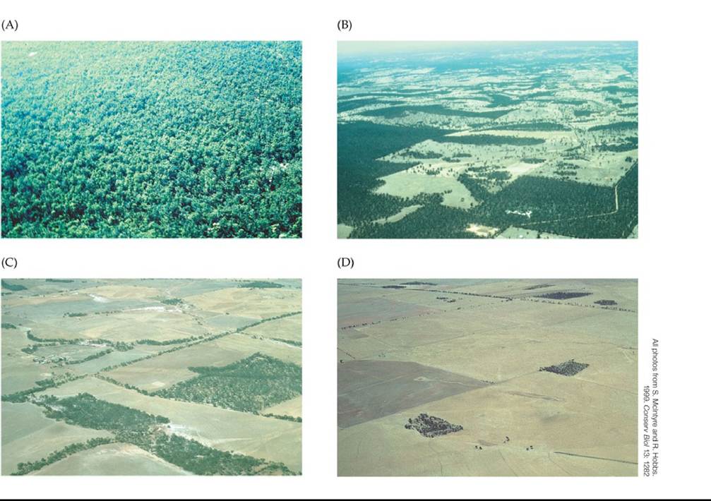
FIGURE 24.13 The Process of Habitat Loss and Fragmentation Historicallyintact habitats are gradually reduced with increased human presence. These contemporaneous photographs (taken from different locations) illustrate a process that typically takes decades to complete. (A) An intact eucalyptus forest in Western Australia. (B) Areas within the forest have been cleared for grazing. (C) The forest has become further fragmented over time. (D) Only a few remnants of forest remain. Back to text
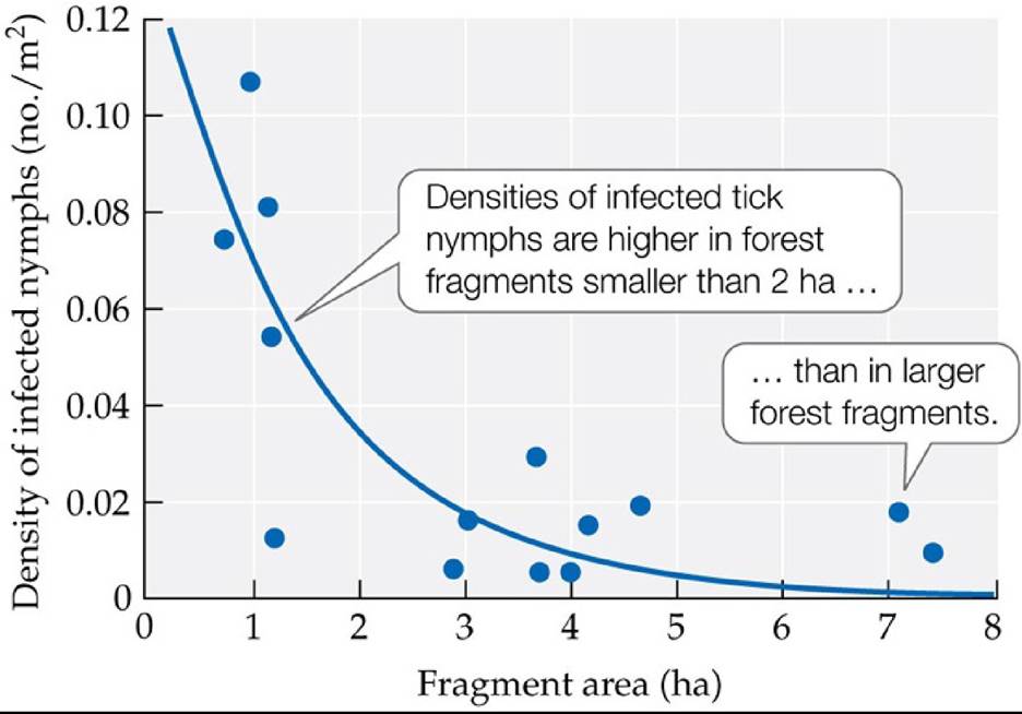
FIGURE 24.14 Habitat Fragmentation Can Have Consequences for Human Health The loss of predators from small forest fragments in New York State has led to elevated populations of white-footed mice in those fragments. As a result, densities of tick nymphs infected with the spirochete bacterium that causes Lyme disease are higher than in larger forest areas. (After B. F. Allan et al. 2003. ConservBiol 17: 267-272.) Back tθ text
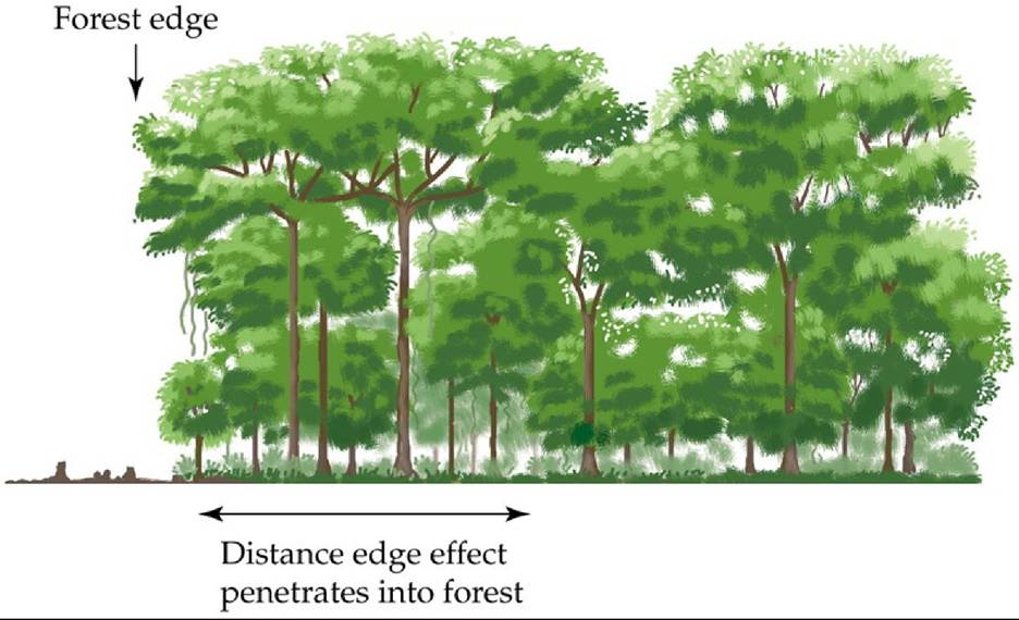
FIGURE 24.15 Edge Effects Deforestation creates new forest edges, exposing trees that once were surrounded by forest to edge effects such as increased light levels, higher temperatures, greater wind speeds, decreased soil moisture, and invasion of disturbance-adapted plants and animals. Some edge effects penetrate a few tens of meters into the forest fragment, while others penetrate hundreds of meters (see Analyzing Data 24.1). Back to text
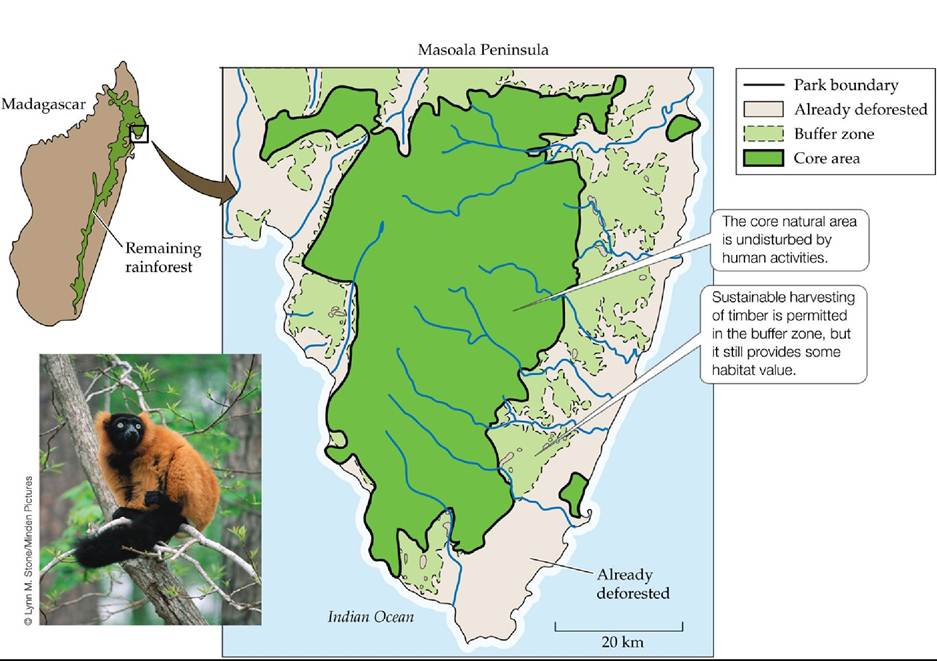
FIGURE 24.16 Designing Masoala National Park Masoala National Park, in northeastern Madagascar, was established after careful planning that took both ecological and socioeconomic concerns into account. It preserves habitat for many threatened species, including the red ruffed lemur (Varecia variegata rubra), which is endemic to this region of Madagascar. This map was simplified from more complex maps generated by using GIS techniques to analyze satellite imagery. (After C. Kremen et al. 1999. ConservBiol 16: 605-618.) Back tθ text
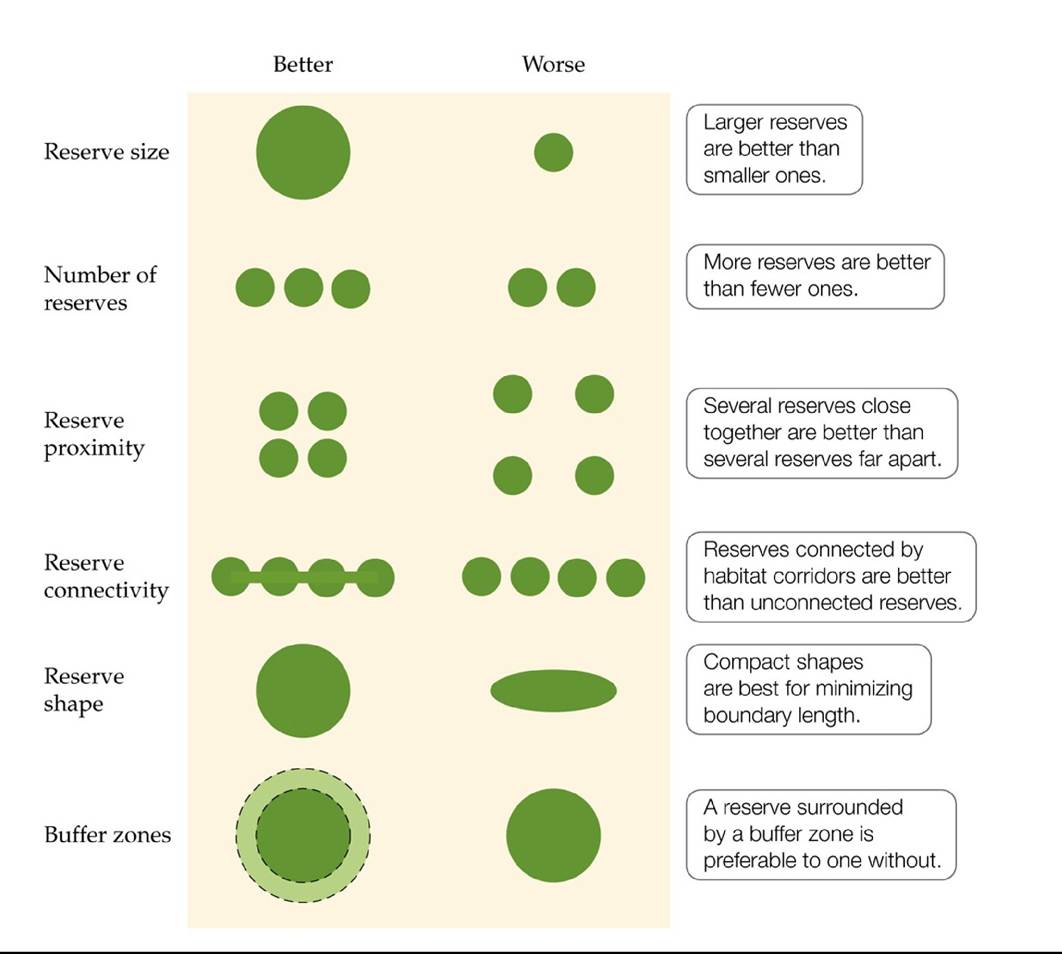
FIGURE 24.17 Guiding Principles for Designing Nature Reserves Somespatial configurations are preferable than others for fostering biodiversity.
Explain the underlying reasons why the design on the left is better than the one on the right for conservation as related to reserve size, proximity of multiple reserves, reserve connectivity, and reserve shape.
(After C. L. Shafer 1997. Terrestrial nature reserve design at the urban/rural interface. In M. W. Schwartz [ed.], Conservation in Highly Fractured Landscapes, pp. 345-347. Chapman and Hall: New York, and R. B. Primack and A. A. Sher. 2016. An Introduction to Conservation Biology. Sinauer and Associates: Sunderland ma.) Back to text
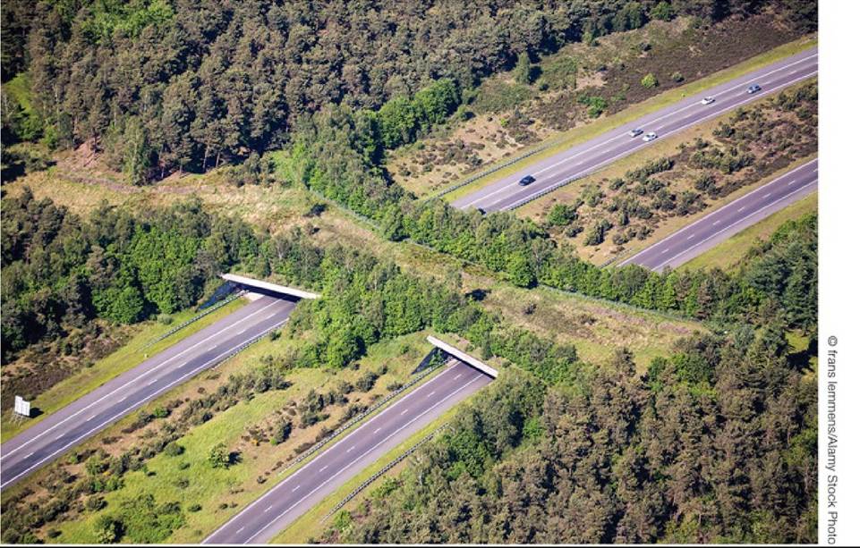
FIGURE 24.18 A Habitat Corridor Wildlife can cross this highway overpass over the A1 highway in the Netherlands. Back to text
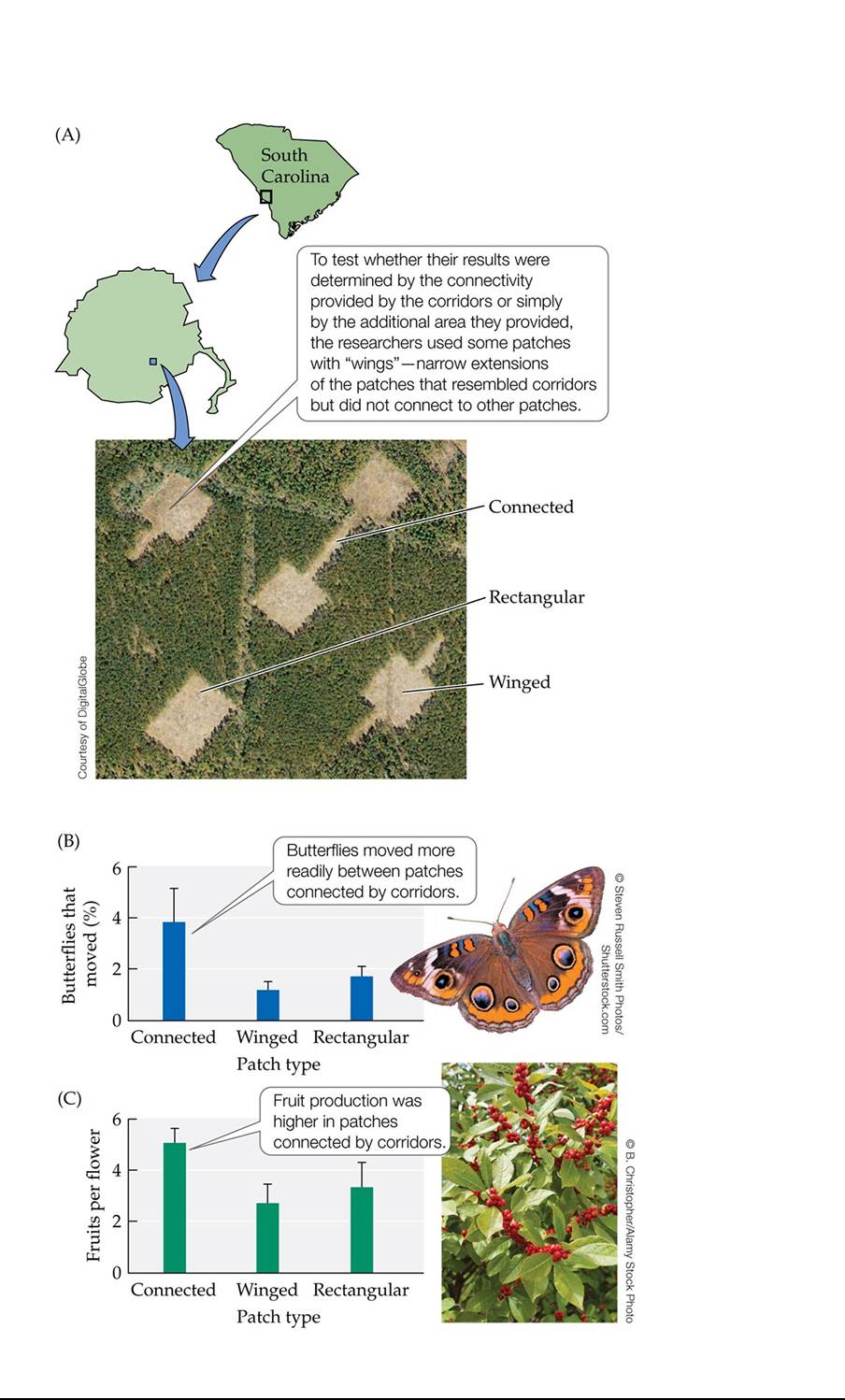
FIGURE 24.19 HowEffectiveAreHabitatCorridors? (A)NickHaddadandhiscolleagues tested the effectiveness of habitat corridors by creating experimental patches of early successional habitat within a pine forest and creating corridors between some of the patches. They then observed (B) movements of the common buckeye butterfly (Junonia coenia) between patches and (C) fruit production (which provides evidence of pollination) in winterberry (Ilex verticillata) in patches. Error bars in (B) and (C) show one SE of the mean. (After J. J. Tewksbury et al. 2002. Proc NatlAcad Sci USA 99: 12923-12926. © 2002 National Academy of Sciences U.S.A.) Back to text
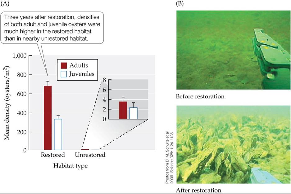
FIGURE 24.20 Dramatic Effects of an Ecological Restoration Project Native oyster populations have collapsed worldwide as a result of habitat loss and overharvesting. (A) In an ecological restoration experiment that began in 2004, oyster reefs were constructed in nine protected areas along the Great Wicomico River in Virginia. Three years later, native oyster populations had recovered dramatically across the 35-ha restoration project. Error bars show one SE of the mean. (B) Oyster habitat before and after restoration. The object on the right in each photograph is a robotic arm that can be used to pick up an individual oyster. (A after D. M. Schulte
et al. 2009. Science 325: 1124-1128.) Back tθ text
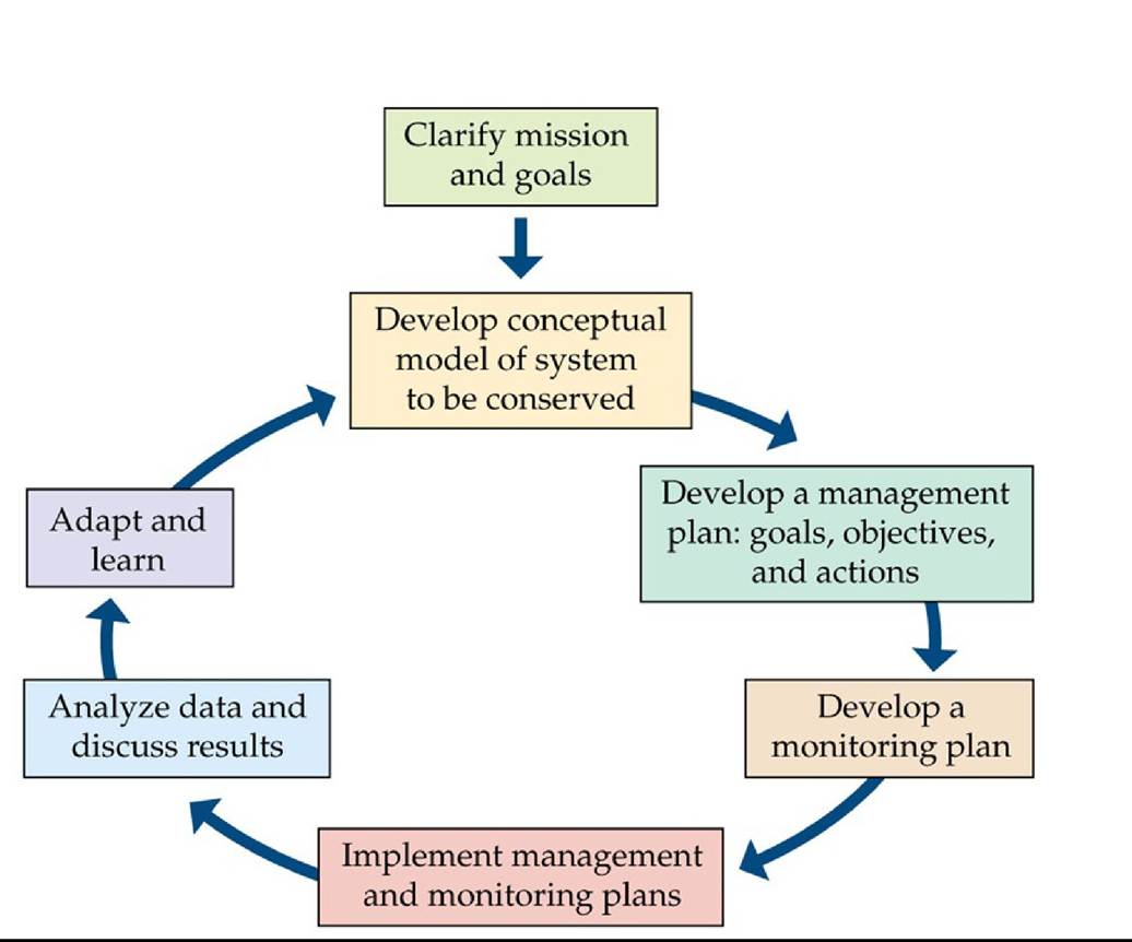
FIGURE 24.21 Adaptive Management Is a Vital Component of Ecosystem Management
Adaptive management is a systematic way of learning from past management actions and adjusting future decisions accordingly. (After R. Margoluis and N. Salafsky. 1998. MeasuresofSuccess: Designing, Managing, and Monitoring Conservation and Development Projects. Island Press: Washington, DC.) Back to text
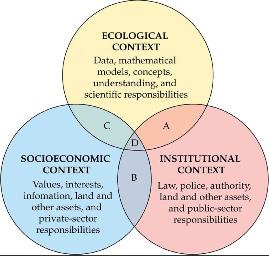
FIGURE 24.22 Humans Are an Integral Part of Ecosystem Management Ecosystem management integrates interests derived from ecological, institutional, and socioeconomic contexts. The letters represent the overlap of the three contexts: A, zone of regulatory or management authority; B, zone of social obligations; C, zone of informal decisions (as opposed to legal requirements); D, zone of win-win-win partnerships. (From Dennis A. Schenborn, personal communication.) Back tθ text
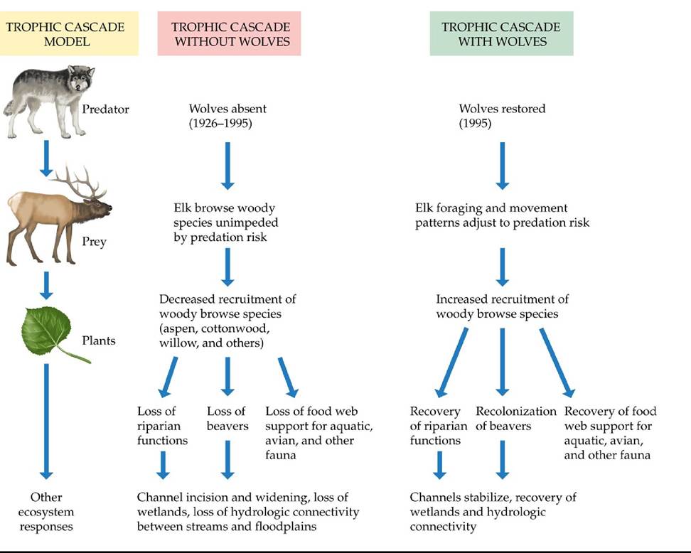
FIGURE 24.23 ATrophiccascadeHypothesis Wolves are top predators, and their reintroduction to the Greater Yellowstone Ecosystem (GYE) has the potential to cause cascading trophic effects. According to the hypothesis shown here, elk now avoid those sites where they are most vulnerable to predation, and trees and shrubs are now returning to those sites after decades of suppression by elk. Researchers are actively testing this and other hypotheses about effects of wolves in the GYE. (After W. J. Ripple and R. L. Beschta. 2004. BioScience 54: 755-766.) Back tθ text
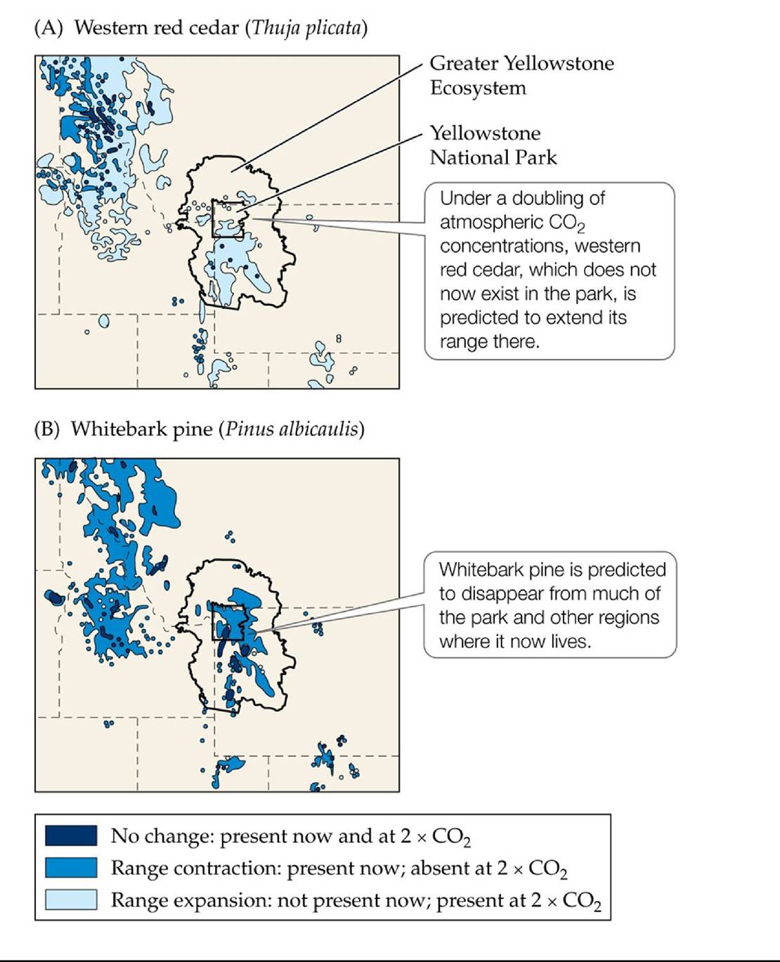
FIGURE 24.24 Projected Effects of Climate Change in the Northern Rockies Shiftsin the distributions of some principal tree species in the northern Rocky Mountains are projected by a model of a future climate driven by twice the current atmospheric CO2 concentrations. These shifts include (A) the increased distribution of western red cedar, which is currently uncommon in the region, and (B) the near disappearance of whitebark pine. (After P. J. Bartlein et al. 1997. ConservBiol 11: 782-792.) Back tθ text
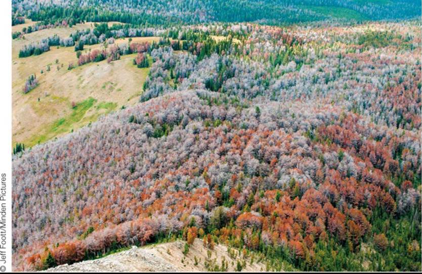
FIGURE 24.25 Warm Winters Have Promoted a Devastating Insect Outbreak Once excluded from whitebark pine forests by cold winter temperatures, the mountain pine beetle has expanded its range as temperatures have warmed in recent decades. These beetles have contributed to the death of millions of whitebark pines, which turn red and subsequently gray when they die (as in this forest in the southern Rocky Mountains). In July 2011, the U.S. Fish and Wildlife Service announced that it will list whitebark pine as a candidate species under the Endangered Species Act. Back to text
25 Global Ecology
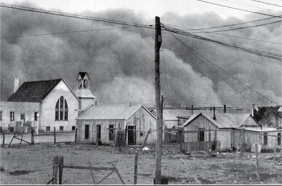
FIGURE 25.1 A Massive Dust Storm A wall of dust approaches the town of Clayton, New Mexico, on May 29, 1937. This storm was one of several “black dusters” that swept through the Dust Bowl during the 1930s. © Science History Images/Alamy Stock Photo Back tθ text
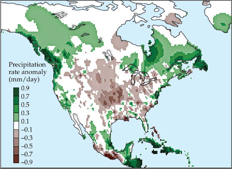
FIGURE 25.2 DroughtintheSouthernPlains During the 1930s, the southern Great Plains of the United States experienced the driest weather on record. The drought, in combination with loss of vegetation cover, created conditions conducive to dust input into the atmosphere. The values shown are anomalies (differences between averages for the period 1932-1939 and longterm averages). (After B. I. Cook et al. 2009. Proc NatlAcad Sci USA 106: 4997-5001. © 2009 National Academy of Sciences, U.S.A.) Back tθ text
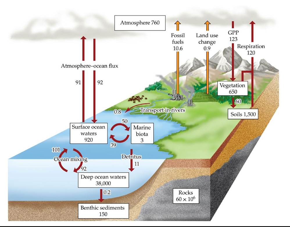
FIGURE 25.3 TheGlobalCarbonCycle Boxes represent major pools of C, measured in petagrams (1 Pg = 1015 g). Arrows represent major fluxes of C, measured in petagrams per year; anthropogenic fluxes are shown in orange. Note that the largest fluxes are terrestrial gross primary production (GPP) and respiration.
How would deforestation influence the magnitude of carbon fluxes?
(After W. H. Schlesinger and E.S. Bernhardt. 2013. Biogeochemistry: AnAnalysis of Global Change, 3rd eds. Academic Press: Cambridge, MA; F. S. Chapin et al. 2002. Principles of Terrestrial Ecosystem Ecology. Springer-Verlag: New York; P. Ciais et al. 2013. In Climate Change 2013: The Physical Science Basis, T. F. Stocker et al. [Eds.], pp. 466-570. Cambridge University Press: Cambridge.) Back tθ text
FIGURE 25.4 AFACEExperiment The circles visible in this aerial photo are free-air CO2 enrichment (FACE) treatment rings in a loblolly pine (Pinus taeda) forest in the Duke Forest in North Carolina. Carbon dioxide is released from plastic pipes surrounding treatment plots at a rate calculated to raise the CO2 concentration to 200 ppm above ambient atmospheric CO2 concentrations. Back to text
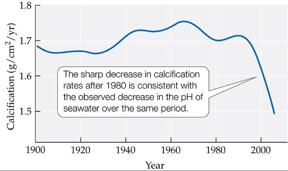
FIGURE 25.5 Rates of Calcification of Corals on Australia’s Great Barrier Reef, 19002005 The sharp decline in calcification rates after 1980 is associated with the combined effects of decreasing pH and increasing ocean water temperature. (After G. De'ath et al. 2009. Science 323: 5910.) Back to text
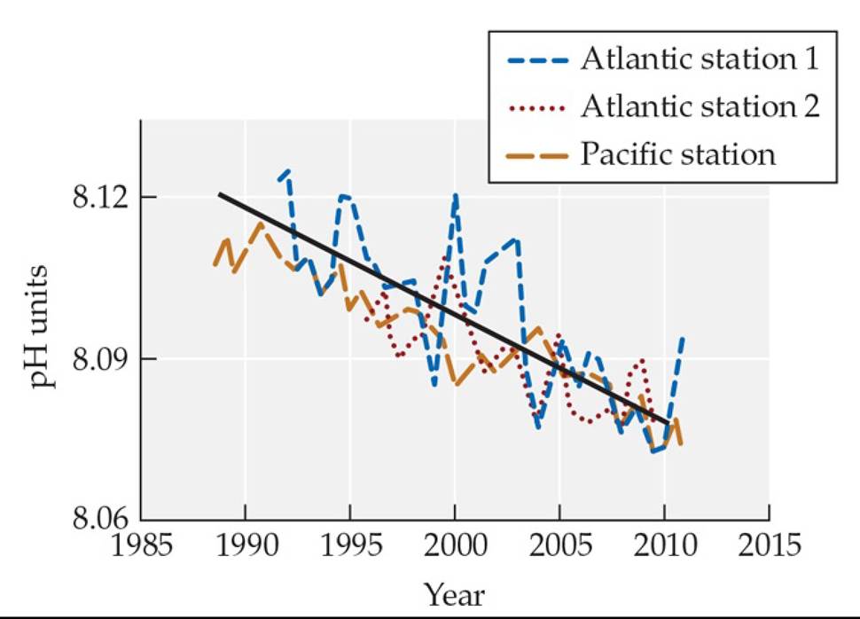
FIGURE A Measured Trend in Ocean pH for Two Stations in the Atlantic Ocean and One in the Pacific Ocean (After IPCC. 2013. Climate Change 2013: The Physical Science Basis. Cambridge University Press: Cambridge.) Back tθ text
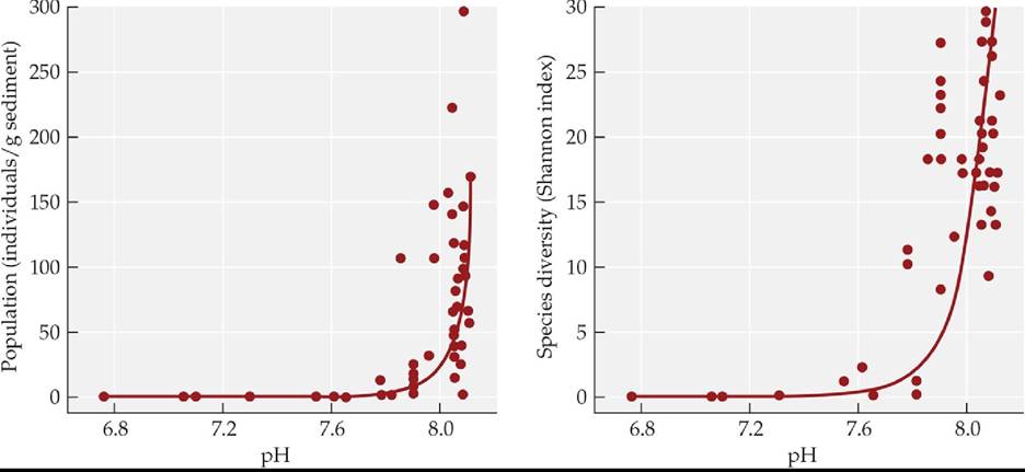
FIGURE B Influence of Ocean pH on the Density and Species Richness of
Foraminiferans near Natural CO2 Seeps (After S. Uthicke et al. 2013. Sci Rep 3: 1-5.) Back to text
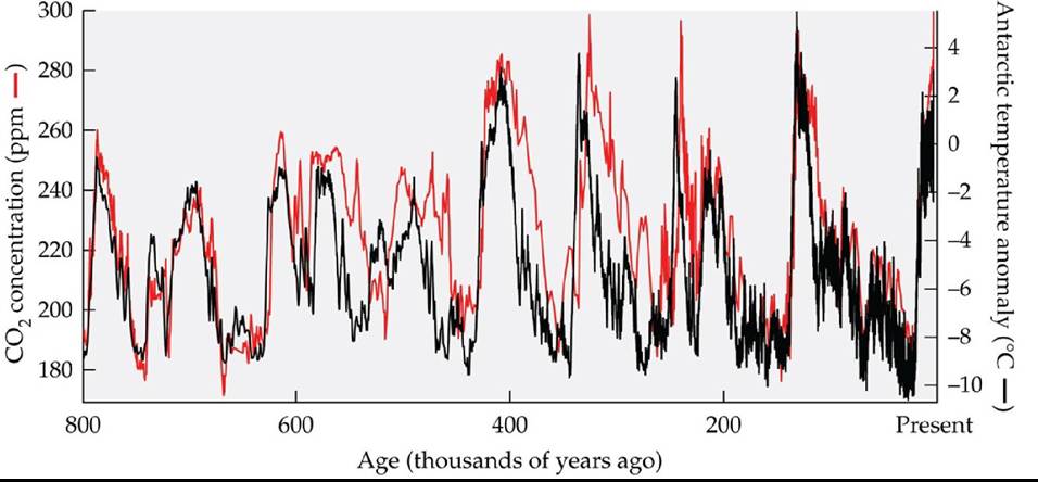
FIGURE 25.6 Changes in Atmospheric CO2 Concentrations over Time Atmospheric
CO2 concentrations have varied with temperature over the past 800,000 years. These gas
concentrations were measured in bubbles trapped in Antarctic ice; temperatures were estimated using oxygen isotopic analyses (see Ecological Toolkit 5.1). CO2 concentrations in 2019 are 408 ppm. (After D. Luthi et al. 2008. Nature 453: 379-382.) Back tθ text
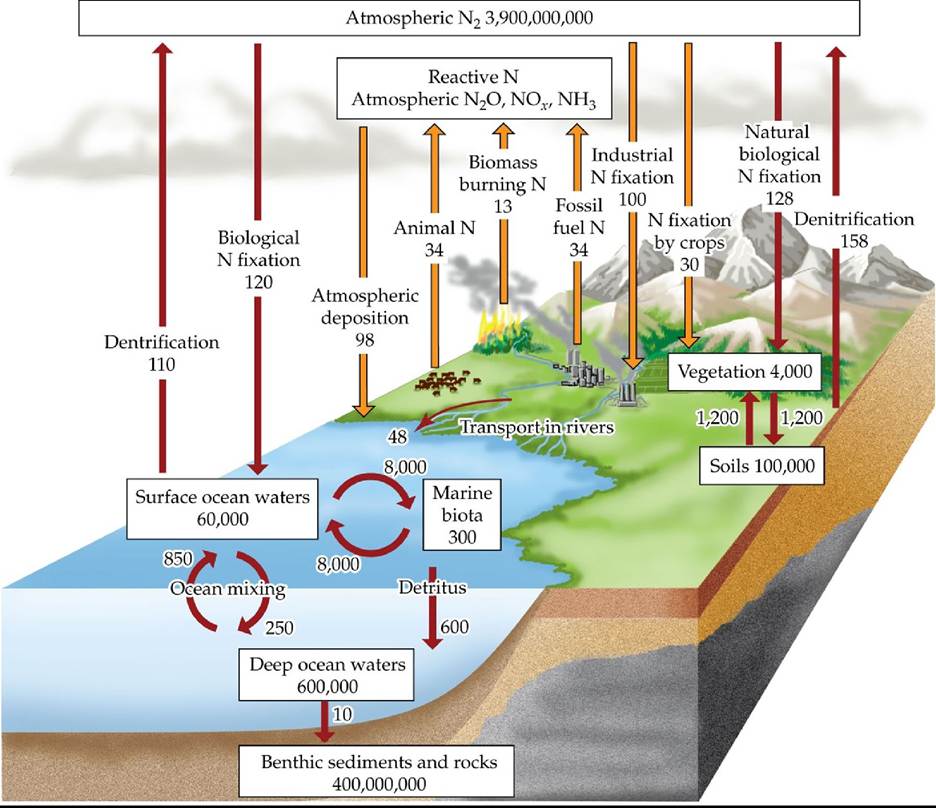
FIGURE 25.7 TheGlobalNitrogenCycle Boxes represent major pools of N, measured in teragrams (1 Tg = 1012 g). Arrows represent major fluxes of N, measured in teragrams per year; anthropogenic fluxes are shown in orange. The percentage of the total atmospheric N pool made up of reactive N is minuscule (it is also difficult to quantify because it is very dynamic).
Given its small size, why is the reactive pool of N of such great interest?
(After W. H. Schlesinger and E.S. Bernhardt. 2013. Biogeochemistry: AnAnalysis of Global Change, 1st and 3rd eds. Academic Press: Cambridge, MA; F. S. Chapin et al. 2002. Principles OfTerrestrial Ecosystem Ecology. Springer-Verlag: New York. Data from various sources including C. Cleveland et al. 1999. Global Biogeochem Cycles 13: 623-645; J. N. Galloway et al. 2004. Biogeochemistry 70: 153-226.) Back to text
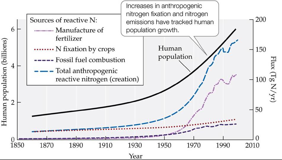
FIGURE 25.8 Changes in Anthropogenic Fluxes in the Global Nitrogen Cycle Increases in fertilizer production through the Haber-Bosch process, the growing of nitrogen-fixing crops, and combustion of fossil fuels have all contributed to the tremendous increase in biologically available (reactive) N. (After J. N. Galloway et al. 2004. Biogeochemistry 70: 153-226.) Back to text
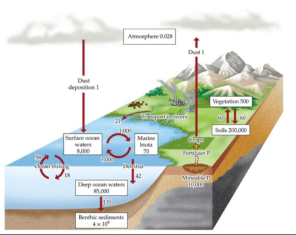
FIGURE 25.9 The Global Phosphorus Cycle Boxes represent major pools of P, measured in teragrams (Tg); arrows represent major fluxes of P, measured in teragrams per year. The major anthropogenic flux (P fertilization of crops) is shown in orange. (After W. H. Schlesinger and E.S. Bernhardt, 2013. Biogeochemistry: AnAnalysis of Global Change, 1st and 3rd eds. Academic Press: Cambridge, MA; F. S. Chapin et al. 2002. Principles of Terrestrial Ecosystem Ecology. Springer-Verlag: New York. Data from various sources cited within.) Back tθ text
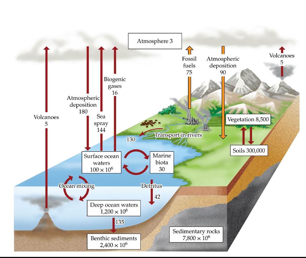
FIGURE 25.10 TheGlobaisuIfurCycIe Boxes represent major pools of S, measured in teragrams (Tg). Arrows represent major fluxes of S, measured in teragrams per year; anthropogenic fluxes are shown in orange. (After W. H. Schlesinger and E.S. Bernhardt, 2013. Biogeochemistry: AnAnalysis of Global Change, 1st and 3rd eds. Academic Press: Cambridge, MA; F. S. Chapin et al. 2002. Principles of Terrestrial Ecosystem Ecology. Springer-Verlag: New York. Data from various sources cited within.) Back tθ text
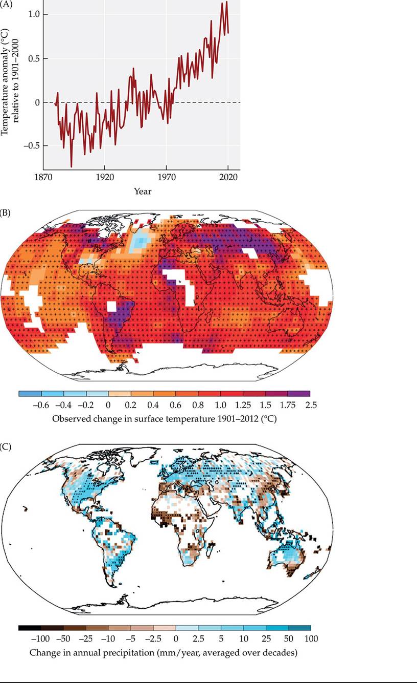
FIGURE 25.11 Changes in Global Temperature and Precipitation (A) Average annual global temperature anomalies (relative to the average global temperature for 1961-1990) between 1880 and 2021, averaged from numerous air and sea surface temperature records and normalized to sea level. (B) Regional trends in average annual temperatures for 1901-2012. (C) Trends in global precipitation from 1951 to 2010. (A, data from NOAA National Centers for Environmental Information, Climate at a Glance: Global Time Series. >⅛⅝ https://www.ncdc.noaa.gov/cag/;
B,C from IPCC. 2013. Climate Change 2013: The Physical Science Basis. Cambridge University Press: Cambridge.) Back to text
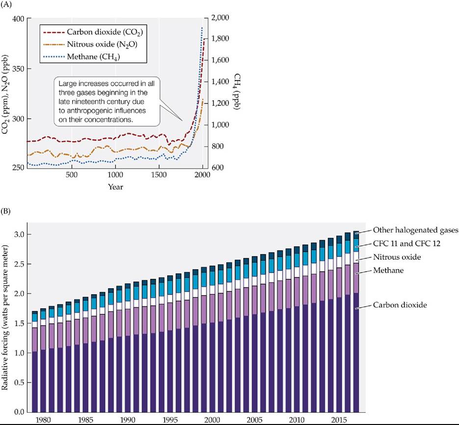
FIGURE 25.12 AtmosphericconcentrationsofGreenhouseGases (A) Long-term trends in the concentrations of CO2, CH4, and N2O. Concentrations prior to 1958 were determined from ice cores; concentrations since 1958 have been measured directly. (B) Contributions of greenhouse gases to warming (radiative forcing), showing that CO2 is the main contributor to the temporal change. (A after P. Forster et al. 2007. In Climate Change 2007: The Physical Science Basis, S. Solomon et al. [Eds.], pp. 129-234. Cambridge University Press: Cambridge; B from GlobalChange.gov.) Back to text
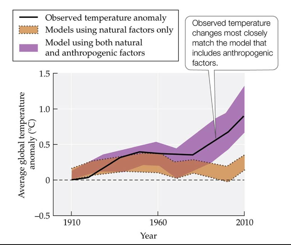
FIGURE 25.13 ContributorstoGlobalTemperatureChange IPCC scientists compared observed global temperature changes between 1910 and 2010 with the results of computer models. The models predicted the temperature changes that would have been expected in that period due to natural climatological factors only, including variation in solar radiation and in atmospheric concentrations of aerosols from volcanic eruptions, and due to both natural and anthropogenic factors, including emissions of greenhouse gases and sulfate aerosols. These comparisons suggest that anthropogenic factors have played a large role in the observed warming. (After IPCC. 2013. Climate Change 2013: The Physical Science Basis. Cambridge University Press: Cambridge.) Back tθ text
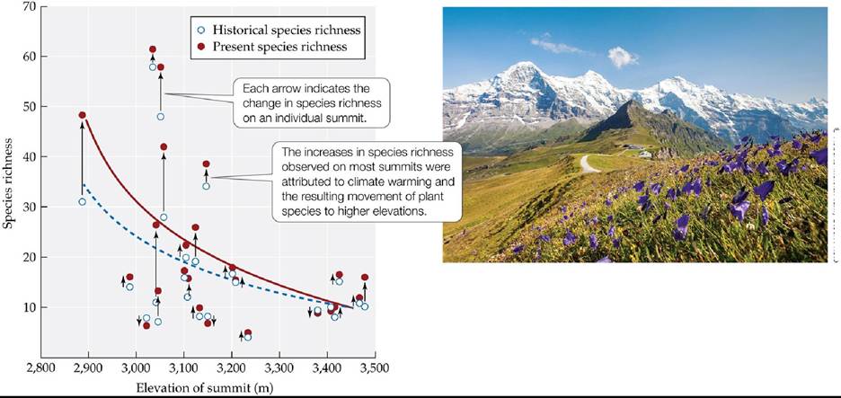
© Roberto MoioIaZAIamy Stock Photo
FIGURE 25.14 Plants Are Moving Up the Alps Grabherrandcolleaguescompared historical records of vascular plant species richness on the summits of mountains in the European Alps with censuses taken in the early 1990s. The dashed blue curve indicates the relationship between species richness and summit elevation in the historical records, while the solid red curve indicates the present relationship. (After V. H. Grabherr et al. 1994. BioScience 53: 469-480.) Back to text
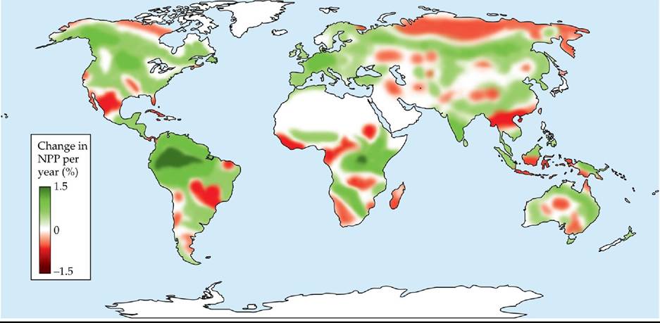
FIGURE 25.15 Changes in Terrestrial NPP Nemani and colleagues calculated changes in net primary production (NPP) between 1982 and 1999, expressed here as percentage change per year. The trend toward increased NPP in tropical regions of South America shown here was reversed in the first decade of the twenty-first century due to prolonged drought. (From R. R.
Nemani et al. 2003. Science 300: 1560-1563.) Back tθ text
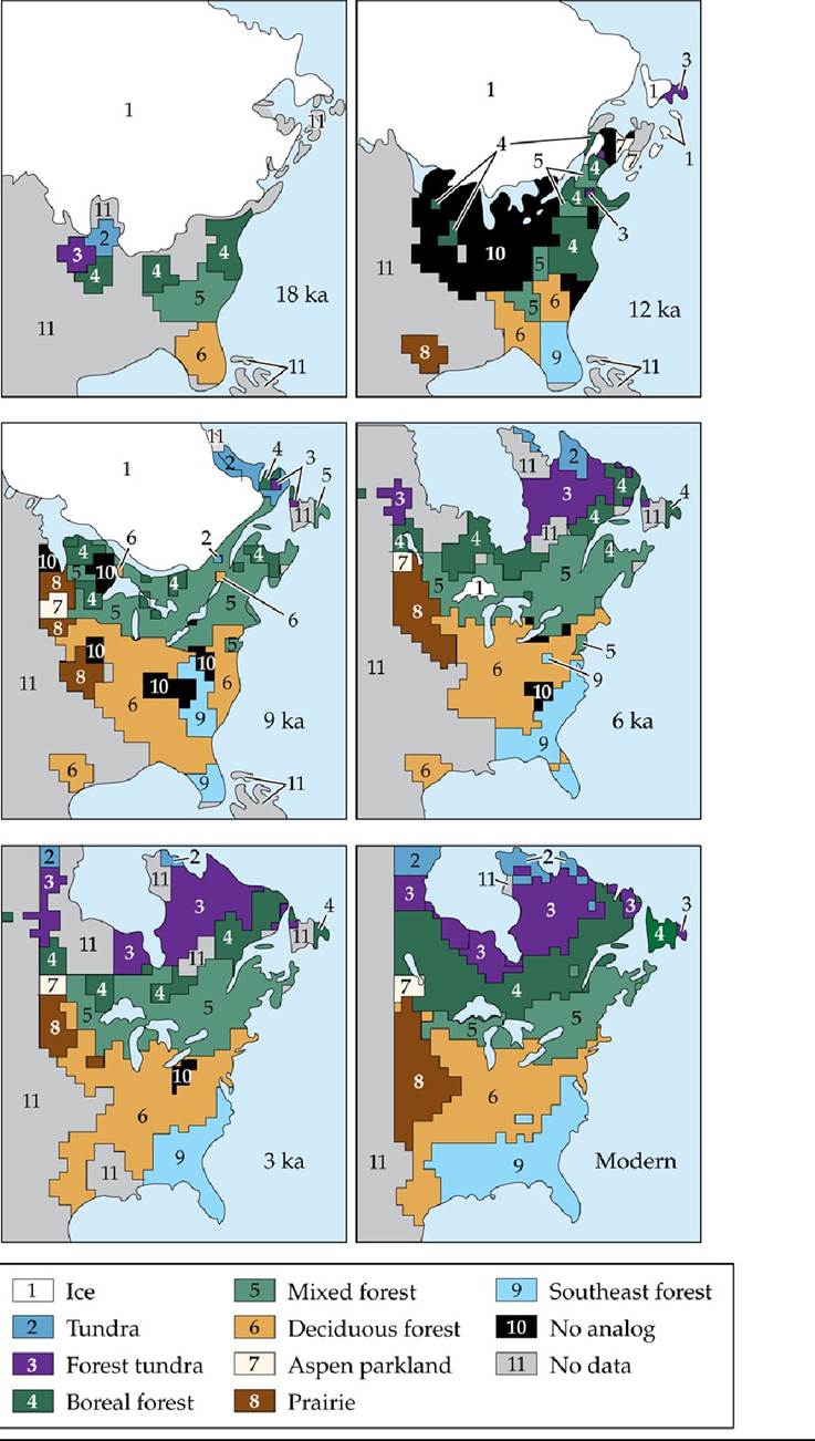
FIGURE 25.16 PastchangesinPlantCommunities VegetationtypesineasternNorth
America have changed since the last glacial maximum, 18,000 years ago (ka = thousand years ago). Vegetation composition was determined from pollen preserved in sediments.
What factors may have led to the development of vegetation types different from those found in North America today following retreat of the continental glacier?
(From J. T. Overpeck et al. 1992. Geology 20: 1071-1074.) Back tθ text
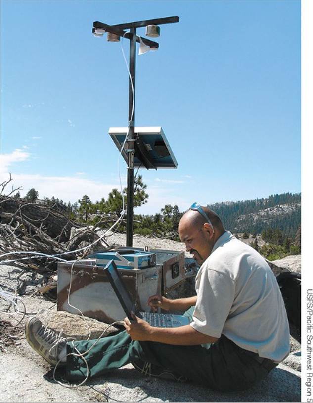
FIGURE 25.17 Air Quality Monitoring in the Sierra National Forest Airsamplesare collected regularly to monitor temporal changes in air chemistry and particulates. Air quality in national parks and wilderness areas, such as the Sierra National Forest, has been compromised by emissions of pollutants, including NOx and sulfate aerosols. These pollutants not only lower visibility, but also pose a health hazard to the organisms that come into contact with them, including humans. Back to text
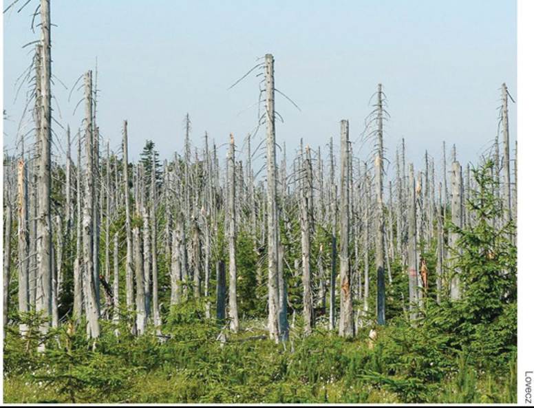
FIGURE 25.18 Air Pollution Has Damaged European Forests The high tree mortality seen in this spruce forest in the Jizera Mountains, Czech Republic, is associated with acid precipitation and the resulting nutrient imbalance, particularly losses of base cations. Extensive forest decline occurred in Germany and northern Czechoslovakia (now part of the Czech Republic) in the 1970s and 1980s. Back to text
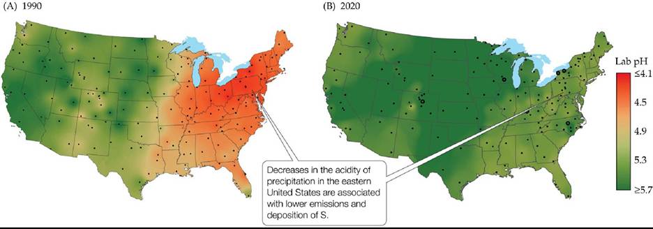
FIGURE 25.19 DecreasesinAcidPrecipitation The pH of precipitation in different parts of the United States as measured in (A) 1990 and (B) 2020, estimated based on measurements made at sampling points indicated by the dots. (From National Atmospheric Deposition Program/National Trends Network.) Back to text
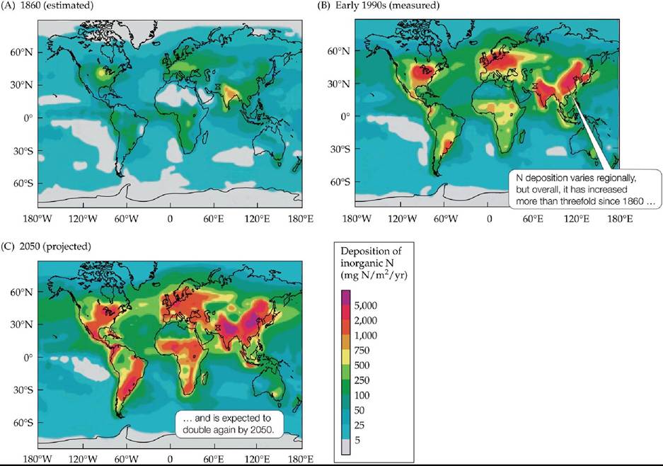
FIGURE 25.20 Historical and Projected Changes in Nitrogen Deposition (A)Estimated rates of deposition of inorganic N compounds (NH4+ and NOβ-) in 1860. (B) Measured rates for the early 1990s. (C) Projected rates for 2050. (From J. N. Galloway et al. 2004. Biogeochemistry 70: 153-226.) Back to text
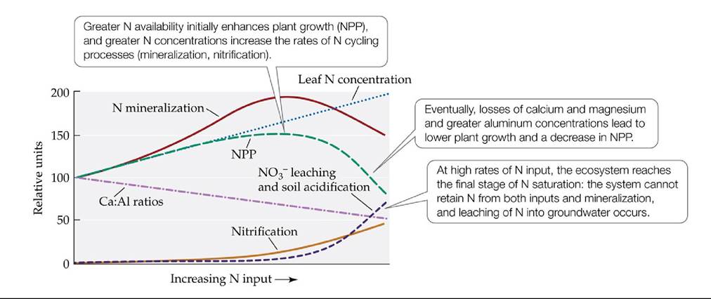
FIGURE 25.21 Effects of Nitrogen Saturation Aber and colleagues devised a conceptual model of the response of forest ecosystems to increasing inputs of inorganic N resulting in nitrogen saturation. (After J. Aber et al. 1998. BioScience 48: 921-934.) Back tθ text
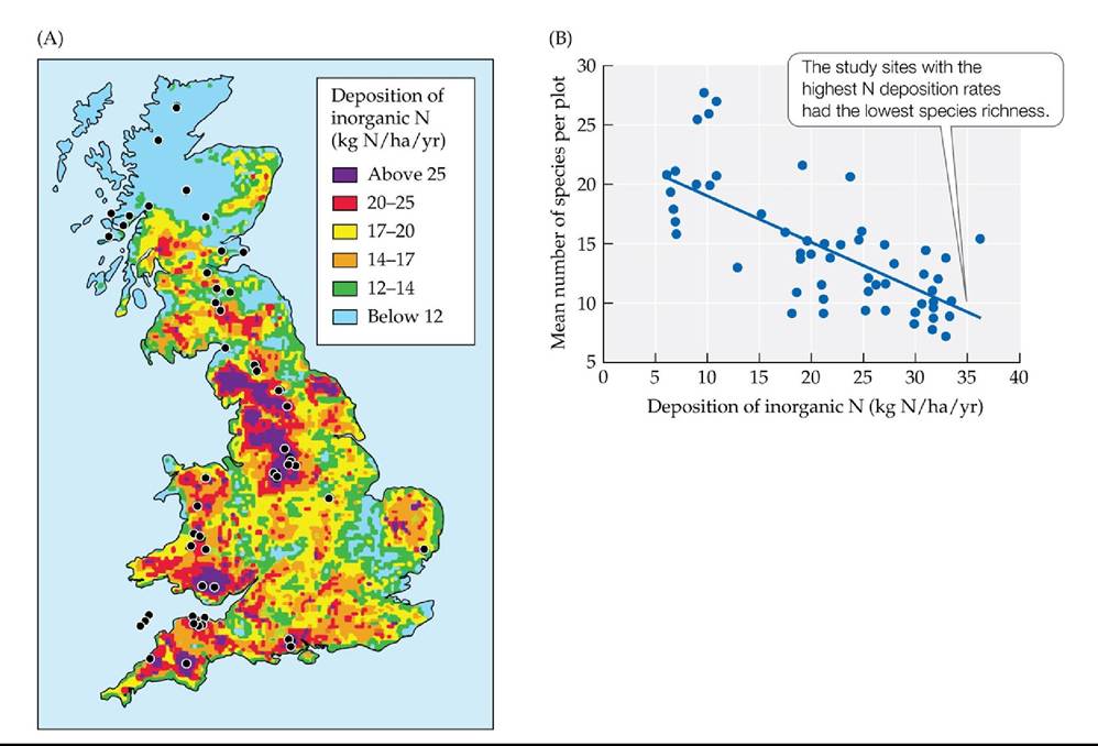
FIGURE 25.22 NitrogenDepositionLowersSpeciesDiversity (A)InorganicNdeposition in Great Britain. Dots on the map indicate the study sites where plant species richness in grassland ecosystems was measured. (B) Correlation between rates of inorganic N deposition and plant species richness. (After C. J. Stevens et al. 2004. Science 303: 1876-1879.) Back to text
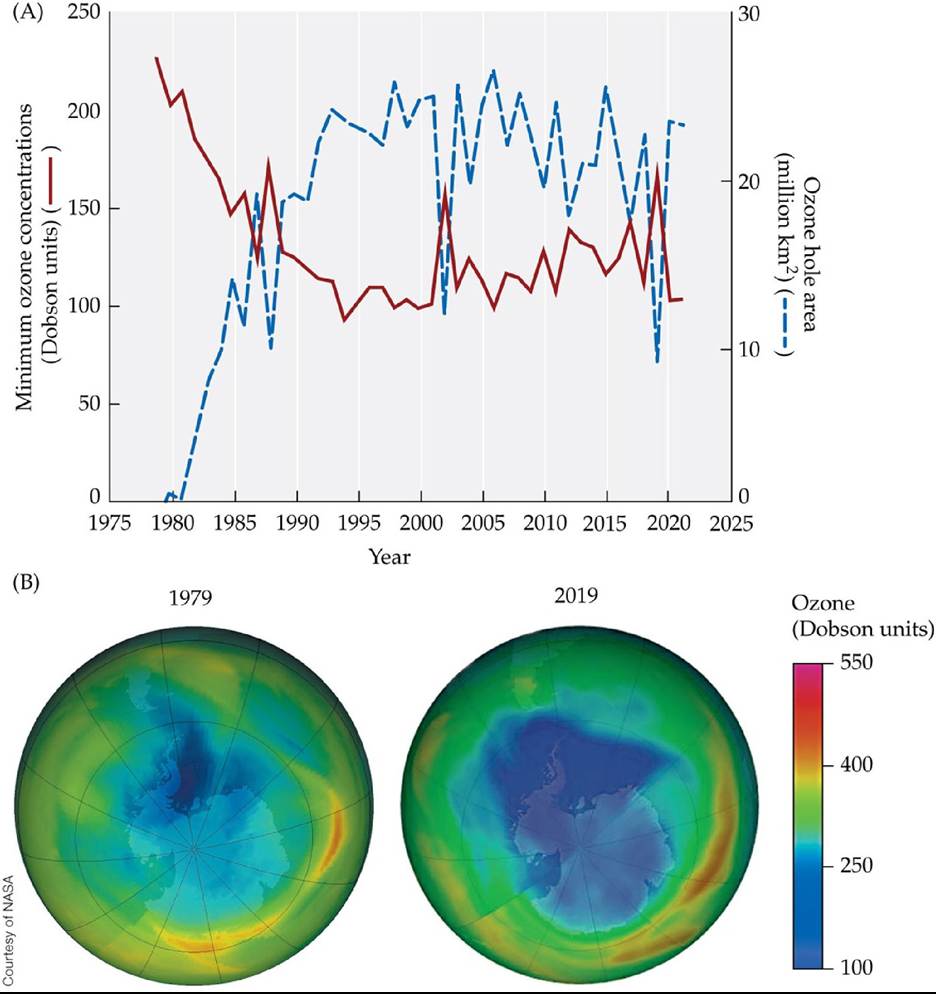
FIGURE 25.23 TheAntarcticOzoneHole (A) Since 1980, there has been a dramatic decrease in springtime ozone concentrations over the Antarctic region, with concentrations dropping below the threshold for ozone hole status (220 Dobson units) for a large proportion of the region after 1984. (B) Average ozone concentrations over Antarctica for the month of September in 1979 and 2019 demonstrate the dramatic decrease that occurred during this period. The lowest ozone concentrations are shown in dark blue. (A, data from ozonewatch.gsfc.nasa.gov.) Back to text
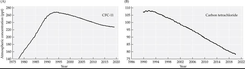
FIGURE 25.24 ProgressagainsttheOzoneKillers Measurementsofatmospheric concentrations of ozone-destroying chlorinated compounds, in parts per trillion (ppt), at five monitoring locations across the globe show that several of them have declined since the signing of the Montreal Protocol in 1989. (Data from NOAA/Earth System Research LaboratoryZGlobal Monitoring DivisionZHATS Flask Sampling Program.
https://www.esrl.noaa.gov/gmd/hats/flask/flasks.html.) Back to text
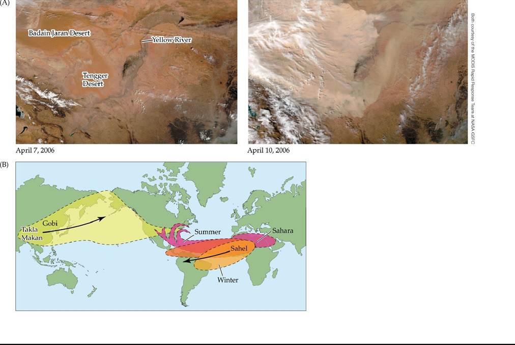
FIGURE 25.25 Desert Origins of Global Dust Storms Desertsaresourcesofdustthat may travel large distances and have important ecological impacts in distant regions. (A) The photo on the left is a satellite image of the Gobi desert in early April 2006. The photo on the right shows the same region 3 days later, obscured by a massive dust storm. (B) Sources of the dust deposited in the Caribbean region include the deserts of North America and Asia. The main directions of dust flow are indicated by arrows. (B adapted from illustration by Betsy Boynton in V. H. Garrison et al. 2003. BioScience 53: 469-480.) Back to text
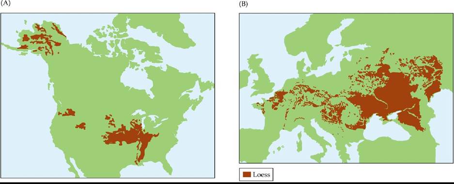
FIGURE 25.26 Distribution of Loess Soils As continental glaciers receded following the most recent glacial maximum, wind carried substantial amounts of loose soil from the exposed areas. Large areas of (A) North America and (B) Europe were covered with deep layers of this
material, which developed into loess soils. (A after D. R. Muhs. 2007. In Encyclopedia of Quaternary
Science, pp. 2075-2086. Elsevier: New York; B after D. Haase et al. 2007. Quat Sci Rev 26: 1301-1312.)
Back to text

FIGURE 25.27 DustySnowintheRockies Dust from the Colorado Plateau is carried by spring storms to the Rocky Mountains, where it increases absorption of sunlight by snow and accelerates its melting. Earlier snowmelt has important implications for mountain ecosystems and regional hydrology. Back to text
2. Convert the log area (m2) and log species richness to nonlog values at the smallest and largest spatial scales for invaded and uninvaded sites. What is the approximate range in spatial extent and in species richness for invaded and uninvaded plots?
1. Densities in this population ranged from a minimum of fewer than 2 individual/m1 1 2 to a maximum of nearly 300 individuals/m2. Since the densities of this population show considerable variation over time (and do not cycle in a regular manner), the growth of this population is best described by the third pattern described in Concept 10.1, population fluctuations.
2. The graph shows that birth rates initially increase with density,
More on the topic Images:
- CHARACTERISTICS OF ETHNO-RELIGIOUS CONFLICTS
- The intermediate disturbance hypothesis considers species diversity under variable conditions
- NAHUM
- Introduction
- The Iconoclastic Controversy
- CHAPTER FOUR Town and Country Urban devotions and rural rituals
- OUTSOURCING RISK IN E-BANKING
- Adhikari S.. Diagnosketch: A Visual Guide to Medical Diagnosis for the Non-Medical Audience Oxford: Oxford University Press,2022. — 665 p., 2022
- Barger A.M., MacNeill A.L. (Eds.). Small Animal Cytologic Diagnosis: Canine and Feline Disease. CRC Press,2024. — 536 p., 2024
- Introduction