[464] [465]: On average the ratio of the consumption/income Ginis is 0.861 (standard deviation of 0.046). We apply that coefficient to the 22 Latin American and Caribbean countries with income data to approximate their consumption Ginis.17,18 In most cases the observations correspond to year 2010, or adjacent years. However, some countries are lacking a recent household survey (or it was dropped due to quality concerns). In fact, in 24 countries the survey used to estimate inequality in 2010 was carried out between 2000 and 2005, whereas in 6 cases (5 of them in the Caribbean) the observation corresponds to the 1990s. With that caveat in mind, the PovcalNet data set has relatively recent distributive information for 82% of the countries in the developing world, representing 97% of its total population (see Table A.1 in the appendix). The country coverage across regions is heterogeneous. In East Asia and Pacific PovcalNet includes 12 out of the 24 developing countries, which nonetheless represent 96% of the total population of the area. The coverage in Eastern Europe and Central Asia is almost complete, lacking information only for Kosovo.
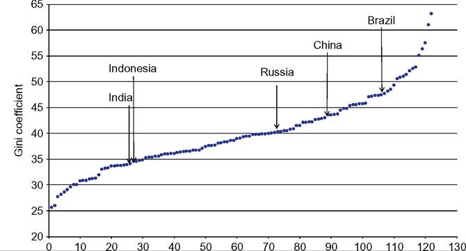
In LAC the coverage is complete in continental Latin America, but weak in the Caribbean. Anyway, countries with information represent 98% of the total population in LAC (the main missing country in terms of population is Cuba). The data set in Middle East and North Africa does not include information for Lebanon and Libya, which represent only 3% of the MENA population. In South Asia the only country missing is Afghanistan, whereas in sub-Saharan Africa there is information for 42 out of the 47 countries, representing 95% of the population, although in some cases the information is rather old. Figure 9.1 displays the range of Gini coefficients for 122 countries around year 2010, ranking from the least unequal (Ukraine, 25.6) to the most unequal economy (South Africa, 63.1). 9 The mean value is 39.8, and the median is 39.2. More than half of the observations are in the range [35, 45]. Only seven Eastern Europe countries have Ginis below 30, and five sub-Saharan African countries have Ginis higher than 55. The population-weighted mean is less than one point lower than the simple mean (39.1), a result affected by the relatively low level of inequality in populous India and Indonesia (China has a Gini somewhat higher than the world mean). Figure 9.1 shows the position of some of the most populated countries: Brazil has high inequality levels, China and Russia intermediate values, and India and Indonesia relatively low levels in the context of the developing world.
The variability of Gini coefficients across countries is large compared to the changes within countries over time, at least for the period for which we have more robust information (since the early 1980s). Li et al. (1998) find in the Deininger and Squire data set that 90% of the total variance in the Gini coefficient is explained by variation across [466]
![]()
Figure 9.1 Gini coefficients for the distribution of household consumption per capita.
Developing countries, 2010. Note: Countries sorted by their Gini coefficients. Source: Own calculations based on PovcalNet (2013). countries, whereas only a small percentage is accounted for by variation over time. From this observation Li et al. (1998) conclude that inequality should be mainly determined by factors that differ substantially across countries, but tend to be relatively stable within countries over time. We find a similar result in a panel of developing countries from 1981 to 2010 (PovcalNet data): 88.5% of the variance in that panel is accounted for by variation across countries.
The inequality rankings are relatively stable over time. The Spearman-rank correlation coefficient for the Ginis in 1981 and 2010 is 0.68, whereas it rises to 0.74 for 1990 and 2010, both significant at 1%. The last decades witnessed enormous economic, social, and political changes in the developing world, but, although the income distributions have been affected with various intensities, the world inequality ranking has not changed much, a fact that suggests the existence of some underlying factors that are stronger determinants of the level of inequality.
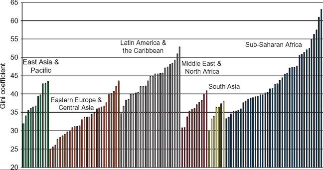
In Figure 9.2 developing countries are grouped in regions. Sub-Saharan Africa is the geographic area that includes countries with the highest inequality levels, but it is also the region with the highest dispersion, possibly in part due to measurement errors (Table 9.2). Although eight out of the 10 highest Gini coefficients belong to sub-Saharan African countries, and the arithmetic mean of the Gini coefficient is the highest in the world, the median is lower than in Latin America.
Latin America and the Caribbean has been typically pointed out as the most unequal region in the world. Deininger and Squire (1996), for instance, stated that their data set confirm the “familiar fact that inequality in Latin America is considerably higher than in
![]()
Figure 9.2 Gini coefficients for the distribution of household consumption per capita.
Developing countries, 2010. Note: Each bar represents a country in a given geographic region of the developing world. Source: Own calculations based on PovcalNet (2013).
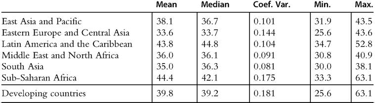
Table 9.2 Gini coefficients for the distribution of household consumption per capita Developing countries, 2010
![]()
Note: Unweighted statistics.
Source: Own calculations based on PovcalNet (2013).
the rest of the world.”[467] This type of assessment, however, is usually made combining income Ginis for LAC with consumption Ginis for other regions and/or ignoring sub-Saharan Africa. With the adjustment mentioned earlier to take the consumption/ income gap into consideration (factor 0.861), we find that the mean Gini for LAC is
43.8, slightly lower than in SSA (44.4), but the median is higher (44.8 in LAC and
42.1 in SSA). To reach the result of a higher mean Gini in LAC than in SSA, we would need an adjustment parameter higher than 0.92; such value is larger than what we estimated in all LA countries in the sample, except Mexico.
The rest of the regions in the developing world have Ginis mostly below 40. The arithmetic mean is 38.1 in East Asia and Pacific, 36.0 in Middle East and North Africa, and 35.0 in South Asia. Inequality is likely to be higher in MENA because several oilproducing countries are excluded for being high-income economies (and also for lack of information).[468] Eastern Europe and Central Asia is the region with the lowest inequality levels, with a mean Gini coefficient of 33.6. Interestingly, the dispersion measured by the coefficient of variation is higher than in the rest of the regions, except SSA.
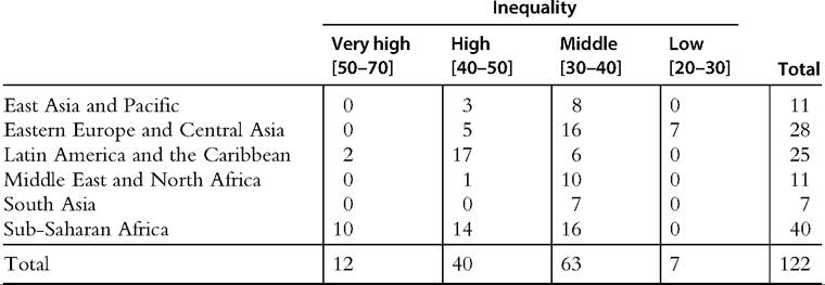
Almost all very highly unequal countries (Gini coefficients above 50) are in subSaharan Africa (Table 9.3). This region, however, has a similar share of countries in the high and middle categories. In contrast, in LAC most countries have high levels ofinequal- ity, whereas in EAP, MENA, and SA most countries are in the middle-inequality group.
Only ECA has economies with low inequality (Gini coefficients below 30). The All the Ginis data set (ATG) includes Gini coefficients from LIS, SEDLAC, WYD, the World Bank ECA database, and WIID. We selected consumption Ginis from ATG for year 2005 or close and applied a similar adjustment as described earlier for those countries in LAC with only income Ginis. The basic results are similar to the ones
Table 9.3 Classification of countries by level of inequality and by region Developing countries, 2010
![]()
Note: Countries are classified according to the value of the Gini coefficient for the distribution of household consumption per capita.
Source: Own calculations based on PovcalNet (2013).
obtained with PovcalNet data. The linear correlation coefficient for the Gini between both data sources is 0.763, whereas the Spearman rank correlation is 0.771, both significant at 1%. The Gini coefficients in ATG go from 23.1 (Czech Republic) to 62.9 (Comoros). The mean and median coincide in 40.1. Again, more than half of the observations are in the range [35, 45]. Only several Eastern European countries have Ginis below 30, whereas only four sub-Saharan African countries have Ginis higher than 55.
The evidence on inequality levels in the developing world drawn from WIID is similar. For instance, based on a sample of income Ginis for around 2005, Gasparini et al. (2013) find that the mean Gini for the six sub-Saharan African countries in the data set is 56.5, followed by LatinAmerica (52.9), Asia (44.7), and Eastern Europe and Central Asia (34.7).[469] The linear correlation coefficient for year 2005 for the Gini coefficient in PovcalNet and WIID is 0.871, and the Spearman coefficient is 0.820.
The Luxembourg Income Study database (see Chapter 8 of this volume) covers 36 countries, including 6 in Latin America, which occupy the top places in all the income inequality rankings.[470] The mean Gini for the Eastern European countries in LIS is slightly higher than the mean for the high-income economies. Data from the World Development Indicators also suggest that inequality in the developing world is significantly higher than in the OECD high-income countries. The mean income Gini for the latter group is 32.2, which is lower than in any other region in the world.
The EHII database confirms the high inequality levels of sub-Saharan Africa and Latin America, but perhaps surprisingly, it records similar levels in South Asia and Middle East and North Africa (Gini of around 47).[471] According to this data set, inequality is relatively lower in East Asia and Pacific and Eastern Europe and Central Asia. The estimated level of the Gini coefficient is substantially lower in the developed economies; the mean is equal to 36.5.[472] The Pearson (Spearman) correlation coefficient between EHII and PovcalNet Ginis is 0.642 (0.603), lower than the resulting value when comparing PovcalNet with WIID or ATG, but still significant at 1%.
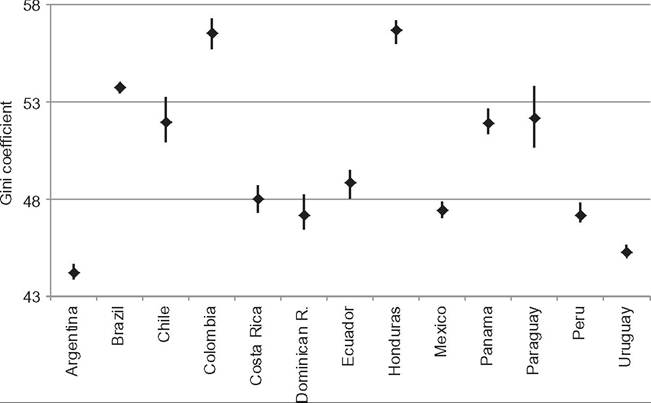
Most international databases do not provide confidence intervals for the point estimates of the distributive measures, making impossible the assessment of the statistical significance of the differences in inequality among countries. However, given that the indicators are calculated from large national household surveys, the confidence intervals are typically relatively narrow. SEDLAC provides the confidence intervals for all the Gini coefficients in Latin America. For instance, the 95% confidence interval for the income Gini was [43.9, 44.7] in Argentina 2010, [53.5, 54.0] in Brazil 2009, and [47.0, 47.9] in Mexico 2010. Differences in the point estimates of more than 1 Gini point are always statistically significant (Figure 9.3).
![]()
Figure 9.3 Gini coefficient and confidence intervals (95%). Distribution of household income per capita. Latin American countries, 2010. Source: Own calculations based on SEDLAC (CEDLAS and the World Bank).
9.3.2 Inequality Beyond the Gini Coefficient
The international databases usually allow a closer look at the distributions in the world beyond a single parameter, such as the Gini coefficient. Table 9.4 reports some basic statistics of the decile shares in 120 countries around 20 1 0.[473] On average (unweighted) the poorest 10% of the population in a country accrues 2.6% of total consumption reported in the survey; that share climbs to 31.5% for the top 10%. In a typical developing country the aggregate consumption of the poorest 60% of the population is similar than the consumption of the top 10%.
It is interesting to notice that the coefficient of variation of the decile consumption shares across countries is decreasing up to the top decile, when it strongly rises. Countries in the world seem substantially different in the consumption share of the poor and the rich, but not in the share of the middle strata, in particular the upper-middle strata.[474]
The aggregate consumption share of deciles 5-9 is on average around 50%, and it is very stable across countries. Palma (2011) has labeled this phenomenon the homogeneous middle. Variability across countries is actually smaller in the upper-middle deciles (deciles 7-9). The proportion of total consumption accruing to that group is quite similar in all geographic regions of the world; it ranges from 35.9% in SSA to 37.3% in ECA. The main difference across regions lies in the share of the bottom 60% compared to those
Table 9.4 Deciles shares, distribution of household consumption per capita Developing countries, 2010
| Deciles | Mean | Std. Dev. | Coef. Var. | Min. | Max. |
| 1 | 2.6 | 0.81 | 0.31 | 1.0 | 4.4 |
| 2 | 3.8 | 0.86 | 0.23 | 1.5 | 5.8 |
| 3 | 4.8 | 0.90 | 0.19 | 2.0 | 6.8 |
| 4 | 5.8 | 0.92 | 0.16 | 2.6 | 7.8 |
| 5 | 6.8 | 0.92 | 0.13 | 3.5 | 8.8 |
| 6 | 8.1 | 0.87 | 0.11 | 4.7 | 9.9 |
| 7 | 9.6 | 0.80 | 0.08 | 6.6 | 11.0 |
| 8 | 11.7 | 0.65 | 0.06 | 9.0 | 12.7 |
| 9 | 15.3 | 0.84 | 0.05 | 12.7 | 17.6 |
| 10 | 31.5 | 6.12 | 0.19 | 19.5 | 51.7 |
Note: Unweighted statistics.
Source: Own calculations based on PovcalNet (2013).
in the upper 10%. For example, whereas the share of deciles 7—9 in total consumption is almost the same in ECA (37.3%) and LAC (37.1%), the share of the bottom 60% is more than 7 points higher in the former (36.4% and 29.1%, respectively).
The correlation coefficients for the decile shares in total consumption provide information about the structure of the distributions across countries (Table 9.5). In a crosscountry perspective, gains are highly positively correlated in the first 8 deciles; on the other hand, for decile 10 correlations are all negative and large, except with decile 9, for which the correlation is non-significant. Gains in the participation of the richest 10% are tightly linked to losses in the share of the poorest 80% of the population. The table suggests that when we move up in the ladder of countries according to the share of the bottom deciles, we expect to see gains in the lowest strata obtained mostly against the share of the upper 20% of the population (and not, for instance, against the middle strata, and in alliance with the most affluent).
9.3.3 Inequality in the Gallup World Poll
The Gallup World Poll provides new evidence on the international comparisons of income inequality, as it includes identical income and demographic questions applied to national samples in 132 countries. Ofcourse, the reliability of the national inequality estimates in Gallup is lower than those obtained with household surveys because only one income question is used to approximate well-being, and the sample sizes are considerably smaller. However, Gluzmann (2012) finds that the correlation coefficient between the Gini coefficients computed with Gallup microdata and those reported in the World Development Indicators (WDI) that are based on per capita income is high (0.85). 8 International surveys with similar questionnaires across countries, such as the Gallup World Poll, could hardly be a substitute for household surveys as the main source for distributive analysis at the country level, but they may have a great potential for international comparisons of social variables. Future improvements in the quality of these surveys could turn them into a very valuable source for comparative international research.
Gasparini and Gluzmann (2012) use microdata from the Gallup World Poll 2006 to compute inequality in each region of the world. According to the unweighted mean of the national income Gini coefficients, Latin America is the most unequal region in the world (excluding Africa, which is not in the sample). The mean Gini in Latin America is
49.9, slightly larger than in South Asia (48.9) and Eastern Asia and Pacific (47.1). Countries in Eastern Europe and Central Asia (41.8), North America (39.2), and especially Western Europe (34.0) are the least unequal. Alternatively, regional inequality can be measured by considering each region as a single unit and computing inequality among
28
Interestingly, the relationship between the income Ginis in Gallup and the consumption Ginis in WDI is much weaker; the linear correlation coefficient is 0.21, non-significant at 10%.
Table 9.5 Correlation coefficients across countries of decile consumption shares Developing countries, 2010
| | d1 | d2 | d3 | d4 | d5 | d6 | d7 | d8 | d9 | d10 |
| d1 | 1 | | | | | | | | | |
| d2 | 0.9355* | 1 | | | | | | | | |
| d3 | 0.8930* | 0.9883* | 1 | | | | | | | |
| d4 | 0.8421* | 0.9624* | 0.9910* | 1 | | | | | | |
| d5 | 0.8042* | 0.9273* | 0.9647* | 0.9787* | 1 | | | | | |
| d6 | 0.7336* | 0.8739* | 0.9291* | 0.9623* | 0.9847* | 1 | | | | |
| d7 | 0.6310* | 0.7734* | 0.8436* | 0.8950* | 0.9378* | 0.9736* | 1 | | | |
| d8 | 0.3127* | 0.4711* | 0.5624* | 0.6446* | 0.7253* | 0.8085* | 0.8982* | 1 | | |
| d9 | -0.5793* | -0.4905* | -0.4112* | -0.3258* | -0.2389* | -0.1232 | 0.0527 | 0.4390* | 1 | |
| d10 | -0.7844* | -0.9032* | -0.9452* | -0.9689* | -0.9844* | -0.9891* | -0.9650* | -0.7962* | 0.118 | 1 |
*Significant at 1%.
Source: Own calculations based on PovcalNet (2013).
all individuals in that unit, after translating their incomes to a common currency—a concept Usuallylabeled global inequality (see Chapter 11 of this Handbook). The global Gini in Latin America is 52.5, a value higher than in Western Europe (40.2), North America (43.8), and Eastern Europe and Central Asia (49.8), but lower than in South Asia (53.2) and Eastern Asia and Pacific (59.4). The change in the rankings between the two concepts of inequality is driven by the differences across regions in the heterogeneity among countries in terms of mean income. Gasparini and Gluzmann (2012) report that the between component in a Theil decomposition accounts for 8% of total regional inequality in Latin America and 32.4% in East Asia and Pacific.
9.3.4 Top Incomes
Until the recent developments in the literature of top incomes from tax records (Atkinson and Piketty, 2007, 2010; see also Chapter 8 in this volume), inequality research has been mostly based on household surveys, which suffer from several limitations when focusing on the upper end of the distribution. Household surveys are all but ideal for studying top shares: The rich are usually missing from surveys, either for sampling reasons or because they refuse to cooperate with the time-consuming task of completing or answering a long form. Because extreme observations are sometimes regarded as data “contamination,” the rich may be intentionally excluded or top coded so as to minimize bias problems generated by presumably less-reliable outliers or to preserve anonymity. In addition, survey data present severe underreporting at the top; the richest individuals are more reluctant to disclose their incomes or have diversified portfolios with income flows that are difficult to value.
Szekely and Hilgert (1999) look at surveys from eighteen Latin American household surveys and confirmed that the ten highest incomes reported are often not much larger than the salary of an average manager in the given country at the time of the survey. In general, the profile of the average individual in the top 10% of the distribution is closer to the prototype of highly educated professionals earning labor incomes, rather than capital owners. On this specific issue, the quality of statistical information coming from surveys has not improved in the last years. Consequently, the inequality that we are able to measure with household surveys can be severely affected, regarding both levels and dynamics, in those cases or periods in which an important part of the story takes place at the top.
Tax and register data are being increasingly preferred over surveys in studying distributive issues at the top. In fact, under certain conditions registry data can provide valuable information to improve survey-based estimates. Typically, incomes reported to the surveys are checked against the registers, or incomes are directly taken from administrative sources for the individuals in the sample. Even if the combination of survey and administrative data can be seen as an improvement, there remains the issue of the sampling framework for the top of the distribution.[475] In any case, statistics offices in the developing world are not exploiting register data to complement surveys yet.
The use of tax statistics is not without drawbacks. First, because only a fraction of the population files a tax return, studies using tax data are restricted to measuring top shares, which are silent about changes in the lower and middle part of the distribution. Second, tax data are collected as part of an administrative process and do not seek to address research needs; both income and tax units are defined by the tax laws and vary considerably across time and countries. Third and most important, estimates are affected by tax avoidance and tax evasion; the rich, in particular, have a strong incentive to understate their taxable incomes. These elements, which are common to all countries, become critical in the developing world, characterized by tax systems with low enforcement and multiple legal ways to avoid the tax.[476]
A number of researchers have addressed the differences in the ability of tax and survey data to represent income inequality, trying to reconcile the evidence using the two sources (see Alvaredo, 2011; Burkhauser et al., 2012 for the United States). Unfortunately, at the moment of writing only a few developing countries have made available microdata from the income tax (namely Colombia, Ecuador, and Uruguay). Alvaredo and Londoho (2013), and Alvaredo and Cano (forthcoming) show that, in contrast to survey-based results, high-income individuals are, in essence, rentiers and capital owners. This feature differs from the pattern found in several developed countries in recent decades, where it has been shown that the large increase in the share of income going to the top groups has been mainly due to spectacular increases in executive compensation and high salaries, and to a lesser extent to a partial restoration ofcapital incomes. Although the working rich have joined capital owners at the top of the income hierarchy in the United States and other English-speaking countries, Colombia and Ecuador remain more traditional societies where the top-income recipients are still the owners of the capital stock.
Results, even if fragmentary, confirm that incomes reported to the tax authorities are considerably higher than those captured by the surveys at the top. For instance, the share of income accrued by the top 1% in Argentina in 2007 was 8.8% using household survey data (PovcalNet) and 13.4% using income tax data (WTID). In Uruguay 2010 the shares were 8.2% and 14.3%, and in Colombia 2010 13.9% and 20.4%, respectively. Even if those numbers are not directly comparable (surveys incomes are before tax), they show that synthetic measures of inequality, if presented in an isolated way, hide survey-based shares that may be unrealistically low. In this sense, it could be a good practice to systematically show the inequality indexes together with the shares of the underlying top percentiles to let users judge the quality of the estimates.[477]
A natural question, which has received much attention lately, is the extent to which tax data can complement household surveys in examining the level of inequality in developing countries. Alvaredo and Londoho (2013) compare the Colombian household survey with the tax micro-data over the years 2007-2010. The total household income from the survey is 60-65% of the NAS measure of disposable income.[478] Such gap cannot be seen as an accurate measure of the total missing income in household surveys because both sources are different, but a partial explanation may well be at the top of the distribution. As a simple exercise, these authors replace all the incomes above the percentile 99 in the survey with those from tax data (net of taxes and social security contributions to render both sources comparable), under the assumption that the top 1% is poorly captured in the survey. Two elements are worth mentioning. First, the gap between the NAS figure and the survey’s incomes of the bottom 99% plus the net-of-tax incomes from tax data above the percentile 99 goes down from 35-40% to 20-25%. Second, the Gini coefficient of individual incomes goes up from 55 to 61 in 2010.[479]
These findings challenge the general skepticism regarding the use of tax data from developing countries to study inequality. Such estimates should be regarded as a lower bound, to take into account the effects of evasion and underreporting. Nevertheless, they show that incomes reported to tax authorities can be a valuable source of information, under certain conditions that require a case-by-case analysis.
9.3.5 Inequality and Development
Is the level of inequality in a country associated to its development stage? In this section we take advantage of a cross section of national Gini coefficients for year 2010 to take a look at this issue. Of course, this topic is related to the long-lasting debate initiated with the seminal contributions by Lewis (1954) and Kuznets (1955), who argued that the process of industrialization would imply an inverse U pattern for inequality. However, the empirical test for the Kuznets curve requires time-series or panel data, and not just a cross
![]()
Figure 9.4 Inequality and development. Per capita gross national income (GNI) and Gini coefficient, 2010. Source: Own calculations based on WDI and PovcalNet (2013).
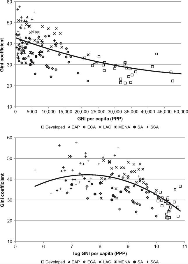
section, because it is a hypothesis about the dynamics of an economy over its development process. The causal relationship between development and inequality is the subject of a large literature that has to face numerous empirical challenges, and hence it is far from settled (see Anand and Kanbur, 1993; Banerjee and Duflo, 2003; Fields, 2002; Voitchovsky, 2009, for assessments). In this section we simply document the empirical relationship between these two variables across countries in a recent point in time without exploring the difficult issue of causality.
The first panel in Figure 9.4 plots the Gini coefficient for the distribution of consumption per capita against per capita gross national income (GNI).[480] The figure seems to
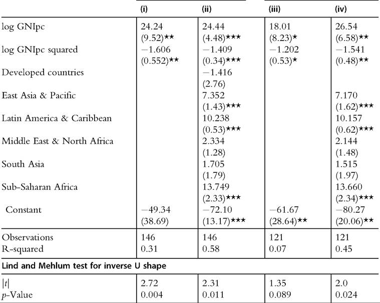
Table 9.6 Regressions of Gini coefficient on log GNI per capita and regional dummies
All countries Only developing countries
![]()
Note: Robust cluster standard errors in brackets.
Omitted category: Eastern Europe and Central Asia.
Lind and Mehlum test: H0: monotone or U shape; H1: inverse U shape. *significant at 10%; **significant at 5%; ***significant at 1%.
34
reveal a decreasing relationship between inequality and development. The linear correlation coefficient between the Gini coefficient and per capita GNI is —0.56 (statistically significant at the 1% level). An inverse-U shape shows up in the second panel of Figure 9.4, when per capita GNI is presented in logs. However, the increasing segment of the curve covers only very poor sub-Saharan African countries. The relationship Gini-GNI is decreasing in the range of GNI of most countries in the world.
The results of the regressions in Table 9.6 and the Lind and Mehlum (2010) test confirm an inverse U shape for the relationship between the Gini coefficient and log GNI per capita in a cross section of countries.[481] The result seems also valid, although it becomes considerable weaker when restricting the sample to developing economies. It should be stressed that the turning points implicit in the regressions correspond to around US$ 1800, a value that is lower than the per capita GNI of most developing countries, except for some economies in sub-Saharan Africa.[482] The inclusion of regional dummies reveals that East Asian, and especially Latin American and sub-Saharan African, countries are particularly unequal, even when controlling for their levels of economic development.[483]
9.4.